Search Results
Ponderosa Motel (American Inn Motel) Neon Survey document, September 16, 2017
Date
Archival Collection
Description
Site address: 3325 Fremont St
Sign owner: American Inn Motel LLC
Sign details: This location has been around since 1968, but mid-2016 it was renovated from the Ponderosa Inn Motel to the American Inn Motel but they use the same sign that was slightly redesigned for their use.
Sign condition: 5- very good condition and shines brightly at night
Sign form: Pylon
Sign-specific description: This pylon sign has a red steel beam base that has a reader board on the bottom portion of the sign. Above the reader board spells out "MOTEL" vertically in white Frontier font letters, with each letter in its own red square. Each letter of this is outlined in red skeletal neon. Above this is a rectangular plastic back lit sign (used to say Ponderosa on it) that now currently has the American Inn logo in it with white letters but a red and blue background. The whole sign is outlined in chasing incandescent light bulbs.
Sign - type of display: Neon, incandescent and plastic back lit sign
Sign - media: Steel and plastic
Sign - non-neon treatments: Plastic back lit portion
Sign animation: Incandescent light bulbs chasing all around the sign.
Sign environment: This property is very east on Fremont in between St. Louis street and Sahara. There are also many other motels and apartments surrounding this property. This motel is right next door to the Lucky Cuss Motel (their old sign is now one of the restored signs in the Las Vegas Signs project showcases on Las Vegas Blvd.).
Sign - date of installation: Has been up since around 2011
Sign - date of redesign/move: 2016 the plastic portion of the sign was swapped out from the Ponderosa motel sign and the American Inn sign that is currently there now.
Sign - thematic influences: The big MOTEL portion of this sign was very prominent on motel signs in the 50's/60's, such as the La Concha and Tam O' Shanter Motel signs.
Sign - artistic significance: Font was an old west Frontier font which was prominently popular in Las Vegas in the 1940's but has been recreated many times throughout Vegas history.
Survey - research locations: Booking.com website has information on the American Inn Motel https://www.booking.com/hotel/us/ponderosa-motel-las-vegas.html , google map sattelite view, Asessor's page
Survey - research notes: When trying to search Ponderosa Motel on google is when it was discovered that it has switched over to the American Inn motel, but google maps helped with dating when the switch occurred.
Surveyor: Emily Fellmer
Survey - date completed: 2017-09-16
Sign keywords: Neon; Incandescent; Plastic; Backlit; Steel; Chasing; Pole sign; Reader board
Text

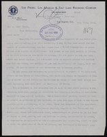

Los Angeles & Salt Lake Railroad Company double privy: architectural drawing
Date
Archival Collection
Description
From Union Pacific Railroad Collection (MS-00397). The scales are noted in the drawing. The bottom of the drawing says, "Material-Finish: All Finish Lumber Unless Otherwise Noted Shall Be [Opsas?] Wood Work Of Vault Shall Be O.P Rough. Exterior Of Privy Including Both Sides Of Door And Door Jamb: Also Wood Lattice Screen On All Sides Shall Be Painted With 3 Coats C.S. Lead & Oil Paint As Directed. Doors Shall Be Hung On 3 1/2" x 3 1/2" Botts. Doors Shall Be Provided With Rim Latch Knob Lock And Iron Barrel Bolt. Revisions: Added Vent Stacks, Seat Cover, Double Floor & Floor Shoe".
The bottom corner of the drawing states, "Union Pacific System L.A. & S.L.R.R. Double Privy 5'x8' With Lattice Screen. Ass't Chief Engineer's Office. Los Angeles, Calif. Drawn By E.C.B. Traced By E.C.B. Checked By F.W.G. Date June 14, 1926. Scale As Noted. Revised May 5. 1927. Drawing No. 15637".
Also written on the drawing: "Two to be built at East Yard, Calif. One ' ' Big Springs, Nev. ' ' Las Vegas, Nev. ' ' Borden, Utah. ' ' Elgin, Nev. 1927. ' ' Dry Lake, Nev. 1927. ' ' Wann ' ' 1928 [crossed out]."
Image
Rancho High School Class of 1962 Collection
Identifier
Abstract
The Rancho High School Class of 1962 Collection (1956-2017) consists of materials donated by students of Rancho High School in Las Vegas, Nevada. The collection contains school event clippings, newspaper clippings, scrapbooks, pamphlets, physical and digital photographs, and school jackets and sweaters. Additionally, the collection chronicles the lives of many students after graduation through school reunion documentation from the 1970s to 2017. The collection also includes planning files for class reunion celebrations including the 40th, 50th, and 55th reunions.
Archival Collection
University of Nevada, Las Vegas Phi Kappa Phi Records
Identifier
Abstract
The University of Nevada, Las Vegas Phi Kappa Phi Records (approximately 1960-2019) consist of meeting minutes, correspondence, financial documents, member lists, programs, newspaper clippings, and photographic prints pertaining to the Honor Society of Phi Kappa Phi Chapter 100 at the University of Nevada, Las Vegas (UNLV). The collection also includes memorabilia from the organization's fiftieth induction ceremony, as well as a framed copy of its charter.
Archival Collection