
Search the Special Collections and Archives Portal

Search Results

Display    Results Per Page
Displaying results 95111 - 95120 of 97758

Binion's Horseshoe Second Floor Plan: architectural drawing

Date

1967-09-20

Description

From the Homer Rissman Architectural Records (MS-00452). Written on the image: "2nd Flr. Plan. 3rd as noted. 1/8"=1'0". Rissman & Rissman Associates. Binion's Horseshoe as-built. Date 9-20-67. Sheet #2".

Image

Erma Cunningham Collection on the Eldorado School District, Nelson, Nevada

Identifier

MS-00156

Abstract

The Erma Cunningham Collection on the Eldorado School District, Nelson, Nevada is comprised of materials related to the elementary school that was located in Nelson, Clark County, Nevada from 1941 through 1952. It includes attendance records, student grades, and assorted materials related to education.

Archival Collection

University of Nevada, Las Vegas Institute for Security Studies Training Video on Terrorism

Identifier

UA-00026

Abstract

University of Nevada, Las Vegas Institute for Security Studies Training Video on Terrorism includes copies of the institute's training video for resort employees called "7 Signs of Terrorism" that was produced in 2008. The collection includes English language and Spanish language versions of the video.

Archival Collection

Photographs of Strip Centre sign, Las Vegas (Nev.), March 24, 2017

Date

2017-03-24
2017-10-01

Description

The Strip Centre sign sits along a stretch of vacant storefronts in the north-end section of South Las Vegas Boulevard. Information about the sign is available in the Southern Nevada Neon Survey Data Sheet.
Sign owner: Has been for sale since 2013
Sign details: This location has is a little shopping mall, and is called the strip centre since they are near the north end of the strip. Though this location has been up for sale since 2013.
Sign condition: 3- has had some bad weathering over the years and the paint is quite faded now.
Sign form: Blade
Sign-specific description: This sign stand on top of the building above the entrance. It is a green base that reaches the top of the sign. On the top part there is a big green steel rectangle with yellow painted words "The Strip Centre" but the word "Strip" is contained in channeled neon while the other two words are skeletal neon. Beneath this is 3 green sign boxes that would contain back lit plastic signs, but there are no signs in them currently. To the south side of the main sign there are remains of a sign that look like it used incandescent light bulbs.
Sign - type of display: Neon and plastic back lit signs.
Sign - media: Steel and plastic
Sign - non-neon treatments: Plastic back lit portion
Sign environment: This location is on the north end of the strip. It is north of the Stratosphere by a few blocks but also has some motels and wedding chapels close to it.
Sign - date of installation: Has been up since at least 2009
Sign - thematic influences: The plastic back lit portion is helpful for malls like this since they can change out which stores are within the mall relatively easily without getting a whole new sign.
Survey - research locations: Google map roadside view, attempted assessor's page but could not find it
Survey - research notes: This location was hard to find information on since it is for sale. Also I could not find information on it the assessor's page for some reason.
Surveyor: Emily Fellmer
Survey - date completed: 2017-10-01
Sign keywords: Neon; Plastic; Backlit; Steel; Pole sign; Back to back

Mixed Content

Transcript of interview with Robert L. Skaggs by Dr. David Emerson, May 06, 2006

Date

2006-05-06

Description

Dr. Robert Skaggs grew up around the St. Louis area. His father was a teamster with a milk delivery route, tried his hand at the restaurant business, and during WWII worked tor U.S. Cartridge. Several members of Dr. Skaggs's family were teachers, including his grandmother and a couple of aunts. Robert graduated trom Normandy High School and afterwards attended the Missouri School of Mines and majored in metallurgical engineering. He graduated in 1954 and went to work tor DuPont tor two years. He went to graduate school at Iowa State on an Atomic Energy Commission scholarship, and afterwards was hired by Standard Oil of California. During this time he met and married Anna Pedersen (1961) and moved to Minneapolis to work for Honeywell. Around 1966, Bob started teaching at the University of Kentucky. After a couple of years, he got wind of teaching opportunities at the Southern Division of the University of Nevada (now UNLV), and interviewed with Herb Wells. He and his family moved to Boulder City (1969) and he began teaching at what is now UNLV. He was involved in the work bringing accreditation to the engineering department, establishing a chapter for Tau Beta Pi, the Engineering Honor Society, and building a master's and a PhD program. After a heart attack in 1975, Dr. Skaggs took a sabbatical from UNLV and did some team teaching at University of Arizona in Tucson with Ray Sierka. He returned to UNLV on a half time teaching basis, and also worked for the Bureau of Mines. He was again involved in accreditation preparations and stayed to graduate a PhD student in engineering. He looks upon his experiences at UNLV as very positive and delightful.

Text

University of Nevada, Las Vegas (UNLV) 2020 and 2021 graduate college commencement program

Date

2021-05-13

Description

Commencement program from University of Nevada, Las Vegas Commencement Programs and Graduation Lists (UA-00115).

Text

Las Vegas Age

Alternate Title

preceded by Las Vegas Times (1905-1906)

Description

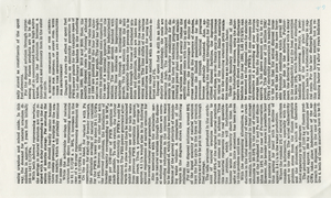
The Las Vegas Age was not Las Vegas's first newspaper; that distinction belongs to the short-lived Las Vegas Times which started publishing on March 25, 1905. But only two weeks later, on April 7, C.W. Nicklin founded what was the not-yet-a-city's third paper, the Age. Nicklin edited and published the Age from the Overland Hotel each Saturday as a six-page independent weekly, at $2 per year. When the railroad finally arrived, and laid out and auctioned off the town lots, the Age and its two competitors, the Times and the Advance, boomed with the new town amid lively journalistic debate. The Age briefly triumphed when the Times and Advance collapsed, until new competition arrived, and Nicklin left the Age to his partner Charles C. Corkhill to give his attention to his other paper, the Beatty Bullfrog Miner. Corkhill struggled for two years as editor and publisher, as Las Vegas languished in post-boom depression, then persuaded local businessman Charles P. "Pop" Squires to buy the paper, only after repeatedly dropping the price. Thus began the long and fruitful newspaper career of Charles Squires, sole editor and proprietor of the Age for almost forty years. Even after he sold the paper in 1943, he continued as editor until its last owner, Frank Garside of the Review-Journal, suspended publication of the Age on November 30, 1947.

As the Las Vegas Age, under Squires' shrewd editorship, dominated its local competition as the leading local newspaper with the largest circulation, it also became the leading paper in Southern Nevada. When Las Vegas was founded it was a remote railroad establishment far from the seat of Lincoln County, in Pioche where the county's leading newspaper and the paper of legal record was the Lincoln County Record, which had been in business since 1871. With the rapid growth of Las Vegas and the decline of the Pioche mining district, the population of southern Nevada shifted to the south and the divisions between the southern and northern sections of Lincoln County, which covered the whole of southeastern Nevada, became politically heated. When the Age began publication in Las Vegas in 1905, with a larger circulation than the Record in Pioche, the county commissioners decided to award to the Age all county printing and job work. The editor of the Record, not surprisingly, was enraged and commenced a series of personal attacks on the Age and the residents of Las Vegas, likening the Age to a mushroom fungi of uncertain life, possessing a readership of "floaters, the shiftless and reckless class."

Squires became the city's foremost booster and the Age became his trumpet, fighting for the division of Lincoln County that created Clark County, or for the new dam (an original member of Nevada's Colorado River Commission, Squires was in charge of publicity), or promoting as a one-man Chamber of Commerce civic and community organizations and projects or the city's nascent tourism and resort industry. Thus, the Age became the Voice of Las Vegas, as well as the most respected "paper of record" for the city. Other newspapers came and went, some were political adversaries (Squires was a staunch conservative, pro-business Republican), and some became well-established. But the Age remained the essential Las Vegas newspaper, from its fiercely independent editorials, to its boosterism and its comprehensive reporting of the simple everyday doings of this boisterous and dynamic new city.

See full information about this title online through Nevada's participation in the National Digital Newspaper Project. All issues digitized online at: Chronicling America collection from the Library of Congress.

1933
August
September
October
November
December
1934
January
February
March
April
May
June
July
August
September
October
November
December
1935
January
February
March
April
May
June
July
August
September

Language

English

English

Frequency

Weekly

Place of Publication

International Standard Serial Number (ISSN)

2766-4791

Library of Congress Control Number (lccn)

sn86076141

OCLC Number

13754433

Photographs of O'Shea's signs, Las Vegas (Nev.), 2002

Date

2002

Description

Daytime views of the O'Sheas Casino signs on the Strip. Information about the sign is available in the Southern Nevada Neon Survey Data Sheet.
Site address: 3555 S Las Vegas Blvd
Sign owner: Park Place Entertainment
Sign details: O'Shea's Casino is located just north across a small driveway from the Flamingo. The small but busy facade is a small, yet busy stop along the Las Vegas Strip. The exterior signage consists of two corner signs, a blade sign, hanging off of the west face of the building, a main entrance sign, backlit screens as well as various images laden with neon. All of these create a flashing display of luminescence all just above the pedestrian's head.
Sign condition: Structure 5 Surface 5 Lighting 5
Sign form: Fascia
Sign-specific description: O'Shea's Casino is located just north across a small driveway from the Flamingo. O'Shea's theme and signage is influenced by Irish culture and imagery, integrated into the forms of signage along the Las Vegas Strip. The building design itself is influenced by traditional European housing imagery, generalized with other elements of architecture also. One example of this is the coloring, exposed wooden beams and narrow rooflines over treated windows, which suggest styles seen in classic European architectural imagery. Examples of other elements such as sculpted windowsills and exterior molding are more akin to neoclassical than the Irish pub or cottage. A small blade sign hangs in the center of the structure facing north /south. Attached off of the building by two poles, the double sided cabinet is designed with a circular portion at the top that transforms along it's bottom edge into length portion of the "blade" that continues down to a rounded bottom. The Circular portion serves as the "O" in O'Shea's. The exterior of the signs width is finished in a polished gold aluminum surface. The top portion continues into a full circular space in the front where the backlit image of the O'Shea's leprechaun mascot resides in it's center. The image has a circular green neon border at the edge of the cabinet and is set into a field of incandescent bulbs, which occupy the remaining space in the face of the "O". Incandescent bulbs also run around the edge of a face on a gold raceway. Channel letters run vertically down the face of the blade spelling the remaining "Sea's" of the title. Each letter is filled with incandescent bulbs, and bordered on it's exterior in green neon. The remainder of the space, which comprises the surface of the sign, is a green material. The entire edge of the rest of the sign is also bordered with incandescent bulbs. Below the blade sign, the main entrance for the establishment is denoted by the large, arched, marquee logo, and wall sign for the casino. The arch shape is bordered by gold polished raceways, with the interior space where the O'Shea's logo is written in a bowed, horizontal arrangement with the "O" and "S" being the biggest letters in this group. The same back-lit leprechaun figure which is present in the blade sign, in seen in the "O" of the logo. The letters are of channel design and filled with incandescent bulbs. Gold scrollwork adorns the green background above and on the sides of the logo. An entablature, running the length below the arch, reads "casino" in channel letters filled with incandescent bulbs and bordered with green neon. The orange background in contained on the bottom edge with a gold polished raceway, which sharply curves into a downward point at the very center. All the raceway edges of the sign are lined with incandescent bulbs. Flanking the wall on either side of the main entrance are two backlit message centers with vinyl lettering. They also are bordered with incandescent bulbs, strewn upon polished raceways. To the south toward the Flamingo Casino, a corner marquee sign faces toward the southwest. The message center on the right of the main entrance essentially continues its shape wrapping in radius fashion all the way around the corner. As the entablature wraps the corner, the color changes to a section of black, containing the channel letters hung at a slight angle, spelling the words " Hall of Fame," in cursive text. Small stars in channel design adorn the black background. On the left of the text, O'Shea's is painted in red paint, in a cursive script at a similar angle as the premier text. Neon is shaped over the surface of the letters to allow it to be spelled in light. The word "Casino" is spelled on the right hand side, and treated in the same fashion. A top the black portion of pediment, the sign continues with it's corner finishing, rounded marquee, containing the text, "Magic & Movie," in a three lined arrangement. Putting the two signs together the appropriate title for the advertisement of the attraction is read "Magic and Movie Hall of Fame." The channel letters on the top portion are filled with neon and treated white on the interiors. The edge of the cabinet is treated with white bull nose borders, sandwiching a field of pink holding two tubes of contoured neon. At the peak of the sign a small element reminiscent of a fan, created using a multi layered box, uses different levels receding into space, with the center blade at the front of the sign. The sections are lined with gold raceways and incandescent bulbs, with the center blade being horizontally striped with tubes of neon. Two small gold finished gargoyle statues flank either side of the theatre-esque entrance. Underneath the overhang created by the corner sign, polished aluminum element creates a sloping drum shape above the door. This drum is divided into sections by gold polished raceways. The flat portion, which returns to the ceiling of the overhang is adorned with painted images of clovers, encircled in rings of green neon. This section is reminiscent of the top section of the corner drum of the Barbary Coast. The black pediment along the south portion of the building., abruptly changes to the orange color seen on the main entrance. Along the south wall section of the pediment green pan channels in the shape of clovers hang, lined on the interior with neon. A small sign denoting parking is also present. Another corner entrance is located on the north end of the property, facing northwest. It too has the rounded corner entrance and logo sign. Slightly different than the main entrance, the same "Casino text and structure is seen on the orange pediment above the door, as well as the channel logo with the mascot located in the letter "O." A three-sectioned panel with swooping wings and an arched center creates the field for the main logo. A more busy section of two dimensional scrollwork sits below the neon filled text. The wings of the top section a recessed panels with checkerboard design behind that. Each side of the entire top section is book ended with two small square posts. Three small miniature spires line the very top, and the same inverted drum shape sits underneath the door. Street posts reside on the sidewalk outside.
Sign - type of display: Neon; Incandescent; Backlit
Sign - media: Steel; Plastic
Sign animation: Chasing, flashing, oscillating
Notes: All of the bulbs, which reside in the fascia signs which designate entrances, oscillate rapidly. The entrance sign a bit closer to the north end of the property also contain the pan channel star shapes, with incandescent bulbs in the center. The bulbs which, reside on the widths edge of the small pole sign at the south end of the property, oscillate giving a twinkling effect. The main pylon's animation is rather simple considering the amount of lighting. Bulbs which create the dazzling background chase each other upward to the very point, then once they reach the top, each letter light up from left to right, one at a time, then off one letter at a time. The letters all turn on simultaneously while, while the background chases up, leaving the lights off in its trail. The text then shuts off as well. The small incandescent bulbs lacing the background of the main body of the sign oscillate subtly, twinkling themselves. Each letter of the text contains a single row of incandescent bulbs, just inside the border of the red neon. This row is always on in a chasing animation from left to right even when the letters are dark. The animation for the three sided, pole sign, at the north end of the property is adorned with sparkling animation as well. The purple bulbs, which create the border of the main base, chase each other from bottom to top, and the star shape in the center is filled with oscillating incandescent bulbs. The bulbs, which also encrust the bottom surface of the cabinet, oscillate as well. The incandescent bulbs, which adorn the background of the text portion of the sign, also sparkle with a soft random oscillating pattern. The stars which sit on top of the cabinet, animate in a random, non descriptive fashion. The inner star shaped pans oscillate with incandescent bulbs, and the neon borders flash on then off, in a clumsy random order. The three-sided sign also rotates, one of the few animatronic signs on the Strip.
Sign environment: Being essentially part of the Flamingo, O'Shea's is only separated by a small drive, producing the easy traffic flow from the north entrance of the former. The north of O'Shea's on the immediate vertical explosion of the front tower/porte cochere of the Imperial Palace. It is easy to say that O'Shea's is sandwiched in between two giants, assuming its place as the charming gap between the Flamingo and the Imperial Palace which is quite a bit more pedestrian friendly. Traveling north on the east side of the strip, O'Shea's is not hard to miss at all
Sign - date of installation: Original date of installation 1989. The southwest, and northwest corner signage were added at a later date
Sign - thematic influences: O'Shea's centers around the theme of the Irish pub, utilizing various imagery to get support the design. The color green is used extensively in the main signs color scheme while the ever-popular image of the folkloric leprechaun illuminated it a cartoon form upon the pylon. The green pan channels, which are shaped like shamrocks, are place along the exterior wall, an obvious reference to the St. Patrick's Day Holiday as well a reference to good luck. ( example: the four-leaf clover, luck of the Irish.) Luck is something synonymously associated with an industry such as gaming. Gold is also used extensively with the exterior referencing the infamous pot of gold associated with the lore of leprechauns. The actual structure itself is constructed with elements which suggest a European rustic cottage.
Surveyor: Joshua Cannaday
Survey - date completed: 2002
Sign keywords: Chasing; Oscillating; Fascia; Neon; Incandescent; Backlit; Steel; Plastic

Mixed Content