Search the Special Collections and Archives Portal
Search Results
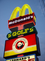
Photographs of McDonald's sign, 3999 S Las Vegas Blvd, Las Vegas (Nev.), 2002
Date
Archival Collection
Description
Site address: 3999 S Las Vegas Blvd
Sign details: The McDonald's pylons sits in the parking lot for a Strip mall, located in the South end of the Las Vegas strip. The sign sits northwest of the actual McDonald's Restaurant and faces north south. It also act as the main advertising pylon for other shops which are located in the strip mall. The pylon consists of four cabinets including the McDonald's main marquee cabinet. The cabinet directly below the McDonald's crown reads "Golf" and advertises for a golf store the other two are internally lit rectangular cabinet with advertisements for Las Vegas Clubwear, Panda Express, a shoe store which reads "Boots and Wide Shoes", and for the local radio station 97.5 KVEG.
Sign condition: Structure 5 Surface 4 Lighting 4
Sign form: Pylon
Sign-specific description: The pylon located on the east side of Las Vegas Boulevard South, and is facing north/south. The structure contains four double-faced cabinets, two of which are internally lit, while the other pair are steel cabinets containing neon and incandescent bulb treatments. The entire structure of the sign itself is essentially a narrow, square, vertical pole, with three cabinets cutting transversely the horizontal plane of the design, and integrated into it's construction. The surface of the sign is stucco with four bars of vertical neon rising vertically up the face of the pole where there are breaks between the internally lit cabinets. The tubing starts as a purple color but transforms into a red as it reached the top and spreads out into the supporting T form, which supports the McDonalds cabinet. The cabinet itself is constructed of a red painted steel, with the arches made of yellow painted steel. The letters that spell McDonalds is spelled in white channel letters, with the sides of the cabinet adorned with miniature golden arches logo. Red incandescent bulbs are laden across the face of the sign. The crowning features of the sign are the golden arches, which are wrapped with repeating bands of golden neon The each face of the cabinet is lined with red neon tubing. The "M" emblem created by the miniature golden arches are lined with the corresponding. yellow neon. The cabinet just below the main attraction is a horizontal rectangular cabinet made of steel and painted green with rounded ends. Yellow channel letters spell the word golf and occupy the majority of the center of the sign. Flanking the text is a three-piece graphic design pattern representing a golf ball and two other geometric elements. It is not obvious what the symbol represents but its is comprised of two non-descriptive shapes in yellow and a circular shape in green. All of the yellow shapes are lined on the interior border with yellow neon. The circular shape is internally lit, with the face matching the shape of the cabinet in color. The cabinet below the golf cabinet is an internally lit, double backed cabinet advertising for a local radio station on the south face of the sign. The black script, set upon a field of various red and orange blended tones, reads the call letters KVEG 97.5, with a white oval backing up the letters and centering the red field. The north face contains a back lit yellow and red advertisement for the Panda Express restaurant. The third and last cabinet closest to the ground is internally lit with different advertising on either side as well. The south face of the cabinet is a three sectioned graphically treated advertisements for the Panda Express, Las Vegas Club Wear, and the Boots and Wide Shoes text for Leonard's Wide shoes which is what dominates the north side of the pylon. The face of the blue steel cabinet is lined with blue neon. At the bottom of the pylon there is a small plaque used to illuminate the blue and white address plate.
Sign - type of display: Neon; Incandescent; Backlit
Sign - media: Steel; Plastic
Sign - non-neon treatments: Paint
Sign animation: Chasing, oscillating
Notes: The incandescent bulbs found on the face of the sign are constantly oscillating at a quick pace. The neon bands which wrap around the golden arches, start in the very middle at the bottom and chase each other upward from the center, leaving every bar illuminated in it's path, until the entire arch itself. Once the arches rapidly fill up, the entire arch flashes off, on, then off again, before restarting the entire sequence.
Sign environment: Headed south, across a small drive on the east side of Las Vegas Blvd from the McDonalds, is a shiny, new fueling station and mini mart, brightly illuminated, creating a constant current of arriving and departing travelers with the McDonalds restaurant. In relation to the larger scale Luxor and Mandalay Bay, the presence, which the McDonalds environment portrays, is like the smaller satellite's to the standing vision of new development on the Strip. Instead of this sign being evidence of what was and was is dying on the southern en of the strip it is actually evidence of the modern development and new life welling up.
Sign manufacturer: YESCO
Sign - thematic influences: The theme of the McDonald's establishment is in the realm of the well-established McDonalds corporation. The golden arches, and solid red hue, have become synonymous with the name " McDonald's," and is an image, which has been communicated to the masses of people for half a century. It is an icon, which is associated with America all over the world. McDonalds has created it's own realm and thematic influence over the years from all of it's extensive advertisements and marketing. Therefore, the theme of the establishment's signs draws from itself and the world that the name has created. Being one of the most commonly seen images in America, this sign is tailored to fit into the illustrious, illuminative properties held on the Las Vegas Strip. It fits into the category of everyday images and businesses dressed up for Las Vegas, which include, Arby's, Arco AM/PM, Walgreen's, and Fatburger.
Surveyor: Joshua Cannaday
Survey - date completed: 2002
Sign keywords: Chasing; Oscillating; Pylon; Neon; Incandescent; Backlit; Steel; Plastic; Paint
Mixed Content
Series IV. RKO Radio Pictures, Incorporated, 1930 to 1974
Level of Description
Scope and Contents
The RKO Radio Pictures, Incorporated series (1930-1974) contains material primarily pertaining to development of RKO films during Hughes' ownership of the company. This series primarily features
Archival Collection
Collection Name: Howard Hughes Film Production Records
Box/Folder: N/A
Archival Component

Interview with David Alan Buer, August 9, 2006
Date
Archival Collection
Description
Text
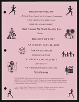
Sister's Network flier
Date
Archival Collection
Description
From the Alpha Kappa Alpha Sorority, Incorporated, Theta Theta Omega Chapter Records (MS-01014) -- Chapter records file.
Text
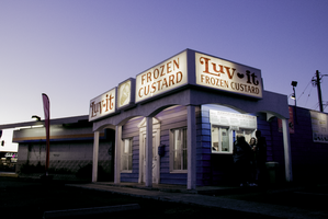
Photographs of Luv-it Frozen Custard stand, Las Vegas (Nev.), January 27, 2017
Date
Archival Collection
Description
Site address: 505 E Oakey Blvd
Sign owner: Brittany and Brandon Tiedemann
Sign details: Luv-It Frozen Custard has been a Las Vegas dessert shop since 1973. They specialize in their "shakes, cones, malts, and hard packs to go." The same family, the Tiedemann's, have been operating the business for four generations. The great-grandmother of the family who opened this modest frozen custard stand originally worked at another famous frozen custard shop called Leon's in Milwaukee, WI. She brought her desire to make frozen custard to Las Vegas and made her own signature flavors. They have been using the same vendors and products to create their delectable ever since they opened. They say the only thing that has changed since they opened is "a new generation of the family and a new color for our building."
Sign condition: 4, the sign is in very good condition. However, the red paint in the letters has faded away slightly.
Sign form: Fascia, Backlit
Sign-specific description: The sign has a very modest design. The signage when looking at the front facade of the building is broken up into three different sections. The first section on the left hand are the words "Luv It" in red, serif style font and a small red heart between the two words. These words are up against a plain white background. Next to that is a small square sign that has a painted vanilla custard cone on it, also with a white background. The sign next to that reads "Frozen Custard" in the same shade of red as the "Luv It" sign and has a white background as well. On the right side of the building over the walk-up window is another sign that reads "Luv It Frozen Custard," which appears to be a combination of the "Luv It" and "Frozen Custard" signs on the front of the building.
Sign - type of display: Backlit
Sign - media: Plastic
Sign - non-neon treatments: Paint
Sign environment: The environment for this humble frozen custard stand straddles Las Vegas Boulevard and a residential neighborhood nearby. It resides near other popular properties along Las Vegas Boulevard as well, such as: Viva Las Arepas, Art of Flavors, Dino's Lounge, and many wedding chapels. It also sits fairly close to John S. Park Historic Neighborhood.
Sign - date of installation: 1973
Sign - thematic influences: The sign looks old fashioned today because they had it ever since they opened. It is a modest sign to reflect the modest business. The element of the sign that reflects back to the business is the frozen yogurt cone portion of the sign that tells you what the business is for.
Sign - artistic significance: This sign uses a symbol to articulate what the business serves. This has been a popular technique for businesses because it is easy for motorists and pedestrians to see what the business is for without having to read any other text.
Survey - research locations: Luvit website
Survey - research notes: https://lasvegassun.com/news/2009/sep/16/sketchy-neighborhood- bites-back/
Surveyor: Lauren Vaccaro
Survey - date completed: 2017-08-25
Sign keywords: Fascia; Backlit; Plastic; Paint
Mixed Content

