Search the Special Collections and Archives Portal
Search Results

Alice Foley Yarish interview, August 31, 1993: transcript
Date
Description
An oral history interview conducted and edited by Robert D. McCracken; Esmeralda County History Project; Goldfield, 1993
Text
Harmon Family Papers
Identifier
Abstract
The Harmon Family Papers consist of the political and personal correspondence of Las Vegas, Nevada pioneer Harley A. Harmon from 1910 to 1934, and his son, Harley E. Harmon, from 1950 to 1966. The collection also includes correspondence, personal papers, and photographs of Harley L. Harmon from approximately 1950 to 1999. Also included are family scrapbooks with wedding announcements, photographs, birthday cards, newspaper clippings, and other ephemera.
Archival Collection
Stardust Resort and Casino Photograph Collection
Identifier
Abstract
The Stardust Resort and Casino Photograph Collection, approximately 1970 to 1979, consists of black-and-white and color photographic prints of the Stardust Hotel and Casino in Las Vegas, Nevada. The photographs depict the interior and exterior of the hotel before and after its renovation in 1975.
Archival Collection

Transcript of interview with Nancy Horden by Ward Murashige, February 26, 1980
Date
Archival Collection
Description
On February 26, 1980, collector Ward Murashige interviewed Nancy Horden (born February 7th, 1921 in Las Vegas, Nevada) in James Dickenson Library at the University of Nevada, Las Vegas. The interview covers Nancy’s family background, and life in Nevada, including home life, recreation, and hobbies. During this interview, Nancy also discusses local development, and the social and environmental changes that have occurred over the span of her lifetime in Las Vegas, Nevada.
Text

Transcript of interview with Marguerite Goldstein by Carol A. Semendoff, February 25, 1979
Date
Archival Collection
Description
On February 25 1979, collector, Carol A. Semendoff interviewed cashier, Marguerite Goldstein, (born on May 1925 in Oberlin, Kansas) in the library at the University of Nevada, Las Vegas. This interview covers early Las Vegas, from 1950 to 1979. Also included during this interview is discussion on local dignitaries, the growth of Las Vegas, gambling as the major industry in Las Vegas, Strip hotels, and housing developments.
Text
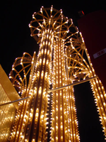
Photographs of Westward Ho signs, Las Vegas (Nev.), 2002
Date
Archival Collection
Description
Site name: Westward Ho Motel (Las Vegas, Nev.)
Site address: 2900 S Las Vegas Blvd
Sign details: The space of the westward Ho is limited yet busy on the landscape of the strip. Approaching from the south, the property lies on the West- side of the Strip. Signage is available on the south elevation, wrapping around into the east elevation, which happens to be the front. Starting with the pylon sign a similar courtyard stretches north with its translucent vinyl awnings, until it reaches its abrupt end with the Circus Circus and Slots A Fun properties.
Sign condition: Structure 5 Surface 5 Lighting 5
Sign form: Pylon; Porte-cochère
Sign-specific description: Approaching the Westward Ho headed north you are immediately confronted by a couple of signs. The first being giant yellow channel letters in Western style font and outlined in blue neon. The font is similar to that of the Frontier Hotel and Casino. The ends of extended appendages of the letters swell in block shapes with points jutting from the flat surface. The letters are filled with incandescent bulbs which all flash on together almost illuminating the entire parking lot in for a brief few seconds and then off again. Below that the building is horizontally striped with polished gold panels sporting three back lit signs for various resort attractions of buffets and drink specials. The building long panel is bordered on the top and the bottom by chasing incandescent bulbs on a polished raceway from left to right when facing this south elevation. The brick facade is adorned with a long backlit message cabinet with yellow painted raceways with incandescent bulbs. On either end of the backlit cabinet are two large square backlit cabinets. These two are bordered with a large steel raceway painted black. Dividing the two large raceways is a channel painted yellow. Inside the recessed channel are incandescent bulbs. The black raceways are faced each with three stripes of neon in blue, whir. The facade of signage and mirrored panels leads the eye to the obvious main pylon sign for the motel. The giant exploding pylon of gold raceways shooting upward into the sky and finally mushrooming out into umbrella formations at different elevations. The sign is comprised of five separate towers: One giant one in the center, which is the tallest, two lower ones flanking the center poles, then one smaller one on the south side of the sign and one equal size on the East side of the structure. The polished gold aluminum raceways comprise the body of the structure and are illuminated with incandescent lamps. The very base of the structure is supported with a structure of red brick masonry. The only elements of actual signage are the back-to-back color animated LED message centers, which are crowned by the 'old west' style text of various sized red neon bordered channel letters. Viewed from the side the Westward ho sign takes on a more sculptural aspect than that of signage. The reason for this is the brilliant finishing of the backs of the message centers. The rears of each panel are finely finished with brushed aluminum gold panels, which combined with the electrifying animation of the incandescent bulbs, creates a high degree of reflectivity. (Barnard) As if echoing the main pylon sign, stretching to the north is a small plaza utilizing the same three-dimensional sculpted umbrella designed awnings to create a pedestrian ready experience to the design. The umbrellas are made into coverings by the addition of illuminated vinyl. The pole structures are steel, covered with brick masonry. Each one of the umbrellas has a planter base and benches where visitors my rest or enjoy the surrounding environment. As the pylon, bulb laden, polished aluminum raceways form the skeleton of the Umbrella. Non-illuminated brass raceways stretch down from the inside and down the center pole. As well as the pylon, polished metal lacework finds its way around the circumference of the Umbrellas bottom edge. The East face of the building is mirrored to ad to the reflectivity of the entire plaza, and adding the illusion of depth to the rather limited space. The half columns and half umbrella's are set into the wall looking as if it is whole against the mirrored surface. A backlit triangular polished cabinet is of particular interest, because it is a sculpted cabinet frame. The top of the two faces is made to mimic the shapes of the pylons swelled crowns. Westward Ho is spelled in red paint.
Sign - type of display: Neon; Incandescent; Backlit; Matrix; Ambient
Sign - media: Steel; Plastic; Glass; Masonry
Sign - non-neon treatments: Graphics; Paint
Sign animation: Chasing, flashing, oscillating
Notes: The incandescent bulbs inside the text reading "Paris" on the balloon oscillate rapidly.
Sign environment: The Westward Ho's unique design of an incorporated courtyard frontage, creates a small strip of closed environment between the Stardust and the Circus Circus/Slots A Fun. The space between the Stardust's property and the Westward Ho's is separated by a small parking lot, which holds claim to the giant letters which boom out casino to the passerby. With its party atmospheric, umbrella design, and mirrored backdrop the pedestrian element makes its own environment distinct to the passerby. Walking through this section gives a sense of a specific taste held in Las Vegas two decades ago, yet still evident today in almost every casino design.
Sign manufacturer: Sign Systems, Inc (pylon and courtyard) YESCO (south side signage)
Sign designer: Brian K. Leming (Pylon and Umbrella frontage)
Sign - date of installation: 1983 (Pylon and Umbrella frontage)
Sign - date of redesign/move: Original backlit plastic message center was replaced with the now existing LED matrix screen
Sign - thematic influences: The Westward Ho facility itself is a Western themed establishment but the design by Lemming reflects a more party atmosphere with its umbrella shaped overhangs and highly animated incandescent raceways. The courtyard was originally designed with a different idea fore a pylon, but the idea of the canopies was carried over into that of the design of the pylon. The over use of the theme of the polished aluminum is reminiscent of that period in Vegas history when the materials could be found virtually everywhere. Such examples included the porte cocheres at the Silverbird Hotel and Casino and the Stardust as well. This theme is still seen on virtually almost every sign. The only elements of Western imagery or style are found in the pylon sign are the font style of the lettering. As for the he building's flavor of the old west, the south wall's yellow channel letters reading "CASINO" is reminiscent of the style of font found on the pylon.
Sign - artistic significance: Besides the fact that the pylon structure stood independently in sculptural aspects as well as functional aspects, the use of materials proved to be a trend setting achievement in that period of Las Vegas. Not only did the property take extensive use materials that could maximize the ability of the lighting such as polished aluminum and mirrored paneling, it was the first to significantly employ the use of colored, translucent vinyl.(Barnard) Soon after the use of this translucent materials in signs could be seen all over the Strip on the interior and exterior of signs and buildings.
Surveyor: Joshua Cannaday
Survey - date completed: 2002
Sign keywords: Chasing; Flashing; Oscillating; Pylon; Porte-cochère; Neon; Incandescent; Backlit; Matrix; Steel; Plastic; Masonry; Glass; Paint; Graphics
Mixed Content
Transcript of interview with Stanley Schwartz by Carol Schwartz, March 1, 1980
Date
Archival Collection
Description
Interview with Stanley Schwartz by Carol Schwartz on March 1, 1980. Stanley talks about coming to Las Vegas in 1951 to open a clothing business on Main Street, Schwartz Brothers Clothing. He compares the business district of the 1950s to the district in 1980, and advertising opportunities in the newspapers and on the radio. Schwartz talks about suit styles and changing preferences of buyers, and moving the store to Second Street, then Fremont Street, then to Maryland Square Shopping Center. In 1970, he changed the focus of the clothing store to "big and tall" and talks about the importance of customer service in retaining customers. He mentions Al Benedict and Herb Tobman as people he admired.
Text

