Search Results
"Beau's Bits": Nevada Southern University Student Handbook
Date
Archival Collection
Mixed Content
Photographs of Circus Circus signs, Las Vegas (Nev.), 2002
Date
Archival Collection
Description
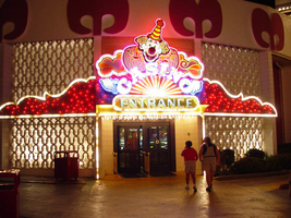
Site name: Circus Circus (Las Vegas, Nev.)
Site address: 2880 S Las Vegas Blvd
Sign owner: Mandalay Resort Group
Sign details: Circus Circus is a cluster of signage and buildings located toward the Sahara Boulevard. When approaching Circus Circus on Las Vegas Boulevard from the North or the South the first thing which is seen is Lucky the Clown, the giant, sculpted, roadside pylon, on the west side of the strip where the property is located. From the South as you approach the property A small double backed marquis sign for the Circus Circus is perched atop the corner or the shared and neighboring establishment of the Slots-a-fun's small street side covering. As you make you way past to entrance to Slots of Fun toward the Giant Lucky sign, the impressive porte cochere comes into view. The porte cochere is the centerpieces for the flankings of the electrified north elevation of the low rise Slots a fun building and the Lucky the Clown Pylon. Following the building North and around it's North elevation, and elevated tram track is exaggerated by the striping of red neon and incandescent bulbs. From there you see the letters horizontally along the high rise towers spelling Circus Circus. The rear of the property serves as home to the Circus Circus Manor, an RV park for the recreational motorist to stay in their travels.
Sign condition: Structure 4 Surface 4 Lighting 5
Sign form: Pylon; Fascia; Porte-cochère
Sign-specific description: The first description belongs to the double backed color LED message center. The board is outlined in rose neon leading up into neon scrollwork center-pieced at the very top of the sign by a smiling clown face. Between the message center and reader board are the animated neon words circus circus in channel lettering with red neon. When facing the front of the Circus Circus, the first fixture, which catches the eye, is the dazzling Rudy Coristomo designed porte cochere. The gradually arched cover is of fully cantilevered design, and the entire piece is encrusted with a dizzying array of animated red and white incandescent bulbs. The words Circus Circus are spelled in channel lettering cross the front peak of the low rise arch design. The letters are filled with white animated incandescent bulbs. A backdrop for the porte-cochere is the pattern of incandescent bulbs along the wall of the structure, which supports the porte cochere. Painted in animated bulbs, narrow, intersecting archway designs reach from the ground nearly to the top of the building itself. The effect is nice backdrop, which leads the eye from the wings of the property to the center. Placed just to the left of the Porte cochere is an entrance into the casino. Above the door a neon and bulb encrusted fascia designed clown holds guard to the word entrance spelled in backlit plastic. Flanking the figure itself are animated red and white bulb laden scrollwork. To the right of the porte cochere is a smeller yet equally charming sign representing another entrance into the building. The smiling backlit plastic wall sign, like the previous, holds an arched text of casino which itself sits above the word entrance. It is outlined in blue neon, with animated incandescent bulbs. Two backlit plastic message boards with changeable vinyl lettering join the wall sign. Animated incandescent bulbs form a border around each. Following around to the North side of the building. A continuous stripe of red neon and a stream of incandescent bulbs border an elevated tram path. As it disappears into a higher elevation building, the giant, vertical, red neon letters Spelling Circus Circus can be seen high above along the east elevation of the tower in the near distance. Continuing west you arrive in the rear parking lot where several items of signage reside. At the very west edge of the property a single sided arched backlit panel faces east and is supported by two candy striped red and white poles. Following the striping and forming a border around the arched panel, white incandescent bulbs chase around the entire sign. In a two-leveled section of text, in the very center of the top of the sign, the words Circus Circus and then Entrance below that are spelled in metal channel lettering with exposed red neon on the interior. On either side of the red neon text are the words free parking painted in white. Directly through the gate further in the distance in the Parking lot, the parking garage can be seen highlighted by the vertical channel lettering, in block text the words Free parking on the west elevation and on the north elevation the key circus circus turn of the century lettering spell circus circus lighted with red neon. The words light up in sequence back and forth in animated turn, saying Circus, Circus. Below that Free Parking is also spelled in block text channel lettering, with exposed red neon. Along the north side of the parking lot is Circus Circus Manor, the recreational vehicle park is highlighted with it's own unique signage.
Sign - type of display: Neon; Incandescent; Backlit; Matrix
Sign - media: Steel; Plastic; Fiberglass
Sign - non-neon treatments: Graphics; Paint
Sign animation: Oscillating, flashing
Sign environment: The site is bordered on the South by Slots of Fun, on the north by the Hilton timeshare under construction, and across the Strip by the Riviera.
Sign manufacturer: YESCO (porte and pylon)
Sign designer: Rudy Crisostomo/LeeLinton (Porte cochere) Dan Edwards (Lucky the Clown Pylon)
Sign - date of installation: Pylon: 1976, Porte Cochere: 1983
Sign - date of redesign/move: The back-lit plastic message board of Lucky the Clown was replaced with an LED matrix screen. In 1983, the porte cochere was redesigned by Rudy Crisostomo and architect Lee Linton.
Sign - thematic influences: The Circus Circus is entirely encompassed by the theme of the big top extravaganza of the three ring circus. The furiously animated light arrays, sheer magnitude of the number of bulbs, intensity of light, all add to the exciting concept of the circus. The turn of the century fonts, reminiscent of the Barbary Coast block Style, are mostly consistent through out the property.
Sign - artistic significance: This theme was en effort to give a bit more respectable image to gambling originally in the late sixties and early seventies. They would incorporate live aerial acts over the casino floor The unique concept was accented by a higher capacity for staying travelers and more family oriented attractions. The giant backlit sculpted pylon Lucky the Clown sign stood as a standard for size and dominance. The 84 ton steel structure was all internally contained and lit from head to toe and welcomed guests and was on of the most memorable Las Vegas sign experiences. Artistically it was influential on the standard on how a resort could be totally encompassed by a theme to create a unique spectacular for most people as well as retain the brilliance of Las Vega's garish style.
Surveyor: Joshua Cannaday
Survey - date completed: 2002
Sign keywords: Oscillating; Flashing; Pylon; Fascia; Porte-cochère; Neon; Incandescent; Backlit; Matrix; Steel; Plastic; Fiberglass; Graphics; Paint
Mixed Content

Interview with Duane L. Lawrence, June 24, 2004
Date
Archival Collection
Description
Text

Interview with Harrie Fox Hess, March 5, 2005
Date
Archival Collection
Description
Text

Interview with Oliver Wilhelm Kaufmann, November 29, 2005
Date
Archival Collection
Description
Text

Interview with Norma Cox, June 8, 2004
Date
Archival Collection
Description
Text

Interview with David Browning Thomson, April 12, 2005
Date
Archival Collection
Description
Text

Transcript of interview with Brad Nelson by Stefani Evans, October 30, 2017
Date
Archival Collection
Description
In 1984, with the advice of his father ringing in his ears, Brad Nelson uprooted his wife and two children from their Denver home and moved them to Henderson, Nevada, where he would begin a new adventure in shaping the new master-planned community of Green Valley with Mark Fine and American Nevada Corporation (ANC). Nelson, lifelong Nebraskan and only child of his parents, arrived armed with a Bachelor's degree in landscape architecture with urban planning option, a Master's degree in urban planning, and fifteen years of planning and executive experience with the national firm of Harmon, O'Donnell and Henniger Planning Consultants. He arrived in time to plan Green Valley's first village, the Village of Silver Spring. By the time he left ANC for Lake Las Vegas in 1999, his work was done and most large parcels had been sold. As Nelson puts it, by 1999 ANC was "out of land, and I'm a land guy." Lake Las Vegas had plenty of undeveloped land, so "land guy" Nelson a chief operating officer
Text

Transcript of interview with F. Andrew Taylor by Claytee White, September 30, 2013
Date
Archival Collection
Description
F. Andrew Taylor has been a Las Vegas resident for over 20 years, moving to the city by way of New England and Georgia at the age of 28. Armed with a degree in painting from the Swain School of Design, got a job at a Laughlin casino as a caricature artist. After a brief stay in Laughlin and Bullhead City, Andrew moved to Ward I, where his girlfriend, now wife, lived. They soon moved to the Spring Valley area, where Andrew later learned through conversations with neighbors and his own research that the home sat on what was the old Stardust Racetrack. With Andrew’s move to the city came new professional opportunities. He got a job at CityLife as the in-house artist and graphic designer, what was then apart of Wick Communications. After a year, Andrew began reporting, initially working for the Sunrise/Whitney paper, and eventually working the downtown beat. Always feeling the pulse of the local arts and culture scene, he has attended First Fridays since it started, continues his own art,
Text