Search Results

Photographs of Pit Stop signs, Las Vegas (Nev.), 2002
Date
2002
Archival Collection
Description
Daytime views of the Pit Stop signs on the Strip. Information about the sign is available in the Southern Nevada Neon Survey Data Sheet.
Site address: 3951 S Las Vegas Blvd
Sign details: In the southern end of the Strip, an interesting lone pole sign stands as a reminder that actual functioning business remaining inside the old, minimal, stucco structures. On the east side of the Strip, somewhat south of the area dominated by the Luxor, a pole sign facing north south stands in close proximity to the strip.
Sign condition: Structure 3 Surface 2 Lighting 2 The sign is still standing, and appears to have a sufficient structural integrity, but the paint on the surface is extremely worn, but the text is still readable and present. The lighting on the sign that was once evident no longer exists.
Sign form: Pylon
Sign-specific description: On the south end of the Strip the small shop resides in an older complex, of dusty buildings. On the east side of the strip, a minimal pylon sign denotes the businesses presence. At the top of a narrow, white, steel pole, a six sided, internally lit, double backed, cabinet advertises the establishment. On the yellow plastic face, "Pit Stop" is spelled in black text, along with white text spelling "Diecast Collectibles" on a black horizontal rectangle. Just below the crowning cabinet, an arrow shaped cabinet is pointed to the bottom right hand side toward the building. The cabinet is double sided with two legs creating the head of the arrow, and the upper end formed by a tail of these two legs. A double pinstripe of blue and red border the edges of the cabinet's face. The word "NASCAR," is spelled in all capital, red, text across the horizontal plane of the cabinet. Placed cantilevering off of the west side of the pole, a square message cabinet faces north /south. It is painted white on the exterior, with a wooden face graphically treated with red white and blue text, and a blue line border. The north side of the cabinet has no face. A small steel cabinet sits on top of the cantilevered one, yet has signage upon it.
Sign - type of display: Backlit
Sign - media: Steel; Plastic
Sign - non-neon treatments: Graphics; Paint
Sign animation: None
Sign environment: To the south is the Motel 8 while a vacant lot occupies the north. The pole sin sits in an island of grass, designated for the beat-up pylon. The small, dual level building, which houses the establishment, is non-descriptive, containing no signage. Of the southern strip it is one of the more minimal structures.
Sign - thematic influences: There appears no theme associated with the actual structure, even with the name itself. The actual structure of the sign is however reminiscent of the roadside pole signs so commonly associated with the roadside motel. To reference an actual sign still standing, it is reminiscent of the signage available for the Happi Inn.
Surveyor: Joshua Cannaday
Survey - date completed: 2002
Sign keywords: Pylon; Backlit; Steel; Plastic; Graphics; Paint
Mixed Content
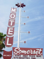
Photographs of Somerset Motel signs, Las Vegas (Nev.), 2002
Date
2002
Archival Collection
Description
Daytime and nighttimes views of the Somerset Motel signs on the Strip. Information about the sign is available in the Southern Nevada Neon Survey Data Sheet.
Site address: 294 Convention Center Dr
Sign details: Just across the small street, connecting with Convention Center Drive, the Somerset Motel resides.
Sign form: Pylon
Sign-specific description: A vertical white steel pole represents the pylon for the establishment. The pole incorporates a backlit message center, and a series of sculpted cabinets to create a complete advertisement for the smaller property. The base of the sign is a white steel pole, whose progress is halted by a backlit message center cabinet. The cabinet is not actually a single cabinet with two sides, but two separate cabinets, sandwich the pole. The sign is flag poled off of the structure being off center. The sides of the cabinet possess the low, sweeping, convex, negative space seen on the Somerset shopping center sign. The bottom half of the face is occupied by the by the white internally lit face, with vinyl lettering. The top half is painted a maroon color with "Somerset" painted on the surface in white paint. Neon hovers over the surface of the text. Jutting off of the south side of the pole from the center of the cabinet, another white, steel pole travels for a very short distance, before turning into a sculpted double backed steel cabinet. The small cabinet is designed with rounded bottom edge, and a recessed negative shape on the top. The bulge on the bottom, is the positive form of the negative space at the top. The result is a pseudo U shaped display. Vacancy is spelled in white graphic text on the surface of the cabinet. Neon tubing spells "NO" above the painted text as well as the tubing hovering over the graphics. The white pole shoots upward, being interrupted but a series of five horizontal steel poles. On the south end of each one of the poles, the U shaped cabinets are present. Each cabinet holds one letter from the word "Motel," starting with the "M" at the top. The letters are painted in white and bordered on the edges with neon. The borders of the face of each one of these cabinets, is lined with neon as well. The north end of each one of the crossing members is a small maroon, circular faced, cylindrical shaped cabinet, with white edges. Neon is bent into the shape of a four-pointed star. The vet top of the [pole is crowned with a double backed cabinet in the shape of a prismatic, seven pointed star. The faces of the cabinet are convex, with each facet of the star being it's own separate plane. In the very center of the star an incandescent bulb resides. The surface is treated in a white and maroon paint finish.
Sign - type of display: Neon; Incandescent; Backlit
Sign - media: Steel; Plastic
Sign - non-neon treatments: Graphics; Paint
Sign animation: Chasing, flashing, oscillating
Surveyor: Joshua Cannaday
Survey - date completed: 2002
Sign keywords: Chasing; Flashing; Oscillating; Pylon; Neon; Incandescent; Backlit; Steel; Plastic; Graphics; Paint
Mixed Content
Photographs of Welcome to Fabulous Las Vegas sign, Las Vegas (Nev.), 2002
Date
2002
Archival Collection
Description
Daytime views of the Welcome to Fabulous Las Vegas sign on the Strip. Information about the sign is available in the Southern Nevada Neon Survey Data Sheet.
Site name: Welcome to Las Vegas neon sign
Site address: 5200 S Las Vegas Blvd
Sign owner: YESCO
Sign details: The sign sits as a welcome to travelers entering the Las Vegas experience via Las Vegas Blvd The sign itself resides in the middle of traffic median directly in the middle of the road.
Sign condition: Structure 5 Surface 5 Lighting 5
Sign form: Pylon
Sign-specific description: The sign itself is a classic roadside pole design which faces North/South. It is double backed, internally lit with a border of yellow incandescent bulbs along the flat edge of its width. Across the top of the sign seven white neon circles house separate red neon letters which form the word welcome. Crowning the sign at the very peak, above the word welcome, is a seven pointed neon star comprised of orange and yellow neon. The cabinet itself is faced with translucent white plastic and treated with blue and red painted text. The South side of the sign reads with the Neon welcome word then in blue painted text "To Fabulous" in a 50's style text reminiscent of that used in the Last Frontier property, and cursive. The Words "Las Vegas" are spelled in all caps, in red block text. And below that in smaller blue text the word "Nevada" are spelled in all caps block text.
Sign - type of display: Neon; Incandescent; Backlit
Sign - media: Steel; Plastic
Sign - non-neon treatments: Graphics; Paint
Sign animation: chasing, flashing
Sign environment: The famous Welcome to Las Vegas sign sits alone at the South end of the strip and is often the very first sign a traveler encounters when entering the strip. It casts a surprisingly powerful glow over the barren median which it stands. It stands as a gateway to the extravaganza that is Las Vegas. When leaving the main drag headed south the sign has an equal effect of being a lone gateway in and out of the Strip.
Sign manufacturer: YESCO
Sign designer: Betty Willis
Sign - date of installation: 1959
Sign - thematic influences: Although it has no specific theme, it is from a specific period in Las Vegas History. It is the quintessential roadside pylon design. With an exposed steel center pole double backed marquee it is reminiscent of the common design of the roadside motor inn.
Sign - artistic significance: This sign has become perhaps the most copied icon of Las Vegas, as it was never copyrighted. It is a ubiquitous symbol of the city.
Surveyor: Joshua Cannaday
Survey - date completed: 2002
Sign keywords: Chasing; Flashing; Pylon; Neon; Incandescent; Backlit; Steel; Plastic; Paint; Graphics
Mixed Content
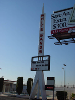
Photographs of White Sands Motel signs, Las Vegas (Nev.), 2002
Date
2002
Archival Collection
Description
Daytime views of the White Sands Motel signs on the Strip. Information about the sign is available in the Southern Nevada Neon Survey Data Sheet.
Site address: 3889 S Las Vegas Blvd
Sign details: Just south of the Tropicana Hotel Casino, the white Sands Motel begins the stretch of decaying properties that comprise the south end of the strip. In the parking lot outside a small low rise office, and rows of rooms the distinct pylon sign for the White Sands Motel faces north/south.
Sign form: Pylon
Sign-specific description: Two legs, in the shape of an "A" with a pole running up through the center, support a black, internally lit message center. The face of the cabinet is two sectioned with a larger portion sitting below a smaller section. The smaller top section has neither a face nor a backing. The interior parts lie exposed to the elements revealing the internal workings. Growing out of the center of the cabinet, tall thin internally lit rectangular cabinet runs into the sky approximately fifteen feet. The cabinet is designated into twelve sections by steel borders. Plastic red letters, reside inside this row of panels, horizontally spelling "White Sands" in all capital letters, with one space between the two words and one below the last word. At the very peak of the sign, a triangular shape, with a rounded top, appears to be back lit also. A smaller section sits on top of this as well. The tall cabinet, the peak, and the top antenna, are lined on the edges with raceways and incandescent bulbs. The resultant effect all of the pieces together is an image of a rocket or missile. Next to the drive on the streets edge, a small red, internally lit, message center faces north /south. The white flexible plastic face is treated with red text, and a logo for the establishment. Across the top of the cabinet "Entrance" is spelled and "Motel" across the bottom. The White sands logo is a red half circular shape with a white silhouette of palm trees, and "White Sands" across the top edge of the half circle.
Sign - type of display: Neon; Incandescent; Backlit
Sign - media: Steel; Plastic
Sign - non-neon treatments: Graphics; Paint
Sign animation: Chasing, flashing, oscillating
Notes: The text, which resides on the southern wall and reads "Casino," is filled with incandescent bulbs that all illuminate at the same time, and oscillate. They then shut off at the same time, and then repeat. The raceways of incandescent bulbs chase each other while the neon, which surrounds the back lit, plastic, screens on this wall flash on then off. The bottom two raceways sandwiching the reflective panel chase from left to right, while the remainder of the raceways surrounding the signs, run right to left. The incandescent bulbs on the pylon chase each other gracefully up the length of the pylon. The animation is patterned so as to appear as if a section of several bulbs are pulsing its way up the towers, hugging the edge of the bulbous tops. The raceways continue around the east face of the building. The umbrellas in the plaza behind the pylon, also are animated with incandescent bulbs chasing each other downward along the raceways.
Surveyor: Joshua Cannaday
Survey - date completed: 2002
Sign keywords: Chasing; Flashing; Oscillating; Pylon; Neon; Incandescent; Backlit; Steel; Plastic; Paint; Graphics
Mixed Content
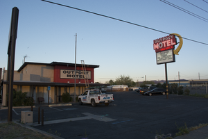
Photographs of Outpost Motel, Las Vegas (Nev.), March 14, 2017
Date
2017-03-14
2017-08-28
Archival Collection
Description
The Outpost Motel sign sits at 1104 North Boulder Highway. Information about the sign is available in the Southern Nevada Neon Survey Data Sheet.
Site name: Outpost Motel (Las Vegas, Nev.)
Site address: 1104 N Boulder Hwy
Sign owner: Vegas Outpost Motel LLC
Sign details: The Outpost motel was built all the way back in 1937 and still resides out in Henderson along Boulder Highway. The current sign was installed around the 1950's.
Sign condition: 5, the sign is in excellent condition.
Sign form: Pole
Sign-specific description: This pole sign has a zig-zag like design on the top of it. Underneath that is the word "OUTPOST" in bold white letters against a forest green background. "MOTEL" is painted under that in bold white letters as well. "VACANCY" is painted under the "OTEL." Outlined in neon is "NO," which is difficult to see if it's not lit up. Each of these words is outlined with neon as well so you can see them at night when the sign would be lit up. The lower half of the sign is a back lit reader board. On the outer edge of the sign is a large, yellow arrow that extends from the top of the sign above the "O" in "OUTPOST" and points to the reader board. This is also covered in incandescent light bulbs.
Sign - type of display: Neon, incandescent, backlit reader board
Sign - media: Steel and plastic
Sign - non-neon treatments: Reader board
Sign animation: From photos, it looks as though the sign has some sort of animation to it in the yellow arrow on the outer edge. The incandescent light bulbs look as though they twinkled, but it is difficult to tell exactly how or in what direction.
Sign environment: This property sits way out in Henderson along Boulder Highway. It is down the street from Sam Boyd Stadium, Clark County Wetlands Park, and the Henderson Bird viewing Preserve. The properties that sit immediately next to the motel are a few small casinos and a random assortment of businesses.
Sign - date of installation: Possibly the 1950's
Sign - date of redesign/move: Photos from 2014 show that the sign was in a rough condition at one point, but in 2015 it received a fresh coat of paint.
Sign - thematic influences: The design for this sign is similar to many of the small motel throughout the city from the 1950's/60's era. They usually have one major element that makes them striking when viewed from the street view, for this sign it would be the big, yellow arrow. It is also a pole sign and many of the motels from this time period use this style of sign.
Survey - research locations: Roadside architecture http://www.roadarch.com/signs/nv2.html , Classic Las Vegas website ghhhttp://classiclasvegas.squarespace.com/classic-las-vegas-photo-galler/classic-las-vegas-signs/900788 , Asessor's Page http://www.clarkcountynv.gov/assessor/Pages/searchbybusinessname.aspx , Flickr website for photos https://www.flickr.com/photos/roadsidepictures/294981090
Survey - research notes: There are not many sources discussing the history of this property.
Surveyor: Lauren Vaccaro
Survey - date completed: 2017-08-28
Sign keywords: Neon; Incandescent; Backlit; Steel; Plastic; Reader board; Pole sign; Directional
Mixed Content
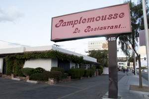
Photographs of Pamplemousse Le Restaurant, Las Vegas (Nev.), March 3, 2017
Date
2017-03-03
2017-08-27
Archival Collection
Description
Pamplemousse Le Restaurant, Las Vegas' oldest French restaurant, sits at 400 East Sahara Avenue. Information about the sign is available in the Southern Nevada Neon Survey Data Sheet.
Site address: 400 E Sahara Ave
Sign owner: Georges La Forge
Sign details: Just a block away from the Strip, this French restaurant, which the name means "grapefruit" in French, has been a mainstay in Las Vegas for over forty years. Georges La Forge has created a wonderful atmosphere set as a "cozy French cottage with Tuxedo-clad waiters" and uses soft candlelight and French music to set the tone of the restaurant. A few of their most popular dishes include Escargots Bourguignonne, Fresh Foie Gras "au Torchon", Breast of Duck & Leg Confit, and Creme Brulee. It has received rave reviews and won many award since they opened in 1976. They have been voted as the "Most Romantic and Best French Restaurant" just to name a few.
Sign condition: 4, the sign is in good condition. It shows some wear from age.
Sign form: Pole sign
Sign-specific description: The sign has a very simple design. It is a pole sign that sits right next to the street; therefore, it is extremely visible for motorists and pedestrians. This is also a back lit sign and the plastic that is used is a soft pink. The sign reads "Pamplemousse Le Restaurant" in a bold, script-style font and maroon color on both sides of the sign.
Sign - type of display: Back lit plastic
Sign - media: Steel and Plastic
Sign - non-neon treatments: Plastic
Sign environment: The restaurant sits just a block away from the Strip. It is near the SLS, the Westgate, and the Stratosphere Hotels as well as the Bonanza Gift Shop. It is also just down the street from another classic Las Vegas restaurant, the Golden Steer Steakhouse.
Sign - date of installation: 1976
Sign - thematic influences: The linkage to the property in this signage is that the text is in French, indicating that is it s a French restaurant. The signage is very modest and straightforward because it just tells you the name of the restaurant.
Sign - artistic significance: The linage to the property in this signage is that the text is in French, indicating that is it s a French restaurant. Other than that the signage is very modest and straightforward because it just tells you the name of the restaurant.
Survey - research locations: Pamplemousse restaurant website http://www.pamplemousserestaurant.com/ , Las Vegas Weekly article https://lasvegasweekly.com/dining/2015/jun/03/rick-moonen-column-pamplemousse-french-restaurant/ , Assessor's Page http://www.clarkcountynv.gov/assessor/Pages/searchbybusinessname.aspx
Surveyor: Lauren Vaccaro
Survey - date completed: 2017-08-27
Sign keywords: Backlit; Plastic; Steel; Pole sign
Mixed Content
Photographs of Holiday House Motel sign, Las Vegas (Nev.), March 1, 2017
Date
2017-03-01
2017-08-30
Archival Collection
Description
The Holiday House motel sign with a "For Sale" sign sits at 2211 South Las Vegas Boulevard. Formerly the Bagdad Inn, the property has been in operation since the early 50s. Information about the sign is available in the Southern Nevada Neon Survey Data Sheet.
Site address: 2211 S Las Vegas Blvd
Sign details: The Holiday House Motel was originally the Bagdad Inn that opened up in the 1950's. The actual motel was possibly named after Bagdad California, a small ghost town in the San Bernardino county. This town was a former route 66 pit stop and later passed by with the new I-15 and I- 40 in the late 1970's. The motel changed its name in 1983 to Holiday House Motel. The motel currently has a for sale sign.
Sign condition: The sign is in a 4.5. There seems to not have much sun or wind damage to the sign. The color is still fresh.
Sign form: This is a two- pole squared structured sign.
Sign-specific description: The sign is a bright red squared basis. All aspects of the sign's advertisement are connected together in one large square. There is no separation within the structure; it just looks like one giant red canvas with words and would even suggest the sign is very minimal. At the bottom, right portion of the sign you will see a small reader board (currently the reader board has been covered with a for sale sign). Vertically on the left side is the word motel in white lettering. The holiday house font is in yellow incandescent lighting, and the font looks italicized. The no vacancy is in neon underneath the holiday house typography. Two white poles are what holds up the sign.
Sign - type of display: Neon, Incandescent and fluorescent lighting.
Sign - media: Steel and Plastic
Sign - non-neon treatments: Reader board
Sign animation: Flasher for the incandescent light bulbs in the letters
Sign environment: This location is on the north end of the Strip across the street from the Stratosphere and near the Holiday Motel and Fun City Motel.
Sign - date of installation: 1983
Sign - date of redesign/move: In 1950's the sign was Bagdad Inn and in 1983 the establishment later changed into the Holiday House Motel.
Sign - thematic influences: This sign could have inspiration from the post modernism idea of open space and minimal design to "advertise" to consumers. This sign is very representative of 1970's designs.
Sign - artistic significance: Every portion of the sign was thoughtfully placed to hit the consumer in a fast and efficient way.
Survey - research locations: Vintage Vegas http://vintagelasvegas.com/search/Holiday+House+Motel and Roadside Architecture http://www.roadarch.com/signs/nvvegas.html .
Surveyor: Gisselle Tipp
Survey - date completed: 2017-08-30
Sign keywords: Neon; Incandescent; Steel; Plastic; Flashing; Reader board; Pole sign; Fluorescent; Roof Sign
Mixed Content
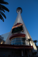
Photographs of Stratosphere signs, Las Vegas (Nev.), March 6, 2017
Date
2017-03-06
2017-07-12
Archival Collection
Description
The Stratosphere Casino, Hotel and Tower sits north of the Las Vegas Strip at 2000 South Las Vegas Boulevard. Information about the sign is available in the Southern Nevada Neon Survey Data Sheet.
Site address: 2000 S Las Vegas Blvd
Sign owner: American Casino and Entertainment Properties
Sign details: This location was the site of Bob Stupak's Vegas World that opened in 1979. The Stratosphere opening in this location in 1996, the Stratosphere includes the tallest freestanding observation tower in the United States. Developed by Bob Stupak, the Stratosphere was meant to be a landmark for the city of Las Vegas. As the years progressed, plans for restaurants and thrill rides came to fruition and the hotel now boasts several popular attractions. From 1996 to 2010, the Stratosphere went through bankruptcy, remodeling, renovations, additions, and new ownership. The current owner, American Casino and Entertainment Properties, also owns three other properties in the Las Vegas area.
Sign condition: About 4-5, appears to have relatively low damage, if any
Sign form: Porte cochere near main entrance
Sign-specific description: Stratopshere in orange neon, three vertical, squiggly lines (red, blue) pointing up toward triangular shape; second neon sign on right side of front facade, "Stratopshere" in orange, overlaid on top of blue cloud shape and orange, poles
Sign - type of display: Neon and plastic back lit sign
Sign - media: Steel and Electronic Media Screen
Sign - non-neon treatments: Electronic Media Screen and plastic back lit sign
Sign animation: Flashing for the design behind their logo on their sign
Sign environment: Located on the North end of the strip on Sahara, just across the street from the SLS Casino.
Sign architect of record: Skidmore, Owings, and Merrill
Sign - date of installation: Circa 1996 around opening
Sign - date of redesign/move: Around 2014/15 the background colors of the sign switched from a blue sky color to a pink/purple design.
Sign - thematic influences: Design similar to radio transmission towers; Stupak compared his design to Eiffel Tower and Space Needle (Seattle).
Survey - research locations: Stratosphere website http://www.stratospherehotel.com/?&mkwid=s0JHs4Hf3_dc&pcrid=102775265532&pkw=stratosphere%20las%20vegas&pmt=p&gclid=CjwKCAjwhOvPBRBxEiwAx2nhLp_Mtg7n6c-FUkbwYgY8MD3TJzgUWEp4WX1IgzePUlk1y-Rat_wmexoCJs8QAvD_BwE, recorder's office, Assessor's page
Survey - research notes: The top of the Stratosphere has blinking lights, but it is not confirmed if they are LED or Neon.
Surveyor: Carlyle Constantino
Survey - date completed: 2017-07-12
Sign keywords: Porte-cochère; Neon; Plastic; Steel; Flashing; Video screen; Incandescent
Mixed Content

Photographs of Dona Maria's Tamales Restaurant signs, Las Vegas (Nev.), March 13, 2017
Date
2017-03-13
2017-08-28
Archival Collection
Description
Dona Maria's Tamales Restaurant sits at 910 South Las Vegas Boulevard. The family owned and operated eatery has been serving the valley for over thirty years. Information about the sign is available in the Southern Nevada Neon Survey Data Sheet.
Site address: 910 S Las Vegas Blvd
Sign owner: Dona Maria Alfredo Martinez
Sign details: Alfredo Martinez and Elvia met each other in California as high school sweethearts. Alfredo was a soccer player and Elvia a cheerleader who always watched his matches. After high school the two of them married and started a new chapter in their life in Las Vegas. Alfredo has a love of cooking traditional Mexican cuisine and soon taught Elvia his family recipes. In 1980 they opened their first restaurant a four table fast food operation on Charleston and 10th. Three years later after great success the four table operation grew into a full time restaurant where their location moved to 910 S. Las Vegas BLVD. For years their restaurant won many awards that led the couple to open another establishment in 1993.
Sign condition: The sign is a 4 out of 5, for the family maintains the sign. The paint on the sign is fading so it could use a new layer of paint to update the color hue.
Sign form: Pylon and entrance sign
Sign-specific description: The sign uses pale turquoise and soft pink hues to stand out. It resembles 1980s southwestern color palette. The sign is rectangular shaped with the background as the soft pink and font as turquoise. Dona Maria's font is in white and the background is maroon surrounding the letters. The border outline for the rectangular shaped sign is also in the color Turquoise to make the soft pink pop out. The base of the sign is bright custard concrete yellow attached to the building.
Sign - type of display: Neon
Sign - media: Concrete and steel
Sign - non-neon treatments: Small portion of the sign is back lit plastic
Sign environment: This location is on Las Vegas Blvd close to Charleston. It is next door to the Gateway Motel, as well as close to the Goodwhich, the Millennium Fandom Bar and a 7/11.
Sign - date of installation: Circa 1983
Sign - thematic influences: The theme resembles the prominent late 1970's/early 1980s Southwestern color palette. The sign is very colorful that resembles many Mexican restaurants that are quite colorful naturally.
Sign - artistic significance: Artistic themes is very 80s in terms of color palette, but also utilizes colors that is representative of Mexican culture.
Survey - research locations: Assessor's Page, Dona Maria's Website for the history- https://www.donamariatamales.com/our-history/
Survey - research notes: In 1980 the restaurant expanded and grew from their location at 10th and Charleston to 910 S. LV, BLVD S.
Surveyor: Gisselle Tipp
Survey - date completed: 2017-08-28
Sign keywords: Neon; Steel; Backlit; Plastic; Building-front design; Back to back; Pole sign
Mixed Content
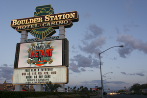
Photographs of Boulder Station sign, Las Vegas (Nev.), March 27, 2017
Date
2017-03-27
2017-09-27
Archival Collection
Description
The Boulder Station Hotel and Casino sign sits at 4111 Boulder Highway. Information about the sign is available in the Southern Nevada Neon Survey Data Sheet.
Site address: 4111 Boulder Hwy
Sign owner: Stations Casino Company
Sign details: This location opened in 1991 and is considered a locals casino. They have a similar train station theme to a few of the other Stations Casino properties used to have. This location also holds a movie theater.
Sign condition: 5- still in very good condition and lights up very brightly at night still
Sign form: Pylon, Porte cochere and semi-decorated shed
Sign-specific description: The main pylon sign has a two white steel bases with a reader board on the bottom, a plasma t.v. screen on top of the reader board and the main portion of the sign with their logo above. Their main logo is a green train front with a yellow neon trim with curved maroon ovals on it stating "Boulder Station" and "Hotel-Casino" underneath it in channeled white letters that contain flashing incandescent. The porte cochere sign above their valet is in a rainbow shape stating "Boulder Station" in sparkling incandescent. With red letters underneath stating "Hotel" in red neon. Also on the main hotel tower there are the same "Boulder Station" letters in incandescent lights outlined in red neon as well. Also the word "Casino" is also in incandescent lights on the side of the building. There are also LED lights that are chasing outlining the whole building making a semi-decorated shed look.
Sign - type of display: Neon, Incandescent, LED, LED plasma screen
Sign - media: Steel and plastic for reader board
Sign - non-neon treatments: Reader board and Plasma screen
Sign animation: Flashing incandescents and Chasing LED lights
Sign environment: This location is on Boulder Hwy on the way to Henderson/Boulder City. This location is near a residential areas and is a neighbor to a Motel 6.
Sign - date of installation: Has been up since at least 2007
Sign - thematic influences: Their train theme is portrayed well in their pylon sign. Also the train theme could be considered an homage to early Vegas history as a railroad stop.
Sign - artistic significance: The pylon sign is very similar to the Fiesta Rancho sign which is also a station casino with the reader board and plasma screen. This sign is almost identical in design to the old Palace Station sign.
Survey - research locations: Palace Station sign. Surveyor Notes 1. Research locations (archAsessor's page, Boulder Station website https://boulderstation.sclv.com/ , Station's Casino website https://www.sclv.com/, google maps satellite/ road view
Survey - research notes: Station's Casinos have 10 casinos in Las Vegas and have been present in the community for the past 40 years.
Surveyor: Emily Fellmer
Survey - date completed: 2017-09-27
Sign keywords: Pylon; Porte-cochère; Neon; Incandescent; Steel; Plastic; Flashing; Reader board; Chasing; Plasma display
Mixed Content