Search the Special Collections and Archives Portal
Search Results
Alex Shoofey Papers
Identifier
Abstract
The Alex Shoofey Papers are comprised of records spanning 1967 to 1972 that primarily pertain to financial operations and policies for the International Hotel and Casino-Las Vegas Hilton and the Flamingo Hotel in Las Vegas, Nevada. The collection includes daily profit and loss reports, interdepartmental correspondence, staffing and operational policies and procedures, production reports, and Shoofey's personal correspondence. Collection materials are representative of business and financial records from Shoofey's tenure as president of both the International and Flamingo hotels and casinos.
Archival Collection
Gilbert Schwartz Papers
Identifier
Abstract
The collection documents Gilbert Shwartz's early involvement with the Clark County Sheriff's Mounted Posse and the Elks Club in the early 1960s as well as the growth of his real estate company, Sahara Realty, from 1963 to 2008. The collection includes photographs and programs of the Clark County Sheriff's Mounted Posse Rodeo and programs for the Elks Club Helldorado Days Rodeo from the early 1960s. The collection also includes photographs of Schwartz and his home, slides of Sahara Realty/Realtors advertising around Las Vegas, and autographed team photographs of the Central Little League teams sponsored by Sahara Realty. Also included is a program for the National Association of Real Estate Brokers annual conference held in Las Vegas in 1974.
Archival Collection
Grace Hayes Papers
Identifier
Abstract
The Grace Hayes Papers (1900-1989) include personal papers and financial papers pertaining to the Grace Hayes Lodge (formerly the Red Rooster), a nightclub on the Strip in Las Vegas, Nevada. The collection includes financial documents, newspaper clippings about Hayes and her family, personal correspondence, career mementos, legal documents, and photograph albums.
Archival Collection
Elizabeth Harrington Collection of Essays
Identifier
Abstract
This collection contains the original drafts of the thirteen essays that Elizabeth Harrington wrote about her life in early Las Vegas, Nevada. These articles were written from her memory and experiences of life in Las Vegas beginning in the early 1900s, and were published in the Nevadan section of the Las Vegas Review-Journal from 1975-1979.
Archival Collection

Jean Munson oral history interview: transcript
Date
Archival Collection
Description
Oral history interview with Jean Munson conducted by Vanessa Concepcion, Cecilia Winchell, and Stefani Evans on November 30, 2021 for Reflections: The Las Vegas Asian American and Pacific Islander Oral History Project. Jean discusses her childhood growing up in Guam, the nursing career path of her parents, and her decision to pursue an "unconventional path" as a comic book artist. She talks about her education at the University of Nevada, Las Vegas, her passion for the Asian American Pacific Islander (AAPI) community within Las Vegas, and her roles in community activism and leadership. Jean also shares her current pursuits as a podcaster of Bruha Baddies, co-owner and printer of Plot Twist Publishing, and co-founder of the Comic and Zines Festival.
Text

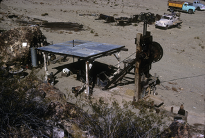
Slide of the old stamp mill, circa 1950s
Date
Archival Collection
Description
Image

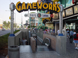
Photographs of Gameworks signs, Las Vegas (Nev.), 2002
Date
Archival Collection
Description
Site address: 3785 S Las Vegas Blvd
Sign details: Game Works is located on the underground level of The Showcase Plaza, which is also home to such establishments as M&M World and the Show case theatres. Two small gateway pylons for the Game Works center, stand on other side of staircases that lead to the underground facility. Just east of there a large wall front design hands approximately nine feet above the ground on the structure of the mall.
Sign condition: Structure 5 Surface 4 Lighting 5
Sign form: Pylon; Fascia
Sign-specific description: The large wall marquee that reads GAMEWORKS in all capitals, utilizes deep, yellow, steel, channel letters painted black on the exteriors. The slightly arched sign is on the West wall of the building, facing West from the East side of the strip. The interior of the text contains double rows of yellow neon. The cabinet, which the words sit upon, is a black steel cabinet shadowing the individual letters in one cabinet. The backing cabinet itself is illuminated from its interior, with middle section of the width of the cabinet is made of a steel grating. This function allows the blue neon on the inside to cast a blue glowing halo seen from the exterior. Sitting on top of the right hand side of the marquee are two steel boxes manufactured into the shape of a male and female figure dashing to the end of the sign. These figures are made of black steel box like formations while retaining a cartoon-ish silhouette. Their posture suggests motion or running. These figures are constructed in the same fashion as the black cabinet, which the text is supported upon. They too are glowing with the blue interior neon halo. In front of the large wall sign are the two, single sided, gateway pylons. They serve as markers for the stairs that lead the underground facility. They sit on either end of the large channel cut into the sidewalk. One faces South on the South entrance, and one faces North at the North end. The signage is actually a smaller replica of the large building front logo. The same interior lit cabinet supports the same design of yellow channel letters, with the backing "shadow" cabinet. A difference between the larger and smaller cabinets is that the cabinets are surfaced with the grated material. The only difference in the channel letters besides their obvious discrepancy in size, is that single rows of neon comprise the interior of the channel letters. On either side of the sign, two, "space age" themed posts provide support. They are topped with a sculpted cylindrical fashion capital. The bases for which they are attached to the concrete with, are blue in color. The actual shaft of the pole is made of several smaller pipes, with a plastic cylindrical tube in the center. Inside this tube is a string of attached incandescent bulbs running vertically. Below the text, suspended with two rods, is an oval shaped, aluminum cabinet. In the face of the cabinet there are the words "cafe" and "lounge" painted in blue. Over the painted text is blue neon. From both sides of the sign, the blue neon scrawl is visible Separating the two words is a black circle with a red neon rectangular shape in the center. The ends of the cabinet are made small circular cabinets approximately seven inches in diameter.
Sign - type of display: Neon; Incandescent; Backlit
Sign - media: Steel; Plastic; Fiberglass
Sign - non-neon treatments: Paint
Sign animation: none
Sign environment: The Game Works facility is located directly across the street from the pedestrian "Brooklyn Bridge" element of the New York New York and sit is the shadow of the MGM super pylon. The vibrant yellow of the sign do stand out as distinct among the tremendous and attractive signage of the Showcase plaza. The large channel cut into the sidewalk, along with its large surrounding counterparts, makes the entrance reminiscent of that of a subway. The plaza itself is self-contained and while standing along the front a person is enveloped in the plaza without being distracted by the rest of the strip itself. The large signage looms over a pedestrian while walking by, or shouts at you while sitting along the shrub filled flowerbeds.
Sign - thematic influences: The actual theme of the sign is correspondent to that of the business, which the sign advertises. The property is an interactive gaming facility and lounge. The use of the glow of a monitor or computer screen. The polished aluminum poles supporting the gateways are reminiscent of the futuristic, or "space-age" theming associated with the classic representations of science fiction in movies and television throughout the twentieth century. Such examples of this classic representations may be seen in television programs from the past like "Lost in Space," or even literary descriptions in Orson Well's "War of The Worlds" of Ray Bradbury's "Martian Chronicles" The combination of materials along with the innovative use of lighting also suggests electricity and digital elements which associate with the function of the facility.
Sign - artistic significance: If not significant for simply combining different elements to create a completely self-contained sign, it fits into the movement in Las Vegas's history , which is geared more toward the family. Not only the space that it occupies, but also the function itself in intended to attract young people if not children into it domain. It is an obvious standout for the vote to make Las Vegas move toward a more family oriented town. Aesthetically the signage is modern innovation on a classic design.
Surveyor: Joshua Cannaday
Survey - date completed: 2002
Sign keywords: Pylon; Fascia; Neon; Incandescent; Backlit; Steel; Plastic; Fiberglass; Paint
Mixed Content

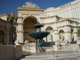
Photographs of Monte Carlo signs, Las Vegas (Nev.), 2002
Date
Archival Collection
Description
Site name: Monte Carlo Resort and Casino (Las Vegas, Nev.)
Site address: 3770 S Las Vegas Blvd
Sign owner: Mandalay Resort Group (50%), MGM Mirage (50%)-Mandalay manages the property
Sign details: The Monte Carlo is located on the west side of the strip just past the New York New York. The signage on the front of the Monte Carlo is limited, with the dominant honors going to the architectural aspects instead. The front facade is made to represent the classical architecture actually found in Monte Carlo. Giant patina fountains are flanked by sweeping staircases, where giant recessed arches and niches hold an abundant array of diversely positioned statuary.
Sign condition: Structure 5 Surface 5 Lighting 5
Sign form: Pylon; Fascia
Sign-specific description: Through the main arch behind the fountain, located on the south east corner, an entrance is guarded from above by black channel letters spelling "Monte Carlo" and filled with incandescent bulbs. This entrance faces southeast. The architecture continues with relief entablature upon fluted columns supporting Corinthian caps, and more statuary. Light posts adorn the sweeping walk in front of the property. Throughout the architecture you can see pools and fountains contained between arches and recessed into other area. Another entrance in the same fashion as the southeast entrance sits facing northeast. Another set of channel letters is set above these doors as well. Just north of the last entrance is the pylon for the Monte Carlo. The pylon fits into the category commonly seen at resorts such as The Mirage, or Luxor. Essentially a giant rectangle in its general silhouette, a multi leveled collection of signs are designated into geometrical planes by the use of classical architectural elements. The sign is at the north end of the Monte Carlo property and faces north/south, and is double sided. The bottom half of the structure is occupied by a tall arch, creating a pedestrian element, allowing passage through the sign. The two legs that flank the arch are created utilizing a pair of double columns supporting a series of crowned ledges supporting yet another architectural element of a pilaster. The resultant effect is two rather massive collections of elements creating the outer legs of columns, combined with pilasters, for the recessed borders of the impressive arch. Above the arch the cabinet rises up divided into two planes, one on top of the other, each holding a message cabinet with a pair of the square post as seen on the structure just below. It creates another pilaster from the front with rows of stacked columns on the structures width. The two arrangements are identical in structure and facade. The difference lies in the different types of display each on holds. The top is a back lit color advertisement currently for magician Lance Burton, while the bottom is an LED matrix screen . The top is an entablature crowned with sweeping overhangs, and containing the text Monte Carlo in black channel letters and filled with incandescent bulbs. The signage on the towers of the hotel are the repeated Monte Carlo logos in giant black channel letters, and filled with incandescent bulbs. On each face of each one of the wings Monte Carlo is spelled in it's trademark text, in black channel letters and filled with incandescent bulbs.
Sign - type of display: Incandescent; Backlit
Sign - media: Steel; Plastic
Sign animation: Oscilllating
Notes: The incandescent bulbs inside the channel letters oscillate, at the entrances on the building as well.
Sign environment: The environment the Monte Carlo creates with its various forms of advertisement abruptly changes in aesthetic contrast to its southern companion and precursor to the northbound traveler. One minute the pedestrian is listening to the nasal audio streaming from the ESPN Zone loudspeakers, to the delicately ornate facade of the Monte Carlo's fountains and highly detailed statuary. Once you cross the drive it is not hard to be attracted the by classical architecture which serves its purpose of bringing in the patron with the limited space utilized for pedestrian passage across the front. I say limited, even though it is one of the more ornate and expansive ones, that is in comparison to its related properties of the Mirage and the Bellagio. The use of architecture makes the utmost use of this great strength of aesthetic by making it interactive for the pedestrian by allowing them to pass up close to the elements while entering the building or traversing the facade. The two giant wings on either end of the property act as arms to pull in people using swooping steps and large fountains. The signage is integrated into this environment, blending in nicely, in similar fashion as the previously mentioned examples. The oscillating incandescent bulbs can be found inside the channel letters, which is the most common animation seen in this type of signage in the other properties as well.
Sign - date of installation: 1995
Sign - thematic influences: The Monte Carlo theme is that of an understated European elegance.
Surveyor: Joshua Cannaday
Survey - date completed: 2002
Sign keywords: Oscillating; Pylon; Fascia; Incandescent; Backlit; Steel; Plastic
Mixed Content

Transcript of interview with Sarah Haggerty and Lancy Kirk by Claytee D. White, February 2, 2010
Date
Archival Collection
Description
Text

Transcript of interview with Mary L. McCoy by Claytee D. White, February 26, 2009
Date
Archival Collection
Description
Text
