Search the Special Collections and Archives Portal
Search Results
Meeting minutes for Consolidated Student Senate University of Nevada, Las Vegas, August 23, 1999
Date
1999-08-23
Archival Collection
Description
Includes meeting agenda and minutes, along with additional information about contracts, bylaws, and UCCSN governing documents.
Text
Meeting minutes for Consolidated Student Senate University of Nevada, Las Vegas, December 10, 2001
Date
2001-12-10
Archival Collection
Description
Includes meeting agenda and minutes , a senate resolution, and rules for the 32nd senate session.
Text
Meeting minutes for Consolidated Student Senate, University of Nevada, Las Vegas, April 07, 2003
Date
2003-04-07
Archival Collection
Description
Includes meeting minutes and agenda, along with additional information about bylaws and letters.
Text
Audio clip from interview with George Simmons conducted by Claytee D. White, December 13, 2013
Date
2013-12-13
Archival Collection
Description
Audio clip from interview with George Simmons. In this clip, Simmons talks about his work with Sproul Homes in Las Vegas and his career designing homes and structures for Test Site.
Sound

Jewish Federation correspondence, meeting minutes, and other records, item 20
Description
Letters to Barry D. Eisen, President of the Jewish Family Service Agency, and William Feldman, Executive Director of the Jewish Family Service Agency, about funding, June 1988.
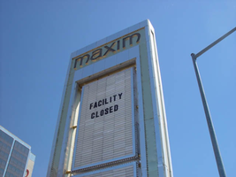
Photographs of Maxim signs, Las Vegas (Nev.), 2002
Date
2002
Archival Collection
Description
Daytime views of the Maxim Hotel and Casino signs. Information about the sign is available in the Southern Nevada Neon Survey Data Sheet.
Site address: 160 E Flamingo Rd
Sign owner: Premier Interval Resorts
Sign details: The Maxim is located just east of the Bourbon Street, in close proximity to Bally's Hotel Casino. The Maxim is no longer operating, and is fenced off from further inspection. The signage that is seen entails building signs, the original pylon, and the porte cochere
Sign condition: Structure 2 Surface 2
Sign form: Pylon; Fascia; Porte-cochère
Sign-specific description: Building: The tower itself contains the logo and giant text spelling the name of the establishment, on one side of the building. The tower is mirrored and reflective, thus matching the porte cochere and pylon, and reserves to collect its building signage to one end of the tower. The tower, which runs east/west, and faces north/south contains the signs on the east end structure. On the north and south faces of the building, giant red channel letters run vertically along the block surface. The letters look to be lined on the interior of the letters with neon. The logo can be seen on the east face. Pylon: The pylon sign is essentially a giant vertical monolith of a rectangle, divided into several different sub-shapes. The center of the monolith is occupied by cabinets which fill in most of the shape, with a small gap bordering the cabinet. The cabinets are treated the same as the square arch, and flush with the surface. The cabinets are very subtle and create an illusion of one solid object. The entire outer arch shape and interior cabinets are bordered with polished aluminum. The interiors surface of the arch are covered in polished gold aluminum panels. The lining of the incandescent bulbs on the sign is interesting. On the arch the incandescent bulbs are on the interior return width of the aluminum borders. With this configuration, the bulbs sit parallel to the surface instead of perpendicular. The main marquee text is aligned horizontally across the top in gold channel letters with red plastic faces. The letters blend with the gold surface nicely. The interior cabinets are internally lit with plastic faces. There are two cabinets, the larger of the two, occupying the upper part the interior space of the monolith. Incandescent bulbs line the exteriors of the cabinets, sitting back on a recessed edge. Porte Cochere: The porte cochere is unique, opting to rise high above the surface of the pavement. The prismatic design crafted in polished aluminum, interlocks into a pattern suitable to the space which it resides. The recesses in which the decoration resides are separated by a small width of structure. This pattern of giant recesses, matched with the prismatic design in each negative space create a hulking environment high above the head in proud stature. Along the peak edge of the pieces of the prism, rods protrude every foot or so, creating a row of arms holding incandescent spheres.
Sign - type of display: Neon; Incandescent
Sign - media: Steel; Plastic
Sign - non-neon treatments: Graphics; Paint
Sign animation: chasing, flashing
Sign environment: The Maxim is now closed, and stands in marked contrast to its neighbors a bit to the east--the famous "Four Corners" of Flamingo and the Strip, and next to the trendy Meridian at Hughes Center apartment complex.
Sign designer: Maxim letter design: Kenneth Young, Porte Cochere; Lighting: Jack Dubois Pylon sign: Marnell Corrao
Sign - date of installation: 1977
Sign - thematic influences: The influence of the Maxim hotel was 70's Vegas design refined to simple geometric forms and curved linear logo's. The pylon was completely sheathed in polished aluminum, as well as the underside of the porte cochere being polished gold aluminum. The use of the popular 70's material is used extensively throughout the design. Letters hung over the main entrance, as well as signage on three sides of the building. Other examples of the material can be seen elsewhere but not as extensively. The only property that comes close is the pylon for usage of the material is the Westward Ho.
Surveyor: Joshua Cannaday
Survey - date completed: 2002
Sign keywords: Chasing; Flashing; Pylon; Fascia; Porte-cochère; Neon; Incandescent; Steel; Plastic; Graphics; Paint
Mixed Content
Pagination
Refine my results
Content Type
Creator or Contributor
Subject
Archival Collection
Digital Project
Resource Type
Year
Material Type
Place
Language
Records Classification

