Search the Special Collections and Archives Portal
Search Results

Edith Fernandez oral history interview: transcript
Date
Archival Collection
Description
Oral history interview with Edith Fernandez conducted by Marcela Rodriguez-Campo and Claytee D. White on September 27, 2018 for the Latinx Voices of Southern Nevada Oral History Project. In this interview, Fernandez discusses her upbringing in Las Vegas, Nevada and growing up in the Charleston Heights neighborhood. She recalls living in a predominantly white community, and the growth of Latinx families in that area. Fernandez talks about her educational experience in the city, her father's involvement with Culinary Worker Union Local 226, and identifying as a Chicana American. Later, Fernandez remembers her involvement with opening the Cambridge Center, working with the Latino Youth Leadership Conference (LVLC), and becoming the District Director for Representative Steven Horsford. Lastly, Fernandez discusses her role as the Associate Vice President at Nevada State College (NSC).
Text

Interview with William Gus Flangas, November 12, 2004
Date
Archival Collection
Description
Text

Interview with Harrie Fox Hess, March 5, 2005
Date
Archival Collection
Description
Text
Katherine L. Rankin oral history interview
Identifier
Abstract
Oral history interview with Katherine L. Rankin conducted by Claytee D. White on June 16, 2014 for the Boyer Early Las Vegas Oral History Project. In the interview, Rankin discusses her childhood, her move to Las Vegas, Nevada, and her career as a librarian. Rankin talks about how she began her library career on the Gila River Reservation in Arizona before accepting a position as an audio and visual materials cataloger at University of Nevada, Las Vegas (UNLV) in the 1970s. Rankin later describes her work with the American Library Association, getting tenure at UNLV, and her role as a map cataloger in UNLV Special Collections and Archives.
Archival Collection
Fercos Family Publicity Collection
Identifier
Abstract
The Fercos Family Publicity Collection (approximately 1978-1989) contains newspaper articles, advertisements, and a poster promoting the Flying Fercos, a family of juggling and acrobatic performers who performed in Las Vegas, Nevada at the Dunes Hotel during the 1970s and 1980s. The materials document the Fercos family's act as part of producer Frederic Apcar's shows such as
Archival Collection
Jack Anderson Professional Papers on Operation Life
Identifier
Abstract
Materials in this collection (1969-1989) document various endeavors of the Operation Life organization. They include original correspondence, meeting minutes, news clippings, medical programs, grant applications, legal and financial documents, brochures and pamphlets, and other materials that provide context on the kinds of services provided by Operation Life. These files were kept by Jack Anderson in the course of his work as attorney for Operation Life.
Archival Collection

Meeting minutes for Consolidated Student Senate University of Nevada, Las Vegas, May 19, 1993
Date
Archival Collection
Description
Text

Interview with Charles E. Violet, May 22, 2004
Date
Archival Collection
Description
Text

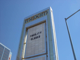
Photographs of Maxim signs, Las Vegas (Nev.), 2002
Date
Archival Collection
Description
Site address: 160 E Flamingo Rd
Sign owner: Premier Interval Resorts
Sign details: The Maxim is located just east of the Bourbon Street, in close proximity to Bally's Hotel Casino. The Maxim is no longer operating, and is fenced off from further inspection. The signage that is seen entails building signs, the original pylon, and the porte cochere
Sign condition: Structure 2 Surface 2
Sign form: Pylon; Fascia; Porte-cochère
Sign-specific description: Building: The tower itself contains the logo and giant text spelling the name of the establishment, on one side of the building. The tower is mirrored and reflective, thus matching the porte cochere and pylon, and reserves to collect its building signage to one end of the tower. The tower, which runs east/west, and faces north/south contains the signs on the east end structure. On the north and south faces of the building, giant red channel letters run vertically along the block surface. The letters look to be lined on the interior of the letters with neon. The logo can be seen on the east face. Pylon: The pylon sign is essentially a giant vertical monolith of a rectangle, divided into several different sub-shapes. The center of the monolith is occupied by cabinets which fill in most of the shape, with a small gap bordering the cabinet. The cabinets are treated the same as the square arch, and flush with the surface. The cabinets are very subtle and create an illusion of one solid object. The entire outer arch shape and interior cabinets are bordered with polished aluminum. The interiors surface of the arch are covered in polished gold aluminum panels. The lining of the incandescent bulbs on the sign is interesting. On the arch the incandescent bulbs are on the interior return width of the aluminum borders. With this configuration, the bulbs sit parallel to the surface instead of perpendicular. The main marquee text is aligned horizontally across the top in gold channel letters with red plastic faces. The letters blend with the gold surface nicely. The interior cabinets are internally lit with plastic faces. There are two cabinets, the larger of the two, occupying the upper part the interior space of the monolith. Incandescent bulbs line the exteriors of the cabinets, sitting back on a recessed edge. Porte Cochere: The porte cochere is unique, opting to rise high above the surface of the pavement. The prismatic design crafted in polished aluminum, interlocks into a pattern suitable to the space which it resides. The recesses in which the decoration resides are separated by a small width of structure. This pattern of giant recesses, matched with the prismatic design in each negative space create a hulking environment high above the head in proud stature. Along the peak edge of the pieces of the prism, rods protrude every foot or so, creating a row of arms holding incandescent spheres.
Sign - type of display: Neon; Incandescent
Sign - media: Steel; Plastic
Sign - non-neon treatments: Graphics; Paint
Sign animation: chasing, flashing
Sign environment: The Maxim is now closed, and stands in marked contrast to its neighbors a bit to the east--the famous "Four Corners" of Flamingo and the Strip, and next to the trendy Meridian at Hughes Center apartment complex.
Sign designer: Maxim letter design: Kenneth Young, Porte Cochere; Lighting: Jack Dubois Pylon sign: Marnell Corrao
Sign - date of installation: 1977
Sign - thematic influences: The influence of the Maxim hotel was 70's Vegas design refined to simple geometric forms and curved linear logo's. The pylon was completely sheathed in polished aluminum, as well as the underside of the porte cochere being polished gold aluminum. The use of the popular 70's material is used extensively throughout the design. Letters hung over the main entrance, as well as signage on three sides of the building. Other examples of the material can be seen elsewhere but not as extensively. The only property that comes close is the pylon for usage of the material is the Westward Ho.
Surveyor: Joshua Cannaday
Survey - date completed: 2002
Sign keywords: Chasing; Flashing; Pylon; Fascia; Porte-cochère; Neon; Incandescent; Steel; Plastic; Graphics; Paint
Mixed Content

