Search the Special Collections and Archives Portal
Search Results
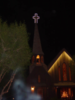
Photographs of Little Church of the West signs, Las Vegas (Nev.), 2002
Date
Archival Collection
Description
Site name: Little Church of the West
Site address: 4617 S Las Vegas Blvd
Sign owner: Greg Smith
Sign details: The Little Church of the West now resides on the south end of the Strip, along the east side among the smaller roadside hotels. Surrounded with pleasant landscaping the property is a charming and welcome sight among the more barren area of the strip.
Sign condition: Structure 4 Surface 4 Lighting 5
Sign form: Pylon; Fascia
Sign-specific description: There are two specific signs which are significant to the property. The first being the double backed internally lit pylon roadside sign which sits on the east side of Las Vegas Blvd and faces east/west. The 10 feet at its widest, and thirty seven feet tall. The structure consists of a center pole upon which an internally lit plastic sculpted message board sits. Painted in an old west script upon the plastic are the words "Little Church Of The West Wedding Chapel," with painted scrollwork on the top and the bottom of the plane. The entire message board is bordered in neon. Sitting on top of the message cabinet is a small, sculpted apse and bell. The original sign from its original construction still exists atop the actual structure of the Little Church of the West. It is an image of a cross outlined in white neon.
Sign - type of display: Neon; Backlit
Sign - media: Steel; Plastic
Sign - non-neon treatments: Graphics; Paint
Sign animation: none
Sign environment: The property sits among the dying roadside motel environment of the South end of Las Vegas Blvd It stands as on of the properties that is still in good repair. The pleasant landscaping and grass provide a pleasant establishment among the southern strip. It seems to capture the environment it has always tried to attain, of the picturesque country church.
Sign manufacturer: Larsen Sign
Sign - date of installation: It was originally part of William J. Moore's Last Frontier Village, which was assembled in the late 1950's. The current pylon sign was manufactured in 1996.
Sign - date of redesign/move: Originally, it resided in the Las Frontier until it was demolished in 1954. The Little Church of the West stood approximately in the spot where Sax Fifth Avenue is located. When the New Frontier was constructed, it was moved to the east side of the Strip approximately where the Silver Slipper was located. It stood in this location until 1978 when it was moved to the south edge of the Hacienda's property. The property was moved to its current location in 1996.
Sign - thematic influences: The thematic influence of the Little Church of the West draws from its original property which was the Old Western theme of the Frontier Hotel Casino. The Last Frontier Village was assembled from actual Western towns and reassembled on the Last Frontier's Property. With its wooden facade, brown color tones, script and pylon structure, the Little Church of the West rings true with its origins, while still incorporating the subtle elements of Las Vegas such as neon.
Sign - artistic significance: The Little Church of the West is reminiscent of old west theme which extends back to the very beginnings of Las Vegas and which dominated the themes for a period of time. " Before it became filled with themed western architecture, Las Vegas was an actual western town with a Spanish Style train station and false front facades fronting plank sidewalks"-Alan Hess, After Hours Architecture. Such properties, which dominated the early years of Las Vegas, were the Pioneer Club, the El Rancho Vegas, the El Cortez, the Last Frontier, Binion's Horseshoe, and the Silver Slipper.
Surveyor: Joshua Cannaday
Survey - date completed: 2002
Sign keywords: Pylon; Fascia; Neon; Backlit; Steel; Plastic; Graphics; Paint
Mixed Content
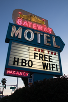
Photographs of Gateway Motel sign, Las Vegas (Nev.), March 12, 2017
Date
Archival Collection
Description
Site address: 928 S Las Vegas Blvd
Sign owner: Vinod Soni and Gateway Motel Inc
Sign details: The Gateway Motel dates back to early 1930's and could be considered one of the earliest motels to pop up in Las Vegas. Before the name changed to Gateway Motel it was named as the Gateway Auto Court circa 1930-1946 it was known as the Gateway Auto Court. The first sign was built circa 1930's and their new remodeled sign which is still in use today was built circa 1950's. The 1950's sign was originally painted darker colors and had a larger graphic of a gate. The original 1930's sign has the streamline modern influence that was prominent in 1930's and 40's. The sign itself is a pole sign with a square structure at the top. The font Auto-Court is in pure neon with that fire-red hue; the font is placed in the middle to stand out the most. The word Gateway is on top of Auto-Court in black with black streamline lines surrounding the word. Underneath is a small wooden board hanging probably stating no vacancy. The background color of the square structure is in pure white and the pole is chrome.
Sign condition: The condition of the sign is a 3.5. Some of the neon is not working when it's turned on at night. The paint has some sun/UV damage since it looks faded. The reader board has a stained effect from sun damage.
Sign form: Pylon with three separate signs converged into one.
Sign-specific description: The sign is made out of glass, steel, plastic, and concrete. The color palette is light blue, white and a cream white. The sign is designed in separate sections. The white cream based portion is situated at the top with a gate and bridge illustrative design in glass tubes and neon. The gate itself lights up yellow with red on the side. The font Gateway is larger than the gate and is in the color white when lit up. Underneath the Gateway word is a subliminal directional arrow pointing towards the motel buildings This section is in the color sky blue with the word motel in massive white letters. Underneath the directional arrow is the reader board surrounded by the steel light blue border. The reader board states Free Wi-Fi and HBO. Underneath in the left corner is a small light blue board that states "no vacancy" in neon. These three separate signs are all connected like blocks with a concrete pillar structure holding up the sign. During the evening, the light blue paint is not shown and is just pure black with the neon illuminating the sign.
Sign - type of display: Neon and plastic back lit sign
Sign - media: Steel, plastic and concrete
Sign - non-neon treatments: Plastic back lit portion
Sign environment: This location is on the corner of Las Vegas Blvd and Charleston. This is right next to the original Dona Maria Tamales restaurant.
Sign - date of installation: Circa 1950's
Sign - date of redesign/move: From a 1930's streamline modern sign to a 1950's Mid-Century modern architectural roadside motel sign.
Sign - thematic influences: The sign is influenced by Mid-Century Modern roadside architecture, with the directional arrow as a staple in many motel roadside designs of the 1950's and 60's to accommodate the car consumer era.
Sign - artistic significance: One main trends of the 1950's designs with neon signs is using illustrative motifs with the inclusion of directional arrows to lend to the highway travelers an idea of where the property is located. To make sure these travelers don't miss the establishment in an empty road.
Survey - research locations: Assessor's Page, Roadside Architecture Website http://www.roadarch.com/signs/nvvegas.html , Neon Museum book Spectacular, Vintage Las Vegas http://vintagelasvegas.com/search/Gateway+Motel
Surveyor: Gisselle Tipp
Survey - date completed: 2017-08-30
Sign keywords: Neon; Plastic; Backlit; Steel; Concrete; Roadside; Reader board; Back to back
Mixed Content
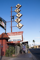
Photographs of Travelers Motel sign, Las Vegas (Nev.), 2017
Date
Archival Collection
Description
Site address: 1100 Fremont St
Sign details: This location was constructed in 1926. Though the year of when the Traveler's Motel opened in unknown though its sign states, "Your Best Bet In Las Vegas Since 1936'. Though Vintage Las Vegas' blog states that the Traveler's Motel acquired some of their land from the Lucky Motel. Currently the Traveler's Motel is closed and gated up.
Sign condition: 3, the sign is fairly in condition. However, the sign does not light up at night. The sign that used to read "Traveler's Motel" that was affixed to the iron gate-like structure appears to have the majority of its sign taken down or destroyed in recent times.
Sign form: Blade Pole sign and Porte Cochere
Sign-specific description: This sign is attached to the building that belongs to and extends outward to Fremont Street. The lower portion of this sign has the same details on each side of the sign. The top portion of this sign is a trapezoid with "Traveler's" painted on it in a cursive text except for the "t." This is done in white on a rust colored background. Neon is also affixed to "Traveler's." Underneath this is a plastic back lit sign detail the various accommodations of the property, such as: phone, cable T.V., microwave, refrigerators, "totally remodeled rooms," "daily * weekly rental," and "Your Best Bet In Las Vegas Since 1936." Under this is another, smaller trapezoid that has the street address painted on it in bold white numbers with a rust background. Extending from the top portion of this sign is a rust colored pole that has five other poles with various lengths extending out from that towards Fremont Street. Attached to these poles are letters that spell out "MOTEL," the top supports the "M" and each pole following hold each of the others letters to spell out the word. Each of these are diamond shaped plastic, possibly back lit signs. The plastic is off-white and each of the letters is black. The marquee sign attached to the iron gate-like structure that connects one side of the building to the next. This sign is a long, rectangular back lit sign that has a white background and bold red text reading "Traveler's Motel. " This sign also was attached to an longer, yellow rectangle with rounded sided on the left and right side of the sign.
Sign - type of display: Neon, possibly back lit (sign doesn't light up any more)
Sign - media: Steel and Plastic
Sign - non-neon treatments: Plastic back lit portion
Sign animation: The sign is no longer in use; therefore, it is difficult to determine this. There is also no record of the sign having any animation.
Sign environment: This property resides in the area east of the Fremont East District with many new businesses surrounding it, such as: PublicUs, the Bunkhouse Saloon, Chow, The Writer's Block, and 11th Street Records. However, there are quite a few other closed Motel properties that reside near the Traveler's Motel as well.
Sign - thematic influences: The sign is extremely reminiscent of many of the signs from the 50's and 60's that belong to the other motels in the downtown area. The sign has many geometric elements to it that make it appear that it could be from this time period.
Sign - artistic significance: This sign does not have a specific theme to it. However, the plastic figure climbing on the sign stresses that this motel would be for those who do enjoy traveling and adventures. This sign does follow a very basic trend regarding motel signs on Fremont Street. It is attractive and very noticeable to those moving along Fremont Street. The overall design of the sign is very geometric, which is a common aesthetic among signs made in the 50's and 60's.
Survey - research locations: Assessor's Page and Vintage Las Vegas website http://vintagelasvegas.com/search/Traveler+Motel
Survey - research notes: It was difficult to find any history or old photographs of this property.
Surveyor: Lauren Vaccaro
Survey - date completed: 2017-08-18
Sign keywords: Neon; Steel; Plastic; Backlit; Pole sign
Mixed Content

Nora Mirabal interview, August 30, 2019: transcript
Date
Archival Collection
Description
Interviewed by Elsa Lopez and Barbara Tabach. Cuban refugee family by way of Spain and then to the US; arrived in Las Vegas in 1973 when Nora was 9 years old. Struggled in youth but rises up as embraces educaton. Currently is Assistant Director of Academic Partnership at CSN.
Text
Transcript of interview with Flo Mlynarczyk by Claytee White, July 7, 2005
Date
Archival Collection
Description
Flo Mlynarczyk began life in Fort Morgan, Colorado. Her parents divorced and she moved with her mother first to Loveland and eventually to Los Angeles. Her mother started the first Red Cross in Bell Gardens, oversaw the building of their home, and raised money for various charities. Flo remembers when the Japanese were rounded up and interred during WWII. She was in grade school and recalls that one day they all just disappeared. Upon graduation from high school in 1943, Flo moved to Kodiak, Alaska, to live with friends. She recalls total blackouts on the streets of Kodiak due to the war, the Short Snorter Club, and her return to California after a bout of pneumonia. Back in Bell Gardens, Flo worked for a department store, married and divorced in 1945, gave birth to her son Michael in 1946, and ended up in Tonopah, Nevada, with a sister who ran a cafe there. After a second marriage ended, Flo moved to Las Vegas and began working at Phelps Pump and Equipment as a bookkeeper.
Text
Meeting minutes for Consolidated Student Senate, University of Nevada, Las Vegas, November 21, 2005
Date
Archival Collection
Description
Text
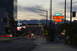
Photographs of Somerset Shopping Center sign, Las Vegas (Nev.), April 4, 2017
Date
Archival Collection
Description
Site address: 252 Convention Center Dr
Sign owner: Somerset Shopping Center CO LP
Sign details: This shopping center was built in 1966 next to the Somerset House Motel. The motel was demolished in 2011; however, the shopping center is still around. Some businesses that reside in the shopping center include: a hair and nail salon, a dry cleaners, an Ethiopian restaurant, and a place for banquets to name a few.
Sign condition: 5, the sign is in beautiful condition.
Sign form: Pole
Sign-specific description: This pole sign sits close to the street so motorists and pedestrians can view it easily. A light blue pole holds up the main portion of this sign, as well as back lit plastic signs on each side of the pole that display what businesses are in the shopping center. The sign itself consists of a yellow ring that encircles three other signs. This yellow circle is covered in incandescent light bulbs that chase when the sign is lit up at night. Also, extending from this yellow circle are light blue poles in various lengths that are surrounded in neon tubes and oscillate around the yellow circle when the sign is lit up at night. In the center of the circle are three signs. The first sign is an elongated oval that has the word "SOMERSET" painted on it in bold white letters with a black outline on a light blue background. Neon tubes outline these letters. The sign under that is a large rectangle shape with each of the sides curving inward. There are also incandescent light bulbs lining the outer edge of this sign that chase when the sign is lit up. This sign has the word "SHOPPING" painted on it in bold white text against a red background. Neon tubes outline each letter of this word. The sign under this is another elongated oval that is a similar size to the "SOMERSET" sign. This sign reads "CENTER" in bold white text against a red background and neon tubes outline this word as well.
Sign - type of display: Neon, Incandescent light bulbs and back lit
Sign - media: Steel and plastic
Sign - non-neon treatments: Plastic portion of sign
Sign animation: Oscillating, chasing
Sign environment: The shopping center that this sign is located in is about a block away from the Strip and is near a few monumental properties. It resides close to the Las Vegas Country Club, the Las Vegas Convention Center, and the Guardian Angel Cathedral that Paul Revere Williams designed. It is down the road from casinos like the Wynn, Encore, Circus Circus, and the Westgate. The Peppermill, an iconic Las Vegas restaurant, is down the street as well. It was down the street from the Stardust when that property was up and running.
Sign manufacturer: YESCO
Sign - date of installation: Most likely 1966, 1960's era
Sign - thematic influences: The design of this sign is very eye-catching from the road, as are many roadside signs throughout this era of the city. Bold text and light animation make this a standout sign to attract motorists and pedestrians to the shopping center.
Sign - artistic significance: This sign appears to have some Googie design influence throughout it. It has a space age feel to it because of the yellow circle that surrounds the "SOMERSET SHOPPING CENTER" signs and the blue poles that extend from it also add to this style.
Survey - research locations: Assessor's Page http://www.clarkcountynv.gov/assessor/Pages/searchbybusinessname.aspx , Vintage Las Vegas website http://vintagelasvegas.com/search/somerset , Roadside architecture website http://www.roadarch.com/signs/nvvegas.html
Surveyor: Lauren Vaccaro
Survey - date completed: 2017-09-01
Sign keywords: Neon; Incandescent; Backlit; Steel; Plastic; Oscillating; Chasing; Pole sign
Mixed Content

Harold McKay interview, March 13, 1981: transcript
Date
Archival Collection
Description
On March 13, 1981, Dana Jamerson interviewed Harold McKay (b. July 27th, 1903 in Dresden, Kansas) about his life as a teacher in Las Vegas, Nevada. McKay speaks about his education, his move from Chicago, Illinois to Las Vegas and how he began his career in education. McKay focuses on how and why he founded the Teacher’s Credit Union, his time working in administration and his business school, as well as the problems related to segregation and integration in the educational system. Lastly, he talks about the growth of the gaming and entertainment industry in Las Vegas, and his volunteer work with the Senior Citizen Center.
Text
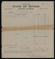
Tax bills and receipts: Sadie George
Date
Archival Collection
Description
Text

