Search Results
"Expanding the Possibilities": article draft by Roosevelt Fitzgerald
Date
Archival Collection
Description
From the Roosevelt Fitzgerald Professional Papers (MS-01082) -- Drafts for the Las Vegas Sentinel Voice file. On Jesse Jackson's 1987 presidential candidacy.
Text
Pair A Dice Mobile Home Park Neon Survey document, September 12, 2017
Date
Archival Collection
Description
Site address: 2067 N Las Vegas Blvd
Sign owner: Peyman Masachi and Pair A Dice Estates LLC
Sign details: Originally construction was in 1956 for a Manufactured Homes park. This location offers 137 spaces for mobile homes and have 42 permanent parked homes.
Sign condition: 3.5- paint has faded drastically
Sign form: Pylon
Sign-specific description: This pylon has 2 plastic back lit red dice on the top of it with the one on top with the number 5 and the lower one reads 2 to make the lucky number 7. To the non-road side of this double sided sign is a yellow circle plastic back lit sign that has painted black letters stating "Pair A Dice". Below this is an orange triangle shape that has channeled neon white steel letters near the top of it stating "Trailer Park" in a block type font that illuminate white at night. Below these letters are a white plastic back lit sign stating "R.V.'s Welcome" with their phone number posted underneath. Below is another plastic back lit sign that is yellow with a black font stating "Senior Park". Below this is a skeletal neon arrow that points to their driveway that illuminates yellow at night.
Sign - type of display: Neon and plastic back lit signs
Sign - media: Steel and plastic
Sign - non-neon treatments: Plastic Back lit portions
Sign animation: Chasing, flashing, oscillating
Notes: The logo cabinets which adorn the entrances on the elevated walkways: The letters start with both rows of text in the off position. The top row flashes on, while the bottom row is dark then the bottom row illuminates, as the top row goes dark. Once the top row flashes off it flashes back on so that both rows of text are briefly illuminated simultaneously before they both go dark and the sequence stars over again. While this is going on the incandescent bulbs which line all of the raceways are chasing each other from left to right on the horizontal planes, while the arched sections chase each other downward. The triangular peaks which radiate around the top of the logo sign, flash on and off in a sequence which chase each other downward. First the top center peak flashes on, then the next sequential triangular channel on both sides illuminate simultaneously, flash off, then the next two in the series illuminate. The resultant effect is a chasing pattern starting from the top. The sister animation is located on almost the exact same design on the porte cochere. I would think the previous smaller sign would be based on the larger porte cochere. The other variance besides obvious size difference is the that the channel letters are filled with incandescent bulbs instead of neon. The animation is a bit simpler as well. The incandescent bulbs oscillate continuously while the triangular pan channels which create the radiating crown, animate. The neon in the channels chase each other as described in the smaller walk way version, while the text continues until the entire text flashes off, then on, off, then begin to animate once again. All of the bulbs, which line the raceways of the exterior edge of the porte cochere, as well as the encrustation of bulbs on the brass bull nose portion, animate in rapid succession. All the raceway bulbs chase each other while the bulbs on the brass portion continually oscillate. Animation continues on the east face of the building with the entrances first. The principle for these two signs is oscillation and chasing. All bulbs on the underside of the entrance, as well as in the logo, oscillate rapidly. All bulbs on the raceways chase each other. Further on the surface of the building as well, the Pepsi cola wall sign is found displaying a very unique form of animation, seen here on the strip. The signage for the Pepsi ad is located on the eastern wall. (Detailed in specific description) The Incandescent bulbs which fill the inside of the text that spells Pepsi, chase each other from left to right, leaving all the bulbs in its path illuminated, as if writing out the word Pepsi. The neon bars located within the tilted bottle of Pepsi are illuminated, and chase each other downward, leaving the bars it its path dark. As this sequence in taking place, the waving tubes of neon illuminate, flashed subtly making the neon appear as soda pouring out of the bottle. As the tubing flows then the vertical neon bars in the cup illuminate one at a time making the cup appear as if it is filling up. The text above each of the painted fires head, flashes back and forth as if talking to each other as well. ESPN ZONE animation: The letters in the vertical blade portion of the ESPN Zone illuminate one at a time, starting from the top. Once the entire phrase is lit, in flashes off then on then off, before restating. The orange and red neon tubing which resides inside the pan channels that represent flames flash on and off in a relaxed manner as if to animate the flickering of the flames. The small incandescent bulbs on the black portions above the main matrix reader board flash on and off subtly.
Sign environment: This location is in North Las Vegas along Las Vegas Blvd. It is north of Jerry's Nugget by about a mile.
Sign manufacturer: There is a marking for "BMS" on this sign which is a sign manufacturer in Minneapolis, Minnesota but could not get in contact with anyone to see if this is the correct manufacturer/maintainer or if it had a different meaning.
Sign - date of installation: Has been up since at least 2007 but does look a lot older than that
Sign - thematic influences: The triangle in this sign does have a mid-century modern theme (50's/60's) to it with curved geometric shapes.
Sign - artistic significance: The theme of Pair A- Dice plays perfectly with the theme of Vegas since for many table dice games you need a pair of dice. Though you are also in paradise here in Vegas particularly since the incorporated area of Vegas which we all know as the strip is technically the city of "Paradise". Also the Pair O' Dice was the name of one of the first casino's down on the strip when gambling was re-legalized in the state of Nevada in 1931.
Survey - research locations: Assessor's Page, Loop Net- Information on what the property offers http://www.loopnet.com/Listing/18840376/2067-N-Las-Vegas-Boulevard-Las-Vegas-NV/ , _Las Vegas Sun article https://lasvegassun.com/news/2011/mar/01/2-southern-nevada-contractors-file-bankruptcy/_, google maps satellite and roadside view
Survey - research notes: With the BMS sticker on this sign, it could be a sign company but the only one found online was in Minnesota. Unless if there was a BMS in Las Vegas but was bought out by a bigger sign company.
Survey - other remarks: The Pair A Dice LLC company went bankrupt in 2011 which this Las Vegas Sun article discusses https://lasvegassun.com/news/2011/mar/01/2-southern-nevada-contractors-file-bankruptcy/
Surveyor: Emily Fellmer
Survey - date completed: 2017-09-12
Sign keywords: Neon; Plastic; Backlit; Steel; Roadside
Text
Meeting minutes for Consolidated Student Senate University of Nevada, Las Vegas, October 8, 1987
Date
Archival Collection
Description
Text
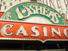
Photographs of O'Shea's signs, Las Vegas (Nev.), 2002
Date
Archival Collection
Description
Site address: 3555 S Las Vegas Blvd
Sign owner: Park Place Entertainment
Sign details: O'Shea's Casino is located just north across a small driveway from the Flamingo. The small but busy facade is a small, yet busy stop along the Las Vegas Strip. The exterior signage consists of two corner signs, a blade sign, hanging off of the west face of the building, a main entrance sign, backlit screens as well as various images laden with neon. All of these create a flashing display of luminescence all just above the pedestrian's head.
Sign condition: Structure 5 Surface 5 Lighting 5
Sign form: Fascia
Sign-specific description: O'Shea's Casino is located just north across a small driveway from the Flamingo. O'Shea's theme and signage is influenced by Irish culture and imagery, integrated into the forms of signage along the Las Vegas Strip. The building design itself is influenced by traditional European housing imagery, generalized with other elements of architecture also. One example of this is the coloring, exposed wooden beams and narrow rooflines over treated windows, which suggest styles seen in classic European architectural imagery. Examples of other elements such as sculpted windowsills and exterior molding are more akin to neoclassical than the Irish pub or cottage. A small blade sign hangs in the center of the structure facing north /south. Attached off of the building by two poles, the double sided cabinet is designed with a circular portion at the top that transforms along it's bottom edge into length portion of the "blade" that continues down to a rounded bottom. The Circular portion serves as the "O" in O'Shea's. The exterior of the signs width is finished in a polished gold aluminum surface. The top portion continues into a full circular space in the front where the backlit image of the O'Shea's leprechaun mascot resides in it's center. The image has a circular green neon border at the edge of the cabinet and is set into a field of incandescent bulbs, which occupy the remaining space in the face of the "O". Incandescent bulbs also run around the edge of a face on a gold raceway. Channel letters run vertically down the face of the blade spelling the remaining "Sea's" of the title. Each letter is filled with incandescent bulbs, and bordered on it's exterior in green neon. The remainder of the space, which comprises the surface of the sign, is a green material. The entire edge of the rest of the sign is also bordered with incandescent bulbs. Below the blade sign, the main entrance for the establishment is denoted by the large, arched, marquee logo, and wall sign for the casino. The arch shape is bordered by gold polished raceways, with the interior space where the O'Shea's logo is written in a bowed, horizontal arrangement with the "O" and "S" being the biggest letters in this group. The same back-lit leprechaun figure which is present in the blade sign, in seen in the "O" of the logo. The letters are of channel design and filled with incandescent bulbs. Gold scrollwork adorns the green background above and on the sides of the logo. An entablature, running the length below the arch, reads "casino" in channel letters filled with incandescent bulbs and bordered with green neon. The orange background in contained on the bottom edge with a gold polished raceway, which sharply curves into a downward point at the very center. All the raceway edges of the sign are lined with incandescent bulbs. Flanking the wall on either side of the main entrance are two backlit message centers with vinyl lettering. They also are bordered with incandescent bulbs, strewn upon polished raceways. To the south toward the Flamingo Casino, a corner marquee sign faces toward the southwest. The message center on the right of the main entrance essentially continues its shape wrapping in radius fashion all the way around the corner. As the entablature wraps the corner, the color changes to a section of black, containing the channel letters hung at a slight angle, spelling the words " Hall of Fame," in cursive text. Small stars in channel design adorn the black background. On the left of the text, O'Shea's is painted in red paint, in a cursive script at a similar angle as the premier text. Neon is shaped over the surface of the letters to allow it to be spelled in light. The word "Casino" is spelled on the right hand side, and treated in the same fashion. A top the black portion of pediment, the sign continues with it's corner finishing, rounded marquee, containing the text, "Magic & Movie," in a three lined arrangement. Putting the two signs together the appropriate title for the advertisement of the attraction is read "Magic and Movie Hall of Fame." The channel letters on the top portion are filled with neon and treated white on the interiors. The edge of the cabinet is treated with white bull nose borders, sandwiching a field of pink holding two tubes of contoured neon. At the peak of the sign a small element reminiscent of a fan, created using a multi layered box, uses different levels receding into space, with the center blade at the front of the sign. The sections are lined with gold raceways and incandescent bulbs, with the center blade being horizontally striped with tubes of neon. Two small gold finished gargoyle statues flank either side of the theatre-esque entrance. Underneath the overhang created by the corner sign, polished aluminum element creates a sloping drum shape above the door. This drum is divided into sections by gold polished raceways. The flat portion, which returns to the ceiling of the overhang is adorned with painted images of clovers, encircled in rings of green neon. This section is reminiscent of the top section of the corner drum of the Barbary Coast. The black pediment along the south portion of the building., abruptly changes to the orange color seen on the main entrance. Along the south wall section of the pediment green pan channels in the shape of clovers hang, lined on the interior with neon. A small sign denoting parking is also present. Another corner entrance is located on the north end of the property, facing northwest. It too has the rounded corner entrance and logo sign. Slightly different than the main entrance, the same "Casino text and structure is seen on the orange pediment above the door, as well as the channel logo with the mascot located in the letter "O." A three-sectioned panel with swooping wings and an arched center creates the field for the main logo. A more busy section of two dimensional scrollwork sits below the neon filled text. The wings of the top section a recessed panels with checkerboard design behind that. Each side of the entire top section is book ended with two small square posts. Three small miniature spires line the very top, and the same inverted drum shape sits underneath the door. Street posts reside on the sidewalk outside.
Sign - type of display: Neon; Incandescent; Backlit
Sign - media: Steel; Plastic
Sign animation: Chasing, flashing, oscillating
Notes: All of the bulbs, which reside in the fascia signs which designate entrances, oscillate rapidly. The entrance sign a bit closer to the north end of the property also contain the pan channel star shapes, with incandescent bulbs in the center. The bulbs which, reside on the widths edge of the small pole sign at the south end of the property, oscillate giving a twinkling effect. The main pylon's animation is rather simple considering the amount of lighting. Bulbs which create the dazzling background chase each other upward to the very point, then once they reach the top, each letter light up from left to right, one at a time, then off one letter at a time. The letters all turn on simultaneously while, while the background chases up, leaving the lights off in its trail. The text then shuts off as well. The small incandescent bulbs lacing the background of the main body of the sign oscillate subtly, twinkling themselves. Each letter of the text contains a single row of incandescent bulbs, just inside the border of the red neon. This row is always on in a chasing animation from left to right even when the letters are dark. The animation for the three sided, pole sign, at the north end of the property is adorned with sparkling animation as well. The purple bulbs, which create the border of the main base, chase each other from bottom to top, and the star shape in the center is filled with oscillating incandescent bulbs. The bulbs, which also encrust the bottom surface of the cabinet, oscillate as well. The incandescent bulbs, which adorn the background of the text portion of the sign, also sparkle with a soft random oscillating pattern. The stars which sit on top of the cabinet, animate in a random, non descriptive fashion. The inner star shaped pans oscillate with incandescent bulbs, and the neon borders flash on then off, in a clumsy random order. The three-sided sign also rotates, one of the few animatronic signs on the Strip.
Sign environment: Being essentially part of the Flamingo, O'Shea's is only separated by a small drive, producing the easy traffic flow from the north entrance of the former. The north of O'Shea's on the immediate vertical explosion of the front tower/porte cochere of the Imperial Palace. It is easy to say that O'Shea's is sandwiched in between two giants, assuming its place as the charming gap between the Flamingo and the Imperial Palace which is quite a bit more pedestrian friendly. Traveling north on the east side of the strip, O'Shea's is not hard to miss at all
Sign - date of installation: Original date of installation 1989. The southwest, and northwest corner signage were added at a later date
Sign - thematic influences: O'Shea's centers around the theme of the Irish pub, utilizing various imagery to get support the design. The color green is used extensively in the main signs color scheme while the ever-popular image of the folkloric leprechaun illuminated it a cartoon form upon the pylon. The green pan channels, which are shaped like shamrocks, are place along the exterior wall, an obvious reference to the St. Patrick's Day Holiday as well a reference to good luck. ( example: the four-leaf clover, luck of the Irish.) Luck is something synonymously associated with an industry such as gaming. Gold is also used extensively with the exterior referencing the infamous pot of gold associated with the lore of leprechauns. The actual structure itself is constructed with elements which suggest a European rustic cottage.
Surveyor: Joshua Cannaday
Survey - date completed: 2002
Sign keywords: Chasing; Oscillating; Fascia; Neon; Incandescent; Backlit; Steel; Plastic
Mixed Content

Nora Mirabal interview, August 30, 2019: transcript
Date
Archival Collection
Description
Interviewed by Elsa Lopez and Barbara Tabach. Cuban refugee family by way of Spain and then to the US; arrived in Las Vegas in 1973 when Nora was 9 years old. Struggled in youth but rises up as embraces educaton. Currently is Assistant Director of Academic Partnership at CSN.
Text

Transcript of roundtable interview with the Holocaust Resource Center: Myra Berkovits, Susan Dubin and Doug Unger, by Barbara Tabach, September 4, 2014
Date
Archival Collection
Description
Interview with Myra Berkovits, Susan Dubin and Doug Unger of the Holocaust Resource Center. In this interview, the group discusses the beginnings of what is now the Sperling Kronberg Mack Holocaust Resource Center. Edythe Katz-Yarchever is discussed as the catalyst for establishing the center and getting others involved with the Governor's Advisory Council on Education Relating to the Holocaust. Berkovits talks about her role as a liason for Holocaust education in the Clark County School District and the student-teacher conferences held each year with funding from Sheldon Adelson. Unger discusses expanding the outreach to the Washoe County School District with assistance from Atlantis Hotel (Reno, Nev.) owner, John Farahi and Judy Mack. They talk about the previous locations of the Holocaust Resource Center on Maryland Parkway, then Renaissance Drive, and the affiliation with the Jewish Federation and the Jewish Family Service Agency. After funding and personnel issues around 2011, the advisory council and the library went through a re-structuring and hired Susan Dubin who organized and catalogued the library collection. The library is now accredited by the Association of Jewish Libraries.
Text
Audio clip of an interview with Kenneth Fong by Lois goodall on February 22, 2014
Date
Archival Collection
Description
Sound
Transcript of interview with Ann McGinley by Claytee D. White, August 01, 2006
Date
Archival Collection
Description
Text

Arizona Charlie's Hotel and Casino Neon Survey document, August 18, 2017
Date
Archival Collection
Description
Site address: 4575 Boulder Hwy
Sign owner: American Casino and Entertainment Properties LLC
Sign details: Currently Arizona Charlie's Boulder is owned by the Parent company American Casino and Entertainment Properties LLC. The original Arizona Charlie's on Decatur was first opened around the 1980's owned by Ernest Becker III and his three sons. These locations were named for Becker's uncle Charlie Meadows. The Becker family has had a long history of development and real estate. Arizona Charlie's Boulder opened in 2001.
Sign condition: 5 - looks new
Sign form: Super Pylon
Sign-specific description: Octagonal design. Effigy of a cowboy at its center in an oval plastic backlit sign. There is the words "Arizona Charlie's Boulder" in channeled neon letters. Underneath is a Reader Board with a LED video screen.
Sign - type of display: Neon, Incandescent, Plasma T.V. screen and reader board
Sign - media: Steel and plastic
Sign - non-neon treatments: LED plasma screen and Incandescents
Sign animation: Flasher for incandescent bulbs
Sign environment: A residential area surrounds the property, and adjacent to the main property is their own RV park.
Sign manufacturer: Possibly YESCO
Sign - date of installation: c. 2007
Sign - thematic influences: The Red and yellow/gold color scheme adds an old west and cowboy theme to the sign. The old West theme was very prominent in Las Vegas in the 1940's.
Survey - research locations: Assessor's Page, Arizona Charlie's Website
Survey - research notes: http://www.arizonacharliesboulder.com/?gclid=Cj0KEQjw9uHOBRDtz6CKke3z6ecBEiQAu0Jr3mlOR65dHh6OypoEF3LcYOCTWpwRltGP9Kh6YWjwBKgaApoi8P8HAQ
Surveyor: Wyatt Currie-Diamond
Survey - date completed: 2017-08-18
Sign keywords: Pylon; Neon; Incandescent; Steel; Plastic; Flashing; Reader board; Video screen
Text
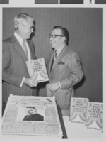
Photograph of Mayor Oran K. Gragson (left) with author Earl Wilson, circa 1971
Date
Archival Collection
Description
Image