Search Results
Photographs of Holiday House Motel sign, Las Vegas (Nev.), March 1, 2017
Date
2017-03-01
2017-08-30
Archival Collection
Description
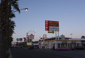
The Holiday House motel sign with a "For Sale" sign sits at 2211 South Las Vegas Boulevard. Formerly the Bagdad Inn, the property has been in operation since the early 50s. Information about the sign is available in the Southern Nevada Neon Survey Data Sheet.
Site address: 2211 S Las Vegas Blvd
Sign details: The Holiday House Motel was originally the Bagdad Inn that opened up in the 1950's. The actual motel was possibly named after Bagdad California, a small ghost town in the San Bernardino county. This town was a former route 66 pit stop and later passed by with the new I-15 and I- 40 in the late 1970's. The motel changed its name in 1983 to Holiday House Motel. The motel currently has a for sale sign.
Sign condition: The sign is in a 4.5. There seems to not have much sun or wind damage to the sign. The color is still fresh.
Sign form: This is a two- pole squared structured sign.
Sign-specific description: The sign is a bright red squared basis. All aspects of the sign's advertisement are connected together in one large square. There is no separation within the structure; it just looks like one giant red canvas with words and would even suggest the sign is very minimal. At the bottom, right portion of the sign you will see a small reader board (currently the reader board has been covered with a for sale sign). Vertically on the left side is the word motel in white lettering. The holiday house font is in yellow incandescent lighting, and the font looks italicized. The no vacancy is in neon underneath the holiday house typography. Two white poles are what holds up the sign.
Sign - type of display: Neon, Incandescent and fluorescent lighting.
Sign - media: Steel and Plastic
Sign - non-neon treatments: Reader board
Sign animation: Flasher for the incandescent light bulbs in the letters
Sign environment: This location is on the north end of the Strip across the street from the Stratosphere and near the Holiday Motel and Fun City Motel.
Sign - date of installation: 1983
Sign - date of redesign/move: In 1950's the sign was Bagdad Inn and in 1983 the establishment later changed into the Holiday House Motel.
Sign - thematic influences: This sign could have inspiration from the post modernism idea of open space and minimal design to "advertise" to consumers. This sign is very representative of 1970's designs.
Sign - artistic significance: Every portion of the sign was thoughtfully placed to hit the consumer in a fast and efficient way.
Survey - research locations: Vintage Vegas http://vintagelasvegas.com/search/Holiday+House+Motel and Roadside Architecture http://www.roadarch.com/signs/nvvegas.html .
Surveyor: Gisselle Tipp
Survey - date completed: 2017-08-30
Sign keywords: Neon; Incandescent; Steel; Plastic; Flashing; Reader board; Pole sign; Fluorescent; Roof Sign
Mixed Content
Photographs of Dona Maria's Tamales Restaurant signs, Las Vegas (Nev.), March 13, 2017
Date
2017-03-13
2017-08-28
Archival Collection
Description
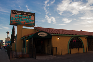
Dona Maria's Tamales Restaurant sits at 910 South Las Vegas Boulevard. The family owned and operated eatery has been serving the valley for over thirty years. Information about the sign is available in the Southern Nevada Neon Survey Data Sheet.
Site address: 910 S Las Vegas Blvd
Sign owner: Dona Maria Alfredo Martinez
Sign details: Alfredo Martinez and Elvia met each other in California as high school sweethearts. Alfredo was a soccer player and Elvia a cheerleader who always watched his matches. After high school the two of them married and started a new chapter in their life in Las Vegas. Alfredo has a love of cooking traditional Mexican cuisine and soon taught Elvia his family recipes. In 1980 they opened their first restaurant a four table fast food operation on Charleston and 10th. Three years later after great success the four table operation grew into a full time restaurant where their location moved to 910 S. Las Vegas BLVD. For years their restaurant won many awards that led the couple to open another establishment in 1993.
Sign condition: The sign is a 4 out of 5, for the family maintains the sign. The paint on the sign is fading so it could use a new layer of paint to update the color hue.
Sign form: Pylon and entrance sign
Sign-specific description: The sign uses pale turquoise and soft pink hues to stand out. It resembles 1980s southwestern color palette. The sign is rectangular shaped with the background as the soft pink and font as turquoise. Dona Maria's font is in white and the background is maroon surrounding the letters. The border outline for the rectangular shaped sign is also in the color Turquoise to make the soft pink pop out. The base of the sign is bright custard concrete yellow attached to the building.
Sign - type of display: Neon
Sign - media: Concrete and steel
Sign - non-neon treatments: Small portion of the sign is back lit plastic
Sign environment: This location is on Las Vegas Blvd close to Charleston. It is next door to the Gateway Motel, as well as close to the Goodwhich, the Millennium Fandom Bar and a 7/11.
Sign - date of installation: Circa 1983
Sign - thematic influences: The theme resembles the prominent late 1970's/early 1980s Southwestern color palette. The sign is very colorful that resembles many Mexican restaurants that are quite colorful naturally.
Sign - artistic significance: Artistic themes is very 80s in terms of color palette, but also utilizes colors that is representative of Mexican culture.
Survey - research locations: Assessor's Page, Dona Maria's Website for the history- https://www.donamariatamales.com/our-history/
Survey - research notes: In 1980 the restaurant expanded and grew from their location at 10th and Charleston to 910 S. LV, BLVD S.
Surveyor: Gisselle Tipp
Survey - date completed: 2017-08-28
Sign keywords: Neon; Steel; Backlit; Plastic; Building-front design; Back to back; Pole sign
Mixed Content
Photographs of Boulder Station sign, Las Vegas (Nev.), March 27, 2017
Date
2017-03-27
2017-09-27
Archival Collection
Description
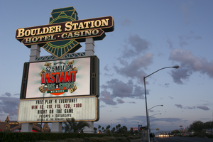
The Boulder Station Hotel and Casino sign sits at 4111 Boulder Highway. Information about the sign is available in the Southern Nevada Neon Survey Data Sheet.
Site address: 4111 Boulder Hwy
Sign owner: Stations Casino Company
Sign details: This location opened in 1991 and is considered a locals casino. They have a similar train station theme to a few of the other Stations Casino properties used to have. This location also holds a movie theater.
Sign condition: 5- still in very good condition and lights up very brightly at night still
Sign form: Pylon, Porte cochere and semi-decorated shed
Sign-specific description: The main pylon sign has a two white steel bases with a reader board on the bottom, a plasma t.v. screen on top of the reader board and the main portion of the sign with their logo above. Their main logo is a green train front with a yellow neon trim with curved maroon ovals on it stating "Boulder Station" and "Hotel-Casino" underneath it in channeled white letters that contain flashing incandescent. The porte cochere sign above their valet is in a rainbow shape stating "Boulder Station" in sparkling incandescent. With red letters underneath stating "Hotel" in red neon. Also on the main hotel tower there are the same "Boulder Station" letters in incandescent lights outlined in red neon as well. Also the word "Casino" is also in incandescent lights on the side of the building. There are also LED lights that are chasing outlining the whole building making a semi-decorated shed look.
Sign - type of display: Neon, Incandescent, LED, LED plasma screen
Sign - media: Steel and plastic for reader board
Sign - non-neon treatments: Reader board and Plasma screen
Sign animation: Flashing incandescents and Chasing LED lights
Sign environment: This location is on Boulder Hwy on the way to Henderson/Boulder City. This location is near a residential areas and is a neighbor to a Motel 6.
Sign - date of installation: Has been up since at least 2007
Sign - thematic influences: Their train theme is portrayed well in their pylon sign. Also the train theme could be considered an homage to early Vegas history as a railroad stop.
Sign - artistic significance: The pylon sign is very similar to the Fiesta Rancho sign which is also a station casino with the reader board and plasma screen. This sign is almost identical in design to the old Palace Station sign.
Survey - research locations: Palace Station sign. Surveyor Notes 1. Research locations (archAsessor's page, Boulder Station website https://boulderstation.sclv.com/ , Station's Casino website https://www.sclv.com/, google maps satellite/ road view
Survey - research notes: Station's Casinos have 10 casinos in Las Vegas and have been present in the community for the past 40 years.
Surveyor: Emily Fellmer
Survey - date completed: 2017-09-27
Sign keywords: Pylon; Porte-cochère; Neon; Incandescent; Steel; Plastic; Flashing; Reader board; Chasing; Plasma display
Mixed Content
Photographs of Fiesta sign at dusk, Las Vegas (Nev.), April 2, 2017
Date
2017-04-02
2017-09-06
Archival Collection
Description
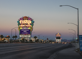
The Fiesta Rancho Hotel and Casino sits at 2400 North Rancho Drive. Information about the sign is available in the Southern Nevada Neon Survey Data Sheet.
Site address: 2400 N Rancho Dr
Sign owner: Stations Casinos Inc.
Sign details: This location was constructed in 1995 as the Fiesta, but in 2001 Stations Casino bought out the casino and renamed it Fiesta Rancho. Stations Casinos Inc. that own this casino have a chain of 9 resort casinos and a number of smaller casinos in the Las Vegas Valley that are popular along the local community here in Las Vegas. The Fiesta Rancho has a sister property named Fiesta Henderson which also has an ice rink as well as identical sign designs.
Sign condition: 4 - the lights still shine very brightly on this one but the colors on the sign have faded over the years and look more like pastel colors when they used to be very vibrant
Sign form: Marquee and Entrance Sign
Sign-specific description: The marquee on Rancho Dr. has concrete bases with a big plasma screen tv with a reader board underneath it. Above the T.V. screen they have a huge design with a purple background, but around this is yellow, orange, blue, green and pink streamers. These all illuminate the same color as the paint at night time. In the middle of the streamer design is channeled letters "Fiesta" in a curvy print font, and then the words "Casino Hotel" underneath it in a normal block type font. The letters illuminate white at night time. Above their main entrance to the casino they have big channeled letters stating " Fiesta" in the same font to their other signs that contain incandescent bulbs that flash at night. Underneath the incandescent "Fiesta" there are red channeled Neon signs stating "Race Sports Keno Bingo" that illuminate red.
Sign - type of display: Neon and Incandescents
Sign - media: Steel
Sign - non-neon treatments: Reader Board and Plasma Screen
Sign animation: Flasher for incandescent bulbs
Sign environment: This property is on North Rancho about a mile north of the 95 highway. It is located right next door to Texas Station, and is near a residential area.
Sign manufacturer: Possibly YESCO
Sign - date of installation: c. 2001
Sign - thematic influences: The theme of the casino matches the sign with the fun party colors and ribbon streamers that they depict on their sign looks like a fiesta.
Sign - artistic significance: This sign is practically identical to the signage for Fiesta Henderson, for they based their sign off of this Fiesta Rancho sign design.
Survey - research locations: Assessor's website, company website
Survey - research notes: Fiesta Rancho website https://fiestarancho.sclv.com/, Stations Casino page https://www.sclv.com/
Survey - other remarks: https://www.sclv.com/Casinos/PropertyMap Stations Casino website has an interactive map of their locations
Surveyor: Emily Fellmer
Survey - date completed: 2017-09-06
Sign keywords: Neon; Incandescent; Steel; Flashing; Reader board; Marquee; Video screen; Pylon
Mixed Content
Photographs of Park on Fremont sign, Las Vegas (Nev.), June 28, 2017
Date
2017-06-28
2017-08-11
Archival Collection
Description
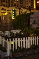
The Park on Fremont sign sits at 506 Fremont Street in Downtown Las Vegas. Information about the sign is available in the Southern Nevada Neon Survey Sheet.
Site address: 506 Fremont St
Sign owner: Justin Weniger and Ryan Doherty both with Corner Bar Management Group
Sign details: This building was constructed in 1956. Though the Park on Fremont opened in 2013 in the former Maharaja Hookah Cafe though the building's exterior was renovated to have more of a wooden facade. This place is claimed as a gastro-pub with rustic-chic decor. Their outside urban beer garden is well recognized with its cool rustic design presenting a teeter totter and a CInderella-like carriage.
Sign condition: 5, very good condition and has bright colors during the day and night
Sign form: Blade
Sign-specific description: They have a long oval shaped blade placed on the left side of the building which is neighboring the public parking lot next door. The oval part of the blade is black with white letters spelling out PARK from the top to the bottom in a thick type font. These letters illuminate green at night time. Surrounding the black oval is a red arrow pointing towards the building (not the entrance) with LED light bulbs which illuminates yellow at night time.
Sign - type of display: Neon and LED lights
Sign - media: Steel
Sign - non-neon treatments: LED lights
Sign animation: Chasing
Notes: LED lights around the perimeter of the blade.
Sign environment: This is the first bar/restaurant on the north side of the Fremont St. East district. To the west of the building is a public parking lot where YESCOs free-standing PBR sign Cool Blue is stationed. To the east is the RED dance club
Sign manufacturer: All Star Electrical Signs
Sign - date of installation: 2013
Sign - thematic influences: The blade with an arrow is is used on many other bar signs in the east Fremont District. Though many of these blade signs are above the entrance this one is on the left side of their building possibly to attract foot traffic from the Fremont Street Experience.
Sign - artistic significance: The blade with an arrow was a prominent sign design in the 50s and 60s.
Survey - research locations: Assessor's Page, Park on Fremont Website https://parkonfremont.com/ , UNLV (bio on Justin Weniger) https://www.unlvfootballfoundation.com/people/justin-weniger/ , google map roadside view, and contact with manager.
Survey - research notes: Owners Justin Weniger and Ryan Doherty founded WENDOH Media which showcases Vegas Seven magazine, DTLV.com, RunRebs.com, SPYONvegas.com, Critical Focus, Corner Bar Management and the Life is Beautiful Festival. With the Corner Bar Management they also own the Commonwealth which is downtown as well.
Surveyor: Emily Fellmer
Survey - date completed: 2017-08-11
Sign keywords: Blade; Neon; LED; Steel; Chasing; Incandescent; Directional
Mixed Content

Photographs of Don't Tell Mama signs, Las Vegas (Nev.), June 28, 2017
Date
2017-06-28
2017-08-14
Archival Collection
Description
Photos show the signs for Don't Tell Mama at 517 Fremont Street Suite 110 in Downtown Las Vegas. Information about the sign is available in the Southern Nevada Neon Survey Sheet.
Site address: 517 Fremont St
Sign owner: Assessor's page stated T-Breo II LLC (possibly owner of the property, but no owner of the bar/business was found.
Sign details: Don't Tell Mama originally opened in 2008/9 as a New York style piano bar. The name is inspired by the 1966 song "Don't Tell Mama" in the Broadway show "Cabaret". They are known for their bartenders that double as entertainers as well as having open mic every night.
Sign condition: 3- The sign does show some aging and some of the neon piano keys currently do not work
Sign form: Hanging sign and entrance sign
Sign-specific description: The hanging sign is a rectangle sign is outlined in red neon with lower case letters "don't tell mama" is spelt out in a painted white font, but at night the letters are in red cursive skeletal neon. Below the font there is a piano key design. On the building right above the entrance the sign is an image of a closed grand piano neon sign. The body of the piano during the day has blue tubes and illuminates blue at night. Some of the keys are blue and others are red. Both signs are also plastic back lit so people can see the black and white piano keys with the neon on top of it.
Sign - type of display: Neon and backlit plastic
Sign - media: Steel and plastic
Sign - non-neon treatments: Plastic backlit sign
Sign animation: There may have been animation with the neon piano keys lighting up to look like the piano was being played but since many of these keys are not working it can not be confirmed.
Sign environment: Located in the East Fremont District in between Las Vegas blvd and 6th St. This bar has the Beauty Bar to the west of it and Le Thai restaurant to the east. Across the street is Therapy and the Emergency Arts center.
Sign manufacturer: Valley Signs and Lighting
Sign - date of installation: Sign has been up since at least 2014
Sign - thematic influences: The sign portrays the New York piano bar vibe they are going for, and since Neon is and was prominent New York it plays along with their theme as well.
Sign - artistic significance: Piano bars were prominent in the 1950's.
Survey - research locations: Don't Tell Mama website http://www.donttellmama.com/Dont_Tell_Mama/About.html, Asessor's page
Survey - research notes: There is a Don't Tell Mama in New York, but did not find an affiliation or a real connection.
Surveyor: Emily Fellmer
Survey - date completed: 2017-08-14
Sign keywords: Neon; Steel; Plastic; Backlit; Hanging; Building-front design; Fascia; Cantilever construction
Mixed Content

Photograph of Therapy restaurant sign, Las Vegas (Nev.), June 28, 2017
Date
2017-06-28
2017-08-06
Archival Collection
Description
The sign for Therapy sits at 518 Fremont Street in Downtown Las Vegas. Information about the sign is available in the Southern Nevada Neon Survey Data Sheet.
Site address: 518 Fremont St
Sign owner: Jared Weiss and Sig Rogich (Motion Corp)
Sign details: The building is from 1951, so within the restaurant there are exposed bricks and wood ceiling from the original building. Therapy restaurant opened in 2015 as a gastropub with Daniel Octiveas as the chef. Previous to turning into the Therapy restaurant this location held a Dollar Store.
Sign condition: 5, a newer sign still in very good condition
Sign form: Hanging sign and entrance sign
Sign-specific description: Pink lettering. The T is a solid print type font, then the rest of the letters are in cursive. There is a period at the end of the word Therapy. Each individual letter is in its own channeled block to contain the light for each letter. Also above their door there is a small black rectangular sign with the Therapy logo (same manufacturing style as the letters previously noted). There is a pink arrow starting from the farthest (from the entrance) top of the sign pointing towards the entrance. On this arrow there are sparking incandescent light bulbs.
Sign - type of display: Neon and Incandescent
Sign - media: Steel
Sign animation: Flasher for Incandescent light bulbs on the arrow to show the entrance of the property.
Sign environment: This property is in between 6th and Las Vegas Blvd. on the North side of Fremont St. This district in the past few years has shaped into its own creative and artsy area.
Sign manufacturer: Vision Signs
Sign designer: Gerrit Blok and Rob McGuire
Sign - date of installation: 2015 when the restaurant opened
Sign - thematic influences: The sign above the door has the arrow which was a popular trend in 1950s signs with the car consumer era, but also helps with the pedestrian traffic on Fremont St.
Sign - artistic significance: The simple yet beautiful cursive font shows that there is simplicity and elegance. Also the arrow above the entrance could be a hint of subliminal messaging, as well as a great direction indicator. The channeled letters shows how to capture illumination compared to skeletal Neon.
Survey - research locations: Therapy website http://www.therapylv.com/ , Las Vegas Weekly Article https://lasvegasweekly.com/dining/reviews/2015/aug/12/therapy-downtown-restaurant-review-fremont-east/ , Acessor's office, discussion with owner and contact with Vision signs
Survey - research notes: Eater Las Vegas (2015 article) shows cool pictures of the building being renovated. https://vegas.eater.com/2015/6/25/8845981/las-vegas-restaurants-therapy#5
Surveyor: Emily Fellmer
Survey - date completed: 2017-08-06
Sign keywords: Neon; Incandescent; Steel; Flashing; Hanging; Building-front design; Fascia; Cantilever construction
Mixed Content
Photographs of Las Vegas Hostel sign, Las Vegas (Nev.), March 3, 2017
Date
2017-03-03
2017-09-09
Archival Collection
Description
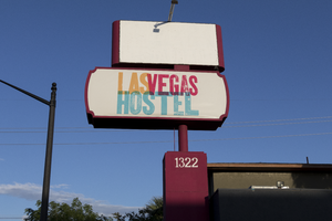
The Las Vegas Hostel sign sits at 1322 East Fremont Street in Downtown Las Vegas. Information about the sign is available in the Southern Nevada Neon Survey Sheet.
Site address: 1322 E Fremont St
Sign owner: Downtown Lodging LLC
Sign details: This building was originally constructed in 1973 for commercial living accommodations and motel purposes. Previous to the Las Vegas Hostel opening in late 2014/early 2015 it was USA hostel whom used the sign box that the Las Vegas Hostel currently uses today. They have 38 rooms of different variety and 158 beds as a cheaper option that the hotels. They also offer packages to do tours of surrounding places such and the Grand Canyon and the Hoover Dam. They also claim to be the only Hostel in Las Vegas with a pool.
Sign condition: 4.5- The sign box was recently repainted and the plastic portion of this sign is relatively new and both still are in good condition
Sign form: Pylon
Sign-specific description: This sign has a reddish/pink steel beam base. There are two sign boxes the top one is a rectangle shape and the bottom one is a oval-rectangular shape. Currently the top rectangle box does not have any signage in it but if it did it would be a plastic or steel sign that would be down lit by an LED spotlight. The bottom one has a plastic back lit sign with the hostel's logo. Their logo entails "Las Vegas Hostels" in modern bright colored block fonts. The "Las" letters are a bright orange, the "Vegas" letters are a magenta pink, and "Hostels" in a bright light blue.
Sign - type of display: Plastic Back lit sign
Sign - media: Steel and Plastic
Sign - non-neon treatments: LED and Plastic back lit signage
Sign environment: On the Intersection of East Fremont St and 14th street. A few blocks from the Fremont East District but is in a neighborhood with many different motels though many of them are currently closed
Sign - date of installation: The sign boxes have been up like this since at least 2007 but with different logos within the sign boxes
Sign - date of redesign/move: Late 2014/ early 2015 they repainted the beam and boxes of the sign and inserted the Las Vegas Hostel logo.
Sign - thematic influences: Since this sign was re-purposed and redesigned it shows how Vegas is constantly changing but can reuse old signs from previous properties.
Sign - artistic significance: The bright colors in the sign show that they are going for a modern vibe which works since they opened in the past few years and have events such as pool parties that appeal to the youth that comes through Vegas.
Survey - research locations: Las Vegas Hostel Website http://lasvegashostel.net/en_US/rooms/, Assessor's page, google maps satellite and roadside view
Surveyor: Emily Fellmer
Survey - date completed: 2017-09-09
Sign keywords: Plastic; Backlit; Steel; Pole sign
Mixed Content
Photographs of Octapharma Plasma sign, Las Vegas (Nev.), March 3, 2017
Date
2017-03-03
2017-09-02
Archival Collection
Description
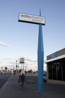
The Octapharma Plasma center sits at 1732 Fremont Street in Downtown Las Vegas. Information about the sign is available in the Southern Nevada Neon Survey Data Sheet.
Site address: 1732 Fremont St
Sign owner: Octapharma Plasma Inc.
Sign details: The original construction year of the building is 1977. This located opened as an Octapharma plasma donation facility in 2010. Octapharma was created by Wolfgang Margurre in Switzerland in 1983 to create plasma products to help save lives.
Sign condition: 4-Relatively recent renovation of their roadside sign and their entrance sign still has bright colors
Sign form: Roadside sign and entrance sign
Sign-specific description: The roadside sign is a long thin steel rod coming out of the ground with a sharp tip. (almost looks like a big toothpick coming out of the ground) This portion of the sign used to be red from the previous owners of this property when it was named "Pyramid". After 2011 Octapharma had this portion of the sign painted blue for them. Close to the sharp tip of this sign there is a sign box that holds plastic backlit signs. For Octapharma it is a white plastic background with blue "Octapharma Plasma" in block type letters. Above their entrance they have blue plastic channeled letters spelling out "Octapharma Plasma" which is backlit making it illuminate blue at night.
Sign - type of display: Back lit plastic sign
Sign - media: Steel and plastic
Sign - non-neon treatments: LED and Plastic back lit signs
Sign environment: This property is far East Fremont on the intersection of Bruce Street which is about a block from the main intersection of Eastern and Fremont St. This location has many motels surrounding it as well as some convenience stores.
Sign - date of installation: Main roadside sign was repurposed for Octapharma around 2010 so this sign does date back to at least 2007
Sign - date of redesign/move: Roadside Sign redesigned for Octapharma around 2010, with repainting the red portion of the roadside sign blue.
Sign - thematic influences: This style of sign is very similar to the sign that PublicUs has which is just about a block West of this company. These signs are similar with both being re-purposed and repainted when their company started to use their sign as well as the thin steel base and the back lit plastic sign.
Survey - research locations: Assessor's page, Octapharma website http://octapharmaplasma.com/donor/center/18536 , google map satellite and roadside view for images and transition of signage
Survey - research notes: Octapharma has research and donation centers in 113 countries to help create plasma based medicine to help cure people with immune disorders, as well as burn victims.
Surveyor: Emily Fellmer
Survey - date completed: 2017-09-02
Sign keywords: Plastic; Backlit; Steel; Roadside; Building-front design; Pole sign
Mixed Content
Photographs of Vegas Motel sign, Las Vegas (Nev.), March 3, 2017
Date
2017-03-03
2017-09-29
Archival Collection
Description
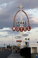
The Vegas Motel sign sits at 2212 East Fremont Street in Downtown Las Vegas. Information about the sign is available in the Southern Nevada Neon Survey Sheet.
Site address: 2212 Fremont St
Sign details: This motel was not found on the Assessor's page so there was not a record found on when the building was constructed. In between April of 2014 and May of 2015 the building was demolished though the signs still remain.
Sign condition: 3- Paint is still relatively nice on the sign but now there are just remains of lightbulbs/neon tubing.
Sign form: Pylon and a roadside directional sign
Sign-specific description: The main pylon is a rectangular beam with light blue paint at the bottom and white on top that has incandescent light bulbs. In the middle of the sign there are horizontal MOTEL white block font letters with each letter in an individual red circle as well as the letters outlined in skeletal neon. There is a red arch coming out of the letter M and ending over the letter L, and this arch goes to the top of the sign. Above the letters is a blue curvilinear sign box with a plastic back lit sign that has blue letters stating VEGAS. On the top of the sign is a white star burst. There also is a smaller roadside directional sign to the west of the main sign that has a white board painted with red letters stating Vegas Motel there is a big curved red arrow also on this one pointing to where they would have entered the driveway.
Sign - type of display: Neon, incandescent light bulbs and plastic back lit sign
Sign - media: Steel and plastic
Sign - non-neon treatments: Plastic back lit sign and incandescent light bulbs
Sign animation: Possibly once had a flasher for the incandescent light bulbs, but can not be determined because there are just remains of the light bulbs currently.
Sign environment: This location was on East Fremont near Eastern Ave where many other motels used to stand, but many have been demolished. Many of the signs of these motels though are still up on though they are not all in working condition.
Sign - thematic influences: This sign has remnants of Googie styles with the star as well as the arch portion of the sign.
Sign - artistic significance: The starburst on top is very similar to the star on Betty Willis Welcome to Fabulous Las Vegas sign.
Survey - research locations: Google map satellite and roadside view. Attempted assessor's page, UNLV special collections and Stephanie Roadside, as well as Vintage Las Vegas but no records found.
Survey - research notes: This location was very difficult to research since the building is no longer there as well as that if you search Vegas Motel into a database to research nearly every motel in Vegas shows up, but also nothing was found for this one.
Surveyor: Emily Fellmer
Survey - date completed: 2017-09-29
Sign keywords: Pylon; Neon; Incandescent; Steel; Plastic; Backlit; Flashing; Roadside; Pole sign
Mixed Content