Search the Special Collections and Archives Portal
Search Results
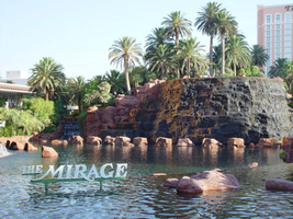
Photographs of Mirage signs, Las Vegas (Nev.), 2002
Date
Archival Collection
Description
Site name: Mirage (Las Vegas, Nev.)
Site address: 3400 S Las Vegas Blvd
Sign owner: MGM Mirage
Sign details: The main attraction of the property is its spectacular exploding volcano placed among an astounding array of lagoons, waterfalls and palm trees. One of the themed hotel casinos, the architectural form takes precedence over an abundance of flashing lights and neon. Two pylon signs reside on the front of the property along Las Vegas Blvd, another on the west side of the property, two arched banner entrances are placed among them, lettering atop the towers, and various text placed among the vast stretch of landscaping are the only visible large elements of signage.
Sign condition: Structure 5 Surface 5 Lighting 5 The structure and lighting on the signs are in excellent repair, with no apparent major physical damage. The surfaces of the pylons and assorted log text, are a bit dirty, but no more than any other establishment, considering the punishment each must undergo due to the elements as well as the live volcano.
Sign form: Pylon; Fascia; Porte-cochère
Sign-specific description: Just north of Caesars Palace a giant pylon sign faces north/south, on the east side of the strip. Two giant square posts support a giant backlit advertisement panel, and an adorning entablature containing the channel letters spelling "Mirage." Between the two giant legs two cabinets are present to fill the space. Just below the main backlit panel an LED screen resides just above another back lit panel. The two giant legs have a series of polished metallic panels running vertically up the sides, creating a recessed channel. The sections are separated with slight overhangs. The bottom smaller panel cabinet is an advertisement for "Danny Gans" and the main panel advertises for the "Seigfried and Roy" magic show. A small banner rests between the main entablature, and the panel, reading "Magicians of the Century." The black channel letters in the main pediment spells "The Mirage," and are filled with incandescent bulbs. The lush foliage and walkways continue north where a covered awning faced with a carved wood and brass bullnose, allows pedestrians to take a moving walkway up to the resort. The landscaping continues north where it meets a driveway denoted by a low arched banner supported by a pair of square columns on either end. "The Mirage" is spelled in polished gold channel letters, with white interiors and filled with incandescent bulbs. The banner itself is sculpted into two sweeping solid shapes on the tops and bottoms, with a series of folded ribbon like scroll shapes. The center section is crafted as to allow light to pass through the negative spaces created by the rows of positive scroll shapes. The banners face east. On the faces of each of the flanking posts, two images of jumping dolphins are sculpted and finished in the same fashion. Past the gateway the thick beds of foliage and palm trees can be seen headed back along the drives. Continuing north a multi tiered lagoon rushes circulating water on and over waterfalls, while yet more green shrubbery and palm trees encrust islands and images of eroded rocks and geological formations. The beautiful imagery continues north, twisting and turning in and behind itself to create a fantastic spectacle for a passerby to be lured in and be fascinated. Approximately in the middle of the length of the expanse, the famous functioning volcano rests quietly amongst smaller rocks and waterfalls. Just past the volcano the lagoon opens up into a wide flat area of water where bronze dolphins are positioned to look as if they are jumping out of the water. Still the rich foliage dominates the landscape, until another arched gateway interrupts the expanse to allow traffic. The foliage, and lagoon landscaping, picks up again, cozily grasping the base of a smaller pylon of similar design as the first. The two reflective paneled legs rise up to connect with a horizontal piece of the same design. A large backlit cabinet advertising for Danny Gans occupies approximately three-quarters of the space between the legs. An entablature of the same design as the main pylon, yet smaller, crowns the top of the sign. The trademark font spells "The Mirage" in black channel letters and filled with incandescent bulbs. Just past the small double sided pylon, a small of recess of rocks plays home to the end marker of the Mirage. A bust of Siegfried and Roy with a tiger is ambiently lit, provided photo opportunities for tourists. An interesting function has been added to the bust. In the flower bed behind and on the sides of the object, faux boulders are places with glowing crystals protruding from the surface. The tower of rooms for the Mirage is the popular three winged "Y" configuration converging onto a center structure. On each face of each wing, giant black channel letters spell "The Mirage" in their trademark text. Each is filled with incandescent bulbs.
Sign - type of display: Neon; Incandescent; Backlit
Sign - media: Steel; Plastic
Sign animation: Oscillating
Notes: The incandescent bulbs located within text logos on the pylon sign, and upon the tower oscillate to appear as shimmering. The effect is one of the more common animations particularly among the larger, corporate casinos.
Sign environment: The placement of the Mirage right on the curve of the Strip makes the pylons visible from a good distance from either direction. The environment displayed by the mirage is that of paradise. When walking past, and up to the property, it hard not to stop and stare at the amazing foliage and spread of waterfalls, and rocks.
Sign manufacturer: Ad-Art
Sign designer: Pylons: Charles Barnard with touches from Wynn's design group Atlandia Design Group. Dolphin Archways: Barnard and Jack Dubois as well as hotel architect, Joel Bergman
Sign - date of installation: 1989
Sign - date of redesign/move: The main pylon has since been updated with a new Siegfried and Roy Back lit Mural, a new LED screen, and another back lit plastic screen featuring Danny Gans. An internally lit banner reads horizontally across the top of the giant Siegfried and Roy Mural which reads Magicians of the Century.
Sign - thematic influences: The theme is tropical island paradise. Complete with active volcano, the front spectacle of rushing waterfalls, chirping bird noises, and leaping bronze dolphins, serves as the backdrop for the simple, slim design of the property's pylon structure. The pylons were designed to reach harmony with the structure of the tower itself, rather than the island theme. The dolphins over the entrance arches however represent the tropical island theme, as well as speaking about the dolphin habitat inside.
Sign - artistic significance: The main pylon was the first of its kind to feature a full color illuminated photographic pictoral. Designed by Rosco, it was billed as the largest of its type in the world. The resort's themed spectacular was also the first of it's kind in regards to its extravagance and unique functionality. Approximate 125,000 people visited the property on its opening day. The resort fits well into the theme of design of the large, corporate property, after all it was one of the pioneers of such a movement in Las Vegas. The Mirage also set the standards for the now frequently seen element of the attraction spectacle, and the standard of quality on the Las Vegas Strip
Surveyor: Joshua Cannaday
Survey - date completed: 2002
Sign keywords: Oscillating; Pylon; Fascia; Porte-cochère; Neon; Incandescent; Backlit; Steel; Plastic
Mixed Content

Brian Greenspun interview, 2018: transcript
Date
Archival Collection
Description
Interviewed by Barbara Tabach. Publisher of Las Vegas Sun, child of Hank and Barbara Green. Part 1 Subjects: Las Vegas Sun, Greenspun family, Israel gun running; Part 2 subjects: Journalism importance, Las Vegas Sun, Watergate tie-in with Hank's safe, October 1 shootings reflections; Part 3 subjects: Hank and Barabara Greenspun. Talks about Jewish visionaries of Las Vegas that includes Art Marshall, Jack Entratter, Sheldon Adelson, Nate Mack; Part 4: Interviewed by Barbara Tabach. Las Vegas Sun newspaper publisher and native Las Vegan talk about events and people from Las Vegas' years of him growing up. From watching pink smoke from test site to hanging out with friends in the John S. Park neighborhood to racial riot of 1969 to playing golf as a kid.
Text

Transcript of interview with Dr. Harrie Fox Hess by Scot Siegel, February 26, 1979
Date
Archival Collection
Description
On February 26th, 1979, Scot Siegel interviewed his psychology professor, Dr. Harrie Hess (born March 1, 1929 in Hammond, Indiana) in his office at the University of Nevada, Las Vegas. Dr. Hess discusses his family’s reason for moving to Nevada and how he felt as a young adult moving to Las Vegas. The two go on to talk about Dr. Hess’ contributions to Nevada through his work as a psychologist, and briefly mentions the first law to be drafted on psychology certification in Nevada. Dr. Hess then describes the Wild Cat Lair as an important site of social recreation for early Las Vegas youth. The interview concludes with his memory of Boulder (Hoover) Dam and how he believes that workers from the Great Depression paved the way for industrial success in gambling due to their employment on the Dam.
Text
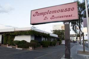
Photographs of Pamplemousse Le Restaurant, Las Vegas (Nev.), March 3, 2017
Date
Archival Collection
Description
Site address: 400 E Sahara Ave
Sign owner: Georges La Forge
Sign details: Just a block away from the Strip, this French restaurant, which the name means "grapefruit" in French, has been a mainstay in Las Vegas for over forty years. Georges La Forge has created a wonderful atmosphere set as a "cozy French cottage with Tuxedo-clad waiters" and uses soft candlelight and French music to set the tone of the restaurant. A few of their most popular dishes include Escargots Bourguignonne, Fresh Foie Gras "au Torchon", Breast of Duck & Leg Confit, and Creme Brulee. It has received rave reviews and won many award since they opened in 1976. They have been voted as the "Most Romantic and Best French Restaurant" just to name a few.
Sign condition: 4, the sign is in good condition. It shows some wear from age.
Sign form: Pole sign
Sign-specific description: The sign has a very simple design. It is a pole sign that sits right next to the street; therefore, it is extremely visible for motorists and pedestrians. This is also a back lit sign and the plastic that is used is a soft pink. The sign reads "Pamplemousse Le Restaurant" in a bold, script-style font and maroon color on both sides of the sign.
Sign - type of display: Back lit plastic
Sign - media: Steel and Plastic
Sign - non-neon treatments: Plastic
Sign environment: The restaurant sits just a block away from the Strip. It is near the SLS, the Westgate, and the Stratosphere Hotels as well as the Bonanza Gift Shop. It is also just down the street from another classic Las Vegas restaurant, the Golden Steer Steakhouse.
Sign - date of installation: 1976
Sign - thematic influences: The linkage to the property in this signage is that the text is in French, indicating that is it s a French restaurant. The signage is very modest and straightforward because it just tells you the name of the restaurant.
Sign - artistic significance: The linage to the property in this signage is that the text is in French, indicating that is it s a French restaurant. Other than that the signage is very modest and straightforward because it just tells you the name of the restaurant.
Survey - research locations: Pamplemousse restaurant website http://www.pamplemousserestaurant.com/ , Las Vegas Weekly article https://lasvegasweekly.com/dining/2015/jun/03/rick-moonen-column-pamplemousse-french-restaurant/ , Assessor's Page http://www.clarkcountynv.gov/assessor/Pages/searchbybusinessname.aspx
Surveyor: Lauren Vaccaro
Survey - date completed: 2017-08-27
Sign keywords: Backlit; Plastic; Steel; Pole sign
Mixed Content
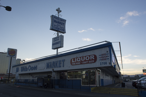
Photographs of White Cross Market, Las Vegas (Nev.), February 15, 2017
Date
Archival Collection
Description
Site address: 1700 S Las Vegas Blvd
Sign owner: Vickie Kelesis
Sign details: This location opened ca. 1950 as White Cross Pharmacy and remained opened until around 2013. This location transitioned in between 2013-2015 into the White Cross Market. The Diner attached to Market has been open since 1952. This is considered one of the oldest standing diners in Las Vegas. The Diner was originally named Tiffanys Diner , but in 2014 it changed ownership from Pete Kelesis to his Daughter Vickie Kelesis who Renamed it Vickies Diner.
Sign condition: 3-4- has had some fading and weathering over the years
Sign form: Pylon and building sign.
Sign-specific description: Blue lettering on a white background on the Building. Pylon has a white cross topping the sign, as well as blue lettering and white plastic back lit sign as the background. There are lights down lighting the building and pylon sign.
Sign - type of display: Plastic back lit sign and down lighting
Sign - media: Steel and plastic
Sign - non-neon treatments: No neon was seen on the sign, and was mostly spotlit
Sign environment: This location is a few blocks north of the Stratosphere on Las Vegas Blvd. as well as a few blocks south of where Dino's Lounge is. This is located in between the Strip and the Downtown area.
Sign - date of installation: The owner stated that the signage on the building as remained nearly unchanged since circa-1955.
Sign - date of redesign/move: The plastic back lit portion of the pylon has changed a few times.
Sign - thematic influences: Since the signage for the White Cross Market is still up even though the company has shut down shows the importance of this property for its history and admiration from the community.
Survey - research locations: Visit to Vickies Diner and discussion with the owner. Las Vegas Weekly https://lasvegasweekly.com/as-we-see-it/2014/nov/19/tiffanys-cafe-now-vickies-diner-downtown-landmark/, assessors, and recorders office.
Survey - research notes: From the discussion with the owner: The diner has been open for 65 years, making it the oldest diner in Las Vegas. Elvis, Frank Sinatra, Liberace, and many more celebrities would frequent the Pharmacy and the diner. The Pharmacy was first 24/7 pharmacy in Las Vegas.
Surveyor: Wyatt Currie-Diamond
Survey - date completed: 2017-08-11
Sign keywords: Steel; Plastic; Backlit; Building-front design; Pole sign; Back to back; Roof Sign
Mixed Content
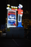
Photographs of Pabst Blue Ribbon sign, Las Vegas (Nev.), June 28, 2017
Date
Archival Collection
Description
Site address: Fremont St and Las Vegas Blvd
Sign owner: PBR Donated, but a part of Fremont Street East
Sign details: PBR held a revealing party when installed in 2015, right next to The Park on Fremont. YESCO manufactured the 30 feet tall sign is nicknamed Cool Blue. Previous to this sign in this location the Maharaja Hookah Cafe had their signage in the same location previous to 2013.
Sign condition: 5, just installed in 2015 so neon and paint are still in great condition
Sign form: Free Standing Sign
Sign-specific description: 30 feet tall, the sign is nicknamed Cool Blue. A 30 foot waiter holding his arm out with 3 beers on his arm and one in his hand. The beers are animated with them lighting up in order starting with the one closest to his body. His arm is resting on a PBR can. The waiters shirt and cheeks illuminate red neon while the rest of his body illuminates blue argon. The PBR beer can illuminates red and blue as well.
Sign - type of display: Neon
Sign - media: Steel
Sign animation: The Beer cans on the waiters arm light up in order, starting with the one closest to his body.
Sign environment: This is located in the parking lot on the corner of Las Vegas Blvd. North and Fremont St. East next to the Park on Fremont. This marks the beginning of the Fremont Street East District were other freestanding Neon signs are as well.
Sign manufacturer: YESCO
Sign - date of installation: 2015
Sign - thematic influences: The retro theme makes it look like a throwback to 1950s/60s advertisement. Also since it is for a beer company it shows that Neon does not always have to be for the Casinos here in Vegas. This is one of the first freestanding signs you see in the Fremont Street East District, thus showing that the Neon community downtown still is thriving and still defines our culture here.
Survey - research locations: YESCO website http://www.yesco.com/news/yesco-installs-pabst-blue-ribbon-neon-sign/ , Vital Vegas website https://vitalvegas.com/downtowns-fremont-east-gets-a-new-neon-sign-courtesy-of-pbr/ , google map roadside view
Survey - research notes: Since this is a freestanding sign it is difficult to find any specific information on a single owner or why this sign was placed there specifically.
Surveyor: Emily Fellmer
Survey - date completed: 2017-07-22
Sign keywords: Neon; Steel; Back to back; Monument sign
Mixed Content

Photographs of Downtowner Motel sign, Las Vegas (Nev.), June 28, 2017
Date
Archival Collection
Description
Site address: 129 N 8th St
Sign owner: Robert and Ada Cohen
Sign details: Original Construction year of this building was 1935 and maintains the Art Deco design to the building. This location was originally built for a motel or apartments, but has mainly been used for motels since its construction.
Sign condition: 5- In great condition and looks as though it may have been restored or repainted recently because of how good it looks
Sign form: Double sided Porte Cochere (Facing both sides of the street)
Sign-specific description: This sign is above their two story building, as used as a directional sign for the tunnel passageway to the parking lot since there is a linear arrow pointing diagonally from the top of the sign to where the drivers would need to go. This arrow is lined with chasing incandescent light bulbs. To building side of the arrow there is a long thin red parallel trapezoid that spells out "MOTEL" in a painted white block font that is lined with Skeletal Neon that illuminates red at night. Underneath this one about a foot down is another long thin red parallel trapezoid that has white painted letters stating "Downtowners APTS." the downtowner part is a cursive font that illuminates blue at night,a and the Apts. part is in block letter that illuminates red at night.
Sign - type of display: Neon and incandescent light bulbs
Sign - media: Steel
Sign animation: Chasing
Notes: incandescent light bulbs
Sign environment: This location is on N 8th Street just a few blocks north of the Fremont Street East District, but near Ogden.
Sign - date of installation: Roadside Architecture website http://www.roadarch.com/signs/nvvegas2.html says it has been there since at least the mid 1960's
Sign - thematic influences: This sign is remnant of the vintage motorcade motel signs that one could see along any highway during the traveling era of the 50's/60's.
Sign - artistic significance: The arrow is reminiscent of the 1950's/60's directional arrows.
Survey - research locations: Assessor's Page, Roadside Architecture http://www.roadarch.com/signs/nvvegas2.html , Downtowner Motel website http://downtownerlv.com/
Survey - research notes: The building showcases remnants of Art deco style and mid-century modern architectural styles. The panels in between the doors/windows have the art deco design and then the canopies above the windows and doorways have a mid-century modern curvilinear canopies.
Surveyor: Emily Fellmer
Survey - date completed: 2017-09-06
Sign keywords: Neon; Incandescent; Steel; Chasing; Directional; Pole sign
Mixed Content

Photographs of Vanguard Lounge sign, Las Vegas (Nev.), June 28, 2017
Date
Archival Collection
Description
Site address: 516 Fremont St
Sign owner: Andrew and Jennifer Wheatley
Sign details: The building was originally constructed in 1951. Previously to the lounge opening it was Fremont Street Guitars. Andrew and Jennifer Wheatley opened the lounge in 2010 after 30 years of experience together in the industry. This trendy bar has Modern-Industrial Decor, as you can see with their black building with a glass garage door entrance.
Sign condition: 5- newer sign that lights up brightly at night
Sign form: Hanging sign
Sign-specific description: Right above the entrance is a black canopy, but at night a white neon tube illuminates the perimeter of the canopy. The canopy also showcases their street address 516 in white channeled numbers. Above the canopy there is a beam which acts as a support for their main sign. Their main sign is a black rectangle which is also attached to the building. The sign states Vanguard Lounge in white skeletal neon letters. The word Vanguard is in a thick block-type print letters. Lounge is written in a smaller but similar type-font.
Sign - type of display: Neon
Sign - media: Steel
Sign environment: This is located in the Fremont East district in between Las Vegas Blvd. and 6th St. This locations storefront is located in between the Therapy restaurant and Red dance club (used to be the old Coin Insert bar).
Sign manufacturer: Valley Signs and Lighting
Sign - date of installation: 2010
Sign - date of redesign/move: Vanguard used the old sign box that the previous company used and added their logo in neon in 2010.
Sign - thematic influences: The skeletal neon showcases a simple yet classic design. It also showcases the Modern trendy vibe.
Sign - artistic significance: The sign does have a modern vibe but is staying true to the Neon culture of downtown.
Survey - research locations: Vanguard lounge website http://www.vanguardlv.com/vanguard_lounge_venue , Las Vegas Sun https://lasvegassun.com/news/2010/sep/20/vanguard-lounge-opens-fremont-street/ , Assessor's page
Survey - research notes: Definition of Vanguard is a group of people leading the way in new developments/ideas. This is possibly alluding to their theme of being different than the other bars downtown. Coincidentally there was a dance club in L.A. also called Vanguard, but no connection found between the properties besides their modern dance vibes.
Surveyor: Emily Fellmer
Survey - date completed: 2017-08-11
Sign keywords: Neon; Steel; Hanging; Pole sign; Roof Sign
Mixed Content
Olivia Diaz (City of Las Vegas Councilwoman) oral history interview conducted by Magdalena Martinez: transcript
Date
Archival Collection
Description
From the Lincy Institute "Perspectives from the COVID-19 Pandemic" Oral History Project (MS-01178) -- Elected official interviews file.
Text

