Search the Special Collections and Archives Portal

Search Results

Displaying results 18791 - 18800 of 19618

Transcript of interview with Robert Gore by David Emerson, January 31, 2008

Date

2008-01-31

Description

Robert Gore first came to Las Vegas in 1973 as a public affairs officer with the Air Force. He returned to West Virginia to go into the family business in 1976 and four years later was offered a job with Summa Corporation. Back in Las Vegas, he also served as director of the Air Force Association. At a dinner meeting of the Association, Retired General Bill Becker suggested that an engineering school was needed at UNLV. Bob and the Air Force Association put together a group called FORGE, whose primary purpose was to promote a school of engineering. Bob Gore, Dave Broxterman, John Heilman and others began researching the idea of building an engineering school. They drew the interest of people at the Test Site, Nellis Air Force Base, and PEPCON, and put together a slide show and a binder full of research data. Bob and Dave presented their information to the Nevada Development Authority and Nevada legislators, and started a grassroots campaign to enlist the support of the people of Nevada. Bob gives details on the efforts that FORGE and many other individuals made on behalf of the engineering school. He takes readers into the myriad meetings that were held and the important associations that were forged with people like Tom Beam Lawrence Livermore Laboratories, the DOE, Jim Cashman, Mary Hausch of the Las Vegas Review Journal, Channel 3, Bob Thomas, and numerous others. The interviewer, Dr. David Emerson, was involved in this effort as well, and shares anecdotes concerning donations from a mining company and Reynolds Electrical and Engineering Company. Today Bob is working with a real estate company in Las Vegas. Twenty-some years later, he still recalls the hard work and dedication of people like Benet Stout, on loan from Senator Chic Hecht's staff, the legislators who unanimously cosponsored the bill initiating the building project, and the original FORGE group who gave their all to the idea of a school of engineering at UNLV.

Text

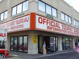
Photographs of Official Tourist Bureau and Viva Vegas Gifts signs, Las Vegas (Nev.), 2002

Date

2002

Description

Daytime views of the Official Tourist Bureau and Viva Vegas Gifts signs on the Strip. Information about the sign is available in the Southern Nevada Neon Survey Data Sheet.
Site address: 3734 S Las Vegas Blvd
Sign details: The signage of the property is a wrapping fascia of horizontal message boards, which advertise for the businesses present. The building is a two story complex on the west-side of Las Vegas Blvd, facing east with a small parking lot along the front and on the south sides. The signage is present on the south and east walls. The signage acts as an artificial marker denoting the difference between the row of doors and wall size windows below, and the large panes of glass and tan stucco finish of the upper level.
Sign condition: Structure 4 Surface 3 Lighting 3
Sign form: Fascia
Sign-specific description: The advertisements are broken up into two distinct sections, but are treated aesthetically the same to retain the continuity of the property. The first is a red steel cabinet, which wraps the southeast corner. The faces of the east and south sides are bordered with aluminum, gold polished raceways, lined with incandescent bulbs. The backlit panels possess text which occupies the majority of the white surface. In red text, both of the sides read, "Official tourist bureau," above "Information-reservations." On the east side of the building above the cabinet, two tan horizontal steel boxes, support green channel letters that read in two lines, "Official," then "Tourist Bureau." Above the south face of the signage two separate sections of the green text read "Information" on the left side of the sign, and "Reservations" on the right hand side. They are treated the same as the previous text on the east face, with letters that possess green neon on the interior, and are in all caps. Further north, on the east face of the building, is another cabinet. This sign is only one side, occupying the flat plane of the remainder of the east face of the building. It too is a red steel cabinet with a back-lit face. On the left hand side of the face the two lined text reads "Viva Vegas," a top the word "Gifts." The second line of the text is flanked on either side by red graphic images of diamonds. The right hand portion of the sign reads prices for T-shirts and souvenirs, in black, blue and red text.
Sign - type of display: Neon; Incandescent
Sign - media: Steel; Plastic
Sign animation: Chasing
Notes: The incandescent bulbs which surround the cabinets chase each other.
Sign manufacturer: YESCO
Surveyor: Joshua Cannaday
Survey - date completed: 2002
Sign keywords: Chasing; Fascia; Neon; Incandescent; Steel; Plastic

Mixed Content

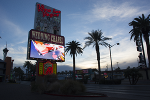
Photographs of Viva Las Vegas Wedding Chapel sign, Las Vegas (Nev.), February 8, 2017

Date

2017-02-08
2017-08-05

Description

The Viva Las Vegas Wedding Chapel sign sits at 1205 Las Vegas Boulevard South. The chapel has provided themed weddings since 1999. Information about the sign is available in the Southern Nevada Neon Survey Data Sheet.
Site address: 1205 S Las Vegas Blvd
Sign owner: Ron Decar And Jamie Richards
Sign details: The building was constructed in 1950. This location was originally The Thunderbird Lounge. In 1999 it was bought by Ron and Jamie to be the Viva Las Las Vegas Wedding Chapel.
Sign condition: 4- still in good condition, paint is still bright
Sign form: Pylon
Sign-specific description: This sign showcases a pink and white color scheme. The sign has a caricature of Elvis, as well as other caricatures surrounding him. The words Viva Las Vegas are in pink channeled neon letters. This sign also has a video screen marquee. Underneath the video screen is sparkling incandescent light bulbs contained in channeled letters stating "Wedding Chapel". This sign also has a plastic back lit signs that advertises themed weddings and themed rooms.
Sign - type of display: Neon, Incandescent light bulbs, plastic back lit and video screen display
Sign - media: Steel, plastic and media screen.
Sign - non-neon treatments: Plastic back lit section and Video Display screen.
Sign animation: Flasher for incandescent light bulbs
Sign environment: This location is on South Las Vegas Blvd. in between Downtown and the Strip. This chapel is next to a Super 8 motel, a couple blocks from the Little White Wedding Chapel, across the street from two Hostels.
Sign manufacturer: Thompson Neon Sign Company and Hyoco Sign Company(the Video board display)
Sign - date of installation: 2000
Sign - date of redesign/move: 2004 video screen added
Sign - thematic influences: This sign showcases Vintage Las Vegas themes with Elvis and his relation to Vegas particularly with the name of the chapel and his caricature on the sign.
Survey - research locations: Assessor's Page, Viva Las Vegas Wedding chapel website http://www.vivalasvegasweddings.com/ , Email correspondence with Blaze Linn(wedding Coordinator)
Surveyor: Wyatt Currie-Diamond
Survey - date completed: 2017-08-05
Sign keywords: Flashing; Incandescent; Plastic; Backlit; Neon; Pylon; Steel; Video screen; Chasing; Back to back; Paint

Mixed Content

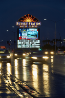
Photographs of Sunset Station signs, Henderson, (Nev.), February 2017

Date

2017-02-18
2017-02-19
2017-09-16

Description

The Sunset Station Hotel and Casino sits at 1301 West Sunset Road as evening traffic passes by. Information about the sign is available in the Southern Nevada Neon Survey Data Sheet.
Site address: 1301 W Sunset Rd
Sign owner: Sunset Station Inc
Sign details: Original construction 1996. opened June 10th 1997, 74.75 acre lot
Sign condition: 5 - great condition, kept up with no broken lights
Sign form: Animated Back to Back Monument Sign
Sign-specific description: Has the words "Sunset Station Hotel Casino" in animated boxed under a setting sun which is framed, the wording lit with incandescent bulbs. The frame has chasers to draw attention and bright neon filling in the sun with neon flashing on and off starting from the middle then spreading out into the rays of the sun with mixed colors of red, white, yellow and orange. The blocks that the casino name sets in, blue neon flash on and off as well like the chasers but glow a bright blue, also framed with chaser bulbs as well. There is also a tv screen under the decorative topper of the sign, then a reader board underneath the tv screen which is internally lit.
Sign - type of display: Neon and incandescent, TV screens
Sign - media: Steel, Plastic
Sign animation: Neon flashing on and off, Chasers, TV screen
Sign environment: Sunset Station is surrounded by shopping centers
Sign - date of installation: c. 1997
Sign - artistic significance: Design inspired by Spanish avant-garde architect Antoni Gaudi.
Survey - research locations: Las Vegas Sun, Neon Museum archives
Survey - research notes: https://lasvegassun.com/news/2017/jun/26/how-sunset-station-changed-the-scene/ - Las Vegas Sun Article of 20th Anniversary of Sunset Station
Survey - other remarks: In 1998, the casino announced a $45 million expansion to add 20,000 square feet, 11 movie screens, a steakhouse, a food court, meeting rooms and a parking garage. In 2005, it opened a bowling alley called Strike Zone that featured 72 lanes and cost $25 million to build. In 2016, it renovated its tower and upgraded many of its suites and rooms.
Surveyor: Danny Jacobs
Survey - date completed: 2017-09-16
Sign keywords: Neon; Incandescent; Steel; Plastic; Flashing; Chasing; Back to back; Video screen; Pylon; Reader board

Mixed Content

Photographs of Casa Malaga signs, Las Vegas (Nev.), 2002

Date

2002

Description

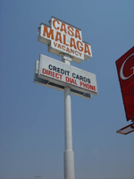
Daytime and nighttime views of the Casa Malaga signs on the Strip. Information about the sign is available in the Southern Nevada Neon Survey Data Sheet.
Site address: 4615 S Las Vegas Blvd
Sign details: The Casa Malaga resides on the east side of the strip, among the decaying roadside motels. The property is in the style of most of the motels in the area. A small office sits up front, with a drive next to it, and leading to a parking lot in the back of the property. The parking lot is surrounded on the east, north, and south sides by one story groups of rooms. The pole sign resides in the front parking lot, next to the street
Sign condition: Structure 2 Surface 2 Lighting 2
Sign form: Pylon
Sign-specific description: The main advertisement for the establishment is the roadside pole sign which faces north /south. It consists mostly of a single white, steel pole with a double-backed steel cabinet. The cabinet is an eight-sided geometric figure, appearing as a swollen cross shape. The middle, horizontal section being larger and wider, than the cross member. The white cabinet is treated with red painted text. The top section reads "Casa," the second "Malaga," and the third reads "Vacancy." All of the texts are in capital letters lined over the contours with bent tubes of neon. Just below the top cabinet, two single-faced cabinets sandwich the pole, facing north/south. The white cabinet with white faces contains vinyl lettering. On the east and west faces of the small office up front, channel letters with clear plastic faces, a gold polished band around the edges, and maroon, and red neon on the interior.
Sign - type of display: Neon; Incandescent
Sign - media: Plastic
Sign animation: Flashing, chasing
Notes: The channel letters which spell motel on the south and west wall of the main office chase. The two signs take turns flashing on, one then the other, as the first shuts off. The incandescent bulbs, which line the bottom of the roofline of the office, chase each other as well.
Sign environment: The Casa Malaga resides between the Little Church of the west and the Glass Pool Inn.
Sign - thematic influences: The only theme present is its significance in design to the classic roadside motel. It falls into this theme seen throughout the southern end of the strip. The tall double-backed pole sign, small front office, and surrounding lengths of rooms, all fit into this motif.
Surveyor: Joshua Cannaday
Survey - date completed: 2002
Sign keywords: Flashing; Chasing; Pylon; Neon; Incandescent; Plastic

Mixed Content

Photograph of Beauty Bar sign, Las Vegas (Nev.), June 28, 2017

Date

2017-06-28
2017-08-14

Description

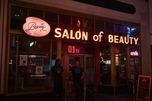
The Beauty Bar sits at 517 Fremont Street in Downtown Las Vegas. Information about the sign is available in the Southern Nevada Neon Survey Data Sheet.
Site address: 517 Fremont St
Sign owner: Darin Feinstein and Corey Harrison (From Pawn Stars)
Sign details: Building originally constructed in 1988 for a retail store. The Beauty Bar franchise was founded in 2004 in New York City. The bar in Las Vegas used to be owned by Paul Devitt, but in 2014 is when Darin and Corey bought it and did some renovations. During the day they offer manicures/pedicures while serving cocktails, but at night function as a bar and concert venue with cool retro 1950s/60s salon style chairs and colors.
Sign condition: 3-4 During the day the sign looks faded and rusted over. At night the light does not beam as if it is a new sign either.
Sign form: Cabinet mounted to building
Sign-specific description: On the building there is a white oval shaped plastic sign saying Beauty Bar. Right above the doors there is a Salon of Beauty in channeled white block type letters. Both signs illuminate pink.
Sign - type of display: Neon and backlit sign
Sign - media: Steel and plastic
Sign - non-neon treatments: Backlit sign in plastic
Sign environment: Located in the Fremont Street East District surrounded by other bars and restaurants.
Sign - date of redesign/move: c. 2014
Sign - thematic influences: The bubbly pink backlit sign almost is the same shape as a painters pallet, so it shows an artsy theme since some consider doing hair and manicures as artwork as well
Sign - artistic significance: The "Salon of beauty" letters each have their illumination contained due to the metal channeling for each letter. The sign does have a retro aspect with their sign not looking totally brand new which extenuates the theme of an old beauty salon that you would see in the 50s or 60s.
Survey - research locations: Beauty Bar Website, accessor's office
Survey - research notes: Paul Devitt, the previous owner, actually started the chain of Beauty Bars in New York in 1995. He still has a part in the ownership in the other location he opened in N.Y., L.A., San Francisco and Chicago.
Surveyor: Emily Fellmer
Survey - date completed: 2017-08-14
Sign keywords: Backlit; Plastic; Steel; Neon; Fascia; Cabinet; Building-front design

Mixed Content

Photographs of Economy Motel sign, Las Vegas (Nev.), April 18, 2017

Date

2017-04-18
2017-09-10

Description

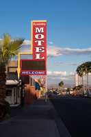
The Economy Motel sign sits at 1605 Fremont Street in Downtown Las Vegas. Information about the sign is available in the Southern Nevada Neon Survey Sheet.
Site address: 1605 Fremont St
Sign owner: Las Vegas Dragon Hotel LLC
Sign details: This building was constructed in 1953 for commercial living and motels and has been used for this since. This location was recently remodeled in 2016. The property previous to the Economy Motel was the Rangler Motel.
Sign condition: 5-looks newly restored
Sign form: Blade
Sign-specific description: The top of the sign is a red rectangular blade with the word "ECONOMY" in white skeletal neon tubes spelt out horizontally. Below the word Economy is the word "MOTEL" spelt out Vertically in channeled white letters with a blue border. Underneath this portion of the sign is a sign box where they have a plastic rectangular sign with their phone number on it. Under the sign box is "WELCOME" painted on the west side of the sign and "BIENVENDIO" on the east side. On the building side of the side box is a rectangular yellow arrow pointing down to the lobby of the motel.
Sign - type of display: Neon and plastic backlit sign
Sign - media: Steel and plastic
Sign - non-neon treatments: Plastic backlit sign
Sign environment: This location is on the East side of Fremont Street located close to many other motels some closed and some still open.
Sign - date of installation: Sign has been up but in a different form since at least 2007
Sign - date of redesign/move: Late 2016/ early 2017 repainted/ restored since it previously said Rangler Motel on the sign (had a plastic cover saying economy over that previous logo for a few years)
Sign - thematic influences: The arrow portion of this sign is a popular 1950's/60's motel sign theme.
Sign - artistic significance: It is a trend down on Fremont to take an old Motel sign and renovate it into the new motel's name and logo.
Survey - research locations: Owner's website http://www.1dragonhotel.com/about_us , assessor's map, Google map satellite view
Survey - research notes: The previous sign for the Rangler motel was repurposed for the Economy Motel, so the same MOTEL blade portion had the same font but channeled neon was added, as well as repainted.
Surveyor: Emily Fellmer
Survey - date completed: 2017-09-10
Sign keywords: Neon; Plastic; Steel; Pole sign; Electronic Message Center

Mixed Content

Photographs of Sterling Gardens sign, Las Vegas (Nev.), March 3, 2017

Date

2017-03-03
2017-08-31

Description

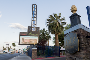
The Sterling Gardens sits at 1808 Fremont Street in Downtown Las Vegas. Information about the sign is available in the Southern Nevada Neon Survey Data Sheet.
Site address: 1808 Fremont St
Sign owner: PROVIEW SERIES 19 LLC
Sign details: 1947 was the original construction year of the building for motel/ commercial living accommodations and has been that since its construction under many different names most recently known as the Bonanza Lodge Motel before the Sterling Gardens renovated and reopened in 2013. This boutique hotel is known for their Western Themed room as well as a retro 1960's themed room as well.
Sign condition: 5 - renovated sign
Sign form: Pylon
Sign-specific description: This roadside pylon has a rectangular base that holds a reader board box that they can add or take out different plastic backlit advertisements. On the back corner of this portion there is a black blade that comes out that has white squares that encase the blue mid century modern font that spell out "STERLING" vertically. On both the left and right side of the "G" there are two blue diamond shapes lined with skeletal neon. Under the vertical letters of "STERLING", horizontally is "Gardens" spelled out in green skeletal neon. Next to the cursive gardens word they have a small red skeletal neon "No Vacancy" sign.
Sign - type of display: Neon and backlit
Sign - media: Steel and plastic
Sign - non-neon treatments: Reader board
Sign environment: On the far East side of Fremont this location is surrounded by many other motels and boutique hotels.
Sign - date of installation: Original from Bonanza - c. 1950s
Sign - date of redesign/move: 2013 when it became the Sterling Gardens
Sign - thematic influences: Since this sign was a repurposed sign it shows how many of the motels on East Fremont have been around since the 40's/50's but have changed names and ownership many times, but they still keep the older signs and just fit it to their own needs.
Sign - artistic significance: The font that they use for the letters "Sterling" is a classic Mid century modern font that you could have seen for an older diner or movie theater/drive in.
Survey - research locations: assessor's website
Survey - research notes: Sterling Gardens Website http://www.sterlinggardenshotel.com/
Surveyor: Emily Fellmer
Survey - date completed: 2017-08-31
Sign keywords: Neon; Backlit; Steel; Plastic; Reader board; Roadside; Pole sign

Mixed Content

Kaku Makino and Masako "Julie" Ishitsuka oral history interview: transcript

Date

2021-03-22

Description

Oral history interview with Kaku Makino and Masako "Julie" Ishitsuka conducted by Kristel Peralta, Vanessa Concepcion, Ayrton Yamaguchi, and Stefani Evans on March 22, 2021 for the Reflections: The Las Vegas Asian American and Pacific Islander Oral History Project. In this interview, Makino discusses his early life in Tokyo, Japan and becoming a chef. He recalls arriving to the United States in 1989, establishing the Todai (now Makino Sushi & Seafood Buffet) restaurant chain, and opening nineteen locations in California, Florida, and in Hawaii. Kano talks about her upbringing in Otsu, Shiga Prefecture, Japan and describes Japan during the Meiji era. She remembers arriving to Las Vegas, Nevada in 2000 and the cultural change she experienced. Lastly, Makino and Kano discuss the restaurant industry during the COVID-19 pandemic.

Text