Search the Special Collections and Archives Portal
Search Results
"Arizona: The Martin Luther King Holiday": paper by Roosevelt Fitzgerald
Date
Archival Collection
Description
From the Roosevelt Fitzgerald Professional Papers (MS-01082) -- Unpublished manuscripts file. Presented at 5th Annual West Coast Meeting of National Social Science Association, Scottsdale, Arizona.
Text
"An Impact of the Moulin Rouge Hotel on Race Relations in Las Vegas": paper by Roosevelt Fitzgerald
Date
Archival Collection
Description
From the Roosevelt Fitzgerald Professional Papers (MS-01082) -- Unpublished manuscripts file. Presented to the National Social Science Association, Reno, Nevada.
Text

Ellen Barre Spiegel interview, December 4, 2017: transcript
Date
Archival Collection
Description
Ellen Barre Spiegel grew up in Jericho NY, a predominantly Jewish town in Long Island. Her ancestors had migrated to the United Sates prior to the outbreak of World War II. And for much of life her exposure to cultural diversity was limited. Ellen was born in 1962. She attended Cornell University, located in upstate New York, and graduated in 1984. Though the student population was 30% Jewish, the university expanded her knowledge of the world: her Protestant roommate explained that she had never met a Jew and Ellen replied, I have never met a WASP. Her college studies centered on consumer economics and she was a public policy major. Ellen was an early adopter of technology and her career path included positions at American Express, Prodigy (a joint venture of IBM and Sears), the Weather Channel, and Manufacturers Hanover Trust. Each company used her increasing experience with using technologies to improve connections with consumers. Ellen describes her Jewish identity as conservative and is a member of Midbar Kodesh Temple in Henderson. She talks about her bat mitzvah and her move back to New York to recite the mourner’s Kaddish for the year following the passing of her father. Later, she moved to Santa Monica, where she met Bill, her husband, using a new dating site called Luvitt AOL. After marriage, the couple saw financial advantages to living in Las Vegas and relocated their business and home to the valley in 2001. Soon Ellen noted that there was no active Democratic Club in Henderson and it became her mission to reignite the club. This launched a long list of political and civic accomplishments for Ellen. She has been an assemblyperson in the Nevada legislature (2008, 2013-2017). Her list of accomplishments and affiliations are on pages 46-47.
Text
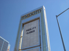
Photographs of Maxim signs, Las Vegas (Nev.), 2002
Date
Archival Collection
Description
Site address: 160 E Flamingo Rd
Sign owner: Premier Interval Resorts
Sign details: The Maxim is located just east of the Bourbon Street, in close proximity to Bally's Hotel Casino. The Maxim is no longer operating, and is fenced off from further inspection. The signage that is seen entails building signs, the original pylon, and the porte cochere
Sign condition: Structure 2 Surface 2
Sign form: Pylon; Fascia; Porte-cochère
Sign-specific description: Building: The tower itself contains the logo and giant text spelling the name of the establishment, on one side of the building. The tower is mirrored and reflective, thus matching the porte cochere and pylon, and reserves to collect its building signage to one end of the tower. The tower, which runs east/west, and faces north/south contains the signs on the east end structure. On the north and south faces of the building, giant red channel letters run vertically along the block surface. The letters look to be lined on the interior of the letters with neon. The logo can be seen on the east face. Pylon: The pylon sign is essentially a giant vertical monolith of a rectangle, divided into several different sub-shapes. The center of the monolith is occupied by cabinets which fill in most of the shape, with a small gap bordering the cabinet. The cabinets are treated the same as the square arch, and flush with the surface. The cabinets are very subtle and create an illusion of one solid object. The entire outer arch shape and interior cabinets are bordered with polished aluminum. The interiors surface of the arch are covered in polished gold aluminum panels. The lining of the incandescent bulbs on the sign is interesting. On the arch the incandescent bulbs are on the interior return width of the aluminum borders. With this configuration, the bulbs sit parallel to the surface instead of perpendicular. The main marquee text is aligned horizontally across the top in gold channel letters with red plastic faces. The letters blend with the gold surface nicely. The interior cabinets are internally lit with plastic faces. There are two cabinets, the larger of the two, occupying the upper part the interior space of the monolith. Incandescent bulbs line the exteriors of the cabinets, sitting back on a recessed edge. Porte Cochere: The porte cochere is unique, opting to rise high above the surface of the pavement. The prismatic design crafted in polished aluminum, interlocks into a pattern suitable to the space which it resides. The recesses in which the decoration resides are separated by a small width of structure. This pattern of giant recesses, matched with the prismatic design in each negative space create a hulking environment high above the head in proud stature. Along the peak edge of the pieces of the prism, rods protrude every foot or so, creating a row of arms holding incandescent spheres.
Sign - type of display: Neon; Incandescent
Sign - media: Steel; Plastic
Sign - non-neon treatments: Graphics; Paint
Sign animation: chasing, flashing
Sign environment: The Maxim is now closed, and stands in marked contrast to its neighbors a bit to the east--the famous "Four Corners" of Flamingo and the Strip, and next to the trendy Meridian at Hughes Center apartment complex.
Sign designer: Maxim letter design: Kenneth Young, Porte Cochere; Lighting: Jack Dubois Pylon sign: Marnell Corrao
Sign - date of installation: 1977
Sign - thematic influences: The influence of the Maxim hotel was 70's Vegas design refined to simple geometric forms and curved linear logo's. The pylon was completely sheathed in polished aluminum, as well as the underside of the porte cochere being polished gold aluminum. The use of the popular 70's material is used extensively throughout the design. Letters hung over the main entrance, as well as signage on three sides of the building. Other examples of the material can be seen elsewhere but not as extensively. The only property that comes close is the pylon for usage of the material is the Westward Ho.
Surveyor: Joshua Cannaday
Survey - date completed: 2002
Sign keywords: Chasing; Flashing; Pylon; Fascia; Porte-cochère; Neon; Incandescent; Steel; Plastic; Graphics; Paint
Mixed Content
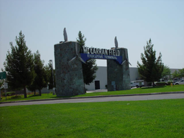
Photographs of McCarran Field signs, Las Vegas (Nev.), 2002
Date
Archival Collection
Description
Site address: 6005 S Las Vegas Blvd
Sign owner: McCarran International Airport
Sign details: On the south end of the Strip, the very last sign on the east side before you arrive at Sunset Blvd Facing West the two stone pylons are set approximately fifty feet off of the street at the end of a dual-lane stretch of pavement separated by an island of grass. The banner marquis between the two pylons stretches over this area of grass.
Sign condition: Structure 3 Surface 3 Lighting 4 Notes: The surface of the pylon is in good shape considering its age and its environmental condition. It is essentially left to fend for itself against the elements, being in the flat expanse of an airfield. The stone, plaques, and paint treatment are all badly worn, with the stone pylons, appearing the least worn.
Sign form: Pylon
Sign-specific description: The original McCarran Air Field entrance is constructed of two masonry pylons sit on an island of grass, and serve as an entrance to the private Hughes executive airport terminal. Each individual tower is adorned with a propeller attached to the front and the representation of a bird's wing crowning the tops Both facets are constructed of steel. When facing the structures the left has a plaque on the bottom section with the inscription "1948" while the one on the right reads "Las Vegas". Between the two pylons a stretch of text in white channel letters and white neon, large text in the old "Frontier style text reads McCarran Airport. The signage sits independently on top of a sturdy connecting steel cabinet, which supports the words "executive terminal" in smaller channel letters, with white neon. The cabinet is a painted blue horizontal plane tapering wider on either end in rounded profile patterns. The wings are outlined in pink neon, while the propellers are outlined in rose neon with a circle of white in the middle.
Sign - type of display: Neon
Sign - media: Masonry
Sign - non-neon treatments: Paint
Sign animation: none
Sign environment: The surrounding area is rather dark due to the wide expanse of the airfield which stretches out behind the sign. It truly is a last marker for the end of the Strip, and stands alone. Even though it is in close proximity to the major strip resorts of the Four Seasons as well as the Mandalay Bay and various small roadside hotels, it seems to stand in solitude.
Sign - date of installation: 1948
Sign - date of redesign/move: The blue banner of steel and white letters was added after its initial construction.
Sign - thematic influences: The masonry pylons are constructed in an adobe style masonry reminiscent of the desert landscape surroundings. Designed for the airport, the appendages stem obviously around the theme of flight. This may be denoted from the propeller and the wing. The juxtaposition of the two elements, one being the method of flight in nature and the other man made, serves as a reminder of mans fascination with flight. The added banner's text is in the pioneer fashion of the original Last Frontier.
Sign - artistic significance: Opened in 1948, the sign was intended for use as a marker for the endpoint of the Strip. " It was part of the city's expanding policy creating a jet-scale entrance for the city," Jorg Rudemer from Lost Las Vegas. Artistic significance also lies in the combination of materials using masonry, steel and, neon. The piece successfully combined these elements to provide an architecturally solid design by day, which was cohesive with its surrounding landscape. A metamorphosis takes place at night as the sign is transformed into a glowing specter of its daytime counterpart. The surrounding area is rather dark as the pylon rises up out of the darkness as a neon marker for the property. The illuminated wing and propeller stand out as the significant and successful partners in the world of flight.
Surveyor: Joshua Cannaday
Survey - date completed: 2002
Sign keywords: Pylon; Neon; Masonry; Paint
Mixed Content
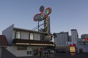
Photographs of Fun City Motel, Las Vegas (Nev.), March 1, 2017
Date
Archival Collection
Description
Site address: 2233 S Las Vegas Blvd
Sign owner: Rick Trusdell and Chetak Development Corporation
Sign details: Originally the Glenn Vegas Motel in early 50's then the sign was reused for Holiday Motel in 1960's and later to the Fun City Motel circa 1970's to current.
Sign condition: This is rated a 2 since the structure is in semi-salvage condition. No treatment seems to have been done. The damage from the sun has left the bright red hue into a grayish purple color. Part of the neon lettering from Fun City is not in working condition.
Sign form: Pole
Sign-specific description: The Fun City Motel sign was installed in 1952. However, the sign has been used in other properties before it became the Fun City Motel. The Sign was first used for the Glenn Motel circa 1950's with a western theme. The reason why the Fun City Motel doesn't resemble Googie influence is because the original funky curvilinear shape was designed to be a peanut. The Glenn Vegas Motel sign included an illustrated rodeo cowgirl holding a looped rope towards the left end of the sign. In the middle top of the sign is a woman diver; towards the bottom of the sign is an outline of a pool with the word swimming pool in the middle. The peanut shape is painted black. In-between all the designs; in large letters Glenn Vegas Motel is written in white with the female diver drawing separating the two words. Underneath the peanut shaped structure is a rectangular sign held by two hooks on each sign with the word motel. The entire structure itself is held by two steel poles with a blue incandescent directional squiggly arrow facing downwards. The Holiday Motel version changed from the black background to a brilliant red with white large neon letters reading Holiday. The sign removed all implication of the western theme and changed the squiggly directional arrow from light blue to a silver hue. There were two additions to the sign; the first is the word motel vertically connected to the side of the directional arrow and second is a circular structure in white and yellow. Later with the Fun City Motel sign there wasn't much change from Holiday Motel. The only significant change was the name of the establishment. The fun city lettering lights up in multiple colors like the rainbow at night. And the two poles that hold up the structure were painted to black. Today the sign itself has lost all its brilliant red hue and is now a gray color from over sun exposure and no maintenance done to the sign. The directional incandescent arrow is still bright yellow.
Sign - type of display: Neon and incandescent
Sign - media: Steel and fiber glass
Sign animation: Chasers for the incandescent directional arrow. The circular structure on the tops of the curvilinear shape have incandescent lights following a circular motion.
Sign environment: This location is on the North end of the strip near the Holiday House, Holiday Motel, and Kaei Thai restaurant.
Sign manufacturer: YESCO
Sign - date of installation: Circa 1970's
Sign - date of redesign/move: 1950's the sign was used for Glenn Vegas Motel, and in 1960's into the Holiday Motel.
Sign - thematic influences: The fun city sign is funky with an odd curvilinear shape that was originally used for a western theme motel as a peanut. Today the theme seems to be clownish with its colorful palette and rainbow neon.
Sign - artistic significance: The fun city sign is funky with an odd curvilinear shape that was originally used for a western theme motel as a peanut. Today the theme seems to be clownish with its colorful palette and rainbow neon.
Survey - research locations: Assessor's page, Photographs on the internet from Vintage Vegas website http://vintagelasvegas.com/search/Fun+City+Motel
Surveyor: Gisselle Tipp
Survey - date completed: 2017-08-30
Sign keywords: Neon; Incandescent; Steel; Chasing; Pole sign; Roof Sign; Back to back; Backlit
Mixed Content
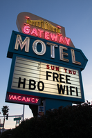
Photographs of Gateway Motel sign, Las Vegas (Nev.), March 12, 2017
Date
Archival Collection
Description
Site address: 928 S Las Vegas Blvd
Sign owner: Vinod Soni and Gateway Motel Inc
Sign details: The Gateway Motel dates back to early 1930's and could be considered one of the earliest motels to pop up in Las Vegas. Before the name changed to Gateway Motel it was named as the Gateway Auto Court circa 1930-1946 it was known as the Gateway Auto Court. The first sign was built circa 1930's and their new remodeled sign which is still in use today was built circa 1950's. The 1950's sign was originally painted darker colors and had a larger graphic of a gate. The original 1930's sign has the streamline modern influence that was prominent in 1930's and 40's. The sign itself is a pole sign with a square structure at the top. The font Auto-Court is in pure neon with that fire-red hue; the font is placed in the middle to stand out the most. The word Gateway is on top of Auto-Court in black with black streamline lines surrounding the word. Underneath is a small wooden board hanging probably stating no vacancy. The background color of the square structure is in pure white and the pole is chrome.
Sign condition: The condition of the sign is a 3.5. Some of the neon is not working when it's turned on at night. The paint has some sun/UV damage since it looks faded. The reader board has a stained effect from sun damage.
Sign form: Pylon with three separate signs converged into one.
Sign-specific description: The sign is made out of glass, steel, plastic, and concrete. The color palette is light blue, white and a cream white. The sign is designed in separate sections. The white cream based portion is situated at the top with a gate and bridge illustrative design in glass tubes and neon. The gate itself lights up yellow with red on the side. The font Gateway is larger than the gate and is in the color white when lit up. Underneath the Gateway word is a subliminal directional arrow pointing towards the motel buildings This section is in the color sky blue with the word motel in massive white letters. Underneath the directional arrow is the reader board surrounded by the steel light blue border. The reader board states Free Wi-Fi and HBO. Underneath in the left corner is a small light blue board that states "no vacancy" in neon. These three separate signs are all connected like blocks with a concrete pillar structure holding up the sign. During the evening, the light blue paint is not shown and is just pure black with the neon illuminating the sign.
Sign - type of display: Neon and plastic back lit sign
Sign - media: Steel, plastic and concrete
Sign - non-neon treatments: Plastic back lit portion
Sign environment: This location is on the corner of Las Vegas Blvd and Charleston. This is right next to the original Dona Maria Tamales restaurant.
Sign - date of installation: Circa 1950's
Sign - date of redesign/move: From a 1930's streamline modern sign to a 1950's Mid-Century modern architectural roadside motel sign.
Sign - thematic influences: The sign is influenced by Mid-Century Modern roadside architecture, with the directional arrow as a staple in many motel roadside designs of the 1950's and 60's to accommodate the car consumer era.
Sign - artistic significance: One main trends of the 1950's designs with neon signs is using illustrative motifs with the inclusion of directional arrows to lend to the highway travelers an idea of where the property is located. To make sure these travelers don't miss the establishment in an empty road.
Survey - research locations: Assessor's Page, Roadside Architecture Website http://www.roadarch.com/signs/nvvegas.html , Neon Museum book Spectacular, Vintage Las Vegas http://vintagelasvegas.com/search/Gateway+Motel
Surveyor: Gisselle Tipp
Survey - date completed: 2017-08-30
Sign keywords: Neon; Plastic; Backlit; Steel; Concrete; Roadside; Reader board; Back to back
Mixed Content


