Search Results
Art Rader Photograph Collection on Nevada Railroads
Identifier
Abstract
The Art Rader Photograph Collection on Nevada Railroads depicts railroads, mills, and depots in Nevada and Southern California from 1905 to approximately 1975. The photographs primarily depict the remnants of the Tonopah & Tidewater Railroad, the Pacific Coast Borax Company, and obsolete tracks, buildings, mills, and boxcars from the early-twentieth century. The photographs also depict depots and railroad intersections in Death Valley Junction, California and Crucere, California, and the photographs include the Union Pacific Railroad's tracks that were once part of the Salt Lake Railroad.
Archival Collection
Howard Booth Papers
Identifier
Abstract
The Howard Booth Papers are comprised of the personal papers of environmental activist Howard Booth from 1964 to 2017. The collection includes information about Booth's efforts to help turn Red Rock Canyon into a National Conservation Area. Booth was a member of multiple conservation organizations and the collection includes meeting minutes and newsletters from the Toiyabe chapter of the Sierra Club. The collection also contains correspondence, newspaper clippings, official reports, newsletters, and meeting minutes collected by Booth from various environmental organizations. The papers also include numerous photographic slides with handwritten captions Booth took of Red Rock and the surrounding area from the early 1980s to 2000s.
Archival Collection
Thomas J. Hickey Photograph Collection
Identifier
Abstract
The Thomas J. Hickey Photograph Collection (1987-1989) contains color and black-and-white photographic prints of Thomas J. Hickey during his tenure as a Nevada State Senator. The collection also includes photographic prints of the Sparks, Nevada train yard and the Home of the Good Shepard church in Las Vegas, Nevada.
Archival Collection
"Minority Labor Problems and the Hoover Dam Project": manuscript draft by Roosevelt Fitzgerald
Date
Archival Collection
Description
From the Roosevelt Fitzgerald Professional Papers (MS-01082) -- Unpublished manuscripts file.
Text
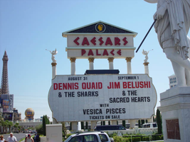
Photographs of Caesars Palace signs, Las Vegas (Nev.), 2002
Date
Archival Collection
Description
Site name: Caesars Palace (Las Vegas, Nev.)
Site address: 3200 S Las Vegas Blvd
Sign owner: Park Place Entertainment
Sign details: Caesars Palace is located between the Flamingo Rd. on the western side of Las Vegas Blvd Caesars has grown over the years since it's opening, but remains the true to its classic form. Signage for the resort is limited compared to some but consists of significant pieces of signage such as two large pylon signs, a rotating sign for Planet Hollywood, building signage consisting of logo text, as well as a porte-cochere. The property itself is an over abundance of classic design form after another, mixed among modern amenities like an Omnimax theatre. Caesars Palace is a permanent icon in Las Vegas Imagery and folklore.
Sign condition: Structure 4 Surface 4 Lighting 4
Sign form: Pylon; Fascia; Porte-cochère
Sign-specific description: The YESCO pylon is located at the northern side of the property and is constructed of black painted steel and centers around a base of four columns aligned in a row. The sign faces north/south. The four columns rise out of the ground about six feet in the air before a long horizontal, gold bordered, rounded end cabinet, that reads and points to free covered parking. The text is graphically applied and internally lit. The cabinet is lit from the backside with neon, creating a halo behind the sign. The columns continue upward until they are met with the triangular cabinet, pointing east, with the two faces, being occupied a color LED message center. The interior edge of the face of the sign is bordered with green neon. Above the visible top edge of the wedge shaped message boards, the Caesar's Palace logo if illuminated in red neon upon a rectangular section created out of two entablatures, stacked on top of each other. The top entablature reads "Caesars" in red letters and "Palace" in the second row The two are capped with pediment lined on the interior edge with gold neon and a back-lit Caesar's logo. The exterior of the cabinet is polished aluminum, with metal channel letters. The original pylon built much earlier, utilized six-column shafts capped with golden statuary, secured to a large concrete base. When facing the columns, facing north, or south, the majority of the view of the vertical pieces is taken up by the giant internally lit message center, with removable lettering. The outer edge is crafted the same as the face of the other pylon, but it is bordered in pink neon. The four center columns supports an entablature supporting the logo text, and above that a pediment rounds out the classic architectural combination. The top half of the pediment is larger and supports the text "Caesars," while the lower, narrower section reads "Palace". The entire pediment is striped horizontally with bands of aqua neon that creates a field for the text. The text is in the stylized roman text, in channel letters, and lined with red neon. One of the most attractive pieces of signage is the Caesars porte-cochere. The famous fountains lead up to the main entrance, which is shadowed by the massive porte-cochere, which is one of the few remaining on the strip that displays such grandeur. The Porte-cohere is a hulking collection of levels, stacked upon on another, but grow in size as each level steps upward. The rest looks as if a massive set of plaster steps were turned upside down and placed over the entrance. The edge of each level is lined with brass treatments that are repeated vertical poles of polished brass, greeting a repeated striping pattern. From behind this treatment and pushed further back beyond the human eye, a rose colored glow is produced by intense lighting fades into a soft halo as it dies out toward the edges. The mass and girth of the structure is helped out visually by the angles chosen to in its design. The entire construction seems to sag under it's own weight, for each level is slightly cupped into a concave shape. Each levels edges are concave as well, producing a illusion of movement in space. To the right of the porte-cochere there is still the aqua tinted light pouring out of the latticework, that fills the arcade of arches. On the main tower directly behind the porte-cochere, the red neon logo is present as well as elsewhere on the building as well. Facing east this particular set of letters looms high over head. The section of the building is a vertically elongated temple front, stretching the height of the building. Four pilasters run the vertical length of the building, holding black spans of tinted windows in between. They each are topped with golden Corinthian capitals, which hold up the classic entablature and pediment. "Caesars Palace" is spelled across the entablature in channel letters and filled with red neon. In the pediment above a golden crest of Julius Caesar's profile flanked by two encompassing olive branches. The crest is ambiently lit with white light. The tower just behind the main building also supports text on its east face as well. As the narrow edge of the tower, the vertical plane rises upward but is flat and smooth until it reaches the top section. It is essentially a giant entablature created out of the temple fronts on either side that wrap around to meet on the width. On this flat plane, "Caesars Palace" is spelled in the classic lettering and neon treatment seen on the building letters just below that. The building itself is ambiently lit but the profile of Caesar above the text is not a brightly lit as the other. On the south side of the parking garage, on the western edge of the property, the channel letter logo reads in red neon as well.
Sign - type of display: Neon; Incandescent
Sign - media: Steel; Plastic; Masonry
Sign - non-neon treatments: Paint
Sign animation: Chasing, flashing, oscillating
Notes: The V-shaped red channels on the silver main pylon chase each other downward toward the ground. The main text on the pylon animates as well. The letters light up one at a time with red neon from left to right as the arrows continue to chase downward. The logo/text sign located above the giant replica of the Harley Davidson, animate as well. The incandescent bulbs which fill the text, spelling the name of the establishment, oscillate, steady burn, then shut off, and then restarting the sequence. The letters that spell cafe on the lower portion of the sign animate in concert and with the same sequence as the main text.
Sign environment: Caesars Palace sits in one of the biggest and busiest sections of the strip, and has always been a mainstay. The ambiently lit classic features of architecture seem almost specter like moments, with the blazing red eyes of the Caesars text staring from afar. From the street, the actual structures are set a bit back from the street, seeming rather distant. Construction is currently present around the exterior edges of the property, which rather dampens effect of the theming, but everything shines through. The theme does step out to the street with the statuary, creeping out to pedestrians and the pylon signs. The main signs are street side, pointing toward the casino. Headed south on the west side of the street the two pylon signs lead up to the porte-cochere. Standing underneath the porte-cochere looking out, the fountains provide a picturesque scene to see the other side of the street. The buildings loom high over head. The environment contains elements, which can be seen repeated throughout hotel exteriors. The large water element, the Classic architectural design motif, and the spectacular porte-cochere are still evident in properties built today. Even though Caesars continues to evolve with the current trends, all of these elements were presenting its original design.
Sign manufacturer: Pylon 1: YESCO Pylon 2: Ad Art
Sign - date of installation: 1966, 1998
Sign - date of redesign/move: On-going additions since 1966
Sign - thematic influences: Caesars Palace may be the first themed resort, which has taken its theme to an extreme the likes of which had never been seen before. Ever since it's original inception in 1966, Caesars Palace has sought to give its guest the most of the Ancient Roman theme. Caesars is simply dripping with imagery and architecture that is steeped in the theme of Ancient Rome. No matter where you go there are collections of statuary, domes and columns, false temple fronts create the facades of the towers, and low geometric hedges and cypress trees all add to the theme. Any themed property can draw influence from Caesars Palace, and still stands as one of the highest markers for competitors to be judged by.
Sign - artistic significance: Very important signage that can be seen reflected in many aspects of non-casino culture. Caesars Palace is one of the icons of American popular culture, and the distinctive Romanesque neon is a big reason why.
Surveyor: Joshua Cannaday
Survey - date completed: 2002
Sign keywords: Pylon; Fascia; Porte-cochère; Neon; Incandescent; Steel; Plastic; Masonry; Paint
Mixed Content
University of Nevada, Las Vegas law school planning: reports, correspondence, and clippings
Date
Archival Collection
Description
Folder contains materials related to establishing a law school at UNLV, including: "pre-law at UNLV" brochure, August 1975; lists of related archival materials; "UNLV Law" survey of previous law school studies, compiled by Jan Gould, 1976; an issue of "Factor E" magazine containing "The Law School Story," spring 1975; newspaper clippings; and other related reports and correspondence. From the University of Nevada, Las Vegas William S. Boyd School of Law Records (UA-00048).
Text
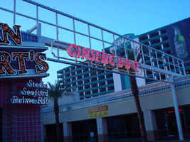
Photographs of Ginseng BBQ signs, Las Vegas (Nev.), 2002
Date
Archival Collection
Description
Site address: 3765 S Las Vegas Blvd
Sign details: Down the driveway created between the Fatburger and Walgreen's structure is a slightly larger lot, which is home to the Ginseng BBQ establishment. The signage is a gateway, banner structure which leads to this slightly larger lot. It is visible standing directly in front of the Fatburger sign, looking east down the alley.
Sign condition: Structure 3 Surface 3 Lighting 3
Sign form: Pylon
Sign-specific description: Attached to the section of the Fatburger building which houses the entrance to the Alan Albert's, and stretches across to the building which houses Walgreen's is a sign which is comprised of a horizontal overhead structure of steel beams, forming a lattice work or skeleton of an entrance. The top and bottom edges are white raceways with incandescent bulbs. Placed awkwardly along the bottom portion of the skeleton is a border of gold polished raceways with incandescent bulbs. There is no backing to the border, so it is simply an edge and nothing more inside this border consisting of the structure of the sign. The top and bottom edges of the structure are lined with incandescent bulbs. "Ginseng BBQ" is spelled in gold channel letters painted white on the inside, with red neon in the interior. The letters are all caps and centered inside the border. The sign faces west. The actual establishment is further east. through the gateway where a slightly larger lot is located, on the north face of the Walgreens side of the complex.
Sign - type of display: Neon; Incandescent
Sign - media: Steel
Sign animation: Chasing, flashing, oscillating
Notes: The text, which resides on the southern wall and reads "Casino," is filled with incandescent bulbs that all illuminate at the same time, and oscillate. They then shut off at the same time, and then repeat. The raceways of incandescent bulbs chase each other while the neon, which surrounds the back lit, plastic, screens on this wall flash on then off. The bottom two raceways sandwiching the reflective panel chase from left to right, while the remainder of the raceways surrounding the signs, run right to left. The incandescent bulbs on the pylon chase each other gracefully up the length of the pylon. The animation is patterned so as to appear as if a section of several bulbs are pulsing its way up the towers, hugging the edge of the bulbous tops. The raceways continue around the east face of the building. The umbrellas in the plaza behind the pylon, also are animated with incandescent bulbs chasing each other downward along the raceways.
Sign environment: The environment which the Ginseng BBQ's establishment shares is dictated by its neighbors of Walgreen's and Fatburger. The small enclosure of a lot, which is in front of the store, follows after passing underneath the main logo text banner for the restaurant. It is hidden among the various neighboring businesses, being protected by the larger structure in front of it.
Sign manufacturer: Vision Sign
Sign - thematic influences: No real theme surrounds the signage other than it appears that it was pieced together from various other pieces of signage. The white, steel skeleton appears as if it was there previously, and the Ginseng sign was attached later. The theme that it does fit into is the small eateries which pop up among the strip malls and small shopping centers along the strip. It is also one of two different Ginseng BBQ establishment.
Surveyor: Joshua Cannaday
Survey - date completed: 2002
Sign keywords: Chasing; Pylon; Neon; Incandescent; Steel
Mixed Content
Photographs of Las Vegas World Souvenirs signs, Las Vegas (Nev.), 2002
Date
Archival Collection
Description
Site address: 3710 S Las Vegas Blvd
Sign owner: property leased from MGM Mirage
Sign details: Located in the same lowrise building which the Las Vegas Helicopter Tours is located. See Las Vegas Helicopter Tours.
Sign condition: Structure 5 Surface 5 Lighting 5 All of the lighting, surface, and structure seem to be intact, and in good repair. The signage appears fairly new, and less worn.
Sign form: Fascia
Sign-specific description: The Las Vegas World Souvenir shop and market, boasts a collection of signage, almost completely crafted out of channel letters. The basic design is an entablature created on the wall above a pedestrian's head. The entablature runs along the south, east, and north faces of the building. The design is essentially channel letter words separated by channel designed stars. On the south wall the sequence reads, "star shape, 'drinks,' star, 'souvenirs,' star then 'market'." The interior of the star shapes are lined along the contours with yellow neon. The all caps lettering has red neon tubing on the interior. The sequence on the east side of the building reads from left to right, " star shape, 'Souvenirs,' star shape, 'Las Vegas World,' star shape, 'drinks,' then another star shape." The words "souvenir" and "drinks" are spelled in the same text and size as the south side, while the phrase "Las Vegas World" is larger fulfilling most of the height of the entablature. The north side of the building is similar to that on the south. This side reads , "Souvenirs, star shape, 'Market,' star shape, 'Film,' and another star shape." On the wall below the pediment closed face channel letters spell two phrases. The black channel letters are faced with red translucent faces. The first phrase reads , "Daily Grand Canyon Flights," in all caps. The second reads "Nightly strip rides in all capitals.
Sign - type of display: Neon; Incandescent
Sign - media: Steel; Plastic
Sign animation: Chasing
Sign manufacturer: Sign Systems, Inc
Sign - date of installation: 1996
Sign - thematic influences: There is no real present theme evident in the appearance other than the Emblem of the American flag crafted in neon on the front of the building. The incandescent bulb lined raceways and bulb filled channel letters, placed within a pediment hanging above the pedestrians head, posses a theme in a sense. It is a common occurrence to see such a combination of lighting among the strip to designate an establishment so its theme cold be considered to be that of Las Vegas. It's artistic significance can only be linked to such a trait. It is one of the most unique properties considering its function. Yes there are many facilities which offer tours but, this is the only one which provides helicopter tours that the pedestrian may watch take off. It is also one of the only establishments where the American flag is represented on the exterior in neon. It is also one of the only establishments where the incandescent bulb lined raceway is shaped into arrows. An interesting use of the most common adornment of exterior surveyed signage.
Surveyor: Joshua Cannaday
Survey - date completed: 2002
Sign keywords: Chasing; Fascia; Neon; Incandescent; Steel; Plastic
Mixed Content
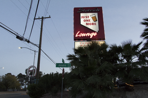
Photographs of Stateside Lounge sign, Las Vegas (Nev.), March 3, 2017
Date
Archival Collection
Description
Site address: 931 N Las Vegas Blvd
Sign owner: Laura and Doris Atchinson
Sign details: This bar opened up in 1996. They aim to be a place for people to have a cold drink and great food. It is a very popular hangout stop for baseball fans since it is within walking distance to Cashman Field. They are also known for their karaoke nights.
Sign condition: 4, the sign is still in pretty good condition. It just looks worn from weather and time.
Sign form: Roadside pole with a message center
Sign-specific description: This pole sign sits along Las Vegas Boulevard and is extremely visible for motorist and pedestrians. A black rectangular pole supports the two portions that make up this sign. The top portion is a wide rectangular shape and both sides of the sign have the same design on them. Each side has a red background with the word "Stateside" in white script open cabinet letters along the top of it. Under this is a plastic backlit sign in the shape of the state of Nevada. The words "JUST ONE MORE" in bold red text are in the in the middle of the Nevada sign as well as an illustration of a foamy glass of beer. Under this is the word "Lounge" in white script open cabinet letters. Surrounding the outside of this sign is a line of incandescent light bulbs that chase. Under this sign is a fairly large backlit message board.
Sign - type of display: Neon, backlit, incandescent
Sign - media: Steel and Plastic
Sign - non-neon treatments: Paint
Sign animation: Chasing
Notes: incandescent light bulbs
Sign environment: This bar sits very close to Cashman Field and is just north of the Cultural Corridor. It is down the street from the Las Vegas Library, the Las Vegas Natural History Museum, and the Neon Museum. It is also just down the road from Fremont Street.
Sign - thematic influences: Since the bar is called "Stateside Lounge," featuring the state of Nevada emphasizes the theme of the bar. Also, the illustration of the beer and the "Just One More" on the sign articulate that the property is a bar.
Sign - artistic significance: This sign is fairly minimal, but has a few striking details that make it unique compared to other bars throughout the city. Featuring the shape of the state of Nevada lets people know that this sign is a nod to the bar's home state. Also, the "Just One More" text in the center of the Nevada shape as well as the illustration of the beer make the property seem very welcoming and like somewhere you wound wants to spend time at.
Survey - research locations: Assessor's website
Survey - research notes: There is no specific date of any redesign; however, in earlier photographs the sign was originally blue with a red pole instead of being red with a black pole.
Survey - other remarks: https://www.reviewjournal.com/sports/sports-columns/ron- kantowski/51s-fans- dont-feel- likealiens-at- stateside-lounge/ https://www.yelp.com/biz/stateside-lounge- las-vegas
Surveyor: Lauren Vaccaro
Survey - date completed: 2017-09-10
Sign keywords: Neon; Incandescent; Backlit; Steel; Plastic; Paint; Chasing; Roadside; Pole sign
Mixed Content
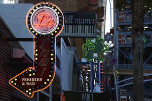
Photograph of Le Thai sign, Las Vegas (Nev.), April 10, 2016
Date
Archival Collection
Description
Site address: 523 Fremont St
Sign owner: Dan and Shauna Coughlin, Dan doubles as the chef as well
Sign details: The buildings original construction year was 1934. The restaurant opened in November of 2011, Le Thai offers a famous Three curry made by Chef Dan Coughlin as well as other traditional Thai food inspired by Dans grandma and mom from Thailand. They also have a beer garden behind their main restaurant. Dan was the owner to Mix zone cafe and is the son of the owner of the King and I (Nikki Bujadham). This building has a tin facade with a pull out canopy for outdoor seating.
Sign condition: 5- looks very new and in amazing condition
Sign form: Blade
Sign-specific description: The blade is mainly made of plastic that is backlit at night time, but has a dark steel border. At the top of the sign is a circle that has Le written in black cursive on the sign, and illuminates red neon at night. Also on this circle portion of the sign it states Downtown Las Vegas in a smaller print type font. This circle is outlined in incandescents, as well as the incandescents being surrounded by red neon. Below the circle there is a red curved arrow that states Thai in black letters that have a white trim, this font looks italicized and has little circles on a part of each of the letters, this makes it a very distinct font for them specifically. Underneath the Words Thai, the sign states Noodles & Bar in a regular white block type font.
Sign - type of display: Incandescent light bulbs and neon
Sign - media: Plastic and Steel
Sign - non-neon treatments: Graphics on plastic portion of the sign are backlit
Sign animation: Chasing:
Notes: incandescent light bulbs
Sign environment: In the East side of Fremont Street, located in between Las Vegas Blvd and 6th street. To the west of the property is the Dont Tell Mama Bar and to the east is Commonwealth. Currently across the street is the Therapy restaurant and the old Emergency Arts building.
Sign manufacturer: YESCO
Sign designer: Owners Shauna and Dan
Sign - date of installation: 2012
Sign - thematic influences: The font that they use for Le and Thai are quite different but it shows the blend of how their restaurant is and does make it more distinguishable since their font draws the attention of people walking by.
Sign - artistic significance: With the usage of both Neon and incandescent the sign really does pop out which is a similar trend to many signs over the age, particularly since there is a lot of pedestrian traffic in the region. The arrow is a great direction indicator, as well as it showcases the 1950s blade sign trend with the arrow at the bottom.
Survey - research locations: Le Thai restaurant website https://lethaivegas.com/, Assessor's page, and contact with Le Thai LLC
Survey - research notes: The assessor's page said the buildings original construction year was 1934 though there was no record of what it originally opened up as.
Surveyor: Emily Fellmer
Survey - date completed: 2017-08-15
Sign keywords: Graphics; Plastic; Backlit; Steel; Blade; Chasing; Incandescent; Neon; Back to back
Mixed Content