Search Results

Photograph of Therapy restaurant sign, Las Vegas (Nev.), June 28, 2017
Date
2017-06-28
2017-08-06
Archival Collection
Description
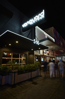
The sign for Therapy sits at 518 Fremont Street in Downtown Las Vegas. Information about the sign is available in the Southern Nevada Neon Survey Data Sheet.
Site address: 518 Fremont St
Sign owner: Jared Weiss and Sig Rogich (Motion Corp)
Sign details: The building is from 1951, so within the restaurant there are exposed bricks and wood ceiling from the original building. Therapy restaurant opened in 2015 as a gastropub with Daniel Octiveas as the chef. Previous to turning into the Therapy restaurant this location held a Dollar Store.
Sign condition: 5, a newer sign still in very good condition
Sign form: Hanging sign and entrance sign
Sign-specific description: Pink lettering. The T is a solid print type font, then the rest of the letters are in cursive. There is a period at the end of the word Therapy. Each individual letter is in its own channeled block to contain the light for each letter. Also above their door there is a small black rectangular sign with the Therapy logo (same manufacturing style as the letters previously noted). There is a pink arrow starting from the farthest (from the entrance) top of the sign pointing towards the entrance. On this arrow there are sparking incandescent light bulbs.
Sign - type of display: Neon and Incandescent
Sign - media: Steel
Sign animation: Flasher for Incandescent light bulbs on the arrow to show the entrance of the property.
Sign environment: This property is in between 6th and Las Vegas Blvd. on the North side of Fremont St. This district in the past few years has shaped into its own creative and artsy area.
Sign manufacturer: Vision Signs
Sign designer: Gerrit Blok and Rob McGuire
Sign - date of installation: 2015 when the restaurant opened
Sign - thematic influences: The sign above the door has the arrow which was a popular trend in 1950s signs with the car consumer era, but also helps with the pedestrian traffic on Fremont St.
Sign - artistic significance: The simple yet beautiful cursive font shows that there is simplicity and elegance. Also the arrow above the entrance could be a hint of subliminal messaging, as well as a great direction indicator. The channeled letters shows how to capture illumination compared to skeletal Neon.
Survey - research locations: Therapy website http://www.therapylv.com/ , Las Vegas Weekly Article https://lasvegasweekly.com/dining/reviews/2015/aug/12/therapy-downtown-restaurant-review-fremont-east/ , Acessor's office, discussion with owner and contact with Vision signs
Survey - research notes: Eater Las Vegas (2015 article) shows cool pictures of the building being renovated. https://vegas.eater.com/2015/6/25/8845981/las-vegas-restaurants-therapy#5
Surveyor: Emily Fellmer
Survey - date completed: 2017-08-06
Sign keywords: Neon; Incandescent; Steel; Flashing; Hanging; Building-front design; Fascia; Cantilever construction
Mixed Content

Photographs of Vanguard Lounge sign, Las Vegas (Nev.), June 28, 2017
Date
2017-06-28
2017-08-11
Archival Collection
Description
The Vanguard Lounge sits at 516 Fremont Street in Downtown Las Vegas. Information about the sign is available in the Southern Nevada Neon Survey Sheet.
Site address: 516 Fremont St
Sign owner: Andrew and Jennifer Wheatley
Sign details: The building was originally constructed in 1951. Previously to the lounge opening it was Fremont Street Guitars. Andrew and Jennifer Wheatley opened the lounge in 2010 after 30 years of experience together in the industry. This trendy bar has Modern-Industrial Decor, as you can see with their black building with a glass garage door entrance.
Sign condition: 5- newer sign that lights up brightly at night
Sign form: Hanging sign
Sign-specific description: Right above the entrance is a black canopy, but at night a white neon tube illuminates the perimeter of the canopy. The canopy also showcases their street address 516 in white channeled numbers. Above the canopy there is a beam which acts as a support for their main sign. Their main sign is a black rectangle which is also attached to the building. The sign states Vanguard Lounge in white skeletal neon letters. The word Vanguard is in a thick block-type print letters. Lounge is written in a smaller but similar type-font.
Sign - type of display: Neon
Sign - media: Steel
Sign environment: This is located in the Fremont East district in between Las Vegas Blvd. and 6th St. This locations storefront is located in between the Therapy restaurant and Red dance club (used to be the old Coin Insert bar).
Sign manufacturer: Valley Signs and Lighting
Sign - date of installation: 2010
Sign - date of redesign/move: Vanguard used the old sign box that the previous company used and added their logo in neon in 2010.
Sign - thematic influences: The skeletal neon showcases a simple yet classic design. It also showcases the Modern trendy vibe.
Sign - artistic significance: The sign does have a modern vibe but is staying true to the Neon culture of downtown.
Survey - research locations: Vanguard lounge website http://www.vanguardlv.com/vanguard_lounge_venue , Las Vegas Sun https://lasvegassun.com/news/2010/sep/20/vanguard-lounge-opens-fremont-street/ , Assessor's page
Survey - research notes: Definition of Vanguard is a group of people leading the way in new developments/ideas. This is possibly alluding to their theme of being different than the other bars downtown. Coincidentally there was a dance club in L.A. also called Vanguard, but no connection found between the properties besides their modern dance vibes.
Surveyor: Emily Fellmer
Survey - date completed: 2017-08-11
Sign keywords: Neon; Steel; Hanging; Pole sign; Roof Sign
Mixed Content
neo000194-002
Date
2017-06-28
Description
Sign animation: Chasing, flashing, oscillating
Notes: The logo cabinets which adorn the entrances on the elevated walkways: The letters start with both rows of text in the off position. The top row flashes on, while the bottom row is dark then the bottom row illuminates, as the top row goes dark. Once the top row flashes off it flashes back on so that both rows of text are briefly illuminated simultaneously before they both go dark and the sequence stars over again. While this is going on the incandescent bulbs which line all of the raceways are chasing each other from left to right on the horizontal planes, while the arched sections chase each other downward. The triangular peaks which radiate around the top of the logo sign, flash on and off in a sequence which chase each other downward. First the top center peak flashes on, then the next sequential triangular channel on both sides illuminate simultaneously, flash off, then the next two in the series illuminate. The resultant effect is a chasing pattern starting from the top. The sister animation is located on almost the exact same design on the porte cochere. I would think the previous smaller sign would be based on the larger porte cochere. The other variance besides obvious size difference is the that the channel letters are filled with incandescent bulbs instead of neon. The animation is a bit simpler as well. The incandescent bulbs oscillate continuously while the triangular pan channels which create the radiating crown, animate. The neon in the channels chase each other as described in the smaller walk way version, while the text continues until the entire text flashes off, then on, off, then begin to animate once again. All of the bulbs, which line the raceways of the exterior edge of the porte cochere, as well as the encrustation of bulbs on the brass bull nose portion, animate in rapid succession. All the raceway bulbs chase each other while the bulbs on the brass portion continually oscillate. Animation continues on the east face of the building with the entrances first. The principle for these two signs is oscillation and chasing. All bulbs on the underside of the entrance, as well as in the logo, oscillate rapidly. All bulbs on the raceways chase each other. Further on the surface of the building as well, the Pepsi cola wall sign is found displaying a very unique form of animation, seen here on the strip. The signage for the Pepsi ad is located on the eastern wall. (Detailed in specific description) The Incandescent bulbs which fill the inside of the text that spells Pepsi, chase each other from left to right, leaving all the bulbs in its path illuminated, as if writing out the word Pepsi. The neon bars located within the tilted bottle of Pepsi are illuminated, and chase each other downward, leaving the bars it its path dark. As this sequence in taking place, the waving tubes of neon illuminate, flashed subtly making the neon appear as soda pouring out of the bottle. As the tubing flows then the vertical neon bars in the cup illuminate one at a time making the cup appear as if it is filling up. The text above each of the painted fires head, flashes back and forth as if talking to each other as well. ESPN ZONE animation: The letters in the vertical blade portion of the ESPN Zone illuminate one at a time, starting from the top. Once the entire phrase is lit, in flashes off then on then off, before restating. The orange and red neon tubing which resides inside the pan channels that represent flames flash on and off in a relaxed manner as if to animate the flickering of the flames. The small incandescent bulbs on the black portions above the main matrix reader board flash on and off subtly.
Notes: The logo cabinets which adorn the entrances on the elevated walkways: The letters start with both rows of text in the off position. The top row flashes on, while the bottom row is dark then the bottom row illuminates, as the top row goes dark. Once the top row flashes off it flashes back on so that both rows of text are briefly illuminated simultaneously before they both go dark and the sequence stars over again. While this is going on the incandescent bulbs which line all of the raceways are chasing each other from left to right on the horizontal planes, while the arched sections chase each other downward. The triangular peaks which radiate around the top of the logo sign, flash on and off in a sequence which chase each other downward. First the top center peak flashes on, then the next sequential triangular channel on both sides illuminate simultaneously, flash off, then the next two in the series illuminate. The resultant effect is a chasing pattern starting from the top. The sister animation is located on almost the exact same design on the porte cochere. I would think the previous smaller sign would be based on the larger porte cochere. The other variance besides obvious size difference is the that the channel letters are filled with incandescent bulbs instead of neon. The animation is a bit simpler as well. The incandescent bulbs oscillate continuously while the triangular pan channels which create the radiating crown, animate. The neon in the channels chase each other as described in the smaller walk way version, while the text continues until the entire text flashes off, then on, off, then begin to animate once again. All of the bulbs, which line the raceways of the exterior edge of the porte cochere, as well as the encrustation of bulbs on the brass bull nose portion, animate in rapid succession. All the raceway bulbs chase each other while the bulbs on the brass portion continually oscillate. Animation continues on the east face of the building with the entrances first. The principle for these two signs is oscillation and chasing. All bulbs on the underside of the entrance, as well as in the logo, oscillate rapidly. All bulbs on the raceways chase each other. Further on the surface of the building as well, the Pepsi cola wall sign is found displaying a very unique form of animation, seen here on the strip. The signage for the Pepsi ad is located on the eastern wall. (Detailed in specific description) The Incandescent bulbs which fill the inside of the text that spells Pepsi, chase each other from left to right, leaving all the bulbs in its path illuminated, as if writing out the word Pepsi. The neon bars located within the tilted bottle of Pepsi are illuminated, and chase each other downward, leaving the bars it its path dark. As this sequence in taking place, the waving tubes of neon illuminate, flashed subtly making the neon appear as soda pouring out of the bottle. As the tubing flows then the vertical neon bars in the cup illuminate one at a time making the cup appear as if it is filling up. The text above each of the painted fires head, flashes back and forth as if talking to each other as well. ESPN ZONE animation: The letters in the vertical blade portion of the ESPN Zone illuminate one at a time, starting from the top. Once the entire phrase is lit, in flashes off then on then off, before restating. The orange and red neon tubing which resides inside the pan channels that represent flames flash on and off in a relaxed manner as if to animate the flickering of the flames. The small incandescent bulbs on the black portions above the main matrix reader board flash on and off subtly.
Photographs of Las Vegas Hostel sign, Las Vegas (Nev.), March 3, 2017
Date
2017-03-03
2017-09-09
Archival Collection
Description
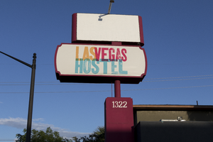
The Las Vegas Hostel sign sits at 1322 East Fremont Street in Downtown Las Vegas. Information about the sign is available in the Southern Nevada Neon Survey Sheet.
Site address: 1322 E Fremont St
Sign owner: Downtown Lodging LLC
Sign details: This building was originally constructed in 1973 for commercial living accommodations and motel purposes. Previous to the Las Vegas Hostel opening in late 2014/early 2015 it was USA hostel whom used the sign box that the Las Vegas Hostel currently uses today. They have 38 rooms of different variety and 158 beds as a cheaper option that the hotels. They also offer packages to do tours of surrounding places such and the Grand Canyon and the Hoover Dam. They also claim to be the only Hostel in Las Vegas with a pool.
Sign condition: 4.5- The sign box was recently repainted and the plastic portion of this sign is relatively new and both still are in good condition
Sign form: Pylon
Sign-specific description: This sign has a reddish/pink steel beam base. There are two sign boxes the top one is a rectangle shape and the bottom one is a oval-rectangular shape. Currently the top rectangle box does not have any signage in it but if it did it would be a plastic or steel sign that would be down lit by an LED spotlight. The bottom one has a plastic back lit sign with the hostel's logo. Their logo entails "Las Vegas Hostels" in modern bright colored block fonts. The "Las" letters are a bright orange, the "Vegas" letters are a magenta pink, and "Hostels" in a bright light blue.
Sign - type of display: Plastic Back lit sign
Sign - media: Steel and Plastic
Sign - non-neon treatments: LED and Plastic back lit signage
Sign environment: On the Intersection of East Fremont St and 14th street. A few blocks from the Fremont East District but is in a neighborhood with many different motels though many of them are currently closed
Sign - date of installation: The sign boxes have been up like this since at least 2007 but with different logos within the sign boxes
Sign - date of redesign/move: Late 2014/ early 2015 they repainted the beam and boxes of the sign and inserted the Las Vegas Hostel logo.
Sign - thematic influences: Since this sign was re-purposed and redesigned it shows how Vegas is constantly changing but can reuse old signs from previous properties.
Sign - artistic significance: The bright colors in the sign show that they are going for a modern vibe which works since they opened in the past few years and have events such as pool parties that appeal to the youth that comes through Vegas.
Survey - research locations: Las Vegas Hostel Website http://lasvegashostel.net/en_US/rooms/, Assessor's page, google maps satellite and roadside view
Surveyor: Emily Fellmer
Survey - date completed: 2017-09-09
Sign keywords: Plastic; Backlit; Steel; Pole sign
Mixed Content
Photographs of Octapharma Plasma sign, Las Vegas (Nev.), March 3, 2017
Date
2017-03-03
2017-09-02
Archival Collection
Description
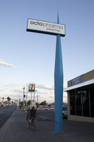
The Octapharma Plasma center sits at 1732 Fremont Street in Downtown Las Vegas. Information about the sign is available in the Southern Nevada Neon Survey Data Sheet.
Site address: 1732 Fremont St
Sign owner: Octapharma Plasma Inc.
Sign details: The original construction year of the building is 1977. This located opened as an Octapharma plasma donation facility in 2010. Octapharma was created by Wolfgang Margurre in Switzerland in 1983 to create plasma products to help save lives.
Sign condition: 4-Relatively recent renovation of their roadside sign and their entrance sign still has bright colors
Sign form: Roadside sign and entrance sign
Sign-specific description: The roadside sign is a long thin steel rod coming out of the ground with a sharp tip. (almost looks like a big toothpick coming out of the ground) This portion of the sign used to be red from the previous owners of this property when it was named "Pyramid". After 2011 Octapharma had this portion of the sign painted blue for them. Close to the sharp tip of this sign there is a sign box that holds plastic backlit signs. For Octapharma it is a white plastic background with blue "Octapharma Plasma" in block type letters. Above their entrance they have blue plastic channeled letters spelling out "Octapharma Plasma" which is backlit making it illuminate blue at night.
Sign - type of display: Back lit plastic sign
Sign - media: Steel and plastic
Sign - non-neon treatments: LED and Plastic back lit signs
Sign environment: This property is far East Fremont on the intersection of Bruce Street which is about a block from the main intersection of Eastern and Fremont St. This location has many motels surrounding it as well as some convenience stores.
Sign - date of installation: Main roadside sign was repurposed for Octapharma around 2010 so this sign does date back to at least 2007
Sign - date of redesign/move: Roadside Sign redesigned for Octapharma around 2010, with repainting the red portion of the roadside sign blue.
Sign - thematic influences: This style of sign is very similar to the sign that PublicUs has which is just about a block West of this company. These signs are similar with both being re-purposed and repainted when their company started to use their sign as well as the thin steel base and the back lit plastic sign.
Survey - research locations: Assessor's page, Octapharma website http://octapharmaplasma.com/donor/center/18536 , google map satellite and roadside view for images and transition of signage
Survey - research notes: Octapharma has research and donation centers in 113 countries to help create plasma based medicine to help cure people with immune disorders, as well as burn victims.
Surveyor: Emily Fellmer
Survey - date completed: 2017-09-02
Sign keywords: Plastic; Backlit; Steel; Roadside; Building-front design; Pole sign
Mixed Content
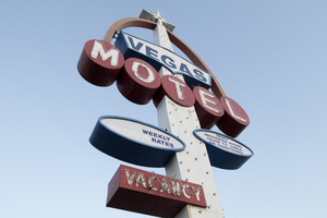
Photographs of Vegas Motel sign, Las Vegas (Nev.), March 3, 2017
Date
2017-03-03
2017-09-29
Archival Collection
Description
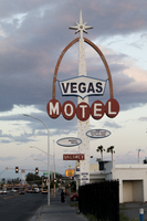
The Vegas Motel sign sits at 2212 East Fremont Street in Downtown Las Vegas. Information about the sign is available in the Southern Nevada Neon Survey Sheet.
Site address: 2212 Fremont St
Sign details: This motel was not found on the Assessor's page so there was not a record found on when the building was constructed. In between April of 2014 and May of 2015 the building was demolished though the signs still remain.
Sign condition: 3- Paint is still relatively nice on the sign but now there are just remains of lightbulbs/neon tubing.
Sign form: Pylon and a roadside directional sign
Sign-specific description: The main pylon is a rectangular beam with light blue paint at the bottom and white on top that has incandescent light bulbs. In the middle of the sign there are horizontal MOTEL white block font letters with each letter in an individual red circle as well as the letters outlined in skeletal neon. There is a red arch coming out of the letter M and ending over the letter L, and this arch goes to the top of the sign. Above the letters is a blue curvilinear sign box with a plastic back lit sign that has blue letters stating VEGAS. On the top of the sign is a white star burst. There also is a smaller roadside directional sign to the west of the main sign that has a white board painted with red letters stating Vegas Motel there is a big curved red arrow also on this one pointing to where they would have entered the driveway.
Sign - type of display: Neon, incandescent light bulbs and plastic back lit sign
Sign - media: Steel and plastic
Sign - non-neon treatments: Plastic back lit sign and incandescent light bulbs
Sign animation: Possibly once had a flasher for the incandescent light bulbs, but can not be determined because there are just remains of the light bulbs currently.
Sign environment: This location was on East Fremont near Eastern Ave where many other motels used to stand, but many have been demolished. Many of the signs of these motels though are still up on though they are not all in working condition.
Sign - thematic influences: This sign has remnants of Googie styles with the star as well as the arch portion of the sign.
Sign - artistic significance: The starburst on top is very similar to the star on Betty Willis Welcome to Fabulous Las Vegas sign.
Survey - research locations: Google map satellite and roadside view. Attempted assessor's page, UNLV special collections and Stephanie Roadside, as well as Vintage Las Vegas but no records found.
Survey - research notes: This location was very difficult to research since the building is no longer there as well as that if you search Vegas Motel into a database to research nearly every motel in Vegas shows up, but also nothing was found for this one.
Surveyor: Emily Fellmer
Survey - date completed: 2017-09-29
Sign keywords: Pylon; Neon; Incandescent; Steel; Plastic; Backlit; Flashing; Roadside; Pole sign
Mixed Content
neo000171-002
Date
2017-03-03
Description
Sign animation: Chasing, flashing, oscillating
Notes: The logo cabinets which adorn the entrances on the elevated walkways: The letters start with both rows of text in the off position. The top row flashes on, while the bottom row is dark then the bottom row illuminates, as the top row goes dark. Once the top row flashes off it flashes back on so that both rows of text are briefly illuminated simultaneously before they both go dark and the sequence stars over again. While this is going on the incandescent bulbs which line all of the raceways are chasing each other from left to right on the horizontal planes, while the arched sections chase each other downward. The triangular peaks which radiate around the top of the logo sign, flash on and off in a sequence which chase each other downward. First the top center peak flashes on, then the next sequential triangular channel on both sides illuminate simultaneously, flash off, then the next two in the series illuminate. The resultant effect is a chasing pattern starting from the top. The sister animation is located on almost the exact same design on the porte cochere. I would think the previous smaller sign would be based on the larger porte cochere. The other variance besides obvious size difference is the that the channel letters are filled with incandescent bulbs instead of neon. The animation is a bit simpler as well. The incandescent bulbs oscillate continuously while the triangular pan channels which create the radiating crown, animate. The neon in the channels chase each other as described in the smaller walk way version, while the text continues until the entire text flashes off, then on, off, then begin to animate once again. All of the bulbs, which line the raceways of the exterior edge of the porte cochere, as well as the encrustation of bulbs on the brass bull nose portion, animate in rapid succession. All the raceway bulbs chase each other while the bulbs on the brass portion continually oscillate. Animation continues on the east face of the building with the entrances first. The principle for these two signs is oscillation and chasing. All bulbs on the underside of the entrance, as well as in the logo, oscillate rapidly. All bulbs on the raceways chase each other. Further on the surface of the building as well, the Pepsi cola wall sign is found displaying a very unique form of animation, seen here on the strip. The signage for the Pepsi ad is located on the eastern wall. (Detailed in specific description) The Incandescent bulbs which fill the inside of the text that spells Pepsi, chase each other from left to right, leaving all the bulbs in its path illuminated, as if writing out the word Pepsi. The neon bars located within the tilted bottle of Pepsi are illuminated, and chase each other downward, leaving the bars it its path dark. As this sequence in taking place, the waving tubes of neon illuminate, flashed subtly making the neon appear as soda pouring out of the bottle. As the tubing flows then the vertical neon bars in the cup illuminate one at a time making the cup appear as if it is filling up. The text above each of the painted fires head, flashes back and forth as if talking to each other as well. ESPN ZONE animation: The letters in the vertical blade portion of the ESPN Zone illuminate one at a time, starting from the top. Once the entire phrase is lit, in flashes off then on then off, before restating. The orange and red neon tubing which resides inside the pan channels that represent flames flash on and off in a relaxed manner as if to animate the flickering of the flames. The small incandescent bulbs on the black portions above the main matrix reader board flash on and off subtly.
Notes: The logo cabinets which adorn the entrances on the elevated walkways: The letters start with both rows of text in the off position. The top row flashes on, while the bottom row is dark then the bottom row illuminates, as the top row goes dark. Once the top row flashes off it flashes back on so that both rows of text are briefly illuminated simultaneously before they both go dark and the sequence stars over again. While this is going on the incandescent bulbs which line all of the raceways are chasing each other from left to right on the horizontal planes, while the arched sections chase each other downward. The triangular peaks which radiate around the top of the logo sign, flash on and off in a sequence which chase each other downward. First the top center peak flashes on, then the next sequential triangular channel on both sides illuminate simultaneously, flash off, then the next two in the series illuminate. The resultant effect is a chasing pattern starting from the top. The sister animation is located on almost the exact same design on the porte cochere. I would think the previous smaller sign would be based on the larger porte cochere. The other variance besides obvious size difference is the that the channel letters are filled with incandescent bulbs instead of neon. The animation is a bit simpler as well. The incandescent bulbs oscillate continuously while the triangular pan channels which create the radiating crown, animate. The neon in the channels chase each other as described in the smaller walk way version, while the text continues until the entire text flashes off, then on, off, then begin to animate once again. All of the bulbs, which line the raceways of the exterior edge of the porte cochere, as well as the encrustation of bulbs on the brass bull nose portion, animate in rapid succession. All the raceway bulbs chase each other while the bulbs on the brass portion continually oscillate. Animation continues on the east face of the building with the entrances first. The principle for these two signs is oscillation and chasing. All bulbs on the underside of the entrance, as well as in the logo, oscillate rapidly. All bulbs on the raceways chase each other. Further on the surface of the building as well, the Pepsi cola wall sign is found displaying a very unique form of animation, seen here on the strip. The signage for the Pepsi ad is located on the eastern wall. (Detailed in specific description) The Incandescent bulbs which fill the inside of the text that spells Pepsi, chase each other from left to right, leaving all the bulbs in its path illuminated, as if writing out the word Pepsi. The neon bars located within the tilted bottle of Pepsi are illuminated, and chase each other downward, leaving the bars it its path dark. As this sequence in taking place, the waving tubes of neon illuminate, flashed subtly making the neon appear as soda pouring out of the bottle. As the tubing flows then the vertical neon bars in the cup illuminate one at a time making the cup appear as if it is filling up. The text above each of the painted fires head, flashes back and forth as if talking to each other as well. ESPN ZONE animation: The letters in the vertical blade portion of the ESPN Zone illuminate one at a time, starting from the top. Once the entire phrase is lit, in flashes off then on then off, before restating. The orange and red neon tubing which resides inside the pan channels that represent flames flash on and off in a relaxed manner as if to animate the flickering of the flames. The small incandescent bulbs on the black portions above the main matrix reader board flash on and off subtly.
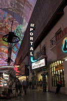
Photographs of El Portal gift shop, Las Vegas (Nev.), April 18, 2017
Date
2017-04-18
2017-08-11
Archival Collection
Description
The El Portal Gift Shop sits at 310 Fremont Street inside the Fremont Street Experience. Information about the sign is available in the Southern Nevada Neon Survey Sheet.
Site address: 310 Fremont St
Sign owner: HS Family LP c/o J. Blut
Sign details: The building was constructed in 1928 (Assessor). The El Portal Theatre opened June 21, 1928 as the first building in Las Vegas to install air conditioning (Cinema Treasures). The theater closed in the 1970's and the site became El Portal Gifts and then a Native American arts and crafts store (Cinema Treasures). The current owner has received approval to turn the building into a food court and tavern (Lazara, 2017).
Sign condition: Condition is 5. The cabinet, paint and lighting are all in top condition. A few light bulbs are missing from the light boxes on either side of the sign.
Sign form: Blade
Sign-specific description: The metal "L" shaped cabinet points inward toward the building. The cabinet is painted turquoise. Two rows of white incandescent bulbs run along the spine of the cabinet. "El" is spelled out horizontally across the top of the sign in white cursive channel letters with the interior outlined in white neon. "PORTAL" runs vertically down the cabinet in sans serif white channel letters with the interiors filled with three rows of white neon. At the bottom of the sign is a white channel arrow which is filled in by three rows of turquoise neon. The sign is inserted between two rectangular light boxes which angle out from the building to the edge of the sign. The light boxes are outlined with clear incandescent light bulbs, have a red and turquoise Native American blanket style design on each end and state "INDIAN ARTS &CRAFTS" in serif Native American style lettering. The light boxes are made to appear as if they are supported by two totem poles painted in back, white, red and turquoise.
Sign - type of display: Neon and incandescent (with lightboxes adjacent)
Sign - media: Steel (and plastic in adjacent lightboxes)
Sign - non-neon treatments: Lightboxes adjacent to sign
Sign environment: In the Fremont Street Experience. Sounded by other storefronts and casinos.
Sign - thematic influences: The El Portal building is Spanish Colonial style. The light boxes are Native American style.
Survey - research locations: Recorder's office
Survey - research notes: Cinema Treasures. (n.d.). El Portal Theatre. Retrieved from http://cinematreasures.org/theaters/1888 Lazara, G. (2017 June 13). The old El Portal Theatre to become a tavern. Retrieved from http://www.ktnv.com/news/the-old- el-portal- theatre-to- become-a- tavern
Surveyor: Mitchell Cohen
Survey - date completed: 2017-08-11
Sign keywords: Blade; Neon; Incandescent; Steel; Light box; Plastic
Mixed Content
Student Senate Appropriations Committee operating policy, University of Nevada, Las Vegas, 1976-77
Date
1976 to 1977
Archival Collection
Description
Student Senate Appropriations Committee operating policy for 1976-1977. CSUN Session 5 Meeting Minutes and Agendas.
Text
Meeting minutes for Consolidated Student Senate, University of Nevada, Las Vegas, December 13, 1973
Date
1973-12-13
Archival Collection
Description
Agenda and meeting minutes for the University of Nevada, Las Vegas Student Senate. CSUN Session 2 Meeting Minutes and Agendas.
Text