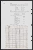
Search Results
Photographs of Riviera signs, Las Vegas (Nev.), 2002
Date
2002
Archival Collection
Description
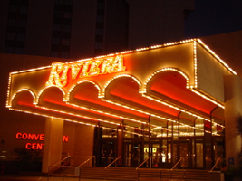
Nighttime views of the Riviera Hotel and Casino signs on the Strip. Information about the sign is available in the Southern Nevada Neon Survey Data Sheet.
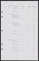
Site name: Riviera Hotel and Casino (Las Vegas, Nev.)
Site address: 2901 S Las Vegas Blvd
Sign owner: Riveria Holdings Corporation
Sign details: The Riviera is another of the properties on the Strip which brought its borders to the street. It is one of the properties with an extensive collection of signs on its properties. The glass wall and block long facade, which incorporates infinity lighting and neon displays. A highly animated an reflective ceiling of the westernmost pedestrian element right along Las Vegas Boulevard also plays host to a continuously pulsing entablature of text and neon. The outer portion of the wall facing west is also adorned with raceways, backlit signs, neon stars, and a host of other signs as well. The northwest corner is a unique collection of fascia wall design and sculptural elements on the corner as well for the "Nickeltown" portion of the casino. Along the east end of the property, more Riviera logo/wall signs denote entrances, while the eastern most edge plays host to the massive Riviera Pylon. Various signs also reside on the eastern side of the property. Text signs are located in several positions among various structures. There is also a rather busily illuminated awning, which is lined with incandescent bulbs and text.
Sign condition: Structure 5 Surface 4 Lighting 5
Sign form: Pylon; Fascia; Porte-cochère
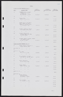
Sign-specific description: The main attraction to the Riviera is its mirrored round wall which serves as a multiuse billboard built around the neon advertisements for the Riviera's big show: Splash Front façade: The front façade of the Riviera is best described by starting with the giant glass well and heading north. The radius of the giant reflective extravaganza is in the general direction of the southwest so reflectivity is extremely good during the afternoon hours. The surface of the structurally integrated visions is surfaced with giant reflective mirrored panel which give way to the multicolored neon puzzle work of the Splash logo. The logo advertises for the show using iconography from the show itself represented with pan channel figures lined on the interiors with neon of corresponding colors for which they are painted. The text that spells "Splash" is painted red, with the circular raceway that sits in its background is painted yellow. The "Splash" text sits above the organic shapes of water shooting out from underneath the array of signage, painted blue and purple. The image of the female inside the logo text is graphically treated with the proper registration of illustrative quality. She is also lined with neon in the proper colors over the major outlines of her form. The entire array sits on a black background laden with incandescent bulbs. The neon is arranged so that as it progresses toward the ground the organic shapes radiate in a repeating pattern outward. The blue and purple neon radiate toward the ground while the red neon in the "Splash" radiates left toward the other side of the wall. Green channels spurt out of the top lined with green neon as well. On opposite sides of the radius wall, there are a series of signage that mirror each other. "Riviera" is written in channel letters filled with neon, and a series of internally lit, color cabinets, lined on the edges with incandescent bulbs. The middle portion of the wall is occupied with various sized stars, raceways, and incandescent bulbs found on extensions and diamond shaped faces. The stars are lined on the interior profile of the shape with blue and pink neon, as well as incandescent bulbs on the interior as well. The bottom of the radius wall is adorned with adorned with internally lit cabinets as well as various small neon creations. Moving north along the face of the building the façade the external elements are greatly supportive of the mirrored walls, and just as brilliant in their own right. The façade begins just to the south of the giant mirrored wall, with a section lined with vertical bars of neon animating in red, pink, purple, and blue neon. Riviera is written in cahnnel letters and filled with incandescent bulbs. The letters are outlined in red neon. On either side of the rectangular section, two small versions of the giant mirrored wall support green and blue wavy channels, lined on the interior edges with corresponding neon colors. Incandescent bulbs are present as well. The façade on the north side smoothly transitions into a wall of transparent plastic cubes, lit from the inside, with raceways running down the edges. This façade runs the entire length of the building, until the end is reached at the northwest corner and Nickeltown. Along the facade, internally lit cabinets surrounded by raceways occupy the vicinity of the lower portion of the sign. The faces are colored plastic and treated with graphics and text. Toward the end of the facade, a collection of small signs is fused together to create a single collection of busy signs. The entire structure is a chaotic vision of relief sculpture smashing into text and iconography, while bright, vibrant colors and neon, fight for attention. The majority of the sign is located on the body of the building, reaches down to touch the ground. Four fluted columns rise up from the ground to meet the bottom base of the massive wall sign. The columns rise up into a sculpted cabinet that is heavily crafted and adorned with ornate edges of hard-coated foam or fiberglass scrollwork. The swelling and swirling scrolls swell out in three dimensions. The entire border of the bottom section is turned into a detailed, organically shaped, cloud like shape. The scrollwork as well as the columns is finished white, with the recesses being toned a golden color. The effect accentuates the three dimensional nature of the design. The surface of this bottom portion is a diagonally crisscrossing pattern of white lattice- work on top of a golden surface. The center of the open surface is occupied by a giant pan channel, of the top three points at a purple, five-pointed star. Flanking either side of the star are small, steel, closed face cabinets, in the shape of squatty looking five pointed stars. They are varying sizes and are painted the three separate colors of purple, yellow, and green. The top point of the largest purple star rises through the top part of the bottom cloud section touching up into the massive collection of signs. This particular sign centers on a top logo reading "Riviera Slot Adventure" in channel letters in the style of action adventure movies such as "Indiana Jones." The first word is written in the logo style of the Riviera, and painted yellow on the interiors. The letters for the two words, "Slot Adventure" are bent with the force of motion and painted red, grading into an orange. Behind that, a circular cabinet, representing a globe, is painted blue in the center and fading to white. Flanking either side of the globe, associated more with the top portion of the globe, pairs of arching bronze colored cabinets slightly arch outward suggesting shining or an explosion. They are laden with incandescent bulbs. The remainder of the sign between the bottom star structure and the top slot adventure text, is occupied by a varied array of signage that can be designated between two halves of the collection. The left-hand side of the sign consists of three-dimensional sculptural elements, channel letters, relief elements. The far left side of the collection is rounded out by the three dimensional relief of crashing waves, creating a background for the three-dimensional structure of the mermaid. Red channel letters spell "Splash" above the mermaid, in white channel letters painted red on the inside. Neon lines the interior of the letters as well. Below the mermaid, more channel letters spell "Gardens" in red channel letters painted yellow on the interiors and lined on the interiors with neon. Above the crest of the wave a relief of a train shoots toward the north with a yellow and red circular cabinet above that with the text for jackpot junction. The train relief is also the designed with perspective to appear as if it is moving forward. Directly to the left of the train is set of yellow channel letters painted blue on the interior reading "Jackpot Factory," lined on the interior with neon. A purple backing cabinet is graphically painted on the face with images of gears. Just to the left of the text is the three dimensional sculpture representing a stack of coins. The space below the "Jackpot Factory" a purple cabinet with a colored face reads with graphics and text for "Valley of Games." Directly to the left of the "Valley of the Games" cabinet a three dimensional cherub is holding a large nickel, with a banner above that. The cherub is painted with the proper flesh tones, and the nickel is adorned with the proper details. The wings animate, utilizing two tubes of neon shaped as wings and in different positions to appear as flapping. A white arched steel banner, with blue text, reading "Nickel Heaven." Neon floats over the top of the letters. The right hand side of the entire collection is just as detailed and elaborate, if not ore than the left hand side. A white steel cabinet cut into the profile of the text, which is painted yellow with red outlines. The text reads 'Slot Frenzy' in two lanes. The red borders are lined with incandescent bulbs. The remaining negative space in the center of the sign is a painted slot handle with a circle of neon around the top of the handle. To the right of that, the surface of the board is created out of relief of faux rocks above what is a set of railroad tracks. A mine cart is on the tracks with giant diamond shaped gems residing in the interior space. A cabinet made of an arched banner and a square cabinet resides above the mine cart. The banner reads Double diamond in blue text, and "mines is spelled" in blue text on the rectangle. Further right the rocks give way to a portion of the cabinet, that reads "Jackpot City" in yellow channel letters, with yellow neon. Vertical raceways lined with incandescent bulbs shoot upward in the area of the text. All are supported on a multicolored flat cabinet, predominantly painted red. Nickel town: On the Northwest corner of the property three distinct images comprise the signage. The main marquee for Nickeltown over the entrance, a Riviera logo just to the right of that, and a large sculptural fountain, that dominates the corner with it's presence. Over the brass and glass doors for the entrance, a polished metal overhang radiuses above the door, and contains the words Nickel Town in channel letters. The two words are written horizontally in a line, and separated in the middle with a pan cjhannel star also lined with neon on it's interior. The star is centered with a channel number "5" which is filled with white neon. The star's neon colors are pink and blue, and are arranged as interior lining of the star. The underside of the awning, as the rest of the front facade, is adorned with the incandescent bulbs, placed neatly in the designated prismatic shapes. The neon rings also are present, running the pediment across the facade. Elements of the electric wall can be seen as well, with the metal diamonds supporting incandescent bulbs trailing upward from the awning up to the facade of the building behind it. Several different sizes of star rise up as well, they are identical in color and design shape. Since the interiors do not contain a channel letter, they contain a channel shaped star, lined with incandescent bulbs in the center. A different sort of star shape is present as well. This shape is an eight-sided shape, reminiscent of a snowflake. When I say snowflake, it is essentially a cross shaped piece crossed, with an "X" shape. The shape is designed out of a pan channel, filled with incandescent bulbs. White neon backs the channel. Directly to the right of the entrance, the mirrored facade reflects the entrance, as the reflective surface house vertical, neon bars as well. The three different colors are Blue, gold and green. Consuming the majority of the concrete expanse created by the small plaza, is the neon-laden fountain of light and steel, with a base of ceramic pool. The design is a circular pool, covered in 1"x1" ceramic tiles, and filled with water. Thee square poles are bent over, looking as if they are spraying up out of the fountain. They appear almost as if a bouquet. One is painted Blue, one gold, and the other red. These poles are striped with neon tubing of the corresponding colors. Internally lit cubes, of the same color scheme as the primary palette. Wrapping around the circumference of the top half of the plumage, is a silver pediment that radiuses around the fountain. The finish is polished metal, and matches the overhang presented in the Nickel Town signage. Raceways run along the top and bottom edges of the face, wile the internally lit advertisements occupying the open space of the pediment every so often. Riviera Convention Center: Directly to the east of Nickeltown, is the Riviera Convention center. Signage for the building is first evident when traveling west, looking at the east face of the building. Not far on the north side of the east face of the building, large channel letters hang denoting the building. The Riviera logo text is spelled in the signature text, outlined with red neon and filled with incandescent bulbs. Below that, a two lined text reads convention center in red channel letters, lined on the interior with red neon. On the south side of the building, two lines of text reads, "Royale Pavilion" and "Entrance" below that. These channel letters are red, and lined with red neon on the interiors. Tower: Along the north side of the main tower, "Riviera" is spelled with giant red channel letters, filled with incandescent bulbs, and lined with red neon. The rear entrance is shared for the hotel, and the convention center, and is denoted with signage, and an overhang. A large blockish overhang is cantilevered off of the side of the building and projects outward, toward the east. On the front edge, an arcade of arches is evident, which reveal five tube-like vaults that project the half radius all the way back to the building. All of the edges of the raceway, including the spaces on the underside, which separates the vaults, are lined with incandescent bulb lined raceways. The Riviera text spells "Riviera" across the front of the cantilevered structure. The channel letters are painted red, lined with red neon and filled with incandescent bulbs. Left of the cantilevered structure are letters, which spell convention center. They are channel letters with red plastic faces.
Sign - type of display: Neon; Incandescent; Backlit
Sign - media: Steel; Plastic; Glass; Fiberglass
Sign - non-neon treatments: Graphics; Paint
Sign animation: Chasing, flashing, oscillating
Notes: The incandescent bulbs inside the text reading "Paris" on the balloon oscillate rapidly.
Sign manufacturer: Federal Signal (fascia front glass)
Sign designer: Marge Williams/ Arch: Nikita Zukov (fascia design)
Sign - date of installation: 1988-1989
Sign - date of redesign/move: Pylon was moved to Convention Center Dr. and Paradise Rd. c. 1988
Surveyor: Joshua Cannaday
Survey - date completed: 2002
Sign keywords: Chasing; Flashing; Oscillating; Pylon; Fascia; Porte-cochère; Neon; Incandescent; Backlit; Steel; Plastic; Glass; Fiberglass; Paint; Graphics
Site name: Riviera Hotel and Casino (Las Vegas, Nev.)
Site address: 2901 S Las Vegas Blvd
Sign owner: Riveria Holdings Corporation
Sign details: The Riviera is another of the properties on the Strip which brought its borders to the street. It is one of the properties with an extensive collection of signs on its properties. The glass wall and block long facade, which incorporates infinity lighting and neon displays. A highly animated an reflective ceiling of the westernmost pedestrian element right along Las Vegas Boulevard also plays host to a continuously pulsing entablature of text and neon. The outer portion of the wall facing west is also adorned with raceways, backlit signs, neon stars, and a host of other signs as well. The northwest corner is a unique collection of fascia wall design and sculptural elements on the corner as well for the "Nickeltown" portion of the casino. Along the east end of the property, more Riviera logo/wall signs denote entrances, while the eastern most edge plays host to the massive Riviera Pylon. Various signs also reside on the eastern side of the property. Text signs are located in several positions among various structures. There is also a rather busily illuminated awning, which is lined with incandescent bulbs and text.
Sign condition: Structure 5 Surface 4 Lighting 5
Sign form: Pylon; Fascia; Porte-cochère
Sign-specific description: The main attraction to the Riviera is its mirrored round wall which serves as a multiuse billboard built around the neon advertisements for the Riviera's big show: Splash Front façade: The front façade of the Riviera is best described by starting with the giant glass well and heading north. The radius of the giant reflective extravaganza is in the general direction of the southwest so reflectivity is extremely good during the afternoon hours. The surface of the structurally integrated visions is surfaced with giant reflective mirrored panel which give way to the multicolored neon puzzle work of the Splash logo. The logo advertises for the show using iconography from the show itself represented with pan channel figures lined on the interiors with neon of corresponding colors for which they are painted. The text that spells "Splash" is painted red, with the circular raceway that sits in its background is painted yellow. The "Splash" text sits above the organic shapes of water shooting out from underneath the array of signage, painted blue and purple. The image of the female inside the logo text is graphically treated with the proper registration of illustrative quality. She is also lined with neon in the proper colors over the major outlines of her form. The entire array sits on a black background laden with incandescent bulbs. The neon is arranged so that as it progresses toward the ground the organic shapes radiate in a repeating pattern outward. The blue and purple neon radiate toward the ground while the red neon in the "Splash" radiates left toward the other side of the wall. Green channels spurt out of the top lined with green neon as well. On opposite sides of the radius wall, there are a series of signage that mirror each other. "Riviera" is written in channel letters filled with neon, and a series of internally lit, color cabinets, lined on the edges with incandescent bulbs. The middle portion of the wall is occupied with various sized stars, raceways, and incandescent bulbs found on extensions and diamond shaped faces. The stars are lined on the interior profile of the shape with blue and pink neon, as well as incandescent bulbs on the interior as well. The bottom of the radius wall is adorned with adorned with internally lit cabinets as well as various small neon creations. Moving north along the face of the building the façade the external elements are greatly supportive of the mirrored walls, and just as brilliant in their own right. The façade begins just to the south of the giant mirrored wall, with a section lined with vertical bars of neon animating in red, pink, purple, and blue neon. Riviera is written in cahnnel letters and filled with incandescent bulbs. The letters are outlined in red neon. On either side of the rectangular section, two small versions of the giant mirrored wall support green and blue wavy channels, lined on the interior edges with corresponding neon colors. Incandescent bulbs are present as well. The façade on the north side smoothly transitions into a wall of transparent plastic cubes, lit from the inside, with raceways running down the edges. This façade runs the entire length of the building, until the end is reached at the northwest corner and Nickeltown. Along the facade, internally lit cabinets surrounded by raceways occupy the vicinity of the lower portion of the sign. The faces are colored plastic and treated with graphics and text. Toward the end of the facade, a collection of small signs is fused together to create a single collection of busy signs. The entire structure is a chaotic vision of relief sculpture smashing into text and iconography, while bright, vibrant colors and neon, fight for attention. The majority of the sign is located on the body of the building, reaches down to touch the ground. Four fluted columns rise up from the ground to meet the bottom base of the massive wall sign. The columns rise up into a sculpted cabinet that is heavily crafted and adorned with ornate edges of hard-coated foam or fiberglass scrollwork. The swelling and swirling scrolls swell out in three dimensions. The entire border of the bottom section is turned into a detailed, organically shaped, cloud like shape. The scrollwork as well as the columns is finished white, with the recesses being toned a golden color. The effect accentuates the three dimensional nature of the design. The surface of this bottom portion is a diagonally crisscrossing pattern of white lattice- work on top of a golden surface. The center of the open surface is occupied by a giant pan channel, of the top three points at a purple, five-pointed star. Flanking either side of the star are small, steel, closed face cabinets, in the shape of squatty looking five pointed stars. They are varying sizes and are painted the three separate colors of purple, yellow, and green. The top point of the largest purple star rises through the top part of the bottom cloud section touching up into the massive collection of signs. This particular sign centers on a top logo reading "Riviera Slot Adventure" in channel letters in the style of action adventure movies such as "Indiana Jones." The first word is written in the logo style of the Riviera, and painted yellow on the interiors. The letters for the two words, "Slot Adventure" are bent with the force of motion and painted red, grading into an orange. Behind that, a circular cabinet, representing a globe, is painted blue in the center and fading to white. Flanking either side of the globe, associated more with the top portion of the globe, pairs of arching bronze colored cabinets slightly arch outward suggesting shining or an explosion. They are laden with incandescent bulbs. The remainder of the sign between the bottom star structure and the top slot adventure text, is occupied by a varied array of signage that can be designated between two halves of the collection. The left-hand side of the sign consists of three-dimensional sculptural elements, channel letters, relief elements. The far left side of the collection is rounded out by the three dimensional relief of crashing waves, creating a background for the three-dimensional structure of the mermaid. Red channel letters spell "Splash" above the mermaid, in white channel letters painted red on the inside. Neon lines the interior of the letters as well. Below the mermaid, more channel letters spell "Gardens" in red channel letters painted yellow on the interiors and lined on the interiors with neon. Above the crest of the wave a relief of a train shoots toward the north with a yellow and red circular cabinet above that with the text for jackpot junction. The train relief is also the designed with perspective to appear as if it is moving forward. Directly to the left of the train is set of yellow channel letters painted blue on the interior reading "Jackpot Factory," lined on the interior with neon. A purple backing cabinet is graphically painted on the face with images of gears. Just to the left of the text is the three dimensional sculpture representing a stack of coins. The space below the "Jackpot Factory" a purple cabinet with a colored face reads with graphics and text for "Valley of Games." Directly to the left of the "Valley of the Games" cabinet a three dimensional cherub is holding a large nickel, with a banner above that. The cherub is painted with the proper flesh tones, and the nickel is adorned with the proper details. The wings animate, utilizing two tubes of neon shaped as wings and in different positions to appear as flapping. A white arched steel banner, with blue text, reading "Nickel Heaven." Neon floats over the top of the letters. The right hand side of the entire collection is just as detailed and elaborate, if not ore than the left hand side. A white steel cabinet cut into the profile of the text, which is painted yellow with red outlines. The text reads 'Slot Frenzy' in two lanes. The red borders are lined with incandescent bulbs. The remaining negative space in the center of the sign is a painted slot handle with a circle of neon around the top of the handle. To the right of that, the surface of the board is created out of relief of faux rocks above what is a set of railroad tracks. A mine cart is on the tracks with giant diamond shaped gems residing in the interior space. A cabinet made of an arched banner and a square cabinet resides above the mine cart. The banner reads Double diamond in blue text, and "mines is spelled" in blue text on the rectangle. Further right the rocks give way to a portion of the cabinet, that reads "Jackpot City" in yellow channel letters, with yellow neon. Vertical raceways lined with incandescent bulbs shoot upward in the area of the text. All are supported on a multicolored flat cabinet, predominantly painted red. Nickel town: On the Northwest corner of the property three distinct images comprise the signage. The main marquee for Nickeltown over the entrance, a Riviera logo just to the right of that, and a large sculptural fountain, that dominates the corner with it's presence. Over the brass and glass doors for the entrance, a polished metal overhang radiuses above the door, and contains the words Nickel Town in channel letters. The two words are written horizontally in a line, and separated in the middle with a pan cjhannel star also lined with neon on it's interior. The star is centered with a channel number "5" which is filled with white neon. The star's neon colors are pink and blue, and are arranged as interior lining of the star. The underside of the awning, as the rest of the front facade, is adorned with the incandescent bulbs, placed neatly in the designated prismatic shapes. The neon rings also are present, running the pediment across the facade. Elements of the electric wall can be seen as well, with the metal diamonds supporting incandescent bulbs trailing upward from the awning up to the facade of the building behind it. Several different sizes of star rise up as well, they are identical in color and design shape. Since the interiors do not contain a channel letter, they contain a channel shaped star, lined with incandescent bulbs in the center. A different sort of star shape is present as well. This shape is an eight-sided shape, reminiscent of a snowflake. When I say snowflake, it is essentially a cross shaped piece crossed, with an "X" shape. The shape is designed out of a pan channel, filled with incandescent bulbs. White neon backs the channel. Directly to the right of the entrance, the mirrored facade reflects the entrance, as the reflective surface house vertical, neon bars as well. The three different colors are Blue, gold and green. Consuming the majority of the concrete expanse created by the small plaza, is the neon-laden fountain of light and steel, with a base of ceramic pool. The design is a circular pool, covered in 1"x1" ceramic tiles, and filled with water. Thee square poles are bent over, looking as if they are spraying up out of the fountain. They appear almost as if a bouquet. One is painted Blue, one gold, and the other red. These poles are striped with neon tubing of the corresponding colors. Internally lit cubes, of the same color scheme as the primary palette. Wrapping around the circumference of the top half of the plumage, is a silver pediment that radiuses around the fountain. The finish is polished metal, and matches the overhang presented in the Nickel Town signage. Raceways run along the top and bottom edges of the face, wile the internally lit advertisements occupying the open space of the pediment every so often. Riviera Convention Center: Directly to the east of Nickeltown, is the Riviera Convention center. Signage for the building is first evident when traveling west, looking at the east face of the building. Not far on the north side of the east face of the building, large channel letters hang denoting the building. The Riviera logo text is spelled in the signature text, outlined with red neon and filled with incandescent bulbs. Below that, a two lined text reads convention center in red channel letters, lined on the interior with red neon. On the south side of the building, two lines of text reads, "Royale Pavilion" and "Entrance" below that. These channel letters are red, and lined with red neon on the interiors. Tower: Along the north side of the main tower, "Riviera" is spelled with giant red channel letters, filled with incandescent bulbs, and lined with red neon. The rear entrance is shared for the hotel, and the convention center, and is denoted with signage, and an overhang. A large blockish overhang is cantilevered off of the side of the building and projects outward, toward the east. On the front edge, an arcade of arches is evident, which reveal five tube-like vaults that project the half radius all the way back to the building. All of the edges of the raceway, including the spaces on the underside, which separates the vaults, are lined with incandescent bulb lined raceways. The Riviera text spells "Riviera" across the front of the cantilevered structure. The channel letters are painted red, lined with red neon and filled with incandescent bulbs. Left of the cantilevered structure are letters, which spell convention center. They are channel letters with red plastic faces.
Sign - type of display: Neon; Incandescent; Backlit
Sign - media: Steel; Plastic; Glass; Fiberglass
Sign - non-neon treatments: Graphics; Paint
Sign animation: Chasing, flashing, oscillating
Notes: The incandescent bulbs inside the text reading "Paris" on the balloon oscillate rapidly.
Sign manufacturer: Federal Signal (fascia front glass)
Sign designer: Marge Williams/ Arch: Nikita Zukov (fascia design)
Sign - date of installation: 1988-1989
Sign - date of redesign/move: Pylon was moved to Convention Center Dr. and Paradise Rd. c. 1988
Surveyor: Joshua Cannaday
Survey - date completed: 2002
Sign keywords: Chasing; Flashing; Oscillating; Pylon; Fascia; Porte-cochère; Neon; Incandescent; Backlit; Steel; Plastic; Glass; Fiberglass; Paint; Graphics
Mixed Content
Photographs of New York New York signs, Las Vegas (Nev.), 2002
Date
2002
2017-08-30
Archival Collection
Description
Photos show New York New York signs at night. Two surveys were conducted to gather information about this sign. One was conducted in 2002 and one was conducted in 2017. PDFs are available for both surveys. See the 2017 survey PDF for additional information that is not included in the object description.
Site name: New York-New York Hotel and Casino (Las Vegas, Nev.)
Site address: 3790 S Las Vegas Blvd
Sign owner: MGM Mirage
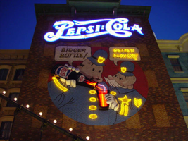
Sign details: Occupying the northwest corner of Las Vegas Blvd and Tropicana Ave. is the New York New York Hotel and Casino. The property is a miniature representation of New York City in a collection of colorful architecture and sculpture. Colored reflective panels create the facades of high rises and skyscrapers. An almost cartoon like element is brought to the structures, flowing seamlessly sometimes throughout a surreal landscape of classical architectural elements and mock high rises. Distinguishable landmarks, such as the Empire State Building, the Statue of Liberty, and the Brooklyn Bridge, can be recognized with ease. A lagoon of water represents a harbor shooting water out of fountains disguised as boats.
Sign condition: Structure 5 Surface 5 Lighting 5
Sign form: Pylon; Fascia; Porte-cochère
Sign-specific description: The porte cochere is located on the south side of the property facing Tropicana Ave. The design cantilevers off of the main structure to the north, and then is supported by two columns on its far end. The three exposed sides hold the radiating crown of the New York New York logo sign. The two on the east and west sides are smaller than the one on the south side, but are essentially the same design. A half circle cabinet holds the text New York New York stacked in two lines. The channel letters are polished metal on the outside with incandescent bulbs on the interior. Their faces are bordered with red neon. The text is positioned on the front of the half circle cabinet. Breaking the surface of the radius edge, elongated triangular pan channels create a repeating pattern. The result is a crown of points running all across the top of the cabinet. It is reminiscent of the crown on the statue of liberty, or the rays of the rising sun. The face of the cabinet is painted blue, with metallic raceways, filling the negative spaces with more triangular shapes. The triangular pans are painted yellow on the interior with a blue finish on the exterior. The exterior width of the cabinet is also finished in a golden reflective surface. Three tubes of neon fashioned into succeedingly smaller triangles are inside each surface. The color scheme of the neon is yellow being the outer, orange being the second, and the center being red. The sign on the south side is designed the same, except being quite a bit larger, and the crowns of the cabinet angle forward instead of straight up in the air. All the edges are bordered with incandescent bulbs. The bottom edge below the signage, actually underlining the signage significantly, is a gold polished double bull nose that wraps the entire length of each side. The surface is strewn with small incandescent bulbs. An entablature runs above the bull nose, filling the spaces between the sign. The pediment is bordered on the top and the bottom with gold polished raceways and incandescent bulbs. Two mirrored posts support the southern end. The ceiling of the porte cochere is treated much the same as the logo signage on the three sides of the roof. Long pan channels are placed on the ceilings and shaped to look like waving banners, confetti, and beams, radiate out of a centerpiece positioned over the entrance to the casino. Red pans are painted orange on the interiors and green channels are painted blue on the interior. Tubes of neon are bent to the contours of the shapes of each one of these channels. The entire composition is a brilliant abstract pattern of light and colored steel shooting out toward Tropicana Ave. Headed east toward the northwest corner a bridge connects the Excalibur property to the New York New York. At the end of a bridge an entrance into the NY NY is below a LED message center and an arched logo cabinet, with the text and the radiating triangular channels. It is actually the same neon and color scheme, just fit to sit over the LCD display. The sign faces south. The sign has the distinct backdrop of a domed rotunda lined with columns. Rounding the corner another elevated bridge stretches east over the strip to the MGM property. The same configuration of the arched signage, along with the illuminated text, and LCD display screen is on the east side of the building. The corner facade of the harbor is flanked by these two collections of signs and walkways. Around the corner, the property extends north up Las Vegas Blvd continuing the facade of fake apartment buildings, with storefront windows at ground level. Here the replica of the Brooklyn Bridge serves as the main concourse of pedestrian activity. There are two sections of sign that are of particular interest to the eastern face of the building. The first is an advertisement for Panasonic. Panasonic is spelled in silver channel letters with blue fronts. The blocky font is internally lit. The entire text sits along the top edge of a matching message center. Further north on the face of the building, a section of building, finished in brick, combine graphics and three-dimensional elements for a sign for Pepsi. Toward the top of the face a logo/wall sign is crafted out of channel letters and filled with incandescent bulbs and bordered with blue neon. The entire text reads "Pepsi: Cola" The capital "P" and "C" are crafted out of one cursive style channel. The remaining letters are spelled in separate channel letters. The channel letters are stylized in a fashion reminiscent of the turn if the century. The colon placed between the "I" in Pepsi and the "C" in cola is also made out of channel boxes. Below the logo, a mural is painted on the majority of the remaining open space on the surface. Two police officers, in the style of early cartoons from the first few decades of the twentieth century, are the focus of the mural and are reminiscent of the famed "keystone" cops. The two figures are shown from about waist up in a circle, which is broken at the top by the white painted thought bubbles, bordered in black. The thought bubble on the left reads "bigger bottle" and the opposite reads, "better flavor". The two police officers correspond the appropriate thought bubble, with the one on the left being the larger figure, and the one on the right being smaller and apparently older. They are treated with blue paint, with their stripes, buttons and badges, treated in yellow paint. The skin tones are treated with proper hues, with facial features distinguished by black contour lines. The three-dimensional aspects come into play when describing their action. The officer on the left is pouring a bottle of the cola into the glass, which the other officer is holding. The one hand each officer is showing is a three-dimensional, fiberglass, white, cartoon, gloves. The one on the left is integrated into the tilted bottle. The bottle is coming off of the wall in a sculpted two-dimensional cabinet. The bottle is treated with the red white and blue Pepsi label, and reminiscent of the logo channel text. The tilted bottle points down toward a glass that the other officer holds. The glass is also a sculpted cabinet treated with paint on the surface, as well as the bottle, to appear as glass, utilizing highlights. Neon for the mural is cleverly designed to accent the mural and compliment the design. The text in the thought bubbles is overlaid with yellow neon, which animates back and forth to suggest an interaction of talking to each other. One half will illuminate, then the other as the first darkens. The yellow painted buttons, stripes, and badges of the characters uniforms are all outlined with yellow neon. The action of the neon in the bottle and glass can be seen through the semitransparent materials. Horizontal tubes of red neon fill the bottle, as well as the glass. In the space between the bottle and the glass waving tubes of neon pass through the apparent opening at the top of the cabinet, and can be seen behind the translucent face. When in action, the bottle appears as if it is pouring the liquid into the cup. (see animation notes) Among the ground level shops along the east side, marquis signage denotes passage. One on the southern end of the elevation just before the Brooklyn Bridge begins, and another, a bit further north, before the ESPN Zone signage. Two message panels come off the wall at an angle flattening off with a smaller panel boasting logo channel letters. Each one of the wings are spanned across the top of the face with channel letters spelling "entrance," painted in an off white on the interior. They are filled with incandescent bulbs and bordered with red neon. The remaining space on the bottom of the face is an LED message center. A narrow horizontal plane rises off of the top edge and is lined with three tubes of neon. The cabinet is made of a polished gold metal. The entire outline of the wing is lined with a raceway lined with incandescent bulbs. Smaller eastern face of the overhang is a square cabinet with an arched top. To either side of the cabinet is crafted into a set of two narrow horizontal planes. The one closest to the cabinet is taller that the one right next to it, with rounded corners echoing the curve of the main cabinet. The resultant effect is a sculpted cabinet with a top edge descending on either side in a water falling radius. These bookend elements are bordered with yellow, and three vertical tubes of neon running the length of the interior. They main cabinet is occupied by the internally lit double set initials "NY," stacked one set on top of the other. They too are filled with incandescent bulbs and bordered with red neon. The face of the middle cabinet is bordered with incandescent bulbs and finished in a slick blue hue. The underside of the overhang is covered in the polished gold surface and laden with incandescent bulbs. The northern end of the property is dominated by the signage for the ESPN Zone sports lounge, located inside the NY NY. The exterior signage is basically a theatre marquee entrance with a long overhang supporting an electronic message banner that reads from left to right. The majority of the theatre front is polished aluminum wit h thin tubes of red neon above and below the electronic reader board. Above the top edge of the actual front of the sign is a design of pan channels, crafted and shaped to form a complex background for the logo text spelling "ESPN." A wavy green crafted channel creates what looks like a horizon. The space between the marquee and the green channel is a black field laden with incandescent bulbs. Above the green channel an array of pan channels crafted into interlocking, swaying, pointed shapes. They are painted yellow and orange so the result is a bed of flames. These too are lined in the interior of the contour in red and orange neon. In the center of the entire face of the overhand in a black steel cabinet with the logo for the establishment spelling "ESPN Zone." The First portion of the two-word phrase is spelled in shallow channel letters lined with horizontal bars of white neon. The text is outlined in red neon as well. The second half spells "Zone," and is written in the same font with the "Z" being the largest letter in the sign, designed with the bottom horizontal leg underlining the rest of the letters in the word. The word is oulined with white neon as well. The latter portion is filled with horizontal bars of red neon. Situated along the middle of the sign, and against the vertical plane of the building, a blade sign repeats the design and colors of the bottom portion of the sign. The vertical cabinet is double sided spelling the "ESPN Zone" logo vertically with the same neon treatments for the respective words. The three toned background of black, green, red and orange on the bottom of the sign is interpreted on the blade. Running vertically, the black portion laden with bulbs runs against the wall, with the wavy channel next to that, disappearing temporarily behind the letters. The flames hang off of the outer edge of the sign. All of the neon treatments are seen here as well. Crowning the top of the blade sign two circular cabinets are arranged touching each other at one end, the faces pointing out to angled directions. Here the ESPN logo is arranged inside a circle. The bottom half below the letters is filled with horizontal bars of green neon, while the flames are present on the top half. The same cabinets can be seen mounted on the ends of the bottom overhang.
Sign - type of display: Neon; Incandescent; Backlit
Sign - media: Steel; Plastic; Fiberglass
Sign - non-neon treatments: Graphics; Paint
Sign animation: Chasing, flashing, oscillating
Notes: The incandescent bulbs inside the text reading "Paris" on the balloon oscillate rapidly.
Sign environment: Centering around the theme of the city of New York, it utilizes the corner to create a wrapping montage of sales kiosks, paralleled by a miniature replica of the Brooklyn bridge transforming into a corner bay flanked by the overhead walkways, and bringing the viewer in to the brightly lit arms of the porte cochere. The environment of the overhead wall signs and entrance signs blend in and compliment the theme aspect of being in a city. Of course they stand out a bit more with the over the top Vegas garishness, but they also add to the pedestrian interactive feature that creates the environment in which it sets out to accomplish. The corner fountain provides a unique experience with the views of the neighboring casinos but creates a bit more of a surreal nature with the small scale Statue of Liberty and backing of stylized skyscrapers and metropolitan architecture. To follow further around the corner headed south; the blazing neon adorned porte-cochere is backed by yet more architecture and the sweeping tracks of the resorts roller coaster.
Sign designer: Marnell Corrao Architect: Neal Gaskin
Sign - date of installation: 1997
Sign - thematic influences: The New York City theme is the consuming factor in the aspects of the outmost design interior and exterior, as well as influencing the design of the signage itself. From the corner design being used to create a miniature water spectacular representing a harbor, to the faux apartment and store-fronts, and replica Brooklyn Bridge, to the peaks of the logo cabinet work. It joins the array of properties on the strip which are heavily themed, and designed to attract a family oriented crowd. It is also themed after a city.
Sign - artistic significance: This resort has regularly been recognized as one of the architectural wonders of the Strip, and the signage contributes to its fame.
Surveyor: Joshua Cannaday
Survey - date completed: 2002
Sign keywords: Chasing; Flashing; Oscillating; Pylon; Fascia; Porte-cochère; Neon; Incandescent; Backlit; Steel; Plastic; Fiberglass; Paint; Graphics
Site name: New York-New York Hotel and Casino (Las Vegas, Nev.)
Site address: 3790 S Las Vegas Blvd
Sign owner: MGM Mirage
Sign details: Occupying the northwest corner of Las Vegas Blvd and Tropicana Ave. is the New York New York Hotel and Casino. The property is a miniature representation of New York City in a collection of colorful architecture and sculpture. Colored reflective panels create the facades of high rises and skyscrapers. An almost cartoon like element is brought to the structures, flowing seamlessly sometimes throughout a surreal landscape of classical architectural elements and mock high rises. Distinguishable landmarks, such as the Empire State Building, the Statue of Liberty, and the Brooklyn Bridge, can be recognized with ease. A lagoon of water represents a harbor shooting water out of fountains disguised as boats.
Sign condition: Structure 5 Surface 5 Lighting 5
Sign form: Pylon; Fascia; Porte-cochère
Sign-specific description: The porte cochere is located on the south side of the property facing Tropicana Ave. The design cantilevers off of the main structure to the north, and then is supported by two columns on its far end. The three exposed sides hold the radiating crown of the New York New York logo sign. The two on the east and west sides are smaller than the one on the south side, but are essentially the same design. A half circle cabinet holds the text New York New York stacked in two lines. The channel letters are polished metal on the outside with incandescent bulbs on the interior. Their faces are bordered with red neon. The text is positioned on the front of the half circle cabinet. Breaking the surface of the radius edge, elongated triangular pan channels create a repeating pattern. The result is a crown of points running all across the top of the cabinet. It is reminiscent of the crown on the statue of liberty, or the rays of the rising sun. The face of the cabinet is painted blue, with metallic raceways, filling the negative spaces with more triangular shapes. The triangular pans are painted yellow on the interior with a blue finish on the exterior. The exterior width of the cabinet is also finished in a golden reflective surface. Three tubes of neon fashioned into succeedingly smaller triangles are inside each surface. The color scheme of the neon is yellow being the outer, orange being the second, and the center being red. The sign on the south side is designed the same, except being quite a bit larger, and the crowns of the cabinet angle forward instead of straight up in the air. All the edges are bordered with incandescent bulbs. The bottom edge below the signage, actually underlining the signage significantly, is a gold polished double bull nose that wraps the entire length of each side. The surface is strewn with small incandescent bulbs. An entablature runs above the bull nose, filling the spaces between the sign. The pediment is bordered on the top and the bottom with gold polished raceways and incandescent bulbs. Two mirrored posts support the southern end. The ceiling of the porte cochere is treated much the same as the logo signage on the three sides of the roof. Long pan channels are placed on the ceilings and shaped to look like waving banners, confetti, and beams, radiate out of a centerpiece positioned over the entrance to the casino. Red pans are painted orange on the interiors and green channels are painted blue on the interior. Tubes of neon are bent to the contours of the shapes of each one of these channels. The entire composition is a brilliant abstract pattern of light and colored steel shooting out toward Tropicana Ave. Headed east toward the northwest corner a bridge connects the Excalibur property to the New York New York. At the end of a bridge an entrance into the NY NY is below a LED message center and an arched logo cabinet, with the text and the radiating triangular channels. It is actually the same neon and color scheme, just fit to sit over the LCD display. The sign faces south. The sign has the distinct backdrop of a domed rotunda lined with columns. Rounding the corner another elevated bridge stretches east over the strip to the MGM property. The same configuration of the arched signage, along with the illuminated text, and LCD display screen is on the east side of the building. The corner facade of the harbor is flanked by these two collections of signs and walkways. Around the corner, the property extends north up Las Vegas Blvd continuing the facade of fake apartment buildings, with storefront windows at ground level. Here the replica of the Brooklyn Bridge serves as the main concourse of pedestrian activity. There are two sections of sign that are of particular interest to the eastern face of the building. The first is an advertisement for Panasonic. Panasonic is spelled in silver channel letters with blue fronts. The blocky font is internally lit. The entire text sits along the top edge of a matching message center. Further north on the face of the building, a section of building, finished in brick, combine graphics and three-dimensional elements for a sign for Pepsi. Toward the top of the face a logo/wall sign is crafted out of channel letters and filled with incandescent bulbs and bordered with blue neon. The entire text reads "Pepsi: Cola" The capital "P" and "C" are crafted out of one cursive style channel. The remaining letters are spelled in separate channel letters. The channel letters are stylized in a fashion reminiscent of the turn if the century. The colon placed between the "I" in Pepsi and the "C" in cola is also made out of channel boxes. Below the logo, a mural is painted on the majority of the remaining open space on the surface. Two police officers, in the style of early cartoons from the first few decades of the twentieth century, are the focus of the mural and are reminiscent of the famed "keystone" cops. The two figures are shown from about waist up in a circle, which is broken at the top by the white painted thought bubbles, bordered in black. The thought bubble on the left reads "bigger bottle" and the opposite reads, "better flavor". The two police officers correspond the appropriate thought bubble, with the one on the left being the larger figure, and the one on the right being smaller and apparently older. They are treated with blue paint, with their stripes, buttons and badges, treated in yellow paint. The skin tones are treated with proper hues, with facial features distinguished by black contour lines. The three-dimensional aspects come into play when describing their action. The officer on the left is pouring a bottle of the cola into the glass, which the other officer is holding. The one hand each officer is showing is a three-dimensional, fiberglass, white, cartoon, gloves. The one on the left is integrated into the tilted bottle. The bottle is coming off of the wall in a sculpted two-dimensional cabinet. The bottle is treated with the red white and blue Pepsi label, and reminiscent of the logo channel text. The tilted bottle points down toward a glass that the other officer holds. The glass is also a sculpted cabinet treated with paint on the surface, as well as the bottle, to appear as glass, utilizing highlights. Neon for the mural is cleverly designed to accent the mural and compliment the design. The text in the thought bubbles is overlaid with yellow neon, which animates back and forth to suggest an interaction of talking to each other. One half will illuminate, then the other as the first darkens. The yellow painted buttons, stripes, and badges of the characters uniforms are all outlined with yellow neon. The action of the neon in the bottle and glass can be seen through the semitransparent materials. Horizontal tubes of red neon fill the bottle, as well as the glass. In the space between the bottle and the glass waving tubes of neon pass through the apparent opening at the top of the cabinet, and can be seen behind the translucent face. When in action, the bottle appears as if it is pouring the liquid into the cup. (see animation notes) Among the ground level shops along the east side, marquis signage denotes passage. One on the southern end of the elevation just before the Brooklyn Bridge begins, and another, a bit further north, before the ESPN Zone signage. Two message panels come off the wall at an angle flattening off with a smaller panel boasting logo channel letters. Each one of the wings are spanned across the top of the face with channel letters spelling "entrance," painted in an off white on the interior. They are filled with incandescent bulbs and bordered with red neon. The remaining space on the bottom of the face is an LED message center. A narrow horizontal plane rises off of the top edge and is lined with three tubes of neon. The cabinet is made of a polished gold metal. The entire outline of the wing is lined with a raceway lined with incandescent bulbs. Smaller eastern face of the overhang is a square cabinet with an arched top. To either side of the cabinet is crafted into a set of two narrow horizontal planes. The one closest to the cabinet is taller that the one right next to it, with rounded corners echoing the curve of the main cabinet. The resultant effect is a sculpted cabinet with a top edge descending on either side in a water falling radius. These bookend elements are bordered with yellow, and three vertical tubes of neon running the length of the interior. They main cabinet is occupied by the internally lit double set initials "NY," stacked one set on top of the other. They too are filled with incandescent bulbs and bordered with red neon. The face of the middle cabinet is bordered with incandescent bulbs and finished in a slick blue hue. The underside of the overhang is covered in the polished gold surface and laden with incandescent bulbs. The northern end of the property is dominated by the signage for the ESPN Zone sports lounge, located inside the NY NY. The exterior signage is basically a theatre marquee entrance with a long overhang supporting an electronic message banner that reads from left to right. The majority of the theatre front is polished aluminum wit h thin tubes of red neon above and below the electronic reader board. Above the top edge of the actual front of the sign is a design of pan channels, crafted and shaped to form a complex background for the logo text spelling "ESPN." A wavy green crafted channel creates what looks like a horizon. The space between the marquee and the green channel is a black field laden with incandescent bulbs. Above the green channel an array of pan channels crafted into interlocking, swaying, pointed shapes. They are painted yellow and orange so the result is a bed of flames. These too are lined in the interior of the contour in red and orange neon. In the center of the entire face of the overhand in a black steel cabinet with the logo for the establishment spelling "ESPN Zone." The First portion of the two-word phrase is spelled in shallow channel letters lined with horizontal bars of white neon. The text is outlined in red neon as well. The second half spells "Zone," and is written in the same font with the "Z" being the largest letter in the sign, designed with the bottom horizontal leg underlining the rest of the letters in the word. The word is oulined with white neon as well. The latter portion is filled with horizontal bars of red neon. Situated along the middle of the sign, and against the vertical plane of the building, a blade sign repeats the design and colors of the bottom portion of the sign. The vertical cabinet is double sided spelling the "ESPN Zone" logo vertically with the same neon treatments for the respective words. The three toned background of black, green, red and orange on the bottom of the sign is interpreted on the blade. Running vertically, the black portion laden with bulbs runs against the wall, with the wavy channel next to that, disappearing temporarily behind the letters. The flames hang off of the outer edge of the sign. All of the neon treatments are seen here as well. Crowning the top of the blade sign two circular cabinets are arranged touching each other at one end, the faces pointing out to angled directions. Here the ESPN logo is arranged inside a circle. The bottom half below the letters is filled with horizontal bars of green neon, while the flames are present on the top half. The same cabinets can be seen mounted on the ends of the bottom overhang.
Sign - type of display: Neon; Incandescent; Backlit
Sign - media: Steel; Plastic; Fiberglass
Sign - non-neon treatments: Graphics; Paint
Sign animation: Chasing, flashing, oscillating
Notes: The incandescent bulbs inside the text reading "Paris" on the balloon oscillate rapidly.
Sign environment: Centering around the theme of the city of New York, it utilizes the corner to create a wrapping montage of sales kiosks, paralleled by a miniature replica of the Brooklyn bridge transforming into a corner bay flanked by the overhead walkways, and bringing the viewer in to the brightly lit arms of the porte cochere. The environment of the overhead wall signs and entrance signs blend in and compliment the theme aspect of being in a city. Of course they stand out a bit more with the over the top Vegas garishness, but they also add to the pedestrian interactive feature that creates the environment in which it sets out to accomplish. The corner fountain provides a unique experience with the views of the neighboring casinos but creates a bit more of a surreal nature with the small scale Statue of Liberty and backing of stylized skyscrapers and metropolitan architecture. To follow further around the corner headed south; the blazing neon adorned porte-cochere is backed by yet more architecture and the sweeping tracks of the resorts roller coaster.
Sign designer: Marnell Corrao Architect: Neal Gaskin
Sign - date of installation: 1997
Sign - thematic influences: The New York City theme is the consuming factor in the aspects of the outmost design interior and exterior, as well as influencing the design of the signage itself. From the corner design being used to create a miniature water spectacular representing a harbor, to the faux apartment and store-fronts, and replica Brooklyn Bridge, to the peaks of the logo cabinet work. It joins the array of properties on the strip which are heavily themed, and designed to attract a family oriented crowd. It is also themed after a city.
Sign - artistic significance: This resort has regularly been recognized as one of the architectural wonders of the Strip, and the signage contributes to its fame.
Surveyor: Joshua Cannaday
Survey - date completed: 2002
Sign keywords: Chasing; Flashing; Oscillating; Pylon; Fascia; Porte-cochère; Neon; Incandescent; Backlit; Steel; Plastic; Fiberglass; Paint; Graphics
Mixed Content