Search Results

Photographs of Candlelight Wedding Chapel sign, Las Vegas (Nev.), 2002
Date
2002
Archival Collection
Description
Daytime and nighttime views of the Candlelight Wedding Chapel sign. Information about the sign is available in the Southern Nevada Neon Survey Data Sheet.
Site address: 800 S 4th Street
Sign details: The Candlelight Wedding chapel is located on the corner, just north from the Riviera and in the same parking lot as The Algiers. The small white, wooden roofed structure sits just to the east of the street and the northern side butts against Stardust Rd . Outside, the corner is treated with grass, and landscaping, creating a pleasant environment to go along with the charm of the building as well. The low level pole sign faces north/west. The building has a small wooden cross, surrounded on the edges with white neon, on the top of the building, in the same fashion as the Little Church of the West. The style of the building is classic New England architecture
Sign condition: Structure 4 Surface 3 Lighting 3
Sign form: Pylon
Sign-specific description: The main sign for the candlelight wedding chapel is essentially a small pole sign with three separate sections of cabinets along with lighting elements. The white steel pole rises out of the ground ,before transforming into a large two sided marquee cabinet. The cabinet is crafted with sculptural elements into its outer edge. The four corners swell up and bulge, before slightly swooping inward. The top and bottom edges are climaxed into a shallow point. The sides sweep into the notch of a negative circular shape. The sides are given a scroll type feel. In two lines across the red face of the sign, Wedding Chapel is spelled is white text, occupying most of the space of the cabinet. Across the very bottom of the cabinet Wedding Information is spelled in an all white single row of text. The larger text is lined with incandescent bulbs and outlined in neon. The bottom line of text is just lined in neon. The pole protrudes through the top of the sign where a small horizontal, internally lit cabinet, sports sculpted edges as well. The top and bottom edges sweep from either side, then descend meeting at a point in the center. The sides are simply concave, radiuses inward. The white cabinet is lit internally, illuminating the white plastic face. Black text stretches across the plastic face, reading candlelight. Below the main cabinet two internally lit cabinet sandwich the pole, creating two faces. The cabinets are all white, with white faces, utilizing red letters. At the very top of the pole is a tree tiered formation created with raceways and lined with incandescent bulbs. One raceway rises vertically into the air perpendicular to the ground, while the two flanking pieces arch out created a three-pieced fountain shape. It is also reminiscent of a Fleur de Lis.
Sign - type of display: Neon; Incandescent; Backlit
Sign - media: Steel; Plastic
Sign animation: none
Sign environment: The positioning of the Candlelight Wedding chapel gives it a unique role as an accent of softness, among a bombardment of neon and pulsating lights. Just to the North, is the Algiers parking lot, and to the south, the Riviera. Directly west across the strip there is the ever electric Circus Circus. Amid all this chaos of incandescence, screeching cabs, and buzzing current, the green shrubbery and plot of turf finely houses the pylon, and leads up to the structure itself. It is very charming and fresh compared to. It definitely is reminiscent of the era of establishment such as its neighbor the Algiers.
Sign manufacturer: YESCO
Sign - thematic influences: The theme of the sign has little to do with the theme of the wedding chapel, and more so to do with the architectural theme, than the function of the establishment. The pole sign contains standard elements of local signage. The logo cabinet, and internally lit message center. It even contains the most common element of a raceway lined with incandescent bulbs. The sculpted edges of the pylon's logo cabinet are reminiscent of other cabinets with sculpted edges. The most famous reference to this shape seen in classic Vegas history, is the original corner fascia seen on the Golden Nugget. As far as being compared to the only other existing independent wedding chapel, its structure is similar, that being a small structure boasting a highly visible steeple.
Surveyor: Joshua Cannaday
Survey - date completed: 2002
Sign keywords: Pylon; Neon; Incandescent; Backlit; Steel; Plastic
Mixed Content
Blue Angel Motel Neon Survey document, August 12, 2017
Date
2017-08-12
Archival Collection
Description
Information about the Blue Angel Motel that sits at 2110 Fremont St.
Site address: 2110 Fremont St
Sign owner: Bartsas Mary 22 LLC
Sign details: Motel was originally constructed c. 1956. Sits on a 2.54 acre site. Property was later changed to Club 2110, but now is vacant.
Sign condition: Unknown - Angel is being repaired by City Centennial Commision and YESCO, and will believed to be placed on medium of Fremont and Charleston once restored. 4 - Arches were repainted at unknown time from original blue to a deep forest green, "Blue Angel" was removed and "Night Club" was put up in blue angels place. "Motel" wording on flag portions of the sign was painted over and replaced with "Club 2110". doesn't have any form of lighting, appears to be in decent condition.
Sign form: Angel - Sculpted Pole Sign/ Monument Sign, Arches: Pole sign with protruding arches on either side. Originally the left side arch would have rested on the Blue Angel motel building, but when it was torn down so was the connection, so it is free hanging off the pole support system.
Sign-specific description: Angel: Pole sign with sculpture of Angel on top. Was internally illuminated, her skin, hair, halow, pole, wand, used to illuminate. Two flag signs hung off of angel pedestal, one read "Motel" other would read "Blue Angel" on opposite sides of the pole. Would of glowed with blue neon. Arches: Repainted by new owner: Arcs protruding on either side of the pole with the words "Night" and "Club" on each other arches. There are flag like components going down the pole support with stars on the opposite side of each component. Slight directional tool of the flags that point downwards to the ground. The stars do not have any lighting system of their own (no neon or bulbs). Each flag component is double sided with painted on graphics.
Sign - type of display: Neon, and internally illuminated plastic
Sign - media: Steel, fiberglass
Sign animation: Possible rotation of the angel?
Sign environment: The property is surrounded by other motels, shopping centers and gas stations
Sign manufacturer: YESCO
Sign designer: Betty Willis
Sign architect of record: C. 1956
Sign - date of installation: C. 1956
Sign - date of redesign/move: Angel - 2014 repaint, 2017 refurbishment, c. 2014 repaint of arches
Sign - thematic influences: Believed that angel was modeled after Marilyn Monroe
Sign - artistic significance: 1950s pop culture themes - Marilyn Monroe and Disney-esque angel
Survey - research locations: Motel site, www.roadarch.com, UNLV photo collections, assessor's website
Surveyor: Danny Jacobs
Survey - date completed: 2017-08-12
Sign keywords: Sculptural; Neon; Steel; Fiberglass; Pole sign; Internally illuminated; Incandescent
Text
Photograph of Summerhays Music Center neon sign; Guardian State Bank, KSL TV Infocenter, Slyvania Superset, Confetti, Flying J Truck Stop, and Bradley's Sleep Center electric signs, undated
Level of Description
Item
Archival Collection
Young Electric Sign Company (YESCO) Corporate Records
To request this item in person:
Collection Number: MS-00403
Collection Name: Young Electric Sign Company (YESCO) Corporate Records
Box/Folder: Box 10
Collection Name: Young Electric Sign Company (YESCO) Corporate Records
Box/Folder: Box 10
Archival Component
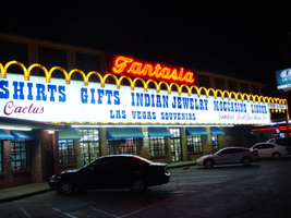
Photographs of Fantasia signs, Las Vegas (Nev.), 2002
Date
2002
Archival Collection
Description
Daytime and nighttime views of the Fantasia gift shop on the Strip. Information about the sign is available in the Southern Nevada Neon Survey Data Sheet.
Site address: 2800 S Las Vegas Blvd
Sign details: Fantasia on the Strip is located north of the Circus Circus, among the smaller properties located the northern end of the Strip before Sahara Avenue. The building faces east, only separated from the street by a small parking lot, which runs along the front of the property. The two-story building is adorned with a building length message cabinet, and sculpted, patterned raceways. The sign extends north across a drive designating parking in the rear. A small pole sign also sits on the east edge of the property.
Sign condition: Structure 3 Surface 4 Lighting 4 The Fantasia establishments signage looks decently weathered up close, for the colors and paint treatments are in good condition. The structure of the sign has a couple of anomalies that are apparent. The pole sign on the street side of the property has no face on the triangular portion of the surface. The far right hand side of the building fascia makes an uncomfortable transition into the support structure from the ground.
Sign form: Pylon; Fascia
Sign-specific description: The design is a building front, message cabinet running the length of the facade of the building, facing east. The white, steel, paneled front cabinet contains Blue and red plastic text. The larger fonts run the entire length of the sign and read "Souvenirs, T-shirts, Gifts, Indian Jewelry, Moccasins, Liquor," in an "old west" style text seen on properties such as the Frontier. This arrangement's color is blue. The bottom line of text is smaller and is broken up into three separate phrases and distributed evenly across the surface. The left side reads, " Jewelry, Belts, Hats, Cactus" in red cursive. The center is blue western font, reading "Las Vegas Souvenirs." The right hand side is red cursive again reading "Sundries, Food, Beer Wine, Ice." The bottom and top edges are lined with yellow raceways with incandescent bulbs. The top edge is created by a repeating series of raceway arches, matching the finish of the other edges. The top edge of repeating arches continues north past the edge of the cabinet onto a smaller, much thinner cabinet. The thinner cabinet looks as is if it is a continuation of the main sign with pieces cut out of it. The arches continue to the end of the extension and down connecting to a steel I-beam linked to the ground. The smaller plane reads "park in rear" in red, plastic, all capital, letters. Raceway arrows protrude through the bottom of the sign, pointing through the entrance it creates for traffic. The arrows are arranged on the bottom edge as if they are extensions of the imaginary points created by the meeting of the downward strokes two sides of two arches. Across the very top of the main banner, a narrow, red, steel cabinet reads the word "Fantasia" in white script. The script is surfaced with neon. Near the street, on the northern portion of the property, a pole sign holds an internally lit cabinet. The frame of the cabinet is a blue raceway whose western edge is fashioned into an arrow shape. White plastic comprises the face of the sign, which faces north south, and does not reach into the arrow section. It is a skeleton of a frame, with nothing in the middle. Translucent vinyl lettering is present on the face of the sign and reads "Liquor, Moccasins, Indian Jewelry 1/2 off," in all capital letters.
Sign - type of display: Neon; Incandescent; Backlit
Sign - media: Steel; Plastic
Sign - non-neon treatments: Paint
Sign animation: Chasing
Notes: The only animation present is the animation of the incandescent bulbs on all the raceways surrounding the signs. The bulbs chase each other from left to right.
Sign environment: The fueling station resides on the northern edge of the strip before Sahara Avenue. Directly to the east, across the street is the Sahara Hotel Casino, but is flanked by smaller non-resort related properties. Along with the other two properties to the north and to the south, they seem as functional aspects for tourists and patrons of the larger properties of the Circus Circus and the Sahara. Almost dwarfed by the two nearby giants the properties can easily go unnoticed without the treatment of the illumination.
Sign manufacturer: YESCO
Sign - thematic influences: There is no real theme associated with the property other than being a typical Las Vegas strip shopping establishment. The unique array of raceways and chasing incandescent bulbs are reminiscent of the countless canvass of the same design technique seen all of the strip, yet retain a hint of originality with it's arched pattern. Another widely used element , present in the design, is the internally lit message center. These two simple elements are used in conjunction to create a unique display typical to the Las Vegas Strip. It fits into the context of the Las Vegas strip as one of the many gift shops, but stands out as one of the larger ones, with the most vibrant signage.
Surveyor: Joshua Cannaday
Survey - date completed: 2002
Sign keywords: Chasing; Pylon; Fascia; Neon; Incandescent; Backlit; Steel; Plastic; Paint
Mixed Content
Photographs of Welcome to Fabulous Las Vegas sign, Las Vegas (Nev.), March 1, 2017
Date
2017-03-01
2017-09-09
Archival Collection
Description
The world famous "Welcome to Fabulous Las Vegas, Nevada" sign sits at 5200 South Las Vegas Boulevard. Information about the sign is available in the Southern Nevada Neon Survey Data Sheet.
Site name: Welcome to Las Vegas neon sign
Site address: 5200 S Las Vegas Blvd
Sign owner: YESCO
Sign details: The sign was originally installed 1959, quickly became an iconic sign for Las Vegas. Betty Willis never trademarked the sign. Betty Willis died at 91 in 2015. Betty Willis also designed the Moulin Rouge and Blue Angel Motel signs. The Welcome to Fabulous Las Vegas sign is on the National Register of Historic Places. This is a 25 foot sign which is considered smaller than a lot of the other signs in Las Vegas.
Sign condition: 5, Taken care of by YESCO and Clark County
Sign form: Pylon
Sign-specific description: The base of this sign is a blue rectangle outline. The main portion of the sign is a white rhombus shape. Welcome to Fabulous Las Vegas written in red and blue on a translucent white background. The word "Welcome" is spelled in red skeletal neon on Silver Coins with each letter on its own coin. On the back of the sign it states Drive Safely Come back Soon. This plastic portion of the sign is surrounded by incandescent light bulbs. On the top left portion of the sign where the blue base of the sign comes out of the top of the sign is the famous red star that is outlined in neon.
Sign - type of display: Incandescent, Neon and back lit plastic.
Sign - media: Steel and plastic
Sign - non-neon treatments: Plastic back lit portion
Sign animation: Chaser for Incandescent light bulbs on the border of the sign.
Sign environment: This sign is in the median of Las Vegas Blvd. near the South most end of the Strip. This location has Mandalay Bay to the west of it and the airport to the east.
Sign manufacturer: Western Neon
Sign designer: Betty Willis
Sign - date of installation: 1959
Sign - date of redesign/move: Mid 2000s redesign of the median to accommodate parking for visitors.
Sign - thematic influences: This sign is designed in the Googie style. This sign also has symbolism with the words Welcome, as each letter is on a silver coin to represent Nevada as the Silver State.
Sign - artistic significance: One of the most Significant signs for Las Vegas. It is easily recognizable and ingrained as part of Las Vegas culture.
Survey - research locations: Las Vegas Sun article https://lasvegassun.com/news/2009/may/21/fabulous-las-vegas-sign-garners-historic-designati/ , Vegas website https://www.vegas.com/attractions/on-the-strip/welcome-las-vegas-sign/ http://www.lasvegaswhereto.com/welcome-las-vegas-sign/ Neon Museum Tour outline , Vintage Vegas http://vintagelasvegas.com/search/welcome+to+fabulous+las+vegas
Surveyor: Wyatt Currie-Diamond
Survey - date completed: 2017-09-09
Sign keywords: Chasing; Plastic; Backlit; Steel; Incandescent; Neon; Pylon
Mixed Content
Photograph of Ogden's Furniture and Carpet, Draper Bank & Trust, Whirlpool Home Appliances, Macey's Sack n' Save, Airport Inn, Big O Tires, Young Outdoor, and The Citizen's Bank electric signs, undated
Level of Description
Item
Archival Collection
Young Electric Sign Company (YESCO) Corporate Records
To request this item in person:
Collection Number: MS-00403
Collection Name: Young Electric Sign Company (YESCO) Corporate Records
Box/Folder: Box 10
Collection Name: Young Electric Sign Company (YESCO) Corporate Records
Box/Folder: Box 10
Archival Component
Oral history interviews
Level of Description
File
Archival Collection
Young Electric Sign Company (YESCO) Corporate Records
To request this item in person:
Collection Number: MS-00403
Collection Name: Young Electric Sign Company (YESCO) Corporate Records
Box/Folder: N/A
Collection Name: Young Electric Sign Company (YESCO) Corporate Records
Box/Folder: N/A
Archival Component
Photograph of two letters, The Marion Hotel, R.E. Cunningham, and Fireside Inn, J.E. Christiel to Thomas Young Sign Company regarding their feelings about signs installed by Young, 1930 June 02, undated
Level of Description
Item
Archival Collection
Young Electric Sign Company (YESCO) Corporate Records
To request this item in person:
Collection Number: MS-00403
Collection Name: Young Electric Sign Company (YESCO) Corporate Records
Box/Folder: Box 07
Collection Name: Young Electric Sign Company (YESCO) Corporate Records
Box/Folder: Box 07
Archival Component
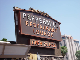
Photographs of Peppermill signs, Las Vegas (Nev.), 2002
Date
2002
2017-09-21
Archival Collection
Description
Photos show Peppermill signs during the day. Two surveys were conducted to gather information about this sign. One was conducted in 2002 and one was conducted in 2017. PDFs are available for both surveys. See the 2017 survey PDF for additional information that is not included in the object description.
Site address: 2985 S Las Vegas Blvd
Sign details: The Peppermill Inn Restaurant is located on the east side of Las Vegas Blvd, just north of the now defunct Silver City Casino. The actual establishment faces west toward the strip, separated from the traffic by the front parking lot. The lowrise brown clad establishment, boasts three specific pieces of signage on the exterior structure. In the parking lot near Las Vegas Blvd, a small two-sided, ground level cabinet, mirrors the aesthetics of the actual structure. Upon the west side of the building, the shingled roofline boasts channel letters filled with neon, as well as a more secluded sign on the north side of the building, toward the rear.
Sign condition: Structure 3 Surface 3 Lighting 3 The condition of the three different pieces of signage are all in different states of repair.
Sign form: Pylon; Fascia
Sign-specific description: The pylon sign, which sits near the street, is a miniature representation of the facade of the Peppermill establishment. Two square legs, constructed of mortared pieces of stone support the two-sided cabinet. The horizontal, rectangular cabinet sits on the pole, and faces north/south. The top edge of the sign is reminiscent of a roofline, with a low rise a-frame design. The grade is very little but exaggerated by the rectangular element rising off of the top edge covered in brown wooden shingles, which also cover the top edge's surface. The effect of the top's finishing is the resemblance of the roof of the Peppermill restaurant. Just below the peak of the "roof-like" element on the surface of the sign, a rectangular metal plate possesses text. The text is stamped out of the metal to reveal recessed negative spaces of fonts. An orange transparent material resides behind the plate, providing the hue for the internally lit apparatus. The text reads "24 Hours" in all capitals. Below the small rectangle, larger, white text runs the length of the sign. The internally lit, closed face, channel letters are in all capitals. In smaller text, along the bottom portion of the face the phrase "Coffee Shop & Lounge," runs the length of the text. The letters are orange, closed faced, internally lit. The actual structure of the restaurant, further east on the property is the model for the previously mentioned sign. The low-rise pitched roofline of the facility concludes at a lowrise rectangular cap. Along the western edge the roofs overhang, large white channel letters lined on the interior with pink neon spell "Peppermill" in all capital letters. Following the brown shingled roofline around the south side of the building, a third sign, not seen by the general public, faces south. A steel cabinet is the two-dimensional representation of both the outer pylon sign as well as the structure itself. A rust colored brown cabinet houses a dork brown steel face, with plastic letters for the advertising of the establishment. "Peppermill" is spelled in all capital letters. Below the top text a two lined, series of orange all capital text spells "Restaurant Lounge." It is apparent that wooden shingles were evident on the top the top edge of the cabinet which rises in the pitched front geometric shape seen on the pylon in the front and the architectural element in the structures center. Underneath the primary cabinet a smaller, horizontal, rectangular cabinet, sits centered underneath the It too is a rust colored brown cabinet, with a dark brown face. Text, as tall as the cabinet spells, "Open 24HRS" in orange plastic all capital letters.
Sign - type of display: Neon; Incandescent; Backlit
Sign - media: Steel; Plastic; Masonry
Sign - non-neon treatments: Graphics; Paint
Sign animation: Chasing, flashing, oscillating
Notes: The text, which resides on the southern wall and reads "Casino," is filled with incandescent bulbs that all illuminate at the same time, and oscillate. They then shut off at the same time, and then repeat. The raceways of incandescent bulbs chase each other while the neon, which surrounds the back lit, plastic, screens on this wall flash on then off. The bottom two raceways sandwiching the reflective panel chase from left to right, while the remainder of the raceways surrounding the signs, run right to left. The incandescent bulbs on the pylon chase each other gracefully up the length of the pylon. The animation is patterned so as to appear as if a section of several bulbs are pulsing its way up the towers, hugging the edge of the bulbous tops. The raceways continue around the east face of the building. The umbrellas in the plaza behind the pylon, also are animated with incandescent bulbs chasing each other downward along the raceways.
Sign environment: The area surrounding the Peppermill contains several interesting properties making the entire area sort of a cove of history. Just to the north the deteriorating, and closed Silver City stands testament to the wave of constant change present on the strip. It is a reminder of the historical significance of the Peppermill and the fact that someday it might not be present at this location any more.
Sign manufacturer: YESCO
Sign - thematic influences: What is evident of the Peppermill theme works around the exterior appearance, and around the name itself. The brown wooden exterior, use of wooden shingles as adornments, and the major color palette all suggest the rustic, if not old west referenced, aesthetic.
Sign - artistic significance: This has become a statement of the "old Vegas" of the 1970s.
Surveyor: Joshua Cannaday
Survey - date completed: 2002
Sign keywords: Pylon; Fascia; Neon; Incandescent; Backlit; Steel; Plastic; Masonry; Paint; Graphics
Mixed Content
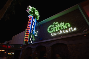
Photograph of The Griffin sign, Las Vegas (Nev.), June 28, 2017
Date
2017-06-28
2017-08-15
Archival Collection
Description
The sign for The Griffin sits at 511 Fremont Street in Downtown Las Vegas. Information about the sign is available in the Southern Nevada Neon Survey Data Sheet.
Site address: 511 Fremont St
Sign owner: Aaron Chepenik and Jonathan Hensleigh
Sign details: Opened in February of 2007 as a medieval British pub/ tavern style bar. This location brought on a wave of revitalization of the East Fremont District especially since many new bars/restaurants started to open in this area after this bar did.
Sign condition: 5- still looks relatively new
Sign form: Blade and overlay neon on building
Sign-specific description: Placed above the entrance their brick building the letters The Griffin Cocktails is painted with white block letters outlined with black paint is painted on the building itself. These letters have skeletal neon surrounding the letters. The Griffin letters are yellow tubes and do illuminate green at night, the word cocktails lights up white. To the left of the entrance but still on the building is a green painted griffin drinking a painted white martini ( also all outlined with black paint) The neon tubing outlining the griffin is a yellow tubing but glows green at night ( possibly argon inserted to make it glow green). The Blade is placed a little left of the entrance and hangs off of the building by two blue steel beams, but in between the beams is a beautiful swirl design. At the top of the Blade there is a green griffin sipping a martini (same design as the one painted on the building). At the base of the griffin is white THE letters painted with skeletal neon. Then below is the blue portion of the blade spelling out GRIFFIN in a Britannic looking font in white channeled letters which do illuminate white at night. This part of the blade is outlined in neon ,possibly argon, since it does illuminate blue at night. On the side of the blade ( if you're looking from the road) there are about 14 red curved neon tubes lining the sign.
Sign - type of display: Neon
Sign - media: Steel and Brick Wall
Sign - non-neon treatments: Using the brick wall as a portion of the sign is a design not seen often in Vegas.
Sign animation: Oscillation of red neon tubes on the side of the sign.
Sign environment: Located in the Fremont East District in between Las Vegas Blvd. and 6th St. This location has The Vault to the East of it and The Smashed Pig Gastropub to the west. It is across the street from the Park and Evil Pie. In the middle of the street right in front of the Griffin Bar is the Martini Glass sign.
Sign manufacturer: YESCO
Sign designer: Owners Aaron Chepenik and Jonathan Hensleigh-Aaron stated that the blade portion of the sign was inspired by the old Boulder Club Blade sign
Sign - date of installation: Slightly before they opened so late 2006/early 2007
Sign - thematic influences: Griffin shows that it has a medieval and kind of fantasy kind of feel since its interior does have that cool medieval tavern vibe to it, especially with their fireplaces. Using their brick wall as a part of the sign is a cool innovative way to use their space and stay true to their theme.
Sign - artistic significance: Medieval theme. The blade is a prominent theme in the 50s/60s, though their blade sign was inspired by the Boulder Club (opened 1931-1960) blade.
Survey - research locations: Acessors page, outreach to owner Aaron Chepenik
Survey - research notes: Possible use of argon within their yellow painted tubes, similar to the Yucca Motel signs leaves.
Survey - other remarks: The Blade does look very similar to the Boulder Club blade, so its awesome to see modern properties paying homage to the ones that are no longer around.
Surveyor: Emily Fellmer
Survey - date completed: 2017-09-15
Sign keywords: Oscillating; Steel; Neon; Blade; Fascia; Building-front design
Mixed Content