Search the Special Collections and Archives Portal
Search Results

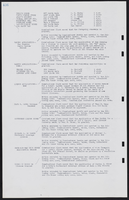
Binion's Horseshoe First Floor As-Built and Demolition Plan: architectural drawing
Date
Archival Collection
Description
From the Homer Rissman Architectural Records (MS-00452). Written on the image: "Rissman and Rissman Associates 1011 Swarthmore Avenue Pacific Palisades California Gladstone 4-7519. Scale 1/8"=1'0". Architects. Structural Engineer Socoloske, Zelner & Assoc. 14545 Friar Street Van Nuys, Calif. 91401 State 5-6821. Mechanical Engineer W.L. Donley & Associates 1516 North West Avenue Fresno, Calif. 93728 268-8029. Electrical Engineer J. L. Cusick & Associates 4219 Lankershim Blvd. North Hollywood, Cal. 91602 Triangle 7-6231. Additions & Alterations. Binion's Horseshoe Hotel & Casino 200 Fremont Street Las Vegas Nevada, 89101. Phone: 702/382-1600. First Floor As-Built & Demolition Plan. 7-15-68 Date. 4 Drawing Number. 8-27-68 Revised".
Image
Clark, Wilbur, 1908-1965
Wilbur Clark (1908-1966) developed and designed the Desert Inn Hotel and Casino in Las Vegas. As the head of the resort, he promoted the Desert Inn and Las Vegas throughout the nation.
Born to Shirley and Lulu Clark in Keyesport, Illinois on December 27, 1908, Wilbur Clark moved to San Diego, California at sixteen. He worked a series of jobs before moving to Reno, Nevada in 1951 and starting a career in gaming. After several years in Reno, he moved to Las Vegas in 1938 and, with several partners, opened a casino on Boulder Highway.
Person
Faiss, Linda C., 1943-
Linda Faiss, Helen Foley, and Melissa Warren founded and run Faiss Foley Warren Public Relations and Public Affairs.
Linda Faiss was born in 1943 and first moved to Nevada in 1945 growing up in Carson City. She is currently active with St. Jude’s Ranch for Children, Boulder City Hospital, Nevadans for the Common good and the MOB museum.
Person

Photographs of Don't Tell Mama signs, Las Vegas (Nev.), June 28, 2017
Date
Archival Collection
Description
Site address: 517 Fremont St
Sign owner: Assessor's page stated T-Breo II LLC (possibly owner of the property, but no owner of the bar/business was found.
Sign details: Don't Tell Mama originally opened in 2008/9 as a New York style piano bar. The name is inspired by the 1966 song "Don't Tell Mama" in the Broadway show "Cabaret". They are known for their bartenders that double as entertainers as well as having open mic every night.
Sign condition: 3- The sign does show some aging and some of the neon piano keys currently do not work
Sign form: Hanging sign and entrance sign
Sign-specific description: The hanging sign is a rectangle sign is outlined in red neon with lower case letters "don't tell mama" is spelt out in a painted white font, but at night the letters are in red cursive skeletal neon. Below the font there is a piano key design. On the building right above the entrance the sign is an image of a closed grand piano neon sign. The body of the piano during the day has blue tubes and illuminates blue at night. Some of the keys are blue and others are red. Both signs are also plastic back lit so people can see the black and white piano keys with the neon on top of it.
Sign - type of display: Neon and backlit plastic
Sign - media: Steel and plastic
Sign - non-neon treatments: Plastic backlit sign
Sign animation: There may have been animation with the neon piano keys lighting up to look like the piano was being played but since many of these keys are not working it can not be confirmed.
Sign environment: Located in the East Fremont District in between Las Vegas blvd and 6th St. This bar has the Beauty Bar to the west of it and Le Thai restaurant to the east. Across the street is Therapy and the Emergency Arts center.
Sign manufacturer: Valley Signs and Lighting
Sign - date of installation: Sign has been up since at least 2014
Sign - thematic influences: The sign portrays the New York piano bar vibe they are going for, and since Neon is and was prominent New York it plays along with their theme as well.
Sign - artistic significance: Piano bars were prominent in the 1950's.
Survey - research locations: Don't Tell Mama website http://www.donttellmama.com/Dont_Tell_Mama/About.html, Asessor's page
Survey - research notes: There is a Don't Tell Mama in New York, but did not find an affiliation or a real connection.
Surveyor: Emily Fellmer
Survey - date completed: 2017-08-14
Sign keywords: Neon; Steel; Plastic; Backlit; Hanging; Building-front design; Fascia; Cantilever construction
Mixed Content

Photograph of Therapy restaurant sign, Las Vegas (Nev.), June 28, 2017
Date
Archival Collection
Description
Site address: 518 Fremont St
Sign owner: Jared Weiss and Sig Rogich (Motion Corp)
Sign details: The building is from 1951, so within the restaurant there are exposed bricks and wood ceiling from the original building. Therapy restaurant opened in 2015 as a gastropub with Daniel Octiveas as the chef. Previous to turning into the Therapy restaurant this location held a Dollar Store.
Sign condition: 5, a newer sign still in very good condition
Sign form: Hanging sign and entrance sign
Sign-specific description: Pink lettering. The T is a solid print type font, then the rest of the letters are in cursive. There is a period at the end of the word Therapy. Each individual letter is in its own channeled block to contain the light for each letter. Also above their door there is a small black rectangular sign with the Therapy logo (same manufacturing style as the letters previously noted). There is a pink arrow starting from the farthest (from the entrance) top of the sign pointing towards the entrance. On this arrow there are sparking incandescent light bulbs.
Sign - type of display: Neon and Incandescent
Sign - media: Steel
Sign animation: Flasher for Incandescent light bulbs on the arrow to show the entrance of the property.
Sign environment: This property is in between 6th and Las Vegas Blvd. on the North side of Fremont St. This district in the past few years has shaped into its own creative and artsy area.
Sign manufacturer: Vision Signs
Sign designer: Gerrit Blok and Rob McGuire
Sign - date of installation: 2015 when the restaurant opened
Sign - thematic influences: The sign above the door has the arrow which was a popular trend in 1950s signs with the car consumer era, but also helps with the pedestrian traffic on Fremont St.
Sign - artistic significance: The simple yet beautiful cursive font shows that there is simplicity and elegance. Also the arrow above the entrance could be a hint of subliminal messaging, as well as a great direction indicator. The channeled letters shows how to capture illumination compared to skeletal Neon.
Survey - research locations: Therapy website http://www.therapylv.com/ , Las Vegas Weekly Article https://lasvegasweekly.com/dining/reviews/2015/aug/12/therapy-downtown-restaurant-review-fremont-east/ , Acessor's office, discussion with owner and contact with Vision signs
Survey - research notes: Eater Las Vegas (2015 article) shows cool pictures of the building being renovated. https://vegas.eater.com/2015/6/25/8845981/las-vegas-restaurants-therapy#5
Surveyor: Emily Fellmer
Survey - date completed: 2017-08-06
Sign keywords: Neon; Incandescent; Steel; Flashing; Hanging; Building-front design; Fascia; Cantilever construction
Mixed Content

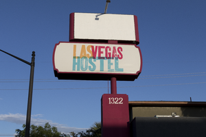
Photographs of Las Vegas Hostel sign, Las Vegas (Nev.), March 3, 2017
Date
Archival Collection
Description
Site address: 1322 E Fremont St
Sign owner: Downtown Lodging LLC
Sign details: This building was originally constructed in 1973 for commercial living accommodations and motel purposes. Previous to the Las Vegas Hostel opening in late 2014/early 2015 it was USA hostel whom used the sign box that the Las Vegas Hostel currently uses today. They have 38 rooms of different variety and 158 beds as a cheaper option that the hotels. They also offer packages to do tours of surrounding places such and the Grand Canyon and the Hoover Dam. They also claim to be the only Hostel in Las Vegas with a pool.
Sign condition: 4.5- The sign box was recently repainted and the plastic portion of this sign is relatively new and both still are in good condition
Sign form: Pylon
Sign-specific description: This sign has a reddish/pink steel beam base. There are two sign boxes the top one is a rectangle shape and the bottom one is a oval-rectangular shape. Currently the top rectangle box does not have any signage in it but if it did it would be a plastic or steel sign that would be down lit by an LED spotlight. The bottom one has a plastic back lit sign with the hostel's logo. Their logo entails "Las Vegas Hostels" in modern bright colored block fonts. The "Las" letters are a bright orange, the "Vegas" letters are a magenta pink, and "Hostels" in a bright light blue.
Sign - type of display: Plastic Back lit sign
Sign - media: Steel and Plastic
Sign - non-neon treatments: LED and Plastic back lit signage
Sign environment: On the Intersection of East Fremont St and 14th street. A few blocks from the Fremont East District but is in a neighborhood with many different motels though many of them are currently closed
Sign - date of installation: The sign boxes have been up like this since at least 2007 but with different logos within the sign boxes
Sign - date of redesign/move: Late 2014/ early 2015 they repainted the beam and boxes of the sign and inserted the Las Vegas Hostel logo.
Sign - thematic influences: Since this sign was re-purposed and redesigned it shows how Vegas is constantly changing but can reuse old signs from previous properties.
Sign - artistic significance: The bright colors in the sign show that they are going for a modern vibe which works since they opened in the past few years and have events such as pool parties that appeal to the youth that comes through Vegas.
Survey - research locations: Las Vegas Hostel Website http://lasvegashostel.net/en_US/rooms/, Assessor's page, google maps satellite and roadside view
Surveyor: Emily Fellmer
Survey - date completed: 2017-09-09
Sign keywords: Plastic; Backlit; Steel; Pole sign
Mixed Content


