Search Results
Echo Mobile Park Neon Survey document, September 28, 2017
Date
2017-09-28
Archival Collection
Description
Information about the Echo Park Mobil Home Park sign that sits at 1322 S Mojave Rd.
Site address: 1322 S Mojave Rd
Sign owner: Garcia Maria Hilda and Whispering Sands LLC
Sign details: This location was constructed in 1961 as a manufactured home park that includes a pool and a laundromat.
Sign condition: 3- paint is heavily faded
Sign form: Porte Cochere
Sign-specific description: This sign is placed above a parking garage. The sign is a turquoise color in a linear geometric shape, almost like a long rectangle was attached to a trapezoid on its top left side. On this sign there are white block font letters spelling out ECHO PARK with a black painted trim. These letters contain skeletal neon.
Sign - type of display: Neon
Sign - media: Steel
Sign - non-neon treatments: Paint
Sign environment: This location is off of East Charleston on the side street Mojave,and is surrounded by other mobile parks as well.
Sign - date of installation: Record shows this has been up since at least 2011 though that record even shows aging on the sign.
Sign - thematic influences: This sign shows a good example of skeletal neon.
Sign - artistic significance: These linear geometric shapes showcased on the sign present mid-century modern design aspects.
Survey - research locations: Asessor's page, google maps satelite and road view
Survey - research notes: There is not much information on this location, and there is no designated website to contact anyone for information on the sign.
Survey - other remarks: The condition of the sign looks as though it could have been from around 1961 when the building was constructed especially with the mid- century modern design, but there is no confirmation or evidence to show when it was made.
Surveyor: Emily Fellmer
Survey - date completed: 2017-09-28
Sign keywords: Neon; Steel; Paint; Pole sign
Text

Road Runner RV Park Neon Survey document, September 14, 2017
Date
2017-09-14
Archival Collection
Description
Information about the Road Runner RV Park sign that sits at 4711 Boulder Hwy.
Site address: 4711 Boulder Hwy
Sign owner: Daryl Thompson
Sign details: This local owned R.V. park has been open since 1986 just miles from the Strip. They have 200 sites to hold guests, as well as a swimming pool.
Sign condition: 5- paint and lights are still bright on the signs
Sign form: Pylon
Sign-specific description: This pylon sign has Roadrunner on the top of it which is outlined in skeletal neon, underneath is a rectangular red sign. This sign has yellow bubble font channeled letters stating "ROAD RUNNER". Underneath this states "R-V Park" in a channeled white frontier style font that contains incandescents. Underneath the red rectangular sign is there prices listed which is on a plastic sign for their daily, weekly and monthly prices. Under the prices is a traditional "NO VACANCY" in red skeletal neon.
Sign - type of display: Neon and incandescents
Sign - media: Steel and plastic
Sign - non-neon treatments: Plastic portion of the sign and incandescent light bulbs
Sign animation: Flasher for incandescent light bulbs
Sign environment: This property is on Boulder Highway and has grocery stores and banks close to it.
Sign - thematic influences: Road Runners are prominent animals in the Nevada and southwest region of the United States.
Sign - artistic significance: Artistically this sign looks as though it can be for a motel particularly since it is also on a highway , but it's for an R.V. park.
Survey - research locations: Asessor's page, Road Runner RV website https://www.roadrunnerrvpark.com/ , Travel Nevada Website https://travelnevada.com/places/26805/roadrunner-rv-park
Surveyor: Emily Fellmer
Survey - date completed: 2017-09-14
Sign keywords: Pylon; Neon; Incandescent; Steel; Plastic; Flashing; Reader board
Text
Photographs of Battista's signs, Las Vegas (Nev.), 2002
Date
2002
Archival Collection
Description
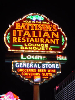
Photos show Battista's signs at night. Two surveys were conducted to gather information about this sign. One was conducted in 2002 and one was conducted in 2017. PDFs are available for both surveys. See the 2017 survey PDF for additional information that is not included in the object description.
Site address: 4041 Audrie St
Sign details: Battista's "hole in the wall" Italian restaurant is located in a small shopping mall on the corner of Audrie and Flamingo, just east of the strip. The actual establishment of Battista's faces east in the northwest corner of the shopping center. The pylon sign sits on the northwest corner of FlamingoRd and Audrie st., the entrance to the building is also adorned with neon signs as well. On the extreme north end of the property a pole sign for a general store also shares signage with Battista's.
Sign condition: Structure 5 Surface 5 Lighting 5
Sign form: Pylon; Fascia
Sign-specific description: The pylon sign for Battista's is on the corner of Flamingo and Audrie, on the wet side of Audrie. It is a double- backed roadside pole sign with two cabinets, and an LED message center. The sign is a host of visual candy, laden with neon and incandescent bulbs. The upper portion of the sign is comprised of the larger cabinet, below that the LED message-center, then below that the smaller cabinet makes up the bottom of the sign. The top cabinet has sculpted edges created bulging edges as well as a round top. The two corners are stepped. The bottom of the sign is a flat horizontal edge. The surface of the sign is painted red. The majority of the sign's face is occupied by channel letters spelling "Battista's Italian Restaurant," in channel letters with red neon borders. Below that "Lounge," and then "Banquets" is spelled one on top of each other in yellow channel letters. Yellow neon in on the interior of the channels. Two tubes of green neon extend horizontally from each side of this text. On the far left and right-hand sides of the cabinet, green neon scrollwork adorn the space between the main text and the edge of the cabinet. Spelled in small painted letters above the main text, resides the phrase "hole in the wall. Yellow neon tubes spell the same text, hovering over the graphics. In the remaining space above this text and the top edge, purple and green neon are sculpted to appear as a bunch of grapes and their vines. The entire sign is bordered in gold polished raceways with incandescent bulbs. Below the main section of the cabinet is a tri-colored LED message center, running scrolling messages about the restaurant in red, white, and green, which are the colors of the Italian flag. The smaller cabinet below the message center has sculpted edges also, with the top edge being straight along the length of the message center. It is painted green. General store is spelled across the top of the sign in white channel letters with white neon on the interior. Graphically painted in red, below the white text, the words "groceries, beer wine, souvenirs, and slots" are overlayed with red neon. In the remaining space on the bottom of the cabinet a small logo for "Coors Light," is graphically painted and overlayed with corresponding neon. To the left and right of that two arrows point toward the property, painted in red then overlayed with red neon. Over the entrance to the building, a wooden A-frame shaped structure forms a cover over the main entrance to the restaurant. In an arched pattern on the wooden face of this awning, "Battista's" is spelled it it's specific text in channel lettering, filled with neon. Below that in green channel letters, in the same arched pattern, spell hole in the wall, and has green neon in the interior. On other side of the dual arched text two, channel designed scrollwork pieces are illuminated with yellow neon. On the far north end of the lot a pole sign is designated next to the general store that the main pylon advertises. The top of the sign is an internally lit cabinet with graphic treatments for the general store. Incandescent bulbs line the edge of the cabinet. Further down the pole a small back-lit, horizontal, rectangular cabinet advertises for the Battista's establishment. Below that a square, internally lit cabinet, has red and green graphical treatments reading "Fine Italian Cuisine." The last bit of signage on the pole is a small, internally lit cabinet, flag poled off of the east end of the pole with red neon spelling, "groceries 24 hrs." On the North side of the building another sign for Battista's is present.
Sign - type of display: Neon; Matrix; Backlit; LED
Sign - media: Steel
Sign - non-neon treatments: Graphics; Paint
Sign animation: Chasing
Notes: The raceways which run around the border of the surface of the sign, chase each other from right to left. The incandescent bulbs which surround the internally lit cabinet on the pole sign designated for the convenience store also chase each other.
Sign environment: The Battista's pylon share unique company when it comes to it's environment. East across Audrie, is the Bourbon Street Hotel Casino, while the extensive Bally's property resides south across Flamingo Dr. The small shopping center proves a break in the action of casino hotels. The pylon stands as a prominent figure on the corner of the lot. Just to the west of the pylon, on the same side of the street, is the original Flamingo pylon, preceding the Barbary Coast. If you continue north on Audrie, the Flamingo Hilton may be assessed through a drive to the west.
Sign manufacturer: YESCO
Sign - thematic influences: The theme of the facility centers around the theme of an Italian restaurant. The pylon's colors, and matrix message center are all in accordance with colors of the Italian flag, as well as the signage above the door. The graphics, and neon representations of grapes on the pylon reference the afore mentioned theme. The entrance to the facility is the A-framed roof-like structure wood structure, referencing a rustic cottage or facility. This is significant in the name "Hole in the wall," which the facility boasts.
Sign - artistic significance: The significance of the Battista's establishment fits in with other facilities on the Strip such as The Rosewood Grill, Alan Albert's, and the Peppermill. Considering that most dining establishments are located on the interior of the properties, these stand as excellent quality, intimate restaurants seen by and available to the pedestrian public. Like the everyday establishments dressed to fit in the Las Vegas Strip such as the neighboring Walgreens, Alan Albert's is a non-casino dressed up to fit in with the local surroundings. It is also unique in the fact that the establishment which dominates the space which it resides. Unlike Alan Albert's which is tucked down a narrow alley, it is spoken out loudly with a pylon sign, another pole sign and a wall sign as well. Both pole signs are reminiscent of old roadside motel signs.
Surveyor: Joshua Cannaday
Survey - date completed: 2002
Sign keywords: Chasing; Fascia; Pylon; Neon; Matrix; Backlit; LED; Steel; Paint; Graphics
Mixed Content
Photographs of Casino Royale and Denny's signs, Las Vegas (Nev.), 2002
Date
2002
Archival Collection
Description
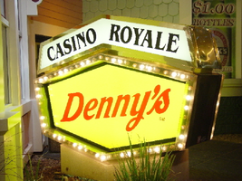
Daytime and nighttime views of the Casino Royale and Denny's signs on the Strip. Information about the sign is available in the Southern Nevada Neon Survey Data Sheet.
Site address: 3419 S Las Vegas Blvd
Sign owner: Tom Elardi
Sign details: The Casino Royale is located on the east side of the strip facing west, just south of the Venetian. The smaller establishment shares its space with a Denny's restaurant, which was present before the Royale was opened. The exterior is adorned with a stylized, European-esque, architecture, including apparent windows, domes, towers, and a cohesive landscape of connected buildings. The exterior of the Royale is a brightly lit facade of white raceways, lined with incandescent bulbs, boxing in vibrantly toned walls, and subdued neon. The colors correspond with those seen in the sign itself, as well the neon placed inside the edges of the windows. One section displays purple, the next a teal color, next a blue, then a red. Total signage of the property includes a two LED screens, one on the west side of the building, and the other housed in the logo cabinet on the south west corner of the property. Two logo cabinets, one in the aforementioned spot, and the second facing west over the main entrance on the west side of the building. Two double-faced cabinets lie on the northern end of the west side of the building, advertising for Denny's restaurant. Two small logos signs are also placed on the west face of the structure, for Caffe Trilussa.
Sign condition: Structure 5 Surface 5 Lighting 5
Sign form: Fascia
Sign-specific description: Upon the southwest corner of the building, a blue cabinet houses an LED screen in the rectangular body of the cabinet. The cabinet continues upward where the blue steel face supports white channel letters bordered in red neon and filled with incandescent bulbs. The text is written in two lines. The cabinet continues upward and is transformed into the sculpted design of a pink, purple, red, and blue crown on channel faced scrolls and sweeping shapes. The interiors of each section are lined with neon of a corresponding color to the paint treatments. Around to the west side of the building, the same style of text and scrolling adornments are used in a different marquee sign denoting the main entrance to the establishment. The same style of text seen on the southwestern sign is present with the same pattern of scroll work, crafted in a cabinet style, with channel faces. The major difference between the two signs is the size. The main entrance sign is much larger than the corner sign, as well as not having a LED screen incorporated below the text. The western sign possesses more scroll work below the text instead. The neon treatments are the same, as well as the incandescent bulbs, inside of the text. The lower roofline of the property plays host to the small but noticeable signage for Caffe Trilussa. Upon a extended surface of the roof line, two separate signs for the establishment are present. The roof shape is three sided with the signage on the northwest and southwest sides of the extension. Inside a section of the entablature created with white raceways, brown channel letters, spell the text "Trilussa," stretching across the length of the surface. The brown letters sit upon a yellow surface and are filled with incandescent bulbs, which are as wide as the channel letters themselves. Spelled in bent neon tubing, the word "Caffe" is spelled in all capital letters, sitting just above the left hand side of the title text. The right of the collection is occupied by a graphically treated, two-dimensional cut-out of a palm tree. The palm tree is treated on the surface with neon tubing as well. The tubing glows green and a gold corresponding to the graphical treatments. At the northern end of the property, two signs sit outside facing north, south. The double backed, internally lit cabinets represent the advertisements for the Denny's restaurant attached to the Royale. The first is at ground level outside the main entrance of the restaurant, the six sided, green cabinet, sports a yellow plastic face with red graphic text, reading "Denny's" in script text. Around the border of the face, incandescent bulbs run in a raceway pattern, and are covered in a plastic sheath. An angular cabinet rests on top of the other cabinet, creating a shallow peak. The internally lit, white face reads "Casino Royale" in black text. The same cabinet can be seen cantilevering off of the west side of the building above its partner sign. The cabinets are of identical design except for there is no plastic sheath covering the raceway of incandescent bulbs, and the plastic face of the main section of the cabinet is treated in different graphics. The script reads "Denny's" similar red script, but with a different background.
Sign - type of display: Neon; Incandescent; Backlit
Sign - media: Steel; Plastic
Sign - non-neon treatments: Graphics; Paint
Sign animation: Chasing, oscillating
Notes: The incandescent bulbs inside the channel letters of the main text oscillate, while all incandescent bulbs on the raceways along the building chase each other also. The incandescent bulbs, which surround the Denny's cabinet, also chase each other.
Sign environment: The Casino Royale stands independently on it's own even though it is surrounded on all sides by casino giants. To the north stands the Venetian, to the South stands Harrah's, and the Mirage lies west across the street. Yes, the property itself seems to be dwarfed by the immense neighbors, but the ultra bright, clear external signage and facade create a charming and bright environment that announces its presence.
Sign manufacturer: YESCO
Sign - date of installation: 1992
Sign - date of redesign/move: The Royale was once the Nob hill, which was closed in 1980. It was reopened in 1992 as the Casino Royale.
Sign - thematic influences: The theme seems to be tied to a European theme with the French term "Royale" in the title. The scrollwork is reminiscent of confetti or Mardi Gras theme. Such a combination of elements to suggest a theme is seen in the Harrah's property also. The party themed reminiscent sculpted cabinets are also reminiscent of the Fleur de Li. Believe it or not, the property is tied to many other larger, corporate, properties in one respect regarding its facades. The facade of a town or city, shrunken down and stylized into the facade of the property is present all over the Strip. Such properties which utilize this technique, to one degree or the next, include: New York New York, Oshea's, Treasure Island, Bellagio, The Venetian, The Luxor, The Tropicana, and the Excalibur.
Surveyor: Joshua Cannaday
Survey - date completed: 2002
Sign keywords: Chasing; Oscillating; Fascia; Neon; Incandescent; Backlit; Steel; Plastic
Mixed Content

Photographs of Arby's and Guinness World of Records Museum signs, Las Vegas (Nev.), 2002
Date
2002
Archival Collection
Description
Daytime and nighttime views of the Arby's and Guinness World of Records Museum signs on the Strip. Information about the sign is available in the Southern Nevada Neon Survey Data Sheet.
Site address: 2776 Las Vegas Blvd, 2780 Las Vegas Blvd
Sign owner: Arby's: Schultzen and Harry Sax, Guinness: ?, Cj's: PDS Gaming used to be Carl Fredrickson
Sign details: Located in a small lot on the west side of the strip, north of the giant Circus Circus pylon, and just north of the Arco AM/PM, the Arby's fast food establishment shares property and a sign with Guinness World of Records, and CJ's Slot Sales Facility. The Arby's is located in the front of the lot facing the strip, flanked on either side by drives. The "L" shaped structure for the other two establishments lies in the rear, western portion of the lot. To the north of the property, is vacant desert, stretching to Sahara Ave. To the south is Fantasia Gifts. Text signage adorns both structures, as well as a small pylon on the front northeast corner of the property. This sign is located in close proximity to the street.
Sign condition: Structure 4 Surface 3 Lighting 3 The structural integrity of all the signs on the property seem to be stable and in decent repair. The surface of the Guinness channel letters is faded, and showing patches of white. The lighting on the Guinness sign does not work, but the main pylon is functional. Even though CJ's slot sales are not present in this location any more, the text on the pylon for CJ's is functional and animating. The back-lit letters on the Arby's facility are functional, but the red channel letters are not.
Sign form: Pylon; Fascia
Sign-specific description: The north and south sides the Arby's building contain red painted, channel letter text, reading "Museum & Gift Shop," with a lengthy channel arrow underlining the above text and pointing toward the buildings located at the rear of the property. The pylon sign is on the north end of the property, across the drive from the establishment itself. It is basically a two-sided, vertically standing rectangle, divided into two sections by a narrow LED message center. The top half belonging to Arby's and the bottom half designated for the Guinness establishment. Both are placed on a smaller section, which serves as the base. The top half is finished in mirrored panels, providing a reflective surface for the Arby's logo. The insignia for the establishment is the outline of a ten-gallon cowboy hat, with the text spelling "Arby's," displayed cutting through the outline onto either side of the object. The entire logo is constructed of crafted channel raceways. Two separate yellow pieces form the top and bottom portions of the hat, while the text is created in orange. All the channels are filled with incandescent bulbs, and outlined in neon. The bottom portion of the sign is also two sided with, a yellow tinged face providing space for a four lined series of text. The text reads, "Guinness World of Records Museum," in red channel letters, and filled with neon, of the same color. The entire sign itself is bordered in neon. The remaining exposed face of the cabinet is finished with mirrors also. The bottom edge of the cabinet is a sloped mirrored surface which angles down into thinner, but equally wide base that contains signage also. In polished channel letters, internally lit with red plastic faces, the text "Slot Sales," resides and contains a small arrow of the same design on the western edge of the sign. A black internally lit cabinet sits beneath that. The sides of the lower portion are mirrored panels as well. The wall signs of the building at the rear of the property, are similar to those seen on the north and west sides of the Arby's establishment. The signs run parallel to the walls of the face of the building. The building is "L" shaped with the leg of the "L" pointing east, and the longer section running north. Supported on a background held up with a series of cylindrical columns, a facade of gold, raceway bordered message banner, runs along the east face. It then recedes west along the leg of the "L", parallel to the northern face section, and angles back to meet the rest of the building. The text on the sign is spelled in red channel letters, and bordered with yellow neon. Along the shortest section facing east, the word "Guinness" is spelled. The section shooting west, and facing north, possesses the text "World of Records." The texts in both sections are almost as tall as the banner itself and in all capitals. The angled portion has smaller text, reading "Entrance" and two arrows pointed down on either side. The remainder of the eastern face is blank until the northern end of the face. On the wall above the entrance two cabinets flank a set of red channel letters reading "CJ's." The edges of the cabinet on either side of the center initials, is crafted in a triangular peak, making the two signs into arrows pointing toward the center. The outside edges are negative triangular cuts, echoing the other pointed end. The edges of the cabinet are crafted out of red raceways, lined with incandescent bulbs. Red channel letters, filled with neon occupy the white background on both cabinets. The left cabinet reads "Slot" and the right reads "Sales."
Sign - type of display: Neon; Incandescent
Sign - media: Plastic; Glass
Sign - non-neon treatments: Paint
Sign animation: Flashing, oscillating
Sign environment: The environment of the Arby's Guinness complex is one of finality. To the north a vacant lot stretches on, leaving the Arby's dangling in conclusion on the west side of the strip. Even though giants such as the Sahara and the Circus Circus loom nearby, the Arby's complex seems very alone.
Sign - date of redesign/move: In August of 2002, the Signage for CJ's was removed
Sign - thematic influences: The theme is only dealt with within the realm of the businesses that they advertise. The Guinness signage is only text, but retains the raceways that are consistent throughout strip properties. The pylon itself is a multi use structure for all the properties, with a mirrored surface, and the cowboy hat logo for Arby's. So if there is any theme present it could be linked to a somewhat cowboy theme.
Sign - artistic significance: The facade can be linked to a trend that took place in Las Vegas in the 1970's. In an effort to help with energy consumption, the incorporation of mirrored panels was put into effect to help reimburse the present effect of lighting. The pylon has a mirrored surface. A trend popular throughout the 80's as well. In a weird link to a specific casino, the Arby's western hat coupled with the mirrored surface is reminiscent of a site such as the Westward Ho Motel. It too is a mirrored surface, utilizing similar colors, and the inkling of a western theme present in its text. The yellow bulbs animated in the Arby's channel edge are comparative to the pulsating raceways of the Westward Ho.
Surveyor: Joshua Cannaday
Survey - date completed: 2002
Sign keywords: Flashing; Oscillating; Fascia; Pylon; Incandescent; Neon; Plastic; Glass; Paint
Mixed Content
Photographs of Rosewood Grille signs, Las Vegas (Nev.), 2002
Date
2002
Archival Collection
Description
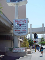
Daytime and nighttime views of the Rosewood Grille signs on the Strip. Information about the sign is available in the Southern Nevada Neon Survey Data Sheet.
Site address: 3335 S Las Vegas Blvd
Sign owner: Alan and Kevin LeWinter
Sign details: The Rosewood Grill is between the Venetian Hotel-Casino and the Tam O'Shanter Motel on the east side of Las Vegas Blvd The facade of the building is a plain, if not unassuming white stucco structure, with a driveway running along the north side of the building. Directly in front of the buildings western wall, along the strip, a tall pylon faces north /south
Sign condition: Structure 3 Surface 3 Lighting 3
Sign form: Pylon
Sign-specific description: The pylon sign, which faces north/south, is the only signage notifying the pedestrian traffic of the establishment within. It is a tall vertical advertisement, mostly comprised of a vertical, rectangular shaped, internally lit cabinet, with rounded edges. The face of the sign is a plastic, graphically treated photo image of a man in a tuxedo holding up a giant lobster.
Sign - type of display: Incandescent; Backlit
Sign - media: Steel; Plastic
Sign - non-neon treatments: Graphics
Sign animation: Chasing, flashing
Notes: The raceway, which runs the circumference of the faces of the sign, contains small strobes placed at random places, and flashing at random patterns.
Sign environment: The sign for the establishment is the only marker that anything is operational in the dimly lit building. Not that the building looks non operational, but the majority of the building is very unassuming, mostly being denoted by the large drive and entrance. It is located just south of the Tam O'Shanter motel, among the awkward transition of the strip, that is Spring Mountain Rd. The Vagabond Inn and the Treasure Island square off the end of the block before the desolate expanse of what used to be the Desert Inn, and the transforming Fashion Show Mall, sprawl out across the north side of the road. The Rosewood Grill is part of the side of the street that trails off in size, but not character as the giant Venetian slows its progress.
Sign - date of redesign/move: Was the Anoje Continental Restaurant, next to the Kit Carson Motel, but was changed to the Rosewood Grill.
Sign - thematic influences: Not much of a theme, outside of advertising for a big lobster dinner.
Surveyor: Joshua Cannaday
Survey - date completed: 2002
Sign keywords: Chasing; Flashing; Pylon; Incandescent; Backlit; Steel; Plastic; Graphics
Mixed Content
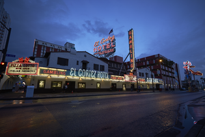
Photographs of El Cortez Hotel and Casino at dusk, Las Vegas (Nev.), April 10, 2016
Date
2016-04-10 to 2017-09-04
Archival Collection
Description
The El Cortez Hotel and Casino sits at 600 E Fremont St in Downtown Las Vegas. Continually operating in the same location since 1941, the El Cortez is listed on the National Register of Historical Places. Information about the sign is available in the Southern Nevada Neon Survey Data Sheet.
Site name: El Cortez Hotel & Casino (Las Vegas, Nev.)
Site address: 600 Fremont St
Sign owner: IKE Gaming Inc
Sign details: 2,77 acre lot, with an original construction year of 1941.
Sign condition: 5 - fully functional, looks well taken care of, no damage to the sign, even looks original.
Sign form: Back to back Architectural sign
Sign-specific description: Double sided architectural sign perched on top of the building of the El Cortez reads El Cortez HOTEL COFFEE SHOP & BAR FREE PARKING with a metal frame work to hold it high for tourists to see down Fremont Street on either side of the road or sidewalk. in the Day it looks white and baby blue with the frame work painted white. At night El Cortez glows red whit what looks like white skeleton neon outlining the wording, HOTEL is outlined with pink skeleton neon, and COFFEE SHOP & BAR FREE PARKING is made of the same pink neon as the HOTEL portion.
Sign - type of display: Neon
Sign - media: Steel
Sign environment: The property is surrounded by other casinos, restaurants, and bars.
Sign - date of installation: circa 1941
Sign - date of redesign/move: Possible change in signage around 1946
Sign - thematic influences: Spanish revival (mission) style, the facade was faced with bricks with weeping mortar and the roof was red tile while a large metal sign announced the casino clubs name.
Sign - artistic significance: Spanish Revival / Western cowboy themes were popular in Vegas especially in the 30s and 40s due to the image pushed to look like the wild west or as a pioneer town.
Survey - research locations: Las Vegas Then and Now, Spectacular, assessor's website
Surveyor: Danny Jacobs
Survey - date completed: 2017-09-04
Sign keywords: Neon; Steel; Architectural; Back to back; Incandescent; Reader board; Marquee; Roof Sign
Mixed Content

Photographs of Palace Station sign, Las Vegas (Nev.), April 5, 2017
Date
2017-04-05
2017-09-10
Archival Collection
Description
The Palace Station Hotel and Casino sign sits at 2411 West Sahara Avenue. Information about the sign is available in the Southern Nevada Neon Survey Data Sheet.
Site address: 2411 W Sahara Ave
Sign owner: Palace Station
Sign details: Founded by Frank Fertitta III, was originally Bingo Palace in 1976 but was changed to Palace Station
Sign condition: 4 - some broken lights on the sign but for the most part seems in great condition. Owners unsure if keeping the sign or replacing it with a new one during 2017 remodel of property
Sign form: back to back pylon
Sign-specific description: Double sided pylon road side sign, word "PALACE STATION HOTEL CASINO" In red encasement stuck to the front of a minimalistic image of a train, the word "BINGO" underneath the train front. Skeleton Neon is used to accentuate the features of the train and the lettering on the sign.
Sign - type of display: Neon and incandescent
Sign - media: Steel, Plastic
Sign animation: Chasers around "PALACE STATION HOTEL CASINO" and "BINGO" boxes and the neon in the boxes turn off then fill in from both sides until full again
Sign environment: Property is near the I-15, by local businesses and some residential
Sign - date of installation: c. 1983
Sign - thematic influences: Seeking to avoid the western theme popular among casinos at the time, Fertitta chose trains. Worried that the name Bingo Palace didn't highlight the full-range of gaming and amenities on offer at the expanded casino, Fertitta held an open contest to rename the casino later that year. More than 26,000 entries were received over three weeks. Las Vegas resident Claire Jarvis won as Palace Station touched on the new train theme while keeping part of the original name. - Las Vegas Review Journal
Sign - artistic significance: Owner Frank Ferttitta Jr held a contest for the casinos new theme and the "train station" theme was the favorite out of the entries.
Survey - research locations: UNLV Special Collections, Las Vegas Sun, YESCO, Review Journal
Surveyor: Danny Jacobs
Survey - date completed: 2017-09-10
Sign keywords: Pylon; Neon; Incandescent; Steel; Chasing; Back to back; Roadside; Video screen; Reader board
Mixed Content
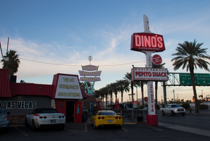
Photographs of Dino's Lounge sign, Las Vegas (Nev.), February 19, 2017
Date
2017-02-19
2017-08-11
Archival Collection
Description
Dino's Lounge sits at 1516 South Las Vegas Boulevard. The dive bar has been in operation since 1962. Information about the sign is available in the Southern Nevada Neon Survey Data Sheet.
Site address: 1516 S Las Vegas Blvd
Sign owner: Kristin Bartolo
Sign details: This location was originally constructed in 1957. Opened as Ringside Liquors by Eddie Trascher. Trascher sold the property to Rinaldo Dean "Dino" Bartolomucci in 1962. Bartolomucci Renamed it "Dino's". Bartolomucci sold cars in california, moved to Las Vegas in the 1950's. "Dino's" is now owned by his granddaughter Kristin Bartolo.
Sign condition: 4 out of 5, it still lights up brightly at night and has bright paint colors.
Sign form: Pylon as well as signage on the building.
Sign-specific description: Sign on building green cover filtered neon, with a script style design for the name. Road pylon contains skeletal neon with red and white design also stating their name "Dino's" in the same font as the sign on the building. This pylon has a white base that extends out of the main red rectangle portion of the sign. Also below their logo is a back lit plastic sign.
Sign - type of display: Neon (skeletal on roadside sign and encased on building) and Plastic Backlit sign
Sign - media: Steel and plastic.
Sign - non-neon treatments: Plastic back lit portion
Sign environment: This is located downtown just a few blocks south of Fremont, next to Tod Motor Motel.
Sign - date of installation: 1963
Sign - thematic influences: This sign shows 50's/60's trend with the base of the sign extending out of the main worded portion of the sign. That trend is very common among many other signs across the valley from the same era.
Survey - research locations: Dino's website http://dinoslv.com/new/, Recorder's office, Assessor's office, Dino's site visit and discussion with owner Kristin.
Survey - research notes: This location is .35 acres and was constructed 1957. The Dino's website contains an archive of images of their bar and owners from the last 50 years, and some of the images show older photos of their sign.
Surveyor: Wyatt Currie-Diamond
Survey - date completed: 2017-08-11
Sign keywords: Neon; Plastic; Backlit; Steel; Pole sign
Mixed Content
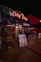
Photograph of Evel Pie sign, Las Vegas (Nev.), June 28, 2017
Date
2017-06-28
2017-08-22
Archival Collection
Description
The Evel Pie sign sits at 508 Fremont Street in Downtown Las Vegas. Information about the sign is available in the Southern Nevada Neon Survey Data Sheet.
Site address: 508 Fremont St
Sign owner: High Horse Group
Sign details: Original construction year of the building was 1949. Previous to this property being Evel pie it house the short lived F. Pigalle fondue restaurant, and the Radio City Pizza. This 1979 Evel Knievel themed pizza restaurant and bar opened in late 2016. Their motto is Live Hard, Ride Fast, Eat Pizza. In the restaurant there is an Evel Knievel Pinball machine and a Stunt Cycle Game.
Sign condition: 5 - new sign, just over a year old
Sign form: Sign above the entrance
Sign-specific description: Above the entrance there are red channeled cursive letters Evel Pie filled with neon tubes that illuminate red at night. To the left and right of the letters there are little white wings that are plastic but are illuminated with neon tubes I behind it.
Sign - type of display: Neon
Sign - media: Steel and Plastic
Sign - non-neon treatments: Plastic for "wings" of sign
Sign environment: Located in the East Fremont District
Sign manufacturer: Diamond Head Signs
Sign - date of installation: Late 2016
Sign - artistic significance: The logo is the same font as Evel Knievels old advertisements. This font this was a close representation of his signature but more of a bubble font cursive letters rather than the flat signature that would have been done with a pen/pencil. Also the wings on the sign represent the theme since he was known for jumping such long distances that they said he would fly.
Survey - research locations: Assessor's website
Survey - research notes: Eater Vegas https://vegas.eater.com/2016/12/16/13979544/evel-knievel- evel-pie- pizza-las- vegas, Las Vegas weekly https://lasvegasweekly.com/dining/dining-news/2016/sep/28/evel- pie-fremont- east-downtown-las- vegas/
Survey - other remarks: The High Horse ownership group that owns this property is comprised of Barden Powers, Jeff Fine, Seth Schorr and Kelly Knievel.
Surveyor: Emily Fellmer
Survey - date completed: 2017-08-22
Sign keywords: Plastic; Steel; Neon; Fascia; Building-front design
Mixed Content