Search the Special Collections and Archives Portal
Search Results
David Sinclair (University of Nevada, Las Vegas) oral history interview conducted by Kelliann Beavers and Peter Grema: transcript
Date
Archival Collection
Description
From the Lincy Institute "Perspectives from the COVID-19 Pandemic" Oral History Project (MS-01178) -- Education sector interviews file.
Text
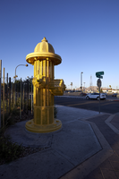
Photographs of Hydrant Club fire hydrant, Las Vegas (Nev.), June 28, 2017
Date
Archival Collection
Description
Site address: 109 N 9th St
Sign owner: 109 9th Street LLC/Cathy Brooks
Sign details: Opened 2012 as a dog training facility, day care, boarding and dog park. Building was constructed in 1939 on 0.16 acres.
Sign condition: 5 - newer looking sign
Sign form: Sculptural
Sign-specific description: 15' yellow fire hydrant. The property also has murals along the front of the property.
Sign - type of display: Internal lighting
Sign - media: Steel
Sign - non-neon treatments: Wire mess and internal lighting
Sign environment: A block from Container Park and Atomic Liquors.
Sign - date of installation: c. 2012
Sign - artistic significance: The property caters to dogs, so the hydrant is appropriate since dogs are often associated with them.
Survey - research locations: Hydrant Club website, correspondence with owner, accessor's website
Surveyor: Wyatt Currie-Diamond
Survey - date completed: 2017-08-25
Sign keywords: Sculptural; Steel; Internally illuminated
Mixed Content
"Thesis Problem: Studying Southern Nevada Migration": manuscript draft by Roosevelt Fitzgerald
Date
Archival Collection
Description
From the Roosevelt Fitzgerald Professional Papers (MS-01082) -- Unpublished manuscripts file.
Text

Transcript of interview with Walter John Ritzau by Elizabeth Garrison, February 25, 1977
Date
Archival Collection
Description
On February 25, 1977, Walter John Ritzau interviewed Elizabeth Schneehagen Garrison (born 1943 in Las Vegas, Nevada) about her life in Southern Nevada. Garrison first talks about her schooling in Las Vegas and her first homes in Las Vegas. She also discusses the atomic testing, the Devils Hole in Ash Meadows, early church involvement, recreational activities, and some of the environmental aspects of Las Vegas. Garrison later describes her work for the Central Telephone Company before describing the Helldorado parade and some of the early activities designed for children. In the latter part of the interview, she describes her father’s garden, the changes in the city environment and building, shopping locations, and more about her home life.
Text
UNLV University Libraries Photographs of the Development of the Las Vegas Valley, Nevada
Identifier
Abstract
The UNLV University Libraries Photographs of the Development of the Las Vegas Valley, Nevada (2016-2020) are comprised of digital photographs captured as part of the Special Collections and Archives Building Las Vegas project. Digital photographs shot in the Las Vegas Valley, Nevada, include color images of street scenes, neighborhoods, developments, land use, housing, flood control, parks, traffic patterns, and parts of the tourism corridor including casinos and hotels.
Archival Collection
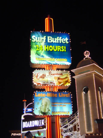
Photographs of Boardwalk Holiday Inn signs, Las Vegas (Nev.), 2002
Date
Archival Collection
Description
Site address: 3750 S Las Vegas Blvd
Sign owner: MGM Mirage
Sign details: The Boardwalk Holiday Inn is one of the most distinctive front faces which incorporate an extreme amount of signage condensed into a replica version of an eastern sea board. Since it is designed to be reminiscent of a boardwalk, the pedestrian element is a wooden planked walkway lined with shops and establishments. The area is separated from the traffic by landscaping and concrete elements. All the shop fronts designs, some false and others functioning, are all linked into the casino. The structure is encrusted with raceways and incandescent bulbs, as well as a ridiculous amount of internally lit signage that advertising everything from hotel promotions, to prices of drinks. Headed from the south, headed north, the parking garage can be seen, set back from the street slightly west, adorned with signage on it's face. The casino begins at full throttle aesthetically, with raceways lining almost every edge, contrasting tones of paint, murals, advertisements, neon and incandescence all come together. Above the first main entrance of the property, is a vibrantly lit, gold clad entrance canopy. Above that a non-functioning skeletal mass of a roller coaster comprises the majority of the southern end of the property. Neon letters are located on the vertical plane created by the rise of the tracks. The carnival style treatments of raceways and propaganda run north until the path is interrupted by the vertical pylon sign which is integrated into the architecture of the Boardwalks facade. The tracks continue above the property, all along the length interrupted by the main pylon and addressed with replica's of Ferris wheels with actual mannequins, dressed and riding inside of them. Just pas the main pylon the facade is transformed into a giant three dimensional clowns head smiling joyfully. The facade continues a short distance past the clown's head, and rounds off just as it began.
Sign condition: Structure 4 Surface 4 Lighting 4
Sign form: Pylon; Fascia
Sign-specific description: Upon the eastern face of the parking garage signage is created upon the top edge of the outside wall. The top edge of the wall is fashioned into a sculpted entablature of signage, complete with rising crests and swooping scrolls, which match the fashion of decoration for the facade as well. On each side of the surface possess a pair of internally lit signage. One is square, and the next is rectangular, brandished with black text. The center portion of the sign is closed in with a pair of half columns which rise out of the surface of the entablature to flank the main text. These half columns are laced with an outline of an orange and yellow neon tubing. The Text is spelled in two different lines of channel letters lined with red neon on the interiors. The First line reads "Boardwalk Casino" the second line reads "Free Parking." The two lines span the length of the space provided and are separated by a sculpted dividing line. The tower just to the north of the parking garage is suited with channel letters that spell "Boardwalk' and are filled with red neon. Roller coaster: The sign which resides over the first entrance is similar that of the paring garage, for it is placed in a raceway bordered fascia. The large channel letters are placed in the center and spell " Casino." The first and last letter are the smallest in size, and gradually climb up toward the middle. They are filled with incandescent bulbs and outlined with a border of red neon. Pylon: The rest of the facade is necessary for the theme to really work, but the tallest and brightest piece is the main pylon sign. The pylon sign is essentially a triangular shape which rises straight up into the air. If a unilateral triangle, then one point is facing east with the two sides meeting at this eastern most point, being designated for the main signage. Three visible posts support the sign, glowing with the reflectivity of the gold polished underside which is striped with rows of incandescent bulbs, running perpendicular to the entrance. Three bands of pink neon wrap the two visible sides, just above the pedestrians head. Just above that there is a narrow LED message center which scrolls text, which also wraps the two sides. The majority of the sign occupies the space between this small border and the main marquee. This rectangular portion each one of the pylons sides can be broken down into four horizontal sections. The bottom two comprise the bottom 1/3 of the sign, and are internally lit advertisements ninety-nine cent offers and the Surf buffet. The middle section, being the tallest, contains a large LED message center, flanked on both sides by multi colored neon tubes crafted into the shapes of stars. The stars vary in size and spread up the small wings of the reader board with surprising fluidity. Compared to the rest of this section, the top remainder is rather plain. A plain surface is accented with a pair of words spelled in channel letters. The word hotel is spelled on the left and filled red neon. They are separated by a small, circular, channel filled with green neon. The word on the right is spelled in the same lettering except it is filled with green neon. The space above that is occupied by the main logo for the establishment. A black field supports large white channel letters that are filled with white neon. Then black field is closed in on all sides by scrollwork shapes created out of incandescence and neon. The white and yellow luminescence, takes the form of a double arched section resembling an "E" or a sideways "M" or "W." The top sweeps upward creating an arched top. A top the main array of signage there are three smoke stacks arranged in a triangular formation, with one at the very front of the edge of the sign and two flanking them in the distance. When looking at the sign directly at the face, it appears as if there are a pair for either side. Spanning the distance between the two smoke stacks is an LED reader board lined on both the top and bottom edge with blue neon. An arch of raceways lined with incandescent bulbs loops over the reader board. A large pylon is designated for the Surf Buffet as well. On the northern end of the property a tall pylon sign faces north/south, and stands lined with red neon. The vertical post supports three internally lit cabinets. The post itself, if viewed directly from the top, would be in an "X" or cross formation. Vertical bars of red neon run up the length of the pole, creating a striping effect. The three cabinets are arranged sitting one on top the other, with a small space in between each. The group all differ in size to an extent, with the two lower cabinets being similar sized, horizontal rectangles, and the top cabinet being the largest. They all have raceways lining the exterior faces with chasing incandescent bulbs. The faces are brightly illuminated colored plastic, with the main cabinet being an advertisement for the Surf Buffet. The others advertise for similar amenities.
Sign - type of display: Neon; Incandescent; Backlit
Sign - media: Steel; Plastic; Fiberglass
Sign - non-neon treatments: Graphics; Paint
Sign animation: Chasing, flashing, oscillating
Sign environment: The environment created by the Boardwalk is an effective use of the theme on the pedestrian to create the environment. The Boardwalk is located next to a CVS Pharmacy to the south, which was erected during the course of the survey. When the pedestrian walks upon the Boardwalk, it is busy and noisy, and very attraction getting. When passing into the front side of the property, a pedestrian is assaulted with sounds and noises that are difficult not to pay attention to. This feeling created by the conglomerate of signage and utter blazing advertisement, is almost like a roller coaster. Person comes out the other side noticeably aware of the silence and darkness contrasted to the presence of the property.
Sign - thematic influences: The theme surrounding the Holiday Inn Boardwalk is that of a seaside boardwalk. Most preferably it is modeled to be representative of the eastern seaboard Coney Island. The facade therefore is most logically themed after the environment experienced on such property, amusement rides, and boisterous circus type lighting loom overhead, while wooden planks exist under the foot of the pedestrian. The walk is lined with coin-operated gadgets and games, while store fronts are found spaced between glowing advertisements. A faux Ferris wheel and roller coaster create an overhead arena of stylized representation that can best be suited as one of the more unique on the strip. It is not often that you see mock people lined up inside of a non- functioning Ferris wheel. Oddly enough, this phenomenon can be linked to couple of still existing Las Vegas Strip properties. When Caesars Palace completed its initial main pylon sign, actual life sized replicas of Centurions and Romans were placed at the base of the statue. They were painted to appear as life like as well. This is one example. The next is the living embodiment of this representation of figures, and their role as evolved on the strip as well. Madame Tussaud's wax museum can be said to be the incarnation of the use and fascination with such a medium. While the exteriors of such properties have shifted toward classic statuary, the life like figure has assumed the role of art form, as an elevated attraction in today's strip community. The noisy facade finds a place for three dimensional sculptural elements, such as the clowns face, which further adds to the "Coney Island" "Atlantic City" theming. Event though, the theme, and very nature of the construction of the Boardwalks facade are dictated by its name, it set early precedence for this interactive miniature city facade as present in many of the major player among the strip. e.g. The Paris, NY NY, Bellagio, Aladdin, etc.
Surveyor: Joshua Cannaday
Survey - date completed: 2002
Sign keywords: Chasing; Flashing; Oscillating; Pylon; Fascia; Neon; Incandescent; Backlit; Steel; Plastic; Fiberglass; Graphics; Paint
Mixed Content

Photographs of Maxim signs, Las Vegas (Nev.), 2002
Date
Archival Collection
Description
Site address: 160 E Flamingo Rd
Sign owner: Premier Interval Resorts
Sign details: The Maxim is located just east of the Bourbon Street, in close proximity to Bally's Hotel Casino. The Maxim is no longer operating, and is fenced off from further inspection. The signage that is seen entails building signs, the original pylon, and the porte cochere
Sign condition: Structure 2 Surface 2
Sign form: Pylon; Fascia; Porte-cochère
Sign-specific description: Building: The tower itself contains the logo and giant text spelling the name of the establishment, on one side of the building. The tower is mirrored and reflective, thus matching the porte cochere and pylon, and reserves to collect its building signage to one end of the tower. The tower, which runs east/west, and faces north/south contains the signs on the east end structure. On the north and south faces of the building, giant red channel letters run vertically along the block surface. The letters look to be lined on the interior of the letters with neon. The logo can be seen on the east face. Pylon: The pylon sign is essentially a giant vertical monolith of a rectangle, divided into several different sub-shapes. The center of the monolith is occupied by cabinets which fill in most of the shape, with a small gap bordering the cabinet. The cabinets are treated the same as the square arch, and flush with the surface. The cabinets are very subtle and create an illusion of one solid object. The entire outer arch shape and interior cabinets are bordered with polished aluminum. The interiors surface of the arch are covered in polished gold aluminum panels. The lining of the incandescent bulbs on the sign is interesting. On the arch the incandescent bulbs are on the interior return width of the aluminum borders. With this configuration, the bulbs sit parallel to the surface instead of perpendicular. The main marquee text is aligned horizontally across the top in gold channel letters with red plastic faces. The letters blend with the gold surface nicely. The interior cabinets are internally lit with plastic faces. There are two cabinets, the larger of the two, occupying the upper part the interior space of the monolith. Incandescent bulbs line the exteriors of the cabinets, sitting back on a recessed edge. Porte Cochere: The porte cochere is unique, opting to rise high above the surface of the pavement. The prismatic design crafted in polished aluminum, interlocks into a pattern suitable to the space which it resides. The recesses in which the decoration resides are separated by a small width of structure. This pattern of giant recesses, matched with the prismatic design in each negative space create a hulking environment high above the head in proud stature. Along the peak edge of the pieces of the prism, rods protrude every foot or so, creating a row of arms holding incandescent spheres.
Sign - type of display: Neon; Incandescent
Sign - media: Steel; Plastic
Sign - non-neon treatments: Graphics; Paint
Sign animation: chasing, flashing
Sign environment: The Maxim is now closed, and stands in marked contrast to its neighbors a bit to the east--the famous "Four Corners" of Flamingo and the Strip, and next to the trendy Meridian at Hughes Center apartment complex.
Sign designer: Maxim letter design: Kenneth Young, Porte Cochere; Lighting: Jack Dubois Pylon sign: Marnell Corrao
Sign - date of installation: 1977
Sign - thematic influences: The influence of the Maxim hotel was 70's Vegas design refined to simple geometric forms and curved linear logo's. The pylon was completely sheathed in polished aluminum, as well as the underside of the porte cochere being polished gold aluminum. The use of the popular 70's material is used extensively throughout the design. Letters hung over the main entrance, as well as signage on three sides of the building. Other examples of the material can be seen elsewhere but not as extensively. The only property that comes close is the pylon for usage of the material is the Westward Ho.
Surveyor: Joshua Cannaday
Survey - date completed: 2002
Sign keywords: Chasing; Flashing; Pylon; Fascia; Porte-cochère; Neon; Incandescent; Steel; Plastic; Graphics; Paint
Mixed Content

Photographs of Candlelight Wedding Chapel sign, Las Vegas (Nev.), 2002
Date
Archival Collection
Description
Site address: 800 S 4th Street
Sign details: The Candlelight Wedding chapel is located on the corner, just north from the Riviera and in the same parking lot as The Algiers. The small white, wooden roofed structure sits just to the east of the street and the northern side butts against Stardust Rd . Outside, the corner is treated with grass, and landscaping, creating a pleasant environment to go along with the charm of the building as well. The low level pole sign faces north/west. The building has a small wooden cross, surrounded on the edges with white neon, on the top of the building, in the same fashion as the Little Church of the West. The style of the building is classic New England architecture
Sign condition: Structure 4 Surface 3 Lighting 3
Sign form: Pylon
Sign-specific description: The main sign for the candlelight wedding chapel is essentially a small pole sign with three separate sections of cabinets along with lighting elements. The white steel pole rises out of the ground ,before transforming into a large two sided marquee cabinet. The cabinet is crafted with sculptural elements into its outer edge. The four corners swell up and bulge, before slightly swooping inward. The top and bottom edges are climaxed into a shallow point. The sides sweep into the notch of a negative circular shape. The sides are given a scroll type feel. In two lines across the red face of the sign, Wedding Chapel is spelled is white text, occupying most of the space of the cabinet. Across the very bottom of the cabinet Wedding Information is spelled in an all white single row of text. The larger text is lined with incandescent bulbs and outlined in neon. The bottom line of text is just lined in neon. The pole protrudes through the top of the sign where a small horizontal, internally lit cabinet, sports sculpted edges as well. The top and bottom edges sweep from either side, then descend meeting at a point in the center. The sides are simply concave, radiuses inward. The white cabinet is lit internally, illuminating the white plastic face. Black text stretches across the plastic face, reading candlelight. Below the main cabinet two internally lit cabinet sandwich the pole, creating two faces. The cabinets are all white, with white faces, utilizing red letters. At the very top of the pole is a tree tiered formation created with raceways and lined with incandescent bulbs. One raceway rises vertically into the air perpendicular to the ground, while the two flanking pieces arch out created a three-pieced fountain shape. It is also reminiscent of a Fleur de Lis.
Sign - type of display: Neon; Incandescent; Backlit
Sign - media: Steel; Plastic
Sign animation: none
Sign environment: The positioning of the Candlelight Wedding chapel gives it a unique role as an accent of softness, among a bombardment of neon and pulsating lights. Just to the North, is the Algiers parking lot, and to the south, the Riviera. Directly west across the strip there is the ever electric Circus Circus. Amid all this chaos of incandescence, screeching cabs, and buzzing current, the green shrubbery and plot of turf finely houses the pylon, and leads up to the structure itself. It is very charming and fresh compared to. It definitely is reminiscent of the era of establishment such as its neighbor the Algiers.
Sign manufacturer: YESCO
Sign - thematic influences: The theme of the sign has little to do with the theme of the wedding chapel, and more so to do with the architectural theme, than the function of the establishment. The pole sign contains standard elements of local signage. The logo cabinet, and internally lit message center. It even contains the most common element of a raceway lined with incandescent bulbs. The sculpted edges of the pylon's logo cabinet are reminiscent of other cabinets with sculpted edges. The most famous reference to this shape seen in classic Vegas history, is the original corner fascia seen on the Golden Nugget. As far as being compared to the only other existing independent wedding chapel, its structure is similar, that being a small structure boasting a highly visible steeple.
Surveyor: Joshua Cannaday
Survey - date completed: 2002
Sign keywords: Pylon; Neon; Incandescent; Backlit; Steel; Plastic
Mixed Content

