Search Results
Transcript of interview with Phyllis Silvestri by Claytee White, January 11, 2010
Date
Archival Collection
Description
As a young woman, Phyllis Silvestri made the adventurous decision to move to the United States. She was bom in Canada and lived there until her early 20s. Over the next few years, Phyllis and her friend Mona logged many miles, worked and visited several states. By 1953, Phyllis had met and married Vincent Silvestri, who worked at Bingo Palace, now the Sahara Hotel and Casino. Soon they had their first child and had bought a home on Santa Rosa. A few years later they were building a new home in the John S. Park area. She proudly recalls her husband's attention to details such as including lots of built-in features and a bomb shelter that represents the era. Phyllis talks fondly of the neighborhood, but also recalls her children not being allowed to play with some of the neighborhood children because they were of Italian ancestry.
Text

Myron Martin and Don Snyder interviews, November 30, 2017, December 06, 2017, and March 08, 2018: transcript
Date
Archival Collection
Description
Part 1: Interviewed by Stefani Evans. Myron G. Martin, President and CEO, and Donald D. Snyder, Chairman of the Board of Directors, share their memories of the founding of The Smith Center for the Performing Arts from the first non-for-profit foundation formed in 1996. The second iteration led by Snyder in 1999 brought in Martin--former Director of UNLV Performing Arts Center--and created a sustainable business plan for a center for the performing arts that would be accessible geographically and culturally for all segments of Nevada society. Here, Martin and Snyder recall how land, funding, and legislation for The Smith Center depended on the ""power of the project"" and the Snyder-Martin team's ability to overcome skeptics in the public, the Nevada Legislature, the Clark County Commission, the Las Vegas City Council, and the Don Reynolds Foundation. Martin and Snyder satisfied the various requirements for each organization and earned unanimous approval at each stop--in fact, the $50 million donation to The Smith Center was the largest the Don Reynolds Foundation had ever granted largest. That the approvals came on three consecutive days from competing municipal jurisdictions makes the accomplishment even sweeter. Subjects: Las Vegas, NV; Cultural center; Performing arts; The Smith Center for the Performing Arts; The Smith Center; Not-for-profit;; Nevada Legislature; Clark County Commission; Las Vegas City Council; The Don Reynolds Foundation; Fundraising; Planning; Endowment; Part 2: Interviewed by Stefani Evans. Martin, who was the youngest of three boys raised in suburban Houston, Texas, likes to say that in college at the University of North Texas he played for the Atlanta Braves and the Texas Rangers. So he did--as the organist. He earned a Bachelors of Music in piano, organ, and voice and an MBA from Golden Gate University. He came to Las Vegas after a fifteen-year career with the Baldwin Piano Company as executive director of the Liberace Foundation; he later became president of UNLV?s Performing Arts Center and in 1999 he became president of the Las Vegas Performing Arts Center Foundation. Here, Martin and Snyder recall the process whereby they hired architect David Schwarz of Washington, DC, to create The Smith Center's ""timeless, elegant"" look; creating a ""shared vocabulary"" by visiting 14 performing venues in 5 European countries; the City of Las Vegas's RFP that resulted in hiring Whiting-Turner Contracting Company; the exterior art/artists, significance of the bell tower, Founding Fifty(seven), and the ability of the theater to adapt from staging The Book of Mormon to staging a community funeral for two slain police officers. Subjects: The Smith Center; The Smith Center for the Performing Arts; Architecture; Fundraising; Acoustics; Public private partnerships; Request for proposals; Whiting-Turner; Theater Projects Group; vocabulary; Part 3: Interviewed by Stefani Evans. Author Jack Sheehan, joining this third session on The Smith Center in his role as Don Snyder's biographer, explains the way he envisions the place of The Smith Center in the larger context of Las Vegas. Martin and Snyder provide names for the group that grew out of the Call to Action meeting and founded the original Las Vegas Performing Arts Foundation. They share anecdotes of a 2005 trip, wherein they were joined by Las Vegas City Councilman Lawrence Weekly, City of Las Vegas Mayor Oscar Goodman, and consultant to the City of Las Vegas Dan Van Epp to visit City Place and the Kravis Center for Performing Arts in West Palm Beach as an example of a place where a performing arts center was a catalyst for revitalization in an area of underused and underutilized urban land. They discuss opening night, March 10, 2012, /From Dust To Dreams: Opening Night at the Smith Center For The Performing Arts/, which was produced broadcast live on national Public Broadcasting System (PBS) television stations, produced by George Stevens Jr. and directed and produced by Michael Stevens for The Stevens Company; hosted by Neil Patrick Harris; and featuring Jennifer Hudson, Willie Nelson, Merle Haggard, Emmylou Harris, Martina McBride, Carole King, Arturo Sandoval, Joshua Bell, Mavis Staples, Pat Monahan; American Ballet Theater dancers Marcello Gomes and Luciana Paris; also Broadway performers Brian Stokes Mitchell, Laura Osnes, Cheyenne Jackson, Sherie Rene Scott, Montego Glover, and Benjamin Walker. Martin describes how provisions of Nevada SB235--introduced March 6, 2017, signed into law by Governor Bob Sandoval, and became effective October 1, 2017--for the regulation of ticket sales to an athletic contest or live entertainment event affect The Smith Center ticket sales. They talk of providing 3,600 good construction jobs during the recession, of Discovery Childrens Museum, of future development plans for the entire 61-acre Symphony Park parcel, and of a second capital campaign to increase the endowment to $100 million to enable The Smith Center to be economically sustainable.
Text
Gary Sternberg Papers
Identifier
Abstract
The Gary Sternberg Papers are comprised of correspondence, publications, and videos documenting Sternberg's involvement with the Las Vegas Jewish community from 1983 to 2015. Organizations represented in the collection include Congregation Ner Tamid and the Holocaust Survivors Group of Southern Nevada. Also included are digital photographs of Sternberg in 2015 wearing his Caesars Palace dealer's uniform.
Archival Collection
Clark County Department of Air Quality and Environmental Management Records
Identifier
Abstract
The Clark County Department of Air Quality and Environmental Management Records (1988-2006) contain materials related to Southern Nevada resource management, air quality, and community planning, particularly related to population growth in Clark County, Nevada. Materials include federal regulations and acts, reports, and land sales, as well as local agency reports, memorandums, workshop pamphlets, maps, and plans.
Archival Collection
Rabbi Yocheved Mintz Photographs
Identifier
Abstract
The collection is comprised primarily of photographs of Rabbi Yocheved Mintz at different events and programs held at Las Vegas, Nevada synagogue Congregation P'nai Tikvah from 2006 to 2017. The collection includes photographs of congregants during different workshops and events held at the synagogue. The collection also includes photographs of Rabbi Mintz and congregants during holidays (Hannukah, Purim, Rosh Hashanah, and Passover), Jewlicious (Jewish education classes and workshops), and from the congregation newsletter.
Archival Collection
Thomas Schiff Panoramic Photographs
Identifier
Abstract
The Thomas R. Schiff Panoramic Photographs (2001-2009) are comprised of physical and digital panoramic photographs of hotel casinos and other locations around Las Vegas, Nevada used in his book,
Archival Collection
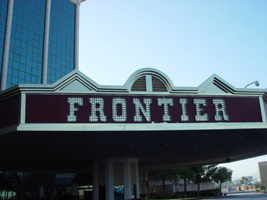
Photographs of Frontier signs, Las Vegas (Nev.), 2002
Date
Archival Collection
Description
Site name: Frontier Hotel and Casino
Site address: 3120 S Las Vegas Blvd
Sign owner: Phil Ruffin
Sign details: The New Frontier Hotel and Casino sits south of the Stardust, on the east side of Las Vegas Blvd The Frontier main pylon still remains at the south end of the property, a short distance from the southeast, near the porte-cochere. A rear port e cochere also resides on the east side of the building . Like so many other properties the Frontier is composed of a low-rise building accompanied by, another higher rise structure, and a tower of rooms. A parking lot sits on the north end of the property, denoted by a small, double-sided pole sign. Two porte-cocheres adorn on the southeast and west sides of the property, as well as the famous pylon outside the eastern porte- cochere.
Sign condition: Structure 4 Surface 4 Lighting 4
Sign form: Pylon; Porte-cochère; Fascia
Sign-specific description: A parking lot sits on the north end of the property, denoted by a small, double-sided pole sign. It is a simple rectangular cabinet, with a small steel circular cabinet on the top east edge of the sign, and a triangle on the west edge of the height, pointing west. The two are connected by a long horizontal section, which runs along the top of the cabinet. The circle, arrow, and connecting pieces are lined with incandescent bulbs. The surface if the Frontier is reserved, not holding too many exterior references to a western theme, besides the actual script of the logo, and wood paneling of the overhangs, little else is there to support the theme. Just south of the parking lot and on the west side of the strip, the Frontier is separated from the sidewalk with a large section of green lawn, and a guard of tall palm trees against the east face of the building. Tall windows occupy most of the wall separated by columns of brick. The structure continues south and juts east to create an entrance, with a text logo above the door with brass edges and a wood panel facade. The three sided entrance is two tiered flat font design, with the lower half being taller, fit with a backlit message board. The top half is shorter in height, and plays home to the polished channel letters spelling "Frontier," and filled with incandescent bulbs. The surface of the top half of the facade is a rusted brown color, referencing panels of exposed wooden construction. The bottom edge of the entire face of the sign is a protruding brass geometric edge, as well as being the device that separates the two parts of the sign. The top edge of the top section is brass treatment also, but is crafted into different forms along its path. Directly in the center of the front face, there is an arch curving over a set of vents. The two sides are treated with an pointed triangular shape. The porte-cochere is located just south, if you follow the property, pointed toward the southeast extending off of the building. The northeast and southwest sides of the porte- cochere are lined on the top and the bottom with the same protruding, square molding, rising into a long, low rising arch, peaking in the center of the sign. The center portions of the sides are the same rusted brown tone seen on the entrance mentioned earlier. Suggestions of the paneling are evident at the edges. The "Old west" font, polished channel letters spell out "Frontier" on the rust facade. Each is filled with incandescent bulbs, and outlined in neon. Most impressive about the covered area is the space occupied by the ceiling. The underside of the port-cochere is separated by four large, deep, recessed rectangles with mirrored walls. The walls slope into another smaller recessed rectangle rising straight up only a sort distance before stopping. Standing directly underneath the section, it is seen as a smaller rectangle located within a larger one. Both rectangles are lined on all edges by polished gold raceways, and incandescent bulbs. The open space is occupied by multi armed, ornate brass chandelier. Each arm is adorned with faux gas lanterns. The arms are curved in a quite extreme fashion, making the piece appear more as an organic shape, or a creature such as an octopus. The centers are adorned with decorative silver spheres. Over the doors to the casino a large backlit message center panel, curves with the radius of the face of the building. The brown and polished metal edges of the sign combined with the incorporation of the architecture of the building, gives it a reserved, streamlined look. South of here the building grows in height and becomes a series of tall windows that create the wall. Following the property around to the building's west side, another porte-cochere can be seen. An eight-sided post serves as a valet station. The facade of the roof is treated as the entrance on the east side of the building. Protruding square brass edges form borders for polished channel letters filled with incandescent bulbs. Text is contained within the southwest, southeast, and western panels. Frontier is spelled in the properties font on both the southeast, and western sides. The southwest side reads "Parking" in the company's font, but is flanked by "self" and "valet," in smaller plain white channel letters filled with neon. The western and southeastern sides are crafted with the top edge of the pediments being an arch flanked by two triangle shaped rooflines. Elements also seen elsewhere over the other entrances. Looking up, facing this porte-cochere, the tower of rooms looms high overhead. Signage is located on all four sides of the tower. The northeast and southwest sides of the tower hold giant channel letters that spell "Frontier" with the interior being a reflective orange material. The facade is a giant replication of the two sides of the southeast and western sides of the multisided porte-cochere below. A giant polished metal framework, with a rounded arch flanked by two A frame roof lines, as well as the rust colored background hold the letters. The text is filled with incandescent bulbs. Along the northwest and southeast sides of the tower "Frontier" is spelled vertically down the face of the building in the distinctive channel letters. They too are filled with incandescent bulbs and finished orange on the inside. The famed main pylon sign for the frontier still stands in good repair, as reminder of Las Vegas past. It is located in the south side of the Frontier property facing north south. The two-sided sign is essentially pair of close set steel legs joined by an arch at the top to create one continuous shape. The steel is treated in a pastel pink coloring lined on both edges with a double row of incandescent bulbs. The inner portion of the arch contains three elements. The small cabinet at the top holds the image of the Frontier "F" logo. The edge of this cabinet is painted yellow, with a white internally lit face below that a long cabinet runs the length of the remaining space to the ground. The interior of the cabinet has been cut away to form a pattern of repeated circular holes down the length of the cabinet. This portion has been painted a teal color, with the edges lined with incandescent bulbs. In the space inside of the circles a continuous string of star shapes, reminiscent of the Stardust star emblems, are crafted in yellow painted steel and laden with small incandescent bulbs. The shape is interrupted twice with the main marquee logo for the establishment as well as well as a large internally lit message center. Both portions are not solid, double faced cabinets, but four single faced cabinets. The design is also seen in the Westward HO pylon. The bottom section message center can divided into essentially six parts: four individually denoted sections for vinyl lettering, and two steel panels with an animated neon silhouette of a cowboy riding a mechanical bull. The bottom half of the cabinet is one portion of the collection of section, with a thin, one letter width portion running the length of the cabinet, separating the sign into two halves. The top half is another section flanked by the two steel panels containing the bull rider. The middle portion contains crafted red vinyl logo the "Gilley's" establishment. A thin, one letter space cabinet, emerges out of the top of the sign, running a bit shorter than the length of the cabinet. The panel with the rider is actually three separate images, crafted with gold neon stacked on top of another in different positions to allow the three-stage animation process of the rider to be realized. Fashioned out of red neon text is written in the same text as the Frontier wall logo's above and below the rider. The word "Ride" sits above and the phrase "The Bull" is below the rider. He entire width edge of both the North and South sides are encrusted with yellow incandescent bulbs. While the bottom half of the pylon is dominated by the message center, a bit further up on the structure is the main marquee logo. The green steel cabinet is a rectangular with added elements of shape and design. The ends of the plane are slightly curved back into space, with the actual surface of the shape rising into a small pointed crest in the center. Across the surface of the cabinet the word "Frontier" is spelled in the "Western Font" in channel letters. The letters are outlined in neon and filled with incandescent bulbs. The surface of the cabinet is striped horizontally with tubes of red neon.
Sign - type of display: Neon; Incandescent; Backlit
Sign - media: Steel; Plastic
Sign - non-neon treatments: Graphics; Paint
Sign animation: Chasing, flashing, oscillating
Notes: The incandescent bulbs inside the text reading "Paris" on the balloon oscillate rapidly.
Sign environment: Sitting north of the Fashion Show Mall and, south of the Stardust, the Frontier seems to create its own environment upon an expansive property. The expansive sidewalks, healthy landscaping, and clean, reserved faced, make the Frontier more akin to the larger corporate establishments such as the Mirage, or Monte Carlo. It is quite the dominant presence on the west side of the street, for the east side is the vacant lot where the Desert Inn used to reside. The Frontier stands clean and strong amongst the chaos of the Fashion Show construction, and the empty lot across the street.
Sign manufacturer: Ad-art (Pylon), Sign Systems, Inc (facade and porte-cochere)
Sign designer: Bill Clarke (Pylon) Brian K. Leming (facade and porte-cochere)
Sign - date of installation: pylon: 1967 porte-cochere and facade 1981
Sign - date of redesign/move: The face of the Frontier was remodeled in an effort to keep up with the larger corporate casinos in 1998, but retained the main pylon, tower signage, porte-cochere signage and various entrance signs.
Sign - thematic influences: The obvious theme of the hotel is a Western, cowboy/pioneer themed establishment. The facade of the structure was at one time engulfed in the theme, but has slowly over time changed to compete and fit in with the ever-changing Las Vegas strip. Vestiges of the Western theme are present in the remaining elements of the porte-cochere, side entrances, the tower fascia and roofline, as well as all the text, including the main pylon. Other establishments that carry the much popular theme throughout Las Vegas history, include the Westward Ho, The Golden Nugget, The Bonanza, Hotel Apache, the Boulder Club, and the Pioneer Club.
Sign - artistic significance: In 1967, the Frontier sign was considered the tallest sign on the Strip. The 24 x 84 foot signature panel proved to be one of the largest at the time as well. Charles Barnard's scale model displayed at the Montreal Expo and his design of the seventeen-foot tall logo cabinet, were instrumental in Ad-Art landing the contract for the establishment. (Barnard) The cabinet and center scalloping used to incorporate animatronics, turning in concert.
Surveyor: Joshua Cannaday
Survey - date completed: 2002
Sign keywords: Chasing; Flashing; Oscillating; Pylon; Porte-cochère; Fascia; Neon; Incandescent; Backlit; Steel; Plastic; Graphics; Paint
Mixed Content
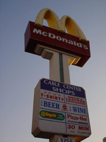
Photographs of McDonald's sign, 3755 S Las Vegas Blvd, Las Vegas (Nev.), 2002
Date
Archival Collection
Description
Site address: 3755 S Las Vegas Blvd
Sign details: The McDonald's pylon sits in the parking lot just to the north of the Fatburger establishment and the Walgreen's structures. It faces north/south in the parking lot of the Cable Center Shops. It sits across a property length parking lot, near Las Vegas Blvd It is also serves as advertising for the rest of the shops in the shopping center, but the main cabinet is dedicated to the McDonald's logo cabinet. The shops behind the sign are covered in the same stucco as seen on the surface of the pylon.
Sign condition: Structure 5 Surface 4.5 Lighting 5 Notes: It is noted that the structural integrity is intact. Certain elements of lighting are out or not working, but present still. The surface appears to be slightly deteriorating at this point.
Sign form: Pylon
Sign-specific description: The pylon sign for the McDonald's and the Cable Center Shops is essentially a double sided pole sign comprised of a two sided main logo cabinet and an internally lit rectangular cabinet. The internally lit cabinet located in the middle of the pole finished it's exterior the same as the rest of the actual pole. The post is covered in an off white stucco finish, with a green channel running up the center of each face. The channel T's off as well following the supporting stretch at the top of the rise, below the main cabinet. Three gold neon bars run up the center of the green channel. The internally lit cabinets face is adorned with graphics advertising for all of the shops located within the strip mall. Its luminescence is strong for an internally lit cabinet. A blue section at the top of the plastic face is designated blue with white script reading "Cable Center" shops. The rest of the text below that reads like two-sided menu. The McDonald's cabinet at the very top of the pole is constructed of red painted steel, as well as yellow painted steel for the golden arch crown designated as the top portion of the cabinet. The face of the cabinet is encrusted with red incandescent bulbs as well as being striped horizontally across its width edge with bars of red neon. The underside of the golden arches is also encrusted with yellow incandescent bulbs, while the faces of each arch is striped horizontally with neon bars as well bordered on the edges of the ace of the arch as well. The text McDonald's is spelled in white channel letters and lined on the interiors with white neon.
Sign - type of display: Neon; Incandescent; Backlit
Sign - media: Steel; Plastic
Sign - non-neon treatments: Paint
Sign animation: Oscillating, flashing
Notes: The incandescent bulbs located on the underside of the arches, as well as on the face of the sign oscillate rapidly, while the neon bars on the width of the sign and underneath chase each other from top to bottom. The neon bars, which comprise the face of the arches, chase each other also. The rest of the arch is dark as they start at the bottom of the middle point of the "M" shape. They chase each other until the surface of the sign is covered, and at this time they all flash off, then on, then off again before the entire sequence starts over.
Sign environment: It is an interesting section of the strip between the Showcase Pylon sign and the edge of the Cable Center shops. First, it is noticeably an interesting cross section of the Strip, because vicinity has three establishments which fit a specific genre of sign. The Fatburger, Walgreen's and McDonalds are properties which function in everyday America, but are suited up to be part of the neon charged appearance of this specific location. Not only are the establishments linked by nature to everyday America, but the face that a strip mall is added to the scenery, just adds to the point. The environment is a heavily pedestrian-accessed area, bombarded by the combination of all of the signage.
Sign manufacturer: YESCO
Sign - thematic influences: The theme of the McDonald's establishment is in the realm of the well-established McDonalds corporation. The golden arches, and solid red hue, have become synonymous with the name " McDonald's," and is an image, which has been communicated to the masses of people for half a century. It is an icon, which is associated with America all over the world. McDonalds has created it's own realm and thematic influence over the years from all of it's extensive advertisements and marketing. Therefore, the theme of the establishment's signs draws from itself and the world that the name has created. Being one of the most commonly seen images in America, this sign is tailored to fit into the illustrious, illuminative properties held on the Las Vegas Strip. It fits into the category of everyday images and businesses dressed up for Las Vegas, which include, Arby's, Arco AM/PM, Walgreen's, and Fatburger.
Surveyor: Joshua Cannaday
Survey - date completed: 2002
Sign keywords: Oscillating; Flashing; Pylon; Neon; Incandescent; Backlit; Steel; Plastic; Paint
Mixed Content