Search Results
Photograph of the exterior corner of the Mint after its expansion (Las Vegas), 1958
Date
Archival Collection
Description
The corner of the Mint at Fremont and First Streets after its first expansion in 1958. The Boulder Club and Hotel Fremont are seen in the background.
Site Name: Mint Las Vegas
Address: 128 East Fremont Street
Image

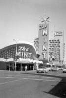
Photograph of the exterior corner of the Mint (Las Vegas), between 1958-1964
Date
Archival Collection
Description
The corner of the Mint at Fremont and First Streets after its first expansion in 1958.
Site Name: Mint Las Vegas
Address: 128 East Fremont Street
Image

Photograph of the exterior corner of the Horseshoe Club (Las Vegas), circa early 1960s
Date
Archival Collection
Description
The exterior corner of the Horseshoe Club on the corner of Fremont and Second Streets.
Site Name: Horseshoe Club
Address: 128 East Fremont Street
Image

Photograph of the front exterior of Club Bingo (Las Vegas), between 1947-1952
Date
Archival Collection
Description
Front the Club Bingo at dusk with neon signs lit.
Site Name: Club Bingo
Address: 2535 Las Vegas Boulevard South
Image
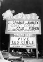
Photograph of a neon sign for the Dunes Hotel and Casino(Las Vegas), 1962-1963
Date
Archival Collection
Description
Nighttime view of a neon sign outside of the Dunes Hotel and Casino. Betty Grable and Dan Dailey in Guys and Dolls and the 1963 edition of Vive Les Girls are featured on the marquee.
Site Name: Dunes Hotel
Address: 3650 Las Vegas Boulevard South, Las Vegas, NV
Image

Photograph of a neon sign for the Silver Slipper Gambling Hall (Las Vegas), circa 1960
Date
Archival Collection
Description
Nighttime view of the neon sign for the Silver Slipper Gambling Hall. Hank Henry and Brandy Long, and Charlie Teagarden's Jazz Group are featured on the marquee.
Site Name: Silver Slipper
Address: 3100 Las Vegas Boulevard South
Image
Photograph of the neon sign for the Sands Hotel (Las Vegas) as seen from under the hotel's porte-cochère (Googie architectural design), 1952
Date
Archival Collection
Description
View of the Sands neon sign from under the porte-cochère.
Site Name: Sands Hotel
Address: 3355 Las Vegas Boulevard South
Image
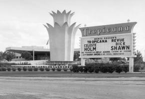
Photograph of the sign and tulip-shaped fountain outside of the Tropicana Hotel (Las Vegas), 1957-1958
Date
Archival Collection
Description
The tulip-shaped fountain and neon sign in front of the Tropicana in 1957 or 1958. The sign advertises Monte Proser's Tropicana Revue, featuring Celeste Holm and Dick Shawn.
Site Name: Tropicana Hotel
Address: 3801 Las Vegas Boulevard South, Las Vegas, NV
Image
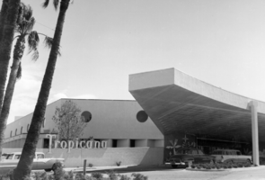
Photograph of the front exterior and porte-cochère of the Tropicana Hotel (Las Vegas), 1957
Date
Archival Collection
Description
Front entrance and porte-cochère of the Tropicana Hotel in 1957.
Site Name: Tropicana Hotel
Address: 3801 Las Vegas Boulevard South, Las Vegas, NV
Image

Photograph of the Riviera Hotel and Casino neon sign (Las Vegas), circa early 1960s
Date
Archival Collection
Description
Neon sign for the Riviera Hotel and Casino. Edie Adams, Rowan & Martin, Charlie Barnet, the Vagabonds, Georgie Auld with Johnny Desmond are featured on the marquee.
Site Name: Riviera Hotel and Casino
Address: 2901 Las Vegas Boulevard South
Image