Search Results
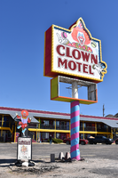
Clown Motel mounted sign, Tonopah, Nevada
Date
Archival Collection
Description
The mounted sign for the Clown Motel during the day with unlit neon.
521 N Main St, Tonopah, NV 89049
Clown Motel
Image
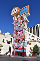
Circus Circus clown sign, Reno, Nevada
Date
Archival Collection
Description
View of the clown sign for the Circus Circus during the day with unlit neon.
500 N Sierra St, Reno, NV 89503
Image
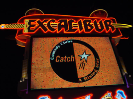
Photographs of Excalibur signs, Las Vegas (Nev.), 2002
Date
Archival Collection
Description
Site name: Excalibur Hotel and Casino (Las Vegas, Nev.)
Site address: 3850 S Las Vegas Blvd
Sign owner: Mandalay Resort Group
Sign details: The Excalibur Hotel and Casino sits on the NE corner of Las Vegas Blvd and Tropicana Ave. While the main attraction is the brightly illuminated fantasy castle facade, the two giant multimedia pylon signs flank the property along the streets. One, on the South side of Tropicana, faces East /West, while the second sits on the West Side of LV Blvd, and faces North/South.
Sign condition: Structure 5 Surface 4 Lighting 5
Sign form: Pylon
Sign-specific description: The two pylons are identical in design. They are both double backed, pylons containing animated incandescent Excalibur logos, neon borders, an animated, color, matrix message center, and a two dizzying renderings of jousting knights, constructed completely of neon, on either side. Constructed to appear as a medieval castle facade themselves, the signs are finished in stucco to appear as if built with stone blocks. The scroll shaped main logo sign box, the outline of the logo, the spires, and sword, are all outlined in neon. The 10'-6" channel letters contain white incandescent bulbs that animate.
Sign - type of display: Neon; Incandescent; Matrix
Sign - media: Steel
Sign - non-neon treatments: Graphics; Paint
Sign animation: Chasing, flashing
Notes: The Excalibur logo, which is comprised of incandescent bulbs, displays a two part chase animation from left to right over the entire text, then in sequence, displays a flashing animation over the entire word before starting the pattern over again.
Sign environment: The two pylons are both in parking lots of their respected positions. Pedestrians may walk up to the one located in a public lot on Tropicana Ave.
Sign manufacturer: Sign Systems, Inc
Sign designer: Brian K. Leming
Sign - date of installation: 1989-1990
Sign - date of redesign/move: The backlit plastic message board and old electronic message center, have been replaced by a single, giant animated, color electronic message board.
Sign - thematic influences: Excalibur capitalizes on the King Arthur/Renaissance fair theme.
Sign - artistic significance: Artistically the sheer magnitude, construction techniques and the magnitude of the themed facade are sincerely significant in the artistic developments of sign making. The pylons directly reflect those elements.
Surveyor: Joshua Cannaday
Survey - date completed: 2002
Sign keywords: Chasing; Flashing; Pylon; Neon; Matrix; Incandescent; Steel; Paint; Graphics
Mixed Content
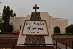
Our Mother of Sorrows Cemetery mounted sign.
Date
Archival Collection
Description
View of Our Mother of Sorrows Cemetery sign during the day.
2700 N Virginia St, Reno, NV 89507
Image
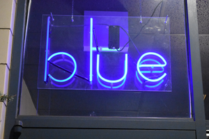
Blue Salon window sign, Reno, Nevada
Date
Archival Collection
Description
View of the window sign for Blue salon in Reno with lit neon.
1170 S Wells Ave # 1, Reno, NV 89502
Image
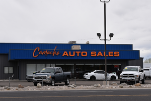
Camacho Auto Sales wall mounted sign
Date
Archival Collection
Description
The wall mounted sign for Camacho Auto Sales during the day.
2525 Reno Hwy, Fallon, NV 89406
Camacho Auto Sales
Image
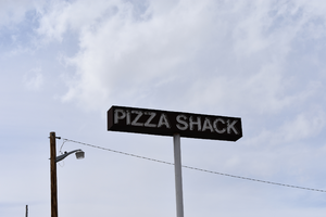
Pizza Shack mounted sign, Fernley, Nevada
Date
Archival Collection
Description
The mounted sign for the Pizza Shack during the day. The restaurant is permanently closed.
790 E Main St, Fernley, NV 89408
Pizza Shack
Image
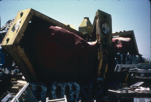
Slide of the YESCO sign graveyard, Las Vegas, 1986
Date
Archival Collection
Description
Image
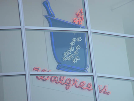
Photographs of Walgreens signs, Las Vegas (Nev.), 2002
Date
Archival Collection
Description
Site address: 3765 S Las Vegas Blvd
Sign condition: Structure 5 Surface 3 Lighting 5
Sign form: Fascia
Sign-specific description: The Walgreens lot is shared with the Fat Burger establishment, and a strip mall of assorted shops. The lot is located on the east side of the strip, just north of the Showcase Mall. On the west elevation of the building the Walgreen's cursive, logo script spells out the word "Walgreen's". The same sign design is repeated on the north face of the building also. The two signs are crafted out of channel letter, with blue and red neon in the interior of the channel. In small black channel letters, a bit further below the logos, there are three separate sets of much smaller channel letters. These spell the phrases "Pharmacy," "24HRS," and "1 Hour Photo." These are also lined on the interior with red and blue neon. Above the entrance to the building, a wall sign crafted of neon in the shape of the "mortar and pestle" is perched above the customers head as they enter the building from the NW. The entire structure of the image of the Walgreen's mortar and pestle, as well as the outline of the exterior stars, is constructed of one giant pan channel. The body of the pestle is made of a series of blue neon tubing which starts in the center of the pan in a square shape and creates a concentric pattern, filling the pan. Small white neon stars float to the top of the sign and into the body of the sign. Below that image, on the same elevated plane, the Walgreen's script logo is written in channel letters with white neon. Below that script is written independently in neon reading "The Pharmacy that America Trusts." Facing north /south, the street-side, pylon sign for the Walgreen's establishment is a multi-use pylon. The sign boasts advertisements for several other businesses, however the Walgreen's advertisement is the most visible and dominant on the face. The architecture of the sign is mostly a giant, stucco covered vertical rectangle with a simple crown cornice molding on the top edge of the structure. The other establishments mentioned on the sign are as read from the top of the sign to the bottom: Alan Albert's Lobster House, Club Utopia, Fatburger, and a small back-lit plastic sign for ice cream and t-shirts. At the bottom of the sign, channel letters spell the phrase parking in rear, with an arrow of the same concept pointing east toward the rear of the property. The pylon is two sided, with almost the entire top of the sign belonging to Walgreen's, and sculpted almost completely out of neon. Red, horizontal neon tubes form a field of light for the neon mortar and pestle, as seen above the entrance. The red field is also home to the cursive, Walgreen's logo script, and the phrase "Open 24 hours." The mortar and pestle are a pan channel including the stars floating out of the top incorporated into its design. Crafted in blue, with white neon for the stars, the mortar handle portion sticking out of the top of the pestle animates to appear as if it is stirring, while the stars turn on and off, representing the concoction being stirred in the body of the image. The Walgreen's script is made of channel letters filled with white neon. The bottom line of the sign that reads "Open 24 Hours," is in all caps, and channel letters with white neon on the interior. They animate in sequence one word at a time from left to right. Along the vertical edge width of the sign, the words "The Plaza" are spelled in red neon.
Sign - type of display: Neon
Sign - media: Steel
Sign - non-neon treatments: Paint
Sign animation: Chasing, flashing, oscillating
Notes: The text, which resides on the southern wall and reads "Casino," is filled with incandescent bulbs that all illuminate at the same time, and oscillate. They then shut off at the same time, and then repeat. The raceways of incandescent bulbs chase each other while the neon, which surrounds the back lit, plastic, screens on this wall flash on then off. The bottom two raceways sandwiching the reflective panel chase from left to right, while the remainder of the raceways surrounding the signs, run right to left. The incandescent bulbs on the pylon chase each other gracefully up the length of the pylon. The animation is patterned so as to appear as if a section of several bulbs are pulsing its way up the towers, hugging the edge of the bulbous tops. The raceways continue around the east face of the building. The umbrellas in the plaza behind the pylon, also are animated with incandescent bulbs chasing each other downward along the raceways.
Sign manufacturer: Mikhon lighting and sign
Sign - date of installation: 1997
Sign - thematic influences: The thematic influence of the Walgreens pylon is based on the logo for the establishment, incorporated into the architectural design of a modern commercial signage. The objects represented in the logo's are based on historical peripheral tools used in the pharmaceutical trade. The mortar and pestle were instruments used by chemists and doctors to grind and pulverize chemical to me mixed together. Since Walgreen's is a pharmacy and purveyor of commonly used goods, the mortar and pestle are appropriate symbols of the property's function.
Sign - artistic significance: Walgreen's fits into a niche of locations on the Las Vegas Strip that are establishments that can be found anywhere in the United States.
Surveyor: Joshua Cannaday
Survey - date completed: 2002
Sign keywords: Flashing; Fascia; Neon; Steel; Paint
Mixed Content
Beefy's wall mounted sign, Reno, Nevada
Date
Archival Collection
Description
View of Beefy's wall mounted sign with lit neon.
1300 S Virginia St, Reno, NV 89502
Image