Search the Special Collections and Archives Portal

Search Results

Display    Results Per Page
Displaying results 139961 - 139970 of 140032

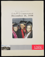
University of Nevada, Las Vegas (UNLV) 45th commencement program

Date

2008-12-16

Description

Commencement program from University of Nevada, Las Vegas Commencement Programs and Graduation Lists (UA-00115).

Text

Transcript of interview with Jan Kennedy by Barbara Tabach, September 7, 2011

Date

2011-09-07

Description

Jan Kennedy was born (1924) Janet Parmelee, the daughter of a Connecticut physician and a homemaker. In high school she met Norman Kennedy, who she would marry after both had attended college and to whom she was married for 64 years. Until 1963, their roots seemed to be taking hold in the Seattle area. That is until Norm was offered an attractive career opportunity as a weather man at the Nevada Test Site. They settled in and enjoyed a zest-filled life with their four sons and a dynamic group of friends who they often entertained at their cabin in Mount Charleston. In addition, Jan managed to volunteer for a list of organizations including UMC Hospital/Southern Nevada Memorial Hospital; Clark County Museum Guild; Salvation Army Women's Auxiliary; church deacon; Assistance League; Red Hats—keeping herself ever busy and joyfully satisfied.

Text

Transcript of interview with Burton Cohen by Claytee White, January 9, 2009

Date

2009-01-09

Description

In this interview, Burton Cohen discusses his involvement in the Las Vegas casino industry, including booking entertainment for various hotels.

Burton Cohen's long casino executive career began in the mid-1960s when he accepted a proposition to become involved with the transformation of the Frontier Hotel. He left his south Florida roots and law practice to become a co-owner/general manager of the Frontier Hotel. Thus, began his highly regarded Las Vegas presence. For nearly four decades he served in the management of some of the Strip's most famous casinos: Flamingo, Dunes, Circus Circus, Caesar Palace, Thunderbird and the Desert Inn, which remains his favorite. In this interview, Burt reflects on the positions he held, the celebrities he hired and befriended, and offers a unique look at the behind the scenes marketing and entertainment strategies that he helmed. He shares stories of becoming entrenched in casino operations, his reflections of union experiences, and even anecdotes about moving his mother to Las Vegas.

Text

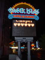
Photographs of Greek Isles signs, Las Vegas (Nev.), 2002

Date

2002

Description

Daytime and nighttime views of the Greek Isles Hotel and Casino signs. Information about the sign is available in the Southern Nevada Neon Survey Data Sheet.
Site address: 305 Convention Center Dr
Sign owner: Mark IV Realty
Sign details: The property which is at the eastern end of Convention Center Dr., is one tower at the east end of the property, and is attached to a low-rise structure which reaches westward along the east side of Convention Center drive. Various signs adorn the facade of the Greek Isles including a small pylon sign, a porte- cochere and two wall/logo signs. The stucco surface of the front of the building is painted with images of rustic Mediterranean cottages, as well as the rising or setting sun image seen on the pylon as well.
Sign condition: Structure 5 Surface 5 Lighting 5 Notes: The signage for the Greek Isles is essentially brand new, with exception to the porte-cochere. The Porte cochere was left over from the previous establishment with a bit of standard upkeep.
Sign form: Pylon; Fascia; Porte-cochère
Sign-specific description: At the east end of Convention center Blvd The Greek Isles casino resides at the old site of establishments such as The Paddlewheel, and The Debbie Reynolds Hotel Casino. The signage consists a pylon sign, a porte- cochere and two wall signs. Located on the south side of the street, the signage is located in relatively small span of space along the north face of the establishment. At the western most end of the property, a section of the low rise structure radiuses outward creating a giant white, convex stucco canvass. A golden sunset has been painted on the entire surface of this rounded wall. A bright white round section represents it with the color blending from an intense yellow into a burnt orange on the top edge of the building. At the top of the wall along the surface, "Greek Isles is spelled in shallow blue channel letters, with each letter set upon a white cabinet which mimics the shape of the font. Incandescent bulbs fill each channel letter, surrounded by a border of blue neon. The text is very angular, also mimicking ancient Greek text and the text utilized in Caesar's Palace. Just below the text on the surface of the wall. A wall sign in the shape of a rectangle with scrolls on the either sides. The resultant effect is a two-dimension representation of an Ionic top of a column. The outer edge of the sign including the spiraling scrolls on either side is created with a narrow blue channel. Tubes of blue neon line the interior of this channel. The open rectangular space left in the banner of the sign reads "Hotel &Casino," in red channel letters, lined with red neon on the interiors. Further east on the surface of the building, the white stucco is treated with a mural of broken tile overhangs and open shutters. Column, and corbels are other elements represented in the mural of a Greek village. Another sign is located on the wall between the western most sign and the central Porte cochere. This sign is two parts. Pair of concrete columns support a cabinet, crafted in the same fashion as the secondary portion of the previously mentioned sign. The details of the scroll are created by gold raceways lined with incandescent bulbs. Painted in red , all capital, letters, the text "Restaurant &Lounge Show," lies horizontally across the white surface. Neon is crafted over the tops of the letters. Sitting on top of the cabinet is another set of channel letters. The shallow blue letters are filled with incandescent bulbs. The shadowing cabinet, behind the letters is painted gold. Blue neon borders each one of the letters. On either side of the text, three slightly arched rods angle out of the body of the faux scrolled cabinet. The rods are lined on the surface with one single tube of blue neon. A pair of gold, polished, doors lie underneath the sign between the columns. The main entrance of the building is underneath the porte-cochere, continuing east along the property. The surface of the awning is illuminated with lengthy backlit cabinets, lined on the top and the bottom with gold raceways lined with incandescent bulbs. Blue tubes of neon line the top and the bottom edges of the surface of the cabinet. The underside of the awning is divided in clear plastic covered recessed cubes, forming a grid over the surface. The interiors of the cubes are mirrored, and sloped to a point in the negative shape of a pyramid. The centers are adorned with incandescent bulbs. The borders that periodically broken up with polished, reflective panels of a bronze hue. The property continues east still, until a north/south drive separates the building from the pylon sign for the establishment. A pair of white painted steel poles are capped with a white cabinet, sculpted itself to add elements to the poles themselves. The left and right bottom edges of the cabinet are crafted to look lime the scrolled column capital, represented in the two logo wall signs on the east surface. The scrolls are created with blue paint, n the white surface, as well as the address painted in the center. The combination of the sculpted cabinet and supporting poles create a solid base for a giant black cabinet which housed a color LED message center. Atop the cabinet, another horizontal cabinet sits wider in length than the LED cabinet. The cabinet is crafted like the two wall signs as well, with bulbous radius ends, adorned on the surface and edges with the channel raceways creating the scroll shape. This channel is lined with blue neon. All capital, red channel letters, filled with red neon, reads "Hotel & Casino." A top this cabinet another sculpted cabinet hold the main logo text of the sign. The sign is crafted as a half circle, creating a cabinet with the entire outer edge being a single radius. The surface of the sign is painted in the same fashion the sunset mural on the east end of the building. The sign starts as a dark orange at the bottom and fades to a yellow at the top. The edge of the radius is interrupted by the main text. "Greek Isles" is spelled in the same fashion as all the other signs. The mimicking backing cabinets for the letters are painted white as well. The outer edge is also lined with gold polished raceways , and incandescent bulbs. The width of the sign from the LED cabinet on up is painted black
Sign - type of display: Neon; Incandescent
Sign - media: Steel
Sign - non-neon treatments: Graphics; Paint
Sign animation: none
Sign environment: The Greek Isles is on the unique street line of Convention Center drive. To the east there is a nightclub, a chain motel, The Las Vegas Hilton, and the transplanted Riviera pylon. To the west, on that side of the street, is a bank complex and the Casino Royal. Across the street the vast expanse of the Hilton Convention Centers parking lot, makes the Greek Isles seem much larger for it's relatively small set of signage.
Sign manufacturer: YESCO
Sign - date of installation: 2000
Sign - date of redesign/move: The Greek Isles signage is the same since its initial installation, but replaces other vestiges of the previous properties, most recently the Debbie Reynolds Hotel and Casino.
Sign - thematic influences: The theme of the property is quite evident in its name as well as in its facade. The exterior is made to appear with elements of a rustic Greek village utilizing a white stucco finish treated with mural designs of wooden shutters and other village amenities. On western end of the property, the large round, surface of the wall is treated with graphic paint representative to a rising or setting sun. This element also adds to the apparent ambiance of the serene village. The text for the property is crafted in the generalized angular style of the ancient Greek text, not that much dissimilar to the Caesar's Palace logo text. In fact they are almost identical in fashion.
Surveyor: Joshua Cannaday
Survey - date completed: 2002
Sign keywords: Pylon; Fascia; Porte-cochère; Neon; Incandescent; Steel; Graphics; Paint

Mixed Content

Transcript of interview with Stephen Nasser by Barbara Tabach, January 17, 2018

Date

2018-01-17

Description

At the age of thirteen, the incredible life journey of Stephen “Pista” Nasser (b. 1931 - ) is preserved in his heart. His ordeal begins when his family are ripped from their home to be interred in a Nazi concentration camp in 1944. Fifty years later, he sits in his Las Vegas home and reflects on his calling to write and speak about his survival and losses. His ordeal is preserved in his book My Brother’s Voice (2013) and in his follow up stage production Not Now Pista. He is also the author of a companion memoir, Journey to Freedom. Stephen and his wife Francoise are tireless in their travels throughout the United States and the world. At the time of this 2018 oral history interview, Stephen had done over 1092 presentations about his harrowing life story to thousands of people of all ages and denominations. Each presentation fills a spot in his heart as he honors his brother and reminds listeners that such devastating episode in history should not be forgotten, and should never occur again. The timing of this interview also coincided with the premiere of a 20-minute documentary based on his writings and the play production. It was shown at the 2018 Las Vegas Jewish Film Festival. Note: the photo above of Stephen and Francoise Nasser was taken shortly after this interview on their next cruise. (2018)

Text

Pair A Dice Mobile Home Park Neon Survey document, September 12, 2017

Date

2017-09-12

Description

Information about the Pair A Dice Mobile Home Park sign that sits at 2067 N Las Vegas Blvd.
Site address: 2067 N Las Vegas Blvd
Sign owner: Peyman Masachi and Pair A Dice Estates LLC
Sign details: Originally construction was in 1956 for a Manufactured Homes park. This location offers 137 spaces for mobile homes and have 42 permanent parked homes.
Sign condition: 3.5- paint has faded drastically
Sign form: Pylon
Sign-specific description: This pylon has 2 plastic back lit red dice on the top of it with the one on top with the number 5 and the lower one reads 2 to make the lucky number 7. To the non-road side of this double sided sign is a yellow circle plastic back lit sign that has painted black letters stating "Pair A Dice". Below this is an orange triangle shape that has channeled neon white steel letters near the top of it stating "Trailer Park" in a block type font that illuminate white at night. Below these letters are a white plastic back lit sign stating "R.V.'s Welcome" with their phone number posted underneath. Below is another plastic back lit sign that is yellow with a black font stating "Senior Park". Below this is a skeletal neon arrow that points to their driveway that illuminates yellow at night.
Sign - type of display: Neon and plastic back lit signs
Sign - media: Steel and plastic
Sign - non-neon treatments: Plastic Back lit portions
Sign animation: Chasing, flashing, oscillating
Notes: The logo cabinets which adorn the entrances on the elevated walkways: The letters start with both rows of text in the off position. The top row flashes on, while the bottom row is dark then the bottom row illuminates, as the top row goes dark. Once the top row flashes off it flashes back on so that both rows of text are briefly illuminated simultaneously before they both go dark and the sequence stars over again. While this is going on the incandescent bulbs which line all of the raceways are chasing each other from left to right on the horizontal planes, while the arched sections chase each other downward. The triangular peaks which radiate around the top of the logo sign, flash on and off in a sequence which chase each other downward. First the top center peak flashes on, then the next sequential triangular channel on both sides illuminate simultaneously, flash off, then the next two in the series illuminate. The resultant effect is a chasing pattern starting from the top. The sister animation is located on almost the exact same design on the porte cochere. I would think the previous smaller sign would be based on the larger porte cochere. The other variance besides obvious size difference is the that the channel letters are filled with incandescent bulbs instead of neon. The animation is a bit simpler as well. The incandescent bulbs oscillate continuously while the triangular pan channels which create the radiating crown, animate. The neon in the channels chase each other as described in the smaller walk way version, while the text continues until the entire text flashes off, then on, off, then begin to animate once again. All of the bulbs, which line the raceways of the exterior edge of the porte cochere, as well as the encrustation of bulbs on the brass bull nose portion, animate in rapid succession. All the raceway bulbs chase each other while the bulbs on the brass portion continually oscillate. Animation continues on the east face of the building with the entrances first. The principle for these two signs is oscillation and chasing. All bulbs on the underside of the entrance, as well as in the logo, oscillate rapidly. All bulbs on the raceways chase each other. Further on the surface of the building as well, the Pepsi cola wall sign is found displaying a very unique form of animation, seen here on the strip. The signage for the Pepsi ad is located on the eastern wall. (Detailed in specific description) The Incandescent bulbs which fill the inside of the text that spells Pepsi, chase each other from left to right, leaving all the bulbs in its path illuminated, as if writing out the word Pepsi. The neon bars located within the tilted bottle of Pepsi are illuminated, and chase each other downward, leaving the bars it its path dark. As this sequence in taking place, the waving tubes of neon illuminate, flashed subtly making the neon appear as soda pouring out of the bottle. As the tubing flows then the vertical neon bars in the cup illuminate one at a time making the cup appear as if it is filling up. The text above each of the painted fires head, flashes back and forth as if talking to each other as well. ESPN ZONE animation: The letters in the vertical blade portion of the ESPN Zone illuminate one at a time, starting from the top. Once the entire phrase is lit, in flashes off then on then off, before restating. The orange and red neon tubing which resides inside the pan channels that represent flames flash on and off in a relaxed manner as if to animate the flickering of the flames. The small incandescent bulbs on the black portions above the main matrix reader board flash on and off subtly.
Sign environment: This location is in North Las Vegas along Las Vegas Blvd. It is north of Jerry's Nugget by about a mile.
Sign manufacturer: There is a marking for "BMS" on this sign which is a sign manufacturer in Minneapolis, Minnesota but could not get in contact with anyone to see if this is the correct manufacturer/maintainer or if it had a different meaning.
Sign - date of installation: Has been up since at least 2007 but does look a lot older than that
Sign - thematic influences: The triangle in this sign does have a mid-century modern theme (50's/60's) to it with curved geometric shapes.
Sign - artistic significance: The theme of Pair A- Dice plays perfectly with the theme of Vegas since for many table dice games you need a pair of dice. Though you are also in paradise here in Vegas particularly since the incorporated area of Vegas which we all know as the strip is technically the city of "Paradise". Also the Pair O' Dice was the name of one of the first casino's down on the strip when gambling was re-legalized in the state of Nevada in 1931.
Survey - research locations: Assessor's Page, Loop Net- Information on what the property offers http://www.loopnet.com/Listing/18840376/2067-N-Las-Vegas-Boulevard-Las-Vegas-NV/ , _Las Vegas Sun article https://lasvegassun.com/news/2011/mar/01/2-southern-nevada-contractors-file-bankruptcy/_, google maps satellite and roadside view
Survey - research notes: With the BMS sticker on this sign, it could be a sign company but the only one found online was in Minnesota. Unless if there was a BMS in Las Vegas but was bought out by a bigger sign company.
Survey - other remarks: The Pair A Dice LLC company went bankrupt in 2011 which this Las Vegas Sun article discusses https://lasvegassun.com/news/2011/mar/01/2-southern-nevada-contractors-file-bankruptcy/
Surveyor: Emily Fellmer
Survey - date completed: 2017-09-12
Sign keywords: Neon; Plastic; Backlit; Steel; Roadside

Text

Temple Beth Sholom

Temple Beth Sholom was the first Jewish congregation in Southern Nevada and continues to function as a religious, educational, and social center for a considerable portion of the Jewish community of Las Vegas. Previously known as the Jewish Community Center of Las Vegas, it became affiliated with the Conservative Movement and officially known as Temple Beth Sholom in 1958. The congregation originated in Las Vegas in the 1930s with a small group of families and grew to be the largest temple in Nevada during the 1960s.