Search the Special Collections and Archives Portal
Search Results
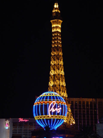
Photographs of Paris signs, Las Vegas (Nev.), 2002
Date
Archival Collection
Description
Site name: Paris Las Vegas Hotel & Casino
Site address: 3655 S Las Vegas Blvd
Sign owner: Park Place Entertainment
Sign details: The Paris property lies on the east side of Las Vegas Blvd, between the Aladdin and Bally's. The three properties stretch from Harmon Avenue, all the way to Flamingo Rd. The only real neon signage includes the text seen on top of the replica of the Eiffel Tower, and a three-dimensional balloon shaped pylon sign located at the south end of the property.
Sign condition: Structure 5 Surface 5 Lighting 5
Sign form: Pylon; Fascia; Porte-cochère
Sign-specific description: Leaving the Aladdin property, headed north you are immediately confronted with the giant hot-air balloon, which acts as the main marquis sign for the Paris Hotel and Casino. The three-dimensional balloon shape sits among trimmed shrubbery and foliage, representational of a classic French garden. The sign is located on an island with a long driveway on its north side running east into the property. It towers high above the viewer, almost appearing as if it is floating. In the spirit of properties like the Aladdin and the Excalibur, the facade of the resort is modeled after a theme, which is the French City of Paris. Complete with fountains, replica street fronts and markets, the main focal point is a life size replica of the Eiffel Tower. Some signage is located high up on the tower, in yellow channel letters. The sign reads "Eiffel Tower Restaurant." The three-dimensional sculpted pylon sign is composed of basically three pieces. At the very bottom, a large post holds up the second section of a large cube. All four sides of the cube are occupied by square, advertising screens. The two facing east/west are back lit color plastic, while the ones facing north/south are LCD screens. The cube is finished in stucco, with sculptural treatments along all of the edges of the cubes. The edges are made to look like giant ropes with knots on all eight corners. The sign is located on the East Side of the strip, yet the only directional orientations are on the cube that the balloon sits on. The spherical structure is an exterior frame with blue vinyl material stretched to form the balloon shape. Steel framework also runs around the circumference in six different places along the structure. On the north and south sides Paris is spelled in red channel letters, filled with incandescent bulbs and bordered in neon. The blue vinyl material is treated with graphic painted images, which are repeated around the circumference of the balloon. The images are of lion heads holding red sashes, above golden eagles. On the middle section an image of a woman's face is surrounded by a golden halo. The yellow structural supports, which are visible on the exterior, also house tubes of neon. The resulting effect is a repeating pattern of neon running up the length of the structure, with horizontal bands around the bottom of the structure, below the channel letters and above them also. A criss-cross pattern adorns the two bands below the text, as well as a scalloped pattern above the text also. The porte cochere is a circular drive with the only lighting being incandescent bulbs running along the raceways, which create the structure of the interior. The structure is finished in a patina bronze, made to look oxidized.
Sign - type of display: Neon; Incandescent
Sign - media: Steel; Plastic
Sign - non-neon treatments: Graphics; Paint
Sign animation: Chasing, flashing, oscillating
Notes: The incandescent bulbs inside the text reading "Paris" on the balloon oscillate rapidly.
Sign environment: Located between Bally's and the Aladdin, two heavily frequented and boisterous properties themselves, the Paris fits nicely creating it's own environment that stands alone when entered. If a pedestrian is present among the stunning architecture, it is easy to be pulled into the theme. Even though the Bellagio is west across the street, the expanse of the street keep the Paris far enough away to be mostly independent, that is of course if the Bellagio's water show is not being displayed. The surrounding properties of Bally's, the Aladdin, and The Bellagio make the area of Las Vegas Blvd between Harmon Ave. and Flamingo rd. a fantastic world stylized cities and dazzling imagery, yet an interesting mix of architecture and signage.
Sign designer: Architect/consultant: Bergman, Walls & Youngblood Ltd. Contractor: Perini Building
Sign - date of installation: 1997
Sign - thematic influences: The Paris Hotel Casino is obviously themed after the actual French city of Paris. The entire facade represents the Parisian atmosphere containing the most famous of Parisian attractions including the Eiffel Tower, the Arch de Triumph, open air cafes, plazas utilizing fountains, and the ornate architecture that spans from gothic to neo classical. The Paris fits into the themed hotel casino industry seamlessly, actually boasting one of the more ornate and unique facades. Other properties that parallel the Paris in style and genre include the Aladdin, the Venetian, and the New York New York. In fact it fits into the category of Hotel/Casino whose theme is what dominates the aesthetic surroundings as well as operation inside and out. Other facilities contain elements of a theme, such as the Stardust, but the interior and exterior are no longer the dominant aspect of the aesthetics. It also fits into the category of resorts themed after actual cities.
Surveyor: Joshua Cannaday
Survey - date completed: 2002
Sign keywords: Chasing; Flashing; Oscillating; Pylon; Fascia; Porte-cochère; Neon; Incandescent; Steel; Plastic; Paint; Graphics
Mixed Content
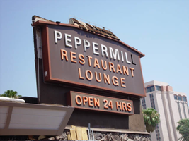
Photographs of Peppermill signs, Las Vegas (Nev.), 2002
Date
Archival Collection
Description
Site address: 2985 S Las Vegas Blvd
Sign details: The Peppermill Inn Restaurant is located on the east side of Las Vegas Blvd, just north of the now defunct Silver City Casino. The actual establishment faces west toward the strip, separated from the traffic by the front parking lot. The lowrise brown clad establishment, boasts three specific pieces of signage on the exterior structure. In the parking lot near Las Vegas Blvd, a small two-sided, ground level cabinet, mirrors the aesthetics of the actual structure. Upon the west side of the building, the shingled roofline boasts channel letters filled with neon, as well as a more secluded sign on the north side of the building, toward the rear.
Sign condition: Structure 3 Surface 3 Lighting 3 The condition of the three different pieces of signage are all in different states of repair.
Sign form: Pylon; Fascia
Sign-specific description: The pylon sign, which sits near the street, is a miniature representation of the facade of the Peppermill establishment. Two square legs, constructed of mortared pieces of stone support the two-sided cabinet. The horizontal, rectangular cabinet sits on the pole, and faces north/south. The top edge of the sign is reminiscent of a roofline, with a low rise a-frame design. The grade is very little but exaggerated by the rectangular element rising off of the top edge covered in brown wooden shingles, which also cover the top edge's surface. The effect of the top's finishing is the resemblance of the roof of the Peppermill restaurant. Just below the peak of the "roof-like" element on the surface of the sign, a rectangular metal plate possesses text. The text is stamped out of the metal to reveal recessed negative spaces of fonts. An orange transparent material resides behind the plate, providing the hue for the internally lit apparatus. The text reads "24 Hours" in all capitals. Below the small rectangle, larger, white text runs the length of the sign. The internally lit, closed face, channel letters are in all capitals. In smaller text, along the bottom portion of the face the phrase "Coffee Shop & Lounge," runs the length of the text. The letters are orange, closed faced, internally lit. The actual structure of the restaurant, further east on the property is the model for the previously mentioned sign. The low-rise pitched roofline of the facility concludes at a lowrise rectangular cap. Along the western edge the roofs overhang, large white channel letters lined on the interior with pink neon spell "Peppermill" in all capital letters. Following the brown shingled roofline around the south side of the building, a third sign, not seen by the general public, faces south. A steel cabinet is the two-dimensional representation of both the outer pylon sign as well as the structure itself. A rust colored brown cabinet houses a dork brown steel face, with plastic letters for the advertising of the establishment. "Peppermill" is spelled in all capital letters. Below the top text a two lined, series of orange all capital text spells "Restaurant Lounge." It is apparent that wooden shingles were evident on the top the top edge of the cabinet which rises in the pitched front geometric shape seen on the pylon in the front and the architectural element in the structures center. Underneath the primary cabinet a smaller, horizontal, rectangular cabinet, sits centered underneath the It too is a rust colored brown cabinet, with a dark brown face. Text, as tall as the cabinet spells, "Open 24HRS" in orange plastic all capital letters.
Sign - type of display: Neon; Incandescent; Backlit
Sign - media: Steel; Plastic; Masonry
Sign - non-neon treatments: Graphics; Paint
Sign animation: Chasing, flashing, oscillating
Notes: The text, which resides on the southern wall and reads "Casino," is filled with incandescent bulbs that all illuminate at the same time, and oscillate. They then shut off at the same time, and then repeat. The raceways of incandescent bulbs chase each other while the neon, which surrounds the back lit, plastic, screens on this wall flash on then off. The bottom two raceways sandwiching the reflective panel chase from left to right, while the remainder of the raceways surrounding the signs, run right to left. The incandescent bulbs on the pylon chase each other gracefully up the length of the pylon. The animation is patterned so as to appear as if a section of several bulbs are pulsing its way up the towers, hugging the edge of the bulbous tops. The raceways continue around the east face of the building. The umbrellas in the plaza behind the pylon, also are animated with incandescent bulbs chasing each other downward along the raceways.
Sign environment: The area surrounding the Peppermill contains several interesting properties making the entire area sort of a cove of history. Just to the north the deteriorating, and closed Silver City stands testament to the wave of constant change present on the strip. It is a reminder of the historical significance of the Peppermill and the fact that someday it might not be present at this location any more.
Sign manufacturer: YESCO
Sign - thematic influences: What is evident of the Peppermill theme works around the exterior appearance, and around the name itself. The brown wooden exterior, use of wooden shingles as adornments, and the major color palette all suggest the rustic, if not old west referenced, aesthetic.
Sign - artistic significance: This has become a statement of the "old Vegas" of the 1970s.
Surveyor: Joshua Cannaday
Survey - date completed: 2002
Sign keywords: Pylon; Fascia; Neon; Incandescent; Backlit; Steel; Plastic; Masonry; Paint; Graphics
Mixed Content
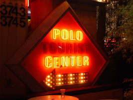
Photographs of Polo Towers signs, Las Vegas (Nev.), 2002
Date
Archival Collection
Description
Site address: 3745 S Las Vegas Blvd
Sign details: The Polo Towers actual facility is located behind the shopping center, further to the east. The small pylon resides outside in the very front of the property, in close proximity to Las Vegas Blvd It is surrounded with a planter and bushes, in a pedestrian environment, shadowing a seated courtyard, just to the south. The tower itself is lined on its major edges with tubes of purple neon. The tower also contains internally lit cabinets as well as polished metal treatments.
Sign condition: Structure 4 Surface 3 Lighting 4 The building itself is in great shape, with the structural integrity, lighting, and surface being is good condition. The small pylon adjacent to Las Vegas Blvd is in some disrepair in all of the categories.
Sign form: Pylon; Fascia
Sign-specific description: The Polo Towers lies Just north of the McDonalds plaza, along with a shopping plaza out front near the street. The plaza has a different name, this is designated by the polo towers pylon facing north/south on the east side of the street. The Pylon sign for the polo towers sits in this parking lot for this plaza. The pylon consists of a double backed backlit plastic message cabinet, a color LED matrix screen, two square message boxes on either side, one diamond shaped one then the marquee and logo for the polo towers. On the bottom of the sign, on the side closest to Las Vegas Blvd, a clear plastic front, diamond shaped message center reads "polo tourist center" behind the glass. A bulb laden center pole is noticeable at the bottom along with two larger legs on either side. The text is painted in red and then overlaid with red neon. Just above that, a light blue, backlit message center, boasts a white plastic surface with purple text. Incandescent bulbs border the edges of the cabinet. Directly above this is a color LED screen. The center-pole continues up past the message center, eventually transforming into a diamond shaped cabinet. On either side of the center pole, just above the LED screen are two smaller, square, message cabinets. They too are painted the same light blue as the large cabinet, as well as possessing incandescent bulb raceways as borders. One contains the Polo Towers logo of the silhouetted horse's head, with the text "Polo Towers Tourist Center," in black and purple. The other reads text or free maps and discount show tickets. From the tops of these cabinets, two sections reach upwards following the bottom edges of the diamond created out of the center pole. These two angled sections are both striped with a repeating series of red neon along their width. The previously mentioned center pole is flat, with the face laden with incandescent bulbs. This flat front pole continues up to form a diamond, with the actual pole section running along the bottom edge of the diamond, between the neon laden angled sections, and the marquee cabinet. The continuation of the pole, extends to run along the top of the diamond, but stops short of totally enclosing it. The incandescent bulbs cover the face of the pole along this edge also. Red neon tubing runs up the edges of this centerpiece. The top cabinet, which the centerpiece seems to he holding, is also painted light blue, with a purple face, and the black horse silhouette logo for the Polo towers. Two pieces of red neon are bent to act as glowing pieces of the horse's mane. Just below the top image of the horse, "Polo Towers" is spelled, floating above the surface of the sign in purple, channel letters. Below that in purple channel letters, on the same plane, the text "& Plaza" is crafted in the same fashion. Both rows of text are filled with incandescent bulbs that oscillate. The surface of the body of the sign, excluding the cabinets, is finished in stucco and laced with the smatterings of the lavender and light blue hue found throughout the sign. The building of the Polo Towers itself has pieces of purple vertical neon running up the edges of the building in several places. The radius section on the east west faces of the tower is also lined purple across its vertical edges. Giant purple channel letters spell Polo Towers across the very top of the building's West face. On the North and South faces of the tower, the giant diamond shaped cabinets with the Polo Towers logo hang with steady confidence. At the base of the west side of the building, there is also the internally lit, diamond shaped cabinets with the horse's head, rendered in black/ the white cabinets are bordered with a hot pink colored neo, recessed behind the polished metal, to create a halo on the wall.
Sign - type of display: Neon; Incandescent; Backlit
Sign - media: Steel; Plastic
Sign - non-neon treatments: Paint
Sign animation: Chasing, flashing, oscillating
Notes: The incandescent bulbs inside the text reading "Paris" on the balloon oscillate rapidly.
Sign environment: The small pylon sits outside a Starbucks Coffee located in the front row of shops, surrounded with bushes. The environment is pedestrian heavy.
Sign manufacturer: Federal Signal
Sign - date of installation: 1985-1989
Sign - thematic influences: The theme present in the polo towers revolves around its name, and references to the sport of polo. But the only exterior images that reference the theme are the logos themselves. The sign itself is more akin to roadside pylon signs, utilizing a number of different sign techniques functions to create an interesting mix of design. The color scheme does seem to reference the time of its inception, that being the eighties. The eighties is recognized with the usage of teal, pink and gold. The brass cabinet enclosed in plexiglass, references the typical Vegas adornment.
Surveyor: Joshua Cannaday
Survey - date completed: 2002
Sign keywords: Chasing; Flashing; Pylon; Fascia; Neon; Incandescent; Backlit; Steel; Plastic; Paint; Oscillating
Mixed Content
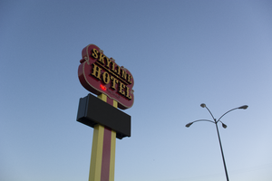
Photographs of Skyline Hotel and Casino sign, Las Vegas (Nev.), March 14, 2017
Date
Archival Collection
Description
Site address: 1741 N Boulder Hwy
Sign owner: Jim Marsh American Corp.
Sign details: The business began as the Dixie bar, which was operating by 1948 in what was then known as Pittman, Nevada (Moore, 2016; Skyline Casino, n.d.). The property's colorful history includes the suicide of one of the original owners on the motel premises and the first library in Pittman, which was located inside the tavern (Skyline Casino, n.d.). The Skyline Casino and restaurant was built on the property in 1964 (Benston, 2003; Meehan, 2016; Skyline Casino, n.d.). The name was briefly changed to Wheel and then returned to Skyline (Old-And the new, 1988). Jim Marsh purchased the Skyline from the son of the original owner in 2003 (Benston, 2003; Meehan, 2016; Skyline Casino, n.d.). In June of 2017, Marsh added a hotel to the casino and restaurant (Meehan, 2016; Moore, 2016; Skyline Casino, n.d.).
Sign condition: Condition is 5, fully restored to a "like new" state. The cabinet, paint and lights are in excellent shape.
Sign form: Pole Sign
Sign-specific description: The sign consists of a rectangular metal pole which supports an electronic reader board topped by a badge-shaped metal cabinet. The pole is painted yellow with a red stripe running down the center. The frame of the reader board is black metal. The badge-shaped metal cabinet is painted red outlined in gold. Yellow incandescent light bulbs outline the cabinet. Light boxes framed in black metal faced with yellow plastic spell out "SKYLINE HOTEL" in western-style serif letters. "SKYLINE" is stacked over "HOTEL", the words separated by a horizontal ornamental design. Below the light boxes, "NO VACANCY" is spelled out in clear skeleton neon letters.
Sign - type of display: Neon
Sign - media: Steel, Plastic
Sign - non-neon treatments: Incandescent lightbulbs, lightboxes and electronic readerboard
Sign environment: Property is located on Boulder Highway near the Skyline Casino
Sign - date of installation: c. 1988
Sign - thematic influences: Western style, common to a lot of Las Vegas valley casino and motel properties
Sign - artistic significance: The property opened in the 1960s, still during the heyday of Western themed properties
Survey - research locations: Assessor's website
Survey - research notes: Benston, L. (2003 June 5). Owner to sell Henderson's Skyline casino. Las Vegas Sun. Retrieved from https://lasvegassun.com/news/2003/jun/05/owner-to- sell-hendersons- skyline-casino/ Meehan, J. (2016 June 26). Marsh adding hotel to Skyline Casino. Las Vegas Business Press. Retrieved from https://businesspress.vegas/gaming-hospitality/marsh- adding-hotel- to-skyline- casino/ Moore, T. (2016 October 11). Changing Skyline: Hotel wing coming to old-time casino. Las Vegas Sun. Retrieved from https://lasvegassun.com/news/2016/oct/11/changing-skyline- hotel-wing- coming-to- old- time-cas/ Old-And the new. (1988 October 20). Henderson Home News [Newspaper clipping]. Retrieved from http://www.recapturist.com/wp-content/uploads/Sky- Motel_Henderson-Home- News-19881020.jpg Sky Motel. (n.d.). Retrieved from http://www.recapturist.com/portfolio/sky-motel/ Skyline Casino. (n.d.). Wikipedia. Retrieved from https://en.wikipedia.org/wiki/Skyline_Casino Skyline Casino & Restaurant. (n.d.). Retrieved from https://www.cardcow.com/368494/skyline-casino- restaurant-henderson/
Survey - other remarks: Date(s) of any major redesign/move: An undated postcard shows the sign sometime between 1964 and 1988 (Skyline Casino & Restaurant, n.d.). A round pole supports a light box type reader board topped by a badge-shaped metal cabinet. Yellow incandescent light bulbs outline the cabinet. "SKYLINE" is spelled out in clear red skeleton neon sans serif letters. "CASINO" is spelled out in blue skeleton neon western-style serif letters. "RESTAURANT" is spelled out in clear red neon skeleton neon sans serif letters. A photograph taken for a news article in 1988 shows the sign with the same design when it was taken down and moved next door to the Sky Motel (Old-And the new, 1988). The Sky Motel retained the round pole, the reader board, the badge-shaped cabinet and the incandescent light bulbs outlining the cabinet. The Skyline lettering was removed and replaced. "SKY MOTEL" was spelled out in white channel western-style serif letters which were outlined in the interior by white neon tubing. Below "SKY MOTEL" were clear skeleton neon san serif letters which spelled out "NO VACANCY". The Skyline Hotel reclaimed the sign when it opened in 2017. The current sign has a rectangular support, although the original round pole might still be inside. The light box has been replaced by an electronic reader board. The "SKY MOTEL" channel letters have been replaced with light box "SKYLINE HOTEL" letters. The "NO VACANCY" letters from the Sky Motel have been retained.
Surveyor: Mitchell Cohen
Survey - date completed: 2017-09-18
Sign keywords: Neon; Steel; Plastic; Incandescent; Reader board; Pole sign; Light box
Mixed Content
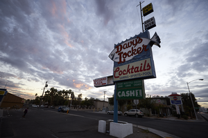
Photographs of Davy's Locker sign, Las Vegas (Nev.), November 20, 2016
Date
Archival Collection
Description
Site address: 1149 E Desert Inn Rd
Sign owner: Was Cindy Slight since 2010. Albert Hamika bought the property in 2016. Derek Stonebarger went to the property after they took the sign down and the fish portion of the sign is currently in his possession.
Sign details: The property was originally opened in 1968 by Davey Pearl, who was most known for being a boxing referee and later inducted to the World Boxing Hall of Fame. The actual opening date of the bar is unknown, but property records have shown that its building was constructed in 1968. The bar was known for the welcoming environment inside and inexpensive drinks. The sign itself drew people in because of its unique design. Right before their closure they started to have a variety of events taking place there such as: open mic night, trivia, and genre specific music nights. The current owners have demolished the iconic and beloved sign for the bar. The only portions that remain are white sign that reads "Cocktails" in red and the waves that the fish once "swam" above. The current owner of the property has told the Las Vegas Weekly, "I want to emphasize I wasn't like, 'Ok let's destroy this sign.' I like the sign, and I like the historic memorabilia"I tried. The only thing I can I can say is, it was time for it to come down." After hearing about this news Derek Stonebarger, who owns ReBar on Main Street, was distraught when he heard the news of the sign being taken down so he went to the property to find its remains. He hopes to restore as much of the sign as he can and possibly display it in a Nevada-themed restaurant he plans to open up.
Sign condition: Since the sign has been taken down it is a 0.
Sign form: Roadside pole sign
Sign-specific description: This sign was designed to look like a fish was swimming in the ocean. The top of the sign give the appearance of waves. A neon tube was attached to the implied waves. Underneath this was a large, white fish whose tail and nose extended beyond the confines of the square shape of the sign. The fish appeared to have a large smile and two smaller fish "swimming" beside it. One of these smaller fish was near the larger fish's mouth and the "L." The other fish was located right under the "ker" in "Locker." Both of these fish were a light blue color, the same blue that matched the wave on top of the sign and surrounded the larger fish. In the middle of the large fish that makes up much of the sign were the words "Davy's Locker" in bright red and an elaborate cursive style font. Neon tubes outlined these letters, as well as all three fish included in the sign. Underneath all of this is a neon tube in the shape of a wave that is difficult to see in photos of the sign during the day, but glowed brightly at night. Below this signage was a back lit plastic sign reading "Cocktails" in a red script and "Gaming Spirits Pool" under that in a sans-serif, bold, dark blue font. Extending from the top of the sign at the end near the street was a pole with two, small square signs attached to that. The top one was yellow and read "OPEN 24 HRS." The one below that was white and read "COLD BEER." There are other photos of this sign where the plastic portion of the sign reads "COCKTAILS" in red still, but "Slots Video Poker" in blue and "Package Liquor" under that in red.
Sign - type of display: Neon and backlit plastic sign
Sign - media: Steel and plastic
Sign - non-neon treatments: Plastic backlit portion
Sign environment: The surrounding environment of Davy's Locker was in a district that was close to UNLV as well as another popular bar that still caters to locals, Champagnes Cafe. It was located in a bustling area along to Maryland Parkway that locals travel on a daily basis. Davy's Locker was a popular watering hole for many people in the neighborhood due to its convenient location.
Sign - date of installation: Around the 1960's
Sign - date of redesign/move: It was first restored in 2011 and another time in 2014. Sign was taken down from the property in 2017.
Sign - thematic influences: The theme of the sign appears to take inspiration from the phrase "Davy Jones' Locker." This is a common phrase that refers to "the bottom of the sea" or even "the mythical resting place of drowned mariners." Davy Jones is also believed to be an evil spirit from the bottom of the sea; therefore, the sign shows the influence of these aquatic origins that possibly inspired the name of the property.
Sign - artistic significance: The theme of the sign is aquatic, which also ties into the name of the property. The name of the property appears to take influence from the myth of Davy Jones, the evil spirit of the sea.
Survey - research locations: Las Vegas weekly articles https://lasvegasweekly.com/as-we-see-it/2016/mar/23/beloved-dive-bar-davys-locker-sold-old-vegas/ https://lasvegasweekly.com/intersection/2017/jan/11/davys-locker-neon-sign-demolished/ https://lasvegasweekly.com/intersection/2017/jan/13/davys-locker-bar-neon-sign-recovered-stonebarger/ , Las Vegas Sun article https://vegasinc.lasvegassun.com/business/2016/mar/25/popular-dive-bar-to-take-a-breather-while-sports-b/ , Roadside Architecture http://www.roadarch.com/signs/nvvegas3.html , Phrase website http://www.phrases.org.uk/meanings/davy-jones-locker.html
Surveyor: Lauren Vaccaro
Survey - date completed: 2017-08-22
Sign keywords: Steel; Plastic; Backlit; Neon; Roadside; Pole sign; Back to back
Mixed Content
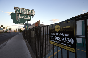
Photographs of Hialeah Motel sign, Las Vegas (Nev.), April 18, 2017
Date
Archival Collection
Description
Site address: 1924 Fremont St
Sign owner: La Jolla Development Group, LLC
Sign details: The current building was constructed in 1951 (Assessor). One source states that Tinkler's Motel may have been open on the site in the 1940's (VintageVegas.com, n.d.). A vintage postcard circa late 1940's-early 1950's advertises "Tinkler's Motel Hialeah", although the sign shown in the photograph states" Tinkler's Motel" (CardCow.com, n.d.). A vintage postcard circa 1950's-early 1960's shows the current name,"Hialeah Motel" (Las Vegas motels then and now, n.d.).
Sign condition: Condition is 3, fair. The cabinets are intact with no major rust damage. On the east side of the sign, the paint is flaking moderately on the upper arrow cabinet. On the west side, the paint is flaking severely on the upper arrow cabinet as well as the lower cabinet. Most of the incandescent light bulbs around the upper cabinet remain. All of the neon tubes are gone from both the lower and upper cabinets.
Sign form: Pole sign
Sign-specific description: The lower cabinet is shaped like three rectangles stacked upward in increasing size. The pole runs through the cabinet, which is cantilevered toward the street. The upper cabinet is shaped like an arrow pointed at the motel. The pole and lower cabinet are painted forest green. On the lower cabinet, hand painted sans serif letters state, "Hialeah 1924 VACANCY". The exterior of the upper arrow-shaped cabinet is painted black. The interior is white. The cabinet is channeled and holes for neon tubing are evident, but no neon remains. Yellow incandescent light bulbs outline the exterior of the cabinet. At the center of the pole on the hotel side is a horizontal pole from which a small sign may have hung previously.
Sign - type of display: Incandescent light bulbs, but the sign also had neon tubing at one time.
Sign - media: Steel
Sign - non-neon treatments: Incandescent light bulbs
Sign environment: This is located on East Fremont and has many other motels surrounding it though many of the neighboring motels are shut down.
Sign - date of installation: Possibly 1940's, likely circa 1950's-1960's
Sign - date of redesign/move: A vintage postcard circa late 1940's-early 1950's (CardCow.com, n.d.) shows a small sign which has either been replaced or modified over time. The sign consists of three cabinets mounted symmetrically on a pole. The lower cabinet is painted white and states, "AIR CONDITIONED" or "AIR CONDITIONER". The large central cabinet is black and states, "MOTEL". The smaller upper cabinet is painted black and advertises, "Tinkler's". A vintage postcard circa 1950's-early 1960's (Las Vegas motels then and now, n.d.). shows the current pole and cantilevered lower cabinet without the upper arrow-shaped cabinet. On the lower hotel side of the sign hangs a small yellow sign. Some or all of the lettering is traced with neon letters. By the late 1980's, the motel arrow had been added (VintageLasVegas.com, 2017). "MOTEL" is spelled out in red neon inside the channel of the arrow. The lower cabinet is painted green. "T.V." is spelled in black sans serif letters outlined in white. "Hialeah" is painted in white sans serif letters traced by clear neon letters. Below Hialeah is illegible clear neon, possibly "AIR CONDITIONING" or "AIR CONDITIONER". At the bottom of the lower cabinet "HAMBURGERS", "HOT DOGS" and "VACANCY" are spelled out in white san serif letters. A photograph taken sometime between the 1980's and 2008 (Jacobson, n.d.) shows the lettering on the lower cabinet simplified to the current design, except "T.V." is still painted to the left of "HIALEAH". Three yellow skeleton neon waves underline "T.V." and two more indistinguishable neon tubes of the same type sit over the "T". Some neon around "HIALEAH"in the lower cabinet and all of the neon around "MOTEL"in the upper arrow-shaped cabinet remain. By 2008, the sign had reached its current design (Las Vegas motels then and now, n.d.).
Sign - thematic influences: Horseracing (the motel name references Hialeah Park Racetrack in Hialeah, Florida; vintage postcard shows grass and racetrack type fencing [Las Vegas motels then and now, n.d.])
Sign - artistic significance: This location maintains the Horse Racing theme with their name. They also showcase 1940's (possibly), 1950's-1960's eras themes with emergence and prominence of the motor courts during those eras.
Survey - research locations: CardCow.com. (n.d.). Tinler's [sic] Motel Hialeah. Retrieved from https://www.cardcow.com/281785/tinlers-motel-hialeah-las-vegas-nevada/ Clark County Assessor, parcel no. 139-35-803-004. Retrieved from http://www.clarkcountynv.gov/assessor/Pages/PropertyRecords.aspx?H=redrock&P=assrrealprop/pcl.aspx Jacobson, J. (n.d.). Hialeah Motel [private image, copyright applies]. Retrieved from http://www.pbase.com/easystreet/image/103828763 Las Vegas motels then and now. (n.d.). 15: Hialeah Motel. Retrieved from http://stefanidrivesvegas.com/2.html VintageLasVegas.com. (n.d.). Downtown Las Vegas hotels & casinos 1931-2000. Retrieved from http://vintagelasvegas.com/downtown VintageLasVegas.com. (2017 February 2). Hialeah Motel. Retrieved from http://vintagelasvegas.com/tagged/Hialeah-Motel
Surveyor: Mitchell Cohen
Survey - date completed: 2017-08-23
Sign keywords: Neon; Incandescent; Steel; Pole sign; Directional
Mixed Content
High Hat Regency Neon Survey document, September 6, 2017
Date
Archival Collection
Description
Site address: 1300 S Las Vegas Blvd
Sign owner: Tarighi Bahman and Farideh
Sign details: The building was constructed in 1958 (Assessor). A vintage postcard from the 1950's-- or more likely the 1960's (based upon the automobiles pictured)-- shows that the business was previously named the Chevron Motel (Las Vegas motels then and now).
Sign condition: Condition is 3-4, fair to good. The pole, cabinets and reader board are in good condition. Moderate rust is evident around the edges of the top cabinet. The paint is generally in good condition, although there white patches (from repairs?) on the chevron. The neon tubing is entirely intact. Most of the incandescent light bulbs are present, except for the underside of the lower cabinet, where they are completely absent.
Sign form: Pole Sign
Sign-specific description: A single round white metal pole supports the sign, which is cantilevered toward the street. The cabinets form a rectangular "C" which is open on the motel side. The interior of the "C" surrounds a chevron which points toward the motel. On top of the motel side of the upper cabinet is a metal top hat and cane. The sign is attached to the pole at the side of the lower cabinet, the point of the chevron and the bottom of the upper cabinet. The background color of the sign is sky blue. The bottom of the face of the lower cabinet has the word "VACANCY" painted in white sans serif letters. The letters are traced in white skeleton neon. To the left, the word "NO" is spelled out in clear skeleton neon sans serif letters. Above the neon letters is a white metal reader board which has a row of clear incandescent light bulbs running along the top, bottom and motel side edges. A single row of clear incandescent light bulbs runs the entire length of the street side of the sign. On the street side of the chevron is a blue metal cabinet with the word "MOTEL" spelled in white channel letters. The channels are outlined by white neon tubes, while the interior of the channels are filled with clear or white incandescent light bulbs. On the motel side of the "MOTEL" cabinet is a blue chevron which is covered with clear or white incandescent light bulbs. The top cabinet features the words "High Hat" spelled out in white cursive letters. Below is the word "REGENCY" painted in white sans serif letters. All wording is traced by white skeleton neon. On top of the motel side of the upper cabinet is a white top hat with a blue hat band. Running through the hat is a white cane. The hat and cane are traced by white skeleton neon. The hat is covered with white or clear incandescent light bulbs.
Sign - type of display: Neon, incandescent, reader board
Sign - media: Steel, plastic
Sign - non-neon treatments: reader board
Sign animation: Light bulbs flicker
Sign environment: Las Vegas Boulevard South, north of the Las Vegas Strip near other motels and wedding chapels.
Sign - date of installation: c.1950s
Sign - thematic influences: Elegance, sophistication, high society, boomerang/chevron, 1950's, 1960's, mid-century
Survey - research locations: Assessor's website
Survey - research notes: Connolly, D. (2012 July 21). Chevron Motel. Retrieved from https://www.flickr.com/photos/dennisconnolly5059yahoocom/7635650456 Hagopian, M. (2011 January 28). No vacancy in vintage Vegas. Retrieved https://hyperallergic.com/15738/no-vacancy- vintage-vegas/ Las Vegas motels then and now. (n.d.). Chevron Motel. Retrieved from http://stefanidrivesvegas.com/8.html RoadsideArchitecture. (n.d.). High Hat Regency Motel. Retrieved from http://www.roadarch.com/signs/nvvegas.html Seltzer, D. J. (2014 June 1). High Hat Regency Motel sign in Las Vegas [Video recording]. Retrieved from https://www.youtube.com/watch?v=-bQdw48LVrA
Survey - other remarks: A vintage postcard circa 1950's-1960's shows the Chevron Motel sign as a simple pole mounted with a reader board and two light boxes which form a "C" shape open toward the motel (Las Vegas motels then and now, n.d.). A later postcard features the same sign with a chevron in the center and a semi-circular arch which encloses a light ball above the upper cabinet (Connolly, 2012). The current sign retains the chevron, the metal frames of the light boxes and reader board (Las Vegas motels then and now, n.d.). A hat and cane have replaced the arch and light ball at the top of the sign (Las Vegas motels then and now, n.d.). The light boxes have been replaced with metal cabinets with incandescent and neon displays (Las Vegas motels then and now, n.d.). The sign is pictured in a vintage postcard circa 1950's-1960's (Las Vegas motels then and now, n.d.). At that time it advertised the Chevron Motel.
Surveyor: Mitchell Cohen
Survey - date completed: 2017-09-06
Sign keywords: Neon; Incandescent; Steel; Plastic; Reader board; Pole sign; Flickering
Text
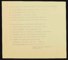
Phi Delta Kappa sorority records
Date
Archival Collection
Description
Folder of materials from the Mabel Hoggard Papers (MS-00565) -- Civic engagement file. National Sorority of Phi Delta Kappa certificate, journal, meeting minutes, program, and poem.
Mixed Content

Sanje Sedera oral history interview: transcript
Date
Archival Collection
Description
Oral history interview with Sanje Sedera conducted by Kristel Peralta, Cecilia Winchell, Ayrton Yamaguchi, and Stefani Evans on April 16, 2021 for Reflections: The Las Vegas Asian American and Pacific Islander Oral History Project. Sanje Sedera discusses growing up in Sri Lanka, formerly Ceylon, with his family. He shares his educational history, moving from Sri Lanka to Darwin, Northern Territory, Australia as a high schooler to learn English before immigrating to the United States to attend Idaho State University. Sedera discusses the political unrest and civil war that took place in Sri Lanka between the Tamil and Sinhalese people, and how he grew to appreciate political activism instilled in him by his paternal grandparents. Sedera shares his employment history working as a manager for K-Mart, an opportunity that brought him to Las Vegas, as well as his entrepreneurial pursuits of owning a mortgage business and becoming a realtor. He talks about the financial crisis of 2008 that led to losing his business, his attempts to run for public office, and how he helped to form Nevada's Asian American Democratic Caucus. Sedera concludes with a discussion of his Buddhist practice and how these philosophies have shaped his life.
Text

