Search Results
Photographs of Golden Steer Steakhouse sign, Las Vegas (Nev.), March 3, 2017
Date
2017-03-03
2017-07-28
Archival Collection
Description
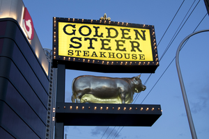
The Golden Steer Steakhouse sign sits at 308 West Sahara Avenue. Information about the sign is available in the Southern Nevada Neon Survey Data Sheet.
Site name: Golden Steer Steak House (Las Vegas, Nev.)
Site address: 308 W Sahara Ave
Sign owner: Dr. Michael J. Signorelli has owned it since 2001 after purchasing it from the original owners
Sign details: Opened 1958, and started expanding in the 1970's by buying out neighboring shops. They redesigned their interior in the 90's but still kept it true to the original design. The Rat Pack was known to frequent this steakhouse and even have a dedicated booth to them. Tony Spilotro, Elvis Presley and Nat "King" Cole were a few of the many famous customers. This is the Oldest Steakhouse in Las Vegas, and still maintains their original old Vegas dining style.
Sign condition: 4-The sign looks as though it has aged, but it has done so gracefully
Sign form: Pylon with sculptural element and entrance sign on building
Sign-specific description: The Pylon sign has the main logo stating "Golden Steer Steakhouse" on a yellow sign with a black border. The black border has yellow/gold incandescent light bulbs with a small gold Fleur-de-Lis on the top. Under the main logo there is a shelf/stage holding a golden sculptural steer. The sign above the entrance is a wrap around yellow sign similar to their pylon sign with their logo and an image of a steer in between the words Golden and Steer. They also advertise Prime Rib and Seafood on the wrap around sign.
Sign - type of display: Incandescents surrounding all of their "reader board" type signs, no neon tubing
Sign - media: Plastic and steel
Sign - non-neon treatments: Reader board type plastic for for all the wording
Sign animation: Chasing:
Notes: ncandescent light bulbs
Sign environment: On West Sahara a few blocks West of Las Vegas Blvd.
Sign manufacturer: Wright Signs
Sign designer: Origninal Steer from the 60's and John Burke said the record of the designer was lost
Sign - date of installation: Pylon sign-1960's but refabricated around 2015 to its original condition, but still original steer. Sign above entrance still from the 1970's.
Sign - date of redesign/move: Pylon sign-1960's but restored around 2015 to its original condition, but still original steer. Sign above entrance still from the 1970's.
Sign - thematic influences: Sign shows old west type font. The Golden sculptural steer helps show it is a steakhouse but one that is top of the line since their sign is golden.
Sign - artistic significance: Opened in 1958, still had the prominent old west/ ranch theme that was popular in Vegas in the 1950's. Though the interior was classy their signage shows the old west cowboy style.
Survey - research locations: Assessor's page, Golden Steer website https://www.goldensteerlasvegas.com/our_history.html , Telephone conversation with John Burke the General Manager of the restaurant
Survey - research notes: John Burke has a lot of great info on their signage as well as their property. Also the Golden Steer website had a great history of the property.
Survey - other remarks: Some of the older Golden Steer signage is in the Neon Museum.
Surveyor: Emily Fellmer
Survey - date completed: 2017-07-28
Sign keywords: Sculptural; Plastic; Steel; Incandescent; Chasing; Reader board; Building-front design; Pole sign
Mixed Content
Photograph of Le Thai sign, Las Vegas (Nev.), April 10, 2016
Date
2016-04-10 to 2017-08-15
Archival Collection
Description
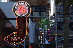
The sign for Le Thai restaurant sits at 523 Fremont Street in Downtown Las Vegas. Information about the sign is available in the Southern Nevada Neon Survey Data Sheet.
Site address: 523 Fremont St
Sign owner: Dan and Shauna Coughlin, Dan doubles as the chef as well
Sign details: The buildings original construction year was 1934. The restaurant opened in November of 2011, Le Thai offers a famous Three curry made by Chef Dan Coughlin as well as other traditional Thai food inspired by Dans grandma and mom from Thailand. They also have a beer garden behind their main restaurant. Dan was the owner to Mix zone cafe and is the son of the owner of the King and I (Nikki Bujadham). This building has a tin facade with a pull out canopy for outdoor seating.
Sign condition: 5- looks very new and in amazing condition
Sign form: Blade
Sign-specific description: The blade is mainly made of plastic that is backlit at night time, but has a dark steel border. At the top of the sign is a circle that has Le written in black cursive on the sign, and illuminates red neon at night. Also on this circle portion of the sign it states Downtown Las Vegas in a smaller print type font. This circle is outlined in incandescents, as well as the incandescents being surrounded by red neon. Below the circle there is a red curved arrow that states Thai in black letters that have a white trim, this font looks italicized and has little circles on a part of each of the letters, this makes it a very distinct font for them specifically. Underneath the Words Thai, the sign states Noodles & Bar in a regular white block type font.
Sign - type of display: Incandescent light bulbs and neon
Sign - media: Plastic and Steel
Sign - non-neon treatments: Graphics on plastic portion of the sign are backlit
Sign animation: Chasing:
Notes: incandescent light bulbs
Sign environment: In the East side of Fremont Street, located in between Las Vegas Blvd and 6th street. To the west of the property is the Dont Tell Mama Bar and to the east is Commonwealth. Currently across the street is the Therapy restaurant and the old Emergency Arts building.
Sign manufacturer: YESCO
Sign designer: Owners Shauna and Dan
Sign - date of installation: 2012
Sign - thematic influences: The font that they use for Le and Thai are quite different but it shows the blend of how their restaurant is and does make it more distinguishable since their font draws the attention of people walking by.
Sign - artistic significance: With the usage of both Neon and incandescent the sign really does pop out which is a similar trend to many signs over the age, particularly since there is a lot of pedestrian traffic in the region. The arrow is a great direction indicator, as well as it showcases the 1950s blade sign trend with the arrow at the bottom.
Survey - research locations: Le Thai restaurant website https://lethaivegas.com/, Assessor's page, and contact with Le Thai LLC
Survey - research notes: The assessor's page said the buildings original construction year was 1934 though there was no record of what it originally opened up as.
Surveyor: Emily Fellmer
Survey - date completed: 2017-08-15
Sign keywords: Graphics; Plastic; Backlit; Steel; Blade; Chasing; Incandescent; Neon; Back to back
Mixed Content
Photographs of Backstage Bar & Billiards, Las Vegas (Nev.), 2016-2017
Date
2016-04-28 to 2017-08-11
Archival Collection
Description
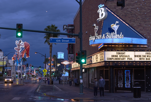
The sign for Backstage Bar & Billiards sits at 601 Fremont Street in Downtown Las Vegas. Information about the sign is available in the Southern Nevada Neon Survey Data Sheet.
Site address: 601 Fremont St
Sign owner: DJ Lethal co-owned with DJ Scotty
Sign details: This building dates back to 1957. Triple B opened in 2012 as a billiard hall bar and concert venue. It is filled with a lot of Rock Memorabilia which includes a "turntable library" which they claim showcases over 8 decades of rock history. This location was furnished by rock outfitter Anvil Cases. This property got its name by being "backstage" to the adjoining Fremont Country Club.
Sign condition: 5- looks relatively new and still in great condition
Sign form: Variation of a Bull Nose Sign
Sign-specific description: Their entrance is on the corner of 6th (going South) and Fremont with a blue bull nose type sign in a triangle shape. The base of the triangle sign is right above the entrance. The triangle border has a blue (argon) strip with incandescents lining both sides of the neon tubing. At the base of the sign there is a blue (argon) curved platform (half circle placed adjoining to the base of the triangle). On this platform there are 5 separate strips of argon tubes. Above the platform states "Backstage Bar & Billiards" in white cursive channeled letters. Above the words Backstage and Billiards there are two martini glasses with a pool ball and flag in each glass. At the top of the triangle portion of the sign there is their logo "Triple B" in cursive with Triple in Blue and B in white. Below the bull nose sign there is a reader board that wraps around the building. This reader board is also lined with incandescent light bulbs. In the middle of the of the reader board there is a black background rectangle with 3 rhombus's lined in incandescent light bulbs in a design.
Sign - type of display: Neon, incandescent and reader board
Sign - media: Steel and Plastic
Sign - non-neon treatments: Reader Board
Sign animation: Flasher for incandescent light bulbs
Sign environment: Fremont East district East District, next to other bars and restaurants. This location is right across the street from the El Cortez. Also they claim to be "backstage" to the adjoining Fremont Country Club which inspired their name.
Sign manufacturer: Ultra Signs' recently bought out by Jones Las Vegas ( of Jones SIgns) who did not have records of this sign.
Sign - date of installation: 2012 when the bar opened
Sign - thematic influences: On Fremont many of the entrances are at the corner intersections, so the bull nose sign has been prominent design type to draw attention to the entrance of the company. This is remnant of the Golden Nugget and Binion's Horseshoe put up their bull nose signs in 1961.
Sign - artistic significance: The curved platform at the bottom of their bull nose sign looks like an old retro movie theater style sign platform that you would see in the 1940's/50's. Particularly with their reader board with incandescent light bulbs speaks to this era as well.
Survey - research locations: Assessor's page, triple B website http://www.backstagebarlv.com/ , Las Vegas Weekly Newspaper article https://lasvegasweekly.com/nightlife/lowball-diary/2012/dec/05/triple-b-fills-downtowns-watering-hole-hole/
Survey - research notes: Fremont Bars.com has a photo of their main sign being installed. http://www.fremontstreetbars.com/2012/11/29/welcome-to-the-neighborhood-backstage-bar-billiards/
Survey - other remarks: The Ultra Signs logo is visible on the left side of the sign.
Surveyor: Emily Fellmer
Survey - date completed: 2017-08-11
Sign keywords: Neon; Incandescent; Steel; Plastic; Flashing; Reader board; Bullnose; Marquee
Mixed Content
Photographs of Luv-it Frozen Custard stand, Las Vegas (Nev.), January 27, 2017
Date
2017-01-27
2017-08-25
Archival Collection
Description
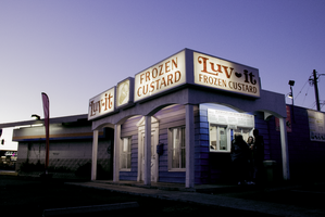
Luv-it Frozen Custard sits north of the Las Vegas Strip at 505 East Oakey Boulevard. Information about the sign is available in the Southern Nevada Neon Survey Data Sheet.
Site address: 505 E Oakey Blvd
Sign owner: Brittany and Brandon Tiedemann
Sign details: Luv-It Frozen Custard has been a Las Vegas dessert shop since 1973. They specialize in their "shakes, cones, malts, and hard packs to go." The same family, the Tiedemann's, have been operating the business for four generations. The great-grandmother of the family who opened this modest frozen custard stand originally worked at another famous frozen custard shop called Leon's in Milwaukee, WI. She brought her desire to make frozen custard to Las Vegas and made her own signature flavors. They have been using the same vendors and products to create their delectable ever since they opened. They say the only thing that has changed since they opened is "a new generation of the family and a new color for our building."
Sign condition: 4, the sign is in very good condition. However, the red paint in the letters has faded away slightly.
Sign form: Fascia, Backlit
Sign-specific description: The sign has a very modest design. The signage when looking at the front facade of the building is broken up into three different sections. The first section on the left hand are the words "Luv It" in red, serif style font and a small red heart between the two words. These words are up against a plain white background. Next to that is a small square sign that has a painted vanilla custard cone on it, also with a white background. The sign next to that reads "Frozen Custard" in the same shade of red as the "Luv It" sign and has a white background as well. On the right side of the building over the walk-up window is another sign that reads "Luv It Frozen Custard," which appears to be a combination of the "Luv It" and "Frozen Custard" signs on the front of the building.
Sign - type of display: Backlit
Sign - media: Plastic
Sign - non-neon treatments: Paint
Sign environment: The environment for this humble frozen custard stand straddles Las Vegas Boulevard and a residential neighborhood nearby. It resides near other popular properties along Las Vegas Boulevard as well, such as: Viva Las Arepas, Art of Flavors, Dino's Lounge, and many wedding chapels. It also sits fairly close to John S. Park Historic Neighborhood.
Sign - date of installation: 1973
Sign - thematic influences: The sign looks old fashioned today because they had it ever since they opened. It is a modest sign to reflect the modest business. The element of the sign that reflects back to the business is the frozen yogurt cone portion of the sign that tells you what the business is for.
Sign - artistic significance: This sign uses a symbol to articulate what the business serves. This has been a popular technique for businesses because it is easy for motorists and pedestrians to see what the business is for without having to read any other text.
Survey - research locations: Luvit website
Survey - research notes: https://lasvegassun.com/news/2009/sep/16/sketchy-neighborhood- bites-back/
Surveyor: Lauren Vaccaro
Survey - date completed: 2017-08-25
Sign keywords: Fascia; Backlit; Plastic; Paint
Mixed Content
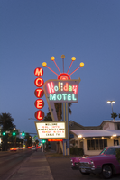
Photographs of Holiday Motel, Las Vegas (Nev.), March 1, 2017
Date
2017-03-01
2017-08-25
Archival Collection
Description
The multi-colored Holiday Motel sign sits at 2205 South Las Vegas Boulevard. Originally Holiday Inn, the motel has operated for over 50 years. Information about the sign is available in the Southern Nevada Neon Survey Data Sheet.
Site address: 2205 S Las Vegas Blvd
Sign owner: Calcaterra Family and Trust
Sign details: Holiday Motel was built-in 1952 - a one acre lot with 14,238 sq. ft. of living space.
Sign condition: 2 - The neon is not working completely, majority of the lights have not been repaired or maintained. The actual paint has shifted from a brilliant red into a subdued salmon rustic color from exposure of Sun/UV and wind.
Sign form: Pole mounted sign with reader board
Sign-specific description: The Holiday Motel is an animated sign that is part of the mid-century and Googie design. The color scheme is mostly a primary color palette of red, blue and yellow. The neon holiday typography is the only element of the sign that differs from the palette, but only when it is lit up. Instead the holiday font illuminates multiple colors to continue the clown theme effect. The sign is in true Googie fashion that popularized roadside signage from 1950s-late1960s. It is in the style of a pylon sign with a directional arrow that points towards the motel entryway. When the sign lights up the directional arrow uses a chaser to animate the arrow and its design with incandescent bulbs. The directional arrow surrounds the holiday motel square shaped portion of the sign. On the top portion of the sign is a rainbow design with five metal rods with circles at the end shooting out of the rainbow. These five rods when lit up in the evening are animated as well and produce a wave motion. On the side of the sign are separate white letters encased in red circles and are designed vertically reading the word motel.
Sign - type of display: Neon, incadescent
Sign - media: Steel and plastic
Sign animation: Animation with upper circles/rods chasing from one to the next.
Sign environment: Property is near other motels and the Stratosphere.
Sign manufacturer: YESCO
Sign - date of installation: c. 1952
Sign - thematic influences: This sign is completely influenced by the 1952 Holiday Inn sign. Both are include an animated chaser direction arrow. The initial design is completely replicated from the Holiday Inn sign. The only difference is the five animated rods in Holiday Motel and where Holiday inn sign has a star instead of a rainbow at the top of the sign. The main difference is that the Holiday Motel sign includes a side panel with the word motel spelled vertically.
Sign - artistic significance: Artistic theme includes a circus theme, but also involves the Googie roadside sign that channels the space age landing beacon. As for majority of signs in 1950s-1960s the sign itself was quite colorful and in the shape of a pylon sign to grab the travelers attention.
Survey - research locations: roadarch.com, assessor's website
Survey - research notes: There was hardly any information pertaining to the history of the Holiday Motel sign. The property was originally called the Holiday Inn Motel but had to change its name in the 1960s due to the large Holiday Inn chain.
Surveyor: Gisselle Tipp
Survey - date completed: 2017-08-25
Sign keywords: Neon; Incandescent; Steel; Plastic; Chasing; Reader board; Pole sign
Mixed Content
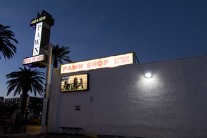
Photographs of Gold and Silver Pawn Shop signs, Las Vegas (Nev.), March 3, 2017
Date
2017-03-03
2017-08-12
Archival Collection
Description
The Gold and Silver Pawn Shop sits at 713 South Las Vegas Boulevard in Downtown Las Vegas. Information about the sign is available in the Southern Nevada Neon Survey Data Sheet.
Site address: 713 S Las Vegas Blvd
Sign owner: Richard Harrison
Sign details: This pawn shop was opened by Richard Harrison in 1988. Rick , Richard and Corey Harrison along with Austin Russell made this store famous with the History Channel reality T.V. show Pawn Stars which started airing in 2009. This show has made this location a tourist destination, so much so there is even a line to get in sometimes. With the rise of popularity they added Rick Harrison's Pawn Plaza which is a shopping center with eateries.
Sign condition: 4- looks relatively new and not too faded
Sign form: Rectangular Blade
Sign-specific description: The whole blade sign is outlined with a gold trim and red LED lights surrounding the gold. The main long rectangle blade spells out "PAWN" lengthwise in black on white backdrop. Right above the white part of the blade is a black rectangle (long side of rectangle is above the white blade) stating "Gold & Silver" written in white thin printed letters. Above this is a little white diamond. Below the white PAWN blade is a white rectangle stating "OPEN 24 HRS" in red block print letters. This blade-type sign is held right next to the building on a big white beam that has their address "713" painted on it. On the building above the entrance states "World Famous (in yellow) Gold and Silver (In red) Pawn Shop ( in Green) in back lit plastic letters. Also to the left of the entrance they have 3 plastic rectangle back lit signs that they have switched out over the years, but the current ones have been up since 2011/12. The one in the middle states "World Famous Gold & Silver Pawn Shop" in an elaborate white cursive font written on a black background. The other two showcase the Welcome to Fabulous Las Vegas Logo but states "World Famous Gold & Silver Las Vegas" . Below these three rectangle signs there is another smaller one with a white background stating "We Never Close" in thick blue type font letters.
Sign - type of display: Back lit plastic signs, LED lights
Sign - media: Steel, Plastic
Sign - non-neon treatments: Back lit plastic
Sign animation: Charger with red LED's
Sign environment: Halfway between the strip and downtown on Las Vegas Blvd. There are a few antique shops near the pawn shop. Right next door is now Rick Harrison's Pawn Plaza Shopping Center as well as a nice sized parking lot to accommodate their guests.
Sign - date of installation: Has been up since at least 2007
Sign - date of redesign/move: Some of the plastic back lit signs have been switched out over the years
Sign - thematic influences: Gold+ Silver- could refer to the mining times in Nevada and since it is a pawn shop it could mean that you can strike it rich with bringing something there. Similar to finding gold or silver.
Sign - artistic significance: The blade type sign was popular in the 50's for directions in the car consumer and traveling era.
Survey - research locations: Acessor's page, Nevada Magazine http://nevadamagazine.com/home/inside-the-magazine/city-limits/gold-silver-pawn-shop/ , Gold and Silver Pawn Shop website https://gspawn.com/ , history.com for information on the show
Surveyor: Emily Fellmer
Survey - date completed: 2017-08-12
Sign keywords: Backlit; Plastic; LED; Steel; Pole sign
Mixed Content
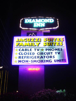
Photographs of Diamond Inn signs, Las Vegas (Nev.), 2002
Date
2002
Archival Collection
Description
Nighttime views of the Diamond Inn signs on the Strip. Information about the sign is available in the Southern Nevada Neon Survey Data Sheet.
Site address: 4605 S Las Vegas Blvd
Sign details: North of the Glass Pool Inn is the Diamond Inn. The motel is on the east side of the strip, and is one of the larger properties on the southern tip of Las Vegas Blvd The facility fits into the typical model of the roadside motel on this portion of the strip. An official building sits on the north side of the property and precedes a span of pavement centered with a pool, and backed by the flanking wings of rooms. A pylon side is on the north end of the property, across a span of pavement from a grass island with a rather large statue of an elephant made of fiberglass. In the near distance behind the island, the pool house for the said pool, is adorned with distinct neon as well.
Sign condition: Structure 3 Surface 3 Lighting 3
Sign form: Pylon; Fascia
Sign-specific description: The facility fits into the typical model of the roadside motel on this portion of the strip. An official building sits on the north side of the property and precedes a span of pavement centered with a pool, and backed by the flanking wings of rooms. A pylon side is on the north end of the property, across a span of pavement from a grass island with a rather large statue of an elephant made of fiberglass. In the near distance behind the island, the pool house for the said pool, is adorned with distinct neon as well. The pylon sign is a tall vertical rectangle with a large square internally lit cabinet in the center, a message cabinet on top of the rectangle as well as a small LED screen between the two. The large, double backed, internally lit cabinet, is bordered on the faces with purple neon, which closes in the yellow and black graphic text which advertises amenities for the motel. The cabinet on top is a six sided, horizontal, diamond-esque shape, which is double backed as well. The border of the surface of the sign is created using incandescent bulbs. Diamond Inn is spelled on the surface with two lined channel letter text. The letters are filled with incandescent bulbs and bordered in blue neon. The pool's treatment also utilizes the corresponding colors of purple and pink as well. Along the roofs edge a glowing entablature is created using a top border of purple neon as well as a bottom border of pink neon. Inside the border seven pink and star shapes are crafted out of neon tubing. They run horizontally across the length of the pediment, alternating pink, then purple.
Sign - type of display: Neon; Incandescent; Backlit
Sign - media: Steel; Plastic; Fiberglass
Sign - non-neon treatments: Graphics
Sign animation: Chasing, flashing, oscillating
Notes: the letters inside of the letters of the tower actually oscillate.
Sign environment: The Glass Pool Inn resides just to the north of the Diamond Inn. Boasting a newer, yet improperly functioning pylon sign, the larger Diamond Inn property is one of the more standout establishments in the area. Its expansive lot and pink sculpture of an elephant make the Diamond Inn conspicuous.
Sign manufacturer: Diamond Head Sign Co.
Sign - thematic influences: No specific theme seems to be related to the Diamond Inn other than the typical roadside motel, typical for the south end of the Strip.
Surveyor: Joshua Cannaday
Survey - date completed: 2002
Sign keywords: Chasing; Oscillating; Pylon; Fascia; Neon; Incandescent; Backlit; Steel; Plastic; Fiberglass; Graphics
Mixed Content
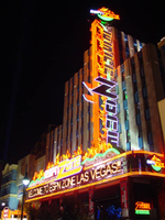
Photographs of ESPN Zone signs, Las Vegas (Nev.), 2002
Date
2002
Archival Collection
Description
Daytime and nighttime views of the ESPN Zone signs on the Strip. Information about the sign is available in the Southern Nevada Neon Survey Data Sheet.
Site name: New York-New York Hotel and Casino (Las Vegas, Nev.)
Site address: 3790 S Las Vegas Blvd
Sign details: Located in New York-New York Casino and Hotel
Sign condition: Structure 5 Surface 5 Lighting 5
Sign form: Pylon; Fascia; Porte-cochère
Sign-specific description: The northern end of the property is dominated by the signage for the ESPN Zone sports lounge, located inside the NY NY. The exterior signage is basically a theatre marquee entrance with a long overhang supporting an electronic message banner that reads from left to right. The majority of the theatre front is polished aluminum with thin tubes of red neon above and below the electronic reader board. Above the top edge of the actual front of the sign is a design of pan channels, crafted and shaped to form a complex background for the logo text spelling "ESPN." A wavy green crafted channel creates what looks like a horizon. The space between the marquee and the green channel is a black field laden with incandescent bulbs. Above the green channel an array of pan channels crafted into interlocking, swaying, pointed shapes. They are painted yellow and orange so the result is a bed of flames. These too are lined in the interior of the contour in red and orange neon. In the center of the entire face of the overhand in a black steel cabinet with the logo for the establishment spelling "ESPN Zone." The First portion of the two-word phrase is spelled in shallow channel letters lined with horizontal bars of white neon. The text is outlined in red neon as well. The second half spells "Zone," and is written in the same font with the "Z" being the largest letter in the sign, designed with the bottom horizontal leg underlining the rest of the letters in the word. The word is outlined with white neon as well. The latter portion is filled with horizontal bars of red neon. Situated along the middle of the sign, and against the vertical plane of the building, a blade sign repeats the design and colors of the bottom portion of the sign. The vertical cabinet is double sided spelling the "ESPN Zone" logo vertically with the same neon treatments for the respective words. The three toned background of black, green, red and orange on the bottom of the sign is interpreted on the blade. Running vertically, the black portion laden with bulbs runs against the wall, with the wavy channel next to that, disappearing temporarily behind the letters. The flames hang off of the outer edge of the sign. All of the neon treatments are seen here as well. Crowning the top of the blade sign two circular cabinets are arranged touching each other at one end, the faces pointing out to angled directions. Here the ESPN logo is arranged inside a circle. The bottom half below the letters is filled with horizontal bars of green neon, while the flames are present on the top half. The same cabinets can be seen mounted on the ends of the bottom overhang.
Sign - type of display: Neon; Incandescent; Backlit
Sign - media: Steel; Plastic
Sign - non-neon treatments: Graphics
Sign animation: Notes: The letters in the vertical blade portion of the ESPN Zone illuminate one at a time, starting from the top. Once the entire phrase is lit, in flashes off then on then off, before restating. The orange and red neon tubing which resides inside the pan channels that represent flames flash on and off in a relaxed manner as if to animate the flickering of the flames. The small incandescent bulbs on the black portions above the main matrix reader board flash on and off subtly.
Surveyor: Joshua Cannaday
Survey - date completed: 2002
Sign keywords: Chasing; Flashing; Oscillating; Pylon; Fascia; Porte-cochère; Neon; Incandescent; Backlit; Steel; Plastic; Graphics
Mixed Content

4 Mile Bar Neon Survey document, September 8, 2017
Date
2017-09-08
Archival Collection
Description
Information about the 4 Mile Bar sign that sits at 3650 Boulder Hwy.
Site name: 4 Mile Bar (Las Vegas, Nev.)
Site address: 3650 Boulder Hwy
Sign owner: Bob and Bill Joslin
Sign details: This is one of the most historic bars in Las Vegas. The original site of the bar was actually where one of the oldest communities in town began called Formyle. The community was there long before The Boulder Highway or US Highway 95. The area where the bar currently resides was called Four Mile Spring because it was "four miles from the center of town" and for the natural spring that was there. This part of town, for much of its history, was outside of Las Vegas city limits and outside of the laws for the rest of the city as well. This site was originally a brothel when it opened in the 1950s. In 1954, the property was raided by the FBI and then ended up turning into a bar. It is "one of the Valley's last true-blue roadhouses" and it is named because it sits four miles away from the Downtown area. They are also known for their very popular karaoke nights.
Sign condition: 4, the roadside sign is in good condition, but the sign that is attached to the building has some light bulbs that have been burned out on it.
Sign form: Roadside sign is a pole sign with a message center and there is an architectural sign attached to the facade of the building.
Sign-specific description: The road side portion of the signage for the 4 Mile Bar is fairly simple. The top of the sign features a plastic, backlit square that has a large red "4" and "MILE" in bold white text in the middle of the number. Underneath this is "BAR" in a bold red text against a white background. About a foot or two underneath this sign is a large plastic, backlit reader board. The main support for the sign is a white rectangular structure with two red stripes running down the center of it with a few inches of space between the lines. The architectural sign that is on the facade of the building is uncomplicated as well. The shape of it fits the top portion of the building and looks like a stretched out rectangle. All of the edges are lined by incandescent light bulbs. In the middle of the sign in open channel letters are the words "4 MILE BAR" that are filled with white glowing neon tubes.
Sign - type of display: Incandescent, neon and backlit plastic portion
Sign - media: Steel and plastic
Sign - non-neon treatments: Plastic
Sign environment: This bar sits at the cusp where Fremont Street transitions to Boulder Highway. Many of the immediate properties that sit near this bar are motels and mobile home communities. This is also just down the road from Boulder Station Hotel and Casino as well as the Winchester Cultural Center.
Sign - thematic influences: The roadside sign is very straightforward since it just displays the name of the bar, but there could have been a stylistic choice to use the actual number "4" instead of the word "four."
Sign - artistic significance: The most notable feature about this sign is the number "4" instead of the word "four" that is used, possibly for stylistic reasons.
Survey - research locations: Accessor's Page http://www.clarkcountynv.gov/assessor/Pages/searchbybusinessname.aspx, Review Journal articles https://storify.com/ReviewJournal/7-of-the-most-historic-bars-in-las-vegas and https://www.reviewjournal.com/uncategorized/over-a-century-four-mile-has-gone-from-trailside-oasis-to-brothel-to-bar/ , Vegas Seven article http://vegasseven.com/2013/06/12/las-vegas-bar-hall-fame/
Surveyor: Lauren Vaccaro
Survey - date completed: 2017-09-08
Sign keywords: Architectural; Incandescent; Neon; Backlit; Plastic; Steel; Pole sign; Roadside
Text
Capri Motel Neon Survey document, September 14, 2017
Date
2017-09-14
Archival Collection
Description
Information about the Capri Motel sign that sits at 325 Fremont St.
Site address: 325 Fremont St
Sign owner: Nemo Motel LLC
Sign details: This motel was originally constructed in 1958. Their sign states "New Rooms, Daily and Weekly", so it is unclear if they renovated or if they have new rooms daily since this has been on their sign since 2007.
Sign condition: 2- Has a lot of weathering and the paint is very faded and some neon tubing is broken
Sign form: Pylon
Sign-specific description: This pylon has a red steel base. On the top there is a rusty-red rectangle with "MOTEL" spelt out horizontally in a painted white block letter font (looks as though it had skeletal neon with most of it broken on each side). Below this is a rusty-red rectangular blade sign box that has a white plastic sign in it that states "CAPRI" vertically in Red block font letters. The base behind this sign box does look like it has holes in it every few inches as a part of its design. Below this is another rusty-red sign box that has a white plastic sign that says, "New Rooms, Daily and Weekly, Free Phone- Wifi Internet-Cable T.V.- Movies" In a mid-century modern paint effect font. This sign box looks as though there once was incandescents surrounding it but are now mostly missing.
Sign - type of display: Neon and incandescent remains
Sign - media: Steel and plastic
Sign - non-neon treatments: Plastic backlit portion of sign
Sign environment: Down on the East side of Fremont, this location has two car sales lots on either side of it and has other Motels nearby.
Sign - date of installation: Has been up since at least 2007
Sign - thematic influences: The font they use on the bottom portion listing what this location offers has that thick paintbrush effect that you would see on older signs. With this it shows that many signs were hand painted (though we do not know if this one was or not).
Survey - research locations: Asessor's Page and Google map roadside view
Survey - other remarks: Next to the Flamingo there was a motel called the Flamingo Capri Motel which is a very similar name http://vintagelasvegas.com/post/116515472029/flamingo-capri- motel-las- vegas-c1960- this.
Surveyor: Emily Fellmer
Survey - date completed: 2017-09-14
Sign keywords: Neon; Steel; Plastic; Backlit; Pole sign
Text