Search Results
Slide of protesters at a demonstration near the Nevada Test Site, March 24, 1989
Date
1989-03-24
Archival Collection
Description
Color image of protesters passing through a wire fence at an anti-nuclear testing demonstration held in the Nevada desert on Good Friday.
Image
Slide of protesters with upraised arms at a demonstration at the Nevada Test Site, March 24, 1989
Date
1989-03-24
Archival Collection
Description
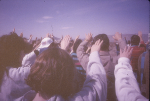
Color image of protesters with their arms upraised at an anti-nuclear testing demonstration held in the Nevada desert on Good Friday.
Image
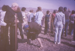
Slide of protesters at a demonstration near the Nevada Test Site, March 24, 1989
Date
1989-03-24
Archival Collection
Description
Color image of protesters passing through a wire fence at an anti-nuclear testing demonstration held in the Nevada desert on Good Friday.
Image

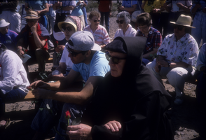
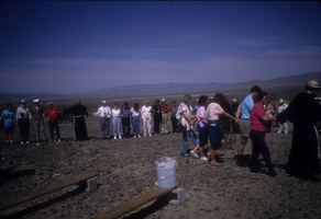
Slide of protesters at a demonstration near the Nevada Test Site, March 25, 1990
Date
1990-03-25
Archival Collection
Description
Color image of a crowd of protesters during a Franciscan weekend of peaceful demonstrations against nuclear testing.
Image
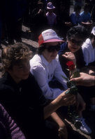
Slide of protesters at a demonstration near the Nevada Test Site, March 25, 1990
Date
1990-03-25
Archival Collection
Description
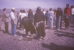
Color image showing a close-up of three protesters during a Franciscan weekend of peaceful demonstrations against nuclear testing.
Image
Slide of protesters with roses at a demonstration near the Nevada Test Site, March 25, 1990
Date
1990-03-25
Archival Collection
Description
Color image of protesters holding red roses during a Franciscan weekend of peaceful demonstrations against nuclear testing.
Image
Slide of protesters with roses at a demonstration near the Nevada Test Site, March 25, 1990
Date
1990-03-25
Archival Collection
Description
Color image of protesters holding red roses during a Franciscan weekend of peaceful demonstrations against nuclear testing.
Image
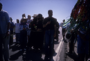
Slide of protesters at a demonstration near the Nevada Test Site, March 25, 1990
Date
1990-03-25
Archival Collection
Description
Color image of protesters holding hands during a Franciscan weekend of peaceful demonstrations against nuclear testing.
Image