Search the Special Collections and Archives Portal
Search Results
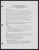
Alpha Kappa Alpha Sorority, Theta Theta Omega Chapter connections committee reports
Date
Archival Collection
Description
From the Alpha Kappa Alpha Sorority, Incorporated, Theta Theta Omega Chapter Records (MS-01014) -- Chapter records file.
Text
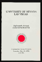
University of Nevada, Las Vegas (UNLV) 18th commencement program
Date
Archival Collection
Description
Commencement program from University of Nevada, Las Vegas Commencement Programs and Graduation Lists (UA-00115).
Text

James Dean Leavitt oral history interviews: transcript
Date
Archival Collection
Description
Oral history interviews with James Dean Leavitt conducted by Claytee D. White on September 27 and October 4, 2022 for the Boyer Early Las Vegas Oral History Project. In this interview, Leavitt recalls his role in establishing a medical school at the University of Nevada, Las Vegas (UNLV), now known as Kirk Kerkorian School of Medicine. Leavitt was elected to the Board of Regents in 2004 while Jim Rogers was interim Chancellor of the Nevada System of Higher Education (NSHE), and he suggested the creation of an ad hoc committee Health Science Center Committee. In 2009, Leavitt became Chairman of the Board of Regents, Dan Klaich became Chancellor, and in the following year, Dr. Mark Doubrava joined the board. In May 2014, the planning dean was hired, Dr. Barbara Atkinson, and the UNLV School of Medicine was officially established on August 22, 2014.
Text
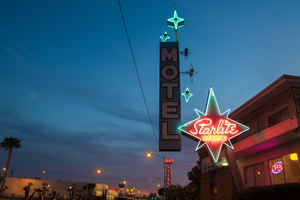
Photographs of Starlite Motel at dusk, Las Vegas (Nev.), March 17, 2017
Date
Archival Collection
Description
Site address: 1873 N Las Vegas Blvd
Sign owner: LAS VEGAS DRAGON HOTEL LLC
Sign details: This motel resides in North Las Vegas and is one of the few around that still offers traditional roadside lodging.
Sign condition: 5 - Sign was recently updated with was appears to be newer neon and a different color scheme, going with a bright blue and brown. New white vinyl letters have been added.
Sign form: Pole
Sign-specific description: Previous to the spring 2017 upgrade: This pole sign extends out toward the street for motorists and pedestrians to see. This pole is a bright red color. A four pointed red star sits at the top of the red pole for everyone to see. This is outlined with neon tubes that glow blue at night. In the spaces between the points of the star the neon tube is bent to create smaller points. In the middle of the star painted in bold white script is the word "Starlite." This is also outlined with neon tubes to glow at night. Under this is the word "VACANCY" painted in bold white text, but the neon tubes that outline it light up red. Attached to the point of the star that extends toward the road is a long, rectangular sign that reads "MOTEL" in bold white text with a black outline on a light blue background. Extending from the "MOTEL" sign towards the red star are 3 smaller four pointed stars that have incandescent light bulbs in their center and are outlined by neon tubes that glow blue at night. On top of the "MOTEL" sign is another one of these four pointed stars that sits on the outer edge of the sign. Next to this is a larger, light blue four pointed star with an incandescent light bulb in the center and a smaller four pointed star made from a neon tube surrounding the light bulb. The neon tube that outlines the larger portion of the star is bent to create smaller points in the portions of the star without points.
Sign - type of display: Neon and incandescent
Sign - media: Steel
Sign - non-neon treatments: Paint
Sign animation: Unknown since update
Sign environment: The surrounding properties are Jerry's Nugget and the Silver Nugget casinos. It is also just down the street from the Cultural Corridor which includes the Neon Museum and the Las Vegas Natural History Museum. The Las Vegas Library is also down the street.
Sign - date of installation: c. 1950s
Sign - date of redesign/move: Spring 2017
Sign - thematic influences: This property is one of many star-themed motels throughout the city. The 1950's was a popular time for space age/ star themed business due to the Space Age and explorations during this time period. Also, since the name of the property is the "Starlite Motel", the amount of stars included in this sign emphasizes this theme.
Sign - artistic significance: This sign has a heavy influence of the Space Age due to the stars throughout the sign that are telling of the theme for the property. The specific stars for this sign have a Googie-like influence as well because they are very stylized in a futuristic manner.
Survey - research locations: Assessor's website, roadarch.com
Survey - other remarks: http://www.roadsidepeek.com/roadusa/southwest/nevada/vegas/lvmotel/lvnorthmotel/index.htm#sta rlitemotel
Surveyor: Lauren Vaccaro
Survey - date completed: 2017-09-05
Sign keywords: Neon; Incandescent; Steel; Paint; Pole sign
Mixed Content
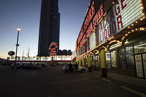
Photographs of Bonanza Gift Shop, Las Vegas (Nev.), March 6, 2017
Date
Archival Collection
Description
Site address: 2440 S Las Vegas Blvd
Sign owner: Haim Gabay
Sign details: The Bonanza Gift Shop opened in 1981 marketing as the world's largest gift shop. Though in 1963 a portion of the property opened as an Honest John's Casino. In 1971 the Big Wheel opened next to Honest John's Casino. After 1974 Big Wheel changed to Centerfold Casino 1975-1977. In 1977 the Centerfold Casino changed to Jolly Trolley Restaurant, Saloon and Dining Depot. From 1977-1981 Jolly Trolley remained at the location; it seems at one point Jolly Trolley took over the entire shopping center and casinos. Between 1977 and 1981, a 24 Hour Adult Book Store was taken over by Jolly Trolley that allowed Bonanza Gift Shop to purchase the whole property. The sign's design and theme has stayed the same from 1963 to current. The gift shop was sold for $50 million in 2016 to Haim Gabay.
Sign condition: 3- the paint is peeling off, and the signs have holes in them. The incandescent light bulbs and marquee are not working to full capacity; some portions do not light up at all.
Sign form: This is considered an architectural sign with the reader boards-marquee built into the building. The sign at the end of the corner is considered a cantilever construction.
Sign-specific description: The sign is mainly rusty red and a gold-yellow that surrounds the building with multiple "Bonanza Gift Shop" logos in a old west type font. Also there is a reader board surrounding the building as well.
Sign - type of display: The Display used is a reader board, neon, incandescent, and fluorescent lighting.
Sign - media: Plastic, Steel and Fiberglass
Sign - non-neon treatments: Plastic for reader board
Sign animation: Chasing
Notes: Incandescent light bulbs that surround the building and logos
Sign environment: The property is on the west corner of Las Vegas Blvd and Sahara. The stores surrounding the establishment are Naughty Town, Walgreens, Essence Cannabis, Strip Gun Club and Diversity Tattoos.
Sign - date of installation: Estimated 1963 or earlier
Sign - date of redesign/move: 1963 Honest John's cantilever construction. 1971 Big Wheel opened up and added the projection sign. In 1974 the Big wheel changed to Centerfold Casino and in 1977 name changed to Jolly Trolley. In 1981 the Jolly Trolley projection and cantilever construction sign changed to Bonanza Gift Shop.
Sign - thematic influences: The sign dates back to 1963 and resembles the golden nugget decorated shed concept along with the cantilever construction sign similar to golden nugget's 1946 sign, except circular rather than organic. The actual sign uses color psychology to attract consumers to the gift shop. The theme is definitely western themed.
Survey - research locations: https://www.reviewjournal.com/business/bonanza-gift-shop-in-las-vegas-sold-for-50m-records-show/ about new owner purchase. Vintage Las Vegas http://vintagelasvegas.com/search/Bonanza+Gift+Shop helped with dates of property change. Author Paul W. Papa's book "Discovering Vintage Las Vegas: A Guide to the City's Timeless Shops"
Surveyor: Gisselle Tipp
Survey - date completed: 2017-08-12
Sign keywords: Architectural; Plastic; Steel; Incandescent; Chasing; Reader board; Neon; Marquee; Fluorescent; Roof Sign
Mixed Content
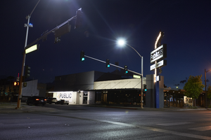
Photographs of PublicUs sign, Las Vegas (Nev.), April 18, 2017
Date
Archival Collection
Description
Site address: 1126 Fremont St
Sign owner: Kimo Akiona, Cole McBride and Travis Landice
Sign details: PublicUs opened in 2015. This property has previously held other restaurants the most recent being a Philly Cheese Steak restaurant. PublicUs represents "for the people" in Latin. Hemant Kishore is the baker and chef. This location is a canteen-style restaurant and coffee house where they make all organic foods in house.
Sign condition: 4- the steel part of the sign looks relatively new and has bright paint, but the plastic portion for the sign does some aging to it.
Sign form: Pylon
Sign-specific description: On the corner of Fremont E and Maryland pkwy at the corner of their building there is a blue been sticking out of the ground that is curved at the top. Near this curved section is a rectangle steel sign box that has a back lit plastic sign in it, and underneath is a similar rectangular box. The bigger rectangular box has a white background, but has the a light tan box with PublicUs logo in white letters in the light tan brown box. The smaller box on the bottom has the white backdrop and the tan colored rectangle has Fremont Village written in a white font. Both rectangle signs have an arrow pointing through them with the tip of the arrow above their main logo sign and the "feathers" of the arrow underneath Fremont Village sign.
Sign - type of display: Backlit plastic sign and incandescent light bulbs
Sign - media: Steel and plastic
Sign - non-neon treatments: Plastic back lit portion of sign
Sign animation: Flasher for incandescent light bulbs
Sign environment: This is located on the corner of Maryland Pkwy and Fremont Street East. Surrounding this property is a lot of old motels that have been shut down, and painted over though many of their neon signs are still up and some working. On the same block as them is a vintage barber shop and a vintage tattoo parlor.
Sign manufacturer: Main portion of the sign was around before they opened so information on the base of the sign was not found
Sign - date of installation: The sign box has records of being around longer than the PublicUs has, records (Google Maps satellite view) show the sign similar to this has been up since at least 2013
Sign - date of redesign/move: Late 2015 is when their main logo was installed
Sign - thematic influences: This sign shows how signs can be re-purposed or can evolve with different colors and slightly different designs over the years even though the theme of the property has changed.
Sign - artistic significance: The arrow in the sign could signify a bulls eye in the sense that you are looking in the right spot or have found the perfect spot.
Survey - research locations: Google Maps satellite view, Sprudge coffee blog http://sprudge.com/publicus-97938.html , Eating Las Vegas http://www.eatinglv.com/2015/03/publicus-is-open-and-baking-for-the-people/
Survey - research notes: This restaurant has faux trees and nice wooden tables inside to make it feel as though you are outdoors but still in a homey place.
Surveyor: Emily Fellmer
Survey - date completed: 2017-08-18
Sign keywords: Plastic; Backlit; Incandescent; Steel; Flashing; Pole sign
Mixed Content
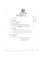
Meeting minutes for Consolidated Student Senate University of Nevada, Las Vegas, November 4, 1992
Date
Archival Collection
Description
Text
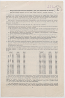
Notice inviting sealed proposals for the purchase of $8,700,000 waterworks bonds of Las Vegas Valley Water District, April 5, 1954
Date
Archival Collection
Description
Prospectus for the Las Vegas Valley Water District's $8.7 million bond issue. This notice is given pursuant to the Las Vegas Valley Water District Board of Directors resolution adopted April 2, 1954. Date stamp from E. E. Bennett
Text

