Search the Special Collections and Archives Portal
Search Results
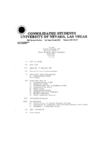
Meeting minutes for Consolidated Student Senate, University of Nevada, Las Vegas, October 27, 1981
Date
Archival Collection
Description
Text
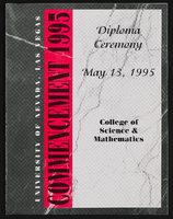
University of Nevada, Las Vegas (UNLV) College of Sciences and Mathematics Diploma Ceremony program
Date
Archival Collection
Description
Commencement program from University of Nevada, Las Vegas Commencement Programs and Graduation Lists (UA-00115).
Text
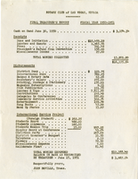
The Wheel of Rotary Las Vegas Rotary Club newsletter, June 21, 1951
Date
Archival Collection
Description
Text
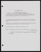
Alpha Kappa Alpha Sorority, Theta Theta Omega Chapter arts and humanities committee reports
Date
Archival Collection
Description
From the Alpha Kappa Alpha Sorority, Incorporated, Theta Theta Omega Chapter Records (MS-01014) -- Chapter records file.
Text
Federico Zaragoza (College of Southern Nevada) oral history interview conducted by Magdalena Martinez and Elia Del Carmen Solano-Patricio: transcript
Date
Archival Collection
Description
From the Lincy Institute "Perspectives from the COVID-19 Pandemic" Oral History Project (MS-01178) -- Education sector interviews file.
Text
Michele Fiore (City of Las Vegas Councilwoman) oral history interview conducted by Magdalena Martinez: transcript
Date
Archival Collection
Description
From the Lincy Institute "Perspectives from the COVID-19 Pandemic" Oral History Project (MS-01178) -- Elected official interviews file.
Text
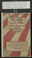
Mabel Hoggard: recipes
Date
Archival Collection
Description
Folder of materials from the Mabel Hoggard Papers (MS-00565) -- Personal papers file. This folder contains a book with cooking recipes (not digitized in its entirety), a memo, and other documents containing recipes.
Text
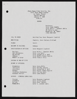
Alpha Kappa Alpha Sorority, Theta Theta Omega Chapter meeting agendas
Date
Archival Collection
Description
From the Alpha Kappa Alpha Sorority, Incorporated, Theta Theta Omega Chapter Records (MS-01014) -- Chapter records file.
Text
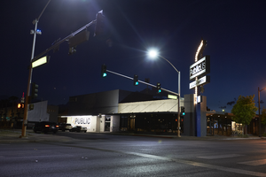
Photographs of PublicUs sign, Las Vegas (Nev.), April 18, 2017
Date
Archival Collection
Description
Site address: 1126 Fremont St
Sign owner: Kimo Akiona, Cole McBride and Travis Landice
Sign details: PublicUs opened in 2015. This property has previously held other restaurants the most recent being a Philly Cheese Steak restaurant. PublicUs represents "for the people" in Latin. Hemant Kishore is the baker and chef. This location is a canteen-style restaurant and coffee house where they make all organic foods in house.
Sign condition: 4- the steel part of the sign looks relatively new and has bright paint, but the plastic portion for the sign does some aging to it.
Sign form: Pylon
Sign-specific description: On the corner of Fremont E and Maryland pkwy at the corner of their building there is a blue been sticking out of the ground that is curved at the top. Near this curved section is a rectangle steel sign box that has a back lit plastic sign in it, and underneath is a similar rectangular box. The bigger rectangular box has a white background, but has the a light tan box with PublicUs logo in white letters in the light tan brown box. The smaller box on the bottom has the white backdrop and the tan colored rectangle has Fremont Village written in a white font. Both rectangle signs have an arrow pointing through them with the tip of the arrow above their main logo sign and the "feathers" of the arrow underneath Fremont Village sign.
Sign - type of display: Backlit plastic sign and incandescent light bulbs
Sign - media: Steel and plastic
Sign - non-neon treatments: Plastic back lit portion of sign
Sign animation: Flasher for incandescent light bulbs
Sign environment: This is located on the corner of Maryland Pkwy and Fremont Street East. Surrounding this property is a lot of old motels that have been shut down, and painted over though many of their neon signs are still up and some working. On the same block as them is a vintage barber shop and a vintage tattoo parlor.
Sign manufacturer: Main portion of the sign was around before they opened so information on the base of the sign was not found
Sign - date of installation: The sign box has records of being around longer than the PublicUs has, records (Google Maps satellite view) show the sign similar to this has been up since at least 2013
Sign - date of redesign/move: Late 2015 is when their main logo was installed
Sign - thematic influences: This sign shows how signs can be re-purposed or can evolve with different colors and slightly different designs over the years even though the theme of the property has changed.
Sign - artistic significance: The arrow in the sign could signify a bulls eye in the sense that you are looking in the right spot or have found the perfect spot.
Survey - research locations: Google Maps satellite view, Sprudge coffee blog http://sprudge.com/publicus-97938.html , Eating Las Vegas http://www.eatinglv.com/2015/03/publicus-is-open-and-baking-for-the-people/
Survey - research notes: This restaurant has faux trees and nice wooden tables inside to make it feel as though you are outdoors but still in a homey place.
Surveyor: Emily Fellmer
Survey - date completed: 2017-08-18
Sign keywords: Plastic; Backlit; Incandescent; Steel; Flashing; Pole sign
Mixed Content

