Search Results
Photographs of Holiday Motel, Las Vegas (Nev.), March 1, 2017
Date
2017-03-01
2017-08-25
Archival Collection
Description
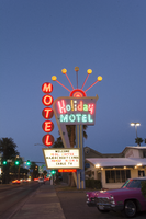
The multi-colored Holiday Motel sign sits at 2205 South Las Vegas Boulevard. Originally Holiday Inn, the motel has operated for over 50 years. Information about the sign is available in the Southern Nevada Neon Survey Data Sheet.
Site address: 2205 S Las Vegas Blvd
Sign owner: Calcaterra Family and Trust
Sign details: Holiday Motel was built-in 1952 - a one acre lot with 14,238 sq. ft. of living space.
Sign condition: 2 - The neon is not working completely, majority of the lights have not been repaired or maintained. The actual paint has shifted from a brilliant red into a subdued salmon rustic color from exposure of Sun/UV and wind.
Sign form: Pole mounted sign with reader board
Sign-specific description: The Holiday Motel is an animated sign that is part of the mid-century and Googie design. The color scheme is mostly a primary color palette of red, blue and yellow. The neon holiday typography is the only element of the sign that differs from the palette, but only when it is lit up. Instead the holiday font illuminates multiple colors to continue the clown theme effect. The sign is in true Googie fashion that popularized roadside signage from 1950s-late1960s. It is in the style of a pylon sign with a directional arrow that points towards the motel entryway. When the sign lights up the directional arrow uses a chaser to animate the arrow and its design with incandescent bulbs. The directional arrow surrounds the holiday motel square shaped portion of the sign. On the top portion of the sign is a rainbow design with five metal rods with circles at the end shooting out of the rainbow. These five rods when lit up in the evening are animated as well and produce a wave motion. On the side of the sign are separate white letters encased in red circles and are designed vertically reading the word motel.
Sign - type of display: Neon, incadescent
Sign - media: Steel and plastic
Sign animation: Animation with upper circles/rods chasing from one to the next.
Sign environment: Property is near other motels and the Stratosphere.
Sign manufacturer: YESCO
Sign - date of installation: c. 1952
Sign - thematic influences: This sign is completely influenced by the 1952 Holiday Inn sign. Both are include an animated chaser direction arrow. The initial design is completely replicated from the Holiday Inn sign. The only difference is the five animated rods in Holiday Motel and where Holiday inn sign has a star instead of a rainbow at the top of the sign. The main difference is that the Holiday Motel sign includes a side panel with the word motel spelled vertically.
Sign - artistic significance: Artistic theme includes a circus theme, but also involves the Googie roadside sign that channels the space age landing beacon. As for majority of signs in 1950s-1960s the sign itself was quite colorful and in the shape of a pylon sign to grab the travelers attention.
Survey - research locations: roadarch.com, assessor's website
Survey - research notes: There was hardly any information pertaining to the history of the Holiday Motel sign. The property was originally called the Holiday Inn Motel but had to change its name in the 1960s due to the large Holiday Inn chain.
Surveyor: Gisselle Tipp
Survey - date completed: 2017-08-25
Sign keywords: Neon; Incandescent; Steel; Plastic; Chasing; Reader board; Pole sign
Mixed Content
Photographs of Las Vegas Helicopter Tours signs, Las Vegas (Nev.), 2002
Date
2002
Archival Collection
Description
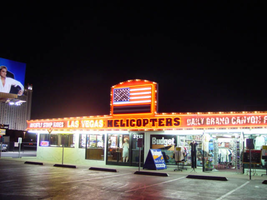
Nighttime views of the Las Vegas Helicopter Tours signs on the Strip. Information about the sign is available in the Southern Nevada Neon Survey Data Sheet.
Site address: 3712 S Las Vegas Blvd
Sign details: The establishment rests in a lot on the western side of the strip adjacent to the airfield, which is utilized for takeoff and landing of the aircraft. The Las Vegas Helicopter facility is also adjacent to and shares a building with a souvenir shop.
Sign condition: Structure 5 Surface 5 Lighting 5
Sign form: Fascia
Sign-specific description: The Las Vegas Helicopter tours facility possesses a quite elaborate wall sign which wraps the fascia of the building. The face of the building looks east. The eastern face is an entablature bordered in with polished gold aluminum raceway lined with incandescent bulbs. In the center of the eastern face of the narrow border transforms into a rectangular face, which juts upward. A giant pan channel representing the American flag occupies the space in the section. The horizontal red and white stripes are painted channels, and the blue field in the upper left- hand corner is a channel itself. The horizontal channels are lined with tubes of neon in a corresponding color. The blue field is bordered in blue neon, with incandescent bulbs in the center of graphically painted stars. The entire flag is bordered in red neon. The entablature below which runs along the entire face of the building plays home to several phrases of different text and designs. The center portion is taken up by a phrase "Las Vegas Helicopters," in black channel letters painted red on the interior. The exterior edge is lined with a border of red neon. The text is also filled with incandescent bulbs. To the left of the main title, smaller black, channel letters filled incandescent bulbs read, "Nightly Strip Rides" in all caps. The raceway deviated from the straight form underneath the secondary text, next to the primary title. On the bottom edge beneath the phrase, the raceway turns into an arrow pointing downward. The incandescent bulbs are still present along this deviation.
Sign - type of display: Neon; Incandescent; Backlit
Sign - media: Steel; Glass
Sign - non-neon treatments: Graphics; Paint
Sign animation: Chasing, flashing, oscillating
Notes: The incandescent bulbs inside the text reading "Paris" on the balloon oscillate rapidly.
Sign manufacturer: Sign Systems, Inc
Sign - date of installation: 1996
Sign - thematic influences: There is no real present theme evident in the appearance other than the Emblem of the American flag crafted in neon on the front of the building. The incandescent bulb lined raceways and bulb filled channel letters, placed within a pediment hanging above the pedestrians head, posses a theme in a sense. It is a common occurrence to see such a combination of lighting among the strip to designate an establishment so its theme cold be considered to be that of Las Vegas. It's artistic significance can only be linked to such a trait. It is one of the most unique properties considering its function. Yes there are many facilities which offer tours but, this is the only one which provides helicopter tours that the pedestrian may watch take off. It is also one of the only establishments where the American flag is represented on the exterior in neon. It is also one of the only establishments where the incandescent bulb lined raceway is shaped into arrows. An interesting use of the most common adornment of exterior surveyed signage.
Surveyor: Joshua Cannaday
Survey - date completed: 2002
Sign keywords: Chasing; Flashing; Oscillating; Fascia; Neon; Incandescent; Backlit; Steel; Glass; Graphics; Paint
Mixed Content
Photographs of Starlite Motel at dusk, Las Vegas (Nev.), March 17, 2017
Date
2017-03-17
2017-09-05
Archival Collection
Description
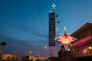
The Starlite Motel sits at 1873 North Las Vegas Boulevard. Shortly after this photo was taken, the sign was scrubbed of its neon and made dormant. Information about the sign is available in the Southern Nevada Neon Survey Data Sheet.
Site address: 1873 N Las Vegas Blvd
Sign owner: LAS VEGAS DRAGON HOTEL LLC
Sign details: This motel resides in North Las Vegas and is one of the few around that still offers traditional roadside lodging.
Sign condition: 5 - Sign was recently updated with was appears to be newer neon and a different color scheme, going with a bright blue and brown. New white vinyl letters have been added.
Sign form: Pole
Sign-specific description: Previous to the spring 2017 upgrade: This pole sign extends out toward the street for motorists and pedestrians to see. This pole is a bright red color. A four pointed red star sits at the top of the red pole for everyone to see. This is outlined with neon tubes that glow blue at night. In the spaces between the points of the star the neon tube is bent to create smaller points. In the middle of the star painted in bold white script is the word "Starlite." This is also outlined with neon tubes to glow at night. Under this is the word "VACANCY" painted in bold white text, but the neon tubes that outline it light up red. Attached to the point of the star that extends toward the road is a long, rectangular sign that reads "MOTEL" in bold white text with a black outline on a light blue background. Extending from the "MOTEL" sign towards the red star are 3 smaller four pointed stars that have incandescent light bulbs in their center and are outlined by neon tubes that glow blue at night. On top of the "MOTEL" sign is another one of these four pointed stars that sits on the outer edge of the sign. Next to this is a larger, light blue four pointed star with an incandescent light bulb in the center and a smaller four pointed star made from a neon tube surrounding the light bulb. The neon tube that outlines the larger portion of the star is bent to create smaller points in the portions of the star without points.
Sign - type of display: Neon and incandescent
Sign - media: Steel
Sign - non-neon treatments: Paint
Sign animation: Unknown since update
Sign environment: The surrounding properties are Jerry's Nugget and the Silver Nugget casinos. It is also just down the street from the Cultural Corridor which includes the Neon Museum and the Las Vegas Natural History Museum. The Las Vegas Library is also down the street.
Sign - date of installation: c. 1950s
Sign - date of redesign/move: Spring 2017
Sign - thematic influences: This property is one of many star-themed motels throughout the city. The 1950's was a popular time for space age/ star themed business due to the Space Age and explorations during this time period. Also, since the name of the property is the "Starlite Motel", the amount of stars included in this sign emphasizes this theme.
Sign - artistic significance: This sign has a heavy influence of the Space Age due to the stars throughout the sign that are telling of the theme for the property. The specific stars for this sign have a Googie-like influence as well because they are very stylized in a futuristic manner.
Survey - research locations: Assessor's website, roadarch.com
Survey - other remarks: http://www.roadsidepeek.com/roadusa/southwest/nevada/vegas/lvmotel/lvnorthmotel/index.htm#sta rlitemotel
Surveyor: Lauren Vaccaro
Survey - date completed: 2017-09-05
Sign keywords: Neon; Incandescent; Steel; Paint; Pole sign
Mixed Content
Photographs of Golden Steer Steakhouse sign, Las Vegas (Nev.), March 3, 2017
Date
2017-03-03
2017-07-28
Archival Collection
Description
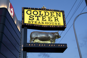
The Golden Steer Steakhouse sign sits at 308 West Sahara Avenue. Information about the sign is available in the Southern Nevada Neon Survey Data Sheet.
Site name: Golden Steer Steak House (Las Vegas, Nev.)
Site address: 308 W Sahara Ave
Sign owner: Dr. Michael J. Signorelli has owned it since 2001 after purchasing it from the original owners
Sign details: Opened 1958, and started expanding in the 1970's by buying out neighboring shops. They redesigned their interior in the 90's but still kept it true to the original design. The Rat Pack was known to frequent this steakhouse and even have a dedicated booth to them. Tony Spilotro, Elvis Presley and Nat "King" Cole were a few of the many famous customers. This is the Oldest Steakhouse in Las Vegas, and still maintains their original old Vegas dining style.
Sign condition: 4-The sign looks as though it has aged, but it has done so gracefully
Sign form: Pylon with sculptural element and entrance sign on building
Sign-specific description: The Pylon sign has the main logo stating "Golden Steer Steakhouse" on a yellow sign with a black border. The black border has yellow/gold incandescent light bulbs with a small gold Fleur-de-Lis on the top. Under the main logo there is a shelf/stage holding a golden sculptural steer. The sign above the entrance is a wrap around yellow sign similar to their pylon sign with their logo and an image of a steer in between the words Golden and Steer. They also advertise Prime Rib and Seafood on the wrap around sign.
Sign - type of display: Incandescents surrounding all of their "reader board" type signs, no neon tubing
Sign - media: Plastic and steel
Sign - non-neon treatments: Reader board type plastic for for all the wording
Sign animation: Chasing:
Notes: ncandescent light bulbs
Sign environment: On West Sahara a few blocks West of Las Vegas Blvd.
Sign manufacturer: Wright Signs
Sign designer: Origninal Steer from the 60's and John Burke said the record of the designer was lost
Sign - date of installation: Pylon sign-1960's but refabricated around 2015 to its original condition, but still original steer. Sign above entrance still from the 1970's.
Sign - date of redesign/move: Pylon sign-1960's but restored around 2015 to its original condition, but still original steer. Sign above entrance still from the 1970's.
Sign - thematic influences: Sign shows old west type font. The Golden sculptural steer helps show it is a steakhouse but one that is top of the line since their sign is golden.
Sign - artistic significance: Opened in 1958, still had the prominent old west/ ranch theme that was popular in Vegas in the 1950's. Though the interior was classy their signage shows the old west cowboy style.
Survey - research locations: Assessor's page, Golden Steer website https://www.goldensteerlasvegas.com/our_history.html , Telephone conversation with John Burke the General Manager of the restaurant
Survey - research notes: John Burke has a lot of great info on their signage as well as their property. Also the Golden Steer website had a great history of the property.
Survey - other remarks: Some of the older Golden Steer signage is in the Neon Museum.
Surveyor: Emily Fellmer
Survey - date completed: 2017-07-28
Sign keywords: Sculptural; Plastic; Steel; Incandescent; Chasing; Reader board; Building-front design; Pole sign
Mixed Content
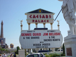
Photographs of Caesars Palace signs, Las Vegas (Nev.), 2002
Date
2002
Archival Collection
Description
Photos show Caesars signs during the day and the porte-cochere at night. Two surveys were conducted to gather information about this sign. One was conducted in 2002 and one was conducted in 2017. PDFs are available for both surveys. See the 2017 survey PDF for additional information that is not included in the object description.
Site name: Caesars Palace (Las Vegas, Nev.)
Site address: 3200 S Las Vegas Blvd
Sign owner: Park Place Entertainment
Sign details: Caesars Palace is located between the Flamingo Rd. on the western side of Las Vegas Blvd Caesars has grown over the years since it's opening, but remains the true to its classic form. Signage for the resort is limited compared to some but consists of significant pieces of signage such as two large pylon signs, a rotating sign for Planet Hollywood, building signage consisting of logo text, as well as a porte-cochere. The property itself is an over abundance of classic design form after another, mixed among modern amenities like an Omnimax theatre. Caesars Palace is a permanent icon in Las Vegas Imagery and folklore.
Sign condition: Structure 4 Surface 4 Lighting 4
Sign form: Pylon; Fascia; Porte-cochère
Sign-specific description: The YESCO pylon is located at the northern side of the property and is constructed of black painted steel and centers around a base of four columns aligned in a row. The sign faces north/south. The four columns rise out of the ground about six feet in the air before a long horizontal, gold bordered, rounded end cabinet, that reads and points to free covered parking. The text is graphically applied and internally lit. The cabinet is lit from the backside with neon, creating a halo behind the sign. The columns continue upward until they are met with the triangular cabinet, pointing east, with the two faces, being occupied a color LED message center. The interior edge of the face of the sign is bordered with green neon. Above the visible top edge of the wedge shaped message boards, the Caesar's Palace logo if illuminated in red neon upon a rectangular section created out of two entablatures, stacked on top of each other. The top entablature reads "Caesars" in red letters and "Palace" in the second row The two are capped with pediment lined on the interior edge with gold neon and a back-lit Caesar's logo. The exterior of the cabinet is polished aluminum, with metal channel letters. The original pylon built much earlier, utilized six-column shafts capped with golden statuary, secured to a large concrete base. When facing the columns, facing north, or south, the majority of the view of the vertical pieces is taken up by the giant internally lit message center, with removable lettering. The outer edge is crafted the same as the face of the other pylon, but it is bordered in pink neon. The four center columns supports an entablature supporting the logo text, and above that a pediment rounds out the classic architectural combination. The top half of the pediment is larger and supports the text "Caesars," while the lower, narrower section reads "Palace". The entire pediment is striped horizontally with bands of aqua neon that creates a field for the text. The text is in the stylized roman text, in channel letters, and lined with red neon. One of the most attractive pieces of signage is the Caesars porte-cochere. The famous fountains lead up to the main entrance, which is shadowed by the massive porte-cochere, which is one of the few remaining on the strip that displays such grandeur. The Porte-cohere is a hulking collection of levels, stacked upon on another, but grow in size as each level steps upward. The rest looks as if a massive set of plaster steps were turned upside down and placed over the entrance. The edge of each level is lined with brass treatments that are repeated vertical poles of polished brass, greeting a repeated striping pattern. From behind this treatment and pushed further back beyond the human eye, a rose colored glow is produced by intense lighting fades into a soft halo as it dies out toward the edges. The mass and girth of the structure is helped out visually by the angles chosen to in its design. The entire construction seems to sag under it's own weight, for each level is slightly cupped into a concave shape. Each levels edges are concave as well, producing a illusion of movement in space. To the right of the porte-cochere there is still the aqua tinted light pouring out of the latticework, that fills the arcade of arches. On the main tower directly behind the porte-cochere, the red neon logo is present as well as elsewhere on the building as well. Facing east this particular set of letters looms high over head. The section of the building is a vertically elongated temple front, stretching the height of the building. Four pilasters run the vertical length of the building, holding black spans of tinted windows in between. They each are topped with golden Corinthian capitals, which hold up the classic entablature and pediment. "Caesars Palace" is spelled across the entablature in channel letters and filled with red neon. In the pediment above a golden crest of Julius Caesar's profile flanked by two encompassing olive branches. The crest is ambiently lit with white light. The tower just behind the main building also supports text on its east face as well. As the narrow edge of the tower, the vertical plane rises upward but is flat and smooth until it reaches the top section. It is essentially a giant entablature created out of the temple fronts on either side that wrap around to meet on the width. On this flat plane, "Caesars Palace" is spelled in the classic lettering and neon treatment seen on the building letters just below that. The building itself is ambiently lit but the profile of Caesar above the text is not a brightly lit as the other. On the south side of the parking garage, on the western edge of the property, the channel letter logo reads in red neon as well.
Sign - type of display: Neon; Incandescent
Sign - media: Steel; Plastic; Masonry
Sign - non-neon treatments: Paint
Sign animation: Chasing, flashing, oscillating
Notes: The V-shaped red channels on the silver main pylon chase each other downward toward the ground. The main text on the pylon animates as well. The letters light up one at a time with red neon from left to right as the arrows continue to chase downward. The logo/text sign located above the giant replica of the Harley Davidson, animate as well. The incandescent bulbs which fill the text, spelling the name of the establishment, oscillate, steady burn, then shut off, and then restarting the sequence. The letters that spell cafe on the lower portion of the sign animate in concert and with the same sequence as the main text.
Sign environment: Caesars Palace sits in one of the biggest and busiest sections of the strip, and has always been a mainstay. The ambiently lit classic features of architecture seem almost specter like moments, with the blazing red eyes of the Caesars text staring from afar. From the street, the actual structures are set a bit back from the street, seeming rather distant. Construction is currently present around the exterior edges of the property, which rather dampens effect of the theming, but everything shines through. The theme does step out to the street with the statuary, creeping out to pedestrians and the pylon signs. The main signs are street side, pointing toward the casino. Headed south on the west side of the street the two pylon signs lead up to the porte-cochere. Standing underneath the porte-cochere looking out, the fountains provide a picturesque scene to see the other side of the street. The buildings loom high over head. The environment contains elements, which can be seen repeated throughout hotel exteriors. The large water element, the Classic architectural design motif, and the spectacular porte-cochere are still evident in properties built today. Even though Caesars continues to evolve with the current trends, all of these elements were presenting its original design.
Sign manufacturer: Pylon 1: YESCO Pylon 2: Ad Art
Sign - date of installation: 1966, 1998
Sign - date of redesign/move: On-going additions since 1966
Sign - thematic influences: Caesars Palace may be the first themed resort, which has taken its theme to an extreme the likes of which had never been seen before. Ever since it's original inception in 1966, Caesars Palace has sought to give its guest the most of the Ancient Roman theme. Caesars is simply dripping with imagery and architecture that is steeped in the theme of Ancient Rome. No matter where you go there are collections of statuary, domes and columns, false temple fronts create the facades of the towers, and low geometric hedges and cypress trees all add to the theme. Any themed property can draw influence from Caesars Palace, and still stands as one of the highest markers for competitors to be judged by.
Sign - artistic significance: Very important signage that can be seen reflected in many aspects of non-casino culture. Caesars Palace is one of the icons of American popular culture, and the distinctive Romanesque neon is a big reason why.
Surveyor: Joshua Cannaday
Survey - date completed: 2002
Sign keywords: Pylon; Fascia; Porte-cochère; Neon; Incandescent; Steel; Plastic; Masonry; Paint
Mixed Content
Photographs of New York New York signs, Las Vegas (Nev.), 2002
Date
2002
2017-08-30
Archival Collection
Description
Photos show New York New York signs at night. Two surveys were conducted to gather information about this sign. One was conducted in 2002 and one was conducted in 2017. PDFs are available for both surveys. See the 2017 survey PDF for additional information that is not included in the object description.
Site name: New York-New York Hotel and Casino (Las Vegas, Nev.)
Site address: 3790 S Las Vegas Blvd
Sign owner: MGM Mirage
Sign details: Occupying the northwest corner of Las Vegas Blvd and Tropicana Ave. is the New York New York Hotel and Casino. The property is a miniature representation of New York City in a collection of colorful architecture and sculpture. Colored reflective panels create the facades of high rises and skyscrapers. An almost cartoon like element is brought to the structures, flowing seamlessly sometimes throughout a surreal landscape of classical architectural elements and mock high rises. Distinguishable landmarks, such as the Empire State Building, the Statue of Liberty, and the Brooklyn Bridge, can be recognized with ease. A lagoon of water represents a harbor shooting water out of fountains disguised as boats.
Sign condition: Structure 5 Surface 5 Lighting 5
Sign form: Pylon; Fascia; Porte-cochère
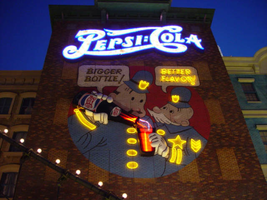
Sign-specific description: The porte cochere is located on the south side of the property facing Tropicana Ave. The design cantilevers off of the main structure to the north, and then is supported by two columns on its far end. The three exposed sides hold the radiating crown of the New York New York logo sign. The two on the east and west sides are smaller than the one on the south side, but are essentially the same design. A half circle cabinet holds the text New York New York stacked in two lines. The channel letters are polished metal on the outside with incandescent bulbs on the interior. Their faces are bordered with red neon. The text is positioned on the front of the half circle cabinet. Breaking the surface of the radius edge, elongated triangular pan channels create a repeating pattern. The result is a crown of points running all across the top of the cabinet. It is reminiscent of the crown on the statue of liberty, or the rays of the rising sun. The face of the cabinet is painted blue, with metallic raceways, filling the negative spaces with more triangular shapes. The triangular pans are painted yellow on the interior with a blue finish on the exterior. The exterior width of the cabinet is also finished in a golden reflective surface. Three tubes of neon fashioned into succeedingly smaller triangles are inside each surface. The color scheme of the neon is yellow being the outer, orange being the second, and the center being red. The sign on the south side is designed the same, except being quite a bit larger, and the crowns of the cabinet angle forward instead of straight up in the air. All the edges are bordered with incandescent bulbs. The bottom edge below the signage, actually underlining the signage significantly, is a gold polished double bull nose that wraps the entire length of each side. The surface is strewn with small incandescent bulbs. An entablature runs above the bull nose, filling the spaces between the sign. The pediment is bordered on the top and the bottom with gold polished raceways and incandescent bulbs. Two mirrored posts support the southern end. The ceiling of the porte cochere is treated much the same as the logo signage on the three sides of the roof. Long pan channels are placed on the ceilings and shaped to look like waving banners, confetti, and beams, radiate out of a centerpiece positioned over the entrance to the casino. Red pans are painted orange on the interiors and green channels are painted blue on the interior. Tubes of neon are bent to the contours of the shapes of each one of these channels. The entire composition is a brilliant abstract pattern of light and colored steel shooting out toward Tropicana Ave. Headed east toward the northwest corner a bridge connects the Excalibur property to the New York New York. At the end of a bridge an entrance into the NY NY is below a LED message center and an arched logo cabinet, with the text and the radiating triangular channels. It is actually the same neon and color scheme, just fit to sit over the LCD display. The sign faces south. The sign has the distinct backdrop of a domed rotunda lined with columns. Rounding the corner another elevated bridge stretches east over the strip to the MGM property. The same configuration of the arched signage, along with the illuminated text, and LCD display screen is on the east side of the building. The corner facade of the harbor is flanked by these two collections of signs and walkways. Around the corner, the property extends north up Las Vegas Blvd continuing the facade of fake apartment buildings, with storefront windows at ground level. Here the replica of the Brooklyn Bridge serves as the main concourse of pedestrian activity. There are two sections of sign that are of particular interest to the eastern face of the building. The first is an advertisement for Panasonic. Panasonic is spelled in silver channel letters with blue fronts. The blocky font is internally lit. The entire text sits along the top edge of a matching message center. Further north on the face of the building, a section of building, finished in brick, combine graphics and three-dimensional elements for a sign for Pepsi. Toward the top of the face a logo/wall sign is crafted out of channel letters and filled with incandescent bulbs and bordered with blue neon. The entire text reads "Pepsi: Cola" The capital "P" and "C" are crafted out of one cursive style channel. The remaining letters are spelled in separate channel letters. The channel letters are stylized in a fashion reminiscent of the turn if the century. The colon placed between the "I" in Pepsi and the "C" in cola is also made out of channel boxes. Below the logo, a mural is painted on the majority of the remaining open space on the surface. Two police officers, in the style of early cartoons from the first few decades of the twentieth century, are the focus of the mural and are reminiscent of the famed "keystone" cops. The two figures are shown from about waist up in a circle, which is broken at the top by the white painted thought bubbles, bordered in black. The thought bubble on the left reads "bigger bottle" and the opposite reads, "better flavor". The two police officers correspond the appropriate thought bubble, with the one on the left being the larger figure, and the one on the right being smaller and apparently older. They are treated with blue paint, with their stripes, buttons and badges, treated in yellow paint. The skin tones are treated with proper hues, with facial features distinguished by black contour lines. The three-dimensional aspects come into play when describing their action. The officer on the left is pouring a bottle of the cola into the glass, which the other officer is holding. The one hand each officer is showing is a three-dimensional, fiberglass, white, cartoon, gloves. The one on the left is integrated into the tilted bottle. The bottle is coming off of the wall in a sculpted two-dimensional cabinet. The bottle is treated with the red white and blue Pepsi label, and reminiscent of the logo channel text. The tilted bottle points down toward a glass that the other officer holds. The glass is also a sculpted cabinet treated with paint on the surface, as well as the bottle, to appear as glass, utilizing highlights. Neon for the mural is cleverly designed to accent the mural and compliment the design. The text in the thought bubbles is overlaid with yellow neon, which animates back and forth to suggest an interaction of talking to each other. One half will illuminate, then the other as the first darkens. The yellow painted buttons, stripes, and badges of the characters uniforms are all outlined with yellow neon. The action of the neon in the bottle and glass can be seen through the semitransparent materials. Horizontal tubes of red neon fill the bottle, as well as the glass. In the space between the bottle and the glass waving tubes of neon pass through the apparent opening at the top of the cabinet, and can be seen behind the translucent face. When in action, the bottle appears as if it is pouring the liquid into the cup. (see animation notes) Among the ground level shops along the east side, marquis signage denotes passage. One on the southern end of the elevation just before the Brooklyn Bridge begins, and another, a bit further north, before the ESPN Zone signage. Two message panels come off the wall at an angle flattening off with a smaller panel boasting logo channel letters. Each one of the wings are spanned across the top of the face with channel letters spelling "entrance," painted in an off white on the interior. They are filled with incandescent bulbs and bordered with red neon. The remaining space on the bottom of the face is an LED message center. A narrow horizontal plane rises off of the top edge and is lined with three tubes of neon. The cabinet is made of a polished gold metal. The entire outline of the wing is lined with a raceway lined with incandescent bulbs. Smaller eastern face of the overhang is a square cabinet with an arched top. To either side of the cabinet is crafted into a set of two narrow horizontal planes. The one closest to the cabinet is taller that the one right next to it, with rounded corners echoing the curve of the main cabinet. The resultant effect is a sculpted cabinet with a top edge descending on either side in a water falling radius. These bookend elements are bordered with yellow, and three vertical tubes of neon running the length of the interior. They main cabinet is occupied by the internally lit double set initials "NY," stacked one set on top of the other. They too are filled with incandescent bulbs and bordered with red neon. The face of the middle cabinet is bordered with incandescent bulbs and finished in a slick blue hue. The underside of the overhang is covered in the polished gold surface and laden with incandescent bulbs. The northern end of the property is dominated by the signage for the ESPN Zone sports lounge, located inside the NY NY. The exterior signage is basically a theatre marquee entrance with a long overhang supporting an electronic message banner that reads from left to right. The majority of the theatre front is polished aluminum wit h thin tubes of red neon above and below the electronic reader board. Above the top edge of the actual front of the sign is a design of pan channels, crafted and shaped to form a complex background for the logo text spelling "ESPN." A wavy green crafted channel creates what looks like a horizon. The space between the marquee and the green channel is a black field laden with incandescent bulbs. Above the green channel an array of pan channels crafted into interlocking, swaying, pointed shapes. They are painted yellow and orange so the result is a bed of flames. These too are lined in the interior of the contour in red and orange neon. In the center of the entire face of the overhand in a black steel cabinet with the logo for the establishment spelling "ESPN Zone." The First portion of the two-word phrase is spelled in shallow channel letters lined with horizontal bars of white neon. The text is outlined in red neon as well. The second half spells "Zone," and is written in the same font with the "Z" being the largest letter in the sign, designed with the bottom horizontal leg underlining the rest of the letters in the word. The word is oulined with white neon as well. The latter portion is filled with horizontal bars of red neon. Situated along the middle of the sign, and against the vertical plane of the building, a blade sign repeats the design and colors of the bottom portion of the sign. The vertical cabinet is double sided spelling the "ESPN Zone" logo vertically with the same neon treatments for the respective words. The three toned background of black, green, red and orange on the bottom of the sign is interpreted on the blade. Running vertically, the black portion laden with bulbs runs against the wall, with the wavy channel next to that, disappearing temporarily behind the letters. The flames hang off of the outer edge of the sign. All of the neon treatments are seen here as well. Crowning the top of the blade sign two circular cabinets are arranged touching each other at one end, the faces pointing out to angled directions. Here the ESPN logo is arranged inside a circle. The bottom half below the letters is filled with horizontal bars of green neon, while the flames are present on the top half. The same cabinets can be seen mounted on the ends of the bottom overhang.
Sign - type of display: Neon; Incandescent; Backlit
Sign - media: Steel; Plastic; Fiberglass
Sign - non-neon treatments: Graphics; Paint
Sign animation: Chasing, flashing, oscillating
Notes: The incandescent bulbs inside the text reading "Paris" on the balloon oscillate rapidly.
Sign environment: Centering around the theme of the city of New York, it utilizes the corner to create a wrapping montage of sales kiosks, paralleled by a miniature replica of the Brooklyn bridge transforming into a corner bay flanked by the overhead walkways, and bringing the viewer in to the brightly lit arms of the porte cochere. The environment of the overhead wall signs and entrance signs blend in and compliment the theme aspect of being in a city. Of course they stand out a bit more with the over the top Vegas garishness, but they also add to the pedestrian interactive feature that creates the environment in which it sets out to accomplish. The corner fountain provides a unique experience with the views of the neighboring casinos but creates a bit more of a surreal nature with the small scale Statue of Liberty and backing of stylized skyscrapers and metropolitan architecture. To follow further around the corner headed south; the blazing neon adorned porte-cochere is backed by yet more architecture and the sweeping tracks of the resorts roller coaster.
Sign designer: Marnell Corrao Architect: Neal Gaskin
Sign - date of installation: 1997
Sign - thematic influences: The New York City theme is the consuming factor in the aspects of the outmost design interior and exterior, as well as influencing the design of the signage itself. From the corner design being used to create a miniature water spectacular representing a harbor, to the faux apartment and store-fronts, and replica Brooklyn Bridge, to the peaks of the logo cabinet work. It joins the array of properties on the strip which are heavily themed, and designed to attract a family oriented crowd. It is also themed after a city.
Sign - artistic significance: This resort has regularly been recognized as one of the architectural wonders of the Strip, and the signage contributes to its fame.
Surveyor: Joshua Cannaday
Survey - date completed: 2002
Sign keywords: Chasing; Flashing; Oscillating; Pylon; Fascia; Porte-cochère; Neon; Incandescent; Backlit; Steel; Plastic; Fiberglass; Paint; Graphics
Site name: New York-New York Hotel and Casino (Las Vegas, Nev.)
Site address: 3790 S Las Vegas Blvd
Sign owner: MGM Mirage
Sign details: Occupying the northwest corner of Las Vegas Blvd and Tropicana Ave. is the New York New York Hotel and Casino. The property is a miniature representation of New York City in a collection of colorful architecture and sculpture. Colored reflective panels create the facades of high rises and skyscrapers. An almost cartoon like element is brought to the structures, flowing seamlessly sometimes throughout a surreal landscape of classical architectural elements and mock high rises. Distinguishable landmarks, such as the Empire State Building, the Statue of Liberty, and the Brooklyn Bridge, can be recognized with ease. A lagoon of water represents a harbor shooting water out of fountains disguised as boats.
Sign condition: Structure 5 Surface 5 Lighting 5
Sign form: Pylon; Fascia; Porte-cochère
Sign-specific description: The porte cochere is located on the south side of the property facing Tropicana Ave. The design cantilevers off of the main structure to the north, and then is supported by two columns on its far end. The three exposed sides hold the radiating crown of the New York New York logo sign. The two on the east and west sides are smaller than the one on the south side, but are essentially the same design. A half circle cabinet holds the text New York New York stacked in two lines. The channel letters are polished metal on the outside with incandescent bulbs on the interior. Their faces are bordered with red neon. The text is positioned on the front of the half circle cabinet. Breaking the surface of the radius edge, elongated triangular pan channels create a repeating pattern. The result is a crown of points running all across the top of the cabinet. It is reminiscent of the crown on the statue of liberty, or the rays of the rising sun. The face of the cabinet is painted blue, with metallic raceways, filling the negative spaces with more triangular shapes. The triangular pans are painted yellow on the interior with a blue finish on the exterior. The exterior width of the cabinet is also finished in a golden reflective surface. Three tubes of neon fashioned into succeedingly smaller triangles are inside each surface. The color scheme of the neon is yellow being the outer, orange being the second, and the center being red. The sign on the south side is designed the same, except being quite a bit larger, and the crowns of the cabinet angle forward instead of straight up in the air. All the edges are bordered with incandescent bulbs. The bottom edge below the signage, actually underlining the signage significantly, is a gold polished double bull nose that wraps the entire length of each side. The surface is strewn with small incandescent bulbs. An entablature runs above the bull nose, filling the spaces between the sign. The pediment is bordered on the top and the bottom with gold polished raceways and incandescent bulbs. Two mirrored posts support the southern end. The ceiling of the porte cochere is treated much the same as the logo signage on the three sides of the roof. Long pan channels are placed on the ceilings and shaped to look like waving banners, confetti, and beams, radiate out of a centerpiece positioned over the entrance to the casino. Red pans are painted orange on the interiors and green channels are painted blue on the interior. Tubes of neon are bent to the contours of the shapes of each one of these channels. The entire composition is a brilliant abstract pattern of light and colored steel shooting out toward Tropicana Ave. Headed east toward the northwest corner a bridge connects the Excalibur property to the New York New York. At the end of a bridge an entrance into the NY NY is below a LED message center and an arched logo cabinet, with the text and the radiating triangular channels. It is actually the same neon and color scheme, just fit to sit over the LCD display. The sign faces south. The sign has the distinct backdrop of a domed rotunda lined with columns. Rounding the corner another elevated bridge stretches east over the strip to the MGM property. The same configuration of the arched signage, along with the illuminated text, and LCD display screen is on the east side of the building. The corner facade of the harbor is flanked by these two collections of signs and walkways. Around the corner, the property extends north up Las Vegas Blvd continuing the facade of fake apartment buildings, with storefront windows at ground level. Here the replica of the Brooklyn Bridge serves as the main concourse of pedestrian activity. There are two sections of sign that are of particular interest to the eastern face of the building. The first is an advertisement for Panasonic. Panasonic is spelled in silver channel letters with blue fronts. The blocky font is internally lit. The entire text sits along the top edge of a matching message center. Further north on the face of the building, a section of building, finished in brick, combine graphics and three-dimensional elements for a sign for Pepsi. Toward the top of the face a logo/wall sign is crafted out of channel letters and filled with incandescent bulbs and bordered with blue neon. The entire text reads "Pepsi: Cola" The capital "P" and "C" are crafted out of one cursive style channel. The remaining letters are spelled in separate channel letters. The channel letters are stylized in a fashion reminiscent of the turn if the century. The colon placed between the "I" in Pepsi and the "C" in cola is also made out of channel boxes. Below the logo, a mural is painted on the majority of the remaining open space on the surface. Two police officers, in the style of early cartoons from the first few decades of the twentieth century, are the focus of the mural and are reminiscent of the famed "keystone" cops. The two figures are shown from about waist up in a circle, which is broken at the top by the white painted thought bubbles, bordered in black. The thought bubble on the left reads "bigger bottle" and the opposite reads, "better flavor". The two police officers correspond the appropriate thought bubble, with the one on the left being the larger figure, and the one on the right being smaller and apparently older. They are treated with blue paint, with their stripes, buttons and badges, treated in yellow paint. The skin tones are treated with proper hues, with facial features distinguished by black contour lines. The three-dimensional aspects come into play when describing their action. The officer on the left is pouring a bottle of the cola into the glass, which the other officer is holding. The one hand each officer is showing is a three-dimensional, fiberglass, white, cartoon, gloves. The one on the left is integrated into the tilted bottle. The bottle is coming off of the wall in a sculpted two-dimensional cabinet. The bottle is treated with the red white and blue Pepsi label, and reminiscent of the logo channel text. The tilted bottle points down toward a glass that the other officer holds. The glass is also a sculpted cabinet treated with paint on the surface, as well as the bottle, to appear as glass, utilizing highlights. Neon for the mural is cleverly designed to accent the mural and compliment the design. The text in the thought bubbles is overlaid with yellow neon, which animates back and forth to suggest an interaction of talking to each other. One half will illuminate, then the other as the first darkens. The yellow painted buttons, stripes, and badges of the characters uniforms are all outlined with yellow neon. The action of the neon in the bottle and glass can be seen through the semitransparent materials. Horizontal tubes of red neon fill the bottle, as well as the glass. In the space between the bottle and the glass waving tubes of neon pass through the apparent opening at the top of the cabinet, and can be seen behind the translucent face. When in action, the bottle appears as if it is pouring the liquid into the cup. (see animation notes) Among the ground level shops along the east side, marquis signage denotes passage. One on the southern end of the elevation just before the Brooklyn Bridge begins, and another, a bit further north, before the ESPN Zone signage. Two message panels come off the wall at an angle flattening off with a smaller panel boasting logo channel letters. Each one of the wings are spanned across the top of the face with channel letters spelling "entrance," painted in an off white on the interior. They are filled with incandescent bulbs and bordered with red neon. The remaining space on the bottom of the face is an LED message center. A narrow horizontal plane rises off of the top edge and is lined with three tubes of neon. The cabinet is made of a polished gold metal. The entire outline of the wing is lined with a raceway lined with incandescent bulbs. Smaller eastern face of the overhang is a square cabinet with an arched top. To either side of the cabinet is crafted into a set of two narrow horizontal planes. The one closest to the cabinet is taller that the one right next to it, with rounded corners echoing the curve of the main cabinet. The resultant effect is a sculpted cabinet with a top edge descending on either side in a water falling radius. These bookend elements are bordered with yellow, and three vertical tubes of neon running the length of the interior. They main cabinet is occupied by the internally lit double set initials "NY," stacked one set on top of the other. They too are filled with incandescent bulbs and bordered with red neon. The face of the middle cabinet is bordered with incandescent bulbs and finished in a slick blue hue. The underside of the overhang is covered in the polished gold surface and laden with incandescent bulbs. The northern end of the property is dominated by the signage for the ESPN Zone sports lounge, located inside the NY NY. The exterior signage is basically a theatre marquee entrance with a long overhang supporting an electronic message banner that reads from left to right. The majority of the theatre front is polished aluminum wit h thin tubes of red neon above and below the electronic reader board. Above the top edge of the actual front of the sign is a design of pan channels, crafted and shaped to form a complex background for the logo text spelling "ESPN." A wavy green crafted channel creates what looks like a horizon. The space between the marquee and the green channel is a black field laden with incandescent bulbs. Above the green channel an array of pan channels crafted into interlocking, swaying, pointed shapes. They are painted yellow and orange so the result is a bed of flames. These too are lined in the interior of the contour in red and orange neon. In the center of the entire face of the overhand in a black steel cabinet with the logo for the establishment spelling "ESPN Zone." The First portion of the two-word phrase is spelled in shallow channel letters lined with horizontal bars of white neon. The text is outlined in red neon as well. The second half spells "Zone," and is written in the same font with the "Z" being the largest letter in the sign, designed with the bottom horizontal leg underlining the rest of the letters in the word. The word is oulined with white neon as well. The latter portion is filled with horizontal bars of red neon. Situated along the middle of the sign, and against the vertical plane of the building, a blade sign repeats the design and colors of the bottom portion of the sign. The vertical cabinet is double sided spelling the "ESPN Zone" logo vertically with the same neon treatments for the respective words. The three toned background of black, green, red and orange on the bottom of the sign is interpreted on the blade. Running vertically, the black portion laden with bulbs runs against the wall, with the wavy channel next to that, disappearing temporarily behind the letters. The flames hang off of the outer edge of the sign. All of the neon treatments are seen here as well. Crowning the top of the blade sign two circular cabinets are arranged touching each other at one end, the faces pointing out to angled directions. Here the ESPN logo is arranged inside a circle. The bottom half below the letters is filled with horizontal bars of green neon, while the flames are present on the top half. The same cabinets can be seen mounted on the ends of the bottom overhang.
Sign - type of display: Neon; Incandescent; Backlit
Sign - media: Steel; Plastic; Fiberglass
Sign - non-neon treatments: Graphics; Paint
Sign animation: Chasing, flashing, oscillating
Notes: The incandescent bulbs inside the text reading "Paris" on the balloon oscillate rapidly.
Sign environment: Centering around the theme of the city of New York, it utilizes the corner to create a wrapping montage of sales kiosks, paralleled by a miniature replica of the Brooklyn bridge transforming into a corner bay flanked by the overhead walkways, and bringing the viewer in to the brightly lit arms of the porte cochere. The environment of the overhead wall signs and entrance signs blend in and compliment the theme aspect of being in a city. Of course they stand out a bit more with the over the top Vegas garishness, but they also add to the pedestrian interactive feature that creates the environment in which it sets out to accomplish. The corner fountain provides a unique experience with the views of the neighboring casinos but creates a bit more of a surreal nature with the small scale Statue of Liberty and backing of stylized skyscrapers and metropolitan architecture. To follow further around the corner headed south; the blazing neon adorned porte-cochere is backed by yet more architecture and the sweeping tracks of the resorts roller coaster.
Sign designer: Marnell Corrao Architect: Neal Gaskin
Sign - date of installation: 1997
Sign - thematic influences: The New York City theme is the consuming factor in the aspects of the outmost design interior and exterior, as well as influencing the design of the signage itself. From the corner design being used to create a miniature water spectacular representing a harbor, to the faux apartment and store-fronts, and replica Brooklyn Bridge, to the peaks of the logo cabinet work. It joins the array of properties on the strip which are heavily themed, and designed to attract a family oriented crowd. It is also themed after a city.
Sign - artistic significance: This resort has regularly been recognized as one of the architectural wonders of the Strip, and the signage contributes to its fame.
Surveyor: Joshua Cannaday
Survey - date completed: 2002
Sign keywords: Chasing; Flashing; Oscillating; Pylon; Fascia; Porte-cochère; Neon; Incandescent; Backlit; Steel; Plastic; Fiberglass; Paint; Graphics
Mixed Content
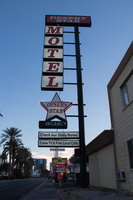
Photographs of Desert Star Motel sign, Las Vegas (Nev.), March 24, 2017
Date
2017-03-24
2017-09-09
Archival Collection
Description
The Desert Star Motel sign sits aglow at 1210 South Las Vegas Boulevard. Information about the sign is available in the Southern Nevada Neon Survey Data Sheet.
Site address: 1210 S Las Vegas Blvd
Sign owner: Desert Star Motel Enterprises
Sign details: The original construction of this motel was in 1961 and has acted as a motel since.
Sign condition: 3, sign is in decent condition. Some portions of it do not light up anymore.
Sign form: Roadside pole sign
Sign-specific description: This sign sits directly on the roadside along Las Vegas Boulevard. The sign consists of a large black pole with many different back lit signs extending toward Las Vegas Boulevard attached to it. Staring from the top of the sign. There is a plastic back lit sign reading "DESERT STAR" in bold white letters against a red background. Under this are individual square signs each containing one letter. Moving down the length of the pole they spell out the word "MOTEL". Each of these letters are red against a white background. Under this series of letters is a star shaped back lit sign reading "DESERT STAR" in bold red text against a white background. This sign is outlined by a neon tube that no longer works. Attached to the bottom points of the star is a rectangular back sign with "VACANCY" painted on it in white. Neon tubes outline the word "NO" as well as "VACANCY." Under this sign is another plastic back lit sign reading "Check Out our Weekly & Daily Rates" in white letters against a red background. Finally, the last portion of this sign is another plastic back lit sign reading "Free Local Calls" in white letters against a red background.
Sign - type of display: Neon and back lit plastic sign
Sign - media: Steel and plastic
Sign - non-neon treatments: Plastic backlit sign
Sign environment: This motel sits very close to the intersection of Las Vegas Boulevard and Charleston. It is a short distance away from the Arts District and Fremont Street. It is a few blocks north of the Stratosphere hotel. A few properties that are close to this motel are the Little White Wedding Chapel as well as many other hostels and motels.
Sign - date of redesign/move: From an earlier photograph, this sign has changed from what appears to might have been their original sign. There is no exact year when the sign changed. The sign that they had in the 60s looks similar to their sign today, but with different colors. The earlier sign had the same "MOTEL" running down the side of the pole, but the letters were black against a yellow background and the pole was white. The star under this was white with forest green letters reading "DESERT STAR." There were three other rectangular signs under this. Each of these had forest green letters against a white background. The sign under the star sign and the "NO VACANCY" attached to that read " TV PHONES." The second sign said "REFRIGERATION." And the third said "AAA HEATED POOL."
Sign - thematic influences: The name "DESERT STAR" could've taken influence from the Space Age. There were plenty of motels that had a star theme or "star" in their name all throughout the city.
Sign - artistic significance: This is a good example of how roadside signs could be simple, yet eye catching to motorists and pedestrians. It does keep in theme with many of the other motel signs throughout the city by sitting directly along the roadside to be noticeable.
Survey - research locations: Assessor's Page, Stephani Drives Las Vegas Website http://stefanidrivesvegas.com/8.html
Survey - research notes: There in not much information on the history of this property.
Surveyor: Emily Fellmer
Survey - date completed: 2017-09-09
Sign keywords: Neon; Plastic; Backlit; Steel; Roadside; Pole sign
Mixed Content
Photographs of ESPN Zone signs, Las Vegas (Nev.), 2002
Date
2002
Archival Collection
Description
Daytime and nighttime views of the ESPN Zone signs on the Strip. Information about the sign is available in the Southern Nevada Neon Survey Data Sheet.
Site name: New York-New York Hotel and Casino (Las Vegas, Nev.)
Site address: 3790 S Las Vegas Blvd
Sign details: Located in New York-New York Casino and Hotel
Sign condition: Structure 5 Surface 5 Lighting 5
Sign form: Pylon; Fascia; Porte-cochère
Sign-specific description: The northern end of the property is dominated by the signage for the ESPN Zone sports lounge, located inside the NY NY. The exterior signage is basically a theatre marquee entrance with a long overhang supporting an electronic message banner that reads from left to right. The majority of the theatre front is polished aluminum with thin tubes of red neon above and below the electronic reader board. Above the top edge of the actual front of the sign is a design of pan channels, crafted and shaped to form a complex background for the logo text spelling "ESPN." A wavy green crafted channel creates what looks like a horizon. The space between the marquee and the green channel is a black field laden with incandescent bulbs. Above the green channel an array of pan channels crafted into interlocking, swaying, pointed shapes. They are painted yellow and orange so the result is a bed of flames. These too are lined in the interior of the contour in red and orange neon. In the center of the entire face of the overhand in a black steel cabinet with the logo for the establishment spelling "ESPN Zone." The First portion of the two-word phrase is spelled in shallow channel letters lined with horizontal bars of white neon. The text is outlined in red neon as well. The second half spells "Zone," and is written in the same font with the "Z" being the largest letter in the sign, designed with the bottom horizontal leg underlining the rest of the letters in the word. The word is outlined with white neon as well. The latter portion is filled with horizontal bars of red neon. Situated along the middle of the sign, and against the vertical plane of the building, a blade sign repeats the design and colors of the bottom portion of the sign. The vertical cabinet is double sided spelling the "ESPN Zone" logo vertically with the same neon treatments for the respective words. The three toned background of black, green, red and orange on the bottom of the sign is interpreted on the blade. Running vertically, the black portion laden with bulbs runs against the wall, with the wavy channel next to that, disappearing temporarily behind the letters. The flames hang off of the outer edge of the sign. All of the neon treatments are seen here as well. Crowning the top of the blade sign two circular cabinets are arranged touching each other at one end, the faces pointing out to angled directions. Here the ESPN logo is arranged inside a circle. The bottom half below the letters is filled with horizontal bars of green neon, while the flames are present on the top half. The same cabinets can be seen mounted on the ends of the bottom overhang.
Sign - type of display: Neon; Incandescent; Backlit
Sign - media: Steel; Plastic
Sign - non-neon treatments: Graphics
Sign animation: Notes: The letters in the vertical blade portion of the ESPN Zone illuminate one at a time, starting from the top. Once the entire phrase is lit, in flashes off then on then off, before restating. The orange and red neon tubing which resides inside the pan channels that represent flames flash on and off in a relaxed manner as if to animate the flickering of the flames. The small incandescent bulbs on the black portions above the main matrix reader board flash on and off subtly.
Surveyor: Joshua Cannaday
Survey - date completed: 2002
Sign keywords: Chasing; Flashing; Oscillating; Pylon; Fascia; Porte-cochère; Neon; Incandescent; Backlit; Steel; Plastic; Graphics
Mixed Content
Alpha Kappa Alpha Sorority, Theta Theta Omega Chapter graduate advisor's reports
Date
2003-01
2003-02
2003-05-10
2003-06-07
2003-06-28
2003-09-06
2003-10-04
Archival Collection
Description
From the Alpha Kappa Alpha Sorority, Incorporated, Theta Theta Omega Chapter Records (MS-01014) -- Chapter records file.
Text