Search Results

Photographs of Mirage signs, Las Vegas (Nev.), 2002
Date
2002
2017-08-15
Archival Collection
Description
Photos show Mirage signs during the daytime. Two surveys were conducted to gather information about this sign. One was conducted in 2002 and one was conducted in 2017. PDFs are available for both surveys. See the 2017 survey PDF for additional information that is not included in the object description.
Site name: Mirage (Las Vegas, Nev.)
Site address: 3400 S Las Vegas Blvd
Sign owner: MGM Mirage
Sign details: The main attraction of the property is its spectacular exploding volcano placed among an astounding array of lagoons, waterfalls and palm trees. One of the themed hotel casinos, the architectural form takes precedence over an abundance of flashing lights and neon. Two pylon signs reside on the front of the property along Las Vegas Blvd, another on the west side of the property, two arched banner entrances are placed among them, lettering atop the towers, and various text placed among the vast stretch of landscaping are the only visible large elements of signage.
Sign condition: Structure 5 Surface 5 Lighting 5 The structure and lighting on the signs are in excellent repair, with no apparent major physical damage. The surfaces of the pylons and assorted log text, are a bit dirty, but no more than any other establishment, considering the punishment each must undergo due to the elements as well as the live volcano.
Sign form: Pylon; Fascia; Porte-cochère
Sign-specific description: Just north of Caesars Palace a giant pylon sign faces north/south, on the east side of the strip. Two giant square posts support a giant backlit advertisement panel, and an adorning entablature containing the channel letters spelling "Mirage." Between the two giant legs two cabinets are present to fill the space. Just below the main backlit panel an LED screen resides just above another back lit panel. The two giant legs have a series of polished metallic panels running vertically up the sides, creating a recessed channel. The sections are separated with slight overhangs. The bottom smaller panel cabinet is an advertisement for "Danny Gans" and the main panel advertises for the "Seigfried and Roy" magic show. A small banner rests between the main entablature, and the panel, reading "Magicians of the Century." The black channel letters in the main pediment spells "The Mirage," and are filled with incandescent bulbs. The lush foliage and walkways continue north where a covered awning faced with a carved wood and brass bullnose, allows pedestrians to take a moving walkway up to the resort. The landscaping continues north where it meets a driveway denoted by a low arched banner supported by a pair of square columns on either end. "The Mirage" is spelled in polished gold channel letters, with white interiors and filled with incandescent bulbs. The banner itself is sculpted into two sweeping solid shapes on the tops and bottoms, with a series of folded ribbon like scroll shapes. The center section is crafted as to allow light to pass through the negative spaces created by the rows of positive scroll shapes. The banners face east. On the faces of each of the flanking posts, two images of jumping dolphins are sculpted and finished in the same fashion. Past the gateway the thick beds of foliage and palm trees can be seen headed back along the drives. Continuing north a multi tiered lagoon rushes circulating water on and over waterfalls, while yet more green shrubbery and palm trees encrust islands and images of eroded rocks and geological formations. The beautiful imagery continues north, twisting and turning in and behind itself to create a fantastic spectacle for a passerby to be lured in and be fascinated. Approximately in the middle of the length of the expanse, the famous functioning volcano rests quietly amongst smaller rocks and waterfalls. Just past the volcano the lagoon opens up into a wide flat area of water where bronze dolphins are positioned to look as if they are jumping out of the water. Still the rich foliage dominates the landscape, until another arched gateway interrupts the expanse to allow traffic. The foliage, and lagoon landscaping, picks up again, cozily grasping the base of a smaller pylon of similar design as the first. The two reflective paneled legs rise up to connect with a horizontal piece of the same design. A large backlit cabinet advertising for Danny Gans occupies approximately three-quarters of the space between the legs. An entablature of the same design as the main pylon, yet smaller, crowns the top of the sign. The trademark font spells "The Mirage" in black channel letters and filled with incandescent bulbs. Just past the small double sided pylon, a small of recess of rocks plays home to the end marker of the Mirage. A bust of Siegfried and Roy with a tiger is ambiently lit, provided photo opportunities for tourists. An interesting function has been added to the bust. In the flower bed behind and on the sides of the object, faux boulders are places with glowing crystals protruding from the surface. The tower of rooms for the Mirage is the popular three winged "Y" configuration converging onto a center structure. On each face of each wing, giant black channel letters spell "The Mirage" in their trademark text. Each is filled with incandescent bulbs.
Sign - type of display: Neon; Incandescent; Backlit
Sign - media: Steel; Plastic
Sign animation: Oscillating
Notes: The incandescent bulbs located within text logos on the pylon sign, and upon the tower oscillate to appear as shimmering. The effect is one of the more common animations particularly among the larger, corporate casinos.
Sign environment: The placement of the Mirage right on the curve of the Strip makes the pylons visible from a good distance from either direction. The environment displayed by the mirage is that of paradise. When walking past, and up to the property, it hard not to stop and stare at the amazing foliage and spread of waterfalls, and rocks.
Sign manufacturer: Ad-Art
Sign designer: Pylons: Charles Barnard with touches from Wynn's design group Atlandia Design Group. Dolphin Archways: Barnard and Jack Dubois as well as hotel architect, Joel Bergman
Sign - date of installation: 1989
Sign - date of redesign/move: The main pylon has since been updated with a new Siegfried and Roy Back lit Mural, a new LED screen, and another back lit plastic screen featuring Danny Gans. An internally lit banner reads horizontally across the top of the giant Siegfried and Roy Mural which reads Magicians of the Century.
Sign - thematic influences: The theme is tropical island paradise. Complete with active volcano, the front spectacle of rushing waterfalls, chirping bird noises, and leaping bronze dolphins, serves as the backdrop for the simple, slim design of the property's pylon structure. The pylons were designed to reach harmony with the structure of the tower itself, rather than the island theme. The dolphins over the entrance arches however represent the tropical island theme, as well as speaking about the dolphin habitat inside.
Sign - artistic significance: The main pylon was the first of its kind to feature a full color illuminated photographic pictoral. Designed by Rosco, it was billed as the largest of its type in the world. The resort's themed spectacular was also the first of it's kind in regards to its extravagance and unique functionality. Approximate 125,000 people visited the property on its opening day. The resort fits well into the theme of design of the large, corporate property, after all it was one of the pioneers of such a movement in Las Vegas. The Mirage also set the standards for the now frequently seen element of the attraction spectacle, and the standard of quality on the Las Vegas Strip
Surveyor: Joshua Cannaday
Survey - date completed: 2002
Sign keywords: Oscillating; Pylon; Fascia; Porte-cochère; Neon; Incandescent; Backlit; Steel; Plastic
Mixed Content

Photographs of White Sands Motel signs, Las Vegas (Nev.), 2002
Date
2002
Archival Collection
Description
Daytime views of the White Sands Motel signs on the Strip. Information about the sign is available in the Southern Nevada Neon Survey Data Sheet.
Site address: 3889 S Las Vegas Blvd
Sign details: Just south of the Tropicana Hotel Casino, the white Sands Motel begins the stretch of decaying properties that comprise the south end of the strip. In the parking lot outside a small low rise office, and rows of rooms the distinct pylon sign for the White Sands Motel faces north/south.
Sign form: Pylon
Sign-specific description: Two legs, in the shape of an "A" with a pole running up through the center, support a black, internally lit message center. The face of the cabinet is two sectioned with a larger portion sitting below a smaller section. The smaller top section has neither a face nor a backing. The interior parts lie exposed to the elements revealing the internal workings. Growing out of the center of the cabinet, tall thin internally lit rectangular cabinet runs into the sky approximately fifteen feet. The cabinet is designated into twelve sections by steel borders. Plastic red letters, reside inside this row of panels, horizontally spelling "White Sands" in all capital letters, with one space between the two words and one below the last word. At the very peak of the sign, a triangular shape, with a rounded top, appears to be back lit also. A smaller section sits on top of this as well. The tall cabinet, the peak, and the top antenna, are lined on the edges with raceways and incandescent bulbs. The resultant effect all of the pieces together is an image of a rocket or missile. Next to the drive on the streets edge, a small red, internally lit, message center faces north /south. The white flexible plastic face is treated with red text, and a logo for the establishment. Across the top of the cabinet "Entrance" is spelled and "Motel" across the bottom. The White sands logo is a red half circular shape with a white silhouette of palm trees, and "White Sands" across the top edge of the half circle.
Sign - type of display: Neon; Incandescent; Backlit
Sign - media: Steel; Plastic
Sign - non-neon treatments: Graphics; Paint
Sign animation: Chasing, flashing, oscillating
Notes: The text, which resides on the southern wall and reads "Casino," is filled with incandescent bulbs that all illuminate at the same time, and oscillate. They then shut off at the same time, and then repeat. The raceways of incandescent bulbs chase each other while the neon, which surrounds the back lit, plastic, screens on this wall flash on then off. The bottom two raceways sandwiching the reflective panel chase from left to right, while the remainder of the raceways surrounding the signs, run right to left. The incandescent bulbs on the pylon chase each other gracefully up the length of the pylon. The animation is patterned so as to appear as if a section of several bulbs are pulsing its way up the towers, hugging the edge of the bulbous tops. The raceways continue around the east face of the building. The umbrellas in the plaza behind the pylon, also are animated with incandescent bulbs chasing each other downward along the raceways.
Surveyor: Joshua Cannaday
Survey - date completed: 2002
Sign keywords: Chasing; Flashing; Oscillating; Pylon; Neon; Incandescent; Backlit; Steel; Plastic; Paint; Graphics
Mixed Content

Neonopolis Neon Survey document, September 8, 2017
Date
2017-09-08
Archival Collection
Description
Information about the Neonopolis sign that sits at 450 Fremont St.
Site address: 450 Fremont St
Sign owner: Rohit Joshi leases the building from Wirrulla USA Inc.
Sign details: This building was originally constructed in 2001 as a retail store center. This location currently holds a Denny's, a vintage toy store, the Telemundo station office and an international food market. This location also held a movie theater until 2009.
Sign condition: 4.5- Sign still in relatively new looking condition
Sign form: Entrance sign
Sign-specific description: Above the main entrance way into the mall there are the letter "NEONOPOLIS" in plastic back lit signs. Each letter has a lime green border with white strip and then purple for the main color of the block letters. The letter "O" in "polis" is actually an orbit shape that is orange and purple to double as the "O". Portions of the building have neon tubes, some illuminating blue and others are purple, green, red and yellow. There are also different colored shapes of neon spread throughout the building such as yellow triangle as well as orbits showcasing red and yellow neon tubing. Many of the companies in this location have their own signs as well.
Sign - type of display: Plastic back lit sign and neon
Sign - media: Plastic and steel
Sign - non-neon treatments: Plastic back lit portion
Sign environment: This property is on Fremont in between 4th St. and Las Vegas Blvd. Right in front on the building is the Slotzilla machine where people get onto the zipline.
Sign - date of installation: 2002
Sign - date of redesign/move: When the movie theater portion of this location closed in 2009 part of the signage was taken down and in recent years with different companies settling in there have added their own signs.
Sign - thematic influences: The name and the theme of this location being neonopolis showcases the downtown neon vibe particularly since there is a wide variety of neon display surrounding this property.
Sign - artistic significance: Showcasing the different designs with neon shows how true of an art it still is, particularly with the triangle designs and the orbits
Survey - research locations: Asessors page, https://neonjoshiassociate.wixsite.com/mysite-1 Neonopolis website, https://www.reviewjournal.com/entertainment/food/neonopolis-theaters-to-go-dark-thursday-night/ Review Journal article discussing the closure of their movie theater, https://lasvegassun.com/news/2002/may/03/long-awaited-neonopolis-opens-in-downtown-vegas/ Las Vegas Sun article talking about their opening in 2002
Survey - research notes: There used to be an 18 theater movie theater located there which shut down in 2009 and was renovated into clubs, the most recent one to open is called the Nerd.
Surveyor: Emily Fellmer
Survey - date completed: 2017-09-08
Sign keywords: Plastic; Backlit; Neon; Steel; Fascia
Text
Ponderosa Motel (American Inn Motel) Neon Survey document, September 16, 2017
Date
2017-09-16
Archival Collection
Description
Information about the Ponderosa Motel (American Inn Motel) sign that sits at 3325 Fremont St.
Site address: 3325 Fremont St
Sign owner: American Inn Motel LLC
Sign details: This location has been around since 1968, but mid-2016 it was renovated from the Ponderosa Inn Motel to the American Inn Motel but they use the same sign that was slightly redesigned for their use.
Sign condition: 5- very good condition and shines brightly at night
Sign form: Pylon
Sign-specific description: This pylon sign has a red steel beam base that has a reader board on the bottom portion of the sign. Above the reader board spells out "MOTEL" vertically in white Frontier font letters, with each letter in its own red square. Each letter of this is outlined in red skeletal neon. Above this is a rectangular plastic back lit sign (used to say Ponderosa on it) that now currently has the American Inn logo in it with white letters but a red and blue background. The whole sign is outlined in chasing incandescent light bulbs.
Sign - type of display: Neon, incandescent and plastic back lit sign
Sign - media: Steel and plastic
Sign - non-neon treatments: Plastic back lit portion
Sign animation: Incandescent light bulbs chasing all around the sign.
Sign environment: This property is very east on Fremont in between St. Louis street and Sahara. There are also many other motels and apartments surrounding this property. This motel is right next door to the Lucky Cuss Motel (their old sign is now one of the restored signs in the Las Vegas Signs project showcases on Las Vegas Blvd.).
Sign - date of installation: Has been up since around 2011
Sign - date of redesign/move: 2016 the plastic portion of the sign was swapped out from the Ponderosa motel sign and the American Inn sign that is currently there now.
Sign - thematic influences: The big MOTEL portion of this sign was very prominent on motel signs in the 50's/60's, such as the La Concha and Tam O' Shanter Motel signs.
Sign - artistic significance: Font was an old west Frontier font which was prominently popular in Las Vegas in the 1940's but has been recreated many times throughout Vegas history.
Survey - research locations: Booking.com website has information on the American Inn Motel https://www.booking.com/hotel/us/ponderosa-motel-las-vegas.html , google map sattelite view, Asessor's page
Survey - research notes: When trying to search Ponderosa Motel on google is when it was discovered that it has switched over to the American Inn motel, but google maps helped with dating when the switch occurred.
Surveyor: Emily Fellmer
Survey - date completed: 2017-09-16
Sign keywords: Neon; Incandescent; Plastic; Backlit; Steel; Chasing; Pole sign; Reader board
Text

Photographs of Ginseng BBQ signs, Las Vegas (Nev.), 2002
Date
2002
Archival Collection
Description
Daytime views of the Ginseng BBQ signs on the Strip. Information about the sign is available in the Southern Nevada Neon Survey Data Sheet.
Site address: 3765 S Las Vegas Blvd
Sign details: Down the driveway created between the Fatburger and Walgreen's structure is a slightly larger lot, which is home to the Ginseng BBQ establishment. The signage is a gateway, banner structure which leads to this slightly larger lot. It is visible standing directly in front of the Fatburger sign, looking east down the alley.
Sign condition: Structure 3 Surface 3 Lighting 3
Sign form: Pylon
Sign-specific description: Attached to the section of the Fatburger building which houses the entrance to the Alan Albert's, and stretches across to the building which houses Walgreen's is a sign which is comprised of a horizontal overhead structure of steel beams, forming a lattice work or skeleton of an entrance. The top and bottom edges are white raceways with incandescent bulbs. Placed awkwardly along the bottom portion of the skeleton is a border of gold polished raceways with incandescent bulbs. There is no backing to the border, so it is simply an edge and nothing more inside this border consisting of the structure of the sign. The top and bottom edges of the structure are lined with incandescent bulbs. "Ginseng BBQ" is spelled in gold channel letters painted white on the inside, with red neon in the interior. The letters are all caps and centered inside the border. The sign faces west. The actual establishment is further east. through the gateway where a slightly larger lot is located, on the north face of the Walgreens side of the complex.
Sign - type of display: Neon; Incandescent
Sign - media: Steel
Sign animation: Chasing, flashing, oscillating
Notes: The text, which resides on the southern wall and reads "Casino," is filled with incandescent bulbs that all illuminate at the same time, and oscillate. They then shut off at the same time, and then repeat. The raceways of incandescent bulbs chase each other while the neon, which surrounds the back lit, plastic, screens on this wall flash on then off. The bottom two raceways sandwiching the reflective panel chase from left to right, while the remainder of the raceways surrounding the signs, run right to left. The incandescent bulbs on the pylon chase each other gracefully up the length of the pylon. The animation is patterned so as to appear as if a section of several bulbs are pulsing its way up the towers, hugging the edge of the bulbous tops. The raceways continue around the east face of the building. The umbrellas in the plaza behind the pylon, also are animated with incandescent bulbs chasing each other downward along the raceways.
Sign environment: The environment which the Ginseng BBQ's establishment shares is dictated by its neighbors of Walgreen's and Fatburger. The small enclosure of a lot, which is in front of the store, follows after passing underneath the main logo text banner for the restaurant. It is hidden among the various neighboring businesses, being protected by the larger structure in front of it.
Sign manufacturer: Vision Sign
Sign - thematic influences: No real theme surrounds the signage other than it appears that it was pieced together from various other pieces of signage. The white, steel skeleton appears as if it was there previously, and the Ginseng sign was attached later. The theme that it does fit into is the small eateries which pop up among the strip malls and small shopping centers along the strip. It is also one of two different Ginseng BBQ establishment.
Surveyor: Joshua Cannaday
Survey - date completed: 2002
Sign keywords: Chasing; Pylon; Neon; Incandescent; Steel
Mixed Content
Photographs of Las Vegas World Souvenirs signs, Las Vegas (Nev.), 2002
Date
2002
Archival Collection
Description
Daytime and nighttime views of the Las Vegas World Souvenirs signs on the Strip. Information about the sign is available in the Southern Nevada Neon Survey Data Sheet.
Site address: 3710 S Las Vegas Blvd
Sign owner: property leased from MGM Mirage
Sign details: Located in the same lowrise building which the Las Vegas Helicopter Tours is located. See Las Vegas Helicopter Tours.
Sign condition: Structure 5 Surface 5 Lighting 5 All of the lighting, surface, and structure seem to be intact, and in good repair. The signage appears fairly new, and less worn.
Sign form: Fascia
Sign-specific description: The Las Vegas World Souvenir shop and market, boasts a collection of signage, almost completely crafted out of channel letters. The basic design is an entablature created on the wall above a pedestrian's head. The entablature runs along the south, east, and north faces of the building. The design is essentially channel letter words separated by channel designed stars. On the south wall the sequence reads, "star shape, 'drinks,' star, 'souvenirs,' star then 'market'." The interior of the star shapes are lined along the contours with yellow neon. The all caps lettering has red neon tubing on the interior. The sequence on the east side of the building reads from left to right, " star shape, 'Souvenirs,' star shape, 'Las Vegas World,' star shape, 'drinks,' then another star shape." The words "souvenir" and "drinks" are spelled in the same text and size as the south side, while the phrase "Las Vegas World" is larger fulfilling most of the height of the entablature. The north side of the building is similar to that on the south. This side reads , "Souvenirs, star shape, 'Market,' star shape, 'Film,' and another star shape." On the wall below the pediment closed face channel letters spell two phrases. The black channel letters are faced with red translucent faces. The first phrase reads , "Daily Grand Canyon Flights," in all caps. The second reads "Nightly strip rides in all capitals.
Sign - type of display: Neon; Incandescent
Sign - media: Steel; Plastic
Sign animation: Chasing
Sign manufacturer: Sign Systems, Inc
Sign - date of installation: 1996
Sign - thematic influences: There is no real present theme evident in the appearance other than the Emblem of the American flag crafted in neon on the front of the building. The incandescent bulb lined raceways and bulb filled channel letters, placed within a pediment hanging above the pedestrians head, posses a theme in a sense. It is a common occurrence to see such a combination of lighting among the strip to designate an establishment so its theme cold be considered to be that of Las Vegas. It's artistic significance can only be linked to such a trait. It is one of the most unique properties considering its function. Yes there are many facilities which offer tours but, this is the only one which provides helicopter tours that the pedestrian may watch take off. It is also one of the only establishments where the American flag is represented on the exterior in neon. It is also one of the only establishments where the incandescent bulb lined raceway is shaped into arrows. An interesting use of the most common adornment of exterior surveyed signage.
Surveyor: Joshua Cannaday
Survey - date completed: 2002
Sign keywords: Chasing; Fascia; Neon; Incandescent; Steel; Plastic
Mixed Content
Photographs of Stateside Lounge sign, Las Vegas (Nev.), March 3, 2017
Date
2017-03-03
2017-09-10
Archival Collection
Description
The Stateside Lounge sign sits at 931 North Las Vegas Boulevard. Information about the sign is available in the Southern Nevada Neon Survey Data Sheet.
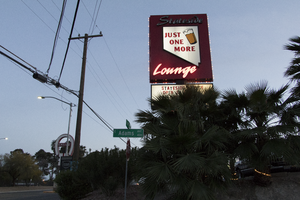
Site address: 931 N Las Vegas Blvd
Sign owner: Laura and Doris Atchinson
Sign details: This bar opened up in 1996. They aim to be a place for people to have a cold drink and great food. It is a very popular hangout stop for baseball fans since it is within walking distance to Cashman Field. They are also known for their karaoke nights.
Sign condition: 4, the sign is still in pretty good condition. It just looks worn from weather and time.
Sign form: Roadside pole with a message center
Sign-specific description: This pole sign sits along Las Vegas Boulevard and is extremely visible for motorist and pedestrians. A black rectangular pole supports the two portions that make up this sign. The top portion is a wide rectangular shape and both sides of the sign have the same design on them. Each side has a red background with the word "Stateside" in white script open cabinet letters along the top of it. Under this is a plastic backlit sign in the shape of the state of Nevada. The words "JUST ONE MORE" in bold red text are in the in the middle of the Nevada sign as well as an illustration of a foamy glass of beer. Under this is the word "Lounge" in white script open cabinet letters. Surrounding the outside of this sign is a line of incandescent light bulbs that chase. Under this sign is a fairly large backlit message board.
Sign - type of display: Neon, backlit, incandescent
Sign - media: Steel and Plastic
Sign - non-neon treatments: Paint
Sign animation: Chasing
Notes: incandescent light bulbs
Sign environment: This bar sits very close to Cashman Field and is just north of the Cultural Corridor. It is down the street from the Las Vegas Library, the Las Vegas Natural History Museum, and the Neon Museum. It is also just down the road from Fremont Street.
Sign - thematic influences: Since the bar is called "Stateside Lounge," featuring the state of Nevada emphasizes the theme of the bar. Also, the illustration of the beer and the "Just One More" on the sign articulate that the property is a bar.
Sign - artistic significance: This sign is fairly minimal, but has a few striking details that make it unique compared to other bars throughout the city. Featuring the shape of the state of Nevada lets people know that this sign is a nod to the bar's home state. Also, the "Just One More" text in the center of the Nevada shape as well as the illustration of the beer make the property seem very welcoming and like somewhere you wound wants to spend time at.
Survey - research locations: Assessor's website
Survey - research notes: There is no specific date of any redesign; however, in earlier photographs the sign was originally blue with a red pole instead of being red with a black pole.
Survey - other remarks: https://www.reviewjournal.com/sports/sports-columns/ron- kantowski/51s-fans- dont-feel- likealiens-at- stateside-lounge/ https://www.yelp.com/biz/stateside-lounge- las-vegas
Surveyor: Lauren Vaccaro
Survey - date completed: 2017-09-10
Sign keywords: Neon; Incandescent; Backlit; Steel; Plastic; Paint; Chasing; Roadside; Pole sign
Mixed Content
Photograph of Le Thai sign, Las Vegas (Nev.), April 10, 2016
Date
2016-04-10 to 2017-08-15
Archival Collection
Description
The sign for Le Thai restaurant sits at 523 Fremont Street in Downtown Las Vegas. Information about the sign is available in the Southern Nevada Neon Survey Data Sheet.
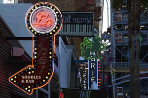
Site address: 523 Fremont St
Sign owner: Dan and Shauna Coughlin, Dan doubles as the chef as well
Sign details: The buildings original construction year was 1934. The restaurant opened in November of 2011, Le Thai offers a famous Three curry made by Chef Dan Coughlin as well as other traditional Thai food inspired by Dans grandma and mom from Thailand. They also have a beer garden behind their main restaurant. Dan was the owner to Mix zone cafe and is the son of the owner of the King and I (Nikki Bujadham). This building has a tin facade with a pull out canopy for outdoor seating.
Sign condition: 5- looks very new and in amazing condition
Sign form: Blade
Sign-specific description: The blade is mainly made of plastic that is backlit at night time, but has a dark steel border. At the top of the sign is a circle that has Le written in black cursive on the sign, and illuminates red neon at night. Also on this circle portion of the sign it states Downtown Las Vegas in a smaller print type font. This circle is outlined in incandescents, as well as the incandescents being surrounded by red neon. Below the circle there is a red curved arrow that states Thai in black letters that have a white trim, this font looks italicized and has little circles on a part of each of the letters, this makes it a very distinct font for them specifically. Underneath the Words Thai, the sign states Noodles & Bar in a regular white block type font.
Sign - type of display: Incandescent light bulbs and neon
Sign - media: Plastic and Steel
Sign - non-neon treatments: Graphics on plastic portion of the sign are backlit
Sign animation: Chasing:
Notes: incandescent light bulbs
Sign environment: In the East side of Fremont Street, located in between Las Vegas Blvd and 6th street. To the west of the property is the Dont Tell Mama Bar and to the east is Commonwealth. Currently across the street is the Therapy restaurant and the old Emergency Arts building.
Sign manufacturer: YESCO
Sign designer: Owners Shauna and Dan
Sign - date of installation: 2012
Sign - thematic influences: The font that they use for Le and Thai are quite different but it shows the blend of how their restaurant is and does make it more distinguishable since their font draws the attention of people walking by.
Sign - artistic significance: With the usage of both Neon and incandescent the sign really does pop out which is a similar trend to many signs over the age, particularly since there is a lot of pedestrian traffic in the region. The arrow is a great direction indicator, as well as it showcases the 1950s blade sign trend with the arrow at the bottom.
Survey - research locations: Le Thai restaurant website https://lethaivegas.com/, Assessor's page, and contact with Le Thai LLC
Survey - research notes: The assessor's page said the buildings original construction year was 1934 though there was no record of what it originally opened up as.
Surveyor: Emily Fellmer
Survey - date completed: 2017-08-15
Sign keywords: Graphics; Plastic; Backlit; Steel; Blade; Chasing; Incandescent; Neon; Back to back
Mixed Content