Search Results

Dr. Syed Saquib oral history interview: transcript
Date
Archival Collection
Description
Oral history interview with Dr. Syed Saquib conducted by Barbara Tabach on February 23, 2018 for the Remembering 1 October Oral History Project. In this interview, doctor Syed Saquib discusses the University Medical Center's (UMC) role during the night of the October 2017 mass shooting in Las Vegas, Nevada. He speaks about the hospital's level of preparation and the procedures in place that allowed for an effective and controlled system to treat the survivors. Saquib talks about the group effort that was required to care for all of the patients in an efficient manner. In addition to that night, he also discusses his move to Las Vegas in 2016 and the sense of community he has developed.
Text

Transcript of interview with Joe M. Wilcock by Claytee White, April 17, 18, & 30, 2014
Date
Archival Collection
Description
Chef and longtime gaming executive Joseph “Joe” Wilcock was born in Detroit and raised by his mother, Ruby, and stepfather, Ross Johnson, in Sarasota, Florida; Gary, Indiana; and Harlan, Kentucky. After he graduated from high school in Gary he moved to Chicago to attend Washburne Culinary Institute. While attending Washburne Joe worked at Chicago’s Drake Hotel and lived at the Sears YMCA. After earning his certificate from Washburne, Joe worked at the newly opened Holiday Inn in Chicago, the Sea View hotel in Bal Harbour, Florida, and a resort at Blowing Rock, North Carolina. At Blowing Rock he heard about the new School of Hotel Management at UNLV and in August 1969 23-year-old Joe headed for Las Vegas with $400 in his pocket. Las Vegas was a disappointment. Joe could not get a job as a chef without first joining Culinary Workers Union Local 226-which he could not afford to do. Also, because he ran a poker game and cooked at the Chuck Wagon Diner during high school his high school grade point average was roughly a C-, which hindered his admittance into the School of Hotel Management. Undaunted, Joe found a job bussing tables at the Frontier Hotel and joined the Culinary Union so he could work as a chef. He also took three classes at UNLV that semester, earned an A in each, and was admitted to the School of Hotel Management. While at UNLV he affiliated with Sigma Chi fraternity. In his career Joe has worked in all facets of the gaming industry in such Las Vegas properties as the Flamingo Capri, the Frontier, Caesars Palace, the Tropicana, the Dunes, the Golden Nugget, the Mirage, Treasure Island, the Sands, MGM, and the Downtown Grand. He learned the business from the ground up. He also worked at Caesars Tahoe and at different times owned and operated a sandwich shop and a bar. Joe married his wife, Linda, 38 years ago in Las Vegas, in 1976. He is currently employed as a casino shift manager at the Downtown Grand hotel and is affiliated with the House Corporation of Sigma Chi Alumni, UNLV Rebel Golf, the Las Vegas Natural History Museum, and Candlelighters Childhood Cancer Foundation of Nevada.
Text
Transcript of interview with Jackie MacFarlane by Claytee White, February 4, 2010
Date
Archival Collection
Description
Jacqueline "Jackie" Tilman MacFarlane was born in her grandmother's Las Vegas home at H Street and Clark Ave. Her father John Franklin Tilman was a construction worker at Boulder Dam (now Hoover) in early 1930s. Jackie recalls her family having to move several times the Great Depression and living in rural Nevada. Eventually the family came back to reside in Las Vegas. After graduating from high school, she took a waitress job at the Spot Cafe (Main & Charleston) and then at the Askew Drive-In. It was there that she met her future husband, David MacFarlane, an Air Force cadet. David continued to work at Nellis Air force Base as a civilian until he retired in 1987. Jackie describes raising her children in Fair Circle neighborhood during the 1950s and 1960s; a time when Las Vegas was just a "small town of 50,000." She felt safe and always found work in the casinos. Her work career included being a change girl at the Mint of Fremont St. and working as the front office cashier at the Desert Inn and then working at the Sands Hotel and Casino. Eventually she became a night auditor at Sands Hotel and Casino and then at Sahara Hotel and Casino from 1970-1977. She remembers working nightshift, coming home to get the kids and husband off to school and work. After leaving Sahara, she began selling Vanda cosmetics as a home business, something she still does today.
Text

Benilda Long Somes oral history interview: transcript
Date
Archival Collection
Description
Oral history interview with Benilda Long Somes conducted by Vincent Long on November 29, 2021 for Reflections: The Las Vegas Asian American and Pacific Islander Oral History Project. Benilda discusses her life in Magalang, Philippines and her immigration to Saipan, part of the Northern Mariana Islands, as a young woman. She talks about meeting her partner, airman Robert Long, the birth of their son, and Robert's untimely death in an air crash less than a year later. Benilda shares how she and her child immigrated to the United States to be with family and their move to Las Vegas, Nevada in 2009.
Text
Photographs of New York New York signs, Las Vegas (Nev.), 2002
Date
Archival Collection
Description
Site name: New York-New York Hotel and Casino (Las Vegas, Nev.)
Site address: 3790 S Las Vegas Blvd
Sign owner: MGM Mirage
Sign details: Occupying the northwest corner of Las Vegas Blvd and Tropicana Ave. is the New York New York Hotel and Casino. The property is a miniature representation of New York City in a collection of colorful architecture and sculpture. Colored reflective panels create the facades of high rises and skyscrapers. An almost cartoon like element is brought to the structures, flowing seamlessly sometimes throughout a surreal landscape of classical architectural elements and mock high rises. Distinguishable landmarks, such as the Empire State Building, the Statue of Liberty, and the Brooklyn Bridge, can be recognized with ease. A lagoon of water represents a harbor shooting water out of fountains disguised as boats.
Sign condition: Structure 5 Surface 5 Lighting 5
Sign form: Pylon; Fascia; Porte-cochère
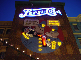
Sign-specific description: The porte cochere is located on the south side of the property facing Tropicana Ave. The design cantilevers off of the main structure to the north, and then is supported by two columns on its far end. The three exposed sides hold the radiating crown of the New York New York logo sign. The two on the east and west sides are smaller than the one on the south side, but are essentially the same design. A half circle cabinet holds the text New York New York stacked in two lines. The channel letters are polished metal on the outside with incandescent bulbs on the interior. Their faces are bordered with red neon. The text is positioned on the front of the half circle cabinet. Breaking the surface of the radius edge, elongated triangular pan channels create a repeating pattern. The result is a crown of points running all across the top of the cabinet. It is reminiscent of the crown on the statue of liberty, or the rays of the rising sun. The face of the cabinet is painted blue, with metallic raceways, filling the negative spaces with more triangular shapes. The triangular pans are painted yellow on the interior with a blue finish on the exterior. The exterior width of the cabinet is also finished in a golden reflective surface. Three tubes of neon fashioned into succeedingly smaller triangles are inside each surface. The color scheme of the neon is yellow being the outer, orange being the second, and the center being red. The sign on the south side is designed the same, except being quite a bit larger, and the crowns of the cabinet angle forward instead of straight up in the air. All the edges are bordered with incandescent bulbs. The bottom edge below the signage, actually underlining the signage significantly, is a gold polished double bull nose that wraps the entire length of each side. The surface is strewn with small incandescent bulbs. An entablature runs above the bull nose, filling the spaces between the sign. The pediment is bordered on the top and the bottom with gold polished raceways and incandescent bulbs. Two mirrored posts support the southern end. The ceiling of the porte cochere is treated much the same as the logo signage on the three sides of the roof. Long pan channels are placed on the ceilings and shaped to look like waving banners, confetti, and beams, radiate out of a centerpiece positioned over the entrance to the casino. Red pans are painted orange on the interiors and green channels are painted blue on the interior. Tubes of neon are bent to the contours of the shapes of each one of these channels. The entire composition is a brilliant abstract pattern of light and colored steel shooting out toward Tropicana Ave. Headed east toward the northwest corner a bridge connects the Excalibur property to the New York New York. At the end of a bridge an entrance into the NY NY is below a LED message center and an arched logo cabinet, with the text and the radiating triangular channels. It is actually the same neon and color scheme, just fit to sit over the LCD display. The sign faces south. The sign has the distinct backdrop of a domed rotunda lined with columns. Rounding the corner another elevated bridge stretches east over the strip to the MGM property. The same configuration of the arched signage, along with the illuminated text, and LCD display screen is on the east side of the building. The corner facade of the harbor is flanked by these two collections of signs and walkways. Around the corner, the property extends north up Las Vegas Blvd continuing the facade of fake apartment buildings, with storefront windows at ground level. Here the replica of the Brooklyn Bridge serves as the main concourse of pedestrian activity. There are two sections of sign that are of particular interest to the eastern face of the building. The first is an advertisement for Panasonic. Panasonic is spelled in silver channel letters with blue fronts. The blocky font is internally lit. The entire text sits along the top edge of a matching message center. Further north on the face of the building, a section of building, finished in brick, combine graphics and three-dimensional elements for a sign for Pepsi. Toward the top of the face a logo/wall sign is crafted out of channel letters and filled with incandescent bulbs and bordered with blue neon. The entire text reads "Pepsi: Cola" The capital "P" and "C" are crafted out of one cursive style channel. The remaining letters are spelled in separate channel letters. The channel letters are stylized in a fashion reminiscent of the turn if the century. The colon placed between the "I" in Pepsi and the "C" in cola is also made out of channel boxes. Below the logo, a mural is painted on the majority of the remaining open space on the surface. Two police officers, in the style of early cartoons from the first few decades of the twentieth century, are the focus of the mural and are reminiscent of the famed "keystone" cops. The two figures are shown from about waist up in a circle, which is broken at the top by the white painted thought bubbles, bordered in black. The thought bubble on the left reads "bigger bottle" and the opposite reads, "better flavor". The two police officers correspond the appropriate thought bubble, with the one on the left being the larger figure, and the one on the right being smaller and apparently older. They are treated with blue paint, with their stripes, buttons and badges, treated in yellow paint. The skin tones are treated with proper hues, with facial features distinguished by black contour lines. The three-dimensional aspects come into play when describing their action. The officer on the left is pouring a bottle of the cola into the glass, which the other officer is holding. The one hand each officer is showing is a three-dimensional, fiberglass, white, cartoon, gloves. The one on the left is integrated into the tilted bottle. The bottle is coming off of the wall in a sculpted two-dimensional cabinet. The bottle is treated with the red white and blue Pepsi label, and reminiscent of the logo channel text. The tilted bottle points down toward a glass that the other officer holds. The glass is also a sculpted cabinet treated with paint on the surface, as well as the bottle, to appear as glass, utilizing highlights. Neon for the mural is cleverly designed to accent the mural and compliment the design. The text in the thought bubbles is overlaid with yellow neon, which animates back and forth to suggest an interaction of talking to each other. One half will illuminate, then the other as the first darkens. The yellow painted buttons, stripes, and badges of the characters uniforms are all outlined with yellow neon. The action of the neon in the bottle and glass can be seen through the semitransparent materials. Horizontal tubes of red neon fill the bottle, as well as the glass. In the space between the bottle and the glass waving tubes of neon pass through the apparent opening at the top of the cabinet, and can be seen behind the translucent face. When in action, the bottle appears as if it is pouring the liquid into the cup. (see animation notes) Among the ground level shops along the east side, marquis signage denotes passage. One on the southern end of the elevation just before the Brooklyn Bridge begins, and another, a bit further north, before the ESPN Zone signage. Two message panels come off the wall at an angle flattening off with a smaller panel boasting logo channel letters. Each one of the wings are spanned across the top of the face with channel letters spelling "entrance," painted in an off white on the interior. They are filled with incandescent bulbs and bordered with red neon. The remaining space on the bottom of the face is an LED message center. A narrow horizontal plane rises off of the top edge and is lined with three tubes of neon. The cabinet is made of a polished gold metal. The entire outline of the wing is lined with a raceway lined with incandescent bulbs. Smaller eastern face of the overhang is a square cabinet with an arched top. To either side of the cabinet is crafted into a set of two narrow horizontal planes. The one closest to the cabinet is taller that the one right next to it, with rounded corners echoing the curve of the main cabinet. The resultant effect is a sculpted cabinet with a top edge descending on either side in a water falling radius. These bookend elements are bordered with yellow, and three vertical tubes of neon running the length of the interior. They main cabinet is occupied by the internally lit double set initials "NY," stacked one set on top of the other. They too are filled with incandescent bulbs and bordered with red neon. The face of the middle cabinet is bordered with incandescent bulbs and finished in a slick blue hue. The underside of the overhang is covered in the polished gold surface and laden with incandescent bulbs. The northern end of the property is dominated by the signage for the ESPN Zone sports lounge, located inside the NY NY. The exterior signage is basically a theatre marquee entrance with a long overhang supporting an electronic message banner that reads from left to right. The majority of the theatre front is polished aluminum wit h thin tubes of red neon above and below the electronic reader board. Above the top edge of the actual front of the sign is a design of pan channels, crafted and shaped to form a complex background for the logo text spelling "ESPN." A wavy green crafted channel creates what looks like a horizon. The space between the marquee and the green channel is a black field laden with incandescent bulbs. Above the green channel an array of pan channels crafted into interlocking, swaying, pointed shapes. They are painted yellow and orange so the result is a bed of flames. These too are lined in the interior of the contour in red and orange neon. In the center of the entire face of the overhand in a black steel cabinet with the logo for the establishment spelling "ESPN Zone." The First portion of the two-word phrase is spelled in shallow channel letters lined with horizontal bars of white neon. The text is outlined in red neon as well. The second half spells "Zone," and is written in the same font with the "Z" being the largest letter in the sign, designed with the bottom horizontal leg underlining the rest of the letters in the word. The word is oulined with white neon as well. The latter portion is filled with horizontal bars of red neon. Situated along the middle of the sign, and against the vertical plane of the building, a blade sign repeats the design and colors of the bottom portion of the sign. The vertical cabinet is double sided spelling the "ESPN Zone" logo vertically with the same neon treatments for the respective words. The three toned background of black, green, red and orange on the bottom of the sign is interpreted on the blade. Running vertically, the black portion laden with bulbs runs against the wall, with the wavy channel next to that, disappearing temporarily behind the letters. The flames hang off of the outer edge of the sign. All of the neon treatments are seen here as well. Crowning the top of the blade sign two circular cabinets are arranged touching each other at one end, the faces pointing out to angled directions. Here the ESPN logo is arranged inside a circle. The bottom half below the letters is filled with horizontal bars of green neon, while the flames are present on the top half. The same cabinets can be seen mounted on the ends of the bottom overhang.
Sign - type of display: Neon; Incandescent; Backlit
Sign - media: Steel; Plastic; Fiberglass
Sign - non-neon treatments: Graphics; Paint
Sign animation: Chasing, flashing, oscillating
Notes: The incandescent bulbs inside the text reading "Paris" on the balloon oscillate rapidly.
Sign environment: Centering around the theme of the city of New York, it utilizes the corner to create a wrapping montage of sales kiosks, paralleled by a miniature replica of the Brooklyn bridge transforming into a corner bay flanked by the overhead walkways, and bringing the viewer in to the brightly lit arms of the porte cochere. The environment of the overhead wall signs and entrance signs blend in and compliment the theme aspect of being in a city. Of course they stand out a bit more with the over the top Vegas garishness, but they also add to the pedestrian interactive feature that creates the environment in which it sets out to accomplish. The corner fountain provides a unique experience with the views of the neighboring casinos but creates a bit more of a surreal nature with the small scale Statue of Liberty and backing of stylized skyscrapers and metropolitan architecture. To follow further around the corner headed south; the blazing neon adorned porte-cochere is backed by yet more architecture and the sweeping tracks of the resorts roller coaster.
Sign designer: Marnell Corrao Architect: Neal Gaskin
Sign - date of installation: 1997
Sign - thematic influences: The New York City theme is the consuming factor in the aspects of the outmost design interior and exterior, as well as influencing the design of the signage itself. From the corner design being used to create a miniature water spectacular representing a harbor, to the faux apartment and store-fronts, and replica Brooklyn Bridge, to the peaks of the logo cabinet work. It joins the array of properties on the strip which are heavily themed, and designed to attract a family oriented crowd. It is also themed after a city.
Sign - artistic significance: This resort has regularly been recognized as one of the architectural wonders of the Strip, and the signage contributes to its fame.
Surveyor: Joshua Cannaday
Survey - date completed: 2002
Sign keywords: Chasing; Flashing; Oscillating; Pylon; Fascia; Porte-cochère; Neon; Incandescent; Backlit; Steel; Plastic; Fiberglass; Paint; Graphics
Mixed Content
Transcript of interview with Ruth Poirier by Joanne Goodwin, February 5, 2003
Date
Archival Collection
Description
In 1927, a sixteen-year-old girl from Rockford, Illinois moved to New York City to play trumpet with the all-girl bands common from the 1920s through the end of World War II. During this period, which spanned Prohibition, the Great Depression, and World War II, all-girl bands came into their own in America. They were especially popular during the war, when most men were off fighting but people still needed and appreciated music. This was also a time when jazz and swing became wildly popular in this country. All-girl bands were able fill a niche left empty by men at war. Doris Eloise Pressler was born in Jamesville, Illinois on January 17, 1911 to Bertha Hendrich Pressler and Louis Pressler. Almost immediately after her birth, the Pressler family moved to Rockford, Illinois. Bertha was a teacher, a homemaker and mother. Louis did auto body hand-painting and also managed a bar. In addition, he played baritone saxophone and taught his daughter Doris to play trumpet. They both performed with hometown bands, playing churches, dances, and other social events. In 1927 at age sixteen, Doris left school, moved out of the family home, and went to work for Walgreens in downtown Rockford. In her free time she played music. Doris began her professional music career in 1927 as a trumpeter with the Gypsy Sweethearts in Rockford. That same year, she moved to New York, where she played in the only women’s band that ever performed at New York’s historic Roseland Ballroom. During the early 1930s, Doris performed with the Red Dominos, an all-girl band that was part of a variety show produced by E. K. Nadel. However, it was tough for girl musicians during the Depression. Few managers wanted to hire female players when so many men were out of work. Doris persevered, and through the 1940s, she traveled and played with other all-girl bands such as Annette Demon and her French Dolls and the Hollywood Debs. While Doris pursued her music career, a little girl in Wisconsin was learning to play the piano and trombone. Born on April 13, 1917, Ruth Poirier came from a musical family: her father John played drums and French horn, her brother drums and bassoon. John performed with the local Elks Club group, while Ruth and her brother played for their high school band. Ruth’s mother Mary had been a nurse, so when she finished high school Ruth decided to attend nursing school in Chicago. After a year, she returned home to Wisconsin and trained as a beautician. In 1939, Ruth answered a local ad for girl musicians and signed on as a trombonist with an all-girl band. Her first gig lasted only a month, the band dissolved, and she left to tour with Annette Demon and her French Dolls out of Milwaukee. While playing down South, Ruth met a fellow musician who became her lifelong companion, Doris Pressler. In July 1939, Ruth and Doris took off for Southern California. While living in Long Beach, Doris performed with bands at the 660 Club on the Pike, a well-known waterfront amusement park, and at the Waldorf Cellar. She also played a gig at Murphy’s, across from the Showboat in Las Vegas. Girl musicians began getting more jobs because the men were being called into military service. Ruth, a “Rosie the Riveter” during the war years, helped to build Navy fighter planes for Douglas Aircraft in El Segundo, California. After the war ended in 1945 women, whether “Rosie the Riveters” or band members, lost their jobs to the hordes of returning servicemen. Realizing that all-girl bands were “gonna go nowhere at all,” Doris had decided in the early 1940s to return to school and pursue studies in her second love, mathematics. She took classes in math and engineering at the University of Southern California, and then joined the Los Angeles County surveyors’ department as a civil engineer. After two years there, Doris transferred to the road department, where she worked until her retirement in 1974. Ruth returned to work as a beautician, running a shop out of her home. The Greater Los Angeles area contained an active gay and lesbian community both during and after the war. Doris and Ruth enjoyed a social life that included girls’ clubs such as Tess’s and drag clubs like the Flamingo. According to Ruth, these were “sitting-down, drinking places…and visiting. We had one club where they had dancing…. But then they let everybody in.” After the war, everybody just wanted to have fun, and Doris and Ruth enjoyed getting together with all types of friends in clubs and in private homes. During these at-home evenings, Doris and others would play popular music for everyone’s enjoyment. After their retirement to Las Vegas in 1974, Doris and Ruth were active in their local senior center. Doris played with the Las Vegas Senior Band for ten years, and Ruth worked in support of the band and the center. According to Ruth, Doris loved playing with the band, and enjoyed it more because she was retired and could devote herself to her playing. Doris Pressler and Ruth Poirier lived together through six decades of radical social change in America. From the rise of women musicians and workers outside the home, through the return of women to more “traditional” roles after World War II, and finally the revolution in women’s roles from the 1960s to the present, Doris and Ruth experienced it all. And through it all, they maintained a relationship that lasted for 62 years, until Doris’s death. According to Ruth, “I enjoyed my life. I never found anything wrong with . ... I think Doris would say the same."
Text
"Chapter 7: Civil Rights in a Resort City": manuscript by Roosevelt Fitzgerald
Date
Archival Collection
Description
From the Roosevelt Fitzgerald Professional Papers (MS-01082) -- Unpublished manuscripts file. Pages 274 -313 of unknown manuscript.
Text

Kimberly and William King oral history interview: transcript
Date
Archival Collection
Description
Oral history interview with Kimberly and William King conducted by Claytee D. White on November 27, 2017 for the Remembering 1 October Oral History Project. In this interview, Kimberly and William King discuss the October 2017 mass shooting in Las Vegas, Nevada and their experiences from that day. They talk about attending the Route 91 Harvest festival and their struggle to find safety and obtain medical medical attention for William after he was shot. Kimberly describes her feelings regarding the city prior to the shooting and how her perspective on Las Vegas has changed. The couple finish the interview with a discussion of life after the shooting, especially in regards to love and community.
Text

José Eliqué oral history interview: transcript
Date
Archival Collection
Description
Oral history interview with José Eliqué conducted by Barbara Tabach on January 17, 2018 for the Remembering 1 October Oral History Project. In this interview, José Eliqué discusses his responsibilities as the Associate Vice President and Chief of Police for the Department of Police Services at the University of Nevada, Las Vegas (UNLV). He talks about the Police Services Department and its mission to maintain a safe environment on campus. Eliqué discusses the night of the October 1, 2017 shooting and the procedures in place that helped the police officers and detectives support the survivors who made their way to the UNLV campus. He also provides details about using the Thomas & Mack Center as a place of refuge for survivors. In addition to his work in Las Vegas, which started when he moved to the city in 2000, Eliqué discusses his service in the US Navy and his career history in New York City and Chicago, Illinois.
Text

Kathia Quiros Pereira oral history interview: transcript
Date
Archival Collection
Description
Oral history interview with Kathia Quiros Pereira conducted by Monserrath Hernández on March 6, 2020 for the Latinx Voices of Southern Nevada Oral History Project. Pereira discusses her personal history and immigration from Lima, Peru to the United States. She also talks of her educational background as a student at the William S. Boyd School of Law at the University of Nevada, Las Vegas and her current work as a founding partner of Pereira Immigration Law Group where she exclusively practices immigration law in Las Vegas.
Text