Search Results

neo000080-003
Description
Sign animation: Chasing, flashing, oscillating
Notes: The text letters on the porte-cochere and entrances hold a three step animation: The incandescent bulbs all oscillate rapidly inside the letters, then steady burn on, and finally come to rest in the off position. The sequence then repeats. The main pylon sign carries several different sections which all hold different animation patterns. Inside the middle sculptural piece, the incandescent bulbs, which encrust the star shapes, oscillate in a twinkling fashion. The bulbs which border the outlying portion of the middle section chase each other, with the inner row running downward, and the outer row chasing upward. The double rows of incandescent bulbs that create the outer border, also chase each other in a similar fashion. The outer-most lane, of the double rowed bulbs, animate chasing downward, while the inner is treated with chasing animation, which chases upward. The bulbs, which encrust the bottom of the main marquee oscillate, as well as the bulbs on the widths edge of the main message center. The incandescent bulbs, which fill the text in the main marquee of the pylon, oscillate rapidly while the vertical red bars of neon, animate behind them. They star in the middle and chase out to either side illuminating all of the bars, then chase back to the center leaving them dark. They then start all illuminated, and curtain open to either side, then animates, chasing each other from either side back to the middle again. Once all illuminated, they flash off, on, off, on, then off. The marquee seems to be the one with a set sequence. On the main message board, the golden image of the cowboy animates in three stages, rocking back and forth, as if riding the bull. The letters, which adorn the tower of the building, animate in sequence. The incandescent bulbs in each letter light up individually one at a time from left to right, then once all are illuminated, they each oscillate one at a time, from left to right. They then light up continuously from left to right again one at a time, and then turn off. The letters, which run vertically on the northwest side of the tower, also have the same sequence.
Notes: The text letters on the porte-cochere and entrances hold a three step animation: The incandescent bulbs all oscillate rapidly inside the letters, then steady burn on, and finally come to rest in the off position. The sequence then repeats. The main pylon sign carries several different sections which all hold different animation patterns. Inside the middle sculptural piece, the incandescent bulbs, which encrust the star shapes, oscillate in a twinkling fashion. The bulbs which border the outlying portion of the middle section chase each other, with the inner row running downward, and the outer row chasing upward. The double rows of incandescent bulbs that create the outer border, also chase each other in a similar fashion. The outer-most lane, of the double rowed bulbs, animate chasing downward, while the inner is treated with chasing animation, which chases upward. The bulbs, which encrust the bottom of the main marquee oscillate, as well as the bulbs on the widths edge of the main message center. The incandescent bulbs, which fill the text in the main marquee of the pylon, oscillate rapidly while the vertical red bars of neon, animate behind them. They star in the middle and chase out to either side illuminating all of the bars, then chase back to the center leaving them dark. They then start all illuminated, and curtain open to either side, then animates, chasing each other from either side back to the middle again. Once all illuminated, they flash off, on, off, on, then off. The marquee seems to be the one with a set sequence. On the main message board, the golden image of the cowboy animates in three stages, rocking back and forth, as if riding the bull. The letters, which adorn the tower of the building, animate in sequence. The incandescent bulbs in each letter light up individually one at a time from left to right, then once all are illuminated, they each oscillate one at a time, from left to right. They then light up continuously from left to right again one at a time, and then turn off. The letters, which run vertically on the northwest side of the tower, also have the same sequence.
neo000080-004
Description
Sign animation: Chasing, flashing, oscillating
Notes: The text fascia sign just to the north of the giant glass display illuminates with a background of neon tubing which chases from right to left. The pattern of colors running across are a sequence banks of red, pink purple and blue vertical neon tubing, chase each other creating a pulsating movement of the individual banks of these colors. While they are animating, the channel letters, which spell "Riviera," are dark and proceed to light up one letter at a time. Once all lit they remain lit, until the background stops with all the bars illuminated. Once all the bars are lit, the interiors of the letters turn off one at a time starting on the far right. The giant mirrored section of the building, advertising for the Splash stage show. The sequence can be best described from its dramatic powering up. The entire sign comes alive with a rapid upward chasing pattern covering the surface of the tower. Once alive, small white bulbs grow out of the end of the space on the top and bottom of the end of the "Splash" text. Once all the previous elements are illuminated, the letters in the Splash logo shut off, illuminate one letter at a time in red neon, then the white neon figure of the seal balancing a ball on the end of it's nose, lights up. The neon bordered circular raceway, then animates with the bulbs in the center chasing each other in a clock-wise sequence. Once lit the vast array of white bulbs grown out of the end of the text begin to gently oscillate, as well as the sparse assortment of floating and attached incandescent bulbs on the wall of the tower. Once the bulbs animate for a few seconds, the entire wall chases downward, becoming black as night, except for the Slash logo text. Underneath the entire front side of the western face of the Riviera, the incandescent bulbs which cover the entire surface oscillate in a wildly, while the ringed entablature on the wall animates quietly in comparison. The multi-colored rings of neon tubing chase each other from left to right, chasing the distance then repeating. The sequence then changes direction and chase from left to right. Creating the tops and bottoms of the entablature are raceways lined with incandescent bulbs that chase each other from left to right. On the surface of the west wall incandescent bulbs chase each other along the raceways which run horizontally around the internally lit cabinets. The small vertical raceways which run inside the clear plastic boxes chase each other from top to bottom, but all the raceways are offset to each other by a few seconds. At the North end of the property the signage for the Riviera's, "Nickeltown" gambling attraction, dominates the corner. He animation on the large exploding sculptural fountain lights up the entire corner. The three rocketing pieces of steel are wrapped in repeating bands of their corresponding colors of blue, purple and yellow. All three simultaneously chase from bottom to top, until completely lit. Then they begin to animate in a chasing pattern from bottom to top. After a few moments of chasing, they chase from beginnig to top once more, leaving al the tubes dark in its path. Along the circular entablature, which runs the circumference of the top mass of the fountain, incandescent bulbs chase each other from right to left, but only on the side which faces the casino. The wall, which faces north, contains the multicolored banks of vertical neon bars that animate in a specific pattern. They chase each other from right to left, then only the purple neon tubing illuminates, they chase again, then only the blue neon tubing illuminates. They chase once again, and then only the gold bars illuminate. The bars chase yet one more time, then all of the tubing illuminates, thus ending the sequence. The main entrance to nickel town is adorned with neon text and images, but only the stars higher up on the wall itself animate. The incandescent bulbs elevated above the surface of the mirrored wall, animate in a soft oscillating pattern, adding the twinkling effect. The larger five pointed stars are animated on the interior by a center of oscillating incandescent bulbs, while concentric neon shapes echo outward in the yellow, purple and blue colors seen on the adjacent wall facing north. The smaller snow-flake esque star shapes are alive with oscillating incandescent bulbs. Looking upward along the north face of the closest tower, the giant vertical, Riviera channel letters animate one character at a time, oscillate then shuts off.
Notes: The text fascia sign just to the north of the giant glass display illuminates with a background of neon tubing which chases from right to left. The pattern of colors running across are a sequence banks of red, pink purple and blue vertical neon tubing, chase each other creating a pulsating movement of the individual banks of these colors. While they are animating, the channel letters, which spell "Riviera," are dark and proceed to light up one letter at a time. Once all lit they remain lit, until the background stops with all the bars illuminated. Once all the bars are lit, the interiors of the letters turn off one at a time starting on the far right. The giant mirrored section of the building, advertising for the Splash stage show. The sequence can be best described from its dramatic powering up. The entire sign comes alive with a rapid upward chasing pattern covering the surface of the tower. Once alive, small white bulbs grow out of the end of the space on the top and bottom of the end of the "Splash" text. Once all the previous elements are illuminated, the letters in the Splash logo shut off, illuminate one letter at a time in red neon, then the white neon figure of the seal balancing a ball on the end of it's nose, lights up. The neon bordered circular raceway, then animates with the bulbs in the center chasing each other in a clock-wise sequence. Once lit the vast array of white bulbs grown out of the end of the text begin to gently oscillate, as well as the sparse assortment of floating and attached incandescent bulbs on the wall of the tower. Once the bulbs animate for a few seconds, the entire wall chases downward, becoming black as night, except for the Slash logo text. Underneath the entire front side of the western face of the Riviera, the incandescent bulbs which cover the entire surface oscillate in a wildly, while the ringed entablature on the wall animates quietly in comparison. The multi-colored rings of neon tubing chase each other from left to right, chasing the distance then repeating. The sequence then changes direction and chase from left to right. Creating the tops and bottoms of the entablature are raceways lined with incandescent bulbs that chase each other from left to right. On the surface of the west wall incandescent bulbs chase each other along the raceways which run horizontally around the internally lit cabinets. The small vertical raceways which run inside the clear plastic boxes chase each other from top to bottom, but all the raceways are offset to each other by a few seconds. At the North end of the property the signage for the Riviera's, "Nickeltown" gambling attraction, dominates the corner. He animation on the large exploding sculptural fountain lights up the entire corner. The three rocketing pieces of steel are wrapped in repeating bands of their corresponding colors of blue, purple and yellow. All three simultaneously chase from bottom to top, until completely lit. Then they begin to animate in a chasing pattern from bottom to top. After a few moments of chasing, they chase from beginnig to top once more, leaving al the tubes dark in its path. Along the circular entablature, which runs the circumference of the top mass of the fountain, incandescent bulbs chase each other from right to left, but only on the side which faces the casino. The wall, which faces north, contains the multicolored banks of vertical neon bars that animate in a specific pattern. They chase each other from right to left, then only the purple neon tubing illuminates, they chase again, then only the blue neon tubing illuminates. They chase once again, and then only the gold bars illuminate. The bars chase yet one more time, then all of the tubing illuminates, thus ending the sequence. The main entrance to nickel town is adorned with neon text and images, but only the stars higher up on the wall itself animate. The incandescent bulbs elevated above the surface of the mirrored wall, animate in a soft oscillating pattern, adding the twinkling effect. The larger five pointed stars are animated on the interior by a center of oscillating incandescent bulbs, while concentric neon shapes echo outward in the yellow, purple and blue colors seen on the adjacent wall facing north. The smaller snow-flake esque star shapes are alive with oscillating incandescent bulbs. Looking upward along the north face of the closest tower, the giant vertical, Riviera channel letters animate one character at a time, oscillate then shuts off.

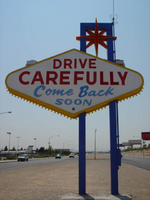
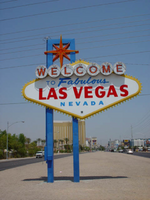
Photographs of Welcome to Fabulous Las Vegas sign, Las Vegas (Nev.), 2002
Date
2002
Archival Collection
Description
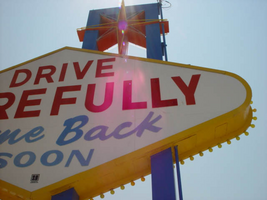
Daytime views of the Welcome to Fabulous Las Vegas sign on the Strip. Information about the sign is available in the Southern Nevada Neon Survey Data Sheet.
Site name: Welcome to Las Vegas neon sign
Site address: 5200 S Las Vegas Blvd
Sign owner: YESCO
Sign details: The sign sits as a welcome to travelers entering the Las Vegas experience via Las Vegas Blvd The sign itself resides in the middle of traffic median directly in the middle of the road.
Sign condition: Structure 5 Surface 5 Lighting 5
Sign form: Pylon
Sign-specific description: The sign itself is a classic roadside pole design which faces North/South. It is double backed, internally lit with a border of yellow incandescent bulbs along the flat edge of its width. Across the top of the sign seven white neon circles house separate red neon letters which form the word welcome. Crowning the sign at the very peak, above the word welcome, is a seven pointed neon star comprised of orange and yellow neon. The cabinet itself is faced with translucent white plastic and treated with blue and red painted text. The South side of the sign reads with the Neon welcome word then in blue painted text "To Fabulous" in a 50's style text reminiscent of that used in the Last Frontier property, and cursive. The Words "Las Vegas" are spelled in all caps, in red block text. And below that in smaller blue text the word "Nevada" are spelled in all caps block text.
Sign - type of display: Neon; Incandescent; Backlit
Sign - media: Steel; Plastic
Sign - non-neon treatments: Graphics; Paint
Sign animation: chasing, flashing
Sign environment: The famous Welcome to Las Vegas sign sits alone at the South end of the strip and is often the very first sign a traveler encounters when entering the strip. It casts a surprisingly powerful glow over the barren median which it stands. It stands as a gateway to the extravaganza that is Las Vegas. When leaving the main drag headed south the sign has an equal effect of being a lone gateway in and out of the Strip.
Sign manufacturer: YESCO
Sign designer: Betty Willis
Sign - date of installation: 1959
Sign - thematic influences: Although it has no specific theme, it is from a specific period in Las Vegas History. It is the quintessential roadside pylon design. With an exposed steel center pole double backed marquee it is reminiscent of the common design of the roadside motor inn.
Sign - artistic significance: This sign has become perhaps the most copied icon of Las Vegas, as it was never copyrighted. It is a ubiquitous symbol of the city.
Surveyor: Joshua Cannaday
Survey - date completed: 2002
Sign keywords: Chasing; Flashing; Pylon; Neon; Incandescent; Backlit; Steel; Plastic; Paint; Graphics
Mixed Content

Photographs of Westward Ho signs, Las Vegas (Nev.), 2002
Date
2002
Archival Collection
Description
Nighttime views of the Westward Ho signs on the Strip. Information about the sign is available in the Southern Nevada Neon Survey Data Sheet.
Site name: Westward Ho Motel (Las Vegas, Nev.)
Site address: 2900 S Las Vegas Blvd
Sign details: The space of the westward Ho is limited yet busy on the landscape of the strip. Approaching from the south, the property lies on the West- side of the Strip. Signage is available on the south elevation, wrapping around into the east elevation, which happens to be the front. Starting with the pylon sign a similar courtyard stretches north with its translucent vinyl awnings, until it reaches its abrupt end with the Circus Circus and Slots A Fun properties.
Sign condition: Structure 5 Surface 5 Lighting 5
Sign form: Pylon; Porte-cochère
Sign-specific description: Approaching the Westward Ho headed north you are immediately confronted by a couple of signs. The first being giant yellow channel letters in Western style font and outlined in blue neon. The font is similar to that of the Frontier Hotel and Casino. The ends of extended appendages of the letters swell in block shapes with points jutting from the flat surface. The letters are filled with incandescent bulbs which all flash on together almost illuminating the entire parking lot in for a brief few seconds and then off again. Below that the building is horizontally striped with polished gold panels sporting three back lit signs for various resort attractions of buffets and drink specials. The building long panel is bordered on the top and the bottom by chasing incandescent bulbs on a polished raceway from left to right when facing this south elevation. The brick facade is adorned with a long backlit message cabinet with yellow painted raceways with incandescent bulbs. On either end of the backlit cabinet are two large square backlit cabinets. These two are bordered with a large steel raceway painted black. Dividing the two large raceways is a channel painted yellow. Inside the recessed channel are incandescent bulbs. The black raceways are faced each with three stripes of neon in blue, whir. The facade of signage and mirrored panels leads the eye to the obvious main pylon sign for the motel. The giant exploding pylon of gold raceways shooting upward into the sky and finally mushrooming out into umbrella formations at different elevations. The sign is comprised of five separate towers: One giant one in the center, which is the tallest, two lower ones flanking the center poles, then one smaller one on the south side of the sign and one equal size on the East side of the structure. The polished gold aluminum raceways comprise the body of the structure and are illuminated with incandescent lamps. The very base of the structure is supported with a structure of red brick masonry. The only elements of actual signage are the back-to-back color animated LED message centers, which are crowned by the 'old west' style text of various sized red neon bordered channel letters. Viewed from the side the Westward ho sign takes on a more sculptural aspect than that of signage. The reason for this is the brilliant finishing of the backs of the message centers. The rears of each panel are finely finished with brushed aluminum gold panels, which combined with the electrifying animation of the incandescent bulbs, creates a high degree of reflectivity. (Barnard) As if echoing the main pylon sign, stretching to the north is a small plaza utilizing the same three-dimensional sculpted umbrella designed awnings to create a pedestrian ready experience to the design. The umbrellas are made into coverings by the addition of illuminated vinyl. The pole structures are steel, covered with brick masonry. Each one of the umbrellas has a planter base and benches where visitors my rest or enjoy the surrounding environment. As the pylon, bulb laden, polished aluminum raceways form the skeleton of the Umbrella. Non-illuminated brass raceways stretch down from the inside and down the center pole. As well as the pylon, polished metal lacework finds its way around the circumference of the Umbrellas bottom edge. The East face of the building is mirrored to ad to the reflectivity of the entire plaza, and adding the illusion of depth to the rather limited space. The half columns and half umbrella's are set into the wall looking as if it is whole against the mirrored surface. A backlit triangular polished cabinet is of particular interest, because it is a sculpted cabinet frame. The top of the two faces is made to mimic the shapes of the pylons swelled crowns. Westward Ho is spelled in red paint.
Sign - type of display: Neon; Incandescent; Backlit; Matrix; Ambient
Sign - media: Steel; Plastic; Glass; Masonry
Sign - non-neon treatments: Graphics; Paint
Sign animation: Chasing, flashing, oscillating
Notes: The incandescent bulbs inside the text reading "Paris" on the balloon oscillate rapidly.
Sign environment: The Westward Ho's unique design of an incorporated courtyard frontage, creates a small strip of closed environment between the Stardust and the Circus Circus/Slots A Fun. The space between the Stardust's property and the Westward Ho's is separated by a small parking lot, which holds claim to the giant letters which boom out casino to the passerby. With its party atmospheric, umbrella design, and mirrored backdrop the pedestrian element makes its own environment distinct to the passerby. Walking through this section gives a sense of a specific taste held in Las Vegas two decades ago, yet still evident today in almost every casino design.
Sign manufacturer: Sign Systems, Inc (pylon and courtyard) YESCO (south side signage)
Sign designer: Brian K. Leming (Pylon and Umbrella frontage)
Sign - date of installation: 1983 (Pylon and Umbrella frontage)
Sign - date of redesign/move: Original backlit plastic message center was replaced with the now existing LED matrix screen
Sign - thematic influences: The Westward Ho facility itself is a Western themed establishment but the design by Lemming reflects a more party atmosphere with its umbrella shaped overhangs and highly animated incandescent raceways. The courtyard was originally designed with a different idea fore a pylon, but the idea of the canopies was carried over into that of the design of the pylon. The over use of the theme of the polished aluminum is reminiscent of that period in Vegas history when the materials could be found virtually everywhere. Such examples included the porte cocheres at the Silverbird Hotel and Casino and the Stardust as well. This theme is still seen on virtually almost every sign. The only elements of Western imagery or style are found in the pylon sign are the font style of the lettering. As for the he building's flavor of the old west, the south wall's yellow channel letters reading "CASINO" is reminiscent of the style of font found on the pylon.
Sign - artistic significance: Besides the fact that the pylon structure stood independently in sculptural aspects as well as functional aspects, the use of materials proved to be a trend setting achievement in that period of Las Vegas. Not only did the property take extensive use materials that could maximize the ability of the lighting such as polished aluminum and mirrored paneling, it was the first to significantly employ the use of colored, translucent vinyl.(Barnard) Soon after the use of this translucent materials in signs could be seen all over the Strip on the interior and exterior of signs and buildings.
Surveyor: Joshua Cannaday
Survey - date completed: 2002
Sign keywords: Chasing; Flashing; Oscillating; Pylon; Porte-cochère; Neon; Incandescent; Backlit; Matrix; Steel; Plastic; Masonry; Glass; Paint; Graphics
Mixed Content