Search Results
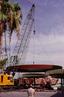
Photograph of the assembly of the Sands Hotel porte-cochère (Las Vegas), 1967
Date
Archival Collection
Description
A crane lifting the canopy of the Sands Hotel porte-cochère.
Site Name: Sands Hotel
Address: 3355 Las Vegas Boulevard South
Image

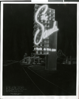
Photograph of neon signs in front of the Aladdin (Las Vegas), 1976
Date
Archival Collection
Description
Nighttime view of neon signs in front of the Aladdin Hotel and Casino.
Site Name: Aladdin Hotel
Address: 3667 Las Vegas Boulevard South, Las Vegas, NV
Image
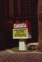
Photograph of an entrance sign to the Sahara casino (Las Vegas), circa 1980s
Date
Archival Collection
Description
Outdoor sign marking the casino entrance for the Sahara.
Site Name: Sahara Hotel and Casino
Address: 2535 Las Vegas Boulevard South
Image
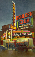
Postcard of the front exterior of the Boulder Club (Las Vegas), 1945
Date
Archival Collection
Description
Color postcard of the front exterior of the Boulder Club at night with its neon signs and marquee lit.
Site Name: Boulder Club
Address: 118 East Fremont Street
Image
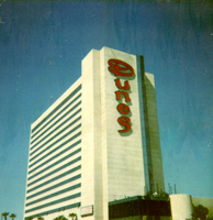
Photograph of the Dunes Hotel tower (Las Vegas), circa 1980s
Date
Archival Collection
Description
View of the Dunes Hotel tower in the 1980s.
Site Name: Dunes Hotel
Address: 3650 Las Vegas Boulevard South, Las Vegas, NV
Image
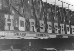
Photograph of construction on the exterior of the Horseshoe Club (Las Vegas), circa 1960s
Date
Archival Collection
Description
The facade of the Horseshoe Club under construction.
Site Name: Horseshoe Club
Address: 128 East Fremont Street
Image

Photograph of a scale model of the Riviera Hotel and Casino (Las Vegas), 1955
Date
Archival Collection
Description
Scale model of the Riviera Hotel and Casino.
Site Name: Riviera Hotel and Casino
Address: 2901 Las Vegas Boulevard South
Image
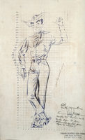
Scale drawing of Vegas Vic, 1951
Date
Archival Collection
Description
Annotated scale drawing of Vegas Vic for the Pioneer Club in Las Vegas with measurement grid.
Site Name: Pioneer Club
Address: 25 East Fremont Street
Image
Photograph of the design sketch for the Sands sign (Las Vegas), circa 1952
Date
Archival Collection
Description
A design sketch for the free-standing sign for the Sands Hotel in Las Vegas.
Site Name: Sands Hotel
Address: 3355 Las Vegas Boulevard South
Image
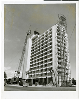
Photograph of construction of the Sahara (Las Vegas), circa 1966
Date
Archival Collection
Description
Construction of the 1966 tower addition to the Sahara Hotel and Casino in Las Vegas.
Site Name: Sahara Hotel and Casino
Address: 2535 Las Vegas Boulevard South
Image