Search Results

Arizona Charlie's Hotel and Casino Neon Survey document, August 18, 2017
Date
Archival Collection
Description
Site address: 4575 Boulder Hwy
Sign owner: American Casino and Entertainment Properties LLC
Sign details: Currently Arizona Charlie's Boulder is owned by the Parent company American Casino and Entertainment Properties LLC. The original Arizona Charlie's on Decatur was first opened around the 1980's owned by Ernest Becker III and his three sons. These locations were named for Becker's uncle Charlie Meadows. The Becker family has had a long history of development and real estate. Arizona Charlie's Boulder opened in 2001.
Sign condition: 5 - looks new
Sign form: Super Pylon
Sign-specific description: Octagonal design. Effigy of a cowboy at its center in an oval plastic backlit sign. There is the words "Arizona Charlie's Boulder" in channeled neon letters. Underneath is a Reader Board with a LED video screen.
Sign - type of display: Neon, Incandescent, Plasma T.V. screen and reader board
Sign - media: Steel and plastic
Sign - non-neon treatments: LED plasma screen and Incandescents
Sign animation: Flasher for incandescent bulbs
Sign environment: A residential area surrounds the property, and adjacent to the main property is their own RV park.
Sign manufacturer: Possibly YESCO
Sign - date of installation: c. 2007
Sign - thematic influences: The Red and yellow/gold color scheme adds an old west and cowboy theme to the sign. The old West theme was very prominent in Las Vegas in the 1940's.
Survey - research locations: Assessor's Page, Arizona Charlie's Website
Survey - research notes: http://www.arizonacharliesboulder.com/?gclid=Cj0KEQjw9uHOBRDtz6CKke3z6ecBEiQAu0Jr3mlOR65dHh6OypoEF3LcYOCTWpwRltGP9Kh6YWjwBKgaApoi8P8HAQ
Surveyor: Wyatt Currie-Diamond
Survey - date completed: 2017-08-18
Sign keywords: Pylon; Neon; Incandescent; Steel; Plastic; Flashing; Reader board; Video screen
Text

Lawless Center Neon Survey document, August 25, 2017
Date
Archival Collection
Description
Site address: 4100 E Lake Mead Blvd
Sign owner: Patricia Van Buskirk
Sign details: This location opened 1962, and has been family owned since then. This is a shopping center where businesses within it have changed over the years.
Sign condition: Needs some retouching but in good shape, 4
Sign form: Pylon
Sign-specific description: This pylon contains a mid-century modern star at the top of it that is painted white with skeletal neon that also illuminates white. Though each corner of the star has an incandescent light bulb. Under this are two googie style shapes one rusty-red and the other is a teal blue. These shapes have white letters stating "Lawless Center" in a mid-century modern font. The first word illuminates blue and the second is red. Underneath is a plastic reader board but does not illuminate at night time.
Sign - type of display: Neon and incandescent
Sign - media: Steel
Sign - non-neon treatments: Plastic for reader board but does not illuminate at night
Sign environment: This location is on East Lake Mead in a residential area, but also has an auto body and paint store near it.
Sign manufacturer: YESCO
Sign designer: Brian "Buzz" Lemming
Sign - date of installation: 1963
Sign - thematic influences: In the Mid-century modern design, Atomic and space theming popular during the era.
Sign - artistic significance: According to Buzz Lemming it is designed after Sputnik, the star looking part on top.
Survey - research locations: Review Journal artricle https://www.reviewjournal.com/uncategorized/naming-las-vegas-lawless-center-history-a-mystery-worth-solving/ (all information from this article).
Surveyor: Wyatt Currie-Diamond
Survey - date completed: 2017-08-25
Sign keywords: Neon; Incandescent; Steel; Plastic; Reader board; Pole sign; Back to back
Text
Photographs of Official Tourist Bureau and Viva Vegas Gifts signs, Las Vegas (Nev.), 2002
Date
Archival Collection
Description
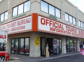
Site address: 3734 S Las Vegas Blvd
Sign details: The signage of the property is a wrapping fascia of horizontal message boards, which advertise for the businesses present. The building is a two story complex on the west-side of Las Vegas Blvd, facing east with a small parking lot along the front and on the south sides. The signage is present on the south and east walls. The signage acts as an artificial marker denoting the difference between the row of doors and wall size windows below, and the large panes of glass and tan stucco finish of the upper level.
Sign condition: Structure 4 Surface 3 Lighting 3
Sign form: Fascia
Sign-specific description: The advertisements are broken up into two distinct sections, but are treated aesthetically the same to retain the continuity of the property. The first is a red steel cabinet, which wraps the southeast corner. The faces of the east and south sides are bordered with aluminum, gold polished raceways, lined with incandescent bulbs. The backlit panels possess text which occupies the majority of the white surface. In red text, both of the sides read, "Official tourist bureau," above "Information-reservations." On the east side of the building above the cabinet, two tan horizontal steel boxes, support green channel letters that read in two lines, "Official," then "Tourist Bureau." Above the south face of the signage two separate sections of the green text read "Information" on the left side of the sign, and "Reservations" on the right hand side. They are treated the same as the previous text on the east face, with letters that possess green neon on the interior, and are in all caps. Further north, on the east face of the building, is another cabinet. This sign is only one side, occupying the flat plane of the remainder of the east face of the building. It too is a red steel cabinet with a back-lit face. On the left hand side of the face the two lined text reads "Viva Vegas," a top the word "Gifts." The second line of the text is flanked on either side by red graphic images of diamonds. The right hand portion of the sign reads prices for T-shirts and souvenirs, in black, blue and red text.
Sign - type of display: Neon; Incandescent
Sign - media: Steel; Plastic
Sign animation: Chasing
Notes: The incandescent bulbs which surround the cabinets chase each other.
Sign manufacturer: YESCO
Surveyor: Joshua Cannaday
Survey - date completed: 2002
Sign keywords: Chasing; Fascia; Neon; Incandescent; Steel; Plastic
Mixed Content
Photographs of Las Vegas Club signs, Las Vegas (Nev.), June 24, 2016
Date
Archival Collection
Description
Site name: Las Vegas Club (Las Vegas, Nev.)
Site address: 18 Fremont St
Sign owner: Las Vegas Club
Sign details: The Las Vegas Club originally opened on the opposite side of Fremont than it is today in the 1930's. It held one of the first few Neon signs on Fremont which was installed around ca.1930. In 1949 the Las Vegas Club reopened in its new location on Main and Fremont Street, and once held a large Baseball Hall of Fame. It has closed down in 2015 and demolition of the building began in 2017.
Sign condition: 4- Signage was working well and still had bright paint before the building had undergone demolition
Sign form: Pylon and architectural
Sign-specific description: They convey sports themes throughout their signs. There was a bronze-type sculptural baseball player. Large Neon and incandescent sign that wrapped around the whole building. Though above each entrance there is a plain graphic lettering with neon surrounding the letters.
Sign - type of display: Neon and Incandescent
Sign - media: Steel and bronze-type material (baseball player)
Sign - non-neon treatments: Sculptural element and incandescent
Sign animation: Flasher for incandescent
Sign environment: This location is on the north corner of Main and Fremont St. It is just north of the Golden Gate and across the street from the Plaza. It also had the Golden Goose, Glitter Gulch and Mermaids to the East of it.
Sign manufacturer: YESCO
Sign designer: Brian "Buzz" Lemming
Sign - date of installation: Circa 1960's
Sign - thematic influences: They convey sports/baseball themes within their signage which showcases the theme of their Baseball Hall of Fame.
Survey - research locations: Neon Museum Tour Hand book, Vintage Vegas http://vintagelasvegas.com/search/Las+Vegas+Club Images, Charles Barnard The Magic Sign.
Survey - research notes: The original Las Vegas Club in the 1930's had the tallest tallest sign in downtown Las Vegas until it was superseded by the Lucky Casino sign about a decade later.
Surveyor: Wyatt Currie-Diamond
Survey - date completed: 2017-09-02
Sign keywords: Architectural; Steel; Sculptural; Incandescent; Flashing; Neon; Bullnose
Mixed Content
Golden Nugget Hotel and Casino Neon Survey document, September 8, 2017
Date
Archival Collection
Description
Site name: Golden Nugget Hotel and Casino (Las Vegas, Nev.)
Site address: 129 E Fremont St
Sign owner: Landry's INC
Sign details: This location opened in 1946 by Guy McAfee, a vice captain with the LAPD. It was bought by Steve Wynn in 1973 and remodeled in 1984.
Sign condition: 5- their sign has stayed in good condition since its installation
Sign form: Architectural
Sign-specific description: Their original concept was an old west cowboy theme and design with a Gold rush inspiration. Steve Wynn remodeled for a modest, modern design to the building almost abandoning the original design and theme. Currently there are many logos of "GOLDEN NUGGET" channeled letters containing incandescent light bulbs that have some exterior skeletal neon surrounding the letters. There are also LED lights surrounding most of the top of the first floor of the building. Also above the entrances there is a satin-like metallic gold material.
Sign - type of display: Incandescent, LED and some neon
Sign - media: Steel
Sign - non-neon treatments: Metallic gold material above entrances
Sign animation: Flashing Incandescent light bulbs
Sign environment: Located Downtown Las Vegas in the hearth of the Fremont Street Experience, across from Binion's and the Four Queens.
Sign manufacturer: AD-ART(1988)
Sign - date of installation: 1988
Sign - date of redesign/move: Mid 1980's Steve Wynn remodeled from the YESCO Kermit Wayne 1961 design to the current facade is installed between 1984-87
Sign - thematic influences: The Gold coloring in the lights and the metallic section of the sign above their entrance showcase their modern twist on their old theme.
Survey - research locations: Ad Art contact, Charles Banard's The Magic Sign, Neon Museum tour outline , Vintage Vegas Website http://vintagelasvegas.com/search/Golden+Nugget
Surveyor: Wyatt Currie-Diamond
Survey - date completed: 2017-09-08
Sign keywords: Architectural; Incandescent; LED; Neon; Steel; Flashing
Text
Photographs of ABC Stores sign, Las Vegas (Nev.), March 3, 2017
Date
Archival Collection
Description
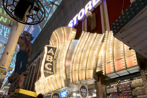
Site address: 23 Fremont St
Sign owner: Sidney and Minnie Kosasa
Sign details: The idea of the ABC stores originated in Hawaii with their first store opening in Waikiki in 1964 as a traveler convenience store selling groceries, cosmetics and souvenirs. The company now has location here in Las Vegas as well as Guam and Saipan. The owners wanted a name that everyone could remember so they named it ABC. The building that houses this ABC Store on Fremont was originally constructed in 1940. The property opened as the ABC Stores in November of 2001.
Sign condition: 5- relatively new and in good condition.
Sign form: Flat bullnose sign, though nearly a canopy sign
Sign-specific description: Above their entrance are big silver plumes that are all lined with chasing incandescent. At night these plumes look like a iridescent pearl color. There is one big plume in the middle and two on either side of the big one. On the middle plume there is a blade sign stating "ABC (vertically) Stores (horizontally)" which is also lined in incandescent on the roadside portion of the sign. The blade portion is a backlit plastic sign. Above the silver plumes is "ABC STORES" in channeled block font letters. These letters are outlined in blue neon (argon) and have gold colored incandescent that are flashing.
Sign - type of display: Neon, incandescents and backlit plastic signs
Sign - media: Plastic and steel
Sign - non-neon treatments: Neon, incandescents and backlit plastic signs
Sign animation: Chaser for the incandescents on the plumes and flasher on the incandescents in the ABC letters above the plumes.
Sign environment: This property is on Fremont in between Main and First Street. To the east would be the site of the old Famous Pioneer Club and La Bayou was to the west, but has been torn down in the past year. Across the street was the Glitter Gulch.
Sign manufacturer: YESCO
Sign - date of installation: 2001
Sign - thematic influences: The plumes that this location has look very similar to the 1970's Raul Rodriguez Flamingo feathers.
Sign - artistic significance: Could be reminiscent of the 1970's Flamingo Feathers designed by Raul Rodriguez. Though it is also remnant of the old showgirl outfits with their plumes and big feathery outfits.
Survey - research locations: ABC website http://www.abcstores.com/about/ , Acessor's Page, contact with Lovella Joy C. Romulando the Assistant Property manager.
Surveyor: Emily Fellmer
Survey - date completed: 2017-09-01
Sign keywords: Neon; Incandescent; Backlit; Plastic; Steel; Chasing; Flashing; Bullnose
Mixed Content
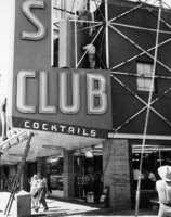
Photograph of assembly of the neon sign in front of the Las Vegas Club (Las Vegas), 1948
Date
Archival Collection
Description
Workers assemble the vertical neon sign in front of the Las Vegas Club while people pass underneath.
Site Name: Las Vegas Club
Address: 18 East Fremont Street
Image
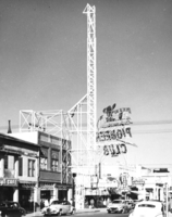
Photograph of metal framework for the neon sign for the Las Vegas Club (Las Vegas), 1948
Date
Archival Collection
Description
Framework for the Las Vegas Club Sign on Fremont Street. The back of the Pioneer Club sign is seen in the background.
Site Name: Las Vegas Club
Address: 18 East Fremont Street
Image
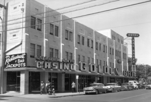
Photograph of the exterior of the Golden Gate Hotel and Casino (Las Vegas), circa 1955-1964
Date
Archival Collection
Description
Exterior of the Golden Gate Casino. Vertical sign for the Hotel Sal Sagev is still on the corner. The business began as Hotel Nevada, built circa 1907, which changed to Sal Sagev from 1931-1955.
Site Name: Hotel Nevada
Address: 1 Fremont Street
Image

Photograph of the exterior of the Mint (Las Vegas), 1957
Date
Archival Collection
Description
The Mint on Fremont Street before its expansion around the corner of First Street. The Boulder Club is seen in the background.
Site Name: Mint Las Vegas
Address: 128 East Fremont Street
Image