Search the Special Collections and Archives Portal
Search Results
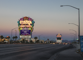
Photographs of Fiesta sign at dusk, Las Vegas (Nev.), April 2, 2017
Date
Archival Collection
Description
Site address: 2400 N Rancho Dr
Sign owner: Stations Casinos Inc.
Sign details: This location was constructed in 1995 as the Fiesta, but in 2001 Stations Casino bought out the casino and renamed it Fiesta Rancho. Stations Casinos Inc. that own this casino have a chain of 9 resort casinos and a number of smaller casinos in the Las Vegas Valley that are popular along the local community here in Las Vegas. The Fiesta Rancho has a sister property named Fiesta Henderson which also has an ice rink as well as identical sign designs.
Sign condition: 4 - the lights still shine very brightly on this one but the colors on the sign have faded over the years and look more like pastel colors when they used to be very vibrant
Sign form: Marquee and Entrance Sign
Sign-specific description: The marquee on Rancho Dr. has concrete bases with a big plasma screen tv with a reader board underneath it. Above the T.V. screen they have a huge design with a purple background, but around this is yellow, orange, blue, green and pink streamers. These all illuminate the same color as the paint at night time. In the middle of the streamer design is channeled letters "Fiesta" in a curvy print font, and then the words "Casino Hotel" underneath it in a normal block type font. The letters illuminate white at night time. Above their main entrance to the casino they have big channeled letters stating " Fiesta" in the same font to their other signs that contain incandescent bulbs that flash at night. Underneath the incandescent "Fiesta" there are red channeled Neon signs stating "Race Sports Keno Bingo" that illuminate red.
Sign - type of display: Neon and Incandescents
Sign - media: Steel
Sign - non-neon treatments: Reader Board and Plasma Screen
Sign animation: Flasher for incandescent bulbs
Sign environment: This property is on North Rancho about a mile north of the 95 highway. It is located right next door to Texas Station, and is near a residential area.
Sign manufacturer: Possibly YESCO
Sign - date of installation: c. 2001
Sign - thematic influences: The theme of the casino matches the sign with the fun party colors and ribbon streamers that they depict on their sign looks like a fiesta.
Sign - artistic significance: This sign is practically identical to the signage for Fiesta Henderson, for they based their sign off of this Fiesta Rancho sign design.
Survey - research locations: Assessor's website, company website
Survey - research notes: Fiesta Rancho website https://fiestarancho.sclv.com/, Stations Casino page https://www.sclv.com/
Survey - other remarks: https://www.sclv.com/Casinos/PropertyMap Stations Casino website has an interactive map of their locations
Surveyor: Emily Fellmer
Survey - date completed: 2017-09-06
Sign keywords: Neon; Incandescent; Steel; Flashing; Reader board; Marquee; Video screen; Pylon
Mixed Content
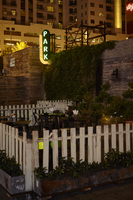
Photographs of Park on Fremont sign, Las Vegas (Nev.), June 28, 2017
Date
Archival Collection
Description
Site address: 506 Fremont St
Sign owner: Justin Weniger and Ryan Doherty both with Corner Bar Management Group
Sign details: This building was constructed in 1956. Though the Park on Fremont opened in 2013 in the former Maharaja Hookah Cafe though the building's exterior was renovated to have more of a wooden facade. This place is claimed as a gastro-pub with rustic-chic decor. Their outside urban beer garden is well recognized with its cool rustic design presenting a teeter totter and a CInderella-like carriage.
Sign condition: 5, very good condition and has bright colors during the day and night
Sign form: Blade
Sign-specific description: They have a long oval shaped blade placed on the left side of the building which is neighboring the public parking lot next door. The oval part of the blade is black with white letters spelling out PARK from the top to the bottom in a thick type font. These letters illuminate green at night time. Surrounding the black oval is a red arrow pointing towards the building (not the entrance) with LED light bulbs which illuminates yellow at night time.
Sign - type of display: Neon and LED lights
Sign - media: Steel
Sign - non-neon treatments: LED lights
Sign animation: Chasing
Notes: LED lights around the perimeter of the blade.
Sign environment: This is the first bar/restaurant on the north side of the Fremont St. East district. To the west of the building is a public parking lot where YESCOs free-standing PBR sign Cool Blue is stationed. To the east is the RED dance club
Sign manufacturer: All Star Electrical Signs
Sign - date of installation: 2013
Sign - thematic influences: The blade with an arrow is is used on many other bar signs in the east Fremont District. Though many of these blade signs are above the entrance this one is on the left side of their building possibly to attract foot traffic from the Fremont Street Experience.
Sign - artistic significance: The blade with an arrow was a prominent sign design in the 50s and 60s.
Survey - research locations: Assessor's Page, Park on Fremont Website https://parkonfremont.com/ , UNLV (bio on Justin Weniger) https://www.unlvfootballfoundation.com/people/justin-weniger/ , google map roadside view, and contact with manager.
Survey - research notes: Owners Justin Weniger and Ryan Doherty founded WENDOH Media which showcases Vegas Seven magazine, DTLV.com, RunRebs.com, SPYONvegas.com, Critical Focus, Corner Bar Management and the Life is Beautiful Festival. With the Corner Bar Management they also own the Commonwealth which is downtown as well.
Surveyor: Emily Fellmer
Survey - date completed: 2017-08-11
Sign keywords: Blade; Neon; LED; Steel; Chasing; Incandescent; Directional
Mixed Content
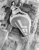
Photograph of an artist's rendering of a woman sitting atop the Las Vegas Club neon sign, circa 1950
Date
Archival Collection
Description
A photograph of a woman in a swim suit is shown sitting atop an artist's rendering of the vertical Las Vegas Club neon sign, with the Las Vegas cityscape below. The illustration is signed "Boernge" in the lower left corner.
Site Name: Las Vegas Club
Address: 18 East Fremont Street
Image
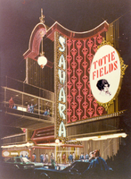
Photograph of Googie architectural design drawing of the front exterior and marquee of the Sahara Hotel and Casino (Las Vegas), circa 1970s
Date
Archival Collection
Description
Artist's conception of proposed facade changes to the Sahara. An enclosed pedestrian bridge crossing above the street is shown.
Site Name: Sahara Hotel and Casino
Address: 2535 Las Vegas Boulevard South
Image
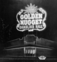
Photograph of an artist's concept of the electric sign on the exterior corner of the Golden Nugget Gambling Hall (Las Vegas), 1945
Date
Archival Collection
Description
Annotated artist's sketch of the Golden Nugget's exterior electric and neon sign at night. A label near the bottom right says "Produced by Young Electric Sign Co." Measurements and a flashing schedule are written near the bottom and other handwritten notes are written on the left side.
Site Name: Golden Nugget Las Vegas
Address: 129 East Fremont Street
Image
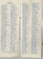
LVCJA Ball programs and planning documents, item 02
Description
Program for the Silver Anniversary Ambassador's Ball at Caesars Palace in Las Vegas, Nevada.
Mon Bel Ami Neon Survey document, August 19, 2017
Date
Archival Collection
Description
Site address: 607 S Las Vegas Blvd
Sign owner: Mon Bel Ami- Maudie Dog Trust
Sign details: Mon Bel Ami Wedding Chapel originally was the Silver Bell Wedding Chapel owned by nineteen year old Jim Duszynski. He moved from Toledo, Ohio and purchased the small wedding chapel for five dollars in 1958. Silver Bell wedding Chapel eventually moved across the street adding a steeple to an old masonic lodge hosting dozens of weddings. In 2002 the building caught on fire where the property was later purchased by new ownership. In 2003 the new ownership re-named Silver Bell Wedding Chapel to Mon Bel Ami Wedding chapel. The new chapel replaced the Silver Bell panel and painted over the SB. Currently the sign has been removed and donated to the Neon Museum and replaced with new signage.
Sign condition: The condition of the sign is a 5. From what I can tell the sign has been kept maintained. No paint has chipped, and the LED is still working perfectly.
Sign form: The sign is a pole sign and not attached to the building.
Sign-specific description: The sign is a pole based free standing sign. The heavy curved triangle is in the color burnt sienna made of steel. The pole itself is a faux marble with swirls circulating the pole etched into the pole. The sign is tastefully ornate, yet simple in design. The pole transitions into a Chapean Tuscan architectural feature. The typography is slightly thick and light up white at night. The actual light features surround the typography and takes the shape of the curved triangle. The light is LED based.
Sign - type of display: LED
Sign - media: Steel and concrete
Sign environment: It is next door to Graceland Wedding Chapel and near Nevada Legal Services, US Labor Department Wage and Hour Divisions, Dougie J's Cafe, Thunderbird Lounge, and Rogue Toys.
Sign manufacturer: YESCO
Sign - date of installation: Mid 2000's
Sign - date of redesign/move: After 2003 the ownership from Silver Bells changed and renamed the chapel to Mon Bel Ami. The Silver Bells Wedding sign was donated to the Neon Museum.
Sign - thematic influences: The design resembles faux Tuscan elements, simple yet semi- ornamental.
Sign - artistic significance: The sign resembles the early 2000's trend with faux semi ornate but sleek contemporary design within architecture. The sign is quite reminiscent of Wynn Hotel, Palazzo, and Encore.
Survey - research locations: Mon Bel Ami wedding chapel website https://www.monbelami.com/historic-wedding-chapel-sign-neon-museum-vegas/ , Asessor's Page
Surveyor: Gisselle Tipp
Survey - date completed: 2017-08-19
Sign keywords: Steel; Concrete; Pole sign; Neon
Text
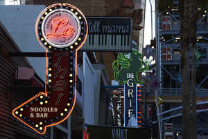
Photograph of Le Thai sign, Las Vegas (Nev.), April 10, 2016
Date
Archival Collection
Description
Site address: 523 Fremont St
Sign owner: Dan and Shauna Coughlin, Dan doubles as the chef as well
Sign details: The buildings original construction year was 1934. The restaurant opened in November of 2011, Le Thai offers a famous Three curry made by Chef Dan Coughlin as well as other traditional Thai food inspired by Dans grandma and mom from Thailand. They also have a beer garden behind their main restaurant. Dan was the owner to Mix zone cafe and is the son of the owner of the King and I (Nikki Bujadham). This building has a tin facade with a pull out canopy for outdoor seating.
Sign condition: 5- looks very new and in amazing condition
Sign form: Blade
Sign-specific description: The blade is mainly made of plastic that is backlit at night time, but has a dark steel border. At the top of the sign is a circle that has Le written in black cursive on the sign, and illuminates red neon at night. Also on this circle portion of the sign it states Downtown Las Vegas in a smaller print type font. This circle is outlined in incandescents, as well as the incandescents being surrounded by red neon. Below the circle there is a red curved arrow that states Thai in black letters that have a white trim, this font looks italicized and has little circles on a part of each of the letters, this makes it a very distinct font for them specifically. Underneath the Words Thai, the sign states Noodles & Bar in a regular white block type font.
Sign - type of display: Incandescent light bulbs and neon
Sign - media: Plastic and Steel
Sign - non-neon treatments: Graphics on plastic portion of the sign are backlit
Sign animation: Chasing:
Notes: incandescent light bulbs
Sign environment: In the East side of Fremont Street, located in between Las Vegas Blvd and 6th street. To the west of the property is the Dont Tell Mama Bar and to the east is Commonwealth. Currently across the street is the Therapy restaurant and the old Emergency Arts building.
Sign manufacturer: YESCO
Sign designer: Owners Shauna and Dan
Sign - date of installation: 2012
Sign - thematic influences: The font that they use for Le and Thai are quite different but it shows the blend of how their restaurant is and does make it more distinguishable since their font draws the attention of people walking by.
Sign - artistic significance: With the usage of both Neon and incandescent the sign really does pop out which is a similar trend to many signs over the age, particularly since there is a lot of pedestrian traffic in the region. The arrow is a great direction indicator, as well as it showcases the 1950s blade sign trend with the arrow at the bottom.
Survey - research locations: Le Thai restaurant website https://lethaivegas.com/, Assessor's page, and contact with Le Thai LLC
Survey - research notes: The assessor's page said the buildings original construction year was 1934 though there was no record of what it originally opened up as.
Surveyor: Emily Fellmer
Survey - date completed: 2017-08-15
Sign keywords: Graphics; Plastic; Backlit; Steel; Blade; Chasing; Incandescent; Neon; Back to back
Mixed Content
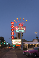
Photographs of Holiday Motel, Las Vegas (Nev.), March 1, 2017
Date
Archival Collection
Description
Site address: 2205 S Las Vegas Blvd
Sign owner: Calcaterra Family and Trust
Sign details: Holiday Motel was built-in 1952 - a one acre lot with 14,238 sq. ft. of living space.
Sign condition: 2 - The neon is not working completely, majority of the lights have not been repaired or maintained. The actual paint has shifted from a brilliant red into a subdued salmon rustic color from exposure of Sun/UV and wind.
Sign form: Pole mounted sign with reader board
Sign-specific description: The Holiday Motel is an animated sign that is part of the mid-century and Googie design. The color scheme is mostly a primary color palette of red, blue and yellow. The neon holiday typography is the only element of the sign that differs from the palette, but only when it is lit up. Instead the holiday font illuminates multiple colors to continue the clown theme effect. The sign is in true Googie fashion that popularized roadside signage from 1950s-late1960s. It is in the style of a pylon sign with a directional arrow that points towards the motel entryway. When the sign lights up the directional arrow uses a chaser to animate the arrow and its design with incandescent bulbs. The directional arrow surrounds the holiday motel square shaped portion of the sign. On the top portion of the sign is a rainbow design with five metal rods with circles at the end shooting out of the rainbow. These five rods when lit up in the evening are animated as well and produce a wave motion. On the side of the sign are separate white letters encased in red circles and are designed vertically reading the word motel.
Sign - type of display: Neon, incadescent
Sign - media: Steel and plastic
Sign animation: Animation with upper circles/rods chasing from one to the next.
Sign environment: Property is near other motels and the Stratosphere.
Sign manufacturer: YESCO
Sign - date of installation: c. 1952
Sign - thematic influences: This sign is completely influenced by the 1952 Holiday Inn sign. Both are include an animated chaser direction arrow. The initial design is completely replicated from the Holiday Inn sign. The only difference is the five animated rods in Holiday Motel and where Holiday inn sign has a star instead of a rainbow at the top of the sign. The main difference is that the Holiday Motel sign includes a side panel with the word motel spelled vertically.
Sign - artistic significance: Artistic theme includes a circus theme, but also involves the Googie roadside sign that channels the space age landing beacon. As for majority of signs in 1950s-1960s the sign itself was quite colorful and in the shape of a pylon sign to grab the travelers attention.
Survey - research locations: roadarch.com, assessor's website
Survey - research notes: There was hardly any information pertaining to the history of the Holiday Motel sign. The property was originally called the Holiday Inn Motel but had to change its name in the 1960s due to the large Holiday Inn chain.
Surveyor: Gisselle Tipp
Survey - date completed: 2017-08-25
Sign keywords: Neon; Incandescent; Steel; Plastic; Chasing; Reader board; Pole sign
Mixed Content

Photographs of Caesars Palace signs, Las Vegas (Nev.), 2002
Date
Archival Collection
Description
Site name: Caesars Palace (Las Vegas, Nev.)
Site address: 3200 S Las Vegas Blvd
Sign owner: Park Place Entertainment
Sign details: Caesars Palace is located between the Flamingo Rd. on the western side of Las Vegas Blvd Caesars has grown over the years since it's opening, but remains the true to its classic form. Signage for the resort is limited compared to some but consists of significant pieces of signage such as two large pylon signs, a rotating sign for Planet Hollywood, building signage consisting of logo text, as well as a porte-cochere. The property itself is an over abundance of classic design form after another, mixed among modern amenities like an Omnimax theatre. Caesars Palace is a permanent icon in Las Vegas Imagery and folklore.
Sign condition: Structure 4 Surface 4 Lighting 4
Sign form: Pylon; Fascia; Porte-cochère
Sign-specific description: The YESCO pylon is located at the northern side of the property and is constructed of black painted steel and centers around a base of four columns aligned in a row. The sign faces north/south. The four columns rise out of the ground about six feet in the air before a long horizontal, gold bordered, rounded end cabinet, that reads and points to free covered parking. The text is graphically applied and internally lit. The cabinet is lit from the backside with neon, creating a halo behind the sign. The columns continue upward until they are met with the triangular cabinet, pointing east, with the two faces, being occupied a color LED message center. The interior edge of the face of the sign is bordered with green neon. Above the visible top edge of the wedge shaped message boards, the Caesar's Palace logo if illuminated in red neon upon a rectangular section created out of two entablatures, stacked on top of each other. The top entablature reads "Caesars" in red letters and "Palace" in the second row The two are capped with pediment lined on the interior edge with gold neon and a back-lit Caesar's logo. The exterior of the cabinet is polished aluminum, with metal channel letters. The original pylon built much earlier, utilized six-column shafts capped with golden statuary, secured to a large concrete base. When facing the columns, facing north, or south, the majority of the view of the vertical pieces is taken up by the giant internally lit message center, with removable lettering. The outer edge is crafted the same as the face of the other pylon, but it is bordered in pink neon. The four center columns supports an entablature supporting the logo text, and above that a pediment rounds out the classic architectural combination. The top half of the pediment is larger and supports the text "Caesars," while the lower, narrower section reads "Palace". The entire pediment is striped horizontally with bands of aqua neon that creates a field for the text. The text is in the stylized roman text, in channel letters, and lined with red neon. One of the most attractive pieces of signage is the Caesars porte-cochere. The famous fountains lead up to the main entrance, which is shadowed by the massive porte-cochere, which is one of the few remaining on the strip that displays such grandeur. The Porte-cohere is a hulking collection of levels, stacked upon on another, but grow in size as each level steps upward. The rest looks as if a massive set of plaster steps were turned upside down and placed over the entrance. The edge of each level is lined with brass treatments that are repeated vertical poles of polished brass, greeting a repeated striping pattern. From behind this treatment and pushed further back beyond the human eye, a rose colored glow is produced by intense lighting fades into a soft halo as it dies out toward the edges. The mass and girth of the structure is helped out visually by the angles chosen to in its design. The entire construction seems to sag under it's own weight, for each level is slightly cupped into a concave shape. Each levels edges are concave as well, producing a illusion of movement in space. To the right of the porte-cochere there is still the aqua tinted light pouring out of the latticework, that fills the arcade of arches. On the main tower directly behind the porte-cochere, the red neon logo is present as well as elsewhere on the building as well. Facing east this particular set of letters looms high over head. The section of the building is a vertically elongated temple front, stretching the height of the building. Four pilasters run the vertical length of the building, holding black spans of tinted windows in between. They each are topped with golden Corinthian capitals, which hold up the classic entablature and pediment. "Caesars Palace" is spelled across the entablature in channel letters and filled with red neon. In the pediment above a golden crest of Julius Caesar's profile flanked by two encompassing olive branches. The crest is ambiently lit with white light. The tower just behind the main building also supports text on its east face as well. As the narrow edge of the tower, the vertical plane rises upward but is flat and smooth until it reaches the top section. It is essentially a giant entablature created out of the temple fronts on either side that wrap around to meet on the width. On this flat plane, "Caesars Palace" is spelled in the classic lettering and neon treatment seen on the building letters just below that. The building itself is ambiently lit but the profile of Caesar above the text is not a brightly lit as the other. On the south side of the parking garage, on the western edge of the property, the channel letter logo reads in red neon as well.
Sign - type of display: Neon; Incandescent
Sign - media: Steel; Plastic; Masonry
Sign - non-neon treatments: Paint
Sign animation: Chasing, flashing, oscillating
Notes: The V-shaped red channels on the silver main pylon chase each other downward toward the ground. The main text on the pylon animates as well. The letters light up one at a time with red neon from left to right as the arrows continue to chase downward. The logo/text sign located above the giant replica of the Harley Davidson, animate as well. The incandescent bulbs which fill the text, spelling the name of the establishment, oscillate, steady burn, then shut off, and then restarting the sequence. The letters that spell cafe on the lower portion of the sign animate in concert and with the same sequence as the main text.
Sign environment: Caesars Palace sits in one of the biggest and busiest sections of the strip, and has always been a mainstay. The ambiently lit classic features of architecture seem almost specter like moments, with the blazing red eyes of the Caesars text staring from afar. From the street, the actual structures are set a bit back from the street, seeming rather distant. Construction is currently present around the exterior edges of the property, which rather dampens effect of the theming, but everything shines through. The theme does step out to the street with the statuary, creeping out to pedestrians and the pylon signs. The main signs are street side, pointing toward the casino. Headed south on the west side of the street the two pylon signs lead up to the porte-cochere. Standing underneath the porte-cochere looking out, the fountains provide a picturesque scene to see the other side of the street. The buildings loom high over head. The environment contains elements, which can be seen repeated throughout hotel exteriors. The large water element, the Classic architectural design motif, and the spectacular porte-cochere are still evident in properties built today. Even though Caesars continues to evolve with the current trends, all of these elements were presenting its original design.
Sign manufacturer: Pylon 1: YESCO Pylon 2: Ad Art
Sign - date of installation: 1966, 1998
Sign - date of redesign/move: On-going additions since 1966
Sign - thematic influences: Caesars Palace may be the first themed resort, which has taken its theme to an extreme the likes of which had never been seen before. Ever since it's original inception in 1966, Caesars Palace has sought to give its guest the most of the Ancient Roman theme. Caesars is simply dripping with imagery and architecture that is steeped in the theme of Ancient Rome. No matter where you go there are collections of statuary, domes and columns, false temple fronts create the facades of the towers, and low geometric hedges and cypress trees all add to the theme. Any themed property can draw influence from Caesars Palace, and still stands as one of the highest markers for competitors to be judged by.
Sign - artistic significance: Very important signage that can be seen reflected in many aspects of non-casino culture. Caesars Palace is one of the icons of American popular culture, and the distinctive Romanesque neon is a big reason why.
Surveyor: Joshua Cannaday
Survey - date completed: 2002
Sign keywords: Pylon; Fascia; Porte-cochère; Neon; Incandescent; Steel; Plastic; Masonry; Paint
Mixed Content
