Search Results
Alterations in Union Pacific Railroad passenger station: architectural drawing
Date
Archival Collection
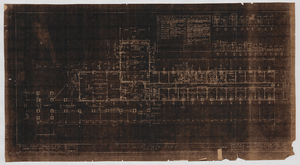
Description
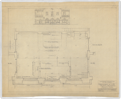
From Union Pacific Railroad Collection (MS-00397). On the bottom, the drawing states, "Part First Floor Plan Scale 1/8" = 1' - 0" ". The corner of the drawing states, "Union Pacific Railroad Co. Office of Chief Engineer. Caliente, Nevada. Alterations in Passenger Station To Enclose Arcade. First Floor Plan, Elevations And Section. Drawn By - RC-FD. Traced By - RC-FD. Checked By - . Date - Feb, 27, 1943. Scale As Noted. Work Order. DWG. No. 48251."
Image
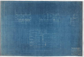
Los Angeles & Salt Lake Railroad Company employees clubhouse at Caliente, Nevada: architectural drawing
Date
Archival Collection
Description
From Union Pacific Railroad Collection (MS-00397). The scales are noted in the drawing. The bottom of the drawing says, "First Floor 1/8" = 1' - 0" " , and "Second-Floor Scale 1/8" = 1' - 0" " . The corner of the drawing says, "Union Pacific System LA & SL RR. Employees Clubhouse At Caliente. Asst. Chief Engineers Office Los Angeles. Drawn By ECB. Oct 14 1926. Scale 1/8" = 1' - 0". S-335".
Image
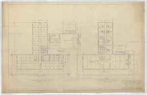
Los Angeles & Salt Lake Railroad Company lavatory and locker room at Caliente, Nevada: architectural drawing
Date
Archival Collection
Description
From Union Pacific Railroad Collection (MS-00397). The scales are noted in the drawing. The bottom of the drawing says "Floor Plan". The corner of the drawing says, "Union Pacific System L.A. & S.L.R.R. Lavatory & Locker Room. Plans Elevations & Details. Caliente Nevada".
Image
Alterations in Union Pacific Railroad passenger station: architectural drawing
Date
Archival Collection
Description
From Union Pacific Railroad Collection (MS-00397). The scales are noted in the drawing. The drawing states, "Part First Floor Plan Scale 1/8" = 1' - 0" ". The corner of the drawing says, "Union Pacific Railroad Co. Office of Chief Engineer. Caliente, Nevada. Alterations in Passenger Station To Enclose Arcade Location Plan, Floor Plan Elevations, Details. Drawn By LAL. Traced By LL-FD. Checked By. Date Mar. 29, 1943. Scale As Noted. Work Order 2398. DNG. No. 48583".
Image
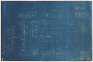
Rearrangement of lobby at Caliente, Nevada railroad station: architectural drawing
Date
Archival Collection
Description
From Union Pacific Railroad Collection (MS-00397). The scales are noted in the drawing. The bottom corner of the drawing says, "Union Pacific System LA & S.L.R.R. Co. Rearrangement of Lobby Caliente Station Bldg. Caliente. Nevada. Ass't. Chief Engineers Office Los. Angeles. Calif. Drawn By E.C.B. Trace By F.W.G. Checked. Date April 24/28. Scales. Revised. Drawing No 1514 8-B".
Image

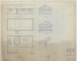
Los Angeles & Salt Lake Railroad Company standard signal maintainers & pumpers house: architectural drawing
Date
Archival Collection
Description
From Union Pacific Railroad Collection (MS-00397). The scales are noted in the drawing. The bottom corner says, "Union Pacific System L.A. & S.L.R.R. Standard Signal Maintainers & Pumpers House. Locations East Of Caliente. Ass't. Chief Engineers Office Los Angeles. Drawn By F.W.G. Traced By F.W.G. Checked By W.V.L-B. Date. Nov. 24. 1926. Scales As Noted. Revised. Drawing. No. 15656-B".
Image
Remodeling south wing of basement of Union Pacific Railroad Company clubhouse in Caliente, Nevada: architectural drawing
Date
Archival Collection
Description
From Union Pacific Railroad Collection (MS-00397). The scales are noted in the drawing. The bottom corner says, "Union Pacific Railroad Company South Central District. Remodeling South Wing Of Basement of Clubhouse, Caliente Nevada. Office Of Manager Of Industrial Development, Los Angeles. Drawn by [Rdw?]. Scale - [not legible]. Date - 6-8-38. Revised. No. 15899. Sh. 1".
Image
Basement heating plan for Union Pacific Railroad Company clubhouse in Caliente, Nevada: architectural drawing
Date
Archival Collection
Description
From Union Pacific Railroad Collection (MS-00397). The bottom corner says, "Union Pacific Railroad Company Southwestern District. Basement Heating Plan. Proposed Remodeling of Clubhouse, Caliente Nevada. Office of Manager of Industrial Development, Los Angeles. Drawn by R.d.W. Date 9-20-37. Scale - 1/8" = 1'. Revised. No S-567-1".
Image
Union Pacific Railroad clubhouse foundation and basement plan, Caliente, Nevada: architectural drawing
Date
Archival Collection
Description
From Union Pacific Railroad Collection (MS-00397). The bottom of the drawing states, "Gilbert Stanley Underwood & Co. Architects, And Engineers. 730 S. Los Angeles St. Los Angeles. Cal. Foundation & Basement Plan. Scale 1/8" = 1'0". File no [15690-A?]. Sheet No.1 Job No. 399. Date. 8-10-27. A Club House For The Union Pacific System. Caliente Nevada".
Image
Union Pacific Railroad clubhouse first floor plan, Caliente, Nevada: architectural drawing
Date
Archival Collection
Description
From Union Pacific Railroad Collection (MS-00397). The bottom of the drawing states, "Gilbert Stanley Underwood & Co. Architects And Engineers. 730 S. Los Angeles St. Los Angeles Cal. First Floor Plan. Scale 1/8" = 1'0". File No. 15684-B. Sheet No. 2. Job. No. 399. Date 8-10-27. A Club House For The Union Pacific System Caliente Nevada."
Image