Search Results

Exterior details for Union Pacific Railroad clubhouse in Caliente, Nevada: architectural drawing
Date
Archival Collection
Description
From Union Pacific Railroad Collection (MS-00397). The scales are noted in the drawing. At the bottom of the drawing it says, "Gilbert Stanley Underwood And Co. Architects & Engineers. 408 So Spring St. Los Angeles Calif. Exterior Details. 15684-V. Sheet #20-A. Job No. 399. Dec 21-27. A Club House For Union Pacific System Caliente Nevada."
Image
Details for Union Pacific Railroad club house in Caliente, Nevada: architectural drawing
Date
Archival Collection
Description
From Union Pacific Railroad Collection (MS-00397). The scales are noted in the drawing. Near the bottom it says, "Gilbert Stanley Underwood And Co. Architects & Engineers. Miscellaneous Details. A Club House For The Union Pacific System, Caliente, Nevada."
Image

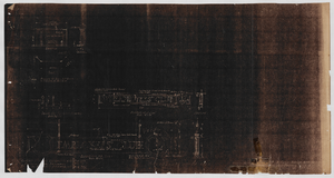
Piping flans for heating a Union Pacific Railroad clubhouse in Caliente, Nevada: architectural drawing
Date
Archival Collection
Description
From Union Pacific Railroad Collection (MS-00397). Near the bottom it says, "Gilbert Stanley Underwood And Co. Architects & Engineers. 730 So. Los Angeles St. Los Angeles Calif. Dr. By Albert. Tr By. Ch. By Albert. Piping Plans For Heating. Scale 1/8" = 1'-0" . File No. 15684-T. Sheet No. 20. Job No. 399. Date 8-10-27. A Club House For The Union Pacific System, Caliente, Nevada."
Image
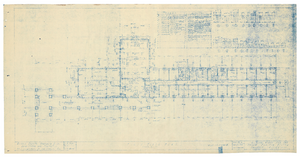
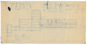
First floor plan for Union Pacific Railroad club house in Caliente, Nevada: architectural drawing
Date
Archival Collection
Description
From Union Pacific Railroad Collection (MS-00397). The scales are noted in the drawing. Near the bottom it says, "Gilbert Stanley Underwood & Co. Architects & Engineers. 730 S. Los Angeles St. Los Angeles Calif. First Floor Plan. File No. 15684-B. Sheet No. 2. Job No. 399. Date 8-10-27. A Club House For The Union Pacific System, Caliente, Nevada."
Image
Sections of Union Pacific Railroad clubhouse in Caliente, Nevada: architectural drawing
Date
Archival Collection
Description
From Union Pacific Railroad Collection (MS-00397). The scales are noted in the drawing. Near the bottom, the drawing says, "Gilbert Stanley Underwood & Co. Architects & Engineers. Sections. File No. [15684-F?]. Sheet No. [6?]. Job No. 399. Date 8-10-27. A Club House For The Union Pacific System, Caliente, Nevada."
Image

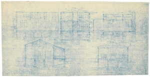
Elevations and sections of Union Pacific Railroad clubhouse in Caliente, Nevada: architectural drawing
Date
Archival Collection
Description
From Union Pacific Railroad Collection (MS-00397).The scales are noted in the drawing. Drawings show Longitudinal Section, East Elevations, and West Elevations. Near the bottom, the drawing says, "Gilbert Stanley Underwood & Co. Architects & Engineers. Elevations And Sections. File No. 15684-[I?] Sheet No. 5. Job No. 399. Date 8-10-27. A Club House For The Union Pacific System, Caliente, Nevada."
Image
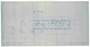
Second floor plan for Union Pacific Railroad clubhouse in Caliente, Nevada: architectural drawing
Date
Archival Collection
Description
From Union Pacific Railroad Collection (MS-00397). The scales are noted in the drawing. Near the bottom, the drawing says, "Gilbert Stanley Underwood & Co. Architects & Engineers. 730 S. Los Angeles St. Los Angeles Calif. Second Floor Plan. File No. 15684-C. Sheet No. 3. Job No. 399. Date 8-10-27. A Club House For The Union Pacific System, Caliente, Nevada."
Image
Foundation and basement plan for Union Pacific Railroad clubhouse in Caliente, Nevada: architectural drawing
Date
Archival Collection
Description
From Union Pacific Railroad Collection (MS-00397). The scales are noted in the drawing. Near the bottom, the drawing says, "Gilbert Stanley Underwood & Co. Architects & Engineers. Foundation & Basement Plan. File No. [not legible]. Sheet No. 1. Job No. 399. Date 8-10-27. A Club House For The Union Pacific System, Caliente, Nevada."
Image

Elevations of Union Pacific Railroad clubhouse in Caliente, Nevada: architectural drawing
Date
Archival Collection
Description
From Union Pacific Railroad Collection (MS-00397). The scales are noted in the drawing. The drawing shows the South and North Elevations. Near the bottom, the drawing says, "Gilbert Stanley Underwood & Co. Architects & Engineers. 730 S. Los Angeles St. Los Angeles Calif. Elevations. File No. 15684-D. Sheet No. 4. Job No. 399. Date 8-10-27. A Club House For The Union Pacific System, Caliente, Nevada."
Image

Basement floor plan for Union Pacific Railroad clubhouse in Caliente, Nevada: architectural drawing
Date
Archival Collection
Description
From Union Pacific Railroad Collection (MS-00397). Near the bottom, the drawing says, "Basement Floor Plan, Scale 1/8" = 1'-0"." The bottom corner says, 'As Constructed.' Union Pacific Railroad Co. Office Of Chief Engineer. Caliente, Nevada. A Club House For Employees, Basement Floor Plan. Drawing No. 49322. Traced On Cloth & Revised 'As Constructed' April 12, 1946 En-Checked F.N."
Image