Search Results
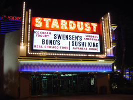
Photographs of Stardust signs, Las Vegas (Nev.), 2002
Date
2002
Archival Collection
Description
Nighttime views of the Stardust Resort and Casino signs on the Strip. Information about the sign is available in the Southern Nevada Neon Survey Data Sheet.
Site name: Stardust Resort and Casino
Site address: 3000 S Las Vegas Blvd
Sign owner: Boyd Gaming
Sign details: This is a large casino property that is clearly a center of attention.
Sign condition: Structure 4 Surface 4 Lighting 4
Sign form: Pylon; Fascia; Porte-cochère
Sign-specific description: Even though the facade of the Stardust has gone through many changes, streamlining itself over the years, yet retains aspects of it's original flavor. The tower faces northwest and southeast and is adorned with horizontal bars of red neon underlining each floor. The top tube only stretches approximately one-quarter of the way across the face, and with each floor, the neon gets increasingly longer. The result is the building being cut across the face at an angle, with one half being illuminated by the red neon and the other by ambiently blue lighting. Large Channel letters spelling "Stardust," are bordered by red neon and filled with incandescent bulbs. The Majority of the external signage is on the low rise structure close to the street, with the tower located to the northwest behind it. The array is comprised of two small pylon message centers, a porte cochere, the main pylon, and assorted entrance signs. On the south side of the building alongside a large parking lot, an entrance sign hangs above a two-sided corner entrance, Wrapping this small corner, polished gold raceways and trim create borders for the accordion surfaced pediment, and shoot up vertically into the sky on the far ends. Blue neon shines from behind the shining trim above the door to illuminate the whit accordion facade. The trim above that is adorned with two tubes of gold neon on the top and the bottom, hidden in recessed channels to cast a gold halo from behind. The two vertical edges are lined with incandescent bulbs. On the south wall of the small corner, channel letters stand on the top edge of the golden molding, reading "Casino." They are black on the exterior, painted white on the interior, and filled with incandescent bulbs, and bordered with red neon. On the Southeast edge of the building another entrance of a bit more design Above a set of doors, and the blue lit accordion facade and golden halo cast metallic trim, a Squared "U" shape made of polished metal raceways, holds a back lit message center housed on a black cabinet. On either side of the vertical legs of the "U" shape, another single raceway rises slightly higher in the air. All the raceways are lined with incandescent bulbs. Above the cabinet, black channel letters, spell "Stardust." They are finished white on the exterior, filled with incandescent bulbs, and outlined in red neon. Moving around to the eastern facade of the building, the facade is a three leveled pediment in the accordion pattern, and separated with the polished trim. The Yellow and blue lighting illuminate this facade also. The pattern is only interrupted by oval shaped back lit cabinets, placed every so often. Eventually you come to the porte. It is no longer finished with mirrors, but still retains the raceways lined with incandescent bulbs. The surface in between is filled with white stucco finish. What is left is a series of 5 hexagonal shapes crafted out of raceways and hung a section ceiling lower than the rest. Geometric patterns radiate from this center piece. North, past the porte cochere a section of building juts out to the east. It contains an entrance on the north and south faces, and two on the east face which are parts wrapping around from the previously mentioned entrances. Over the north and south entrances the "U" shaped polished metallic raceways and external flanking raceways, as seen before on the southeast entrance, play host to a narrow LED message center and channel text spelling stardust. The letters have the same treatment as the previous sign as well, and spell "Stardust" in channel letters. They too are filled with incandescent bulbs and bordered with red neon. Above the text, channel pans are in the shape of four pointed stars as seen on the main pylon, are slightly scattered as if to be showering over the text. They are multi colored, centered with arrays of incandescent bulbs and interior neon contours. The accordion facade and lighting are below the composition. Below the accordion pediment, a polished gold bullnose creates a pediment above the door and wraps around to the east face of the structure. A pointed end polished metallic cabinet is placed in the section of the bullnose over the door, spelling "Casino Entrance" in channel letters and filled with red neon. The surface of the bullnose is laden with incandescent bulbs. The facade wraps around the front with another pointed end cabinet reading entrance in the same fashion as the previously mentioned text. A small section of foliage and shrubbery line the west face of this extension of the casino before the same arrangements of sign are seen repeated on the north face. Passing the entrance the property opens up into a courtyard with an arrangement of low rising concrete cylindrical fountains created a multi-leveled garden of spurting water and plants. Just past the courtyard another entrance is found created out of the northeast corner of the building. Like the other entrances, elements such as the blue lit accordion face, double rows of vertical metallic raceways, properly treated channel letters, are present. The gold raceways wrap the corner with backlit cabinets on the east and north faces. The channel letters read "Stardust" on the east face and "Casino" on the northern face. The ceiling that the overhang creates is finished in polished metallic material and laden with incandescent bulbs. Just outside the last entrance the first of two low rise message pylons. The one located on the north end of the property is larger and more spectacular. The large triangular cabinet's faces are backlit, slightly concave message boards. The tops of each o these cabinets in adorned with a smaller, purple steel cabinet, approximately eighteen inches tall, and running the length of the cabinet. "Stardust is spelled across the length of the cabinet in channel letters, and filed with rose neon. The cabinet is laden with incandescent bulbs, creating a canvass for the letters to reside. The three edges, which is the gap where the three signs meet and the bottom of the cabinet are covered in incandescent bulbs. The surfaces are treated with polished metal. The pole which the cabinet sits is a white, two sided, support with two peaks growing out horizontally about two-thirds up the height. The shape, along with a Stardust style star channel pan in its center, is a representation of the repeated image associated with the logo of the property. The edge of the post is treated with a border of purple paint and lined with purple incandescent bulbs. Just inside the border stripe a channel recesses forming another border for a tube of purple neon. The star pan channel in the center is bordered in teal neon and filled with incandescent bulbs. A top the entire cabinet is an array of stardust stars of various colors, bordered in neon, and or filled incandescent bulbs. The array is assorted again to appear as if they are being showered, tapering to one single star at the top. The entire cabinet rotates slowly from right to left. The cousin to this sign is at the extreme south end of the property, set before an entrance give a larger double backed cabinet sits off center on a square post. The white plastic face is housed in a white steel cabinet with rounded edges. The top or the sign is comprised of the same purple cabinet and channel letters seen in tops of the concave message boards of the rotating relative at the north end. The width of the cabinet is strewn with incandescent bulbs, continuing underneath as well. The post is painted two tones.
Sign - type of display: Neon; Incandescent; Backlit
Sign - media: Steel
Sign - non-neon treatments: Graphics; Paint
Sign animation: Chasing, flashing, oscillating
Notes: The incandescent bulbs inside the text reading "Paris" on the balloon oscillate rapidly.
Sign environment: To the south of the Stardust is the Westward Ho, and to the North is Circus Circus. It stands with these two as well as the Frontier as vestiges of an older era of Las Vegas resorts. The Riviera also resides across the street. Vast shoots of concrete, spread out in front of the hotel, creating a continual plaza which runs from north to south. It contains lush flowers and fountains that toss water to each other is shooting arcs. In the daytime, the white of the remodeled facade is almost blinding against the concrete.
Sign manufacturer: Ad-Art (pylon); Sign Systems, Inc (porte cochere)
Sign designer: Paul Miller (pylon) Brian K. Leming ( porte cochere and facade)
Sign - date of installation: 1968
Sign - date of redesign/move: The original Electra-Jag style letters were replaced in 1991 by a sleeker Helvetica type face, as well as the letters for Enter the Night being changed to read "The Wayne Newton Theatre" in 1999. Also in this year, the facade was changed to a reserved white finish. The accordion shape is still present but no longer tri colored. The move was presumably made in an attempt to compete and fit in with its bigger corporate competitors.
Sign - thematic influences: The Stardust's theme revolves around an outer space/science-fiction theme, which was exceptionally popular during the era which it was created. When the original design, no longer present, was created in 1958, the Russian space project of Sputnik was just realized.
Sign - artistic significance: This is one of the most widely-admired and imitated signs on all the Strip.
Surveyor: Joshua Cannaday
Survey - date completed: 2002
Sign keywords: Chasing; Flashing; Oscillating; Pylon; Fascia; Porte-cochère; Neon; Incandescent; Backlit; Steel; Paint; Graphics
Mixed Content
Photographs of Westward Ho signs, Las Vegas (Nev.), 2002
Date
2002
Archival Collection
Description
Nighttime views of the Westward Ho signs on the Strip. Information about the sign is available in the Southern Nevada Neon Survey Data Sheet.
Site name: Westward Ho Motel (Las Vegas, Nev.)
Site address: 2900 S Las Vegas Blvd
Sign details: The space of the westward Ho is limited yet busy on the landscape of the strip. Approaching from the south, the property lies on the West- side of the Strip. Signage is available on the south elevation, wrapping around into the east elevation, which happens to be the front. Starting with the pylon sign a similar courtyard stretches north with its translucent vinyl awnings, until it reaches its abrupt end with the Circus Circus and Slots A Fun properties.
Sign condition: Structure 5 Surface 5 Lighting 5
Sign form: Pylon; Porte-cochère
Sign-specific description: Approaching the Westward Ho headed north you are immediately confronted by a couple of signs. The first being giant yellow channel letters in Western style font and outlined in blue neon. The font is similar to that of the Frontier Hotel and Casino. The ends of extended appendages of the letters swell in block shapes with points jutting from the flat surface. The letters are filled with incandescent bulbs which all flash on together almost illuminating the entire parking lot in for a brief few seconds and then off again. Below that the building is horizontally striped with polished gold panels sporting three back lit signs for various resort attractions of buffets and drink specials. The building long panel is bordered on the top and the bottom by chasing incandescent bulbs on a polished raceway from left to right when facing this south elevation. The brick facade is adorned with a long backlit message cabinet with yellow painted raceways with incandescent bulbs. On either end of the backlit cabinet are two large square backlit cabinets. These two are bordered with a large steel raceway painted black. Dividing the two large raceways is a channel painted yellow. Inside the recessed channel are incandescent bulbs. The black raceways are faced each with three stripes of neon in blue, whir. The facade of signage and mirrored panels leads the eye to the obvious main pylon sign for the motel. The giant exploding pylon of gold raceways shooting upward into the sky and finally mushrooming out into umbrella formations at different elevations. The sign is comprised of five separate towers: One giant one in the center, which is the tallest, two lower ones flanking the center poles, then one smaller one on the south side of the sign and one equal size on the East side of the structure. The polished gold aluminum raceways comprise the body of the structure and are illuminated with incandescent lamps. The very base of the structure is supported with a structure of red brick masonry. The only elements of actual signage are the back-to-back color animated LED message centers, which are crowned by the 'old west' style text of various sized red neon bordered channel letters. Viewed from the side the Westward ho sign takes on a more sculptural aspect than that of signage. The reason for this is the brilliant finishing of the backs of the message centers. The rears of each panel are finely finished with brushed aluminum gold panels, which combined with the electrifying animation of the incandescent bulbs, creates a high degree of reflectivity. (Barnard) As if echoing the main pylon sign, stretching to the north is a small plaza utilizing the same three-dimensional sculpted umbrella designed awnings to create a pedestrian ready experience to the design. The umbrellas are made into coverings by the addition of illuminated vinyl. The pole structures are steel, covered with brick masonry. Each one of the umbrellas has a planter base and benches where visitors my rest or enjoy the surrounding environment. As the pylon, bulb laden, polished aluminum raceways form the skeleton of the Umbrella. Non-illuminated brass raceways stretch down from the inside and down the center pole. As well as the pylon, polished metal lacework finds its way around the circumference of the Umbrellas bottom edge. The East face of the building is mirrored to ad to the reflectivity of the entire plaza, and adding the illusion of depth to the rather limited space. The half columns and half umbrella's are set into the wall looking as if it is whole against the mirrored surface. A backlit triangular polished cabinet is of particular interest, because it is a sculpted cabinet frame. The top of the two faces is made to mimic the shapes of the pylons swelled crowns. Westward Ho is spelled in red paint.
Sign - type of display: Neon; Incandescent; Backlit; Matrix; Ambient
Sign - media: Steel; Plastic; Glass; Masonry
Sign - non-neon treatments: Graphics; Paint
Sign animation: Chasing, flashing, oscillating
Notes: The incandescent bulbs inside the text reading "Paris" on the balloon oscillate rapidly.
Sign environment: The Westward Ho's unique design of an incorporated courtyard frontage, creates a small strip of closed environment between the Stardust and the Circus Circus/Slots A Fun. The space between the Stardust's property and the Westward Ho's is separated by a small parking lot, which holds claim to the giant letters which boom out casino to the passerby. With its party atmospheric, umbrella design, and mirrored backdrop the pedestrian element makes its own environment distinct to the passerby. Walking through this section gives a sense of a specific taste held in Las Vegas two decades ago, yet still evident today in almost every casino design.
Sign manufacturer: Sign Systems, Inc (pylon and courtyard) YESCO (south side signage)
Sign designer: Brian K. Leming (Pylon and Umbrella frontage)
Sign - date of installation: 1983 (Pylon and Umbrella frontage)
Sign - date of redesign/move: Original backlit plastic message center was replaced with the now existing LED matrix screen
Sign - thematic influences: The Westward Ho facility itself is a Western themed establishment but the design by Lemming reflects a more party atmosphere with its umbrella shaped overhangs and highly animated incandescent raceways. The courtyard was originally designed with a different idea fore a pylon, but the idea of the canopies was carried over into that of the design of the pylon. The over use of the theme of the polished aluminum is reminiscent of that period in Vegas history when the materials could be found virtually everywhere. Such examples included the porte cocheres at the Silverbird Hotel and Casino and the Stardust as well. This theme is still seen on virtually almost every sign. The only elements of Western imagery or style are found in the pylon sign are the font style of the lettering. As for the he building's flavor of the old west, the south wall's yellow channel letters reading "CASINO" is reminiscent of the style of font found on the pylon.
Sign - artistic significance: Besides the fact that the pylon structure stood independently in sculptural aspects as well as functional aspects, the use of materials proved to be a trend setting achievement in that period of Las Vegas. Not only did the property take extensive use materials that could maximize the ability of the lighting such as polished aluminum and mirrored paneling, it was the first to significantly employ the use of colored, translucent vinyl.(Barnard) Soon after the use of this translucent materials in signs could be seen all over the Strip on the interior and exterior of signs and buildings.
Surveyor: Joshua Cannaday
Survey - date completed: 2002
Sign keywords: Chasing; Flashing; Oscillating; Pylon; Porte-cochère; Neon; Incandescent; Backlit; Matrix; Steel; Plastic; Masonry; Glass; Paint; Graphics
Mixed Content
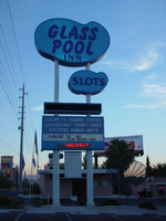
Photographs of Glass Pool Inn signs, Las Vegas (Nev.), 2002
Date
2002
Archival Collection
Description
Daytime views of the Glass Pool Inn signs on the Strip. Information about the sign is available in the Southern Nevada Neon Survey Data Sheet.
Site address: 4613 S Las Vegas Blvd
Sign details: Located on the very south end of Las Vegas Blvd the Glass Pool Inn boasts a Pylon/Pole sign along the east side of the Strip. Both the sign and the adjacent lounge, which holds vestiges of wall signs, are directly Northwest of the famed glass Portaled pool, where the establishment takes its name.
Sign condition: Structure 3 Surface 2 Lighting 2
Sign form: Pylon
Sign-specific description: The Glass Pool's main sign is a double-backed, double poled, internally lit pylon design. The top portion, a sculpted internally lit marquee in the classic kidney pool shape, reads "Glass Pool Inn." A smaller sign of similar water referenced design, sits below the main marquee. They are both contained in sheet metal framed painted blue. The bottom portion is comprised of a incandescent bulb LED matrix center, a Sheet metal message center containing a small plastic readerboard with vinyl letters, and a red neon sign for vacancy. The boxes or the message centers are also blue sheet metal.
Sign - type of display: Neon; Incandescent; Backlit
Sign - media: Steel; Plastic
Sign - non-neon treatments: Paint
Sign animation: none
Sign environment: The Glass Pool Inn sits on south end of the strip among the small dying hotels of Las Vegas Blvd's earlier history, it is one of the first signs you see traveling North on the strip entering town. Just north lies the beginning of the main flood of architecture from the modern strip; while to its south are the beginnings of the strip and the spawning new growth of Las Vegas. The Glass Pool stands in the unique position of being in that gateway of entering the Las Vegas Strip
Sign manufacturer: YESCO
Sign - date of installation: 1953
Sign - date of redesign/move: In 1989 when Steve Wynn was establishing the Mirage, there was another property which also had the name: the small southern Strip, roadside motel. When Wynn acquired the name the original Mirage simply changed its name to the Glass Pool Inn. The original sign was left in place, and simply remodeled to fit the new name of the motel. Permitted by the county to refurbish in December of 1988.
Sign - thematic influences: Water and the pool itself, kidney-shaped design.
Sign - artistic significance: The Glass Pool is an artistic artifact of the older smaller strip hotels. Artistically it is reminiscent of the roadside pole sign used to attract traffic. It represents one of the last strip roadside motels in that portion of the Strip.
Surveyor: Joshua Cannaday
Survey - date completed: 2002
Sign keywords: Pylon; Neon; Incandescent; Backlit; Steel; Plastic; Paint
Mixed Content
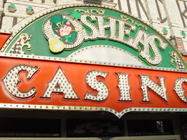
Photographs of O'Shea's signs, Las Vegas (Nev.), 2002
Date
2002
Archival Collection
Description
Daytime views of the O'Sheas Casino signs on the Strip. Information about the sign is available in the Southern Nevada Neon Survey Data Sheet.
Site address: 3555 S Las Vegas Blvd
Sign owner: Park Place Entertainment
Sign details: O'Shea's Casino is located just north across a small driveway from the Flamingo. The small but busy facade is a small, yet busy stop along the Las Vegas Strip. The exterior signage consists of two corner signs, a blade sign, hanging off of the west face of the building, a main entrance sign, backlit screens as well as various images laden with neon. All of these create a flashing display of luminescence all just above the pedestrian's head.
Sign condition: Structure 5 Surface 5 Lighting 5
Sign form: Fascia
Sign-specific description: O'Shea's Casino is located just north across a small driveway from the Flamingo. O'Shea's theme and signage is influenced by Irish culture and imagery, integrated into the forms of signage along the Las Vegas Strip. The building design itself is influenced by traditional European housing imagery, generalized with other elements of architecture also. One example of this is the coloring, exposed wooden beams and narrow rooflines over treated windows, which suggest styles seen in classic European architectural imagery. Examples of other elements such as sculpted windowsills and exterior molding are more akin to neoclassical than the Irish pub or cottage. A small blade sign hangs in the center of the structure facing north /south. Attached off of the building by two poles, the double sided cabinet is designed with a circular portion at the top that transforms along it's bottom edge into length portion of the "blade" that continues down to a rounded bottom. The Circular portion serves as the "O" in O'Shea's. The exterior of the signs width is finished in a polished gold aluminum surface. The top portion continues into a full circular space in the front where the backlit image of the O'Shea's leprechaun mascot resides in it's center. The image has a circular green neon border at the edge of the cabinet and is set into a field of incandescent bulbs, which occupy the remaining space in the face of the "O". Incandescent bulbs also run around the edge of a face on a gold raceway. Channel letters run vertically down the face of the blade spelling the remaining "Sea's" of the title. Each letter is filled with incandescent bulbs, and bordered on it's exterior in green neon. The remainder of the space, which comprises the surface of the sign, is a green material. The entire edge of the rest of the sign is also bordered with incandescent bulbs. Below the blade sign, the main entrance for the establishment is denoted by the large, arched, marquee logo, and wall sign for the casino. The arch shape is bordered by gold polished raceways, with the interior space where the O'Shea's logo is written in a bowed, horizontal arrangement with the "O" and "S" being the biggest letters in this group. The same back-lit leprechaun figure which is present in the blade sign, in seen in the "O" of the logo. The letters are of channel design and filled with incandescent bulbs. Gold scrollwork adorns the green background above and on the sides of the logo. An entablature, running the length below the arch, reads "casino" in channel letters filled with incandescent bulbs and bordered with green neon. The orange background in contained on the bottom edge with a gold polished raceway, which sharply curves into a downward point at the very center. All the raceway edges of the sign are lined with incandescent bulbs. Flanking the wall on either side of the main entrance are two backlit message centers with vinyl lettering. They also are bordered with incandescent bulbs, strewn upon polished raceways. To the south toward the Flamingo Casino, a corner marquee sign faces toward the southwest. The message center on the right of the main entrance essentially continues its shape wrapping in radius fashion all the way around the corner. As the entablature wraps the corner, the color changes to a section of black, containing the channel letters hung at a slight angle, spelling the words " Hall of Fame," in cursive text. Small stars in channel design adorn the black background. On the left of the text, O'Shea's is painted in red paint, in a cursive script at a similar angle as the premier text. Neon is shaped over the surface of the letters to allow it to be spelled in light. The word "Casino" is spelled on the right hand side, and treated in the same fashion. A top the black portion of pediment, the sign continues with it's corner finishing, rounded marquee, containing the text, "Magic & Movie," in a three lined arrangement. Putting the two signs together the appropriate title for the advertisement of the attraction is read "Magic and Movie Hall of Fame." The channel letters on the top portion are filled with neon and treated white on the interiors. The edge of the cabinet is treated with white bull nose borders, sandwiching a field of pink holding two tubes of contoured neon. At the peak of the sign a small element reminiscent of a fan, created using a multi layered box, uses different levels receding into space, with the center blade at the front of the sign. The sections are lined with gold raceways and incandescent bulbs, with the center blade being horizontally striped with tubes of neon. Two small gold finished gargoyle statues flank either side of the theatre-esque entrance. Underneath the overhang created by the corner sign, polished aluminum element creates a sloping drum shape above the door. This drum is divided into sections by gold polished raceways. The flat portion, which returns to the ceiling of the overhang is adorned with painted images of clovers, encircled in rings of green neon. This section is reminiscent of the top section of the corner drum of the Barbary Coast. The black pediment along the south portion of the building., abruptly changes to the orange color seen on the main entrance. Along the south wall section of the pediment green pan channels in the shape of clovers hang, lined on the interior with neon. A small sign denoting parking is also present. Another corner entrance is located on the north end of the property, facing northwest. It too has the rounded corner entrance and logo sign. Slightly different than the main entrance, the same "Casino text and structure is seen on the orange pediment above the door, as well as the channel logo with the mascot located in the letter "O." A three-sectioned panel with swooping wings and an arched center creates the field for the main logo. A more busy section of two dimensional scrollwork sits below the neon filled text. The wings of the top section a recessed panels with checkerboard design behind that. Each side of the entire top section is book ended with two small square posts. Three small miniature spires line the very top, and the same inverted drum shape sits underneath the door. Street posts reside on the sidewalk outside.
Sign - type of display: Neon; Incandescent; Backlit
Sign - media: Steel; Plastic
Sign animation: Chasing, flashing, oscillating
Notes: All of the bulbs, which reside in the fascia signs which designate entrances, oscillate rapidly. The entrance sign a bit closer to the north end of the property also contain the pan channel star shapes, with incandescent bulbs in the center. The bulbs which, reside on the widths edge of the small pole sign at the south end of the property, oscillate giving a twinkling effect. The main pylon's animation is rather simple considering the amount of lighting. Bulbs which create the dazzling background chase each other upward to the very point, then once they reach the top, each letter light up from left to right, one at a time, then off one letter at a time. The letters all turn on simultaneously while, while the background chases up, leaving the lights off in its trail. The text then shuts off as well. The small incandescent bulbs lacing the background of the main body of the sign oscillate subtly, twinkling themselves. Each letter of the text contains a single row of incandescent bulbs, just inside the border of the red neon. This row is always on in a chasing animation from left to right even when the letters are dark. The animation for the three sided, pole sign, at the north end of the property is adorned with sparkling animation as well. The purple bulbs, which create the border of the main base, chase each other from bottom to top, and the star shape in the center is filled with oscillating incandescent bulbs. The bulbs, which also encrust the bottom surface of the cabinet, oscillate as well. The incandescent bulbs, which adorn the background of the text portion of the sign, also sparkle with a soft random oscillating pattern. The stars which sit on top of the cabinet, animate in a random, non descriptive fashion. The inner star shaped pans oscillate with incandescent bulbs, and the neon borders flash on then off, in a clumsy random order. The three-sided sign also rotates, one of the few animatronic signs on the Strip.
Sign environment: Being essentially part of the Flamingo, O'Shea's is only separated by a small drive, producing the easy traffic flow from the north entrance of the former. The north of O'Shea's on the immediate vertical explosion of the front tower/porte cochere of the Imperial Palace. It is easy to say that O'Shea's is sandwiched in between two giants, assuming its place as the charming gap between the Flamingo and the Imperial Palace which is quite a bit more pedestrian friendly. Traveling north on the east side of the strip, O'Shea's is not hard to miss at all
Sign - date of installation: Original date of installation 1989. The southwest, and northwest corner signage were added at a later date
Sign - thematic influences: O'Shea's centers around the theme of the Irish pub, utilizing various imagery to get support the design. The color green is used extensively in the main signs color scheme while the ever-popular image of the folkloric leprechaun illuminated it a cartoon form upon the pylon. The green pan channels, which are shaped like shamrocks, are place along the exterior wall, an obvious reference to the St. Patrick's Day Holiday as well a reference to good luck. ( example: the four-leaf clover, luck of the Irish.) Luck is something synonymously associated with an industry such as gaming. Gold is also used extensively with the exterior referencing the infamous pot of gold associated with the lore of leprechauns. The actual structure itself is constructed with elements which suggest a European rustic cottage.
Surveyor: Joshua Cannaday
Survey - date completed: 2002
Sign keywords: Chasing; Oscillating; Fascia; Neon; Incandescent; Backlit; Steel; Plastic
Mixed Content
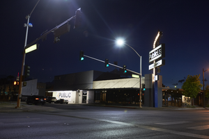
Photographs of PublicUs sign, Las Vegas (Nev.), April 18, 2017
Date
2017-04-18
2017-08-18
Archival Collection
Description
The PublicUs coffee shop sign sits at 1126 Fremont in Downtown Las Vegas. Information about the sign is available in the Southern Nevada Neon Survey Data Sheet.
Site address: 1126 Fremont St
Sign owner: Kimo Akiona, Cole McBride and Travis Landice
Sign details: PublicUs opened in 2015. This property has previously held other restaurants the most recent being a Philly Cheese Steak restaurant. PublicUs represents "for the people" in Latin. Hemant Kishore is the baker and chef. This location is a canteen-style restaurant and coffee house where they make all organic foods in house.
Sign condition: 4- the steel part of the sign looks relatively new and has bright paint, but the plastic portion for the sign does some aging to it.
Sign form: Pylon
Sign-specific description: On the corner of Fremont E and Maryland pkwy at the corner of their building there is a blue been sticking out of the ground that is curved at the top. Near this curved section is a rectangle steel sign box that has a back lit plastic sign in it, and underneath is a similar rectangular box. The bigger rectangular box has a white background, but has the a light tan box with PublicUs logo in white letters in the light tan brown box. The smaller box on the bottom has the white backdrop and the tan colored rectangle has Fremont Village written in a white font. Both rectangle signs have an arrow pointing through them with the tip of the arrow above their main logo sign and the "feathers" of the arrow underneath Fremont Village sign.
Sign - type of display: Backlit plastic sign and incandescent light bulbs
Sign - media: Steel and plastic
Sign - non-neon treatments: Plastic back lit portion of sign
Sign animation: Flasher for incandescent light bulbs
Sign environment: This is located on the corner of Maryland Pkwy and Fremont Street East. Surrounding this property is a lot of old motels that have been shut down, and painted over though many of their neon signs are still up and some working. On the same block as them is a vintage barber shop and a vintage tattoo parlor.
Sign manufacturer: Main portion of the sign was around before they opened so information on the base of the sign was not found
Sign - date of installation: The sign box has records of being around longer than the PublicUs has, records (Google Maps satellite view) show the sign similar to this has been up since at least 2013
Sign - date of redesign/move: Late 2015 is when their main logo was installed
Sign - thematic influences: This sign shows how signs can be re-purposed or can evolve with different colors and slightly different designs over the years even though the theme of the property has changed.
Sign - artistic significance: The arrow in the sign could signify a bulls eye in the sense that you are looking in the right spot or have found the perfect spot.
Survey - research locations: Google Maps satellite view, Sprudge coffee blog http://sprudge.com/publicus-97938.html , Eating Las Vegas http://www.eatinglv.com/2015/03/publicus-is-open-and-baking-for-the-people/
Survey - research notes: This restaurant has faux trees and nice wooden tables inside to make it feel as though you are outdoors but still in a homey place.
Surveyor: Emily Fellmer
Survey - date completed: 2017-08-18
Sign keywords: Plastic; Backlit; Incandescent; Steel; Flashing; Pole sign
Mixed Content
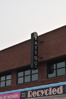
Recycled Records flag mounted wall sign, Reno, Nevada
Date
2016 (year approximate) to 2020 (year approximate)
Archival Collection
Description
View of a flag mounted sign above Recycled Records, the sign reads "tattoo."
822 S Virginia St, Reno, NV 89501
Image
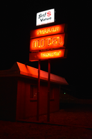
Sharon Motel double mounted sign, Wells, Nevada
Date
2021
Archival Collection
Description
Views of the Sharon Motel double mounted sign with lit neon during the day and at night.
635 6th St, Wells, NV 89835
Sharon Motel
Image
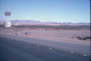
Slide of a roadside neon sign for a casino, Laughlin, Nevada, 1986
Date
1986
Archival Collection
Description
A color image of a neon sign on the side of a road indicating a casino and hotel coming up.
Image
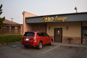
Alibi Lounge wall mounted sign, Reno, Nevada
Date
2019 (year approximate) to 2020 (year approximate)
Archival Collection
Description
View of the wall mounted sign for the Alibi Lounge at night with lit neon.
125 Casazza Dr, Reno, NV 89502
Image
The Union wall mounted signs, Carson City, Nevada
Date
2016 (year approximate) to 2020 (year approximate)
Archival Collection
Description
View of the wall mounted signs for The Union during the day.
302 N Carson St, Carson City, NV 89701
The Union
Image