Search Results
Photographs of McDonald's sign, 2800 S Las Vegas Blvd, Las Vegas (Nev.), 2002
Date
Archival Collection
Description
Site address: 2800 S Las Vegas Blvd
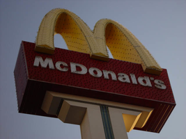
Sign details: Located just south of the Westward Ho's south parking lot is the third and northern most version of the sign. Unlike its other two relatives, this sign is solely designated to the McDonald's establishment. It is located in a small landscaped area directly east of the front of the restaurant. This section essentially comprises the front of the establishment itself. It stands tall on the west side of the strip facing north south.
Sign condition: Structure 5 Surface 4 Lighting 4 It is noted that the structural integrity is intact. Certain elements of lighting are out or not working but still present. The surface appears to be slightly deteriorating at this point.
Sign form: Pylon
Sign-specific description: The odd member of the three McDonald's pylons is different in almost every aspect, considering the similarity of the first two to each other. The sign construction itself is a more sleek, opting to integrate the entire structure into a much smoother design than the previous design as well. The other two cabinets are impressive indeed, but the placement of the cabinets is less clumsy than the others. The pole itself is thinner, painted brown steel flat post, which rises into the air, recording a small rectangular anomaly in the vertical line, which is used to support a yellow plastic internally lit cabinet. The four-sided shape swells out on each side, but transitions smoothly as the vertical shot continues upward. The brown post T's off to either side actually stretching to the widest point of the sign. It then grows vertically once again to create the sides of the cabinet. The shape that the brown portion creates is now more akin to a "U" shape rather than a "T." The entire surface of the pylon which is designated brown in laced with incandescent bulbs. Inside this U shape the face of the cabinet is designated red, and set higher above the surface plain of the face. The red fluted steel face is adorned with vertical neon bars and white channel letters floating above the surface. The channel letters are filled with bars of white neon. The giant golden arches break up the top edge of the red cabinet. The arches themselves are yellow painted steel, whose face are encrusted with yellow incandescent bulbs as well as border of yellow neon which floats around the edge of the arch. The tops and bottom surfaces are finished in a reflective, gold, polished metal. A channel runs up the center of the post and a yellow tube of neon glows as a centering stripe. This stripe actually ties in the internally lit yellow sign, with the crowning arches, quite well.
Sign - type of display: Neon; Incandescent; Backlit
Sign - media: Steel; Plastic
Sign - non-neon treatments: Paint
Sign animation: Oscillating, flashing
Notes: The white incandescent bulbs on the face of the sign illuminate in a chasing pattern from bottom to top, leaving all the bulbs illuminated in it's path, oscillating as they are illuminated. The post vertically illuminates, and when the bulbs reach the top of the brown arms of the U shape, the vertical, red, neon bars on the red portion of the cabinet, chase in simultaneously from either side. They meet in the middle leaving all the bars and thus the cabinet fully illuminated. The cabinet stays lit for a few moments, then the bars curtain out from the middle, back to either side, leaving the bars dark in the animations path. Once they reach the edge, the incandescent bulbs follow suit, and chase back down to the bottom, leaving all the bulbs dark it the chasing path. The yellow incandescent bulbs, which are on the face of the golden arches, constantly oscillate during the animations sequence.
Sign environment: As compared to the other two properties, the environment of this McDonald's is quite different. The other two were integrated into the strip mall design, utilizing the pylon itself for other advertisements as well. Even though the McDonald's pylon stood out as the dominant figure among their surroundings, They still felt as if they were part of a whole as well. The environment, which the northern pylon portrays, also reflects its surroundings as well. This environment of the Westward Ho, the Stardust, the Riviera, and the Circus Circus, bring about a certain garish nature in its design that fits in present in the McDonald's pylon.( see artistic significance and theme for further).
Sign manufacturer: YESCO
Sign - thematic influences: The theme of the McDonald's establishment is in the realm of the well-established McDonalds corporation. The golden arches, and solid red hue, have become synonymous with the name "McDonald's," and is an image, which has been communicated to the masses of people for half a century. It is an icon that is associated with America all over the world. McDonalds has created it's own realm and thematic influence over the years from all of it's extensive advertisements and marketing. Therefore, the theme of the establishment's signs draws from itself and the world, which the name has created. Being one of the most commonly seen images in America, this sign is tailored to fit into the illustrious, illuminative properties held on the Las Vegas Strip. It fits into the category of everyday images and businesses dressed up for Las Vegas, which include, Arabia's, Arco AM/PM, Walgreen's, and Fatburger.
Sign - artistic significance: Besides what is mentioned in the above paragraph about the above nature of the iconography of the said logo, this particular sign draws off of its surroundings to display certain aesthetic elements.
Surveyor: Joshua Cannaday
Survey - date completed: 2002
Sign keywords: Oscillating; Flashing; Pylon; Neon; Incandescent; Backlit; Steel; Plastic; Paint
Mixed Content
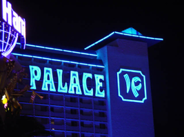
Photographs of Imperial Palace signs, Las Vegas (Nev.), 2002
Date
Archival Collection
Description
Nighttime views of the Imperial Palace Hotel and Casino signs on the Strip. Information about the sign is available in the Southern Nevada Neon Survey Data Sheet.
Site address: 3535 S Las Vegas Blvd
Sign owner: Ralph Engelstad
Sign details: Shadowing Oshea's, the Imperial palace looms high above the street. The tower for the hotel is located just east of the strip, but one of the main entrances is the unique porte-cochere and facade on the east side of the strip. The main tower resides east, seen behind the Harrah's Carnival Court. Signage includes Giant channel letters on the tower, five cabinets of the Imperial Palace logo initials placed along the towers, internally lit sculpted cabinets on the front tower, as well as the an LED screen, and a vastly lit porte- cochere, along with cabinets.
Sign condition: Structure 4 Surface 3 Lighting 4 The structure of the Imperial Palace's main tower signs seem to be intact, while the front towers signage and porte cochere are in great repair. The surfaces of the main tower are rather dull and pale during the day, but the light color aids in the luminescence at night. The lighting is in excellent repair.
Sign form: Fascia; Porte-cochère
Sign-specific description: The structure is themed after an Asian palace, complete with multi tiered swooping tiled Asian style roof lines, and wooden square beams placed to be representative of rice paper doors and windows, and symbols of dragons. Between two gaping square entrances of the front tower, sliding doors almost cower below a giant color LED message center, flanked by two back-lit , color, flex-front, two-dimensional dragons. The dragons stand upright pawing at each side of the central cabinet. The entire array sits on the lowest swooping Asian design roof level in blue tiles. As the building rises upwards, the center section repeats in multi tiered, blue roof lines, finally crowning with a fourth one, peaked at the top. The bottoms of each ones of these rooflines is bordered on the bottom with blue tubes of neon. The two main drives into to covered porte cochere, head east then turn inward, forming a squared U shape. Obviously one door is for entrance and one an exit. The ceiling is comprised of polished aluminum square panels, each one with four large, spherical, incandescent bulbs. The effect is an engaging field of animated bulbs, interrupted only by the presence of five large circular cabinets, which hang facing the floor. One hangs just into the entrance and exit, and one in the center of the north/south connecting sections of the two flanking tunnels, and two more set in the corners. The two just into the mouth, and in the corner of the tunnels, are polished aluminum themselves, with internally lit plastic fronts. These fronts are blue and white, pained graphically with an Asian geometric design, which fills the entire surface. The one cabinet is treated in the same exterior finish, but the design is created out of blue neon. Above the doors to the casino, in this cove, polished channel letters with blue plastic fronts, and borders created with narrow channels, are lined with incandescent bulbs. The tower set back into the property is adorned by a set of two story tall, white channel letters, facing west just below a long blue tiled roof, spell "Imperial Palace" and are filled with blue neon. Letters can be seen on the East face of the tower as well. On the same level of the southern end of the tower, a square, blue, channel edged cabinet, holds the channel letter initials "I" and "P." Another cabinet faces north on the north side of the tower. The channels and initials are lined with blue neon. The same arrangement can be found on the east side of the tower as well. The I and P can also be seen on the north and south end of the tower, but without the border. All of the rooflines on the tower are lined with blue neon as well. Both towers are ambiently lit with blue spotlights, casting a blue hue all over the property. At the very top of the front tower, a spike rises into the air, and is adorned with rings of blue neon.
Sign - type of display: Neon; Incandescent; Backlit
Sign - media: Steel; Plastic
Sign - non-neon treatments: Graphics
Sign animation: Oscillating
Notes: The incandescent bulbs covering the ceiling of the porte cochere, oscillate vibrantly, creating a shimmering cave of light.
Sign environment: The Imperial Palace is placed in an unusual position, with the front tower pushed right up to the street, with cars and taxis zipping in and out of the large square entrances. Just to the north is the Harrah's Carnival Court, which pushes right up to the edge of the north face of the front tower. Just to the south O Shea's sits in the great blue shadow of the Imperial palace.
Sign - date of installation: The hotel opened as the Imperial Palace in 1979. The front tower was built in 1981. The hotel was finished in three phases 1981, 1982, and 1987-1989.
Sign - thematic influences: The Imperial Palace is themed after an Asian palace, signifying the theme through several structural elements seen on the exterior. The stylized roofline, and actual shape of the roof are the representative of the classic eastern palace design seen throughout most Asian cultures in their history. The text on the main towers is stylized and representative of western text written to resemble the graceful brush stroke of Asian characters. Another obvious aspect is the backlit Asian dragons on either side of the giant LED screen on the front of the tower containing the porte-cochere. The Imperial Palace is a themed hotel, revolving around a culture, like that seen in Paris or the Bellagio. The significance of the signage relies in its Porte cochere. Related to the Riviera's parking garage due to the fact that it is located inside of one of the buildings, hidden away from plain sight. The stunning array of incandescent bulbs, lining the ceiling, and reflecting off of the high use of reflective panels. The use of the reflective metals is evidence of the leftover trend massive trend used in the 1970's due to an energy shortage. It itself, is a one of a kind porte-cochere and, is one of the most vibrant still in existence.
Surveyor: Joshua Cannaday
Survey - date completed: 2002
Sign keywords: Oscillating; Fascia; Porte-cochère; Neon; Incandescent; Backlit; Steel; Plastic; Graphics
Mixed Content
Maria Pogee Papers
Identifier
Abstract
The Maria Pogee Papers (1942-2019) document the life and career of Argentinian born dancer, choreographer, and actress, Maria Pogee. Pogee worked extensively in Argentina, Chile, Lebanon, around the United States and in Las Vegas, Nevada. Materials include press clippings, show programs, correspondence, and photographs representing Pogee's entertainment career such as her work in the stage production of
Archival Collection
Young Electric Sign Company (YESCO) Corporate Records
Identifier
Abstract
The Young Electric Sign Company (YESCO) Corporate Records (1914-2000) document the history of the Young Electric Sign Company (YESCO) and is comprised of photographs of sign production and finished signs, negatives, slides, transparencies, anniversary scrapbooks, and videotapes. The collection also contains meeting minutes, correspondence, price books, drawings, calculations, newspaper and trade magazine articles on YESCO, advertising materials, and oral history interviews and audio recordings of YESCO designers and executives. YESCO is responsible for many of the neon signs in and around Las Vegas, Nevada and Reno, Nevada, as well as other Western states.
Archival Collection
Alpha Kappa Alpha Sorority, Theta Theta Omega Chapter health committee reports
Date
Archival Collection
Description
From the Alpha Kappa Alpha Sorority, Incorporated, Theta Theta Omega Chapter Records (MS-01014) -- Chapter records file. Includes National Black Leadership Initiative on Cancer, Las Vegas coalition (NBLIC) records and program for "Nevada's First African American Wellness Conference."
Text
Martin Stern Architectural Records
Identifier
Abstract
The collection is comprised of drawings (1950-1990) completed by American architect Martin Stern and/or his architectural firm, Martin Stern Jr., AIA Architect and Associates, and contains 400 cubic feet of materials including 710 drawings from over 300 different projects involving over 100 buildings. Stern’s work focused on the resort centers of Las Vegas, Nevada; Reno, Nevada; Lake Tahoe, Stateline, Nevada; and Atlantic City, New Jersey. The materials feature hand-drawn architectural drawings, ranging from pencil and ink on tracing paper preliminary sketches to ink on Mylar (TM) construction documents, and a number of artist’s renderings, used for presentations and promotional materials. The drawings also contain work from a number of consultants, engineers, and other architects who collaborated on the development of the various projects. The collection includes architectural drawings for: hotels, casinos, integrated casino resorts, office towers, multi-family residential developments, and custom single-family homes.
Archival Collection