Search Results
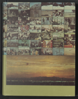
Epilogue: UNLV Yearbook, 1970
Date
Description
Yearbook main highlights: schools and departments; detailed lists with names and headshots of faculty, administration and students; variety of photos from activities, festivals, campus life, and buildings; campus organizations such as sororities, fraternities and councils; beauty contest winners; college sports and featured athletes; and printed advertisements of local businesses; Institution name: University of Nevada, Las Vegas
Mixed Content

Transcript of interview with Toni Clark by Joanne Goodwin, July 2, 1996
Date
Archival Collection
Description
Toni Clark (born Lena Gaglionese) spent her youth in Seattle, Washington where she was born on April 4, 1915 to Angelene and Salvatore Gaglionese. Her father and mother moved to the Seattle area when they immigrated to the United States from Naples, Italy years earlier. Salvatore worked as a street cleaner for the city of Seattle and Angelene cared for the house and family until her early death. Toni grew up with three siblings, her father and step-mother, and an uncle and cousins next door. After attending Seattle’s Franklin High School for three years, she left. “I just didn’t like school so I quit,” she said, and spent the next couple of years at home. From these simple origins, Toni became “the first lady of Las Vegas” as some admirers called her, referring to the role she played in the transformation of Las Vegas from a frontier town into a glamorous resort town during the 1950s and 1960s. In 1941, before the Second World War began, Toni traveled to San Diego to visit friends and decided to stay. After a year of caring for a young boy, she moved into the Barbara Worth Hotel which was owned by Wilbur Clark. Clark’s father ran the hotel and suggested that Toni apply for a job at his son’s new bar and restaurant, the Monte Carlo. She had not met Wilbur Clark at the time and her shyness dissuaded her from making the move. Nevertheless, she did apply and went to work as the hostess of the Monte Carlo in downtown San Diego. Wilbur and Toni’s courtship began slowly. He gave her the name Toni, saying she “looked more like a Toni than a Lena,” and she kept it. In 1944, around the time Wilbur Clark relocated to Las Vegas where he had purchased the El Rancho Hotel, the couple married in Reno, Nevada and permanently made Las Vegas their home. Clark’s involvement in Las Vegas clubs and gambling expanded with the Monte Carlo downtown and the Player’s Club on the strip. But his dream to create a luxury resort hotel came to fruition when the Desert Inn opened in 1950. The fifth major property on the strip, the Desert Inn had several features that distinguished it from other places. The Skyroom offered a private club atmosphere for talking, music, and dancing. The Monte Carlo Room served French cuisine. The Doll House provided round-the-clock childcare for children of hotel guests. The Painted Desert Room, the property’s showroom, featured top performers and the Donn Arden Dancers. All these features combined to create a resort that offered guests an exquisite setting for a gambling vacation. Toni Clark had a special place at the heart of the Desert Inn’s social life. She brought a gracious and elegant charm to social events associated with the property. Although she said she was never involved in the business of the hotel-casino, she played a unique role setting a new tone for the enterprise. She entertained guests and dignitaries at the hotel as well as her home; organized fashion shows featuring the top designers of the time for the wives of high-rollers; and created celebrations of special events, notably her husband’s late December birthday, with annual parties. When Wilbur Clark died in 1965, Toni Clark remained active in the city’s social life. She did not disappear as others had, but continued to plan and attend social functions. As part of her service to the community, she took particular pleasure in her work with the Variety Club. She continued to reside in Las Vegas until her death in 2006.
Text

Transcript of interview with Richard Steele and Zakeisha Steele-Jones by Claytee White, February 12, 2015
Date
Archival Collection
Description
Richard Steele became interested in professional boxing at a young age when he was introduced to world champion boxers Chalky Wright and Sugar Ray Robinson. He trained at Hoover Street Gym in South Central, Los Angeles, with trainer Eddie Futch. Richard joined and boxed for the United States Marine Corps and became Marine Corps Middleweight Champion in 1963. Born in Kansas City, Missouri in 1944 Richard and his family moved to Los Angeles, California in the early 1950s. His father was a bartender and his mother was an elevator operator. During the interview Richard’s daughter Zakeisha Steele-Jones discusses the various job titles her father has held, including professional actor and campus police officer. Most notably, Richard was the second Black professional referee in both Los Angeles, California, and Las Vegas, Nevada. A profound interview heralding key character traits, such as, perseverance, resilience, strength, and determination, Richard recalls being personally invited by Nelson Mandela to referee the WBC Convention in South Africa. Some of Richard’s most memorable title fights to date include, the Hearns and Hagler fight, Sugar Ray Leonard and Tommy Hearns, and four Mike Tyson fights. Zakeisha also interjects that her father currently manages and owns a boxing gym where he trains and mentors young Black and Hispanic aspiring boxing champions and referees.
Text
Transcript of interview with Susan Jones Watson by Claytee White, February 20, 2013
Date
Archival Collection
Description
A resident of Southern Nevada from the age of three, Susan Watson shares her memories of growing up and living in Las Vegas. After a year in Boulder City, Susan's father bought an old army barrack and converted it to a home in North Las Vegas; Susan remembers playing in the desert with her siblings and attending elementary and middle school before starting at Rancho High. Watching her mother design costumes for Strip performers and beautiful dresses for her own high school dances no doubt helped Susan develop her own sense of taste and style - something that she would put to good use over many years as an interior designer. Before that though, Susan shares her memories of what life was like in the Las Vegas of the 1950s and 1960s: cruising Fremont Street; movie nights; after-school work; favorite teachers; lunches on the lawn; and dance club. All combine to paint a vivid picture of a smaller town and a simpler time in the Las Vegas valley.
Text
Transcript of interview with Dr. Joseph Rojas by Lisa Gioia-Acres, September 30, 2008
Date
Archival Collection
Description
Dr. Joseph Rojas, born 1933 in Alexandria, Louisiana, was the son of Joseph Edward Rojas and wife Carroll. He graduated high school at age 16 and entered Loyola University of the South. Two years later he was accepted at Louisiana State University School of Medicine, graduating with a medical degree in 1957. He interned at Charity Hospital and then completed his OB-GYN residency at Tulane University. Several mentors worked with Dr. Rojas during his residency and he recalls learning surgical and bed-side skills from the likes of Dr. Lynn White and Dr. Fred Janson. He also remembers the very high volume of patients - up to 300 - that he and other residents saw daily. Dr. Rojas married Mona Robicheaux, RN, during his residency and afterwards joined the Air Force. He and his family — they eventually had six children — were stationed at Nellis Air Force Base, arriving in Las Vegas in 1961. He was chief of OBGYN and deputy hospital commander while at Nellis and then served as chief of OBGYN at Southern Nevada Memorial Hospital until 1972. He later served as chief of staff at Women's Hospital and Valley Hospital, and was the first chief of staff at Summerlin Hospital. Dr. Rojas also maintained a private practice outside of the hospital. His wife worked alongside him in his office, and they share memories and anecdotes of the patients they saw and the general atmosphere of the medical community. Both Joseph and Mona agree that Las Vegas hospitals were less racially segregated than the hospitals in Louisiana, and felt that the West was more open to integration. In 1966 Dr. Rojas started the first OB-GYN residency in Nevada, which led to the development of the University of Nevada School of Medicine. He was a researcher, lecturer, teacher, and author. He earned many awards, including the Harold Feikes MD Award for Outstanding Physician in Clark County (2001), and the Nevada State Medical Association Distinguished Physician Award (1980). Dr. Rojas passed away in May of 2009, leaving behind an incredible legacy of service to the residents of Clark County.
Text

Jessica Hutchings oral history interview: transcript
Date
Archival Collection
Description
Oral history interview with Jessica Hutchings conducted by Barbara Tabach on March 21, 2018 for the Remembering 1 October Oral History Project. In this interview, Jessica Hutchings discusses her experience flying to Las Vegas, Nevada on the night of the October 1, 2017 mass shooting. She speaks of her flight's detour to Phoenix, Arizona, and her discovery of the shooting. Hutchings explains how Congregation Ner Tamid, where she is a cantor, contributed to the community healing after the tragedy, including their organization of vigils, a music fundraiser called "Vegas Strong in Song," and discussing the event with teenage Hebrew School students who had questions and concerns about the shooting.
Text
Kellie Kowal-Paul (Clark County School District) oral history interview conducted by Magdalena Martinez and Elia Del Carmen Solano-Patricio: transcript
Date
Archival Collection
Description
From the Lincy Institute "Perspectives from the COVID-19 Pandemic" Oral History Project (MS-01178) -- Education sector interviews file.
Text
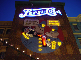
Photographs of New York New York signs, Las Vegas (Nev.), 2002
Date
Archival Collection
Description
Site name: New York-New York Hotel and Casino (Las Vegas, Nev.)
Site address: 3790 S Las Vegas Blvd
Sign owner: MGM Mirage
Sign details: Occupying the northwest corner of Las Vegas Blvd and Tropicana Ave. is the New York New York Hotel and Casino. The property is a miniature representation of New York City in a collection of colorful architecture and sculpture. Colored reflective panels create the facades of high rises and skyscrapers. An almost cartoon like element is brought to the structures, flowing seamlessly sometimes throughout a surreal landscape of classical architectural elements and mock high rises. Distinguishable landmarks, such as the Empire State Building, the Statue of Liberty, and the Brooklyn Bridge, can be recognized with ease. A lagoon of water represents a harbor shooting water out of fountains disguised as boats.
Sign condition: Structure 5 Surface 5 Lighting 5
Sign form: Pylon; Fascia; Porte-cochère
Sign-specific description: The porte cochere is located on the south side of the property facing Tropicana Ave. The design cantilevers off of the main structure to the north, and then is supported by two columns on its far end. The three exposed sides hold the radiating crown of the New York New York logo sign. The two on the east and west sides are smaller than the one on the south side, but are essentially the same design. A half circle cabinet holds the text New York New York stacked in two lines. The channel letters are polished metal on the outside with incandescent bulbs on the interior. Their faces are bordered with red neon. The text is positioned on the front of the half circle cabinet. Breaking the surface of the radius edge, elongated triangular pan channels create a repeating pattern. The result is a crown of points running all across the top of the cabinet. It is reminiscent of the crown on the statue of liberty, or the rays of the rising sun. The face of the cabinet is painted blue, with metallic raceways, filling the negative spaces with more triangular shapes. The triangular pans are painted yellow on the interior with a blue finish on the exterior. The exterior width of the cabinet is also finished in a golden reflective surface. Three tubes of neon fashioned into succeedingly smaller triangles are inside each surface. The color scheme of the neon is yellow being the outer, orange being the second, and the center being red. The sign on the south side is designed the same, except being quite a bit larger, and the crowns of the cabinet angle forward instead of straight up in the air. All the edges are bordered with incandescent bulbs. The bottom edge below the signage, actually underlining the signage significantly, is a gold polished double bull nose that wraps the entire length of each side. The surface is strewn with small incandescent bulbs. An entablature runs above the bull nose, filling the spaces between the sign. The pediment is bordered on the top and the bottom with gold polished raceways and incandescent bulbs. Two mirrored posts support the southern end. The ceiling of the porte cochere is treated much the same as the logo signage on the three sides of the roof. Long pan channels are placed on the ceilings and shaped to look like waving banners, confetti, and beams, radiate out of a centerpiece positioned over the entrance to the casino. Red pans are painted orange on the interiors and green channels are painted blue on the interior. Tubes of neon are bent to the contours of the shapes of each one of these channels. The entire composition is a brilliant abstract pattern of light and colored steel shooting out toward Tropicana Ave. Headed east toward the northwest corner a bridge connects the Excalibur property to the New York New York. At the end of a bridge an entrance into the NY NY is below a LED message center and an arched logo cabinet, with the text and the radiating triangular channels. It is actually the same neon and color scheme, just fit to sit over the LCD display. The sign faces south. The sign has the distinct backdrop of a domed rotunda lined with columns. Rounding the corner another elevated bridge stretches east over the strip to the MGM property. The same configuration of the arched signage, along with the illuminated text, and LCD display screen is on the east side of the building. The corner facade of the harbor is flanked by these two collections of signs and walkways. Around the corner, the property extends north up Las Vegas Blvd continuing the facade of fake apartment buildings, with storefront windows at ground level. Here the replica of the Brooklyn Bridge serves as the main concourse of pedestrian activity. There are two sections of sign that are of particular interest to the eastern face of the building. The first is an advertisement for Panasonic. Panasonic is spelled in silver channel letters with blue fronts. The blocky font is internally lit. The entire text sits along the top edge of a matching message center. Further north on the face of the building, a section of building, finished in brick, combine graphics and three-dimensional elements for a sign for Pepsi. Toward the top of the face a logo/wall sign is crafted out of channel letters and filled with incandescent bulbs and bordered with blue neon. The entire text reads "Pepsi: Cola" The capital "P" and "C" are crafted out of one cursive style channel. The remaining letters are spelled in separate channel letters. The channel letters are stylized in a fashion reminiscent of the turn if the century. The colon placed between the "I" in Pepsi and the "C" in cola is also made out of channel boxes. Below the logo, a mural is painted on the majority of the remaining open space on the surface. Two police officers, in the style of early cartoons from the first few decades of the twentieth century, are the focus of the mural and are reminiscent of the famed "keystone" cops. The two figures are shown from about waist up in a circle, which is broken at the top by the white painted thought bubbles, bordered in black. The thought bubble on the left reads "bigger bottle" and the opposite reads, "better flavor". The two police officers correspond the appropriate thought bubble, with the one on the left being the larger figure, and the one on the right being smaller and apparently older. They are treated with blue paint, with their stripes, buttons and badges, treated in yellow paint. The skin tones are treated with proper hues, with facial features distinguished by black contour lines. The three-dimensional aspects come into play when describing their action. The officer on the left is pouring a bottle of the cola into the glass, which the other officer is holding. The one hand each officer is showing is a three-dimensional, fiberglass, white, cartoon, gloves. The one on the left is integrated into the tilted bottle. The bottle is coming off of the wall in a sculpted two-dimensional cabinet. The bottle is treated with the red white and blue Pepsi label, and reminiscent of the logo channel text. The tilted bottle points down toward a glass that the other officer holds. The glass is also a sculpted cabinet treated with paint on the surface, as well as the bottle, to appear as glass, utilizing highlights. Neon for the mural is cleverly designed to accent the mural and compliment the design. The text in the thought bubbles is overlaid with yellow neon, which animates back and forth to suggest an interaction of talking to each other. One half will illuminate, then the other as the first darkens. The yellow painted buttons, stripes, and badges of the characters uniforms are all outlined with yellow neon. The action of the neon in the bottle and glass can be seen through the semitransparent materials. Horizontal tubes of red neon fill the bottle, as well as the glass. In the space between the bottle and the glass waving tubes of neon pass through the apparent opening at the top of the cabinet, and can be seen behind the translucent face. When in action, the bottle appears as if it is pouring the liquid into the cup. (see animation notes) Among the ground level shops along the east side, marquis signage denotes passage. One on the southern end of the elevation just before the Brooklyn Bridge begins, and another, a bit further north, before the ESPN Zone signage. Two message panels come off the wall at an angle flattening off with a smaller panel boasting logo channel letters. Each one of the wings are spanned across the top of the face with channel letters spelling "entrance," painted in an off white on the interior. They are filled with incandescent bulbs and bordered with red neon. The remaining space on the bottom of the face is an LED message center. A narrow horizontal plane rises off of the top edge and is lined with three tubes of neon. The cabinet is made of a polished gold metal. The entire outline of the wing is lined with a raceway lined with incandescent bulbs. Smaller eastern face of the overhang is a square cabinet with an arched top. To either side of the cabinet is crafted into a set of two narrow horizontal planes. The one closest to the cabinet is taller that the one right next to it, with rounded corners echoing the curve of the main cabinet. The resultant effect is a sculpted cabinet with a top edge descending on either side in a water falling radius. These bookend elements are bordered with yellow, and three vertical tubes of neon running the length of the interior. They main cabinet is occupied by the internally lit double set initials "NY," stacked one set on top of the other. They too are filled with incandescent bulbs and bordered with red neon. The face of the middle cabinet is bordered with incandescent bulbs and finished in a slick blue hue. The underside of the overhang is covered in the polished gold surface and laden with incandescent bulbs. The northern end of the property is dominated by the signage for the ESPN Zone sports lounge, located inside the NY NY. The exterior signage is basically a theatre marquee entrance with a long overhang supporting an electronic message banner that reads from left to right. The majority of the theatre front is polished aluminum wit h thin tubes of red neon above and below the electronic reader board. Above the top edge of the actual front of the sign is a design of pan channels, crafted and shaped to form a complex background for the logo text spelling "ESPN." A wavy green crafted channel creates what looks like a horizon. The space between the marquee and the green channel is a black field laden with incandescent bulbs. Above the green channel an array of pan channels crafted into interlocking, swaying, pointed shapes. They are painted yellow and orange so the result is a bed of flames. These too are lined in the interior of the contour in red and orange neon. In the center of the entire face of the overhand in a black steel cabinet with the logo for the establishment spelling "ESPN Zone." The First portion of the two-word phrase is spelled in shallow channel letters lined with horizontal bars of white neon. The text is outlined in red neon as well. The second half spells "Zone," and is written in the same font with the "Z" being the largest letter in the sign, designed with the bottom horizontal leg underlining the rest of the letters in the word. The word is oulined with white neon as well. The latter portion is filled with horizontal bars of red neon. Situated along the middle of the sign, and against the vertical plane of the building, a blade sign repeats the design and colors of the bottom portion of the sign. The vertical cabinet is double sided spelling the "ESPN Zone" logo vertically with the same neon treatments for the respective words. The three toned background of black, green, red and orange on the bottom of the sign is interpreted on the blade. Running vertically, the black portion laden with bulbs runs against the wall, with the wavy channel next to that, disappearing temporarily behind the letters. The flames hang off of the outer edge of the sign. All of the neon treatments are seen here as well. Crowning the top of the blade sign two circular cabinets are arranged touching each other at one end, the faces pointing out to angled directions. Here the ESPN logo is arranged inside a circle. The bottom half below the letters is filled with horizontal bars of green neon, while the flames are present on the top half. The same cabinets can be seen mounted on the ends of the bottom overhang.
Sign - type of display: Neon; Incandescent; Backlit
Sign - media: Steel; Plastic; Fiberglass
Sign - non-neon treatments: Graphics; Paint
Sign animation: Chasing, flashing, oscillating
Notes: The incandescent bulbs inside the text reading "Paris" on the balloon oscillate rapidly.
Sign environment: Centering around the theme of the city of New York, it utilizes the corner to create a wrapping montage of sales kiosks, paralleled by a miniature replica of the Brooklyn bridge transforming into a corner bay flanked by the overhead walkways, and bringing the viewer in to the brightly lit arms of the porte cochere. The environment of the overhead wall signs and entrance signs blend in and compliment the theme aspect of being in a city. Of course they stand out a bit more with the over the top Vegas garishness, but they also add to the pedestrian interactive feature that creates the environment in which it sets out to accomplish. The corner fountain provides a unique experience with the views of the neighboring casinos but creates a bit more of a surreal nature with the small scale Statue of Liberty and backing of stylized skyscrapers and metropolitan architecture. To follow further around the corner headed south; the blazing neon adorned porte-cochere is backed by yet more architecture and the sweeping tracks of the resorts roller coaster.
Sign designer: Marnell Corrao Architect: Neal Gaskin
Sign - date of installation: 1997
Sign - thematic influences: The New York City theme is the consuming factor in the aspects of the outmost design interior and exterior, as well as influencing the design of the signage itself. From the corner design being used to create a miniature water spectacular representing a harbor, to the faux apartment and store-fronts, and replica Brooklyn Bridge, to the peaks of the logo cabinet work. It joins the array of properties on the strip which are heavily themed, and designed to attract a family oriented crowd. It is also themed after a city.
Sign - artistic significance: This resort has regularly been recognized as one of the architectural wonders of the Strip, and the signage contributes to its fame.
Surveyor: Joshua Cannaday
Survey - date completed: 2002
Sign keywords: Chasing; Flashing; Oscillating; Pylon; Fascia; Porte-cochère; Neon; Incandescent; Backlit; Steel; Plastic; Fiberglass; Paint; Graphics
Mixed Content
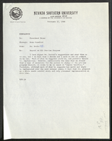
Nevada Southern University law program: reports and correspondence
Date
Archival Collection
Description
Folder contains memorandums, correspondence related to the law program at Nevada Southern University (later UNLV). It includes a report on the NSU law program (fall term 1967-1968), a report of the Association of American Law Schools Committee on Guidelines for New Law Schools (1966), and a report of Dean Willard H. Pedrick, Arizona State University College of Law (1967). From the University of Nevada, Las Vegas William S. Boyd School of Law Records (UA-00048).
Text

Juliana Chen oral history interview: transcript
Date
Archival Collection
Description
Oral history interview with Juliana Chen conducted by Cecilia Winchell and Stefani Evans on March 21, 2021 for Reflections: The Las Vegas Asian American and Pacific Islander Oral History Project. In this interview, Juliana Chen shares her upbringing in Hunan, China and her experiences as a teenager training to become a professional ballet dancer. She discusses her rigorous training and troupe career that ended when Chen sustained a knee injury. With a desire to try something new while still being able to perform, Chen immigrated to Vancouver, Canada and began practicing magic. Chen shares that although she didn't know anyone or speak English, she practiced her craft and broadened her knowledge by joining professional organizations including the International Brotherhood of Magicians. After winning several magic competitions, Chen performed on the Las Vegas Strip at Caesar's Palace and the Riviera Hotel and Casino. She shares her current professional pursuits, her connection to the Las Vegas magician community, and her thoughts on Chinese culture and cuisine.
Text