Search the Special Collections and Archives Portal
Search Results
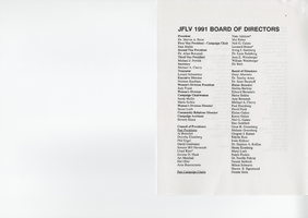
Jewish Federation correspondence, meeting minutes, and other records, item 41
Description
Annual report for the Jewish Federation of Las Vegas, January 1990-June 1991.
Kent Carmichael oral history interview
Identifier
Abstract
Oral history interview with Kent Carmichael conducted by Stefani Evans on November 25 and December 2, 2019 for the Boyer Early Las Vegas Oral History Project.
In the first session of this oral history, Carmichael discusses his early career in lighting design and maintenance from his start at Interstate Neon to his work in the 1950s and 60s in Las Vegas. He discusses some of the iconic signs he built including the Casino Center, Carnival Room, Thunderbird, The Frontier, Bonanza, and the Stardust. He also details the technology and inner workings of these innovative signs including the transition from mechanical to electrically controlled signage. Carmichael continues to discuss Native American laborers and various individuals that he interacted with throughout his early career including Max and Mo Oggenblick, Doby Doc, Benny Binion, Arby Alper, Steve Wynn, Peter Arp, and Wayne and Jerry Newton. Carmichael ends the first interview by recalling a high wind event that damaged the Frontier sign and his efforts to bring the sign under control and repair it as well as his vision and behind the Stardust sign.
The second oral history interview contains Carmichael’s discussion of his career from 1968 onward. He immediately picks up discussion of the Stardust sign and his transition to desk work. Carmichael details the challenge and limitations of designing the International sign (the Westgate as of 2021). He describes the development of his first messenger sign for the International and the time consuming task of using tape to program the sign. He fondly remembers working on the Holiday Inn Riverboat signs, and International transition to Las Vegas Hilton and the Hilton’s transition from blue to red letters. Carmichael shares the story of being caught between organized crime and a young Steve Wynn. He recounts his last project for Ad Art, developing and construction the sign for the Louisiana Superdome in New Orleans, Louisiana. He details working through legislative and construction issues as well as the fallout from the Nat Kiefer Commission.
After leaving Ad Art Carmichael began working with Heath and Co. and began collaborating with Raul Rodriguez. Carmichael and Rodriguez went on to design some of the most enduring and visually unique signs in Las Vegas including, the Flamingo, Four Queens, Golden Nugget, Dunes Hotel, and the Desert Inn. They also worked in Reno on Circus Circus and El Dorado. Carmichael also details his interior work including the main pylon and interior signs for MGM Grand; 1974 renovation Golden Nugget, suspended stained glass ceiling at Tropicana, and the MGM Lion display. Lastly Carmichael outlined his work with Young Electric Sign 1983-85 and the Dewey Sign Company including the Las Vegas Convention Center sign. He ends by sharing his views on the role and importance of lighting in Las Vegas.
Archival Collection
Florence McClure Papers
Identifier
Abstract
The Florence McClure Papers (1969-2007) are comprised of writings, correspondence, newspaper clippings, handwritten notes, and assorted publications that focus on McClure's work with women's organizations, her efforts on behalf of the Southern Nevada Women's Correctional Facility, and her political advocacy work. It also contains a large number of reference clippings McClure collected on women's issues from local, national, and international publications.
Archival Collection

Meeting minutes for Consolidated Student Senate, University of Nevada, Las Vegas, August 05, 2002
Date
Archival Collection
Description
Text
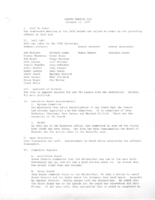
Meeting minutes for Consolidated Student Senate, University of Nevada, Las Vegas, October 11, 1977
Date
Archival Collection
Description
Text
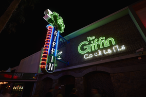
Photograph of The Griffin sign, Las Vegas (Nev.), June 28, 2017
Date
Archival Collection
Description
Site address: 511 Fremont St
Sign owner: Aaron Chepenik and Jonathan Hensleigh
Sign details: Opened in February of 2007 as a medieval British pub/ tavern style bar. This location brought on a wave of revitalization of the East Fremont District especially since many new bars/restaurants started to open in this area after this bar did.
Sign condition: 5- still looks relatively new
Sign form: Blade and overlay neon on building
Sign-specific description: Placed above the entrance their brick building the letters The Griffin Cocktails is painted with white block letters outlined with black paint is painted on the building itself. These letters have skeletal neon surrounding the letters. The Griffin letters are yellow tubes and do illuminate green at night, the word cocktails lights up white. To the left of the entrance but still on the building is a green painted griffin drinking a painted white martini ( also all outlined with black paint) The neon tubing outlining the griffin is a yellow tubing but glows green at night ( possibly argon inserted to make it glow green). The Blade is placed a little left of the entrance and hangs off of the building by two blue steel beams, but in between the beams is a beautiful swirl design. At the top of the Blade there is a green griffin sipping a martini (same design as the one painted on the building). At the base of the griffin is white THE letters painted with skeletal neon. Then below is the blue portion of the blade spelling out GRIFFIN in a Britannic looking font in white channeled letters which do illuminate white at night. This part of the blade is outlined in neon ,possibly argon, since it does illuminate blue at night. On the side of the blade ( if you're looking from the road) there are about 14 red curved neon tubes lining the sign.
Sign - type of display: Neon
Sign - media: Steel and Brick Wall
Sign - non-neon treatments: Using the brick wall as a portion of the sign is a design not seen often in Vegas.
Sign animation: Oscillation of red neon tubes on the side of the sign.
Sign environment: Located in the Fremont East District in between Las Vegas Blvd. and 6th St. This location has The Vault to the East of it and The Smashed Pig Gastropub to the west. It is across the street from the Park and Evil Pie. In the middle of the street right in front of the Griffin Bar is the Martini Glass sign.
Sign manufacturer: YESCO
Sign designer: Owners Aaron Chepenik and Jonathan Hensleigh-Aaron stated that the blade portion of the sign was inspired by the old Boulder Club Blade sign
Sign - date of installation: Slightly before they opened so late 2006/early 2007
Sign - thematic influences: Griffin shows that it has a medieval and kind of fantasy kind of feel since its interior does have that cool medieval tavern vibe to it, especially with their fireplaces. Using their brick wall as a part of the sign is a cool innovative way to use their space and stay true to their theme.
Sign - artistic significance: Medieval theme. The blade is a prominent theme in the 50s/60s, though their blade sign was inspired by the Boulder Club (opened 1931-1960) blade.
Survey - research locations: Acessors page, outreach to owner Aaron Chepenik
Survey - research notes: Possible use of argon within their yellow painted tubes, similar to the Yucca Motel signs leaves.
Survey - other remarks: The Blade does look very similar to the Boulder Club blade, so its awesome to see modern properties paying homage to the ones that are no longer around.
Surveyor: Emily Fellmer
Survey - date completed: 2017-09-15
Sign keywords: Oscillating; Steel; Neon; Blade; Fascia; Building-front design
Mixed Content

