Search the Special Collections and Archives Portal
Search Results
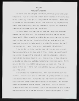
"My Hero": article draft by Roosevelt Fitzgerald
Date
Archival Collection
Description
From the Roosevelt Fitzgerald Professional Papers (MS-01082) -- Drafts for the Las Vegas Sentinel Voice file. A Father's Day tribute to Mr. Sandy, author's stepfather.
Text
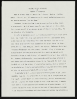
"Nazism, Racism Revisited": article draft by Roosevelt Fitzgerald
Date
Archival Collection
Description
From the Roosevelt Fitzgerald Professional Papers (MS-01082) -- Drafts for the Las Vegas Sentinel Voice file. On the Imperial Palace Hotel & Casino Nazi war room collection.
Text

Interview with Oscar Foger, May 5, 2005
Date
Archival Collection
Description
Text
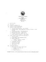
Meeting minutes for Consolidated Student Senate, University of Nevada, Las Vegas, March 22, 1983
Date
Archival Collection
Description
Text

Elena Newman oral history interview: transcript
Date
Archival Collection
Description
Oral history interview with Elena Newman conducted by Cecilia Winchell and Stefani Evans on April 11, 2022 for the Reflections: the Las Vegas Asian American and Pacific Islander Oral History Project. In this interview, Newman discusses her childhood in Dagupan, Pangasinan, Philippines. At the age of eighteen, she moved to Singapore for better work opportunities to help support her family. After meeting her husband, the couple moved to Las Vegas, Nevada. Since moving to Las Vegas, Newman has spent her time working as both a guest room attendant and shop steward at Mandalay Bay. She is also a part of the Culinary Workers Union, and she discusses how helpful the union is to the livelihoods of the many workers in the casino industry.
Text

Nadine Cracraft oral history interview: transcript
Date
Archival Collection
Description
Oral history interview with Nadine Cracraft conducted by Barbara Tabach on November 27, 2017 for the Remembering 1 October Oral History Project. In this interview, Nadine Cracraft discusses the development of her career in child and family therapy after moving to Las Vegas, Nevada in 1991. While describing the work she has done, Cracraft talks about the volunteer counseling services she provided for the survivors of the October 2017 Las Vegas mass shooting. She specifically mentions working with Aria staff members who were struggling with the aftermath of the shooting as well as her time spent working with First Friday to help those impacted by the traumatic event. Throughout the interview, Cracraft explains the different ways people manage their post-traumatic stress disorder and how this knowledge influenced her care of the survivors.
Text
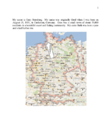
Biographical essay by Gary Sternberg, 2014
Date
Archival Collection
Description
Gary Sternberg grew up in Germany, witnessing anti-Semitic propaganda as early as age 7. He describes some of the experiences his father endured at a concentration camp, and his escape to China. He and his mother reunited with his father in Shanghai in 1940. They left Shanghai in 1948, eventually settling in Cleveland. He and his family came to Las Vegas in 1969.
Text
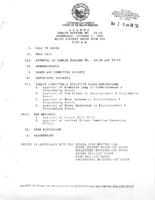
Meeting minutes for Consolidated Student Senate University of Nevada, Las Vegas, October 7, 1992
Date
Archival Collection
Description
Text
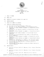
Meeting minutes for Consolidated Student Senate University of Nevada, Las Vegas, January 28, 1988
Date
Archival Collection
Description
Text

