Search Results

Photographs of Dona Maria's Tamales Restaurant signs, Las Vegas (Nev.), March 13, 2017
Date
2017-03-13
2017-08-28
Archival Collection
Description
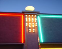
Dona Maria's Tamales Restaurant sits at 910 South Las Vegas Boulevard. The family owned and operated eatery has been serving the valley for over thirty years. Information about the sign is available in the Southern Nevada Neon Survey Data Sheet.
Site address: 910 S Las Vegas Blvd
Sign owner: Dona Maria Alfredo Martinez
Sign details: Alfredo Martinez and Elvia met each other in California as high school sweethearts. Alfredo was a soccer player and Elvia a cheerleader who always watched his matches. After high school the two of them married and started a new chapter in their life in Las Vegas. Alfredo has a love of cooking traditional Mexican cuisine and soon taught Elvia his family recipes. In 1980 they opened their first restaurant a four table fast food operation on Charleston and 10th. Three years later after great success the four table operation grew into a full time restaurant where their location moved to 910 S. Las Vegas BLVD. For years their restaurant won many awards that led the couple to open another establishment in 1993.
Sign condition: The sign is a 4 out of 5, for the family maintains the sign. The paint on the sign is fading so it could use a new layer of paint to update the color hue.
Sign form: Pylon and entrance sign
Sign-specific description: The sign uses pale turquoise and soft pink hues to stand out. It resembles 1980s southwestern color palette. The sign is rectangular shaped with the background as the soft pink and font as turquoise. Dona Maria's font is in white and the background is maroon surrounding the letters. The border outline for the rectangular shaped sign is also in the color Turquoise to make the soft pink pop out. The base of the sign is bright custard concrete yellow attached to the building.
Sign - type of display: Neon
Sign - media: Concrete and steel
Sign - non-neon treatments: Small portion of the sign is back lit plastic
Sign environment: This location is on Las Vegas Blvd close to Charleston. It is next door to the Gateway Motel, as well as close to the Goodwhich, the Millennium Fandom Bar and a 7/11.
Sign - date of installation: Circa 1983
Sign - thematic influences: The theme resembles the prominent late 1970's/early 1980s Southwestern color palette. The sign is very colorful that resembles many Mexican restaurants that are quite colorful naturally.
Sign - artistic significance: Artistic themes is very 80s in terms of color palette, but also utilizes colors that is representative of Mexican culture.
Survey - research locations: Assessor's Page, Dona Maria's Website for the history- https://www.donamariatamales.com/our-history/
Survey - research notes: In 1980 the restaurant expanded and grew from their location at 10th and Charleston to 910 S. LV, BLVD S.
Surveyor: Gisselle Tipp
Survey - date completed: 2017-08-28
Sign keywords: Neon; Steel; Backlit; Plastic; Building-front design; Back to back; Pole sign
Mixed Content

Photographs of Boulder Station sign, Las Vegas (Nev.), March 27, 2017
Date
2017-03-27
2017-09-27
Archival Collection
Description
The Boulder Station Hotel and Casino sign sits at 4111 Boulder Highway. Information about the sign is available in the Southern Nevada Neon Survey Data Sheet.
Site address: 4111 Boulder Hwy
Sign owner: Stations Casino Company
Sign details: This location opened in 1991 and is considered a locals casino. They have a similar train station theme to a few of the other Stations Casino properties used to have. This location also holds a movie theater.
Sign condition: 5- still in very good condition and lights up very brightly at night still
Sign form: Pylon, Porte cochere and semi-decorated shed
Sign-specific description: The main pylon sign has a two white steel bases with a reader board on the bottom, a plasma t.v. screen on top of the reader board and the main portion of the sign with their logo above. Their main logo is a green train front with a yellow neon trim with curved maroon ovals on it stating "Boulder Station" and "Hotel-Casino" underneath it in channeled white letters that contain flashing incandescent. The porte cochere sign above their valet is in a rainbow shape stating "Boulder Station" in sparkling incandescent. With red letters underneath stating "Hotel" in red neon. Also on the main hotel tower there are the same "Boulder Station" letters in incandescent lights outlined in red neon as well. Also the word "Casino" is also in incandescent lights on the side of the building. There are also LED lights that are chasing outlining the whole building making a semi-decorated shed look.
Sign - type of display: Neon, Incandescent, LED, LED plasma screen
Sign - media: Steel and plastic for reader board
Sign - non-neon treatments: Reader board and Plasma screen
Sign animation: Flashing incandescents and Chasing LED lights
Sign environment: This location is on Boulder Hwy on the way to Henderson/Boulder City. This location is near a residential areas and is a neighbor to a Motel 6.
Sign - date of installation: Has been up since at least 2007
Sign - thematic influences: Their train theme is portrayed well in their pylon sign. Also the train theme could be considered an homage to early Vegas history as a railroad stop.
Sign - artistic significance: The pylon sign is very similar to the Fiesta Rancho sign which is also a station casino with the reader board and plasma screen. This sign is almost identical in design to the old Palace Station sign.
Survey - research locations: Palace Station sign. Surveyor Notes 1. Research locations (archAsessor's page, Boulder Station website https://boulderstation.sclv.com/ , Station's Casino website https://www.sclv.com/, google maps satellite/ road view
Survey - research notes: Station's Casinos have 10 casinos in Las Vegas and have been present in the community for the past 40 years.
Surveyor: Emily Fellmer
Survey - date completed: 2017-09-27
Sign keywords: Pylon; Porte-cochère; Neon; Incandescent; Steel; Plastic; Flashing; Reader board; Chasing; Plasma display
Mixed Content

Photographs of Fiesta sign at dusk, Las Vegas (Nev.), April 2, 2017
Date
2017-04-02
2017-09-06
Archival Collection
Description
The Fiesta Rancho Hotel and Casino sits at 2400 North Rancho Drive. Information about the sign is available in the Southern Nevada Neon Survey Data Sheet.
Site address: 2400 N Rancho Dr
Sign owner: Stations Casinos Inc.
Sign details: This location was constructed in 1995 as the Fiesta, but in 2001 Stations Casino bought out the casino and renamed it Fiesta Rancho. Stations Casinos Inc. that own this casino have a chain of 9 resort casinos and a number of smaller casinos in the Las Vegas Valley that are popular along the local community here in Las Vegas. The Fiesta Rancho has a sister property named Fiesta Henderson which also has an ice rink as well as identical sign designs.
Sign condition: 4 - the lights still shine very brightly on this one but the colors on the sign have faded over the years and look more like pastel colors when they used to be very vibrant
Sign form: Marquee and Entrance Sign
Sign-specific description: The marquee on Rancho Dr. has concrete bases with a big plasma screen tv with a reader board underneath it. Above the T.V. screen they have a huge design with a purple background, but around this is yellow, orange, blue, green and pink streamers. These all illuminate the same color as the paint at night time. In the middle of the streamer design is channeled letters "Fiesta" in a curvy print font, and then the words "Casino Hotel" underneath it in a normal block type font. The letters illuminate white at night time. Above their main entrance to the casino they have big channeled letters stating " Fiesta" in the same font to their other signs that contain incandescent bulbs that flash at night. Underneath the incandescent "Fiesta" there are red channeled Neon signs stating "Race Sports Keno Bingo" that illuminate red.
Sign - type of display: Neon and Incandescents
Sign - media: Steel
Sign - non-neon treatments: Reader Board and Plasma Screen
Sign animation: Flasher for incandescent bulbs
Sign environment: This property is on North Rancho about a mile north of the 95 highway. It is located right next door to Texas Station, and is near a residential area.
Sign manufacturer: Possibly YESCO
Sign - date of installation: c. 2001
Sign - thematic influences: The theme of the casino matches the sign with the fun party colors and ribbon streamers that they depict on their sign looks like a fiesta.
Sign - artistic significance: This sign is practically identical to the signage for Fiesta Henderson, for they based their sign off of this Fiesta Rancho sign design.
Survey - research locations: Assessor's website, company website
Survey - research notes: Fiesta Rancho website https://fiestarancho.sclv.com/, Stations Casino page https://www.sclv.com/
Survey - other remarks: https://www.sclv.com/Casinos/PropertyMap Stations Casino website has an interactive map of their locations
Surveyor: Emily Fellmer
Survey - date completed: 2017-09-06
Sign keywords: Neon; Incandescent; Steel; Flashing; Reader board; Marquee; Video screen; Pylon
Mixed Content
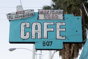
Photographs of El Sombrero Mexican Bistro sign, Las Vegas (Nev.), March 3, 2017
Date
2017-03-03
2017-08-28
Archival Collection
Description
The El Sombrero Mexican Bistro sign sits at 807 South Main Street. Information about the sign is available in the Southern Nevada Neon Survey Data Sheet.
Site address: 807 S Main St
Sign owner: Irma Aguirre
Sign details: This modest, family-owned restaurant has been in town since the 1950's. It was then sold to the current owner, Irma Aguirre, and closed for a brief moment for renovation in 2014. They have been serving favorites like burritos, enchiladas, taco, and tamales for six decades. Even with their modern updates, they are still staying as true to their past as they possibly can.
Sign condition: 5, the sign is still in beautiful condition.
Sign form: Hanging sign
Sign-specific description: The sign for the business extends out from the property towards the street. The rectangular sign is a bright blue that matches the color of the building. On the top outer corner of the sign sits a sombrero with a red and white striped band in the middle portion of the hat. The words "El Sombrero" are painted on the brim of the hat. There are skeletal neon tubes outline the hat and the words "El Sombrero." Next to this is a small sign, within the overall design of the rest of the sign, that is designed to look ripped on both sides and reads "Mexican Food" in red letters. Neon tubes outline these words. Underneath these elements of the sign is the word "CAFE" in bold white text with a thin black border. Neon tubes fill these letters as well. Extending from the bottom of the sign is a small rectangle with the building number "807" painted in black.
Sign - type of display: Neon
Sign - media: Steel
Sign environment: The area that this restaurant sits is right between the Arts District and the excitement of Fremont Street. The locations nearby is a bail bond store, a supply stores for gaming, lawn equipment, and discount appliances. It is also a short distance from the North Premium Outlets.
Sign - date of installation: Circa 1950's
Sign - date of redesign/move: Possibly 2014, they closed this year to renovate the building and the sign looks different today from earlier images of the sign. Before they renovated the building the sign included some sort of striped scarf/cloth underneath the sombrero. However, after the renovation this must have been painted over.
Sign - thematic influences: The sombrero on the sign also lends itself to the name of the property and the "Mexican Food" sign within the sign explicitly tells you what type of restaurant this is. It tells you the theme right away.
Sign - artistic significance: The sign itself is very simple, but the few specific design elements of the sign are very distinct to the property. The sombrero is a nice touch to emphasize the name of the restaurant and the "Mexican Food" sign is helpful in letting both motorists and pedestrians know what type of food they serve.
Survey - research locations: Las Vegas weekly article https://lasvegasweekly.com/dining/reviews/2014/nov/19/revamped-el-sombrero-cafe-mexican-downtown/ , Review Journal article https://www.reviewjournal.com/local/el-sombrero-a-mix-of-modern-classic/, asessor's page
Surveyor: Lauren Vaccaro
Survey - date completed: 2017-08-28
Sign keywords: Neon; Steel; Hanging; Cantilever construction
Mixed Content
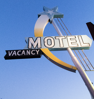
Photographs of Star Motel sign, Las Vegas (Nev.), March 3, 2017
Date
2017-03-03
2017-08-21
Archival Collection
Description
The Star Motel sign sits at 1418 South Third Street in Downtown Las Vegas. Information about the sign is available in the Southern Nevada Neon Survey Data Sheet.
Site address: 1418 S 3rd St
Sign owner: M V Star Group LLC
Sign details: 0.33 acre lot, originally constructed in 1947.
Sign condition: 4 - The sign is in excellent condition, but it does not light up at night.
Sign form: Pole sign
Sign-specific description: The sign itself is attached to a silver pole that extends out toward 3 rd St and is planted into the ground. On the top of the pole is a bright, blue star with a smaller white star in the center. The neon tubes attached to the sign are in concentric star shapes radiating out from the center. Extending out from the star to 3 rd st and curving back towards the pole that hold the sign is a trail implying that this is a shooting star. The first third of this trail is white and then the paint changes to yellow and remains yellow for the rest of the trail. The entire trail of the star is covered with yellow incandescent light bulbs. There are three very thin steel poles on the opposite side of the star from where the trail is attached. These smaller poles run parallel to the main pole of the sign and end about the same place where the tail of the star ends at the other side of the pole. Attached to these thin poles are stars ranging in size and made out of neon tubes. About at the midpoint of the main pole supporting the sign is a minimal, bright blue arrow that has "MOTEL" painted on it in bold white letters with a black outline. Neon tubes in the shape of each letter are attached to the center of the letters. Attached to the bottom of the tail end of this arrow is a smaller, minimal, black arrow that has "VACANCY" painted on it in bold white letters. Neon tubes in the shape of these letters fill this sign as well.
Sign - type of display: Neon and Incandescent
Sign - media: Steel
Sign animation: Unknown, as it no longer lights. However according to RoadArch.com, at one time it might have flashed.
Sign environment: The property is in the heart of the Arts District. It resides next to many other small motels in this neighborhood. It is only a few blocks away from Main Street and Charleston where there are many art galleries, restaurants, and vintage boutiques.
Sign - date of installation: c. 1950s
Sign - date of redesign/move: Based on earlier photographs from the 1950's, the sign's main star that is blue with a smaller white star in the center was originally all white. Also, the white and yellow trail it leaves behind was initially all yellow as well. It is also believed that there were more stars attached to the metal bars that extend from the blue and white star and that they would have flashed.
Sign - thematic influences: A popular theme for properties during this time was the Space Age and this is sign is an example of that influential theme.
Sign - artistic significance: This sign shows an influence of the Space Age that was going on during the late 50's. Many motel signs in the city evoked the theme for the property and this sign does so for the Star Motel.
Survey - research locations: Assessor's website, Vintage Vegas, www.roadarch.com
Surveyor: Lauren Vaccaro
Survey - date completed: 2017-08-21
Sign keywords: Neon; Incandescent; Steel; Pole sign
Mixed Content

Photographs of White Cross Market, Las Vegas (Nev.), February 15, 2017
Date
2017-02-15
2017-08-11
Archival Collection
Description
The permanently closed White Cross Market sits at 1700 South Las Vegas Boulevard. Vickie's Diner, housed inside, remains open. Information about the sign is available in the Southern Nevada Neon Survey Data Sheet.
Site address: 1700 S Las Vegas Blvd
Sign owner: Vickie Kelesis
Sign details: This location opened ca. 1950 as White Cross Pharmacy and remained opened until around 2013. This location transitioned in between 2013-2015 into the White Cross Market. The Diner attached to Market has been open since 1952. This is considered one of the oldest standing diners in Las Vegas. The Diner was originally named Tiffanys Diner , but in 2014 it changed ownership from Pete Kelesis to his Daughter Vickie Kelesis who Renamed it Vickies Diner.
Sign condition: 3-4- has had some fading and weathering over the years
Sign form: Pylon and building sign.
Sign-specific description: Blue lettering on a white background on the Building. Pylon has a white cross topping the sign, as well as blue lettering and white plastic back lit sign as the background. There are lights down lighting the building and pylon sign.
Sign - type of display: Plastic back lit sign and down lighting
Sign - media: Steel and plastic
Sign - non-neon treatments: No neon was seen on the sign, and was mostly spotlit
Sign environment: This location is a few blocks north of the Stratosphere on Las Vegas Blvd. as well as a few blocks south of where Dino's Lounge is. This is located in between the Strip and the Downtown area.
Sign - date of installation: The owner stated that the signage on the building as remained nearly unchanged since circa-1955.
Sign - date of redesign/move: The plastic back lit portion of the pylon has changed a few times.
Sign - thematic influences: Since the signage for the White Cross Market is still up even though the company has shut down shows the importance of this property for its history and admiration from the community.
Survey - research locations: Visit to Vickies Diner and discussion with the owner. Las Vegas Weekly https://lasvegasweekly.com/as-we-see-it/2014/nov/19/tiffanys-cafe-now-vickies-diner-downtown-landmark/, assessors, and recorders office.
Survey - research notes: From the discussion with the owner: The diner has been open for 65 years, making it the oldest diner in Las Vegas. Elvis, Frank Sinatra, Liberace, and many more celebrities would frequent the Pharmacy and the diner. The Pharmacy was first 24/7 pharmacy in Las Vegas.
Surveyor: Wyatt Currie-Diamond
Survey - date completed: 2017-08-11
Sign keywords: Steel; Plastic; Backlit; Building-front design; Pole sign; Back to back; Roof Sign
Mixed Content
Photographs of Welcome to Fabulous Las Vegas sign, Las Vegas (Nev.), March 1, 2017
Date
2017-03-01
2017-09-09
Archival Collection
Description
The world famous "Welcome to Fabulous Las Vegas, Nevada" sign sits at 5200 South Las Vegas Boulevard. Information about the sign is available in the Southern Nevada Neon Survey Data Sheet.
Site name: Welcome to Las Vegas neon sign
Site address: 5200 S Las Vegas Blvd
Sign owner: YESCO
Sign details: The sign was originally installed 1959, quickly became an iconic sign for Las Vegas. Betty Willis never trademarked the sign. Betty Willis died at 91 in 2015. Betty Willis also designed the Moulin Rouge and Blue Angel Motel signs. The Welcome to Fabulous Las Vegas sign is on the National Register of Historic Places. This is a 25 foot sign which is considered smaller than a lot of the other signs in Las Vegas.
Sign condition: 5, Taken care of by YESCO and Clark County
Sign form: Pylon
Sign-specific description: The base of this sign is a blue rectangle outline. The main portion of the sign is a white rhombus shape. Welcome to Fabulous Las Vegas written in red and blue on a translucent white background. The word "Welcome" is spelled in red skeletal neon on Silver Coins with each letter on its own coin. On the back of the sign it states Drive Safely Come back Soon. This plastic portion of the sign is surrounded by incandescent light bulbs. On the top left portion of the sign where the blue base of the sign comes out of the top of the sign is the famous red star that is outlined in neon.
Sign - type of display: Incandescent, Neon and back lit plastic.
Sign - media: Steel and plastic
Sign - non-neon treatments: Plastic back lit portion
Sign animation: Chaser for Incandescent light bulbs on the border of the sign.
Sign environment: This sign is in the median of Las Vegas Blvd. near the South most end of the Strip. This location has Mandalay Bay to the west of it and the airport to the east.
Sign manufacturer: Western Neon
Sign designer: Betty Willis
Sign - date of installation: 1959
Sign - date of redesign/move: Mid 2000s redesign of the median to accommodate parking for visitors.
Sign - thematic influences: This sign is designed in the Googie style. This sign also has symbolism with the words Welcome, as each letter is on a silver coin to represent Nevada as the Silver State.
Sign - artistic significance: One of the most Significant signs for Las Vegas. It is easily recognizable and ingrained as part of Las Vegas culture.
Survey - research locations: Las Vegas Sun article https://lasvegassun.com/news/2009/may/21/fabulous-las-vegas-sign-garners-historic-designati/ , Vegas website https://www.vegas.com/attractions/on-the-strip/welcome-las-vegas-sign/ http://www.lasvegaswhereto.com/welcome-las-vegas-sign/ Neon Museum Tour outline , Vintage Vegas http://vintagelasvegas.com/search/welcome+to+fabulous+las+vegas
Surveyor: Wyatt Currie-Diamond
Survey - date completed: 2017-09-09
Sign keywords: Chasing; Plastic; Backlit; Steel; Incandescent; Neon; Pylon
Mixed Content
Photographs of Excalibur signs, Las Vegas (Nev.), 2002
Date
2002
2017-08-18
Archival Collection
Description
Photos show Excalibur signs at night. Two surveys were conducted to gather information about this sign. One was conducted in 2002 and one was conducted in 2017. PDFs are available for both surveys. See the 2017 survey PDF for additional information that is not included in the object description
Site name: Excalibur Hotel and Casino (Las Vegas, Nev.)
Site address: 3850 S Las Vegas Blvd
Sign owner: Mandalay Resort Group
Sign details: The Excalibur Hotel and Casino sits on the NE corner of Las Vegas Blvd and Tropicana Ave. While the main attraction is the brightly illuminated fantasy castle facade, the two giant multimedia pylon signs flank the property along the streets. One, on the South side of Tropicana, faces East /West, while the second sits on the West Side of LV Blvd, and faces North/South.
Sign condition: Structure 5 Surface 4 Lighting 5
Sign form: Pylon
Sign-specific description: The two pylons are identical in design. They are both double backed, pylons containing animated incandescent Excalibur logos, neon borders, an animated, color, matrix message center, and a two dizzying renderings of jousting knights, constructed completely of neon, on either side. Constructed to appear as a medieval castle facade themselves, the signs are finished in stucco to appear as if built with stone blocks. The scroll shaped main logo sign box, the outline of the logo, the spires, and sword, are all outlined in neon. The 10'-6" channel letters contain white incandescent bulbs that animate.
Sign - type of display: Neon; Incandescent; Matrix
Sign - media: Steel
Sign - non-neon treatments: Graphics; Paint
Sign animation: Chasing, flashing
Notes: The Excalibur logo, which is comprised of incandescent bulbs, displays a two part chase animation from left to right over the entire text, then in sequence, displays a flashing animation over the entire word before starting the pattern over again.
Sign environment: The two pylons are both in parking lots of their respected positions. Pedestrians may walk up to the one located in a public lot on Tropicana Ave.
Sign manufacturer: Sign Systems, Inc
Sign designer: Brian K. Leming
Sign - date of installation: 1989-1990
Sign - date of redesign/move: The backlit plastic message board and old electronic message center, have been replaced by a single, giant animated, color electronic message board.
Sign - thematic influences: Excalibur capitalizes on the King Arthur/Renaissance fair theme.
Sign - artistic significance: Artistically the sheer magnitude, construction techniques and the magnitude of the themed facade are sincerely significant in the artistic developments of sign making. The pylons directly reflect those elements.
Surveyor: Joshua Cannaday
Survey - date completed: 2002
Sign keywords: Chasing; Flashing; Pylon; Neon; Matrix; Incandescent; Steel; Paint; Graphics
Mixed Content
neo000003-004
Description
Sign animation: Chasing, flashing, oscillating
Notes: The text fascia sign just to the north of the giant glass display illuminates with a background of neon tubing which chases from right to left. The pattern of colors running across are a sequence banks of red, pink purple and blue vertical neon tubing, chase each other creating a pulsating movement of the individual banks of these colors. While they are animating, the channel letters, which spell "Riviera," are dark and proceed to light up one letter at a time. Once all lit they remain lit, until the background stops with all the bars illuminated. Once all the bars are lit, the interiors of the letters turn off one at a time starting on the far right. The giant mirrored section of the building, advertising for the Splash stage show. The sequence can be best described from its dramatic powering up. The entire sign comes alive with a rapid upward chasing pattern covering the surface of the tower. Once alive, small white bulbs grow out of the end of the space on the top and bottom of the end of the "Splash" text. Once all the previous elements are illuminated, the letters in the Splash logo shut off, illuminate one letter at a time in red neon, then the white neon figure of the seal balancing a ball on the end of it's nose, lights up. The neon bordered circular raceway, then animates with the bulbs in the center chasing each other in a clock-wise sequence. Once lit the vast array of white bulbs grown out of the end of the text begin to gently oscillate, as well as the sparse assortment of floating and attached incandescent bulbs on the wall of the tower. Once the bulbs animate for a few seconds, the entire wall chases downward, becoming black as night, except for the Slash logo text. Underneath the entire front side of the western face of the Riviera, the incandescent bulbs which cover the entire surface oscillate in a wildly, while the ringed entablature on the wall animates quietly in comparison. The multi-colored rings of neon tubing chase each other from left to right, chasing the distance then repeating. The sequence then changes direction and chase from left to right. Creating the tops and bottoms of the entablature are raceways lined with incandescent bulbs that chase each other from left to right. On the surface of the west wall incandescent bulbs chase each other along the raceways which run horizontally around the internally lit cabinets. The small vertical raceways which run inside the clear plastic boxes chase each other from top to bottom, but all the raceways are offset to each other by a few seconds. At the North end of the property the signage for the Riviera's, "Nickeltown" gambling attraction, dominates the corner. He animation on the large exploding sculptural fountain lights up the entire corner. The three rocketing pieces of steel are wrapped in repeating bands of their corresponding colors of blue, purple and yellow. All three simultaneously chase from bottom to top, until completely lit. Then they begin to animate in a chasing pattern from bottom to top. After a few moments of chasing, they chase from beginnig to top once more, leaving al the tubes dark in its path. Along the circular entablature, which runs the circumference of the top mass of the fountain, incandescent bulbs chase each other from right to left, but only on the side which faces the casino. The wall, which faces north, contains the multicolored banks of vertical neon bars that animate in a specific pattern. They chase each other from right to left, then only the purple neon tubing illuminates, they chase again, then only the blue neon tubing illuminates. They chase once again, and then only the gold bars illuminate. The bars chase yet one more time, then all of the tubing illuminates, thus ending the sequence. The main entrance to nickel town is adorned with neon text and images, but only the stars higher up on the wall itself animate. The incandescent bulbs elevated above the surface of the mirrored wall, animate in a soft oscillating pattern, adding the twinkling effect. The larger five pointed stars are animated on the interior by a center of oscillating incandescent bulbs, while concentric neon shapes echo outward in the yellow, purple and blue colors seen on the adjacent wall facing north. The smaller snow-flake esque star shapes are alive with oscillating incandescent bulbs. Looking upward along the north face of the closest tower, the giant vertical, Riviera channel letters animate one character at a time, oscillate then shuts off.
Notes: The text fascia sign just to the north of the giant glass display illuminates with a background of neon tubing which chases from right to left. The pattern of colors running across are a sequence banks of red, pink purple and blue vertical neon tubing, chase each other creating a pulsating movement of the individual banks of these colors. While they are animating, the channel letters, which spell "Riviera," are dark and proceed to light up one letter at a time. Once all lit they remain lit, until the background stops with all the bars illuminated. Once all the bars are lit, the interiors of the letters turn off one at a time starting on the far right. The giant mirrored section of the building, advertising for the Splash stage show. The sequence can be best described from its dramatic powering up. The entire sign comes alive with a rapid upward chasing pattern covering the surface of the tower. Once alive, small white bulbs grow out of the end of the space on the top and bottom of the end of the "Splash" text. Once all the previous elements are illuminated, the letters in the Splash logo shut off, illuminate one letter at a time in red neon, then the white neon figure of the seal balancing a ball on the end of it's nose, lights up. The neon bordered circular raceway, then animates with the bulbs in the center chasing each other in a clock-wise sequence. Once lit the vast array of white bulbs grown out of the end of the text begin to gently oscillate, as well as the sparse assortment of floating and attached incandescent bulbs on the wall of the tower. Once the bulbs animate for a few seconds, the entire wall chases downward, becoming black as night, except for the Slash logo text. Underneath the entire front side of the western face of the Riviera, the incandescent bulbs which cover the entire surface oscillate in a wildly, while the ringed entablature on the wall animates quietly in comparison. The multi-colored rings of neon tubing chase each other from left to right, chasing the distance then repeating. The sequence then changes direction and chase from left to right. Creating the tops and bottoms of the entablature are raceways lined with incandescent bulbs that chase each other from left to right. On the surface of the west wall incandescent bulbs chase each other along the raceways which run horizontally around the internally lit cabinets. The small vertical raceways which run inside the clear plastic boxes chase each other from top to bottom, but all the raceways are offset to each other by a few seconds. At the North end of the property the signage for the Riviera's, "Nickeltown" gambling attraction, dominates the corner. He animation on the large exploding sculptural fountain lights up the entire corner. The three rocketing pieces of steel are wrapped in repeating bands of their corresponding colors of blue, purple and yellow. All three simultaneously chase from bottom to top, until completely lit. Then they begin to animate in a chasing pattern from bottom to top. After a few moments of chasing, they chase from beginnig to top once more, leaving al the tubes dark in its path. Along the circular entablature, which runs the circumference of the top mass of the fountain, incandescent bulbs chase each other from right to left, but only on the side which faces the casino. The wall, which faces north, contains the multicolored banks of vertical neon bars that animate in a specific pattern. They chase each other from right to left, then only the purple neon tubing illuminates, they chase again, then only the blue neon tubing illuminates. They chase once again, and then only the gold bars illuminate. The bars chase yet one more time, then all of the tubing illuminates, thus ending the sequence. The main entrance to nickel town is adorned with neon text and images, but only the stars higher up on the wall itself animate. The incandescent bulbs elevated above the surface of the mirrored wall, animate in a soft oscillating pattern, adding the twinkling effect. The larger five pointed stars are animated on the interior by a center of oscillating incandescent bulbs, while concentric neon shapes echo outward in the yellow, purple and blue colors seen on the adjacent wall facing north. The smaller snow-flake esque star shapes are alive with oscillating incandescent bulbs. Looking upward along the north face of the closest tower, the giant vertical, Riviera channel letters animate one character at a time, oscillate then shuts off.
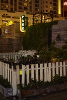
Photographs of Park on Fremont sign, Las Vegas (Nev.), June 28, 2017
Date
2017-06-28
2017-08-11
Archival Collection
Description
The Park on Fremont sign sits at 506 Fremont Street in Downtown Las Vegas. Information about the sign is available in the Southern Nevada Neon Survey Sheet.
Site address: 506 Fremont St
Sign owner: Justin Weniger and Ryan Doherty both with Corner Bar Management Group
Sign details: This building was constructed in 1956. Though the Park on Fremont opened in 2013 in the former Maharaja Hookah Cafe though the building's exterior was renovated to have more of a wooden facade. This place is claimed as a gastro-pub with rustic-chic decor. Their outside urban beer garden is well recognized with its cool rustic design presenting a teeter totter and a CInderella-like carriage.
Sign condition: 5, very good condition and has bright colors during the day and night
Sign form: Blade
Sign-specific description: They have a long oval shaped blade placed on the left side of the building which is neighboring the public parking lot next door. The oval part of the blade is black with white letters spelling out PARK from the top to the bottom in a thick type font. These letters illuminate green at night time. Surrounding the black oval is a red arrow pointing towards the building (not the entrance) with LED light bulbs which illuminates yellow at night time.
Sign - type of display: Neon and LED lights
Sign - media: Steel
Sign - non-neon treatments: LED lights
Sign animation: Chasing
Notes: LED lights around the perimeter of the blade.
Sign environment: This is the first bar/restaurant on the north side of the Fremont St. East district. To the west of the building is a public parking lot where YESCOs free-standing PBR sign Cool Blue is stationed. To the east is the RED dance club
Sign manufacturer: All Star Electrical Signs
Sign - date of installation: 2013
Sign - thematic influences: The blade with an arrow is is used on many other bar signs in the east Fremont District. Though many of these blade signs are above the entrance this one is on the left side of their building possibly to attract foot traffic from the Fremont Street Experience.
Sign - artistic significance: The blade with an arrow was a prominent sign design in the 50s and 60s.
Survey - research locations: Assessor's Page, Park on Fremont Website https://parkonfremont.com/ , UNLV (bio on Justin Weniger) https://www.unlvfootballfoundation.com/people/justin-weniger/ , google map roadside view, and contact with manager.
Survey - research notes: Owners Justin Weniger and Ryan Doherty founded WENDOH Media which showcases Vegas Seven magazine, DTLV.com, RunRebs.com, SPYONvegas.com, Critical Focus, Corner Bar Management and the Life is Beautiful Festival. With the Corner Bar Management they also own the Commonwealth which is downtown as well.
Surveyor: Emily Fellmer
Survey - date completed: 2017-08-11
Sign keywords: Blade; Neon; LED; Steel; Chasing; Incandescent; Directional
Mixed Content