Search the Special Collections and Archives Portal
Search Results
Washington University (Saint Louis, Mo.). School of Fine Arts
The Washington University College of Art, located in St. Louis, Missouri, was founded in 1879. In 1878, Wayman Crow, one of the founders of Washington University, sought to dedicate a new museum to his late son, Wayman Crow, Jr. To accompany the museum, the University also created an independent school, creating the St. Louis School and Museum of Fine Arts, the first art school west of the Mississippi River. In 1906, the museum moved to Forest Park and was rededicated as the St. Louis Museum of Fine Arts.
Corporate Body
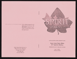
"Spirit of AKA" Alpha Kappa Alpha Sorority targets presentation summary
Date
Archival Collection
Description
This a brochure of the AKA Spirit program to celebrate the 60th Boule, including a presentation by 26th Supreme Basileus Soror Linda Marie White.
From the Alpha Kappa Alpha Sorority, Incorporated, Theta Theta Omega Chapter Records (MS-01014) -- Chapter records file.
Text
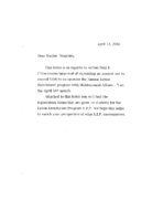
Meeting minutes for Consolidated Student Senate, University of Nevada, Las Vegas, April 16, 2001
Date
Archival Collection
Description
Text
University of Nevada, Las Vegas (UNLV) 27th commencement program
Date
Archival Collection
Description
Commencement program from University of Nevada, Las Vegas Commencement Programs and Graduation Lists (UA-00115).
Text

Marvelys Lopez Omaña oral history interview: transcript
Date
Archival Collection
Description
Oral history interview with Marvelys Lopez Omaña conducted by Monserrath Hernandez and Barbara Tabach on February 21, 2020 for the Latinx Voices of Southern Nevada Oral History Project. In this interview, Marvelys Lopez discusses her childhood and growing up in Caracas, Venezuela, where her father owned a toy store. She attended an all-girls Catholic School and from a young age knew that she wanted to be a doctor. In 1993, at the age of seventeen, she was able to study abroad in the United States for one year and moved to Las Vegas, Nevada. She returned to Venezuela to attend medical school and while attending medical school she met her husband, who was studying to be a registered nurse at the time. Lopez Omaña recalls volunteering as a firefighter in Venezuela, and discusses the political change that happened in Venezuela during her last years in medical school. She moved to back Las Vegas with her husband in 2003 and began working as a caregiver. She recounts Her first son's birth story, and describes how she became a Certified Professional Midwife.
Text
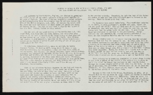
History of George Burton Whitney and Lovina Syphus, his wife and Luke Syphus and Christiana Long, Lovina's parents, undated Genealogical data sheet, John Mathieson Bunker and Mary Etta Syphus
Archival Collection
Description
From the Syphus-Bunker Papers (MS-00169). The folder contains documents about the history of George Burton Whitney and his wife, Lovina Syphus, and Luke Syphus and Christiana Long, Lovina's parents, and a genealogical data sheet for John Mathieson Bunker and Mary Etta Syphus.
Text

LaPalm Motel Neon Survey document, September 10, 2017
Date
Archival Collection
Description
Site address: 2512 Fremont St
Sign owner: La Palm Motel Inc
Sign details: Property originally constructed in 1963 on 0.33 acres.
Sign condition: 3 - the sign is in decent condition and appears worn from weather. It is unclear if the sign still lights up at night.
Sign form: Roadside pole sign
Sign-specific description: This pole roadside sign has a simple design. A large black pole supports the other elements for this sign. The top portion of the sign features a plastic, backlit sign reading "La Palm" in a black, serif text. Underneath the "lm" of the "La Palm" sign is a series of open channel letters spelling out "MOTEL" against a faded teal background. This portion of the sign is also a thin, rectangular shape allowing for an open space between the "MOTEL" of the sign and the pole that supports it. Underneath the "L" of the "MOTEL" is the bottom portion of the sign that is attached to the pole. This portion of the sign features a plastic, backlit sign reading "DAILY WEEKLY CABLE TV POOL KITCHENETTES LAUNDROMAT" in bold red letters against a white background. Under this is the word "VACANCY" painted in bold white text. Neon tubes spell out "NO" and outline "VACANCY." Along the outer edge of this sign facing Fremont, the sign is painted a pale yellow with incandescent light bulbs lining this section.
Sign - type of display: Neon, indandescent, backlit
Sign - media: Steel and plastic
Sign - non-neon treatments: Paint
Sign environment: This property sits at the corner of East Charleston and Fremont in an area filled with many other smaller motels. There is a Pepe's Taco and Lowe's Home Improvement that close to this motel.
Sign - date of installation: Possibly c. 1963
Sign - thematic influences: There is no exact theme replicated in this sign. It does look similar to other motel signs throughout the city since it sits directly along the roadside allowing motorist and pedestrians to see it easily.
Sign - artistic significance: This sign is a standard example of motel signage because it features the basic elements of a roadside motel sign. It has the name of the property, the word "motel", and other amenities that they may offer.
Survey - research locations: Assessor's website
Survey - research notes: http://www.roadsidepeek.com/roadusa/southwest/nevada/vegas/lvmotel/lvdownmotel/index4.htm
Survey - other remarks: There is not a date of any specific redesign of this sign; however, based on an earlier image of this sign the font in the "La Palm" portion of the sign did change somewhere along the way during the time this property has been around.
Surveyor: Lauren Vaccaro
Survey - date completed: 2017-09-10
Sign keywords: Neon; Incandescent; Backlit; Steel; Plastic; Paint; Pole sign; Roadside
Text
Jeffery Silver oral history interview
Identifier
Abstract
Oral history interview with Jeffery Silver conducted by Claytee D. White and Stefani Evans on November 14 and 25, 2024 for the Boyer Early Las Vegas Oral History Project. In this interview, Silver recalls his childhood in Beverly Hills, California before his family relocated to Las Vegas, Nevada when Silver was in the fourth grade. His father worked with Tony Cornero at The Stardust Hotel and the family lived in a Francisco Park duplex. Silver attended various local schools, eventually graduating from Las Vegas High School in the same class with Bruce Woodbury and Gardner Jolley. Silver graduated from Northwestern University with an accounting degree, and attended the University of San Diego School of Law. Upon returning to Las Vegas, he joined the accounting firm Laventhol and Horwath (L&H), and at age 22 became Nevada's youngest person to pass the Certified Public Accountant (CPA) exam. Governor Mike O'Callaghan appointed Silver to the Nevada Gaming Control Board, a position that utilized his legal and accounting expertise. In two interview sessions, Silver describes his legal career with the firm Lionel Sawyer Collins, Nevada's North/South power struggle, his relationship with Oscar Goodman, The National Museum of Organized Crime and Law Enforcement (The Mob Museum), his work at The Landmark (1979-1983) during the Wolfram/Tickel era of ownership, his work at the Riviera (ca. 1983-1984) under owner Meshulam Riklis, his short stint at Caesars World (1984), and his various law partnerships over his 50 years of practice. Digital audio and photographs available; no transcript available.
Archival Collection
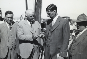
Photograph of Carl Gray handing Ray Lyman Wilbur the first railroad spur spike for Hoover Dam, circa early 1930s
Date
Archival Collection
Description
Image
