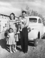
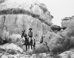
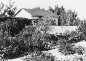
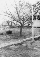
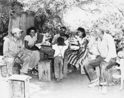
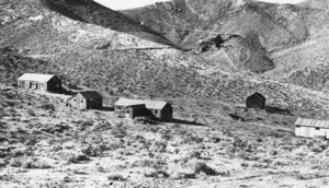
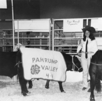
The Robert E. "Spud" Lake Photographs depict "Spud" Lake, his family, and Las Vegas, Nevada from 1905 to 1947. The photographs include the Las Vegas town site auction, Stewart (Kiel) Ranch, Clark County Courthouse, Eglington Ranch, Helldorado Parade, and Colorado River and the Hoover (Boulder) Dam. The photographs also depict a Las Vegas Chamber of Commerce luncheon honoring Las Vegas pioneers, the Gold Bar Club tent in Pahrump, Nevada, and Fremont Street in Las Vegas.
The Boulder Station Hotel and Casino sign sits at 4111 Boulder Highway. Information about the sign is available in the Southern Nevada Neon Survey Data Sheet. Site address: 4111 Boulder Hwy Sign owner: Stations Casino Company Sign details: This location opened in 1991 and is considered a locals casino. They have a similar train station theme to a few of the other Stations Casino properties used to have. This location also holds a movie theater. Sign condition: 5- still in very good condition and lights up very brightly at night still Sign form: Pylon, Porte cochere and semi-decorated shed Sign-specific description: The main pylon sign has a two white steel bases with a reader board on the bottom, a plasma t.v. screen on top of the reader board and the main portion of the sign with their logo above. Their main logo is a green train front with a yellow neon trim with curved maroon ovals on it stating "Boulder Station" and "Hotel-Casino" underneath it in channeled white letters that contain flashing incandescent. The porte cochere sign above their valet is in a rainbow shape stating "Boulder Station" in sparkling incandescent. With red letters underneath stating "Hotel" in red neon. Also on the main hotel tower there are the same "Boulder Station" letters in incandescent lights outlined in red neon as well. Also the word "Casino" is also in incandescent lights on the side of the building. There are also LED lights that are chasing outlining the whole building making a semi-decorated shed look. Sign - type of display: Neon, Incandescent, LED, LED plasma screen Sign - media: Steel and plastic for reader board Sign - non-neon treatments: Reader board and Plasma screen Sign animation: Flashing incandescents and Chasing LED lights Sign environment: This location is on Boulder Hwy on the way to Henderson/Boulder City. This location is near a residential areas and is a neighbor to a Motel 6. Sign - date of installation: Has been up since at least 2007 Sign - thematic influences: Their train theme is portrayed well in their pylon sign. Also the train theme could be considered an homage to early Vegas history as a railroad stop. Sign - artistic significance: The pylon sign is very similar to the Fiesta Rancho sign which is also a station casino with the reader board and plasma screen. This sign is almost identical in design to the old Palace Station sign. Survey - research locations: Palace Station sign. Surveyor Notes 1. Research locations (archAsessor's page, Boulder Station website https://boulderstation.sclv.com/ , Station's Casino website https://www.sclv.com/, google maps satellite/ road view Survey - research notes: Station's Casinos have 10 casinos in Las Vegas and have been present in the community for the past 40 years. Surveyor: Emily Fellmer Survey - date completed: 2017-09-27 Sign keywords: Pylon; Porte-cochère; Neon; Incandescent; Steel; Plastic; Flashing; Reader board; Chasing; Plasma display
The Fiesta Rancho Hotel and Casino sits at 2400 North Rancho Drive. Information about the sign is available in the Southern Nevada Neon Survey Data Sheet. Site address: 2400 N Rancho Dr Sign owner: Stations Casinos Inc. Sign details: This location was constructed in 1995 as the Fiesta, but in 2001 Stations Casino bought out the casino and renamed it Fiesta Rancho. Stations Casinos Inc. that own this casino have a chain of 9 resort casinos and a number of smaller casinos in the Las Vegas Valley that are popular along the local community here in Las Vegas. The Fiesta Rancho has a sister property named Fiesta Henderson which also has an ice rink as well as identical sign designs. Sign condition: 4 - the lights still shine very brightly on this one but the colors on the sign have faded over the years and look more like pastel colors when they used to be very vibrant Sign form: Marquee and Entrance Sign Sign-specific description: The marquee on Rancho Dr. has concrete bases with a big plasma screen tv with a reader board underneath it. Above the T.V. screen they have a huge design with a purple background, but around this is yellow, orange, blue, green and pink streamers. These all illuminate the same color as the paint at night time. In the middle of the streamer design is channeled letters "Fiesta" in a curvy print font, and then the words "Casino Hotel" underneath it in a normal block type font. The letters illuminate white at night time. Above their main entrance to the casino they have big channeled letters stating " Fiesta" in the same font to their other signs that contain incandescent bulbs that flash at night. Underneath the incandescent "Fiesta" there are red channeled Neon signs stating "Race Sports Keno Bingo" that illuminate red. Sign - type of display: Neon and Incandescents Sign - media: Steel Sign - non-neon treatments: Reader Board and Plasma Screen Sign animation: Flasher for incandescent bulbs Sign environment: This property is on North Rancho about a mile north of the 95 highway. It is located right next door to Texas Station, and is near a residential area. Sign manufacturer: Possibly YESCO Sign - date of installation: c. 2001 Sign - thematic influences: The theme of the casino matches the sign with the fun party colors and ribbon streamers that they depict on their sign looks like a fiesta. Sign - artistic significance: This sign is practically identical to the signage for Fiesta Henderson, for they based their sign off of this Fiesta Rancho sign design. Survey - research locations: Assessor's website, company website Survey - research notes: Fiesta Rancho website https://fiestarancho.sclv.com/, Stations Casino page https://www.sclv.com/ Survey - other remarks: https://www.sclv.com/Casinos/PropertyMap Stations Casino website has an interactive map of their locations Surveyor: Emily Fellmer Survey - date completed: 2017-09-06 Sign keywords: Neon; Incandescent; Steel; Flashing; Reader board; Marquee; Video screen; Pylon
The sign for Therapy sits at 518 Fremont Street in Downtown Las Vegas. Information about the sign is available in the Southern Nevada Neon Survey Data Sheet. Site address: 518 Fremont St Sign owner: Jared Weiss and Sig Rogich (Motion Corp) Sign details: The building is from 1951, so within the restaurant there are exposed bricks and wood ceiling from the original building. Therapy restaurant opened in 2015 as a gastropub with Daniel Octiveas as the chef. Previous to turning into the Therapy restaurant this location held a Dollar Store. Sign condition: 5, a newer sign still in very good condition Sign form: Hanging sign and entrance sign Sign-specific description: Pink lettering. The T is a solid print type font, then the rest of the letters are in cursive. There is a period at the end of the word Therapy. Each individual letter is in its own channeled block to contain the light for each letter. Also above their door there is a small black rectangular sign with the Therapy logo (same manufacturing style as the letters previously noted). There is a pink arrow starting from the farthest (from the entrance) top of the sign pointing towards the entrance. On this arrow there are sparking incandescent light bulbs. Sign - type of display: Neon and Incandescent Sign - media: Steel Sign animation: Flasher for Incandescent light bulbs on the arrow to show the entrance of the property. Sign environment: This property is in between 6th and Las Vegas Blvd. on the North side of Fremont St. This district in the past few years has shaped into its own creative and artsy area. Sign manufacturer: Vision Signs Sign designer: Gerrit Blok and Rob McGuire Sign - date of installation: 2015 when the restaurant opened Sign - thematic influences: The sign above the door has the arrow which was a popular trend in 1950s signs with the car consumer era, but also helps with the pedestrian traffic on Fremont St. Sign - artistic significance: The simple yet beautiful cursive font shows that there is simplicity and elegance. Also the arrow above the entrance could be a hint of subliminal messaging, as well as a great direction indicator. The channeled letters shows how to capture illumination compared to skeletal Neon. Survey - research locations: Therapy website http://www.therapylv.com/ , Las Vegas Weekly Article https://lasvegasweekly.com/dining/reviews/2015/aug/12/therapy-downtown-restaurant-review-fremont-east/ , Acessor's office, discussion with owner and contact with Vision signs Survey - research notes: Eater Las Vegas (2015 article) shows cool pictures of the building being renovated. https://vegas.eater.com/2015/6/25/8845981/las-vegas-restaurants-therapy#5 Surveyor: Emily Fellmer Survey - date completed: 2017-08-06 Sign keywords: Neon; Incandescent; Steel; Flashing; Hanging; Building-front design; Fascia; Cantilever construction
The Las Vegas Hostel sign sits at 1322 East Fremont Street in Downtown Las Vegas. Information about the sign is available in the Southern Nevada Neon Survey Sheet. Site address: 1322 E Fremont St Sign owner: Downtown Lodging LLC Sign details: This building was originally constructed in 1973 for commercial living accommodations and motel purposes. Previous to the Las Vegas Hostel opening in late 2014/early 2015 it was USA hostel whom used the sign box that the Las Vegas Hostel currently uses today. They have 38 rooms of different variety and 158 beds as a cheaper option that the hotels. They also offer packages to do tours of surrounding places such and the Grand Canyon and the Hoover Dam. They also claim to be the only Hostel in Las Vegas with a pool. Sign condition: 4.5- The sign box was recently repainted and the plastic portion of this sign is relatively new and both still are in good condition Sign form: Pylon Sign-specific description: This sign has a reddish/pink steel beam base. There are two sign boxes the top one is a rectangle shape and the bottom one is a oval-rectangular shape. Currently the top rectangle box does not have any signage in it but if it did it would be a plastic or steel sign that would be down lit by an LED spotlight. The bottom one has a plastic back lit sign with the hostel's logo. Their logo entails "Las Vegas Hostels" in modern bright colored block fonts. The "Las" letters are a bright orange, the "Vegas" letters are a magenta pink, and "Hostels" in a bright light blue. Sign - type of display: Plastic Back lit sign Sign - media: Steel and Plastic Sign - non-neon treatments: LED and Plastic back lit signage Sign environment: On the Intersection of East Fremont St and 14th street. A few blocks from the Fremont East District but is in a neighborhood with many different motels though many of them are currently closed Sign - date of installation: The sign boxes have been up like this since at least 2007 but with different logos within the sign boxes Sign - date of redesign/move: Late 2014/ early 2015 they repainted the beam and boxes of the sign and inserted the Las Vegas Hostel logo. Sign - thematic influences: Since this sign was re-purposed and redesigned it shows how Vegas is constantly changing but can reuse old signs from previous properties. Sign - artistic significance: The bright colors in the sign show that they are going for a modern vibe which works since they opened in the past few years and have events such as pool parties that appeal to the youth that comes through Vegas. Survey - research locations: Las Vegas Hostel Website http://lasvegashostel.net/en_US/rooms/, Assessor's page, google maps satellite and roadside view Surveyor: Emily Fellmer Survey - date completed: 2017-09-09 Sign keywords: Plastic; Backlit; Steel; Pole sign
The Octapharma Plasma center sits at 1732 Fremont Street in Downtown Las Vegas. Information about the sign is available in the Southern Nevada Neon Survey Data Sheet. Site address: 1732 Fremont St Sign owner: Octapharma Plasma Inc. Sign details: The original construction year of the building is 1977. This located opened as an Octapharma plasma donation facility in 2010. Octapharma was created by Wolfgang Margurre in Switzerland in 1983 to create plasma products to help save lives. Sign condition: 4-Relatively recent renovation of their roadside sign and their entrance sign still has bright colors Sign form: Roadside sign and entrance sign Sign-specific description: The roadside sign is a long thin steel rod coming out of the ground with a sharp tip. (almost looks like a big toothpick coming out of the ground) This portion of the sign used to be red from the previous owners of this property when it was named "Pyramid". After 2011 Octapharma had this portion of the sign painted blue for them. Close to the sharp tip of this sign there is a sign box that holds plastic backlit signs. For Octapharma it is a white plastic background with blue "Octapharma Plasma" in block type letters. Above their entrance they have blue plastic channeled letters spelling out "Octapharma Plasma" which is backlit making it illuminate blue at night. Sign - type of display: Back lit plastic sign Sign - media: Steel and plastic Sign - non-neon treatments: LED and Plastic back lit signs Sign environment: This property is far East Fremont on the intersection of Bruce Street which is about a block from the main intersection of Eastern and Fremont St. This location has many motels surrounding it as well as some convenience stores. Sign - date of installation: Main roadside sign was repurposed for Octapharma around 2010 so this sign does date back to at least 2007 Sign - date of redesign/move: Roadside Sign redesigned for Octapharma around 2010, with repainting the red portion of the roadside sign blue. Sign - thematic influences: This style of sign is very similar to the sign that PublicUs has which is just about a block West of this company. These signs are similar with both being re-purposed and repainted when their company started to use their sign as well as the thin steel base and the back lit plastic sign. Survey - research locations: Assessor's page, Octapharma website http://octapharmaplasma.com/donor/center/18536 , google map satellite and roadside view for images and transition of signage Survey - research notes: Octapharma has research and donation centers in 113 countries to help create plasma based medicine to help cure people with immune disorders, as well as burn victims. Surveyor: Emily Fellmer Survey - date completed: 2017-09-02 Sign keywords: Plastic; Backlit; Steel; Roadside; Building-front design; Pole sign