Search the Special Collections and Archives Portal
Search Results
Report, Outline of water supply system at Basic Magnesium, Incorporated, Henderson, Nevada, September 22, 1944
Date
Archival Collection
Description
Detailed report with drawings and maps of the water system at Basic Magnesium, Incorporated.
Text
Jon Ralston (Nevada Independent) oral history interview conducted by Kelliann Beavers and Kristian Thymianos: transcript
Date
Archival Collection
Description
From the Lincy Institute "Perspectives from the COVID-19 Pandemic" Oral History Project (MS-01178) -- Business interviews file.
Text

Alpha Kappa Alpha Sorority, Theta Theta Omega Chapter meeting minutes (redacted)
Date
Archival Collection
Description
From the Alpha Kappa Alpha Sorority, Incorporated, Theta Theta Omega Chapter Records (MS-01014) -- Chapter records file.
Text
Poker Palace Neon Survey document, August 23, 2017
Date
Archival Collection
Description
Site address: 2757 N Las Vegas Blvd
Sign owner: Marvin and Laura Coleman
Sign details: This location opened 1974 with a castle theme. This location is also claimed as a locals casino. In 2015 their main pylon roadside sign caught on fire, but it was recently replaced.
Sign condition: 4- the signs that were not in the fire are still in relatively good condition
Sign form: Two pylons and architectural sign
Sign-specific description: The building itself has many different neon signs on it mostly red neon. Also the buildings architecture matches the palace theme. There are two pylon signs the first one states "Poker Palace Bingo" in channeled neon letters, then below is a reader board. The second pylon is just north a little of the first one, this is the one that caught on fire in 2015. After the fire the beam bases of the sign remained. This sign has "Poker Palace Casino" in red channeled letters.
Sign - type of display: Neon and incandescent
Sign - media: Steel and plastic
Sign - non-neon treatments: Reader board
Sign animation: Flasher for incandescent light bulbs.
Sign environment: This is located in North Las Vegas in a residential area and by a few other small businesses.
Sign - date of installation: Late 2015/ early 2016 for new pylon sign, others look to be older
Sign - date of redesign/move: 2015 pylon sign went up in flames and was destroyed, then replaced
Sign - thematic influences: The building looks like a palace which goes with their names and theme. Also their signs showcases similar shapes to the building.
Survey - research locations: Poker Palace website http://pokerpalace.net/History.html , Images of sign , Review Journal article https://www.reviewjournal.com/local/local-las-vegas/nlv-casino-marquee-fire-sends-up-plume-visible-for-miles/
Surveyor: Wyatt Currie-Diamond
Survey - date completed: 2017-08-23
Sign keywords: Architectural; Neon; Incandescent; Steel; Plastic; Flashing; Reader board; Pylon; Fascia
Text
Dunes Hotel and Casino Records
Identifier
Abstract
The Dunes Hotel and Casino Records are comprised of administrative, publicity, and entertainment materials documenting the history of the Dunes Hotel and Casino in Las Vegas, Nevada from the years 1954 to 1992. Included are correspondence, contracts, photographs, hotel budgets, and an early aerial photograph of the property. The material provides a significant amount of historical documentation of the hotel that was long known to tourists and residents as the "the Miracle in the Desert."
Archival Collection
Dunes Hotel Photograph Collection
Identifier
Abstract
The Dunes Hotel Photographs (1950-1993) consist of administrative, publicity and entertainment images documenting the history of the Dunes Hotel and Casino in Las Vegas, Nevada. In addition to materials focusing on day-to-day activities at the hotel (correspondence, contracts, personnel, budgets, etc.) the collection provides insight into the hotel’s entertainment and public relations activities. Although there are chronological gaps in the collection, particularly during the later years of the Dunes (1970s-1990s), it provides a significant amount of historical documentation on the famed Strip hotel that was long known to tourists and residents alike as the “the Miracle in the Desert.”
Archival Collection
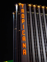
Photographs of Tropicana signs, Las Vegas (Nev.), 2002
Date
Archival Collection
Description
Photos show Tropicana signs at night. Two surveys were conducted to gather information about this sign. One was conducted in 2002 and one was conducted in 2017. PDFs are available for both surveys. See the 2017 survey PDF for additional information that is not included in the object description.
Site name: Tropicana Hotel and Casino (Las Vegas, Nev.)
Site address: 3801 S Las Vegas Blvd
Sign owner: Aztar
Sign details: The southeast corner of Las Vegas Blvd and Tropicana Boulevard belongs to the Tropicana Hotel Casino. The Tropicana is composed of two high-rise towers, the low-rise wings of rooms, and the casino itself. One tower faces southwest/northeast, while the other tower, further east on the property faces southeast/northwest. The expanse of the corner, near the street is an open concrete pedestrian plaza, with rising planters, a large functioning waterfall, also surrounded by foliage, and various vendors. The porte-cochere connects the plaza to the hotel, with the connecting bridge to the Excalibur, residing on top.
Sign condition: Structure 5 Surface 5 Lighting 5
Sign form: Pylon; Fascia
Sign-specific description: On the north and south faces of the porte-cochere roof line, on a pediment between the sloping blue roof and a row of brass fixtures, large channel letters in the faceted Tropicana font, horizontally spell "Tropicana." The exteriors are painted black wit a blue reflective finishing the interiors. They are filled with blue neon. The ceiling of the porte-cochere holds two distinct features to its credit. The north half is adorned with a glass domed hole through the roof. The interior thickness and recessed lip are covered in a polished metallic surface. Seashells adorn the edge where the lip meets the ceiling as well as on the face of the ledge as well. Teal, red and gold organic lines are floating across the surface in paint. The south half of the porte-cochere is covered with six recessed rectangular areas. Within the giant coffering a field of polished metal squares form a tiled field bordered with incandescent bulbs. In each of the corner intersections a sculpted glass cover, hold a single incandescent bulbs. Each field holds forty or so of these bulbs and their coverings. Two identical pylons flank the courtyard. One of them is on the south side of Tropicana avenue facing east /west, while the other faces north/south on the east side of the street. The pylon is essentially a giant double-sided rectangle with a top section that angles back into space on either side to meet at a peak. The result is a small roof like peak at the top of the sign supporting text on its face. The text however is standing up horizontally at a 90-degree angle. Besides the text logo at the top, the sign possesses an internally lit message cabinet on the bottom of the face, a small LED message center, and another backlit cabinet with a color advertisement for Follies Berger. The message center at the bottom is white plastic with vinyl lettering. The small message center is flanked by three steel poles, the height of the sign and finished to look like bamboo. The horizontal line created by the top edge of the sign is also lined with this false bamboo. The channel lettering at the top are polished metallic, shallow channel letters, which extend in depth all the way back to the face of the roof like form. The faces are filled with incandescent bulbs and bordered in neon. The sides of the sign are treated with a vertical bull nose like shape which runs vertically up the width of the sign. It is pointed wit ha triangular shape on both ends. The shape begins flush with the triangular peak of the signs profile and ends with its point approximately halfway down the height of the bottom message center. The bull nose is faceted with three faces. At the triangular tips, the three faces appear to make the space retain a jewel like shape. The middle face is laden with incandescent bulbs. The rest of the width of the sign is also finished in polished gold metal. The remaining open space on the faces of the cabinet, as well as exposed pieces of the cabinet, are painted a teal color. A border on incandescent bulbs runs around the entire face of the signage. The only signage present on the towers , is the on the first tower, closest to the corner. Running vertically down the west side of the southwest face of the tower, giant metallic channel letters spell "Tropicana" and are lined on the interiors with a double row of neon. Along the western end of the tower, three, double rows of incandescent bulbs run the entire height of the building. These animate, chasing each other down, simulating a waterfall.
Sign - type of display: Neon; Incandescent; Backlit; LED
Sign - media: Steel; Plastic
Sign - non-neon treatments: Graphics; Paint
Sign animation: Chasing, oscillating
Notes: Pylons: The incandescent bulbs inside the channel letters for the logo oscillate, as well as on the vertical width of the pylon. The raceways around the backlit screen chase each other, but it is a double row of incandescent bulbs that chase in opposite directions to each other. Building: The giant raceways of incandescent bulbs on the northwest corner of the Tropicana's front tower, chase each other from top to bottom, representing a waterfall.
Sign environment: The Tropicana belongs to one of the four major properties which comprise the intersection of Tropicana Ave. and Las Vegas Blvd The corner is occupied by a plaza and pedestrian element that is also seen in the other neighbors in the intersection as well. The towers loom over the plaza, as is accented by kiosks for patron promotions, and other services such as refreshments. The property is a good example of a property which has adapted over the years to fit and compete with the rapid evolution of Las Vegas.
Sign manufacturer: Original fascia design ( letters on building are what remain after remodel) by Heath and Company. Pylons: by YESCO
Sign designer: Original prismatic design was submitted by AD-Art's Jack DuBois ,but produced by Raul Rodriguez for heath and Company.
Sign - date of installation: 1978
Sign - date of redesign/move: The original facade was remodeled, which altered the exterior of the porte- cochere, but the letters remain.
Sign - thematic influences: The theme surrounding the Tropicana is that of the island paradise. References to the theming, that are evident on the exterior, are the shape and style of the text utilized in the various signage as well as those shapes being carried over into the designs other architectural elements. The blue incandescent bulbs that chase each other down the face of the building obviously reference a waterfall. Juxtaposed to the aesthetic, actual water elements have been incorporated into the front facade also. The angular design of the text is reminiscent of prism like faceted fonts is reminiscent many aspects dealing with Las Vegas, but fit more into the theme of the property than Vegas. The prismatic design is also incorporated into the design of the actual pylon also. The edges of the vertical length of the pylon are faceted and the triangular end seen on the fonts can be found elsewhere on the pylon. Not only is this shape evident with the pylon but on the fascia of the neighboring facade. The peaked rooflines of the village like facade also mirror this shape, being accented by the incandescent bulbs that line the edges. The text are reminiscent of something tropical, the shape somehow represents something rustic and wooden, even a tiki-like flavor.
Surveyor: Joshua Cannaday
Survey - date completed: 2002
Sign keywords: Chasing; Oscillating; Pylon; Fascia; Neon; Incandescent; Backlit; Steel; Plastic; Graphics; Paint; LED
Mixed Content
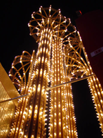
Photographs of Westward Ho signs, Las Vegas (Nev.), 2002
Date
Archival Collection
Description
Site name: Westward Ho Motel (Las Vegas, Nev.)
Site address: 2900 S Las Vegas Blvd
Sign details: The space of the westward Ho is limited yet busy on the landscape of the strip. Approaching from the south, the property lies on the West- side of the Strip. Signage is available on the south elevation, wrapping around into the east elevation, which happens to be the front. Starting with the pylon sign a similar courtyard stretches north with its translucent vinyl awnings, until it reaches its abrupt end with the Circus Circus and Slots A Fun properties.
Sign condition: Structure 5 Surface 5 Lighting 5
Sign form: Pylon; Porte-cochère
Sign-specific description: Approaching the Westward Ho headed north you are immediately confronted by a couple of signs. The first being giant yellow channel letters in Western style font and outlined in blue neon. The font is similar to that of the Frontier Hotel and Casino. The ends of extended appendages of the letters swell in block shapes with points jutting from the flat surface. The letters are filled with incandescent bulbs which all flash on together almost illuminating the entire parking lot in for a brief few seconds and then off again. Below that the building is horizontally striped with polished gold panels sporting three back lit signs for various resort attractions of buffets and drink specials. The building long panel is bordered on the top and the bottom by chasing incandescent bulbs on a polished raceway from left to right when facing this south elevation. The brick facade is adorned with a long backlit message cabinet with yellow painted raceways with incandescent bulbs. On either end of the backlit cabinet are two large square backlit cabinets. These two are bordered with a large steel raceway painted black. Dividing the two large raceways is a channel painted yellow. Inside the recessed channel are incandescent bulbs. The black raceways are faced each with three stripes of neon in blue, whir. The facade of signage and mirrored panels leads the eye to the obvious main pylon sign for the motel. The giant exploding pylon of gold raceways shooting upward into the sky and finally mushrooming out into umbrella formations at different elevations. The sign is comprised of five separate towers: One giant one in the center, which is the tallest, two lower ones flanking the center poles, then one smaller one on the south side of the sign and one equal size on the East side of the structure. The polished gold aluminum raceways comprise the body of the structure and are illuminated with incandescent lamps. The very base of the structure is supported with a structure of red brick masonry. The only elements of actual signage are the back-to-back color animated LED message centers, which are crowned by the 'old west' style text of various sized red neon bordered channel letters. Viewed from the side the Westward ho sign takes on a more sculptural aspect than that of signage. The reason for this is the brilliant finishing of the backs of the message centers. The rears of each panel are finely finished with brushed aluminum gold panels, which combined with the electrifying animation of the incandescent bulbs, creates a high degree of reflectivity. (Barnard) As if echoing the main pylon sign, stretching to the north is a small plaza utilizing the same three-dimensional sculpted umbrella designed awnings to create a pedestrian ready experience to the design. The umbrellas are made into coverings by the addition of illuminated vinyl. The pole structures are steel, covered with brick masonry. Each one of the umbrellas has a planter base and benches where visitors my rest or enjoy the surrounding environment. As the pylon, bulb laden, polished aluminum raceways form the skeleton of the Umbrella. Non-illuminated brass raceways stretch down from the inside and down the center pole. As well as the pylon, polished metal lacework finds its way around the circumference of the Umbrellas bottom edge. The East face of the building is mirrored to ad to the reflectivity of the entire plaza, and adding the illusion of depth to the rather limited space. The half columns and half umbrella's are set into the wall looking as if it is whole against the mirrored surface. A backlit triangular polished cabinet is of particular interest, because it is a sculpted cabinet frame. The top of the two faces is made to mimic the shapes of the pylons swelled crowns. Westward Ho is spelled in red paint.
Sign - type of display: Neon; Incandescent; Backlit; Matrix; Ambient
Sign - media: Steel; Plastic; Glass; Masonry
Sign - non-neon treatments: Graphics; Paint
Sign animation: Chasing, flashing, oscillating
Notes: The incandescent bulbs inside the text reading "Paris" on the balloon oscillate rapidly.
Sign environment: The Westward Ho's unique design of an incorporated courtyard frontage, creates a small strip of closed environment between the Stardust and the Circus Circus/Slots A Fun. The space between the Stardust's property and the Westward Ho's is separated by a small parking lot, which holds claim to the giant letters which boom out casino to the passerby. With its party atmospheric, umbrella design, and mirrored backdrop the pedestrian element makes its own environment distinct to the passerby. Walking through this section gives a sense of a specific taste held in Las Vegas two decades ago, yet still evident today in almost every casino design.
Sign manufacturer: Sign Systems, Inc (pylon and courtyard) YESCO (south side signage)
Sign designer: Brian K. Leming (Pylon and Umbrella frontage)
Sign - date of installation: 1983 (Pylon and Umbrella frontage)
Sign - date of redesign/move: Original backlit plastic message center was replaced with the now existing LED matrix screen
Sign - thematic influences: The Westward Ho facility itself is a Western themed establishment but the design by Lemming reflects a more party atmosphere with its umbrella shaped overhangs and highly animated incandescent raceways. The courtyard was originally designed with a different idea fore a pylon, but the idea of the canopies was carried over into that of the design of the pylon. The over use of the theme of the polished aluminum is reminiscent of that period in Vegas history when the materials could be found virtually everywhere. Such examples included the porte cocheres at the Silverbird Hotel and Casino and the Stardust as well. This theme is still seen on virtually almost every sign. The only elements of Western imagery or style are found in the pylon sign are the font style of the lettering. As for the he building's flavor of the old west, the south wall's yellow channel letters reading "CASINO" is reminiscent of the style of font found on the pylon.
Sign - artistic significance: Besides the fact that the pylon structure stood independently in sculptural aspects as well as functional aspects, the use of materials proved to be a trend setting achievement in that period of Las Vegas. Not only did the property take extensive use materials that could maximize the ability of the lighting such as polished aluminum and mirrored paneling, it was the first to significantly employ the use of colored, translucent vinyl.(Barnard) Soon after the use of this translucent materials in signs could be seen all over the Strip on the interior and exterior of signs and buildings.
Surveyor: Joshua Cannaday
Survey - date completed: 2002
Sign keywords: Chasing; Flashing; Oscillating; Pylon; Porte-cochère; Neon; Incandescent; Backlit; Matrix; Steel; Plastic; Masonry; Glass; Paint; Graphics
Mixed Content

