Search the Special Collections and Archives Portal
Search Results
Kirk Kerkorian School of Medicine at UNLV Records
Identifier
Abstract
The Kirk Kerkorian School of Medicine at UNLV Records (2011-2022) documents the establishment of the Kirk Kerkorian School of Medicine at UNLV (formerly known as the UNLV School of Medicine). The materials include meeting agendas and reports from various committees, advisory boards, and the Legislative Counsel Bureau that were assessing economic impact, research strategies, medical education in the state of Nevada, and the development of the Las Vegas Medical District. Promotional and marketing materials in this collection includes event flyers and buttons produced to promote the UNLV School of Medicine. The collection also contains papers from Dr. Barbara Atkinson, the founding dean of the UNLV School of Medicine, such as letters of congratulaions on her appointment and biographical information. Also included are copies of the school's first commencement and hooding ceremony and a memoir written by James Dean Leavitt that details his experience building the School of Medicine as a member of the Board of Regents and as Chairman of the ad hoc Health Sciences Center Committee.
Archival Collection
Tom and Erma Godbey Photograph Collection
Identifier
Abstract
The Tom and Erma Godbey Photograph Collection is comprised of thirteen black-and-white photographic prints and negatives from 1934 to 1944. The photographs depict the Godbey family participating in parades and other events in Boulder City, Nevada and Las Vegas, Nevada.
Archival Collection
John D. Dombrink Gaming Research Files
Identifier
Abstract
The John D. Dombrink Gaming Research Files (approximately 1951-1990) contain the research files of John D. Dombrink in preparation for his book The Last Resort: Success and Failure in Campaigns for Casinos, published in 1991. The collection consists of newspaper clippings, journal articles, and public reports on a variety of topics and issues related to gaming in the United States, including organized crime, commercial gaming, and regulatory practices and issues. The collection also contains manuscript drafts for The Last Resort: Success and Failure in Campaigns for Casinos with handwritten revisions and comments by Dombrink, as well as correspondence about the book’s potential publication and promotion.
Archival Collection
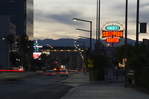
Photographs of Somerset Shopping Center sign, Las Vegas (Nev.), April 4, 2017
Date
Archival Collection
Description
Site address: 252 Convention Center Dr
Sign owner: Somerset Shopping Center CO LP
Sign details: This shopping center was built in 1966 next to the Somerset House Motel. The motel was demolished in 2011; however, the shopping center is still around. Some businesses that reside in the shopping center include: a hair and nail salon, a dry cleaners, an Ethiopian restaurant, and a place for banquets to name a few.
Sign condition: 5, the sign is in beautiful condition.
Sign form: Pole
Sign-specific description: This pole sign sits close to the street so motorists and pedestrians can view it easily. A light blue pole holds up the main portion of this sign, as well as back lit plastic signs on each side of the pole that display what businesses are in the shopping center. The sign itself consists of a yellow ring that encircles three other signs. This yellow circle is covered in incandescent light bulbs that chase when the sign is lit up at night. Also, extending from this yellow circle are light blue poles in various lengths that are surrounded in neon tubes and oscillate around the yellow circle when the sign is lit up at night. In the center of the circle are three signs. The first sign is an elongated oval that has the word "SOMERSET" painted on it in bold white letters with a black outline on a light blue background. Neon tubes outline these letters. The sign under that is a large rectangle shape with each of the sides curving inward. There are also incandescent light bulbs lining the outer edge of this sign that chase when the sign is lit up. This sign has the word "SHOPPING" painted on it in bold white text against a red background. Neon tubes outline each letter of this word. The sign under this is another elongated oval that is a similar size to the "SOMERSET" sign. This sign reads "CENTER" in bold white text against a red background and neon tubes outline this word as well.
Sign - type of display: Neon, Incandescent light bulbs and back lit
Sign - media: Steel and plastic
Sign - non-neon treatments: Plastic portion of sign
Sign animation: Oscillating, chasing
Sign environment: The shopping center that this sign is located in is about a block away from the Strip and is near a few monumental properties. It resides close to the Las Vegas Country Club, the Las Vegas Convention Center, and the Guardian Angel Cathedral that Paul Revere Williams designed. It is down the road from casinos like the Wynn, Encore, Circus Circus, and the Westgate. The Peppermill, an iconic Las Vegas restaurant, is down the street as well. It was down the street from the Stardust when that property was up and running.
Sign manufacturer: YESCO
Sign - date of installation: Most likely 1966, 1960's era
Sign - thematic influences: The design of this sign is very eye-catching from the road, as are many roadside signs throughout this era of the city. Bold text and light animation make this a standout sign to attract motorists and pedestrians to the shopping center.
Sign - artistic significance: This sign appears to have some Googie design influence throughout it. It has a space age feel to it because of the yellow circle that surrounds the "SOMERSET SHOPPING CENTER" signs and the blue poles that extend from it also add to this style.
Survey - research locations: Assessor's Page http://www.clarkcountynv.gov/assessor/Pages/searchbybusinessname.aspx , Vintage Las Vegas website http://vintagelasvegas.com/search/somerset , Roadside architecture website http://www.roadarch.com/signs/nvvegas.html
Surveyor: Lauren Vaccaro
Survey - date completed: 2017-09-01
Sign keywords: Neon; Incandescent; Backlit; Steel; Plastic; Oscillating; Chasing; Pole sign
Mixed Content
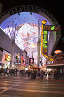
Photographs of Trader Bills sign, Las Vegas (Nev.), April 18, 2017
Date
Archival Collection
Description
The Trader Bills gift shop-turned-motorcycle shop sits at 328 Fremont Street inside the Fremont Street Experience. Information about the sign is available in the Southern Nevada Neon Survey Sheet.
Site address: 328 Fremont St
Sign owner: Marshall Family, LP
Sign details: The current building was constructed in 1943 (Assessor). Trader Bill's was a Western style leather and gift shop (RoadsideArch.com). The business has been located downtown at least since the 1930's or 1940's (UNLV digital photo collection) but possibly longer (Shemeligian, 1997). The store moved to its present location by the 1950's (RoadsideArch.com). It later became the Jewelry Outpost and Las Vegas Harley-Davidson (Shemeligian).
Sign condition: Condition 3-4. Cabinet and lights are in good condition. The paint on the street side of the sign is extremely faded.
Sign form: Blade
Sign-specific description: The metal cabinet is shaped like an upside down "L" which points toward the building. The cabinet is painted red. On the side of the sign facing Las Vegas Boulevard the paint has faded almost completely to reveal the earlier blue paint. An arrow-shaped metal cabinet runs along the Fremont Street side of the sign. The sides of the arrow are painted yellow. Three rows of yellow incandescent light bulbs cover the shaft of the arrow and nine rows cover the feathers and head. "Trader" is spelled out in yellow san serif channel letters which run horizontally across the top of the sign. The interiors of the letters are outlined in white neon tubing. "BILLS" (no apostrophe) runs vertically down the sign in the same channel lettering. Rungs run along the spine of the sign and what appears to be a ladder is located under "Trader" at the top of the sign. A plaque on the back of the arrowhead near the last "S" in "BILLS" has a YESCO logo and states "THIS SIGN IS THE PROPERTY OF THE YOUNG ELECTRIC SIGN COMPANY-{illegible] 876-8080
Sign - type of display: Neon and incandescent
Sign - media: Steel
Sign - non-neon treatments: Incandescent
Sign environment: This location is in the Fremont Street Experience on the corner of Fremont street and Fourth Street. It is across the street from Neonopolis and surrounded by other gift shops.
Sign manufacturer: It has the YESCO logo and states that it is the property of YESCO though it is not confirmed if they manufactured it.
Sign - date of installation: Circa 1960's
Sign - date of redesign/move: The sign is probably from the 1960's (Roadside Architecture). A photograph circa 1960 shows the sign painted dark blue with yellow letters (Classic Las Vegas, n.d.). A photograph from 1991 shows the color scheme unchanged (Classic Las Vegas). The sign was painted its current red color by 2006 (RoadsideArch.com).
Sign - thematic influences: The building is Western style brick and weeping mortar.
Survey - research locations: Clark County Assessor Classic Las Vegas. (n.d.). A brief history of Fremont Street, North side of the street, Third to Fourth. Retrieved from http://classiclasvegas.squarespace.com/downtown-history/2007/5/3/a-brief-history-of-fremont-street-cont.html RoadsideArcitecture. Las vegas Signs, Trader Bill's. Retrieved from http://www.roadarch.com/signs/nvvegas3.html Shemeligian, B. (1997 June 19). Landmark downtown shop changes focus. Las Vegas Sun. Retrieved from https://lasvegassun.com/news/1997/jun/09/landmark-downtown-shop-changes-focus/ UNLV Digital Collections. (n.d.). Film transparency showing Trader Bill's souvenir shop in Las Vegas, circa 1930s-1940s. Retrieved from http://n2t.net/ark:/62930/d1nk2c
Surveyor: Mitchell Cohen
Survey - date completed: 2017-08-14
Sign keywords: Blade; Neon; Incandescent; Steel
Mixed Content
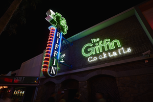
Photograph of The Griffin sign, Las Vegas (Nev.), June 28, 2017
Date
Archival Collection
Description
Site address: 511 Fremont St
Sign owner: Aaron Chepenik and Jonathan Hensleigh
Sign details: Opened in February of 2007 as a medieval British pub/ tavern style bar. This location brought on a wave of revitalization of the East Fremont District especially since many new bars/restaurants started to open in this area after this bar did.
Sign condition: 5- still looks relatively new
Sign form: Blade and overlay neon on building
Sign-specific description: Placed above the entrance their brick building the letters The Griffin Cocktails is painted with white block letters outlined with black paint is painted on the building itself. These letters have skeletal neon surrounding the letters. The Griffin letters are yellow tubes and do illuminate green at night, the word cocktails lights up white. To the left of the entrance but still on the building is a green painted griffin drinking a painted white martini ( also all outlined with black paint) The neon tubing outlining the griffin is a yellow tubing but glows green at night ( possibly argon inserted to make it glow green). The Blade is placed a little left of the entrance and hangs off of the building by two blue steel beams, but in between the beams is a beautiful swirl design. At the top of the Blade there is a green griffin sipping a martini (same design as the one painted on the building). At the base of the griffin is white THE letters painted with skeletal neon. Then below is the blue portion of the blade spelling out GRIFFIN in a Britannic looking font in white channeled letters which do illuminate white at night. This part of the blade is outlined in neon ,possibly argon, since it does illuminate blue at night. On the side of the blade ( if you're looking from the road) there are about 14 red curved neon tubes lining the sign.
Sign - type of display: Neon
Sign - media: Steel and Brick Wall
Sign - non-neon treatments: Using the brick wall as a portion of the sign is a design not seen often in Vegas.
Sign animation: Oscillation of red neon tubes on the side of the sign.
Sign environment: Located in the Fremont East District in between Las Vegas Blvd. and 6th St. This location has The Vault to the East of it and The Smashed Pig Gastropub to the west. It is across the street from the Park and Evil Pie. In the middle of the street right in front of the Griffin Bar is the Martini Glass sign.
Sign manufacturer: YESCO
Sign designer: Owners Aaron Chepenik and Jonathan Hensleigh-Aaron stated that the blade portion of the sign was inspired by the old Boulder Club Blade sign
Sign - date of installation: Slightly before they opened so late 2006/early 2007
Sign - thematic influences: Griffin shows that it has a medieval and kind of fantasy kind of feel since its interior does have that cool medieval tavern vibe to it, especially with their fireplaces. Using their brick wall as a part of the sign is a cool innovative way to use their space and stay true to their theme.
Sign - artistic significance: Medieval theme. The blade is a prominent theme in the 50s/60s, though their blade sign was inspired by the Boulder Club (opened 1931-1960) blade.
Survey - research locations: Acessors page, outreach to owner Aaron Chepenik
Survey - research notes: Possible use of argon within their yellow painted tubes, similar to the Yucca Motel signs leaves.
Survey - other remarks: The Blade does look very similar to the Boulder Club blade, so its awesome to see modern properties paying homage to the ones that are no longer around.
Surveyor: Emily Fellmer
Survey - date completed: 2017-09-15
Sign keywords: Oscillating; Steel; Neon; Blade; Fascia; Building-front design
Mixed Content
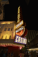
Photographs of Golden Gate Hotel and Casino signs, Las Vegas (Nev.), April 18, 2017
Date
Archival Collection
Description
Site address: 1 Fremont St
Sign owner: Derek and Greg Stevens
Sign details: This location originally held the Hotel Nevada that opened in 1906. This location had the first phone that was installed in Las Vegas in 1907. The building dates back to 1935, but in 1990 Mark and Craig Italo restored the exterior of the building to reflect the original art deco look to the building. This property was named Sal Sagev (Las Vegas spelled backwards) before it changed to the Golden Gate in 1955. This location was made famous with their bargain shrimp cocktail. This location has exhibits near their check-in desk showcasing older casino memorabilia, old slot machines, as well as an old phone.
Sign condition: 5- still shines brightly and paint is holding up very well
Sign form: Blade and semi-decorated shed
Sign-specific description: Their blade sign is on the corner of Main and Fremont on the top of the blade is a spherical yellow light with two neon 3-D diagonal oval shapes beneath it the with the top one blue and the bottom one a fuchsia pink. The main portion of the blade is made up by sideways rusty colored squares spelling out "GOLDEN GATE" in block letters (one letter in each box) each containing flashing incandescent light bulbs. Beneath this is a rusty colored rectangular box that spells out "CASINO" in the interior with white neon letters with the box outlined in sparkling incandescent light bulbs. Underneath the rectangle is a rusty colored circle with white block letters spelling out "HOTEL" in neon, and underneath the words is a red skeletal neon outline of the Golden Gate Bridge. On the corner of the building right underneath the blade is is a rectangle sign with red neon spelling out "CASINO". There are chasing incandescent light bulbs surrounding the first second story of the building with the words "GOLDEN GATE" in channeled white neon letters that are outlined with blue neon and have sparkling incandescent light bulbs at night, and are both on the west and north side of the building. Also there are the words "RESTAURANT" as well as "CASINO" both in flashing incandescent light bulbs on both sides of the building as well. There are also LED lights that illuminate the building's windows at night time.
Sign - type of display: Neon, Incandescent light bulbs and LED
Sign - media: Steel
Sign - non-neon treatments: Incandescent light bulbs on signs and LED lights illuminating the building
Sign animation: Chasing, flashing
Notes: incandescent light bulbs
Sign environment: This location is on the corner of Main and Fremont which is the entrance to the Fremont Street Experience. There is also a concert stage in front of this property. Across the street would have been the Las Vegas Club, the Glitter Gulch and Mermaids; but have been demolished in recent times.
Sign - date of installation: 1964
Sign - date of redesign/move: When the sign was installed in 1964 the bottom circle of the blade stated "HOTEL SAL SAGEV" but now there is the Golden Gate bridge, so it must have switched when the Sal Sagev name was not affiliated with that location anymore.
Sign - artistic significance: This blade looks similar to the old Sal Sagev sign that was up on this building previous to this sign. The blade also was a prominent theme for signs in the 50's and 60's especially down on Fremont.
Survey - research locations: Assessor's Page, Tour outline, Golden Gate website for history http://www.goldengatecasino.com/history/#
Survey - research notes: http://www.goldengatecasino.com/history/# has a good timeline of the history of the casino as well as some good Vegas history notes as well.
Surveyor: Emily Fellmer
Survey - date completed: 2017-09-22
Sign keywords: Neon; Incandescent; Chasing; Flashing; Decorated shed; Steel; Pole sign
Mixed Content
Photographs of The D signs, Las Vegas (Nev.), April 18, 2017
Date
Archival Collection
Description
Site address: 301 Fremont St
Sign owner: Derek Stevens
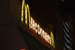
Sign details: This location first opened as the Sundance in 1980 which was known for its affiliation with Moe Dalitz of the Cleveland syndicate. Then the location was reopened in 1987 as the Fitzgerald's by owner Don Barden, one of the first African American casino owners in Las Vegas. Then in 2012 the renovation process began for Derek Stevens to open up the D casino. The D is named after Derek Steven's hometown of Detroit, Michigan.
Sign condition: 5- Very good condition
Sign form: Variation of a Bull Nose sign, signs on buildings and other entrance signs
Sign-specific description: Above their main entrance on Third and Fremont there is a black backdrop that states "the D" the letters the are in gold lights, then the letter D is in a big red steel box that showcases a tv screen in the big part of the letter, but this letter is outlined in two strips of red neon. Underneath this variation of a bull nose sign is a tv plasma screen that they have wrapped around the building. - On the second story of their casino there is a Vintage Vegas section that can be accessed from the street via escalator, above this second floor entrance is a sign stating "the D Vintage Vegas" At the Top of the building is an animated sculptural sign which is a slot machine with a lever that pulls down with the reels changing such as an old slot machine would have done. Then below this are neon coins that light up in order to look like they are falling out of the slot machine. On the top left portion of the coins states "the (in white) D (in red)", but under the logo is a solid yellow neon line. On top of the yellow line states "Vintage" and on the bottom states "Vegas" in a retro 50's 60's font.
Sign - type of display: Neon, LED, Plasma screen
Sign - media: Steel, some plastic
Sign - non-neon treatments: Light bulbs, T.V. screen and sculptural sign
Sign animation: The coins light up in order to look as though they are falling out of the sculptural slot machine. The lever on the slot machine moves to activate the moving reels in the slot machine.
Sign environment: On the corner of Third and Fremont St. West of the building is the Four Queens, to the North West is the Fremont Casino and Hotel. Across Fremont street from the D is little shops including where the El Portal Movie Theater used to be. Also along Fremont Street the D opened a bar which is very helpful with foot traffic. Also Third Street right in front of their main entrance there is a stage that hold concerts.
Sign manufacturer: AD/S Companies
Sign - date of installation: 2012
Sign - thematic influences: This variation of a Bull Nose sign is similar to many of the other entrance signs for casinos on Fremont Street.
Sign - artistic significance: The Vintage Vegas sign has a retro 1950's/60's type font. The sign really does represent the theme of that section of the casino well by having the old slot machine sculptural sign.
Survey - research locations: Acessor's office website, the D website http://www.thed.com/hotel/ , Neon Museum Tour Manual
Survey - research notes: Derek Stevens also owns the Golden Gate. He bought out the Glitter Gulch, Mermaids and La Bayou in 2015 then the Las Vegas club in 2016. La Bayou was demolished in 2016. The summer of 2017 is when the demolition of Glitter Gulch, Mermaids and the Las Vegas Club began.
Surveyor: Emily Fellmer
Survey - date completed: 2017-08-12
Sign keywords: Neon; LED; Steel; Plastic; Bullnose; Building-front design; Plasma display; Video screen; Sculptural
Mixed Content
Photographs of Maxim signs, Las Vegas (Nev.), 2002
Date
Archival Collection
Description
Site address: 160 E Flamingo Rd
Sign owner: Premier Interval Resorts
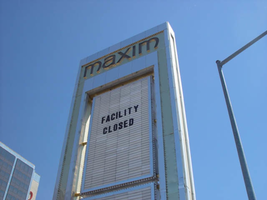
Sign details: The Maxim is located just east of the Bourbon Street, in close proximity to Bally's Hotel Casino. The Maxim is no longer operating, and is fenced off from further inspection. The signage that is seen entails building signs, the original pylon, and the porte cochere
Sign condition: Structure 2 Surface 2
Sign form: Pylon; Fascia; Porte-cochère
Sign-specific description: Building: The tower itself contains the logo and giant text spelling the name of the establishment, on one side of the building. The tower is mirrored and reflective, thus matching the porte cochere and pylon, and reserves to collect its building signage to one end of the tower. The tower, which runs east/west, and faces north/south contains the signs on the east end structure. On the north and south faces of the building, giant red channel letters run vertically along the block surface. The letters look to be lined on the interior of the letters with neon. The logo can be seen on the east face. Pylon: The pylon sign is essentially a giant vertical monolith of a rectangle, divided into several different sub-shapes. The center of the monolith is occupied by cabinets which fill in most of the shape, with a small gap bordering the cabinet. The cabinets are treated the same as the square arch, and flush with the surface. The cabinets are very subtle and create an illusion of one solid object. The entire outer arch shape and interior cabinets are bordered with polished aluminum. The interiors surface of the arch are covered in polished gold aluminum panels. The lining of the incandescent bulbs on the sign is interesting. On the arch the incandescent bulbs are on the interior return width of the aluminum borders. With this configuration, the bulbs sit parallel to the surface instead of perpendicular. The main marquee text is aligned horizontally across the top in gold channel letters with red plastic faces. The letters blend with the gold surface nicely. The interior cabinets are internally lit with plastic faces. There are two cabinets, the larger of the two, occupying the upper part the interior space of the monolith. Incandescent bulbs line the exteriors of the cabinets, sitting back on a recessed edge. Porte Cochere: The porte cochere is unique, opting to rise high above the surface of the pavement. The prismatic design crafted in polished aluminum, interlocks into a pattern suitable to the space which it resides. The recesses in which the decoration resides are separated by a small width of structure. This pattern of giant recesses, matched with the prismatic design in each negative space create a hulking environment high above the head in proud stature. Along the peak edge of the pieces of the prism, rods protrude every foot or so, creating a row of arms holding incandescent spheres.
Sign - type of display: Neon; Incandescent
Sign - media: Steel; Plastic
Sign - non-neon treatments: Graphics; Paint
Sign animation: chasing, flashing
Sign environment: The Maxim is now closed, and stands in marked contrast to its neighbors a bit to the east--the famous "Four Corners" of Flamingo and the Strip, and next to the trendy Meridian at Hughes Center apartment complex.
Sign designer: Maxim letter design: Kenneth Young, Porte Cochere; Lighting: Jack Dubois Pylon sign: Marnell Corrao
Sign - date of installation: 1977
Sign - thematic influences: The influence of the Maxim hotel was 70's Vegas design refined to simple geometric forms and curved linear logo's. The pylon was completely sheathed in polished aluminum, as well as the underside of the porte cochere being polished gold aluminum. The use of the popular 70's material is used extensively throughout the design. Letters hung over the main entrance, as well as signage on three sides of the building. Other examples of the material can be seen elsewhere but not as extensively. The only property that comes close is the pylon for usage of the material is the Westward Ho.
Surveyor: Joshua Cannaday
Survey - date completed: 2002
Sign keywords: Chasing; Flashing; Pylon; Fascia; Porte-cochère; Neon; Incandescent; Steel; Plastic; Graphics; Paint
Mixed Content
Photographs of McCarran Field signs, Las Vegas (Nev.), 2002
Date
Archival Collection
Description
Site address: 6005 S Las Vegas Blvd
Sign owner: McCarran International Airport
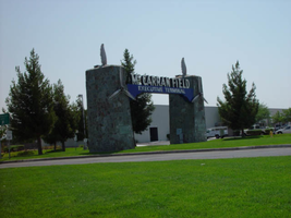
Sign details: On the south end of the Strip, the very last sign on the east side before you arrive at Sunset Blvd Facing West the two stone pylons are set approximately fifty feet off of the street at the end of a dual-lane stretch of pavement separated by an island of grass. The banner marquis between the two pylons stretches over this area of grass.
Sign condition: Structure 3 Surface 3 Lighting 4 Notes: The surface of the pylon is in good shape considering its age and its environmental condition. It is essentially left to fend for itself against the elements, being in the flat expanse of an airfield. The stone, plaques, and paint treatment are all badly worn, with the stone pylons, appearing the least worn.
Sign form: Pylon
Sign-specific description: The original McCarran Air Field entrance is constructed of two masonry pylons sit on an island of grass, and serve as an entrance to the private Hughes executive airport terminal. Each individual tower is adorned with a propeller attached to the front and the representation of a bird's wing crowning the tops Both facets are constructed of steel. When facing the structures the left has a plaque on the bottom section with the inscription "1948" while the one on the right reads "Las Vegas". Between the two pylons a stretch of text in white channel letters and white neon, large text in the old "Frontier style text reads McCarran Airport. The signage sits independently on top of a sturdy connecting steel cabinet, which supports the words "executive terminal" in smaller channel letters, with white neon. The cabinet is a painted blue horizontal plane tapering wider on either end in rounded profile patterns. The wings are outlined in pink neon, while the propellers are outlined in rose neon with a circle of white in the middle.
Sign - type of display: Neon
Sign - media: Masonry
Sign - non-neon treatments: Paint
Sign animation: none
Sign environment: The surrounding area is rather dark due to the wide expanse of the airfield which stretches out behind the sign. It truly is a last marker for the end of the Strip, and stands alone. Even though it is in close proximity to the major strip resorts of the Four Seasons as well as the Mandalay Bay and various small roadside hotels, it seems to stand in solitude.
Sign - date of installation: 1948
Sign - date of redesign/move: The blue banner of steel and white letters was added after its initial construction.
Sign - thematic influences: The masonry pylons are constructed in an adobe style masonry reminiscent of the desert landscape surroundings. Designed for the airport, the appendages stem obviously around the theme of flight. This may be denoted from the propeller and the wing. The juxtaposition of the two elements, one being the method of flight in nature and the other man made, serves as a reminder of mans fascination with flight. The added banner's text is in the pioneer fashion of the original Last Frontier.
Sign - artistic significance: Opened in 1948, the sign was intended for use as a marker for the endpoint of the Strip. " It was part of the city's expanding policy creating a jet-scale entrance for the city," Jorg Rudemer from Lost Las Vegas. Artistic significance also lies in the combination of materials using masonry, steel and, neon. The piece successfully combined these elements to provide an architecturally solid design by day, which was cohesive with its surrounding landscape. A metamorphosis takes place at night as the sign is transformed into a glowing specter of its daytime counterpart. The surrounding area is rather dark as the pylon rises up out of the darkness as a neon marker for the property. The illuminated wing and propeller stand out as the significant and successful partners in the world of flight.
Surveyor: Joshua Cannaday
Survey - date completed: 2002
Sign keywords: Pylon; Neon; Masonry; Paint
Mixed Content
